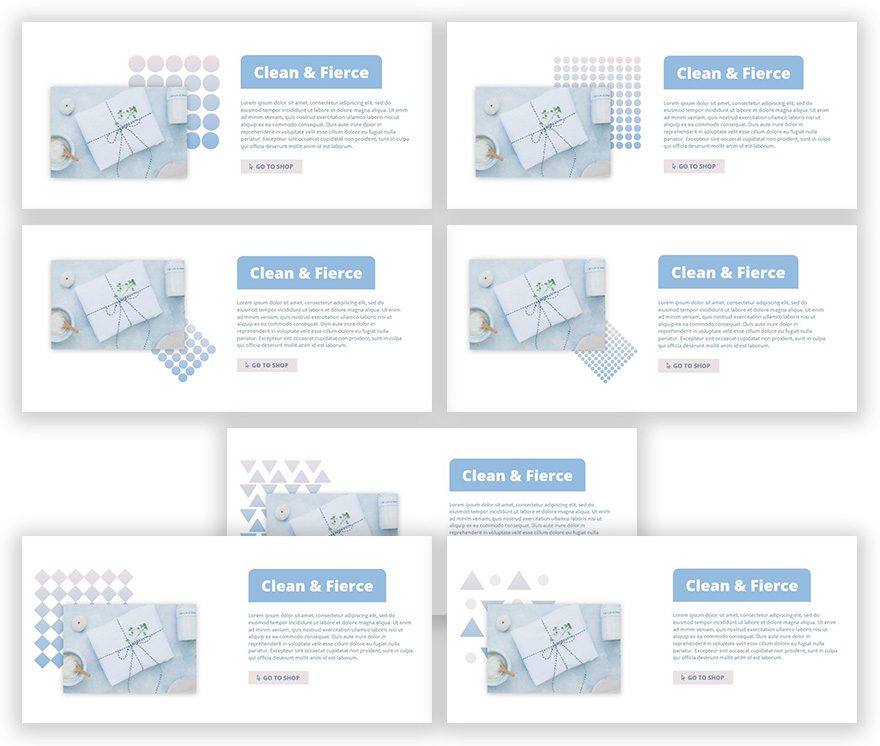
When you’re including images on your website, you want them to draw attention at first sight. One of the things that can bring your image to life is using patterns that emphasize the colors that are being used within the image itself. Not only will it emphasize your image’s colors, it will also take your design up a notch.
Further down this post, you’ll be able to download 7 different patterns for free and use them on any of your designs without restrictions.
Let’s get to it!
- 1 Preview
- 2 Download This Tutorial’s Files
- 3 Download For Free
- 4 You have successfully subscribed. Please check your email address to confirm your subscription and get access to free weekly Divi layout packs!
- 5 How to Emphasize Your Image’s Colors Using Patterns (Download 7 Free Patterns!)
- 6 Approach
- 7 General Steps
- 8 Temporary Result
- 9 Top Right Pattern Position
- 10 Bottom Right Pattern Position
- 11 Top Left Pattern Position
- 12 Preview
- 13 Final Thoughts
Preview
Download This Tutorial’s Files
To lay your hands on the free image files, you will first need to download it using the button below. To gain access to the download you will need to subscribe to our newsletter by using the form below. As a new subscriber, you will receive even more Divi goodness and a free Divi Layout pack every Monday! If you’re already on the list, simply enter your email address below and click download. You will not be “resubscribed” or receive extra emails.
How to Emphasize Your Image’s Colors Using Patterns (Download 7 Free Patterns!)
Subscribe To Our Youtube Channel
Approach
- The pattern image files that you can find in the downloaded folder contain transparent patterns and a white background
- We’ll choose two colors from our image & apply them to our image’s gradient background (the gradient background show up through the patterns)
- We’ll start off by going through the general steps of the design
- Afterwards, we’ll play around with the product image’s & pattern image’s custom margin to change the pattern placement (top right, bottom right & top left)
General Steps
Add a New Section
Background Color
Start by adding a new section and using ‘#ffffff’ as its background color.
Custom Padding
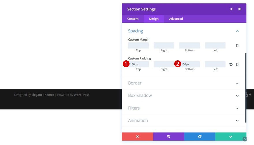
We want to create some space at the top and bottom of our section. That’s why we’ll add ‘150px’ to the top and bottom padding options within the Spacing subcategory.
Add a New Row to Section
Column Structure
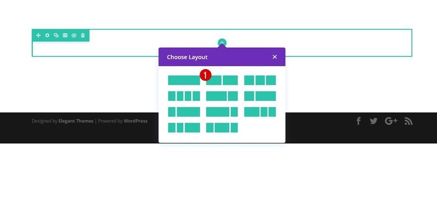
Once you’ve applied the previous steps to your section, go ahead and add a row with the following column structure:
Add Pattern Image Module to Column 1
Gradient Background
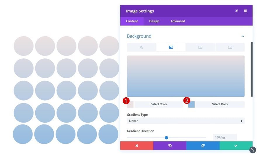
Now you can start adding the various modules. We’ll start with column 1 by adding an Image Module. Upload whichever one of the downloaded patterns you want to use. Then, choose the two colors from your product image that you want to use within your pattern as well. Once you do, open the Background subcategory of your Image Module and use these two colors to create a gradient background:
- Color 1: #ebe2e3
- Color 2: #94bce0
Sizing
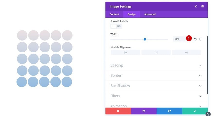
Move on to the Design tab of this Image Module and use ‘60%’ for the width.
Add Product Image Module to Column 1
Image Alignment
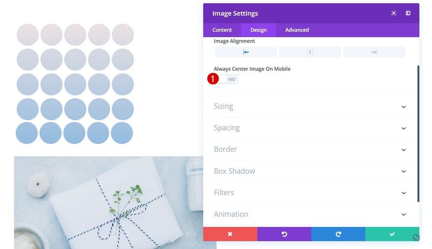
Right below the pattern Image Module, add another Image Module for your product image. The first thing you’ll need to do, after uploading your image, is disabling the ‘Always Center Image on Mobile’ option within the Alignment subcategory.
Sizing
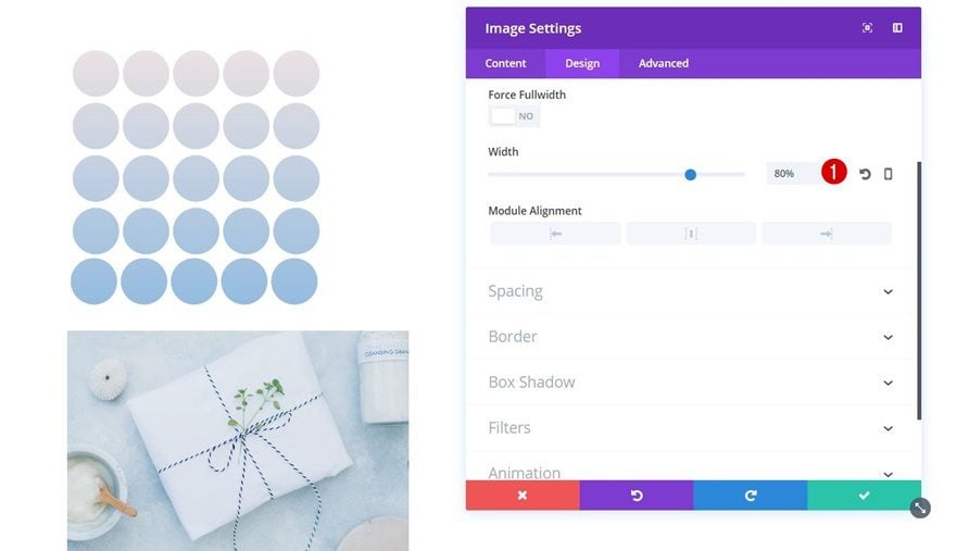
Open the Sizing subcategory next and use ‘80%’ for the Width.
Box Shadow
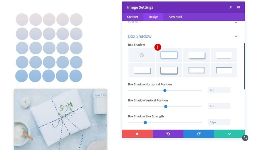
Lastly, enable the first box shadow option without modifying its default settings.
Add Title Text Module to Column 2
Background Color
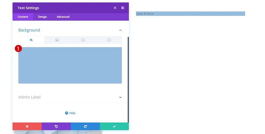
We have all the modules we need in the first column so let’s move on to the second. There, the first thing we’ll need is a title Text Module with ‘#94bce0’ as its background color.
Text Settings
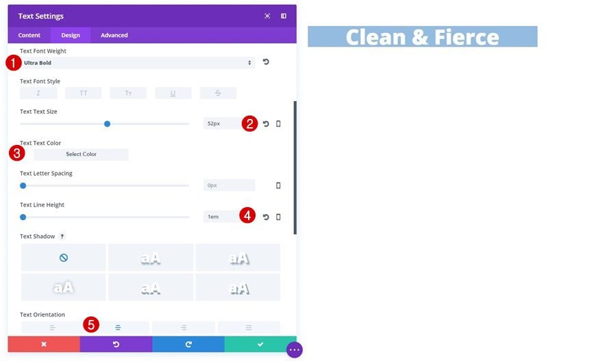
Go to the Design tab and apply the following text settings to this Text Module next:
- Text Font Weight: Ultra Bold
- Text Size: 52px
- Text Color: #ffffff
- Text Line Height: 1em
- Text Orientation: Center
Sizing
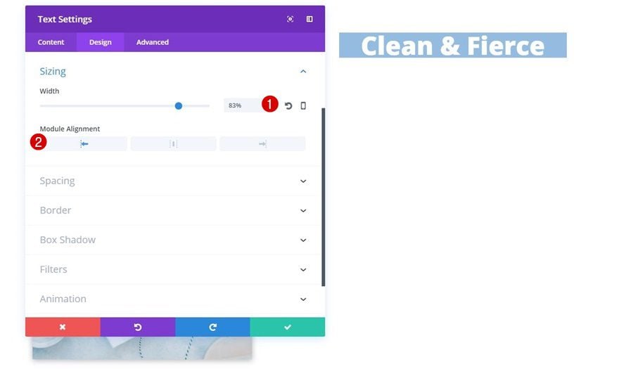
Continue by opening the Sizing subcategory and applying the following settings to it:
- Width: 83%
- Module Alignment: Left
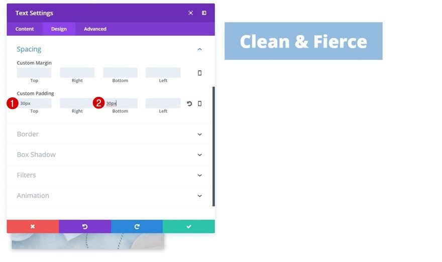
Custom Padding
To create some extra space at the top and bottom, we’ll also apply the following custom padding:
- Top: 30px
- Bottom: 30px
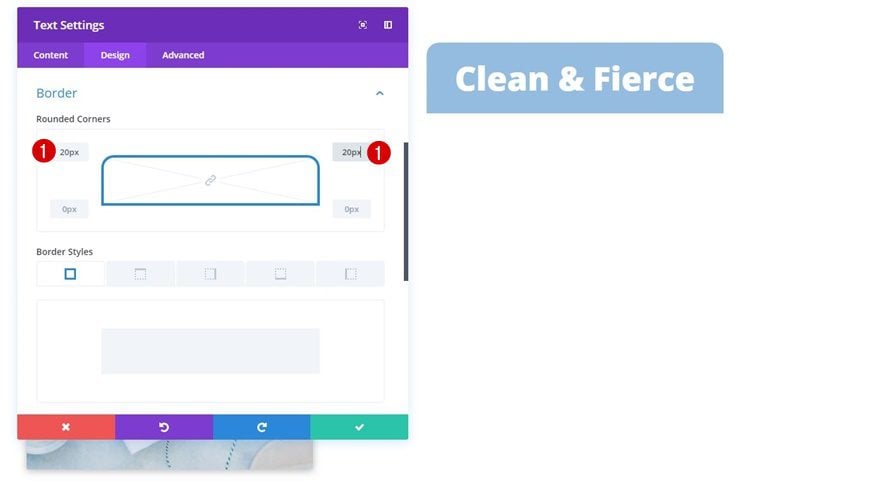
Border
Lastly, we’ll create rounded corners for the top left and top right by adding ’20px’.
Add Description Text Module to Column 2
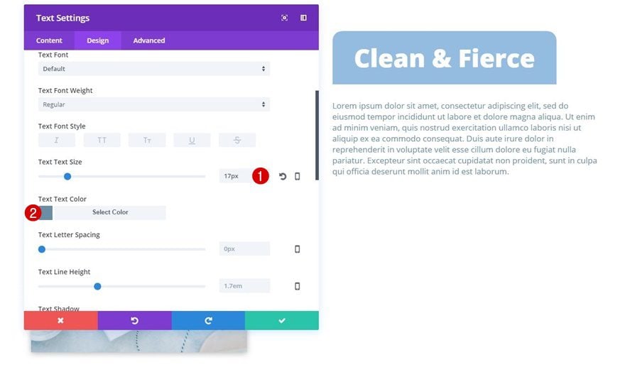
Text Settings
Right below the title Text Module, go ahead and add a description Text Module using the following text settings:
- Text Size: 17px
- Text Color: #6b8ea5
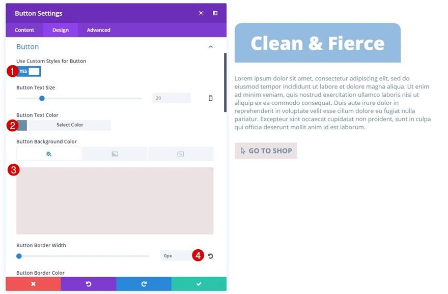
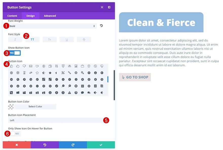
Button Settings
The last module in this column is a Button Module containing the following button settings:
- Use Custom Styles for Button: Yes
- Button Text Color: #6b8ea5
- Button Background Color: #ebe2e3
- Button Border Width: 0px
- Font Weight: Bold
- Font Style: Uppercase
- Show Button Icon: Yes
- Button Icon Placement: Left
- Only Show Icon on Hover for Button: No
Custom Padding
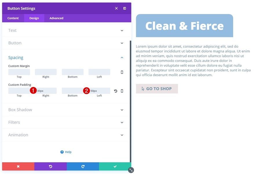
We’ll create some space on the left and right by adding the following custom padding as well:
- Right: 30px
- Left: 50px
Temporary Result
Up until this point, we’ve reached the following result:
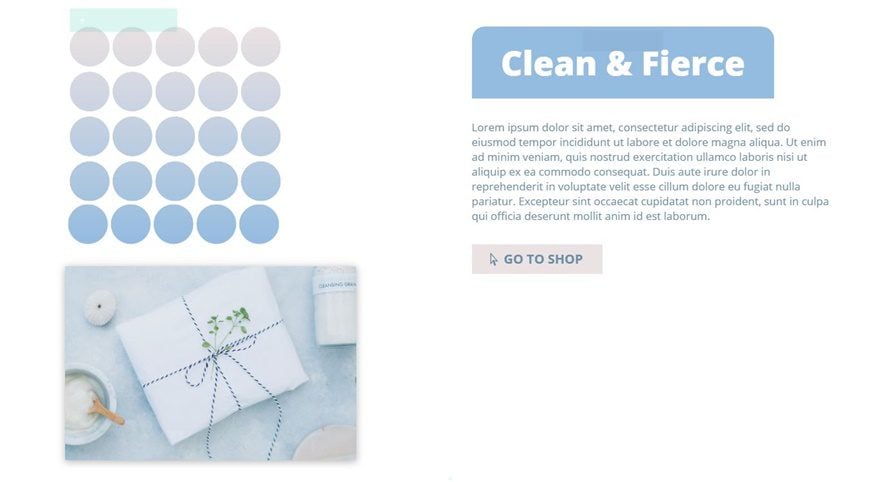
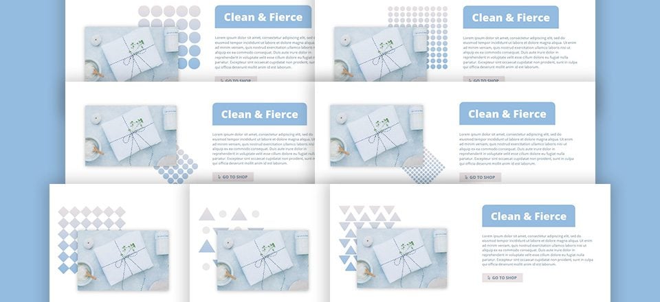
Now, depending on where you want your pattern to show up:
- Top Right
- Bottom Right
- Top Left
You can apply different custom margin values to both the pattern image and product image. In the next part of this post, we’ll go through all three possibilities and how to set them up.
Top Right Pattern Position
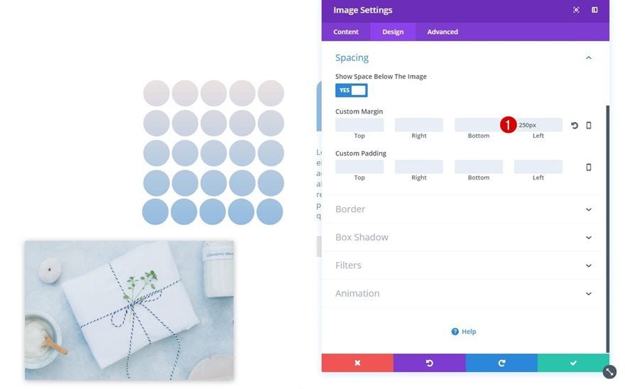
Pattern Image Module Custom Margin
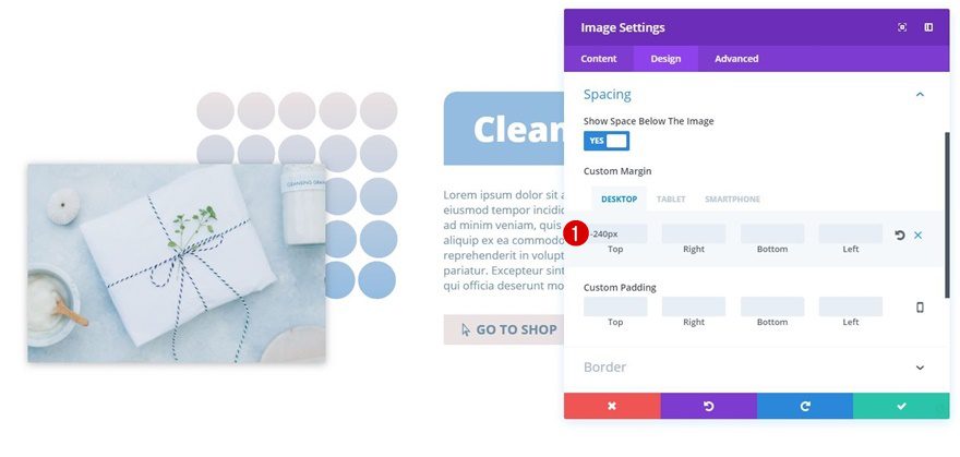
If you want your image to show up on the top right, add the following custom margin to your pattern Image Module:
- Left Margin: 250px (Desktop, Tablet & Phone)
Product Image Module Custom Margin
Then, open the product Image Module and apply the following custom margin to it:
- Top Margin: -240px (Desktop), -220px (Tablet), -100px (Phone)
Bottom Right Pattern Position
Pattern Image Module Custom Margin
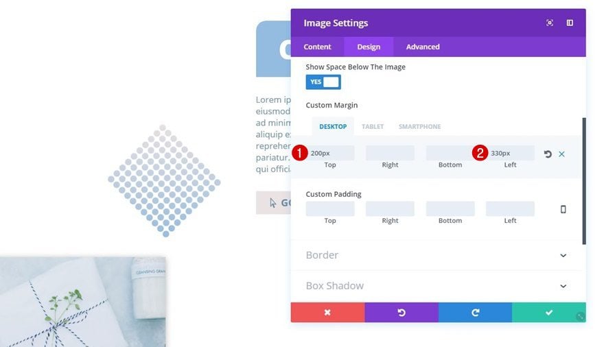
To make the pattern Image Module appear on the bottom right, open the pattern Image Module and apply the following custom margin to it:
- Top Margin: 200px (Desktop), 0px (Tablet & Phone)
- Left Margin: 330px (Desktop & Tablet), 200px (Phone)
Product Image Module Custom Margin
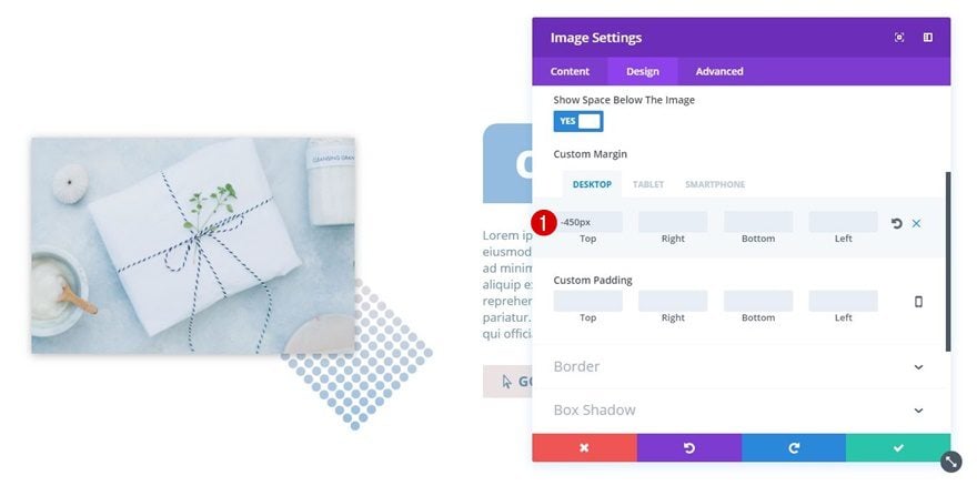
Open the product Image Module next, and add the following custom margin values:
- Top: -450px (Desktop), -400px (Tablet), -300px (Phone)
Top Left Pattern Position
Pattern Image Module Custom Margin
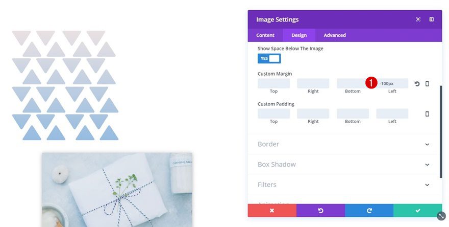
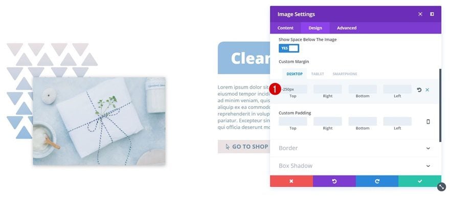
Now, the last pattern position needs the following custom margin:
- Left Margin: -100px (Desktop, Tablet & Phone)
Product Image Module Custom Margin
Lastly, open the product Image Module and use the following custom margin:
- Top Margin: -250px (Desktop), -230px (Tablet), -150px (Phone)
Preview
Now that we’ve gone through all the steps, let’s take a final look at the result.

Final Thoughts
Highlighting your images with patterns can really help you enhance the overall look and feel of your design. In this post, we’ve shared 7 different patterns which you download for free and use without restrictions. We’ve also shown you how to add these to your design using Divi’s built-in options. If you have any questions or suggestions, make sure you leave a comment in the comment section below!



This is a great tutorial Donjete. I got the concept down… now to experiment with variations. And thanks for using the visual builder. I’m not so good with it but your expert presentation has helped me become more comfortable using it.
great tips (Y) help thanks
Great job! how appear in movil devices?
Ohhhh, I am really loving this tutorial Donjete! I’m not fond of creating most of my graphic effects outside of WordPress because if I’m unhappy, it’s this back and forth tweaking thing that just gobbles up too much time. This method just makes complete sense! The design options are endless… thanks so much!
ONLY because you are awesome and included the layout packs into Divi, how about including these and those cool motion images from an earlier post into the modules? Instead of just selecting Icon, we can select Divi Background or whatever you call it. You can create a vector sprite to keep file size to near nothing.
Anyway, thanks for the continued effort!!
Is there a particular reason to doing this this way, as opposed to just adding the pattern to the image when designing it?
It’s a valid comment Christina but doing it this way you will be able to control different pattern background elements on different viewports for one thing – very useful. Also you can change your entire look and feel just by changing a single background image if you wanted to. No need to re-edit in the background to all your images. Separating out the elements gives you more control ultimately. On the face of it it’s seems basic but this is actually a very useful feature with many design possibilities.