I’m a big believer that little things can make a big difference, especially when it comes to building websites. My favorite part of building a site is putting those final touches that seems to bring it all together. It could be a button hover effect, changing the font size of the header in the hero section, or even some padding changes (this sometimes makes a big difference). Whatever the change may be, the important thing to remember is to take time to do them. Your users are bound to notice and appreciate it.
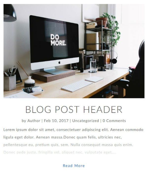
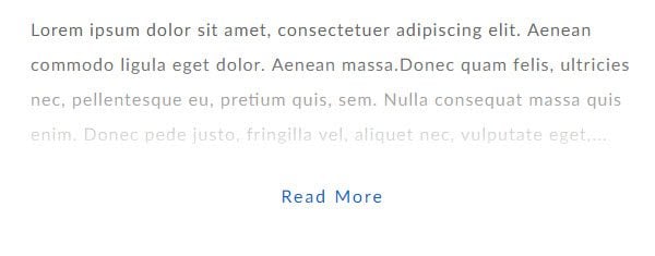
That is why I’m excited to share with you a small, yet extremely cool, design feature that fades out the text of your post excerpt just before the “read more” button.
How to Fade Out Text On Divi Post Excerpts
Subscribe To Our Youtube Channel
Implementing the Design with Divi
To better showcase this text fade out effect, I’m using Divi’s Blog Module to build a blog post excerpt with a fullwidth page layout and a minimalist blog design with a narrow width for optimal reading.
This fade out effect is definitely not a new concept. It’s been around for a long time. But, that doesn’t mean you can’t use it today. Combine it with a modern design and create an element of mystery at the end of your excerpts that just may entice them to click to read more.
Customizing the blog module
If you don’t already, make sure you have at least one blog post published with a featured image. Your featured image should be at least 800px in width.
Now let’s get to it.
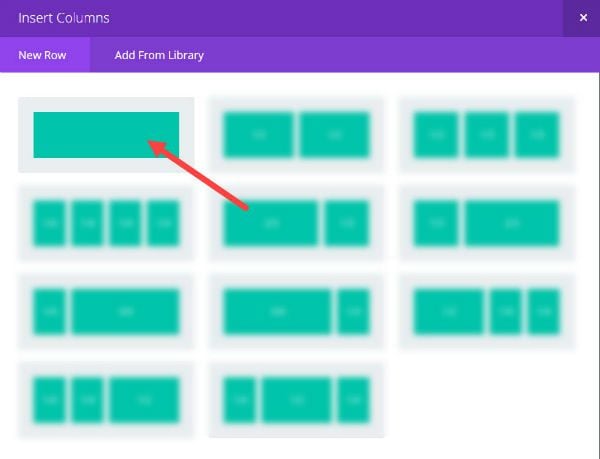
Using the default standard section shown in the Divi Builder, insert a fullwidth column.
For the Row Module Settings, update the following:
Use Custom Width: 600px
Use Custom Gutter Width: Yes
Gutter Width: 2
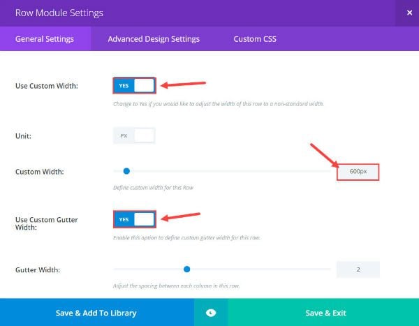
Save & Exit
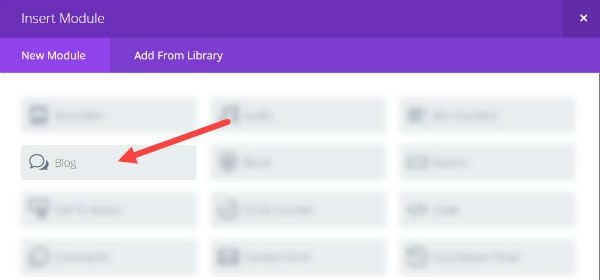
Now Insert a Blog Module into your fullwidth row.
Customize the Blog Module settings under General Settings, Advanced Design Settings, and Custom CSS.
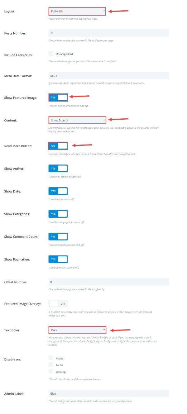
For the General Settings update the following:
Layout: Fullwidth
Show Featured Image: yes
Content: Show Excerpt
Read More Button: ON
Text Color: Dark
For the Advanced Design Settings update the following:
Header Font: Lato Light, Capitalize (TT)
Header Font Size: 40px;
Header Letter Spacing: 2px;
Body Font: Lato
Body Font Size: 16px
Body Letter Spacing: 1px;
Body Line Height: 2em
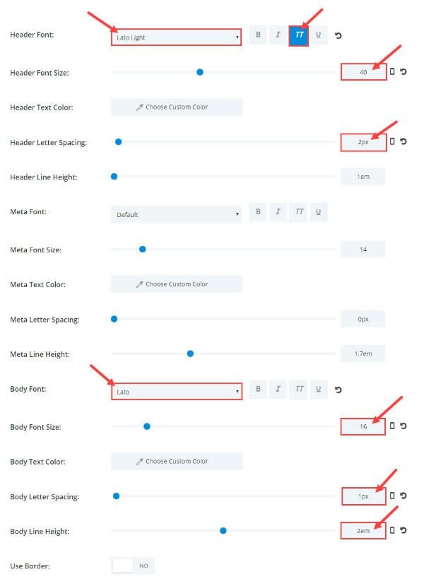
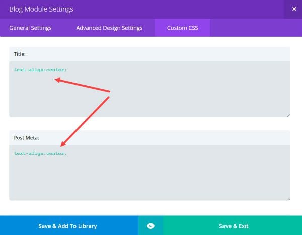
Under Custom CSS add the following CSS code in the Title text box and the Post Meta box:
text-align:center;
This is what it should look like now before we add the text fade out effect:
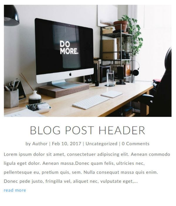
Add The Effect to Fade Out The Text
Because the fade out effect is using CSS instead of an image, you need to add some Custom CSS. Go to Divi → Theme Options and enter the following in the Custom CSS text box:
.post-content:after {
    background: -moz-linear-gradient(top, rgba(255,255,255,0) 0%, rgba(255,255,255,1) 82%, rgba(255,255,255,1) 100%);
    background: -webkit-linear-gradient(top, rgba(255,255,255,0) 0%,rgba(255,255,255,1) 82%,rgba(255,255,255,1) 100%);
    background: linear-gradient(to bottom, rgba(255,255,255,0) 0%,rgba(255,255,255,1) 82%,rgba(255,255,255,1) 100%);
    filter: progid:DXImageTransform.Microsoft.gradient( startColorstr='#00ffffff', endColorstr='#ffffff',GradientType=0 );
    content: '';
    display: block;
    height: 120px;
    position: relative;
    top: -120px;
    left: 0px;

}
.et_pb_blog_grid .post-content:after {
margin-bottom: -70px;
}


.et_pb_posts a.more-link, .et_pb_blog_grid a.more-link {
    margin-bottom: -25px;
    margin-top: 25px;
    position: inherit;
    text-align: center;
    text-transform: capitalize;
    font-size: 16px;
    color: #0066CC;
    letter-spacing: 2px;
    -webkit-transition: all 0.2s ease-in-out;
    -moz-transition: all 0.2s ease-in-out;
    -ms-transition: all 0.2s ease-in-out;
    -o-transition: all 0.2s ease-in-out;
    transition: all 0.2s ease-in-out;
    display:block;
}

.et_pb_posts a.more-link:hover, .et_pb_blog_grid a.more-link:hover {
color: #888;
}
Save Changes
Now let’s check out the result.
Grid Layout Option
Fading out the text excerpts on a grid layout is a great addition. Thankfully, it’s simple to do. In fact, you already added the css needed to optimize the layout for grid display (pretty sneaky I know). All that is left is two easy steps.
First, go to the Row Module settings and switch the “Use Custom Width” option to NO.
Then, go to the Blog Module Settings and select “Grid” for the blog layout.
Now your posts should look like this (assuming you have at least 3 posts published):
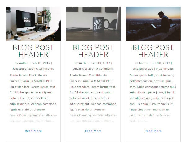
Final Challenges and Thoughts
One of the challenges you may face when adding this feature is not having enough room for your fade out effect. The default length of an excerpt is around 55 words. With a smaller font, a shorter line-height, and/or a wider post width, the fade would hide most of the text you want them to read.
The easiest way to add more text to the excerpt is to use the excerpt box found at the bottom of your page editor in WordPress. Any text entered in this box will replace the default excerpt text shown on the web page.
Also, this layout and feature will render nicely on mobile devices and, I have to admit, the fade out looks really cool on my phone.
Well, that’s it. I hope you enjoy the text fade out design feature combined with a fitting blog design. If you have any questions about it, just leave them in the comments below and I’ll be happy to help where I can.
Cheers!



Looks great. Thanks for the CSS to make it happen.
Great post. I’m building a website right now. Here’s the temporary URL: http://s18842.p20.sites.pressdns.com/. If you scroll down, you’ll see the blog posts. I had previously styled the Read More button. It’s getting cut off now. Also, The columns are different heights – probably because the blog post titles are different lengths. Is there a way to equalize the columns, despite different title lengths?
To fix the button, try changing the margin-bottom of your more link from -25px to -50px as follows:
.et_pb_posts a.more-link, .et_pb_blog_grid a.more-link {margin-bottom: -50px;}Unfortunately there is no easy solution for the unequal column heights that I know of especially since it is responsive.
Hello. is it possible instead of the image on the top, to add a video from youtube?
Andi Haxhiraj, When you create your post select video instead of standard in the format menu on the right hand side of the page.
https://www.elegantthemes.com/gallery/divi/documentation/post-formats/
Awesome tip, and very easy to implement!
Thank you!!
Love this! Thanks for such easy to follow instructions.
Hello Jason! Very nice article! Thank you for it, it has been very interesting for us. All the best from Spain
You’re welcome. So glad you like it. I’m honored to have a shout out from Spain!
Awesome!!! I implemented and it looks very nice, but how can I do to change color in the “read more” button?
Thanks!
Sorry for the delay on this, Cristina. You can change the read more button by changing the line of CSS that you already have in your custom CSS that controls the color.
In the code below….
.et_pb_posts a.more-link, .et_pb_blog_grid a.more-link {
    margin-bottom: -25px;
    margin-top: 25px;
    position: inherit;
    text-align: center;
    text-transform: capitalize;
    font-size: 16px;
    color: #0066CC;
    letter-spacing: 2px;
    -webkit-transition: all 0.2s ease-in-out;
    -moz-transition: all 0.2s ease-in-out;
    -ms-transition: all 0.2s ease-in-out;
    -o-transition: all 0.2s ease-in-out;
    transition: all 0.2s ease-in-out;
    display:block;
}
Change this color code to what ever color you need:
Make sense?
Great Article! Can anyone tell me how to use lightbox to show a post in lightbox when I click on post title in DIVI Theme
Very Nice effect
Sweet! Thanks a ton!
Wow! Never thought it is so easy!!!
Very cute. Nice. And very easy to implement. Thanx !!!!!
One question: How can i make the dissolving area higher?
Very nice effect indeed! thanks for sharing.
oh I have got to try this!!! thank you for this wonderful lesson.
Great post. thanks
Nice! Thanks ET!