This post is part 1 of 5 in our mini series titled 5 Fun Ways to Style Divi’s Audio Module. Stay tuned this week for all five unique examples of Divi’s Audio Module, with a tutorial on how to achieve each one!
Whether you are a budding folk-singer, a part-time podcaster, or an award-winning violinist, you may want to showcase your work on your website. The Divi audio module is the perfect solution, and in this mini-series, I’m going to show you 5 ways to jazz up your design!
Today, we’re going to transform the default Divi Audio Module into a space-age vessel for your latest techno beats!
- 1 Before & After: The Divi Audio Module
- 2 How to Create the “Intergalactic Vibes” Divi Audio Module Design Concept
- 3 Concept & Inspiration
- 4 Preparing the Design Elements
- 5 Implementing the Design In Divi
- 6 Section Settings
- 7 Row Settings
- 8 Audio Module Settings
- 9 Toggle Module Settings
- 10 Tomorrow: Part 2 – How to Make a Retro Record Inspired Divi Audio Module
Before & After: The Divi Audio Module
Before we begin styling the audio module, it’s important to take a look at the default design. Although the out-of-the-box version is clean and functional, most designers will want to add a little flare to help establish a brand or theme.
Here is the default version of the Divi audio module:

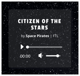
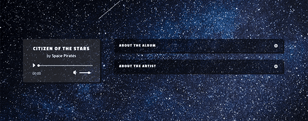
And here is the design concept I’m calling “Intergalactic Vibes”:

Follow the instructions below to replicate my design, and let me know what you think in the comments section below!
How to Create the “Intergalactic Vibes” Divi Audio Module Design Concept
Subscribe To Our Youtube Channel
Concept & Inspiration
The inspiration for this design was a Swedish music duo called Carbon Based Lifeforms, whose sound is somewhat extraterrestrial. (I highly recommend their tracks when you need some non-distracting ambient music while you work!) I asked myself, if I was designing an audio player for one of their songs, what would it look like? This was the result!
Preparing the Design Elements
Because the Divi theme comes with so many built-in customization options, this design only requires one graphic asset: the section background image. Although you are free to select any celestial-themed imagery you want, I chose an image from Unsplash that you can download here. To keep load times reasonable, I recommend importing it into Photoshop or some other graphic design program and scaling it down to a width of 1920px.
Implementing the Design In Divi
This design would suit a musician who tends toward an electronic or futuristic sound, although the image assets could be swapped out to convey any number of aesthetics.
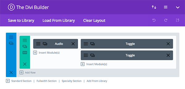
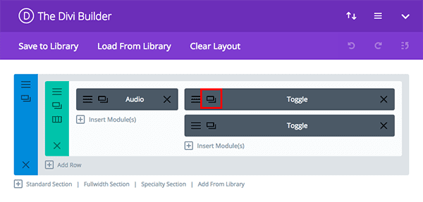
It has a fairly simple architecture: a single section, containing a row with a ⅓ and ⅔ column structure. In the smaller column of the row, we will be inserting an audio module. In the larger column of the row, we will be inserting two stacked toggle modules.
Section Settings
The section settings are straightforward and involve only the upload of a background image. (You can find the starry night sky photo I used here.)
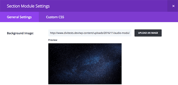
In the general tab of your section settings, select the photo you want to use from your computer–after downloading it, of course!
Row Settings
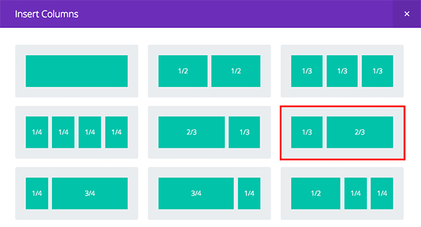
The row settings can remain in their default states. However, be sure you have the appropriate column proportions selected: ⅓ to ⅔
Audio Module Settings
First, we will tackle the star of the show: our audio module. Begin by uploading your selected MP3 file and filling in the basic information under the General Settings tab of the Audio Module Settings window: song, artist, and album name.
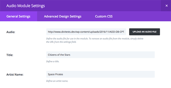
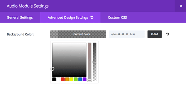
Next, we want to add some styling. Let’s start with the easy details first. Select the Advanced Design Settings tab to adjust the background color and opacity of the box that houses your audio player. I used a rgba value of (61,61,61,0.5) to achieve that steely-grey color, but you can be less precise and play around with the sliders until you find the right combination.
I found the default font a little lackluster for our space-age look, so, scrolling down a little farther, I set the heading font to Passion One with a title letter spacing of 2px to give the characters a little more breathing room.
To achieve the rounded corners and subtle drop-shadow, we’ll need to add a couple of lines of custom CSS. Click the Custom CSS Tab of the Audio Module Settings Window and scroll down to the section titled main element. Code placed here will affect the entire audio box. Paste the following snippet into the text-field.
box-shadow: 5px 5px 5px #111;
border-radius: 5px;
When you’re finished, click Save and Exit. Feel free to check on your progress if you’re starting to get impatient!
Toggle Module Settings
In the other column of your row–the wider column–we are eventually going to insert two toggle modules. To save time, however, we will create and style the top one first, before duplicating it to get the second.
Once you create your first toggle module, open up the Toggle Module Settings window and fill in the relevant information under the General Settings tab. I decided to provide users a little more information about this fictitious album.
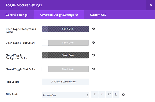
Next, onto styling! As with the audio module, the styling process for the toggle module involves both the Advanced Design Settings tab and the Custom CSS tab. First, navigate to the Advanced Design Settings tab and set your background colors. Note that the toggle module allows you to set different background colors for the opened and closed states.
For the opened toggle module background, I used the following rgba values: (13,1,79,0.55), but again, you can use the sliders to accomplish a similar look. For the closed background color, I selected rgba values of (0,0,0,0.53)–a shade slightly darker than the background of our audio module. Also take this chance to set all of the text colors to white (#fff). This ensures readability.
Next, let’s make the heading typography of our toggle module match that of the audio module. Again, I chose Passion One for my font and a letter spacing of 2px.
To finish our design, we just have to add a few lines of CSS to the Custom CSS tab of the Toggle Module Settings window. Scroll down to main element and paste the following to remove the border and to add a smokey drop-shadow to the containing box.
border:none; box-shadow: 5px 5px 5px #111;
But remember! There were two toggle modules in the original design. Luckily, Divi has a quick solution: simply duplicate your first toggle module by clicking the icon that looks like stacked sheets of paper.
When you’ve finished, click Save and Exit.
Congrats! You’ve created a truly out-of-this world audio module with only a few simple tweaks to Divi’s built-in functions.

Tomorrow: Part 2 – How to Make a Retro Record Inspired Divi Audio Module
Join us tomorrow for the next installation of our series where I’ll show you how to replicate a retro-inspired audio module perfect for playing your favorite classics or the latest indie rock.
Be sure to subscribe to our email newsletter and YouTube channel so that you never miss a big announcement, useful tip, or Divi freebie!



Fantastic. I’m looking forward to adding the Audio module to all 3 of my sites. Can’t wait to see the other demos on Audio.
Awesome. Now, I can add a bit of audio intro to my site. Thanks for sharing.
WOW
Interesting that you give attention to your Audio module.
I dont think any of those parts of your mini series will solve the problem of adding a download button ? I have a really big problem finding a simple solution to create a download button with your audio player.
I have tried many, many plugins but there is no good solution. And I dont understand why you dont offer such an option, it would be perfect wouldnt it ?
We can do a separate tutorial on creating download buttons with the Divi Button Module. Then you can add it to any other module you’d like.
I’m loving all these inspirational Divi tips but was wondering if it’s possible to add demo links so we can see them in action. Every time I see a new post appear my first thought is to see the example in action. Thanks again.
Thanks for the audio module tutorial Samantha! These Divi tips are really coming in handy 🙂
Love it! Thanks for this.
Great tutorial! Thanks so much for taking the time to put it together.