
Whatever kind of website you’re building, chances are high that at some point, you’ll want to display a list of different services, steps and more. One of the easiest ways to approach creating such a list attractively is using Divi and its Blurb Module. Blurb Modules allow you to structure list content beautifully while providing you with endless design possibilities.
In today’s tutorial, we’ll take it one step further and show you how to highlight a hovered Blurb Module by blurring the other ones you’ve displayed. This is a great way to put the focus on one Blurb Module at a time, without allowing the other Blurb Modules to distract the reader. As soon as a visitor moves on to another Blurb Module, that one becomes the highlighted one instead. You’ll be able to download the layout’s JSON file for free as well!
Let’s get to it.
Preview
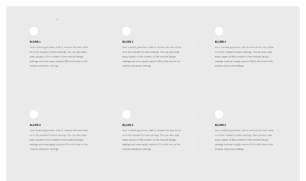
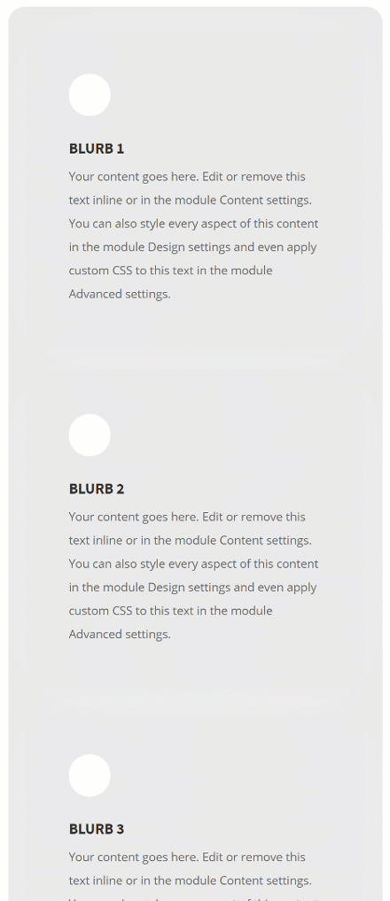
Before we dive into the tutorial, let’s take a quick look at the outcome across different screen sizes.
Desktop
Mobile
Download The Hovered Blurb Module Layout for FREE
To lay your hands on the free hovered blurb module layout, you will first need to download it using the button below. To gain access to the download you will need to subscribe to our newsletter by using the form below. As a new subscriber, you will receive even more Divi goodness and a free Divi Layout pack every Monday! If you’re already on the list, simply enter your email address below and click download. You will not be “resubscribed” or receive extra emails.

Let’s Start Recreating!
Add New Section
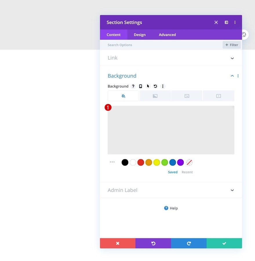
Background Color
Start by adding a regular section to a new page or the one you’re working on. Open the section settings and change the background color.
- Background Coor: #eaeaea
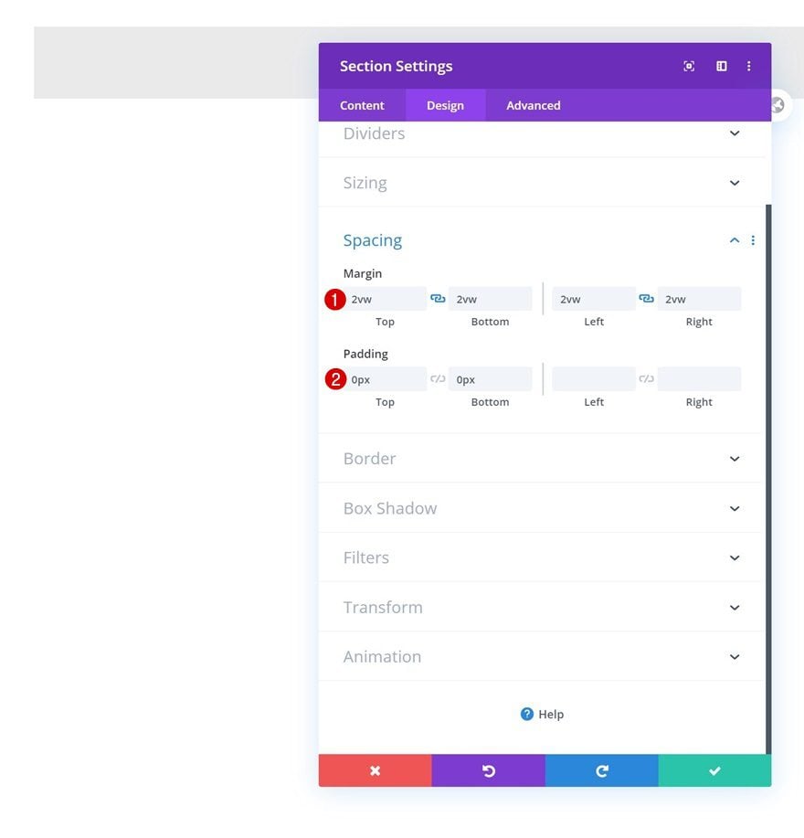
Spacing
Add some custom margin and padding values too.
- Top Margin: 2vw
- Bottom Margin: 2vw
- Left Margin: 2vw
- Right Margin: 2vw
- Top Padding: 0px
- Bottom Padding: 0px
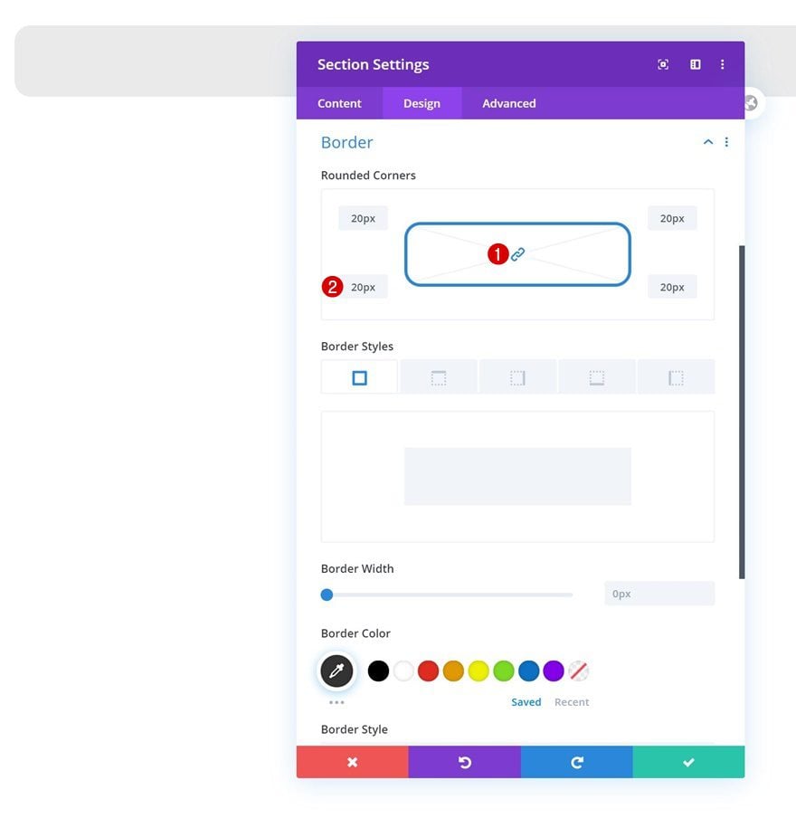
Border
Complete the section settings by adding some border radius.
- All Corners: 20px
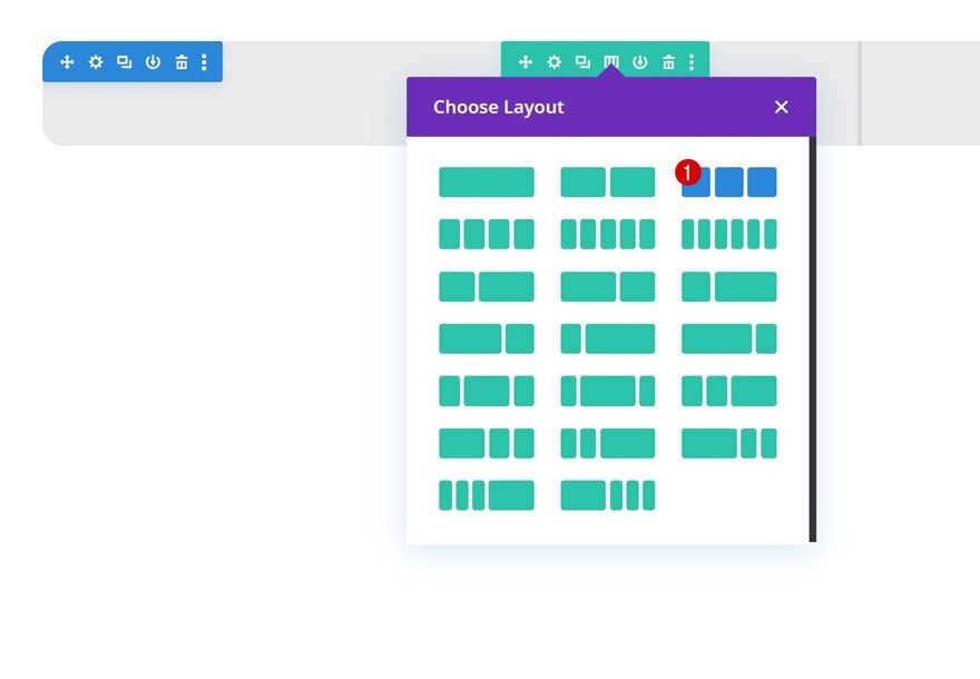
Add New Row
Column Structure
Continue by adding a new row to the section using the following column structure:
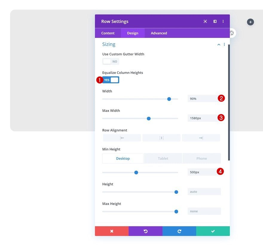
Sizing
Without adding any modules yet, open the row settings and change the sizing settings. Enabling the ‘Equalize Column Heights’ option will help with the next step which aligns the column content.
- Equalize Column Heights: Yes
- Width: 90%
- Max Width: 1580px
- Min Height: 500px (Desktop), auto (Tablet & Phone)
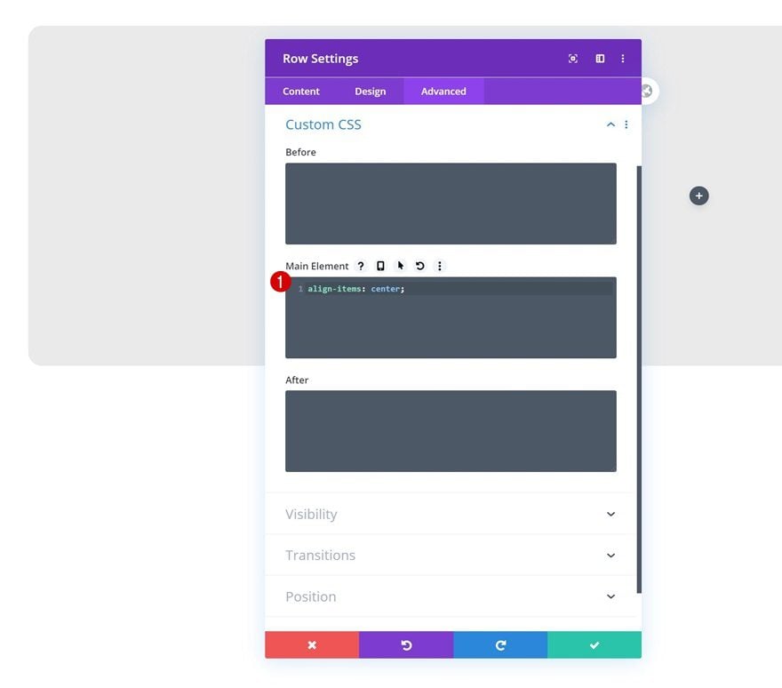
Main Element
Align the column content by adding one single line of CSS code to the row’s main element.
align-items: center;
Add Blurb Module to Column 1
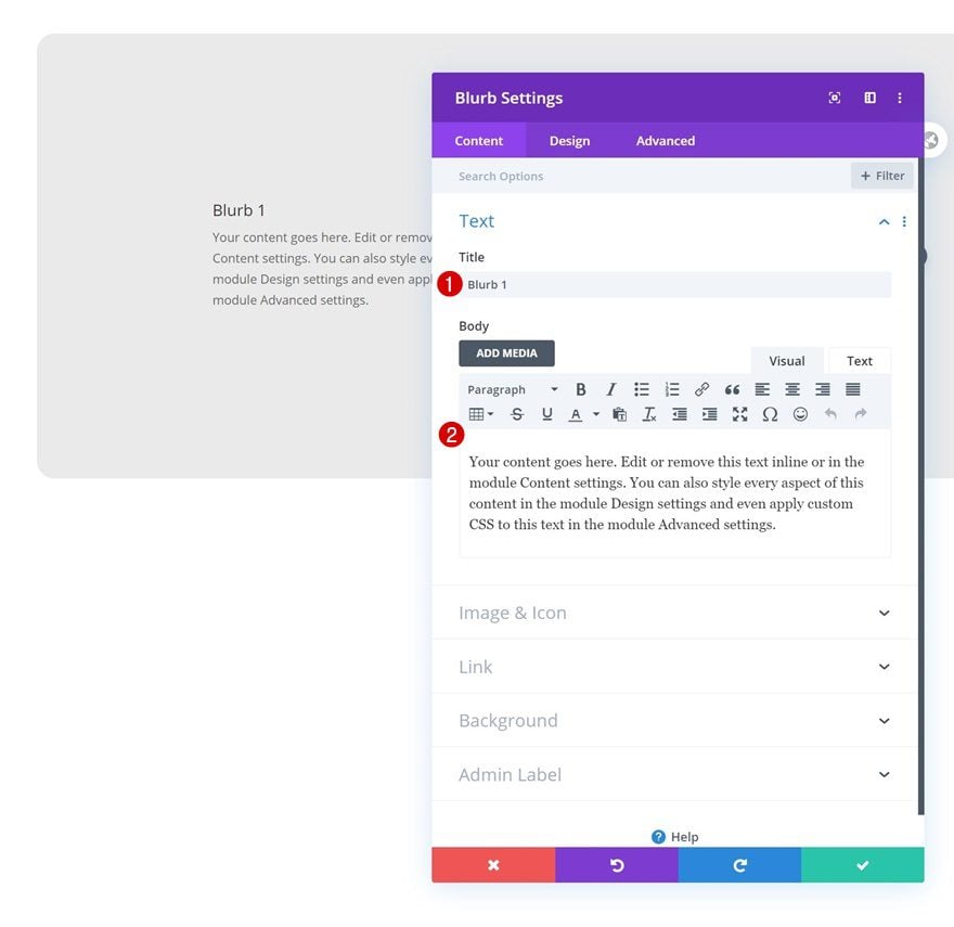
Add Content
The only module we’re using throughout this tutorial is a Blurb Module, but you can replace this module with any module of your choice as long as you add the CSS class which we’ll share in the upcoming steps. Add the first Blurb Module to column 1 and insert some content of your choice.
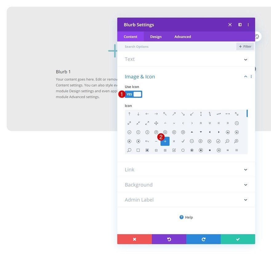
Select Icon
Select an icon next.
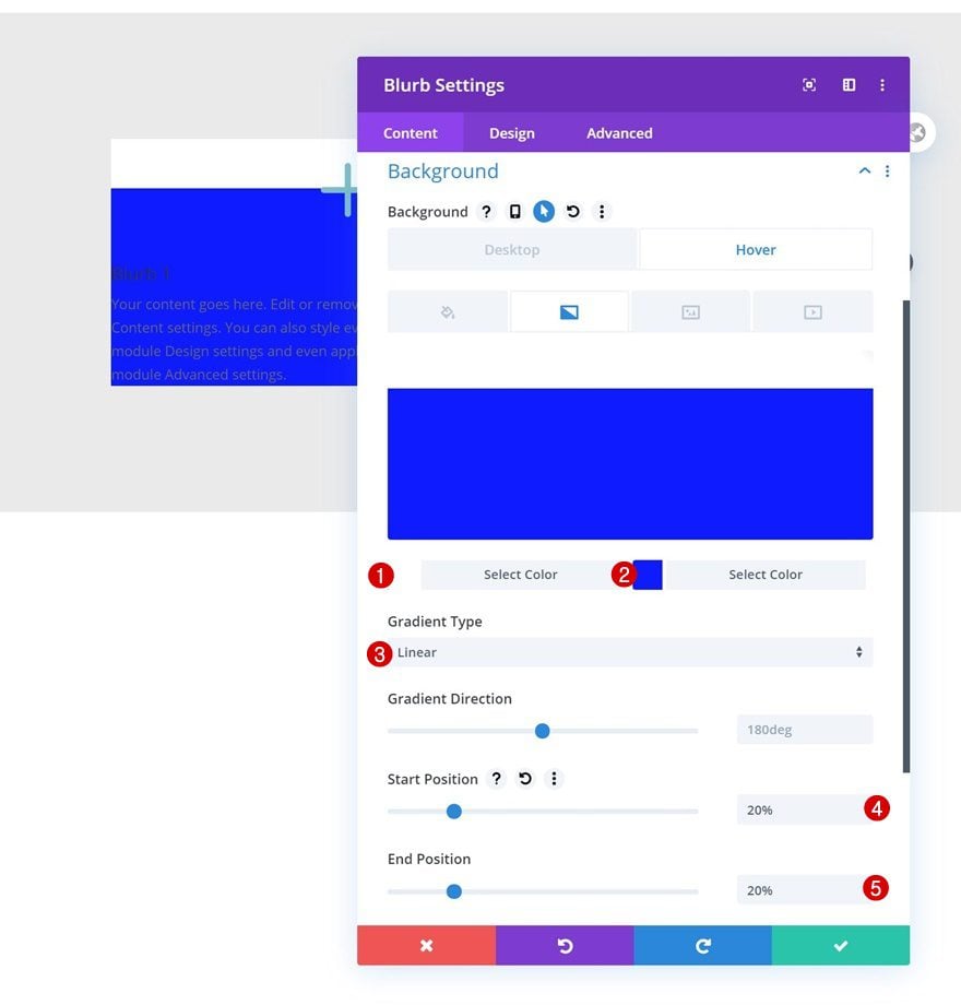
Hover Gradient Background
Then, use a gradient background on hover only.
- Color 1: #ffffff
- Color 2: #0f1bff
- Gradient Type: Linear
- Start Position: 20%
- End Position: 20%
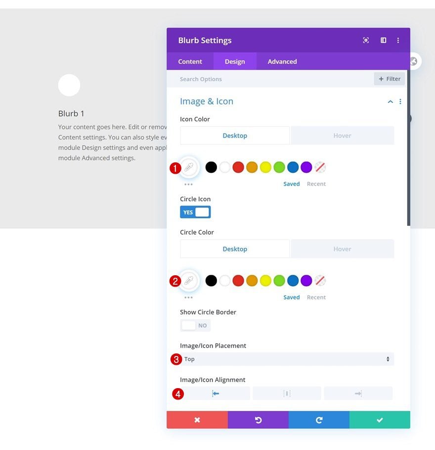
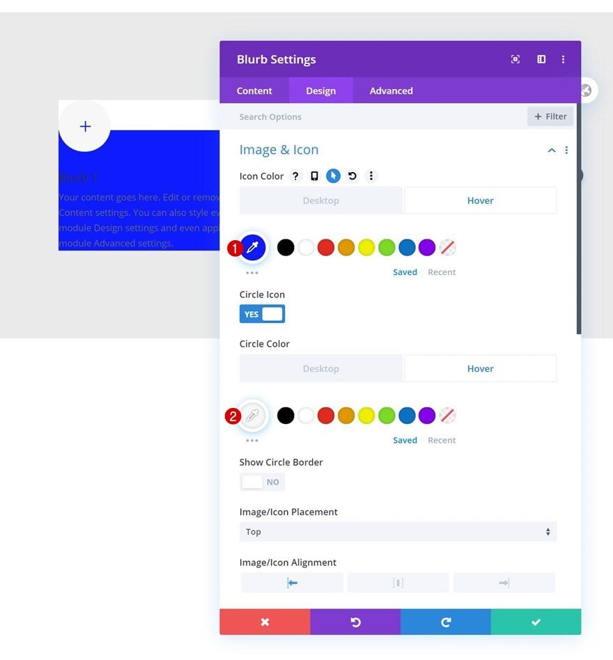
Default Icon Settings
Move on to the module’s design tab and change the icon settings as follows:
- Icon Color: #ffffff
- Circle Icon: Yes
- Circle Color: #ffffff
- Image/Icon Placement: Top
- Image/Icon Alignment: Left
Hover Icon Settings
Change the different icon colors on hover.
- Icon Color: #0f1bff
- Circle Color: #f7f7f7
Default Title Text Settings
Continue by modifying the title text settings.
- Title Font: Source Sans Pro
- Title Font Weight: Bold
- Title Font Style: Uppercase
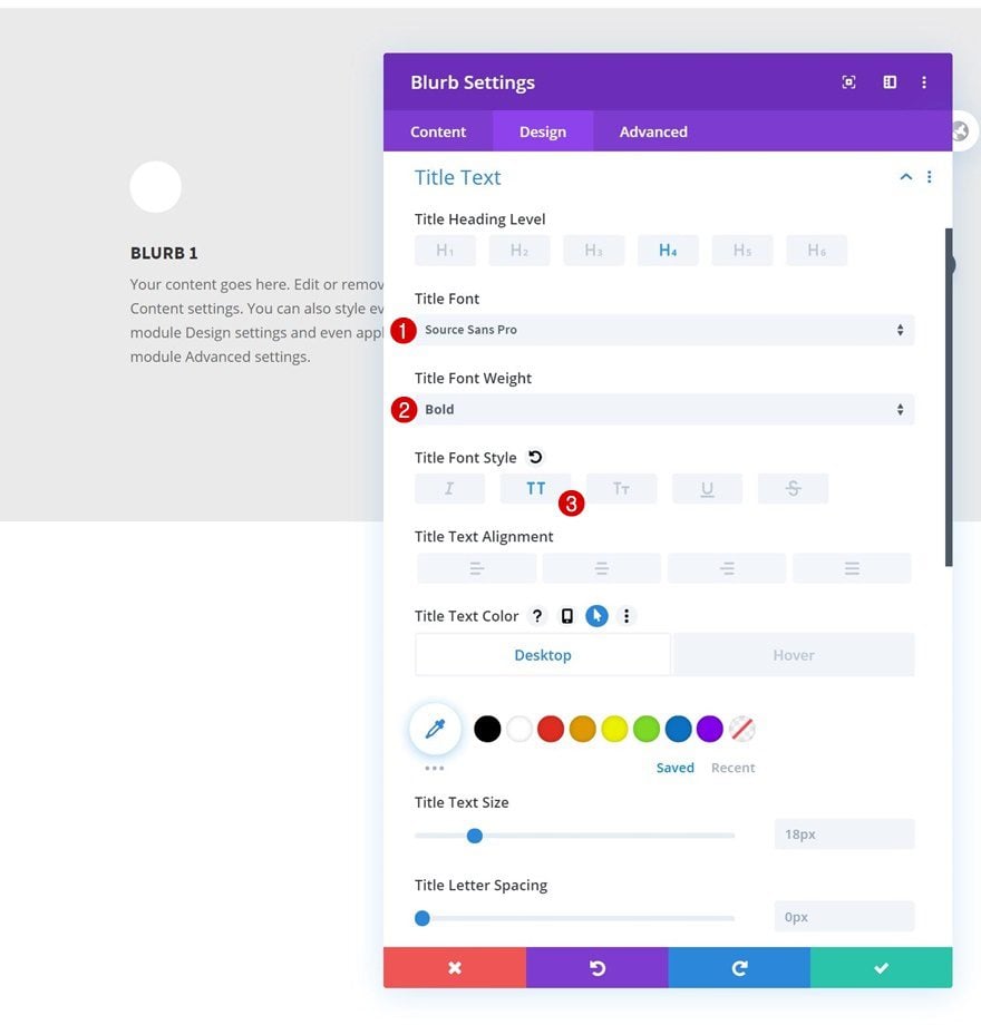
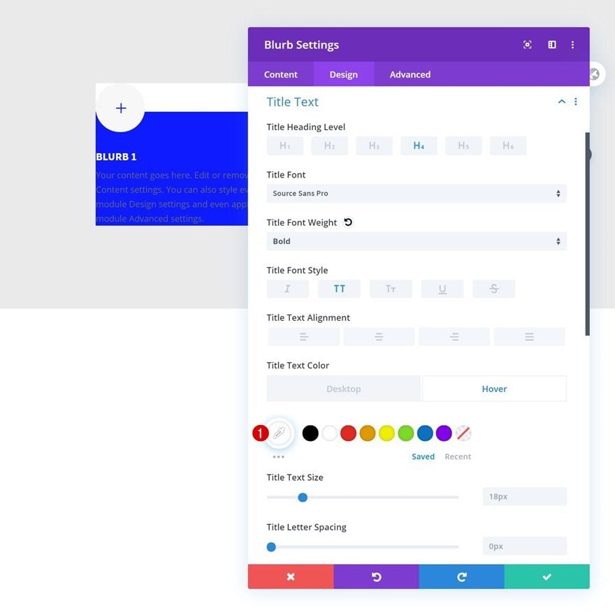
Hover Title Text Settings
Change the title text color on hover.
- Title Text Color: #ffffff
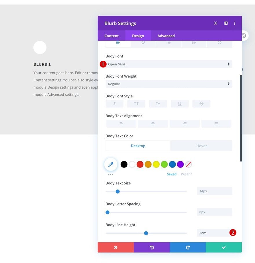
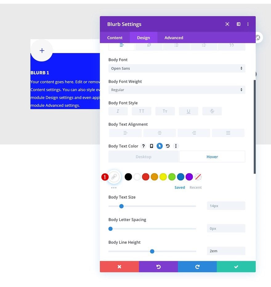
Default Body Text Settings
Next up are the body text settings.
- Body Font: Open Sans
- Body Line Height: 2em
Hover Body Text Settings
Use a white hover text color.
- Body Text Color: #ffffff
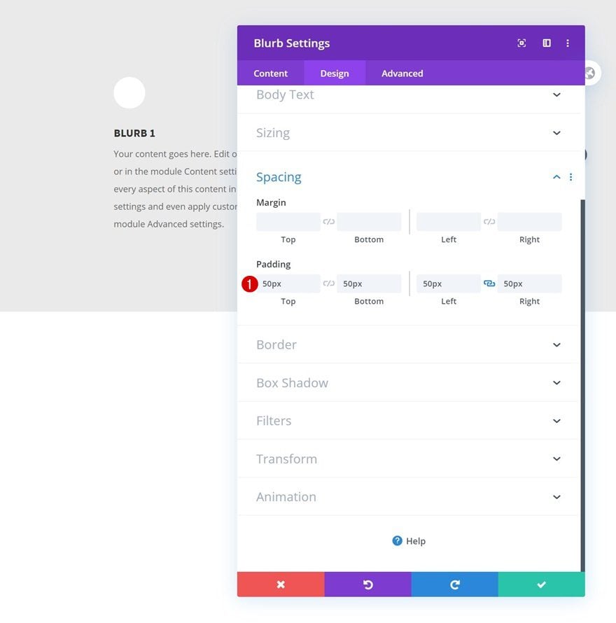
Spacing
Then, go to the spacing settings and add some custom padding values.
- Top Padding: 50px
- Bottom Padding: 50px
- Left Padding: 50px
- Right Padding: 50px
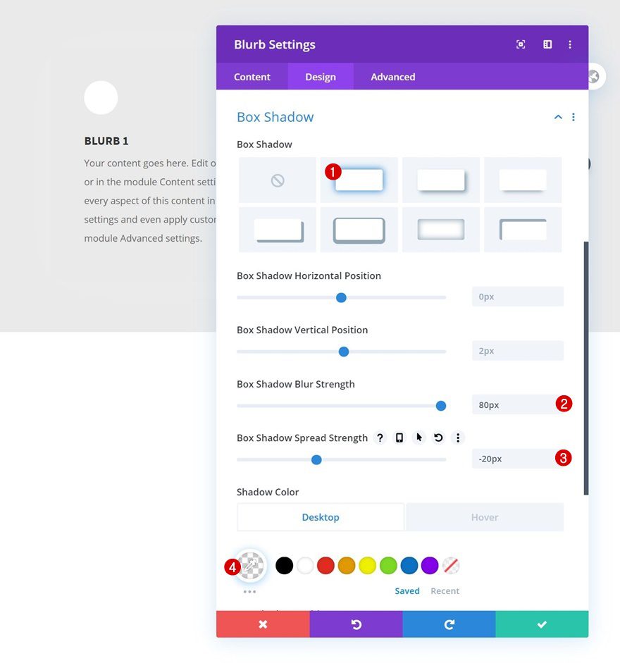
Default Box Shadow
We’re using a box shadow too.
- Box Shadow Blur Strength: 80px
- Box Shadow Spread Strength: -20px
- Shadow Color: rgba(255,255,255,0.18)
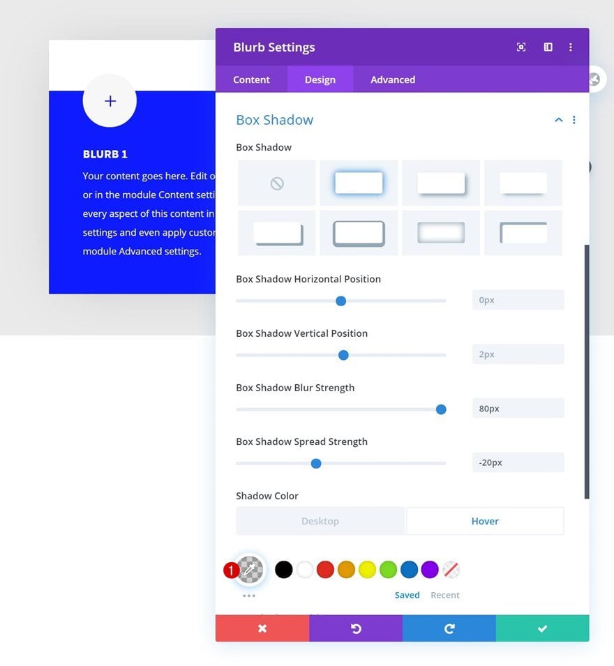
Hover Box Shadow
Change the shadow color on hover.
- Shadow Color: rgba(0,0,0,0.18)
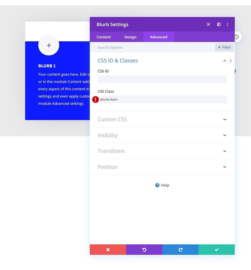
CSS Class
And to make the blur effect happen, we’ll need to assign a CSS class to our Blurb Module. Later on the post, we’ll use this CSS class in some JQuery code.
- CSS Class: blurb-item
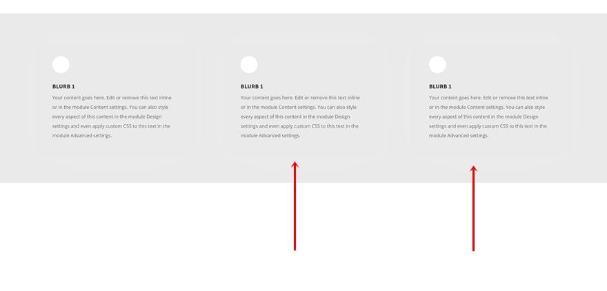
Clone Blurb Module Twice & Place Duplicates in Remaining Columns
Once you’ve completed the Blurb Module in column 1, you can clone it twice and place the duplicates in the row’s remaining columns.
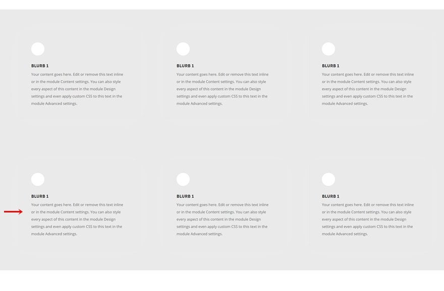
Clone Entire Row
You can clone the row up to as many times as you want, depending on how many Blurb Modules you want to display on your page.
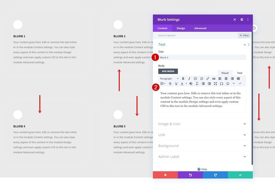
Customize Blurb Modules Individually
Of course, you’ll need to modify each Blurb Module’s individual content.
Add New Row
Column Structure
Add another row to the section using the following column structure:
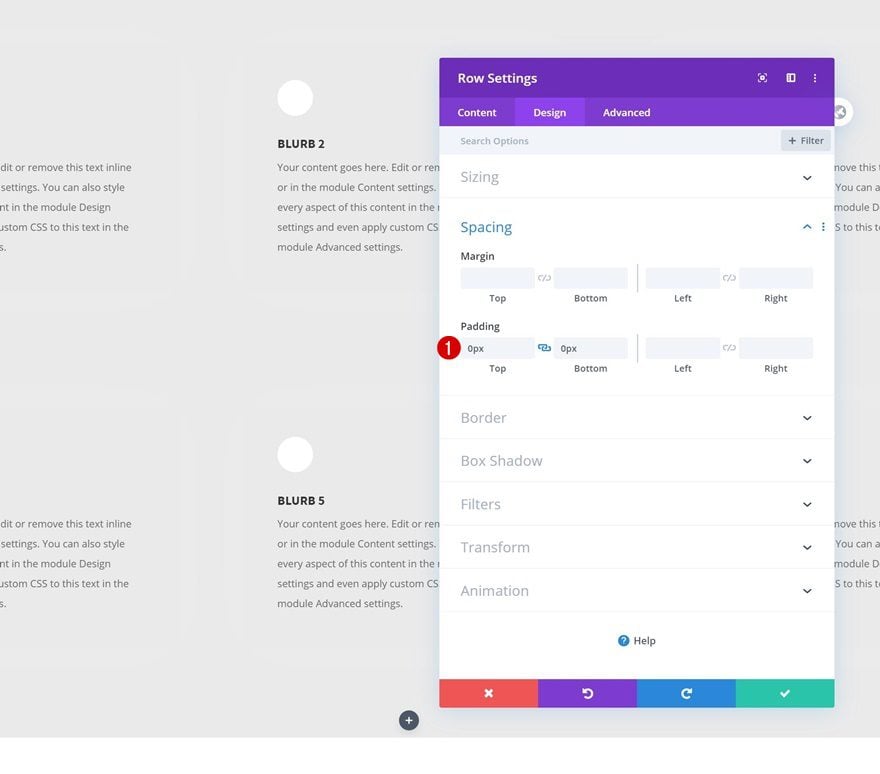
Spacing
Open the row settings and remove all default top and bottom padding. This will help reduce the space this row takes up.
- Top Padding: 0px
- Bottom Padding: 0px
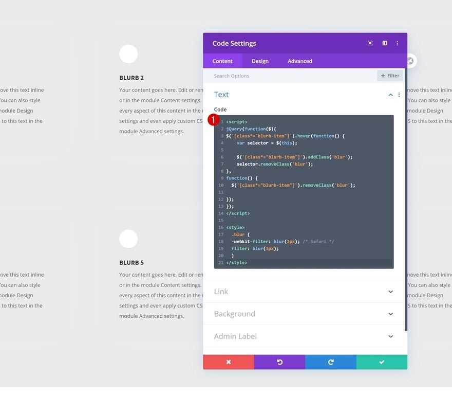
Add Code Module to Column
Insert JQuery & CSS Code
Add a Code Module to the row’s column and insert some JQuery and CSS code to make the effect happen. Don’t forget to put the JQuery code between script tags and the CSS code between style tags as you can see in the print screen below.
jQuery(function($){
$('[class*="blurb-item"]').hover(function() {
var selector = $(this);

$('[class*="blurb-item"]').addClass('blur');
selector.removeClass('blur');
},
function() {
$('[class*="blurb-item"]').removeClass('blur');

});
});
.blur {
-webkit-filter: blur(3px); /* Safari */
filter: blur(3px);
}
Preview
Now that we’ve gone through all the steps, let’s take a final look at the outcome across different screen sizes.
Desktop
Mobile
Final Thoughts
In this post, we’ve shown you how to get creative with the Blurb Modules you share on your website. More specifically, we’ve shown you how to highlight a hovered Blurb Module by blurring the other ones you’ve displayed. You were able to download the JSON file for free as well! If you have any questions, feel free to leave a comment in the comment section below.
If you’re eager to learn more about Divi and get more Divi freebies, make sure you subscribe to our email newsletter and YouTube channel so you’ll always be one of the first people to know and get benefits from this free content.


Seems a little backward – should the plus sign not show before the hover to indicate that there is more content to show?
Great! I like this effect a lot. Thank you for the download!