Every week, we provide you with a new and free Divi layout pack which you can use for your next project. Along with every layout pack, we also share a use case that’ll help you take your website to the next level.
This week, as part of our ongoing Divi design initiative, we’re going to show you how to make your Interior Design website social media ready with the Interior Design Layout Pack, Divi and Monarch. Besides showing you how to add social sharing icons and social follow icons to your pages and posts, we’re also going to create a matching blog post template layout that you can use for all the posts you create on your interior design website.
- 1 Use Case Sneak Peek
- 2 How to Make the Interior Design Layout Pack Social Media Ready with Divi & Monarch
- 3 The Setup
- 4 Part 1: Download & Install the Monarch Plugin
-
5
Part 2: Set up Your Social Follow Icons
- 5.1 Step 1: Go to the Monarch Settings
- 5.2 Step 2: Add Most Relevant Social Media Channels & Enable ‘Open Link in New Window’ Option
- 5.3 Step 3: Appearance Settings
- 5.4 Step 4: Generate Shortcode
- 5.5 Step 5: Choose Social Follow Icons Position Strategically
- 5.6 Step 6: Add Text Module
- 5.7 Step: 7: Add Shortcode to Text Module
- 5.8 Step 8: Modify Text Module Width According to Position
-
6
Part 2: Create Custom Blog Post Template Layout
- 6.1 Step 1: Add New Post
- 6.2 Step 2: Add Title& Featured Image
- 6.3 Step 3: Enable Divi Builder
- 6.4 Step 4: Modify Divi Posts Settings
- 6.5 Step 5: Switch Over to Visual Builder
- 6.6 Step 6: Upload Blog Layout
- 6.7 Step 7: Delete Hero Section Text Module
- 6.8 Step 8: Change Hero Section Spacing
- 6.9 Step 9: Upload Featured Image as Hero Section Background
- 6.10 Step 10: Add Post Title Module
- 6.11 Step 11: Disable Featured Image Element
- 6.12 Step 12: Text Settings
- 6.13 Step 13: Title Text Settings
- 6.14 Step 14: Meta Text Settings
- 6.15 Step 15: Remove Blog Module
- 6.16 Step 16: Add Text Module
- 6.17 Step 17: Text Settings
- 6.18 Step 18: Heading Text Settings
- 6.19 Step 19: Change Sizing
- 6.20 Step 20: Save Layout for Future Posts
- 7 Part 2: Set up Your Social Sharing Icons
- 8 Final Thoughts
Use Case Sneak Peek
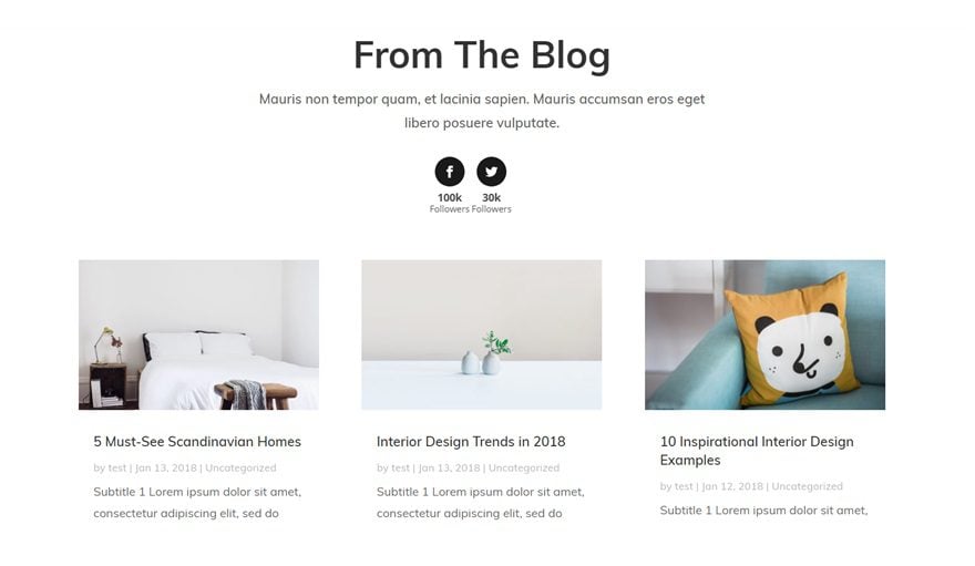
Before diving into the use case blog post, let’s take a look at what we’re going to create visually. First of all, we’ll be adding Monarch’s social follow feature which you can place wherever you want on your pages. We’ll display the number of followers for each one of the social networks as well to create social proof throughout the website in a subtle way.
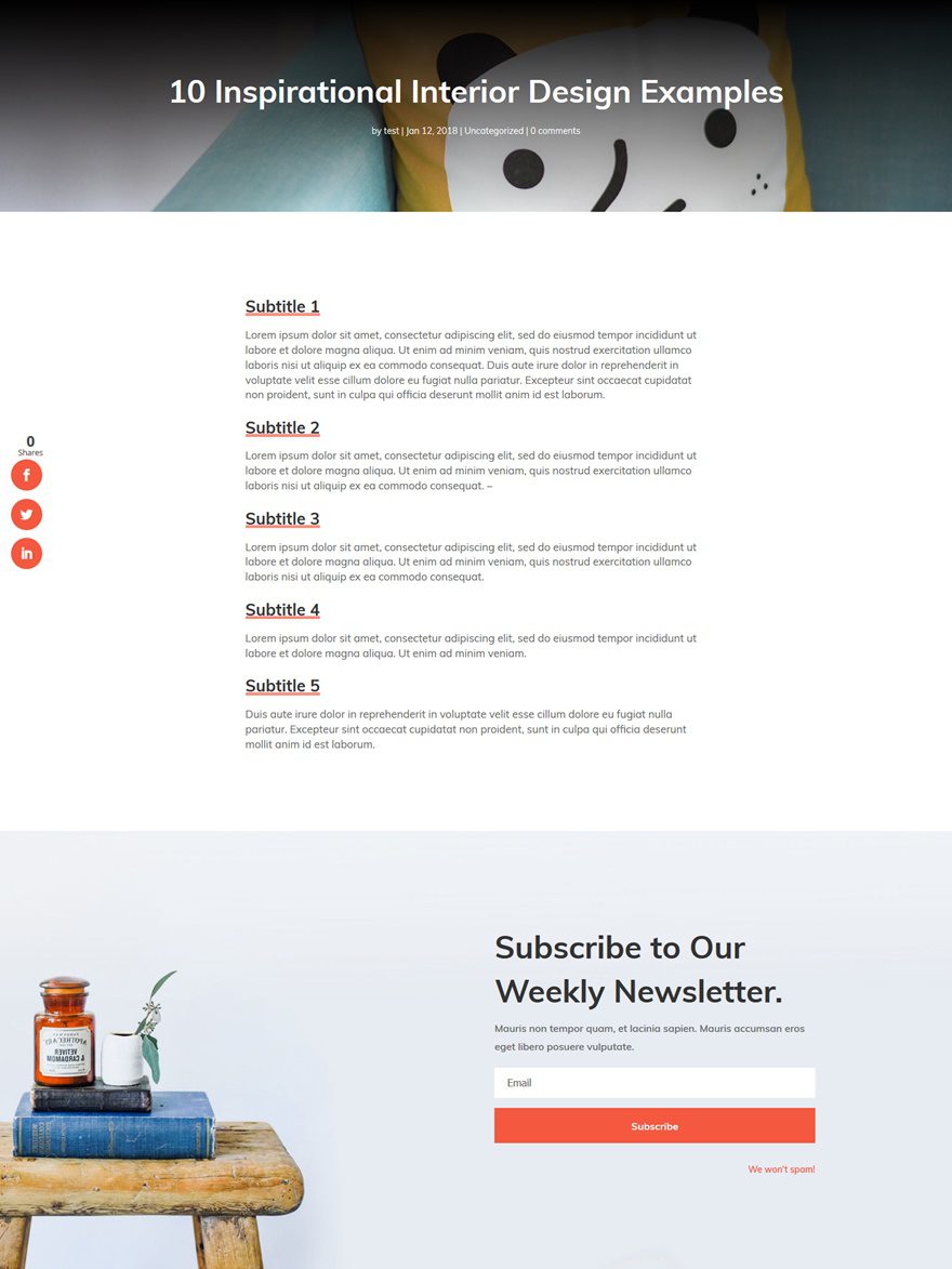
We’ll also show you how to add social sharing icons to each and every blog post. On top of that, we’re also creating a nicely-looking blog post template layout which you can reuse for each one of your future blog posts.
Subscribe To Our Youtube Channel
The Setup
1. Install and activate the Divi Theme
2. Install Plugins
3. Download the Layout Pack and Import the Interior-Design_All.json file to your Divi Theme Library.
4. Create new pages for each layout.
5. Create your primary menu.
If you are confused by the setup listed above, you can find more detailed instructions on how to setup your layout properly by checking out these 10 steps for using a layout pack for your new project.
Part 1: Download & Install the Monarch Plugin
Step 1: Download Plugin
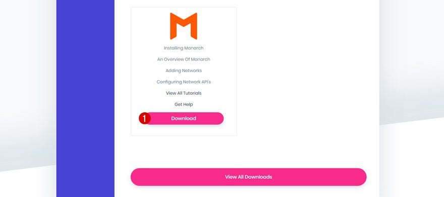
The first thing you’ll need to do is download the Monarch plugin. If you’re an Elegant Themes member, you can find the plugin in the Member’s Area after you log in. If you’re not an Elegant Themes member yet, go to the following page to become a member of our empowered community.
Step 2: Upload & Activate the Plugin
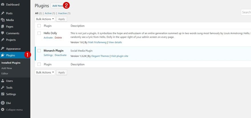
Once you’ve downloaded Monarch, go to your plugins > Add New, upload the zipped file and make sure you activate your plugin as well.

Step 1: Go to the Monarch Settings
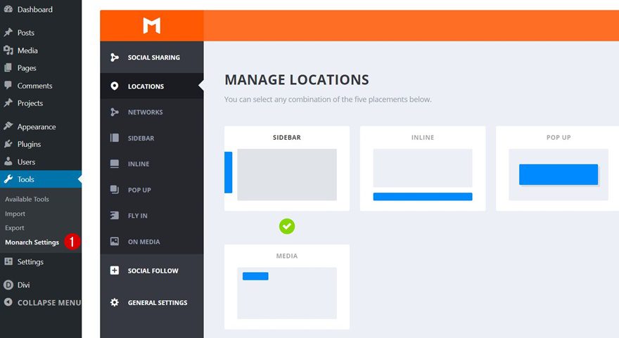
To set up your social follow icons, start by going to Tools > Monarch Settings.
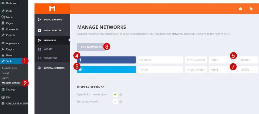
Then, open the Social Follow option, go to Networks and add the relevant social media channels linked to your Interior Design company. No need to add all of the options there, try focusing on the ones that bring the most added value. Enable the ‘Open link in new window’ option as well.
Step 3: Appearance Settings
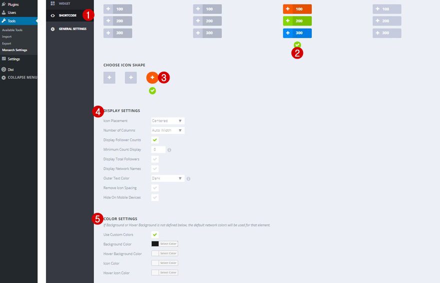
Then, move on to the Shortcode tab and apply the following changes to the appearance of your social follow icons:
- Icon Placement: Centered
- Number of Columns: Auto Width
- Display Follower Counts: Yes
- Minimum Count Display: 0
- Display Total Followers: No
- Display Network Names: No
- Outer Text Color: Dark
- Remove Icon Spacing: No
- Hide On Mobile Devices: No
- Use Custom Colors: Yes
- Background Color: #1a1a1a
Step 4: Generate Shortcode
Once you’ve made all of the appearance changes, you can go ahead and generate a shortcode. Copy this shortcode as you will need it in the next steps of this post.

You can place these social follow icons wherever you want on your website. However and preferably, you’ll choose a strategic position and won’t add them too often as it may become disturbing. A few good places where you can add the social icons are:
- The blog section on the home page or landing page
- The about page
- Any place else that doesn’t include a CTA already
Step 6: Add Text Module
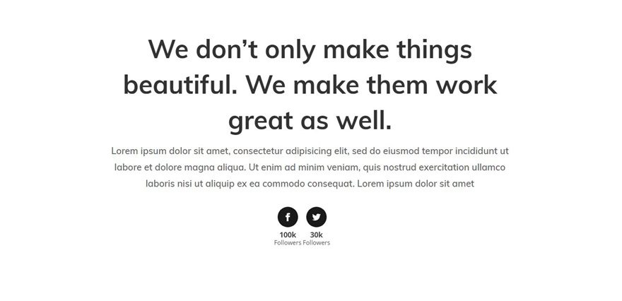
Although you can add it wherever else you want as well, we’ll be showing you how to add it to the blog section of the homepage. After creating the integration first, you can reuse the Text Module wherever else you want on your website. So, go to your homepage, enable the Visual Builder and add a new Text Module right below the existing Text Module of the blog section.
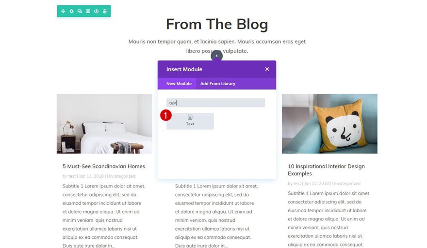
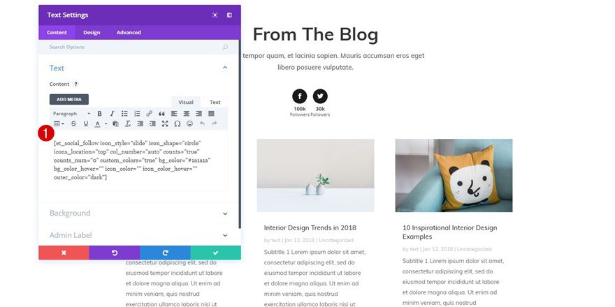
Step: 7: Add Shortcode to Text Module
Then, add the shortcode to the Content box of the Text Module. This will make your social follow icons show up.
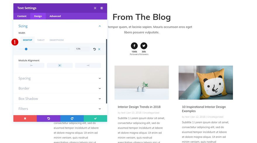
Step 8: Modify Text Module Width According to Position
Depending on the position of your social follow icons, you’ll need to modify the width of your Text Module to match the design. For the example below, we’ve used ‘13%’ for desktop and ‘20%’ for tablet.
Part 2: Create Custom Blog Post Template Layout

Step 1: Add New Post
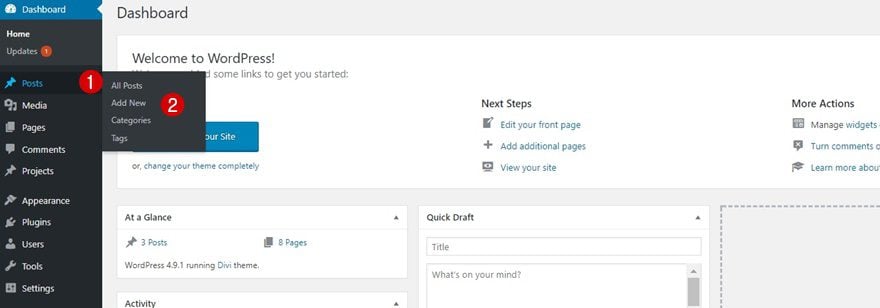
To create the blog post template layout, start by going to Posts > Add New to create a new post.
Step 2: Add Title& Featured Image
Then, add a title and featured image to your post.

Step 3: Enable Divi Builder
Next, enable the Divi Builder.
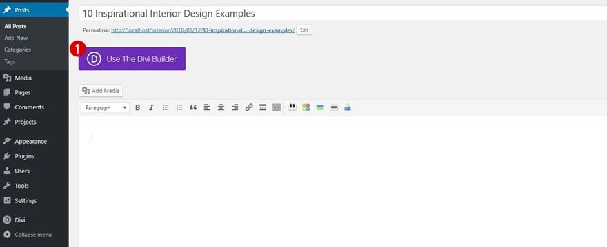
Step 4: Modify Divi Posts Settings
And before moving on to the Visual Builder, make the following Divi Post Settings apply:
- Page Layout: Fullwidth
- Post Title: Hide

Step 5: Switch Over to Visual Builder
Then, switch over to the Visual Builder to continue creating the blog post template layout.

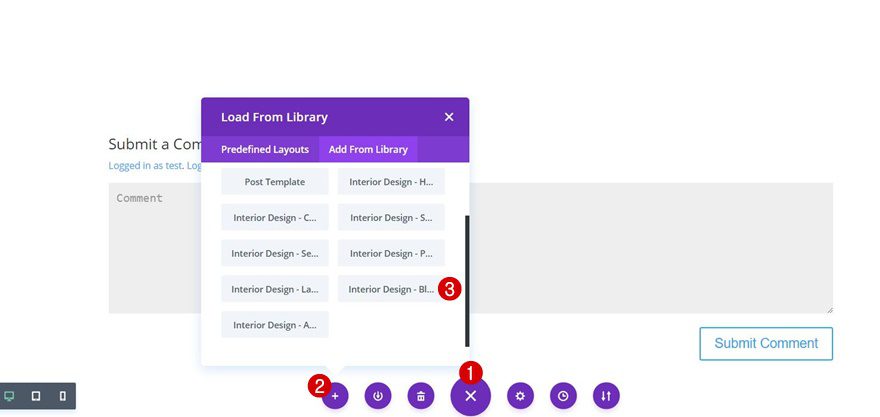
Step 6: Upload Blog Layout
Once you’re there, upload the blog layout included in the Interior Design Layout Pack. We’ll be reusing most parts of this layout and make some changes to keep the work we need to put in to a minimal.
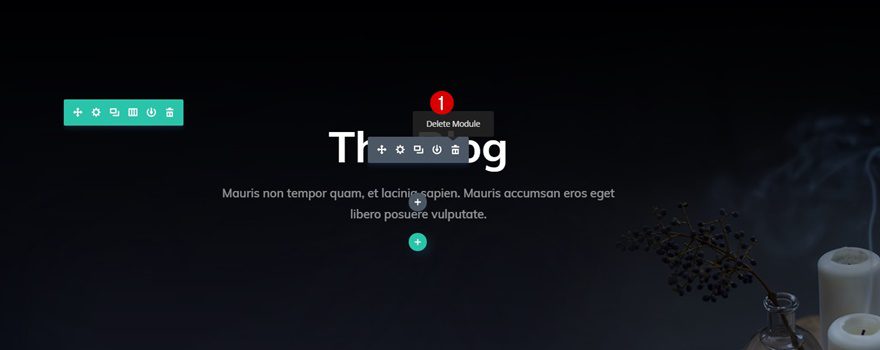
Step 7: Delete Hero Section Text Module
The Text Module within the hero section of the Interior Design blog layout is unnecessary in this case. That’s why you can delete it right away.
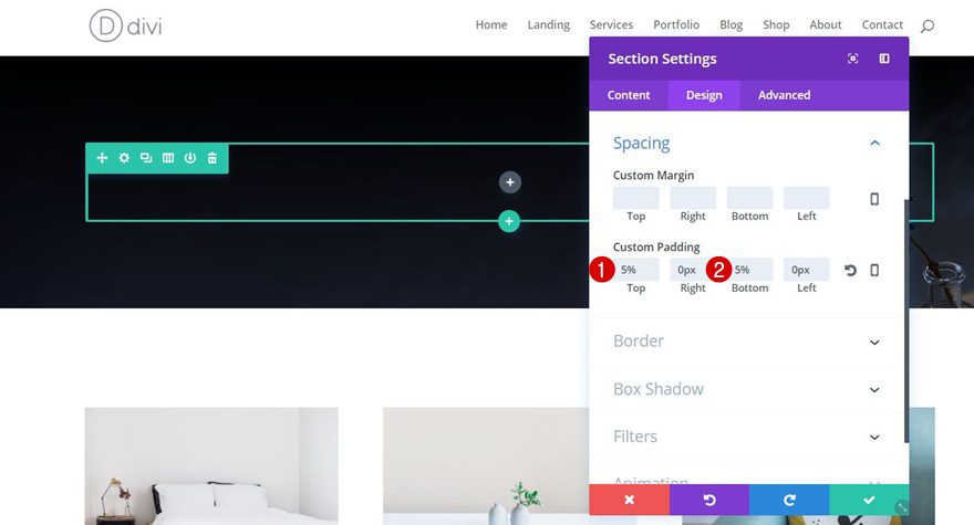
Step 8: Change Hero Section Spacing
Then, open the section settings and change the top and bottom padding of your section to ‘5%’.
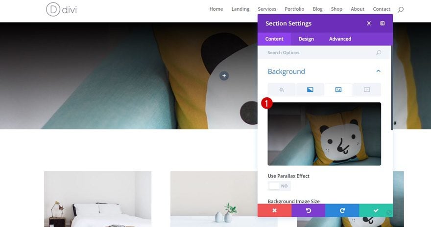
Step 9: Upload Featured Image as Hero Section Background
Within the section settings, change the background image into your featured image as well. You’ll have to change this background image every time you reuse the blog post template layout to match with your new blog post.
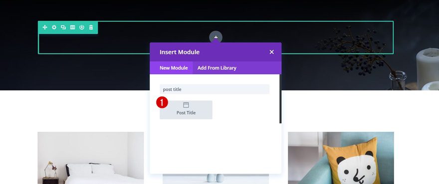
Step 10: Add Post Title Module
Moving on, add the Post Title Module to the column of your row.
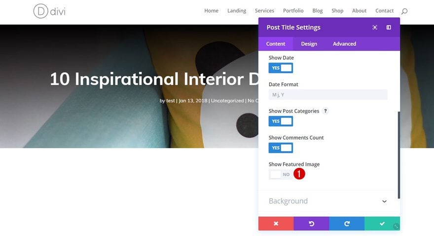
Step 11: Disable Featured Image Element
Since we’re already using the section background for our featured image, you can go ahead and disable the ‘Show Featured Image’ option of the Post Title Module.
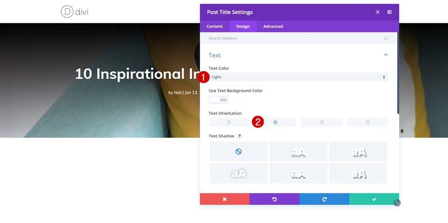
Step 12: Text Settings
Then, move on to the Design tab and apply the following changes to the Text subcategory:
- Text Color: Light
- Text Orientation: Center
Step 13: Title Text Settings
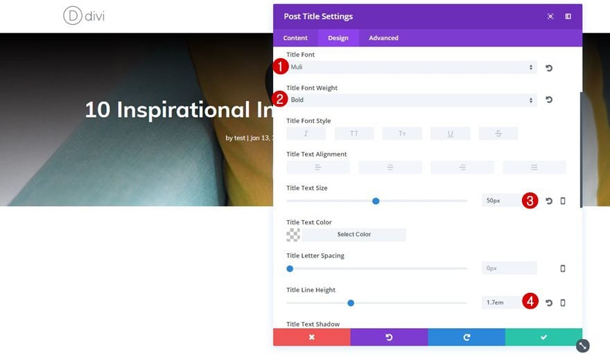
Next, open the Title Text subcategory and use the following settings:
- Title Font: Muli
- Title Font Weight: Bold
- Title Text Size: 50px
- Title Line Height: 1.7em
Step 14: Meta Text Settings
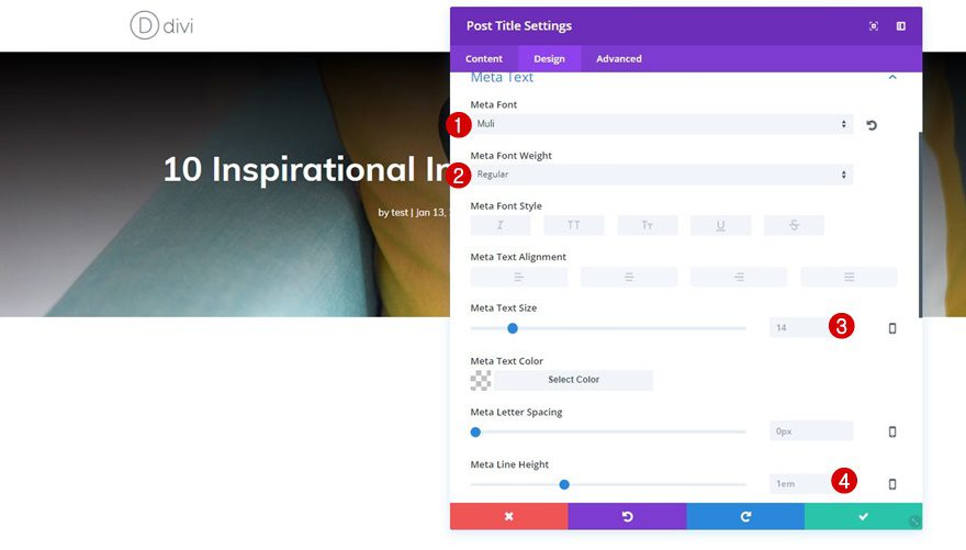
The Meta Text subcategory, will instead, need the following settings:
- Meta Font: Muli
- Meta Font Weight: Regular
- Meta Text Size: 14px
- Meta Line Height: 1em
Step 15: Remove Blog Module
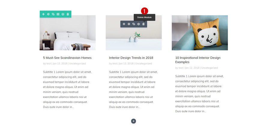
Scroll down the post you’re working on and delete the Blog Module that is already present.
Step 16: Add Text Module
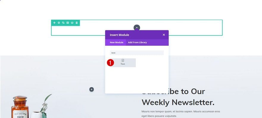
Continue immediately by adding a Text Module to that row instead. This Text Module will contain the content you’ll be sharing with your visitors.
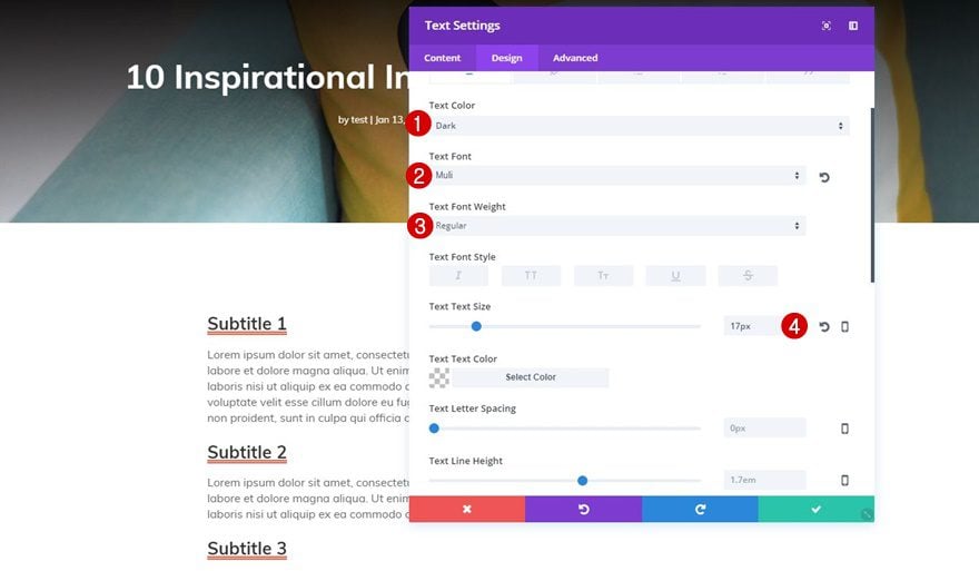
Step 17: Text Settings
After adding some sample text or your first blog post, move on to the Design tab and make the following changes to the Text subcategory:
- Text Color: Dark
- Text Font: Muli
- Text Font Weight: Regular
- Text Size: 17px
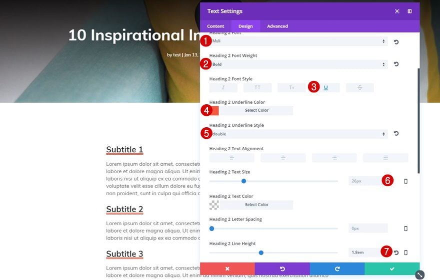
Step 18: Heading Text Settings
For the Heading Text subcategory, use the following settings instead:
- Heading Font: Muli
- Heading Font Weight: Bold
- Heading Font Style: Underline
- Heading Underline Color: #f4583f
- Heading Underline Style: Double
- Heading Text Size: 26px
- Headling Line Height: 1.8em
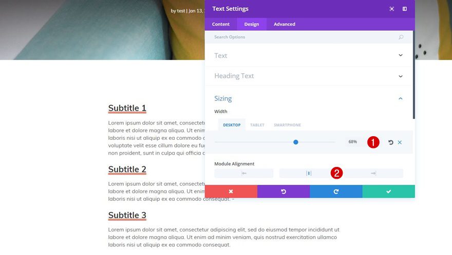
Step 19: Change Sizing
Lastly, scroll down and change the Sizing of your Text Module into:
- Width: 68% (Desktop), 100% (Tablet & Phone)
- Module Alignment: Center
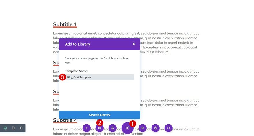
Step 20: Save Layout for Future Posts
Now that you’re done editing your blog post template layout, you can go ahead and save it in your Divi library. This will allow you to reuse the layout everytime you create a new blog post. Of course, you’ll need to modify some things everytime you create a new blog post such as the featured image, hero section background image and the content.
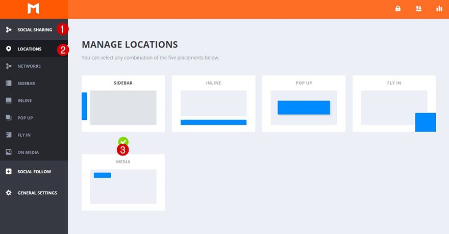
Now that you have your first sample blog post, you can add your social sharing icons and see what they look like on your posts. Start by going to Tools > Monarch Settings > Social Sharing > Locations and choose ‘Sidebar’ as your location.
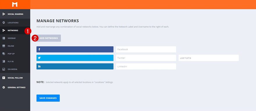
Next, open the Networks tab and add as many social networks you need to the sharing possibilities.
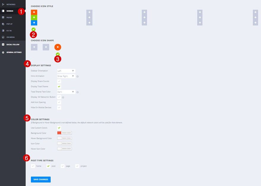
Last but not least, open the Sidebar tab and make the following appearance settings apply to your social sharing icons:
- Sidebar Direction: Left
- Intro Animation: Slide Right
- Display Share Counts: No
- Display Total Shares: Yes
- Total Shares Text Color: Dark
- Display ‘All Networks’ Button: No
- Add Icon Spacing: No
- Hide On Mobile Devices: No
- Use Custom Colors: Yes
- Background Color: #f4583f
- Post Type Settings: Posts Only
Final Thoughts
In this post, we’ve shown you how to make your website social media ready using the free Interior Design Layout Pack, Divi and Monarch. Besides showing you how to add social media follow icons for social proof to your website and social sharing icons to your posts, we’ve also put together a blog post template layout which you can use for all of your upcoming posts. If you have any questions or suggestions; make sure you leave a comment in the comment section below!
Featured Image by COME 2 US / shutterstock.com


very helpful, thank you
I love Monarch and use it on most of my sites.
BUT…
Monarch has the worst interface ever. It is highly unintuitive and to this day I still find myself trying to remember what certain things do because it isn’t readily clear. There is no descriptive text for any of the controls and the sections could be better organized.
In any case, Monarch still rocks, although it could use a hook for adding an email icon. Funny how we can have one for printing but not sending an email.
What I would like to know is if THIS is the best and recommended way of creating and using blog post template layouts!
While it seems great to be able to do this, it will obviously not allow for retrospective layout changes to existing blog posts, nor will it enable you to make layout changes to any blog posts – globally, i.e. you change the layout and it would change all existing blog posts automatically!
I think this has been discussed a few times, can we get an answer if there are plans to implement the creation of blog post page templates/layouts and blog post templates that can be switched on and off so they will apply to ALL blog posts?
Would you be able to add related posts to the blog template?
Impressive, plus a nice layout.
I love these post.