Making sure the content or copy for your website is readable is equally as important as making sure you’re choosing the right words. Of course, getting the overall right look and feel for your website is important as well. But without readable and valuable content, the purpose of a site will most likely get lost.
When you’re creating your website with Divi, you have different design options that allow you to make sure that the copy you’re sharing is readable on whatever kind of image background you’re using. That’s what this post is going to be all about. We’re going to share some tips and tricks and Divi options that will make sure the written content you share on image backgrounds is readable and easily understood.
Let’s take a look!
- 1 How to Make Your Written Content Readable on Image Backgrounds with Divi
- 2 1. Contrast is King but Avoid Extreme Contrasts (Black & White)
- 3 2. Use Neutral Colors & Sober Font Families
- 4 3. Use Bright Colors to Highlight CTAs
- 5 4. Add a Background Color Overlay to Your Background Image
- 6 5. Or Use a Gradient Background Overlay Instead
- 7 6. Use Text Shadow
- 8 Final Thoughts
How to Make Your Written Content Readable on Image Backgrounds with Divi
Subscribe To Our Youtube Channel
1. Contrast is King but Avoid Extreme Contrasts (Black & White)
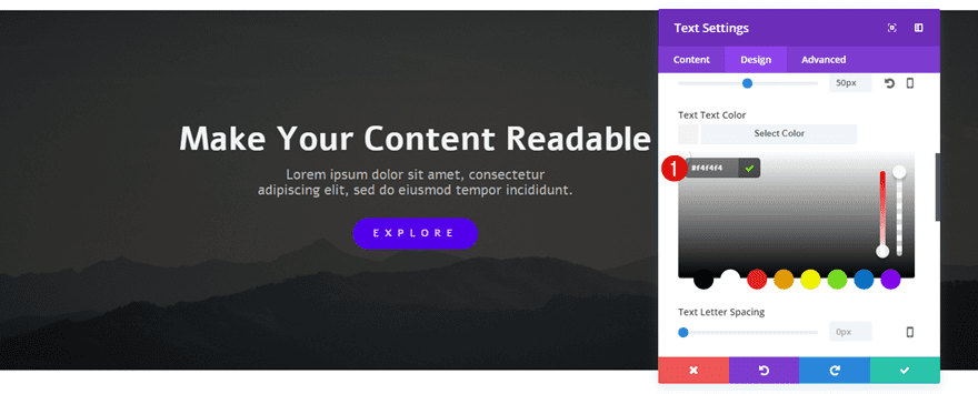
The first bullet point and essential aspect of creating readable content is making sure there is enough contrast between the written content you’re providing and the image background you use. If you’re using a background image that leans too much towards the color of your font, the content you’re sharing can easily go lost. Choose between:
- Using a light font color in combination with a darker background image
- Using a dark font color in combination with a lighter background image
The most obvious contrasting colors are black and white. However, using them in combination can be heavy on the eyes. Therefore, rather opt for two contrasting colors that aren’t as heavy on the eyes as black and white are. Instead of choosing a black color for your background, choose a dark gray color or any other type of dark color. Same counts for a light font color; choose a light gray color or any type of light color that leans close towards white.
2. Use Neutral Colors & Sober Font Families
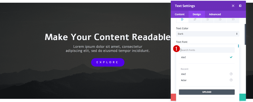
The next thing that’ll determine whether or not your content is readable is the color and font family you choose. Sure, using bright and notable colors draw attention. But if you’re sharing too much copy in that particular color, it will likely cause people to skip reading the content you’re providing because of how disturbing it is on the eyes.
That’s why it’s recommendable to use neutral colors that don’t bother the eyes and allow visitors to focus on the message you’re trying to bring. You can never go wrong by choosing a sober font family for most of the copy you share as well. However, that doesn’t mean you should always go with default fonts, like Arial, only. You can also opt for something that is a bit more sophisticated for your titles–as long as the readability is there.
3. Use Bright Colors to Highlight CTAs
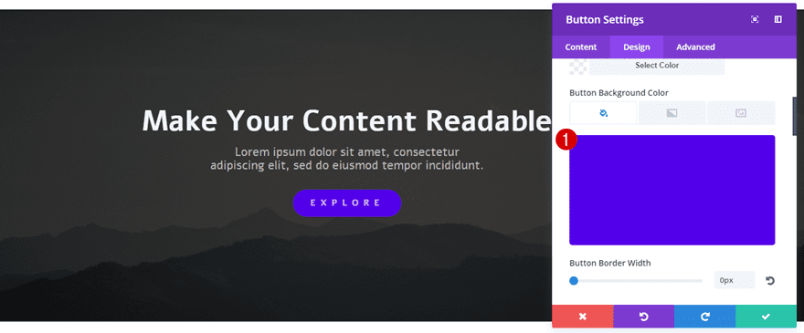
As mentioned in the previous bullet point, a good website mostly uses neutral colors and sober font families. By doing so, you allow visitors to pay special attention to your calls to action.
To make sure your CTAs stand out from the other written content you’re providing, you’ll have to a find a color that contrasts with both the background image and the font color. Visitors are used to this kind of website structure and will automatically recognize your calls to action if you make sure they’re the first thing that catches the eye.
4. Add a Background Color Overlay to Your Background Image
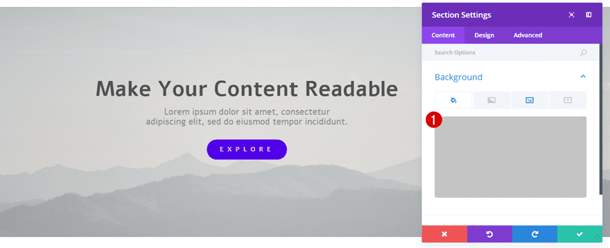
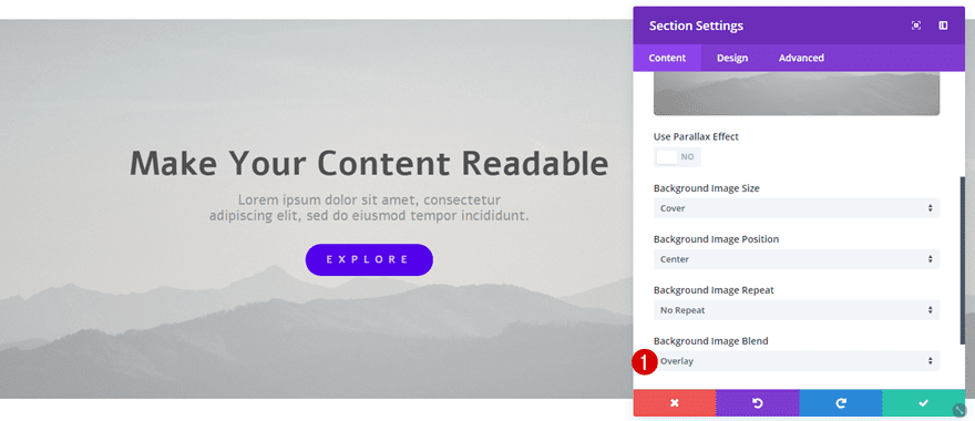
In many cases, the background image you want to use is a combination of light, dark and bright colors. That makes it hard to find a readable font color. Luckily, you can add color overlays to your background images within the Divi builder itself. These overlays are available for any row, column, module or section that you’re using and can be found in the Background subcategory of the Content tab. You could add overlays to images with photo editing software as well, but using Divi built-in options in combination with the Visual Builder allows you to see changes happen in real time and makes using photo editing software hardly necessary.
You can change the overlay color up to the point where you feel like the written content is readable. By doing so, some of the colors of your images will go lost, that’s a fact. But that’s something you’ll have to sacrifice willingly. If you want to keep a colorful image within its original form, using it in a two-column structure with no text overlap is the way to go.
Once you add a background color overlay to your Divi settings, you’ll have to choose the type of Image Blend you want as marked on the print screen below.
5. Or Use a Gradient Background Overlay Instead
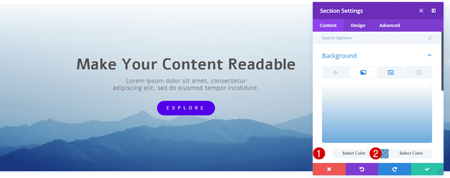
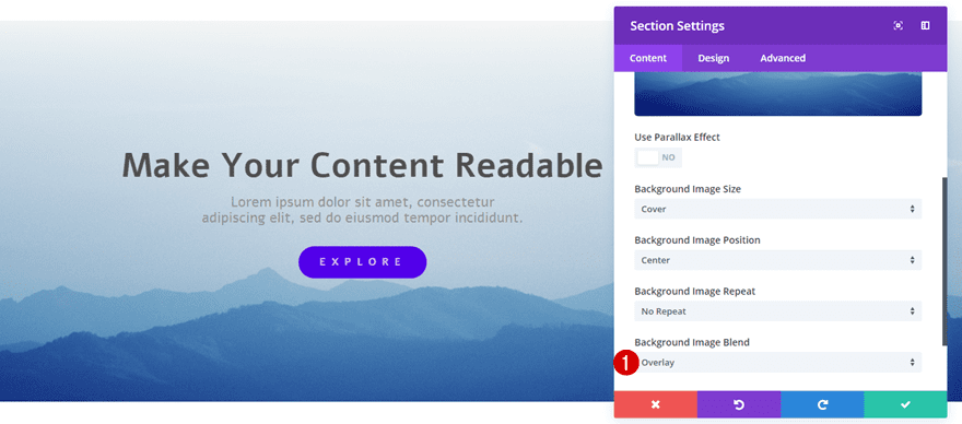
Another option you have is using a gradient background overlay. This gives you the same possibilities as the color overlay does, but allows you to add a gradient of two colors instead. Once you add a gradient background, you will, again, have the option to choose your Image Blend as marked on the print screen below.
6. Use Text Shadow
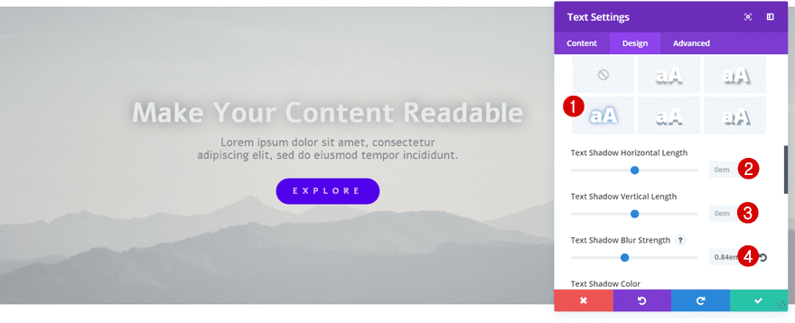
If, however, you want to use the same color for your font and background image at the same time; there’s an alternative. You can use the Text Shadow built-in option of Divi. For this option, you will need to use a shadow color that is the opposite of your font color and background image or overlay color. Not only will you be able to maintain the same color for your font and background image at the same time, but the Text Shadow option also allows you to create some depth which is a helpful contribution to the look and feel of your website.
Final Thoughts
In this post, we’ve shown you several ways on how to make your written content or copy readable when using image backgrounds. Of course, you don’t have to apply all of these methods at the same time, but it’s great to keep them in the back of your mind while designing your next website. If you have any questions or suggestions; make sure you leave a comment in the comment section below!
Featured Image by FernPat / shutterstock.com











Good Work, Thanks
Great Article. A helpful encouragement for newbies. Thanks.
Excellent tutorial, I was looking for a way to do this, but my codes did not look elegant.
Good summary of typographical basics. Just to be a bit technical, I believe the article is referencing “legibility” rather than “readability”.
Legibility describes the ability to identify individual elements on a page such as letters defined by clarity of typeface and contrast with the background.
Although encompassing legibility, I believe readability has more to do with how the words formed by the text flow into paragraphs and convey the writer’s ideas to the reader. Legible text isn’t always readable.
I would like to add to the “gray on gray” prior comment. The recent design trend I see a lot of now where body text is getting lighter and lighter gray is ridiculous. Pretty soon it will just disappear.
Hello! I’m from Brazil! I have several blogs and the content you post here has helped me a lot. Thank you for the tips!
Thanks for the design tips. For people whose vision is not so great, particularly the elderly or people with other eye problems, high contrast and reasonable point sizes have a lot to do with how readable type is. For that reason, a couple of your suggestions make things harder, not easier, for them to read web text. Both gradient and gray overlays reduce contrast. And in the examples you give the “lorem ipsum” text is quite small. Black text on white is the most readable, even if it looks stark. Gray on gray (as, for example, in the “Recent Posts” footer on this blog site) is the worst, especially at 14px, which that type is.
One way for designers to solve this is to create more readable styles and give readers a way to choose them. Another is to remember that not everyone has perfect eyesight and design accordingly.