There are many ways you can make your visitor aware of the fact that they’re moving on to another section on your page. Within Divi, there’s a wide range of section dividers you can use right off the bat. But if you’re looking for a more animated way to make it clear, you’ll love this tutorial. We’ll show you how to mark a new Divi section using subtle motion shapes. We’ll create these shapes with Divi’s built-in options and add motion to them with Divi’s scroll effects. The possibilities are endless, but we’ll share three design examples that you can use right away. You’ll be able to download the JSON files for free as well!
Let’s get to it.
Preview
Before we dive into the tutorial, let’s take a quick look at the outcome across different screen sizes.
Example #1
Desktop
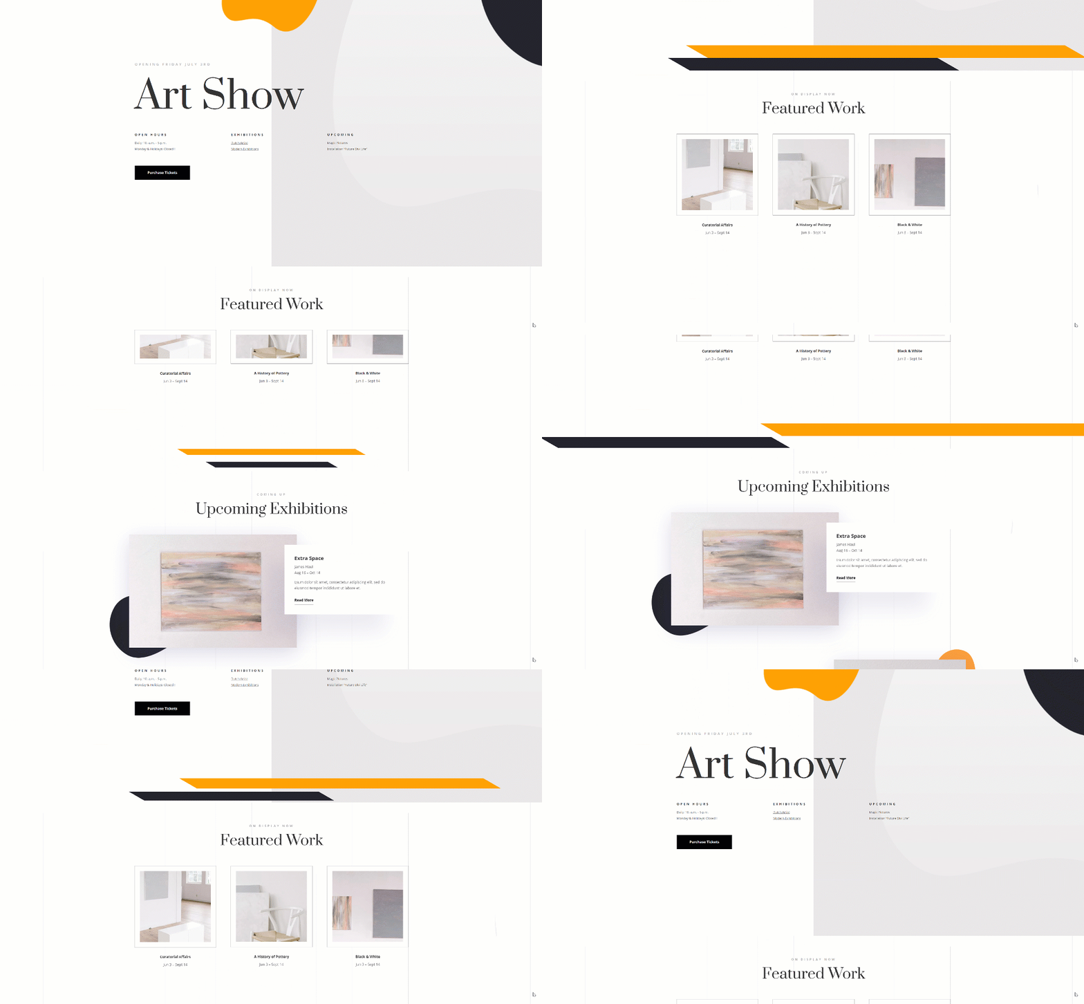
Mobile

Example #2
Desktop
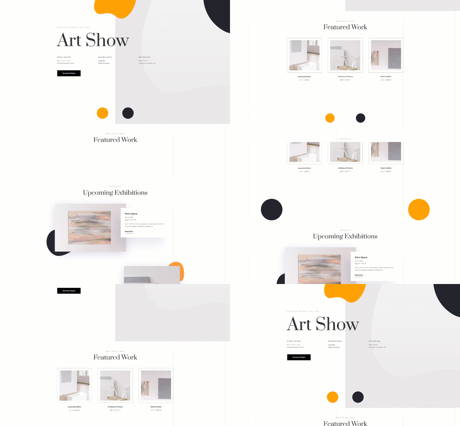
Mobile

Example #3
Desktop
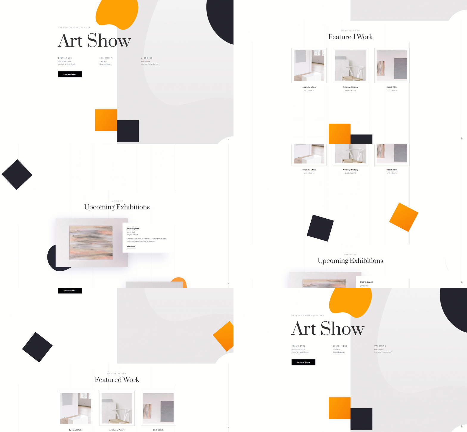
Mobile

Download The Subtle Motion Shapes Layouts for FREE
To lay your hands on the free subtle motion shapes layouts, you will first need to download them using the button below. To gain access to the download you will need to subscribe to our newsletter by using the form below. As a new subscriber, you will receive even more Divi goodness and a free Divi Layout pack every Monday! If you’re already on the list, simply enter your email address below and click download. You will not be “resubscribed” or receive extra emails.
General Steps
Upload Art Gallery Landing Page Layout
For this tutorial, we’ll use the Art Gallery Layout Pack, but you can apply the technique to any kind of website you’re building. Add a new page and upload the layout pack’s landing page.
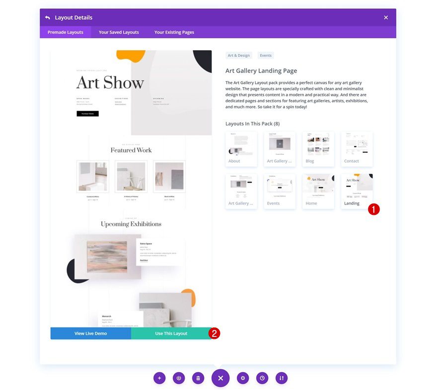
Add New Row to Bottom of Section #1
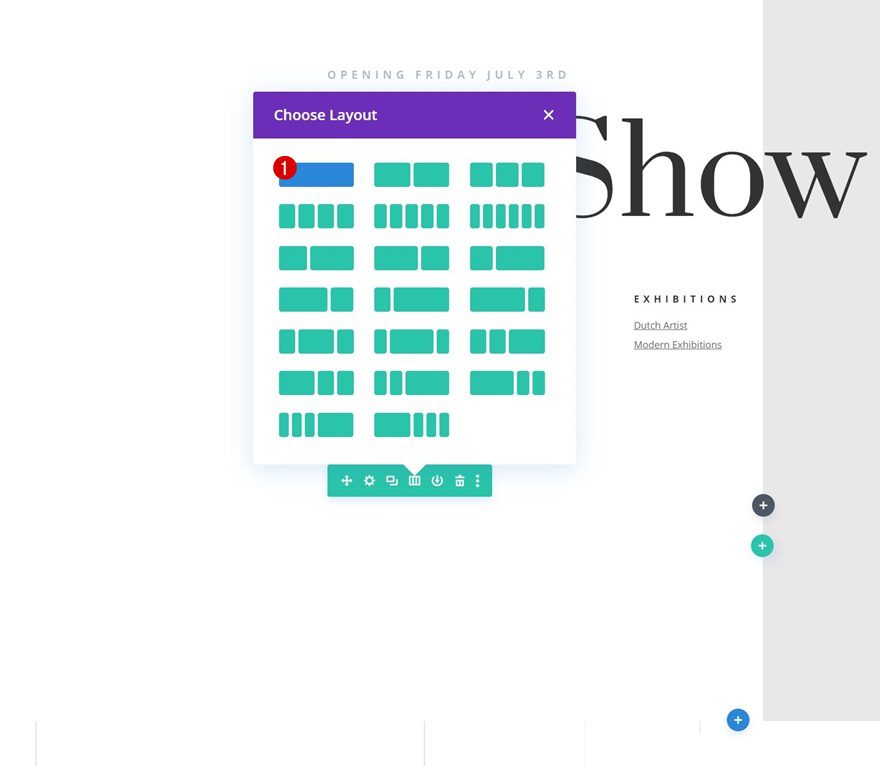
Column Structure
Now, we’ll go through some basic steps that apply to all three examples that were shown at the beginning of this tutorial. First, add a new row to your the bottom of your page’s first section using the following column structure:
Sizing
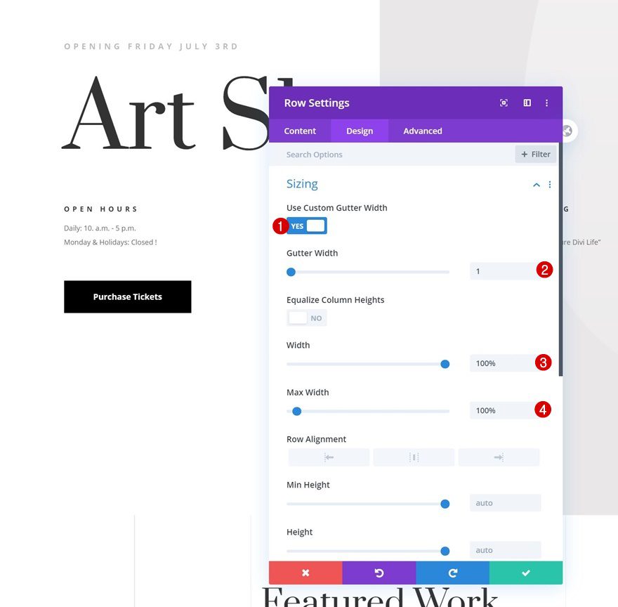
Open the row settings and change the sizing settings as follows:
- Use Custom Gutter Width: Yes
- Gutter Width: 1
- Width: 100%
- Max Width: 100%
Spacing
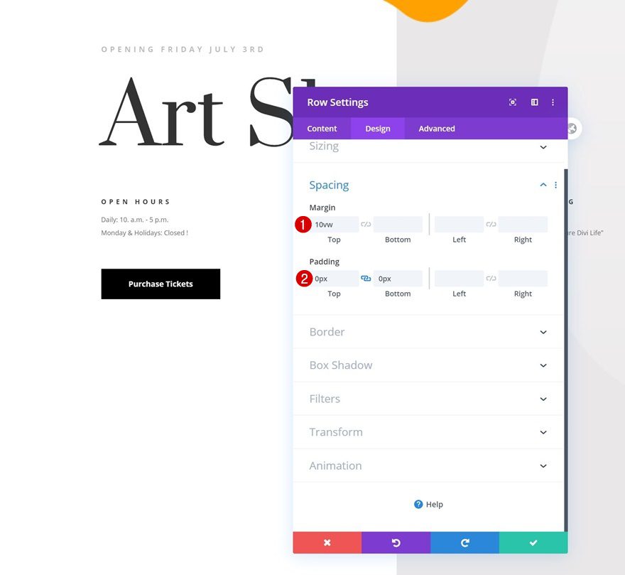
Modify the margin and padding values too.
- Top Margin: 10vw
- Top Padding: 0px
- Bottom Padding: 0px
Remove Section #1 Bottom Padding
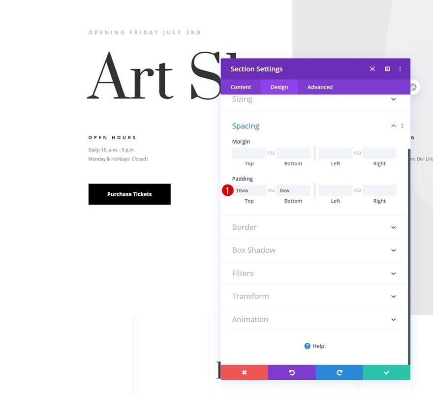
To make sure the row, and the motion shapes, appear at the bottom of the section, we’ll need to remove the section’s bottom padding.
- Bottom Padding: 0vw
Recreate Example #1
Add Divider Module #1
Visibility
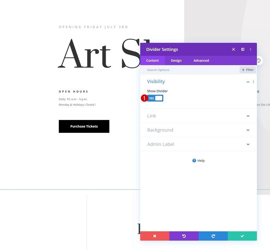
Once you’ve completed the general steps, it’s time to start recreating the different examples, starting with the first one. Add a first Divider Module and make sure the ‘Show Divider’ option is enabled.
- Show Divider: Yes
Line
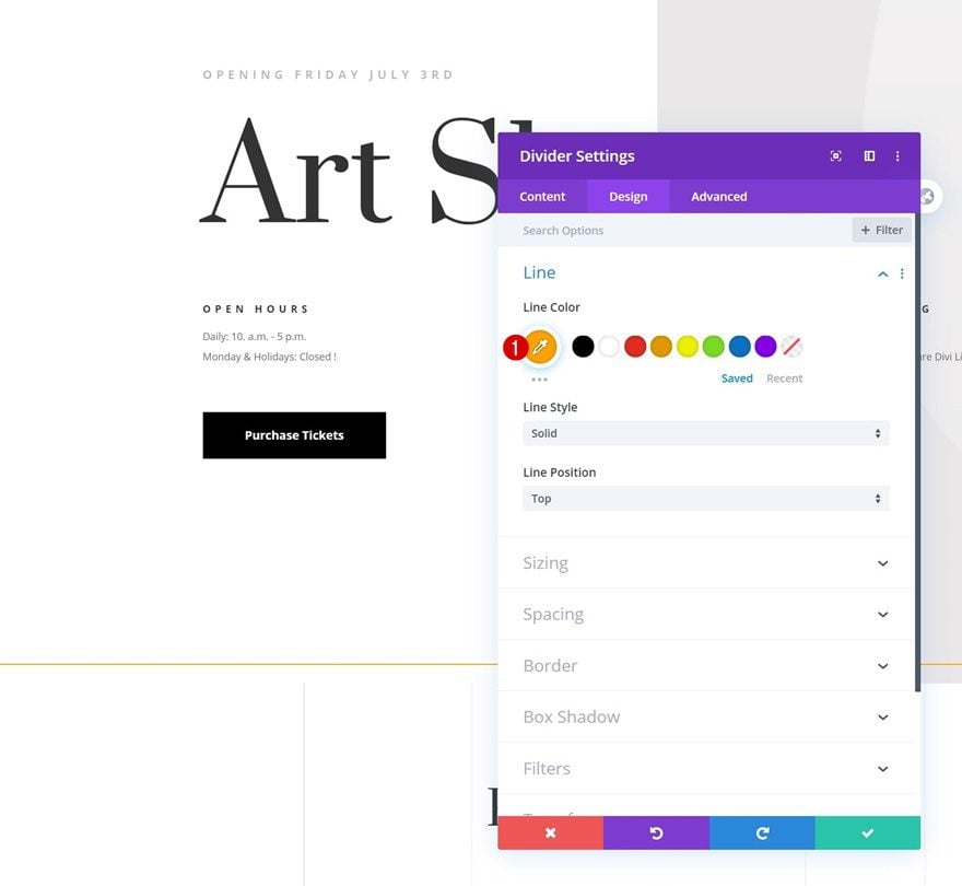
Move on to the module’s design tab and change the line color.
- Line Color: #ffa100
Sizing
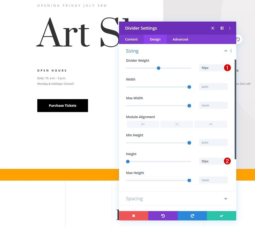
Modify the module’s sizing settings too.
- Divider Weight: 50px
- Height: 50px
Spacing
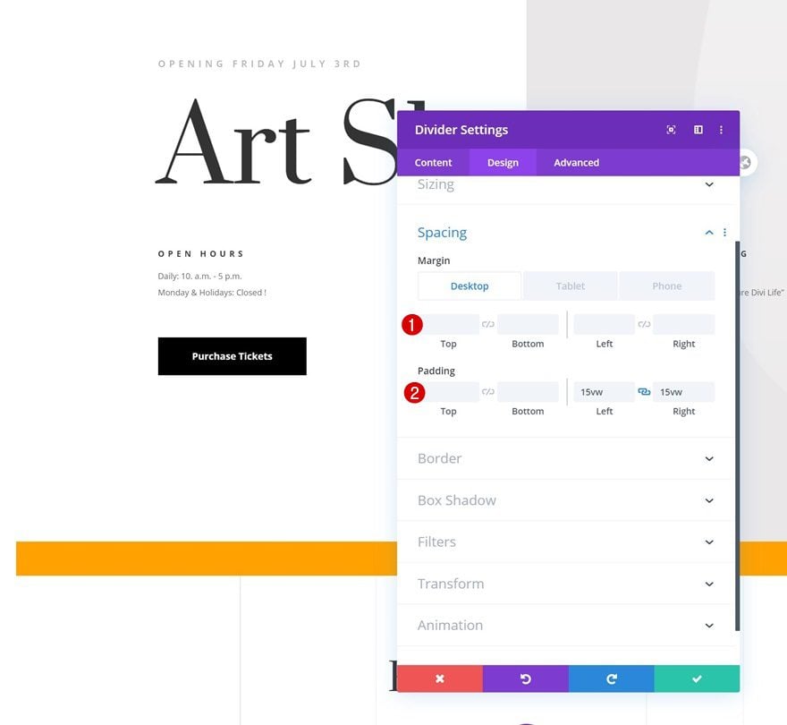
Then, go to the spacing settings and add some custom margin and padding values.
- Left Margin: -200px (Tablet & Phone Only)
- Right Margin: -200px (Tablet & Phone Only)
- Left Padding: 15vw
- Right Padding: 15vw
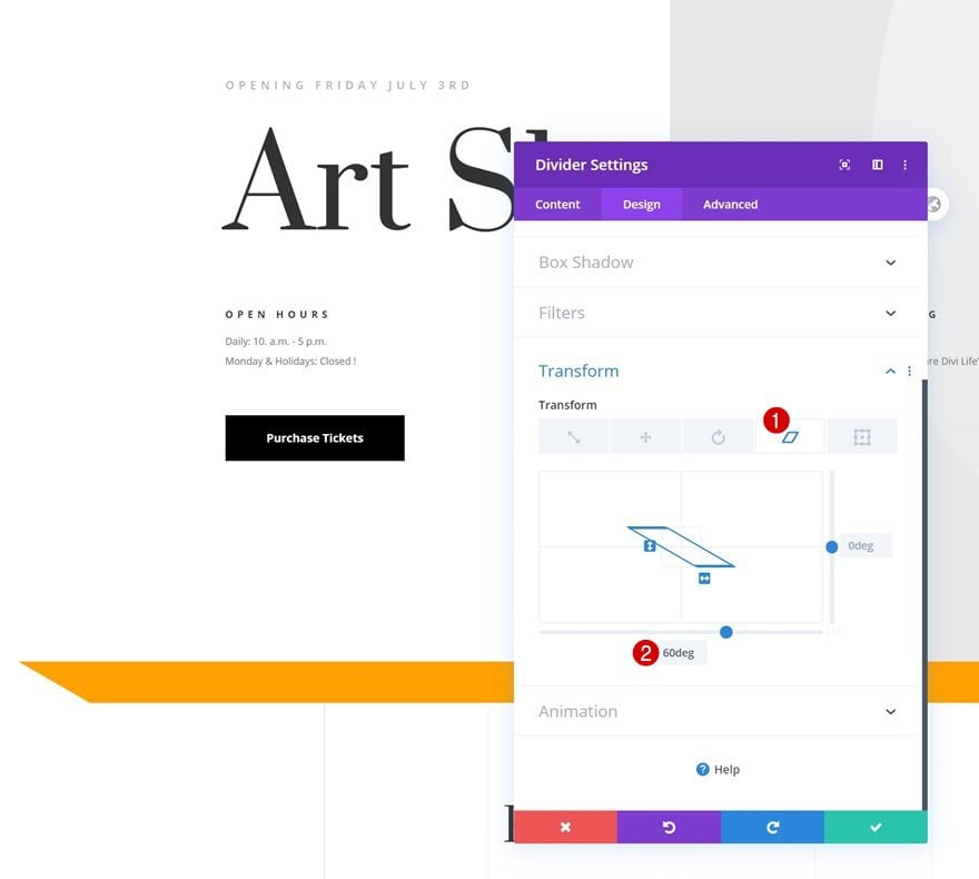
Transform Skew
We’ll also slightly transform the module by adding a bottom skew value in the transform settings.
- Bottom: 60deg
Horizontal Motion Scroll Effect
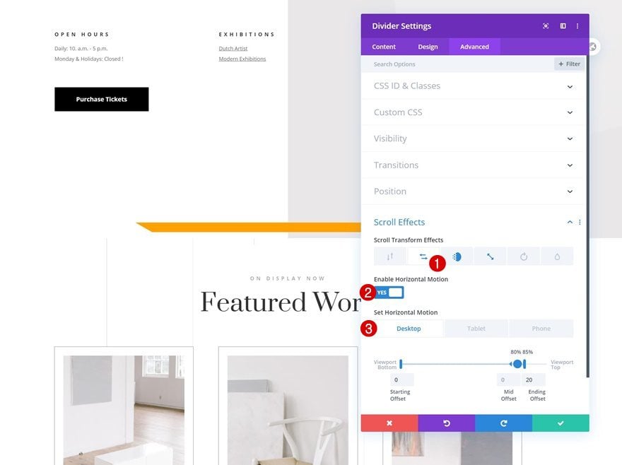
Time to add the different scroll effects to our module! First, we’ll add some horizontal motion.
- Enable Horizontal Motion: Yes
- Starting Offset: 0
- Mid Offset: 0 (at 80%)
- Ending Offset:
- Desktop: 20 (at 85%)
- Tablet & Phone: 5 (at 85%)
Fading In and Out Scroll Effect
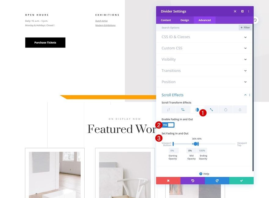
We’ll add a fading in and out effect too.
- Enable Fading In and Out: Yes
- Starting Opacity: 0%
- Mid Opacity: 0% (at 36%)
- Ending Opacity: 100% (at 40%)
Scaling Up and Down Scroll Effect
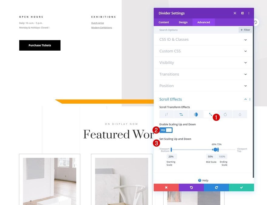
And we’ll complete the module settings by adding a scaling up and down effect.
- Enable Scaling Up and Down: Yes
- Starting Scale: 20%
- Mid Scale: 50% (at 69%)
- Ending Scale: 100% (at 73%)
Clone Divider Module #1
Once you’ve completed the Divider Module, you can clone it.
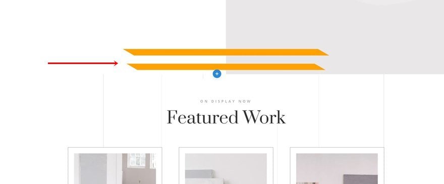
Modify Line Color
Open the duplicate module’s settings and change the line color.
- Line Color: #24252d
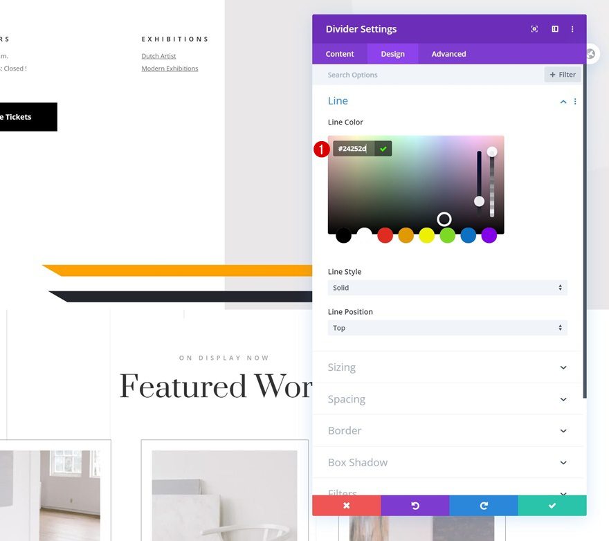
Modify Spacing
Modify the module’s spacing values too.
- Left Margin: -200px (Tablet & Phone Only)
- Right Margin: -200px (Tablet & Phone Only)
- Left Padding: 25vw
- Right Padding: 25vw
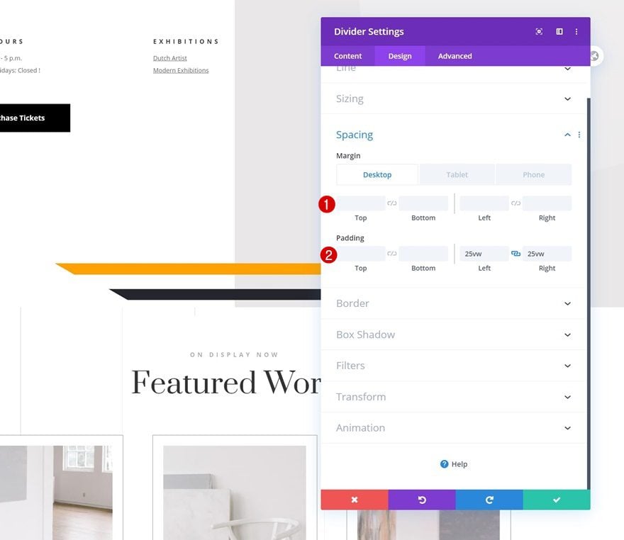
Modify Horizontal Motion Scroll Effect
Then, go to the scroll effects in the advanced tab and modify the ending offset of the horizontal motion scroll effect.
- Ending Offset:
- Desktop: -20
- Tablet & Phone: -5
Recreate Example #2
Add Divider Module #1
Visibility
If you’d rather recreate the second example, go ahead and add a first Divider Module to the last row of your section. Make sure the ‘Show Divider’ option is enabled.
- Show Divider: Yes
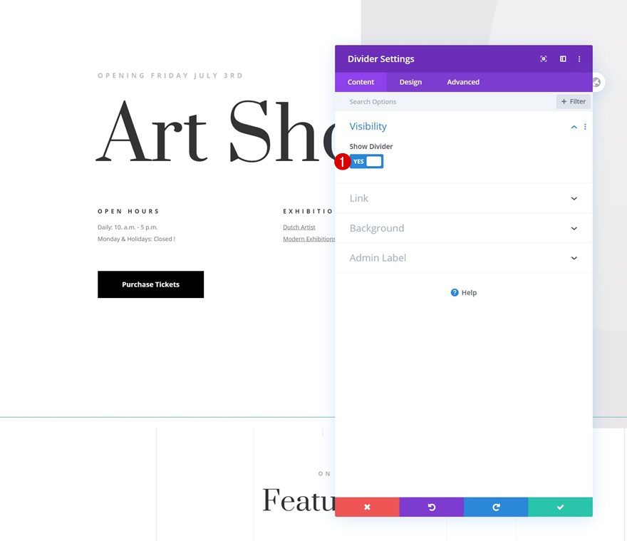
Line
Modify the module’s line color next.
- Line Color: #ffa100
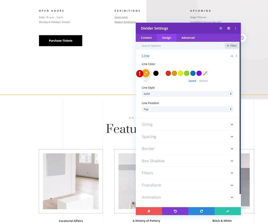
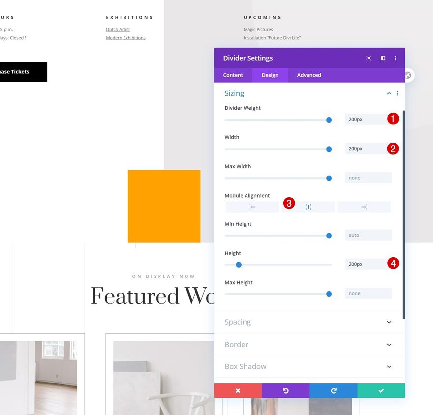
Sizing
Change the sizing settings too.
- Divider Weight: 200px
- Width: 200px
- Module Alignment: Center
- Height: 200px
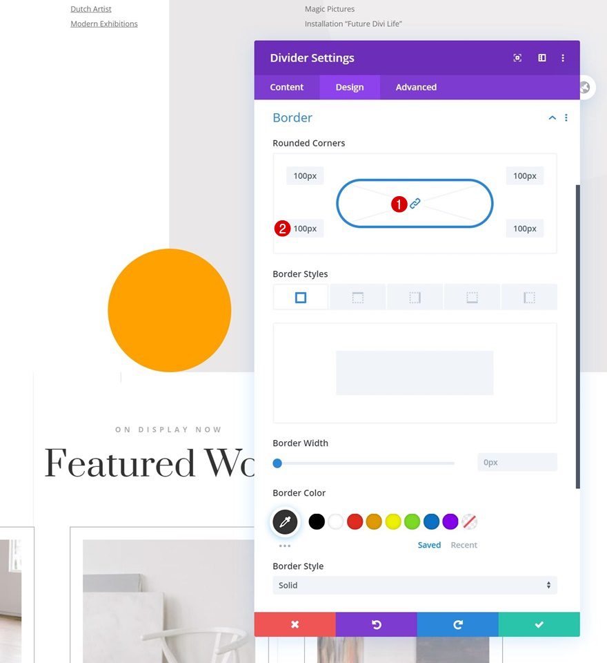
Border
Next, we’ll turn the module into a circle by adding some border radius.
- All Corners: 200px
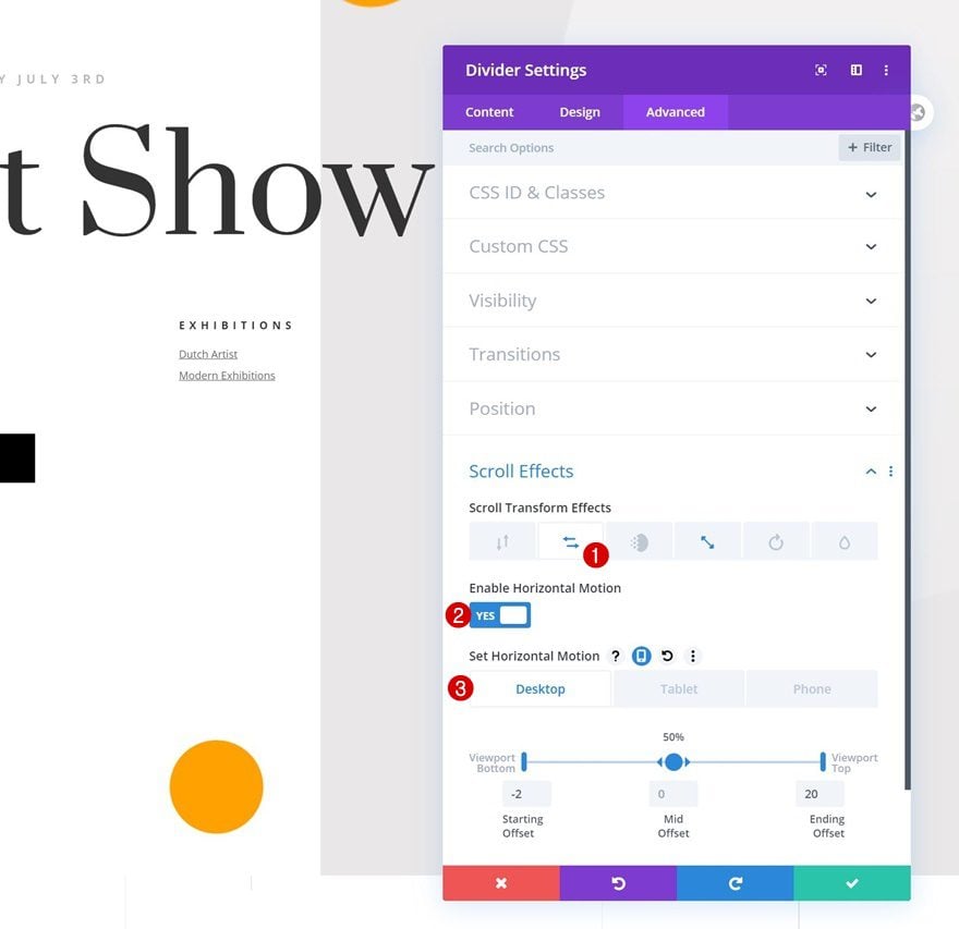
Horizontal Motion Scroll Effect
Time to add the scroll effects! The first effect we’re using is horizontal motion.
- Enable Horizontal Motion: Yes
- Starting Offset: -2
- Mid Offset: 0
- Ending Offset:
- Desktop: 20
- Tablet & Phone: 5
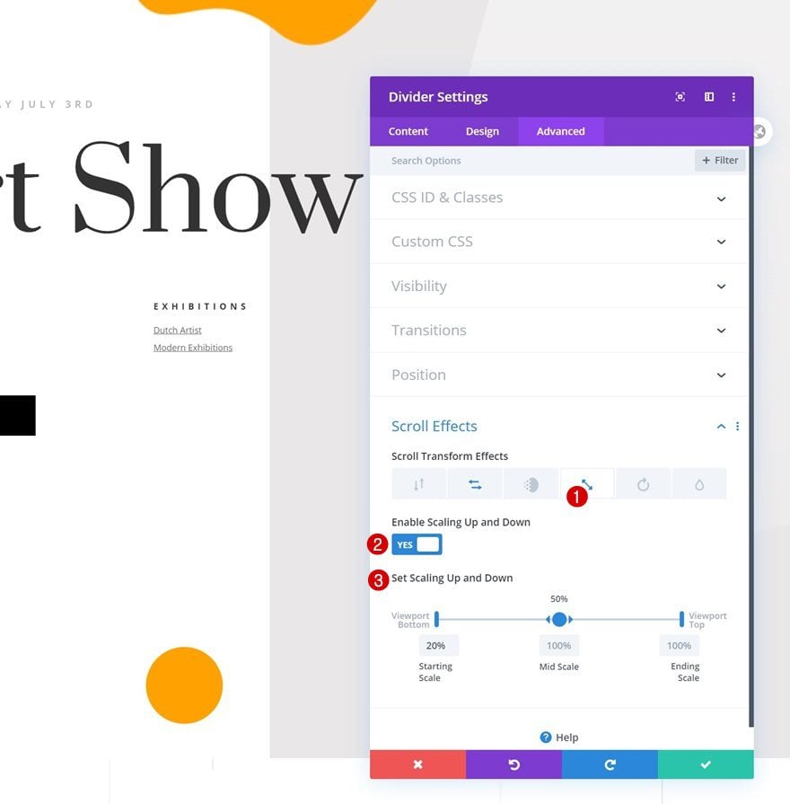
Scaling Up and Down Scroll Effect
Next, we’ll also enable a scaling up and down effect.
- Enable Scaling Up and Down: Yes
- Starting Scale: 20%
- Mid Scale: 100%
- Ending Scale: 100%
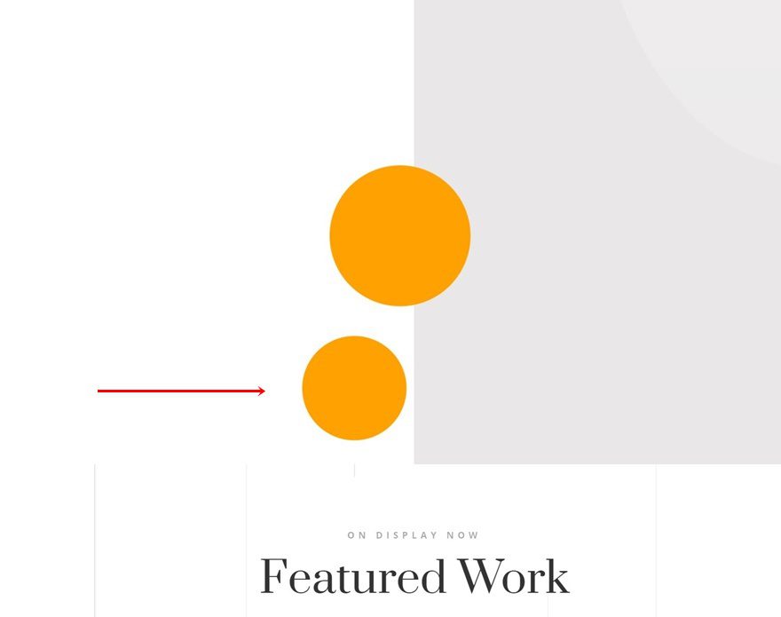
Clone Divider Module
Go ahead and clone the entire Divider Module.
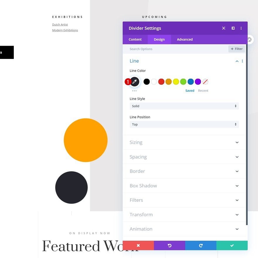
Change Line Color
Open the duplicate and change the line color.
- Line Color: #24252d
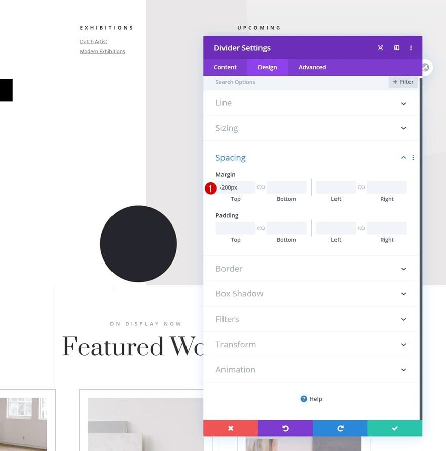
Modify Spacing
Add some top margin too.
- Top Margin: -200px
Change Horizontal Motion Scroll Effect
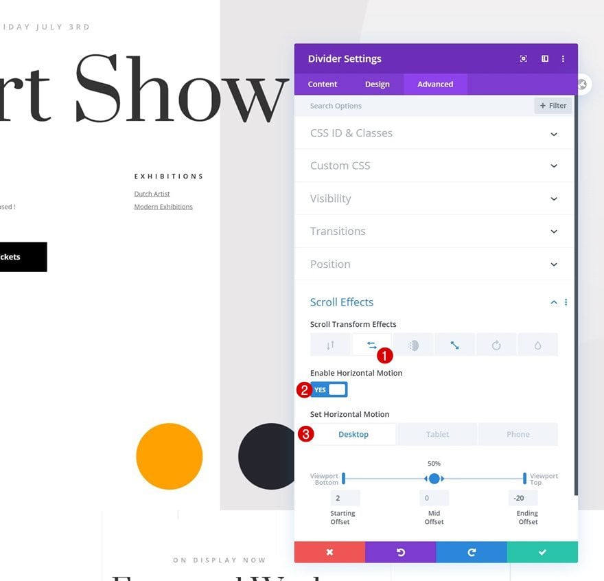
Then, go to the horizontal motion scroll effect settings and change the ending offset.
- Ending Offset:
- Desktop: -20
- Tablet & Phone: -5
Recreate Example #3
Add Row Padding
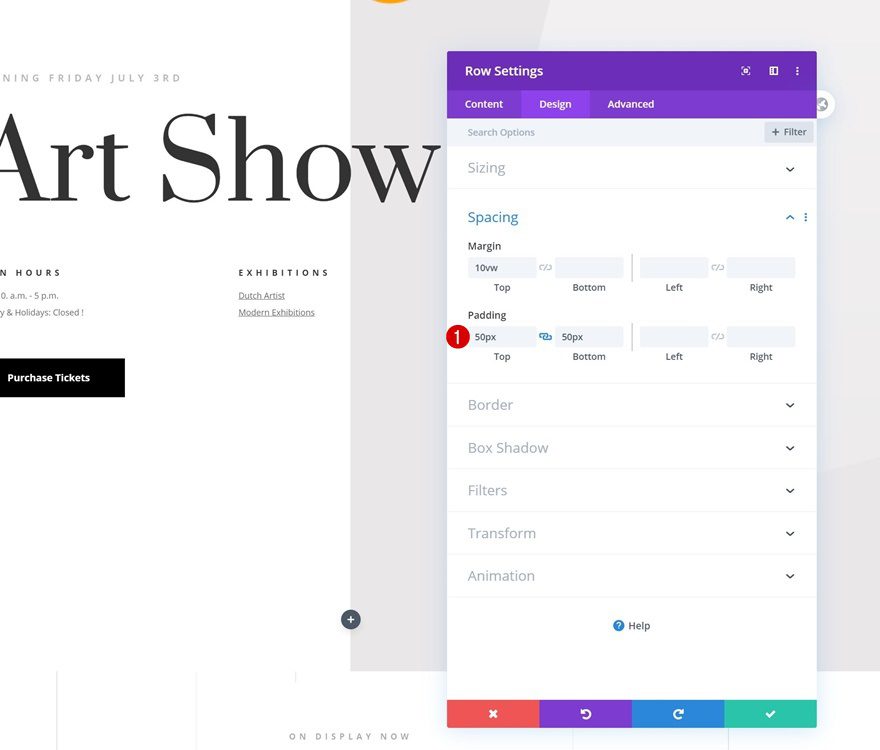
On to the next and last example! Start by opening the row you’ve created in the general steps of this tutorial and change the padding values in the spacing settings.
- Top Padding: 50px
- Bottom Padding: 50px
Add Divider Module #1
Visibility
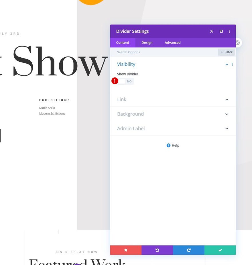
Add a new Divider Module to your section’s last row and hide the divider.
- Show Divider: No
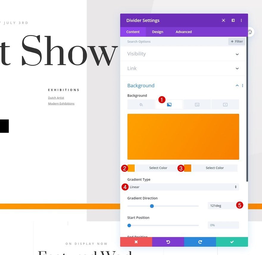
Gradient Background
Add a gradient background next.
- Color 1: #ffa100
- Color 2: #f77f00
- Gradient Type: Linear
- Gradient Direction: 121deg
Sizing
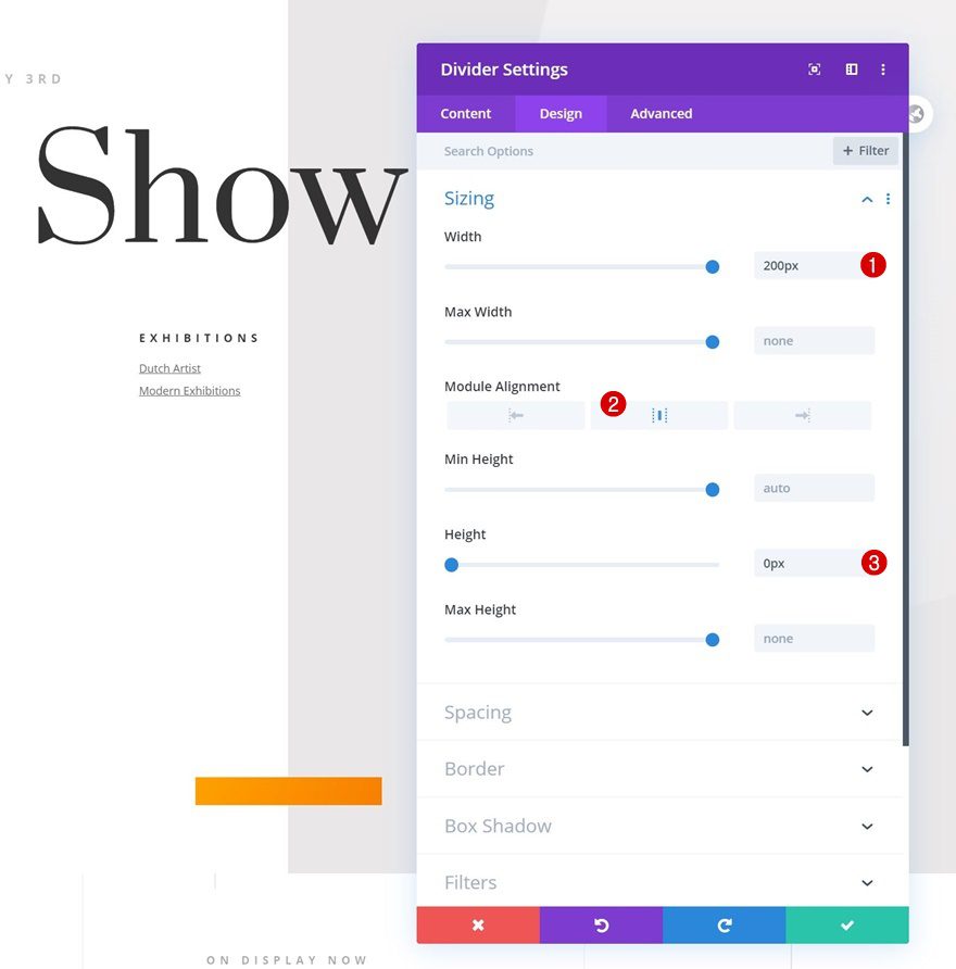
Move on to the module’s design tab and change the sizing settings as follows:
- Width: 200px
- Module Alignment: Center
- Height: 0px
Spacing
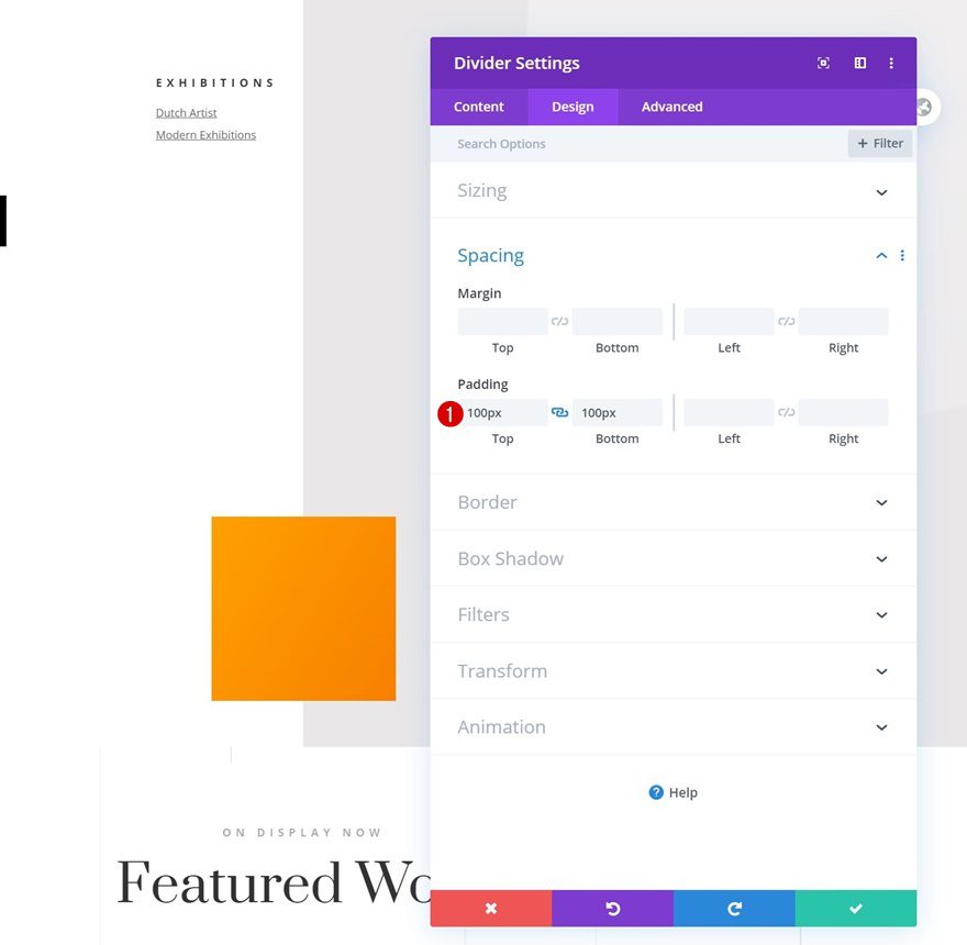
We’re adding some custom top and bottom padding next.
- Top Padding: 100px
- Bottom Padding: 100px
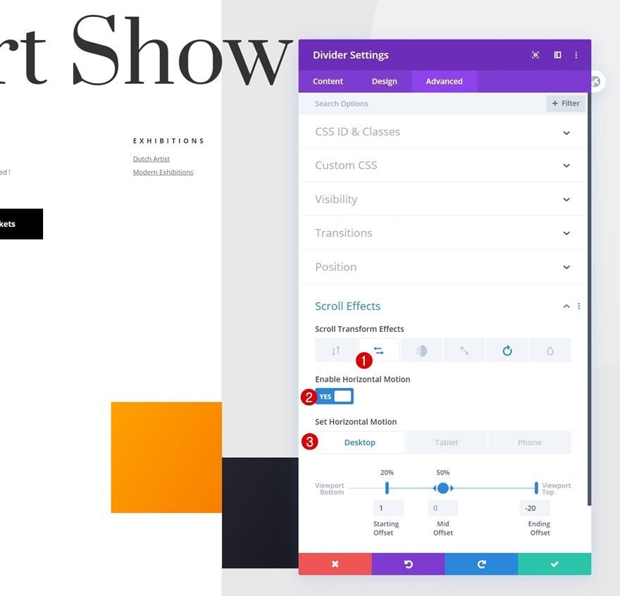
Horizontal Motion Scroll Effect
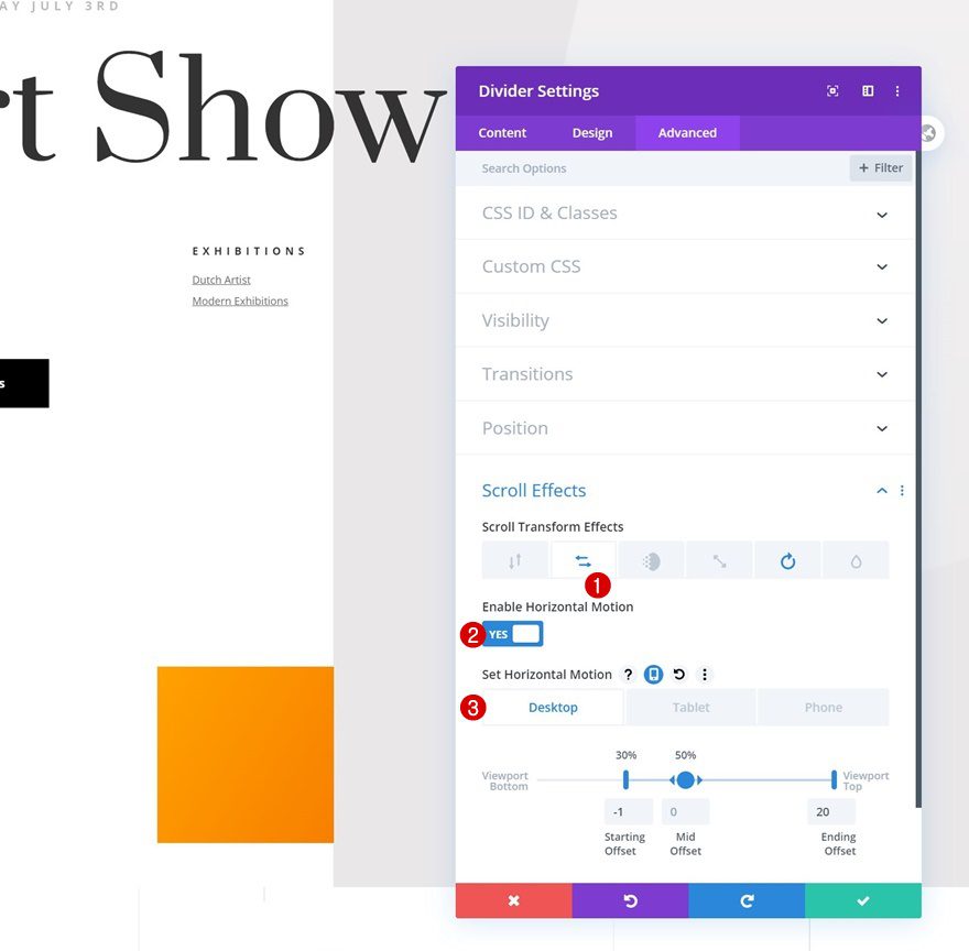
Now, it’s time to add the scroll effects, starting with some horizontal motion across different screen sizes.
- Enable Horizontal Motion: Yes
- Starting Offset: -1 (at 30%)
- Mid Offset: 0
- Ending Offset:
- Desktop: 20
- Tablet & Phone: 5
Rotating Scroll Effect
We’ll complete the module settings by adding a rotating scroll effect.
- Enable Rotating: Yes
- Starting Rotation: 0° (at 46%)
- Mid Rotation: 50° (at 75%)
- Ending Rotation: 90°
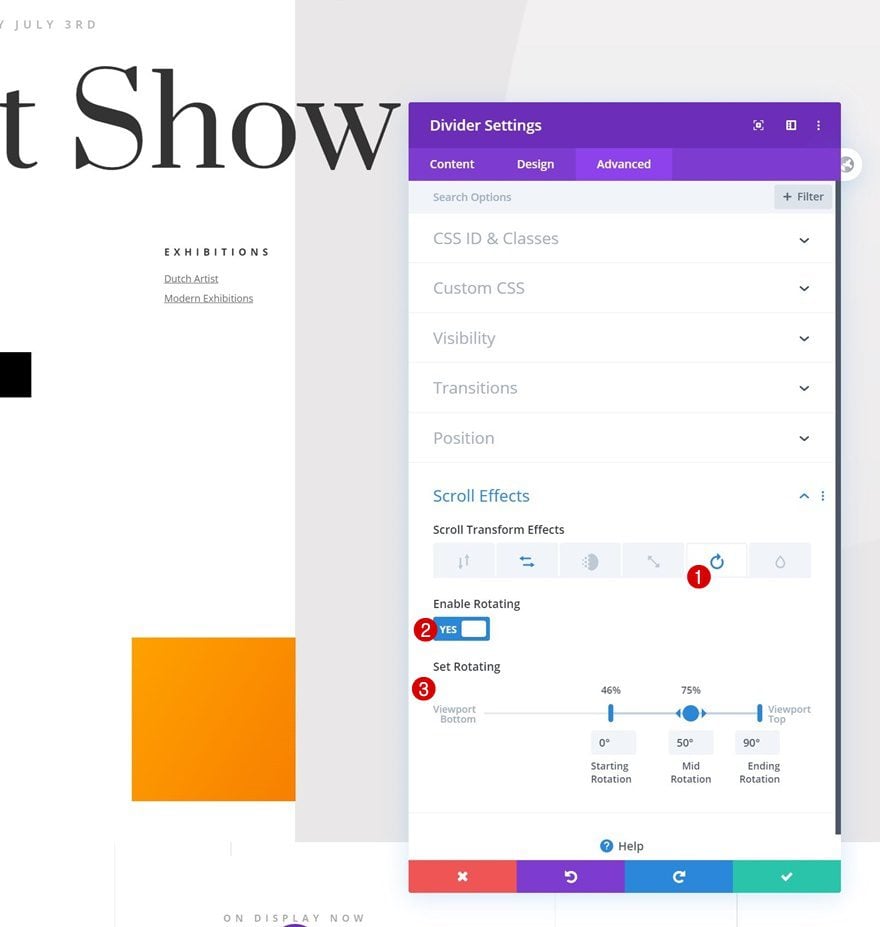
Clone Divider Module
Go ahead and clone the entire module.
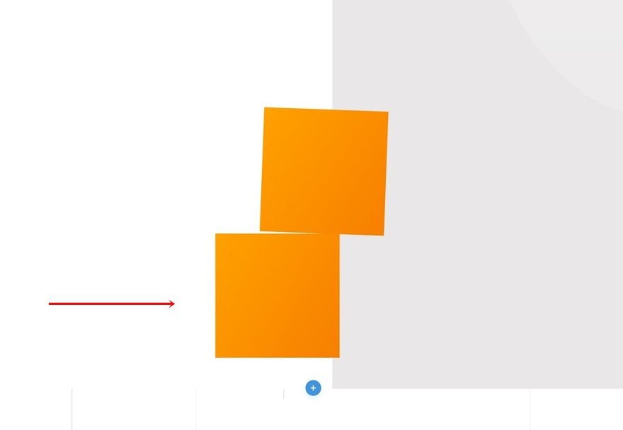
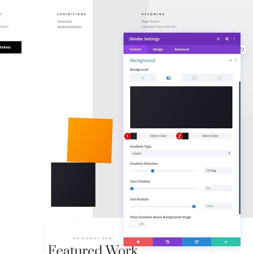
Change Gradient Background
Open the duplicate’s settings and change the gradient background colors.
- Color 1: #24252d
- Color 2: #16161c
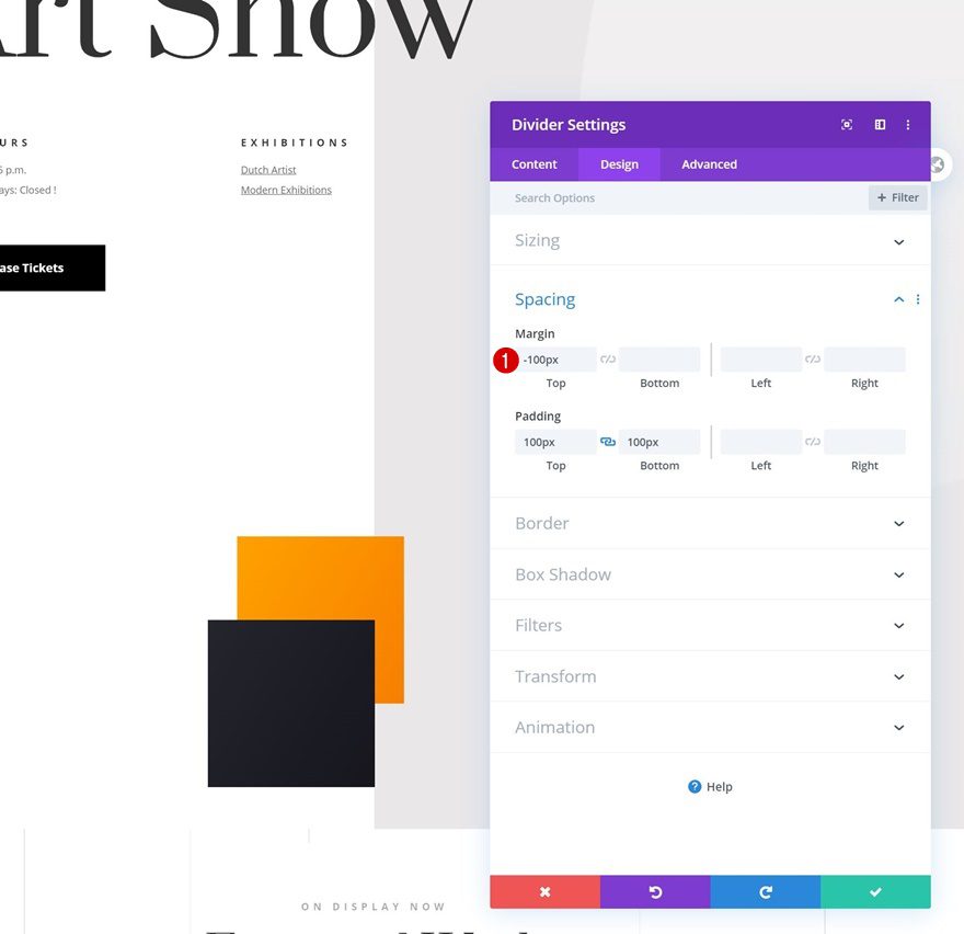
Change Spacing
Add some negative top margin.
- Top Margin: -100px
Change Horizontal Scroll Effect
And modify the horizontal motion’s ending offset in the scroll effects settings.
- Ending Offset:
- Desktop: -20
- Tablet & Phone: -5
Preview
Now that we’ve gone through all the steps, let’s take a final look at the outcome across different screen sizes.
Example #1
Desktop

Mobile

Example #2
Desktop

Mobile

Example #3
Desktop

Mobile

Final Thoughts
In this post, we’ve shown you how to create motion shapes and use them to mark a new section on your Divi page. Using this technique will help visitors become even more aware of the fact that they’re switching over to another part on your page. The motion effects we’ve recreated are subtle and add interaction to your website in an effortless way. You were able to download the JSON files for free as well! If you have any questions or suggestions, feel free to leave a comment in the comment section below.
If you’re eager to learn more about Divi and get more Divi freebies, make sure you subscribe to our email newsletter and YouTube channel so you’ll always be one of the first people to know and get benefits from this free content.




I went through and did Example #1. Love it. BUT now I can scroll right because that’s where the dividers end up. Obviously don’t want to scroll into a white screen. Any assistance would be greatly appreciated.
awesome tutorial … you saved my lots of time. Can you please tell me how can I add table in my page.
Hey Donjete, thank you so much, you saved my time i really loved divi. And one of my clients were asking for an complicated thing, now i just won on that, thanks again
Happy I could help, Rahul! 🙂
Great Tutorial, can we use some small images instead of shapes?
Yes, you can easily use an Image Module instead of a Divider Module! 🙂
looooooove it!!!
Happy to hear that, Alex! 🙂
loved it tooo
Awesome to hear! 🙂
Hey. Let me start by saying I really like this blog. It is very creative and inspiring. So good job and keep it up, but is there a reason why these projects aren’t available for download as json files so that I can upload them directly to the divi library?
It is. See the section above title, “Download The Subtle Motion Shapes Layouts for FREE.”