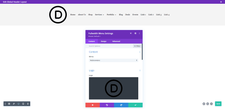
Divi’s Fullwidth Menu Module gives Divi users lots of control over its design. This includes the ability to make any logo completely responsive. One set of controls, the Logo Width and Logo Max Width, work great together to specify the logo size. With just a few adjustments, any Divi user can ensure their logo works great on any screen. In this post, we’ll see how to optimize Divi’s responsive logo size in Divi’s Fullwidth Menu Module.
Let’s get started.
Before we start, let’s take a look at my example and its settings. We can see that the logo is large for the header. This is a square logo. We’ll also see how to adjust the settings for other sizes and shapes. This gives us a starting point and we’ll see how to adjust it as we go. It will also show why we need to adjust it.
Here are my settings:
- Logo: 150×150
- Background Color: #f4f4f4
- Style: Left Aligned (I’ll also show Inline Centered Logo when it helps demonstrate the setting)
- Dropdown Menu Direction: Downwards
- Make Menu Links Fullwidth: No
- Menu Font: Arvo
- Text Color: Black
- Font Size: 16px
- Padding: 2vh Top and Bottom
Here’s the header when seen on a desktop.
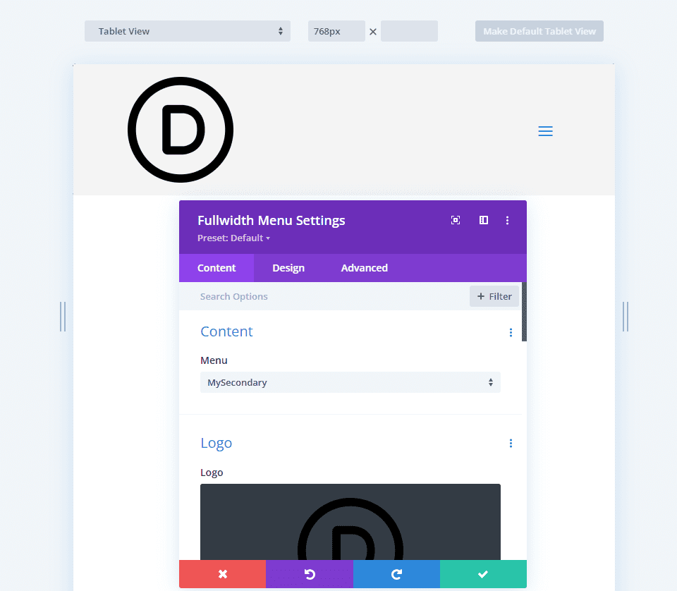
Here’s the header on a tablet. The size of the logo stands out even more.
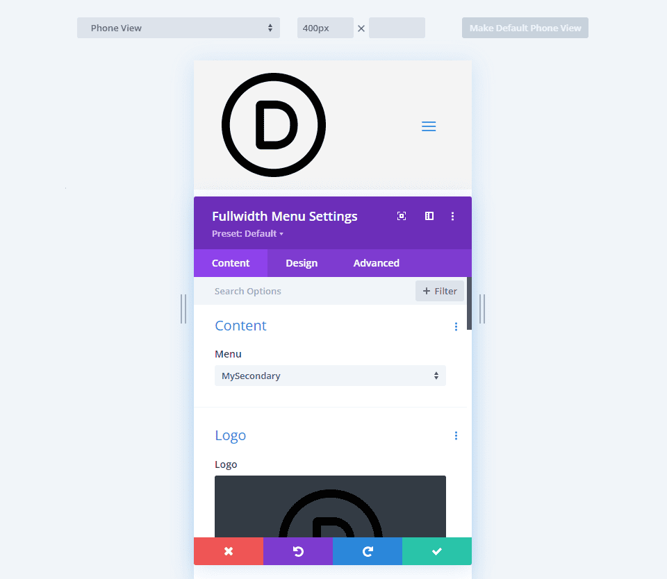
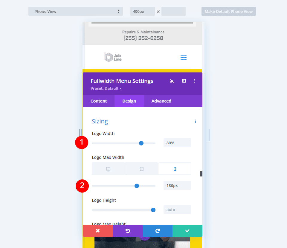
Finally, here’s the phone view. This one makes the header far too large.
These examples demonstrate well why a logo in the Fullwidth Menu Module needs to be responsive.
About Logo Size
The recommended logo size varies across the web. The most recommended size is usually between 250×100 and 250×150. The logos that we include in our Divi layouts are usually in the 160×50 or 225×100 range, but some are much different based on their shape.
I’m using a logo at 150×150, and I’ll show some examples with different size logos. You’ll need to play around with your settings based on your logo’s image size.
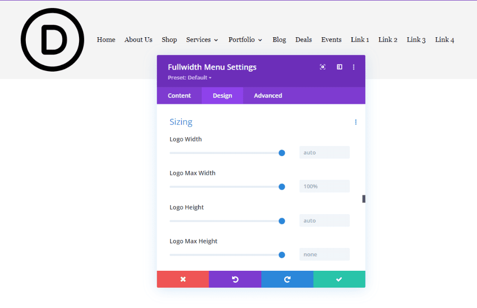
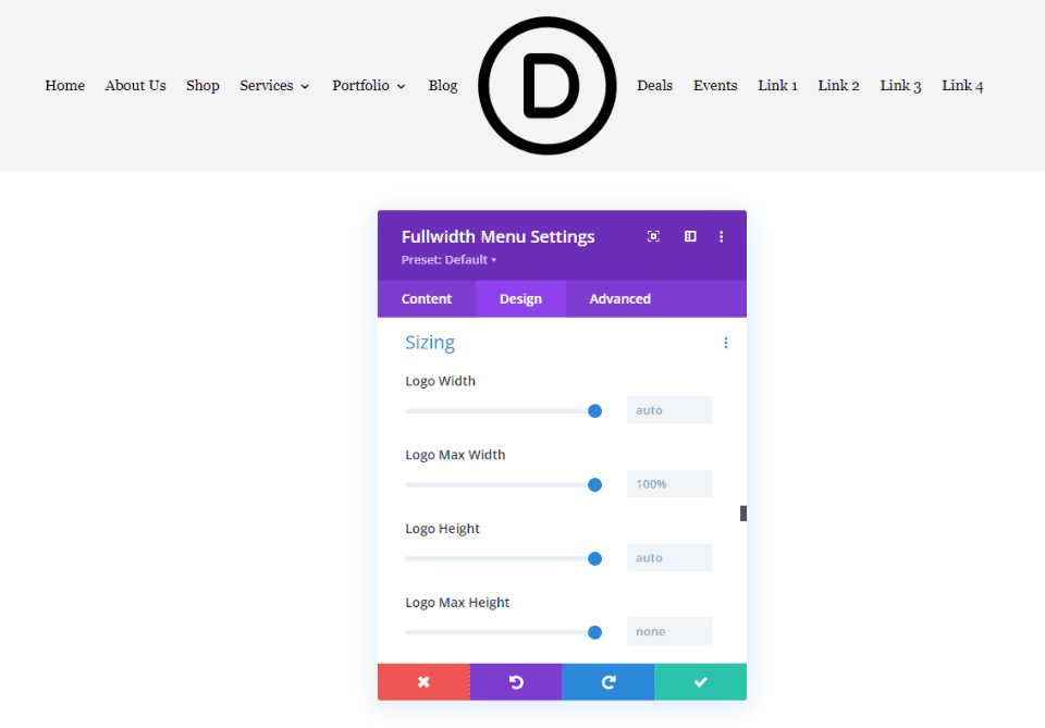
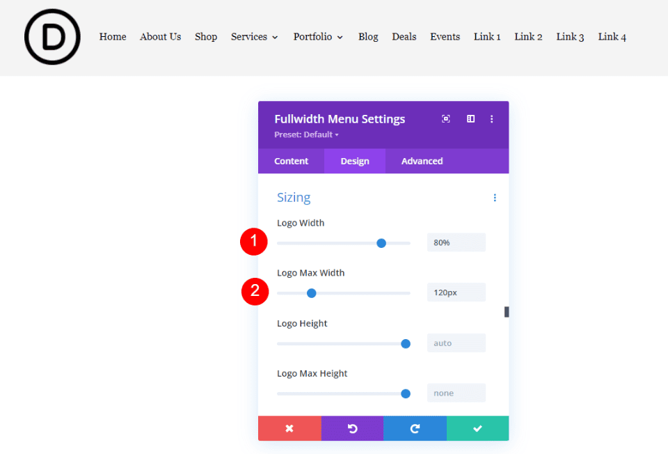
There are 10 settings under the Sizing section. Four of those settings target the logo.
The settings include:
- Logo Width – a percentage of the Max Width. The default is Auto.
- Logo Max Width – sets the maximum width in pixels that the Width cannot exceed. The default is 100%.
- Logo Height – a percentage of the Max Height. The default is Auto.
- Logo Max Height – sets the maximum height in pixels that the Height cannot exceed. The default is 100%.
The width settings work together, and the height settings work together, but the width and height should not be used together. These settings give us fine control over the width or height of the logo. When used with Desktop, Tablet, and Phone settings, we will always have a perfectly responsive logo regardless of the screen size of the user.
For this tutorial, we’ll focus on Logo Width and Logo Max Width. When using the width settings, Height should be set to Auto, and Max Height should be set to 100%.
Logo Width and Logo Max Width
The Logo Width setting sets the width of the logo as a percentage of the Max Width value. The Max Width value is usually set in pixels or vw. The height scales to match, keeping the logo’s shape as the size changes.
For example, if the Max Width is set to 50 pixels and the Width is set to 80%, the logo will display a width of 40px.
By setting the maximum number of pixels for the width, and then setting the logo’s width as a percentage of that maximum for each screen size, we can ensure that the logo is always perfectly responsive.
Width and Max Width Examples
Let’s see a couple of good and bad examples to demonstrate the logo’s responsiveness. This example shows both width settings at their default. I’ve selected Inline Centered Logo to show the width on both sides of the logo.
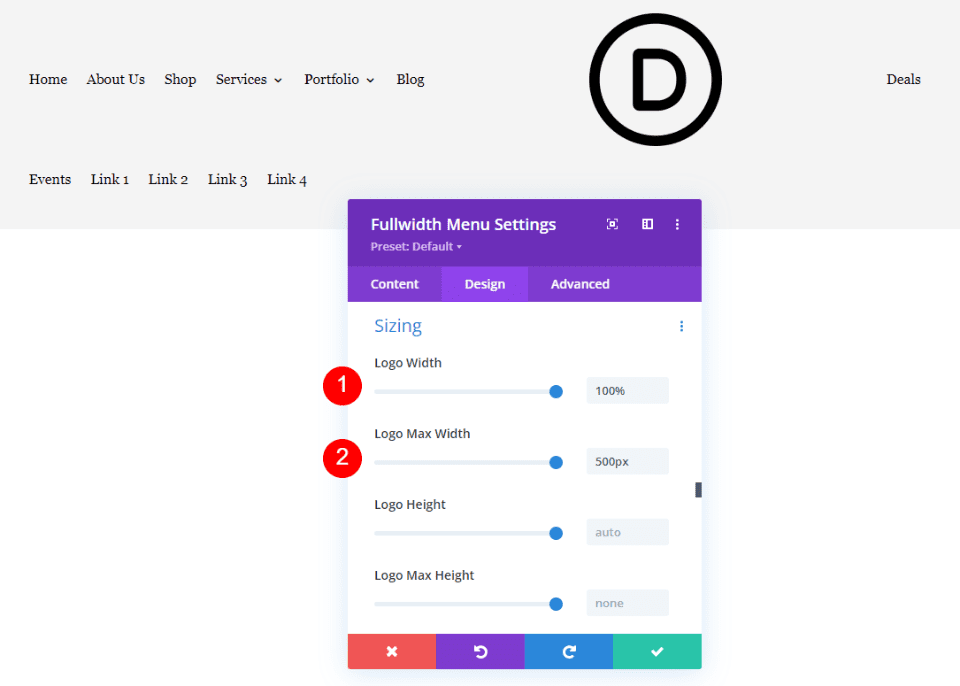
Bad Example
Now, let’s see a bad example. I’ve exaggerated the numbers to make it more obvious. If we increase the Max Width and set the Width to 100%, it pushes the menu links away from the logo. This would look even worse on tablets and phones.
- Logo Width: 100%
- Max Width: 500px
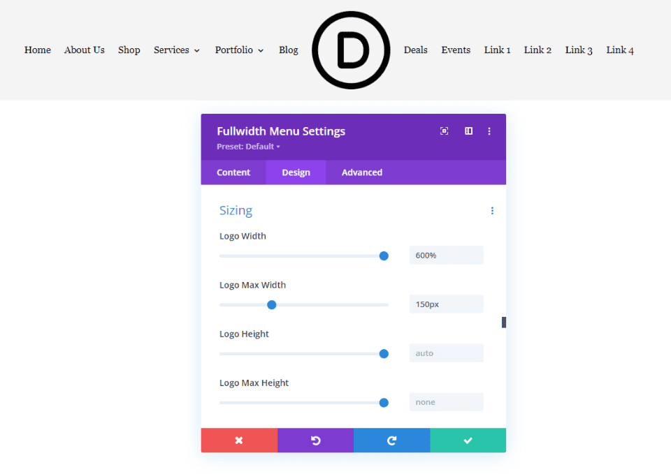
We can use the Max Width to limit the Width. In this example, I’ve set the Max Width to 150px and the Width to 600%. The Width cannot display higher than the Max Width, which is 150px. This helps us limit the possible width and helps us design the logo size for responsiveness.
- Logo Width: 600%
- Max Width: 150px
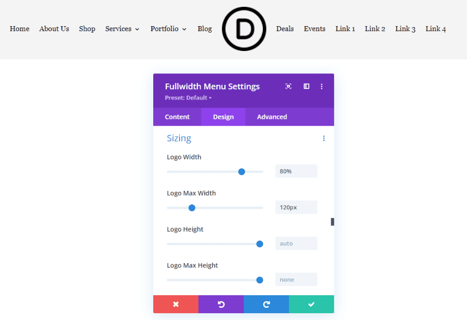
Good Example
Next, let’s see a good example. To start, I recommend leaving the Width at the default and adjusting the Max Width until you find the range in pixels that works well for your logo. I’ve set the Width to 80% of the Max Width, which is 120px. The logo looks a lot better in this header.
- Logo Width: 80%
- Max Width: 120px
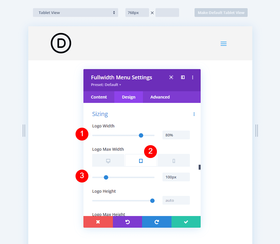
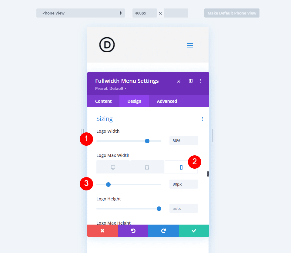
For the best responsive results, we’ll need to set the tablet and phone to different maximum pixel widths. Here’s the logo with Left Aligned for desktop, mobile, and phone. We’ll set 120 pixels for the desktop, 100 pixels for tablets, and 80 pixels for phones.
- Logo Width: 80%
- Max Width: 120px desktop, 100px tablet, 80px phone
Here’s the desktop version.
Here’s the table version. I’ve selected the Tablet option for Logo Max Width and set it to 100px. This looks much better than the default setting.
Finally, here’s the phone version with 80px. The logo is now perfectly responsive on all three screen options.
Responsive Logo Size Examples
Up to this point, we’ve seen a square logo. Now, let’s look at a few different types of logos to see how to use the Width and Max Width settings. I’ll modify a few free Divi headers to include a Fullwidth menu Module and add a logo.
You can these settings to ensure you have a responsive logo. Let’s look at an example of how you could use them on the front end of the website.
First Responsive Logo Example
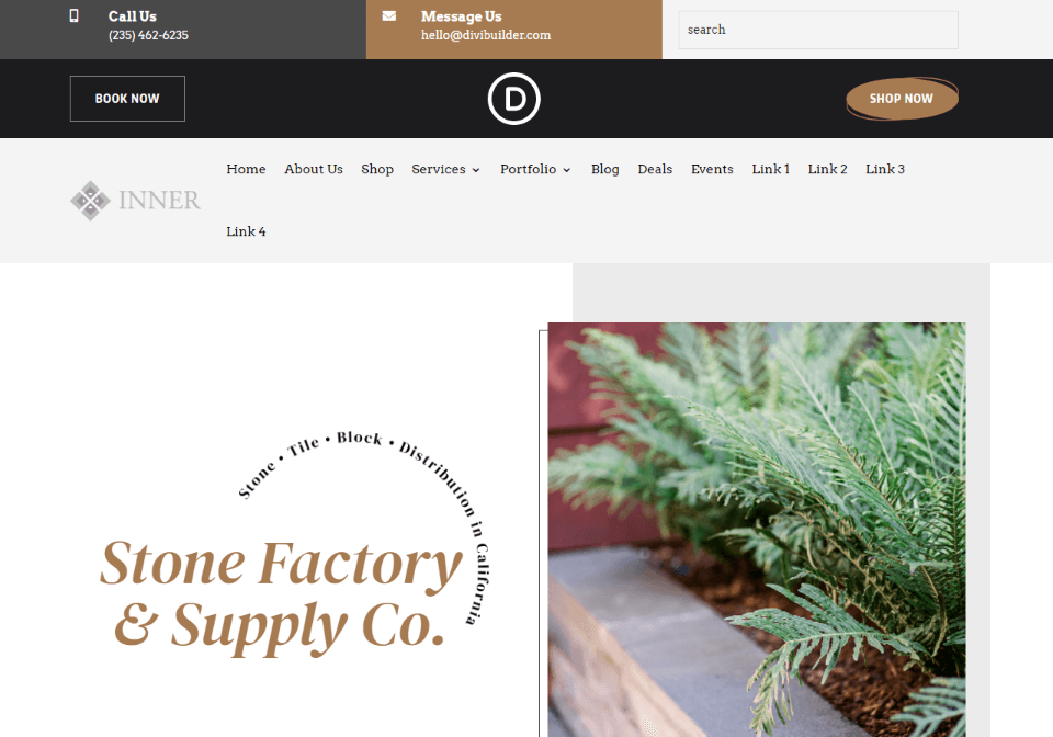
For this example, I’m using the landing page from the free Stone Factory Layout Pack that’s available within Divi. I’m using a modified version of the free Header and Footer Template.
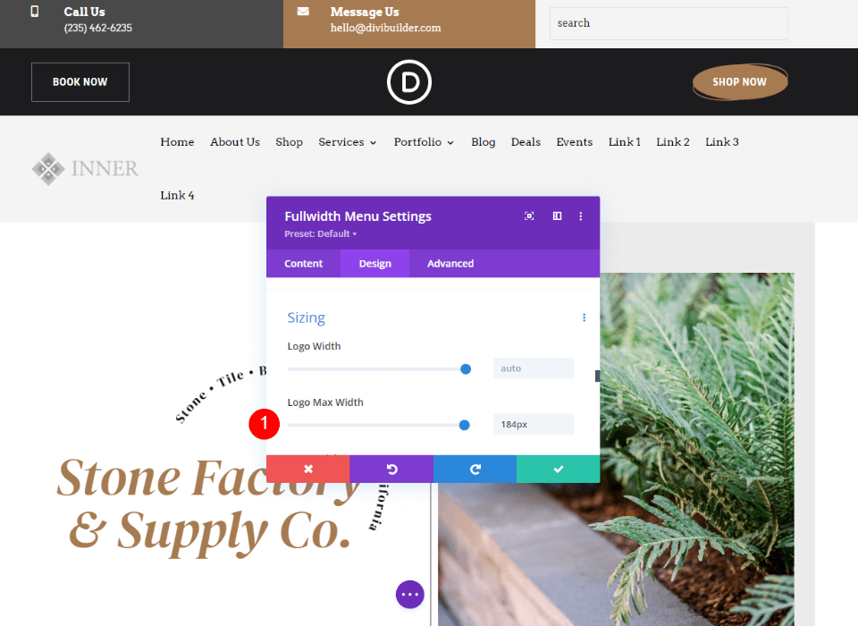
This is the Inner logo. It’s 161×50, making it a wide and short logo. Here are my current settings:
- Logo: 161×50
- Background Color: #f4f4f4
- Style: Left Aligned
- Dropdown Menu Direction: Downwards
- Make Menu Links Fullwidth: No
- Menu Font: Arvo
- Text Color: Black
- Font Size: 16px
The default settings are too wide, making the menu links wrap to the next line.
Optimize the First Responsive Logo Size
Now, let’s optimize the logo using the size options we’ve discussed. I’ll show the settings as we go. The Max Width of 184px causes the menu to wrap, but 183 is fine.
- Logo Width: Auto
- Max Width: 184px
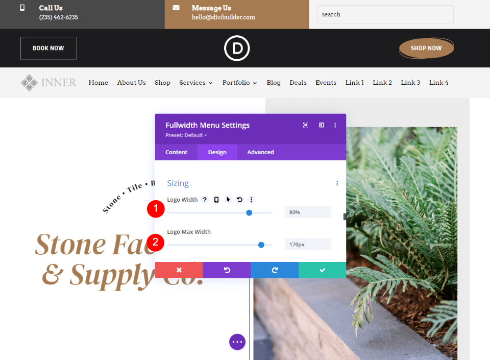
A Max Width between 180 and 145px looks great for desktops, so I’ll use this as a tentative range and set the upper limit to 170px. I’ve set the Width to 80% so it always looks great at this size.
- Logo Width: 80%
- Max Width: 170px
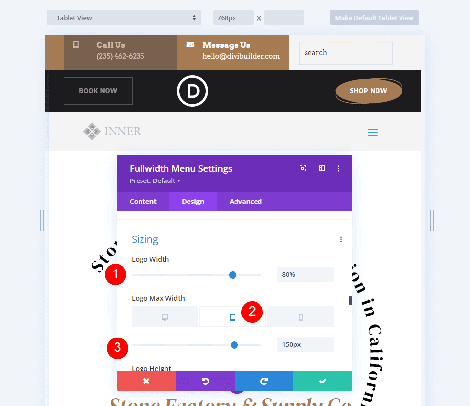
For the tablet, I used the Max Width of 170px as my starting point and reduced it to 150px. I’ve left the Width to 80%.
- Logo Width: 80%
- Max Width: 150px
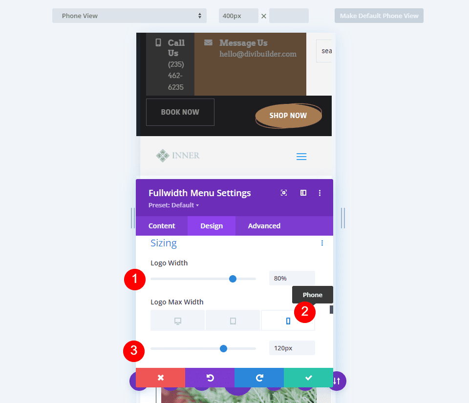
For the phone version, I reduced the Max Width to 120px. As before. I’ve left the Logo Width to 80%.
- Logo Width: 80%
- Max Width:120px
Second Responsive Logo Example
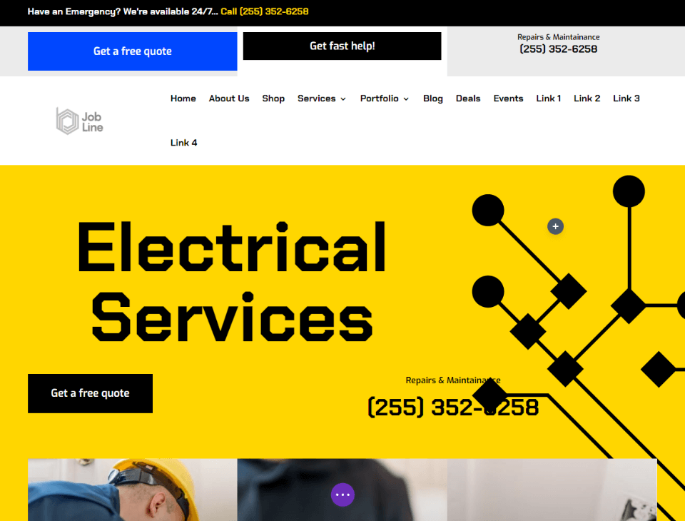
For this one, I’m using the free Electrical Services Layout Pack that’s available within Divi. I’m using a modified version of the free Header and Footer Template. This uses the Job Line logo. It’s 226×100, making it a wide and short logo that’s larger than our last example. Here are my current settings for the Fullwidth Menu Module:
- Logo: 226×100
- Background Color: White
- Style: Left Aligned
- Dropdown Menu Direction: Downwards
- Make Menu Links Fullwidth: No
- Menu Font: Chakra Petch
- Style: Bold
- Text Color: Black
- Font Size: 16px
Like the last example, the default settings are too wide, making the menu links wrap to the next line.
Optimize the Second Responsive Logo Size
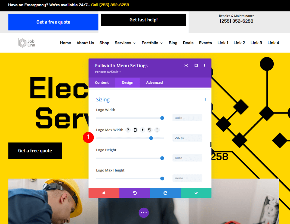
Now, let’s optimize our second logo using the size options we’ve discussed. I’ll show the settings as we go. This logo looks great with a Max Width between 190px and 207px.
- Logo Width: Auto
- Max Width: 207px
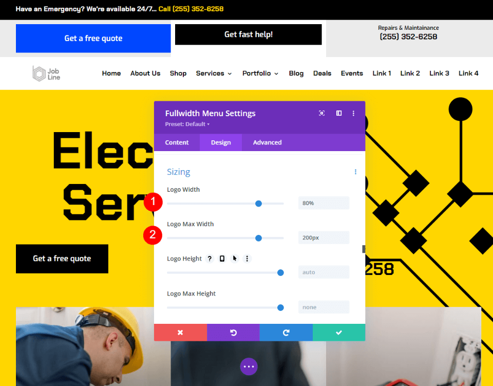
I’ll use 200px as the Max Width. I’ve set the Width to 80% so it always looks great at this size.
- Logo Width: 80%
- Max Width: 200px
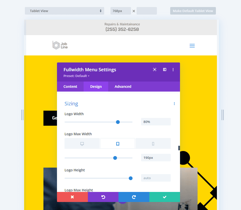
For the tablet, I used the Max Width of 200px as my starting point and reduced it to 190px. I’ve left the Width to 80%.
- Logo Width: 80%
- Max Width: 190px
For the phone version, I reduced the Max Width to 180px. As before, I’ve left the Logo Width at 80%.
- Logo Width: 80%
- Max Width: 180px
Ending Thoughts
That’s our look at how to optimize Divi’s responsive logo size in the Fullwidth Menu Module. The Width and Max width settings work great together to help you find the optimal size and limit the logo to that size for any screen. It does take a little bit of tweaking to get the adjustments you want, but the adjustments are simple. Just a few adjustments make your Divi logo perfectly responsive for any screen.
We want to hear from you. Have you optimized your logo size in Divi’s Fullwidth Menu Module? Let us know in the comments.


Where in this work did you explain how to call up the sizing menu?
Lol, out here hustling hard for those backlinks huh 😀 It’s a great article, but we also think it would be really cool if Divi could come out with an auto-resizing capability. We’ve built some code that does this for Squarespace websites and will look into it if we get a wordpress client who wants it.
If you use a company name, obvious alias, or keyword stuffed phrase your comment will be deleted and marked as spam.
Not my words.
Really an interesting piece of information it was really helpful, I’m new to optimization and this really helped me gain information which was really needed
I am confused here. Normally you set the Width as a %, VW of VH and the Max Width as a fixed pixel value to overrule the width if that gets larger.
It doesn’t make sense that the Logo Width is a percentage of the Max Width. If that were the case then it’s much easier so simply set the Width to 100% and the Max With to the desired value. That way you (and the browser) don’t need to do calculate. For example, if I want a width of 80px then according to your explanation this would be exactly the same:
– Width = 80% and Max Width = 100px » I have to calculate 80% of 100px = 80px
– Width = 100% and Max Width = 80px » no calculation needed
Thank You Jean-Pierre for your comment. Reply by Randy is highly appreciated!
My understanding was that width was relative to the containing element (ie column/row), as opposed to the max-width setting — isn’t this how width works on all other modules? Is it different with the logo width?
I thought the same.
And in my case, I only use 80% width and it seems to work. On mobile I also change the full logo image to the square logo image, still with only setting 80% width.