Overlapping is a useful technique that is often used to create unique web designs and layouts. And it is easy to overlap content with Divi. The basic concept involves adding custom margins and spacing to your modules, rows and sections in a way that positions them to overlap each other. You may have already noticed this overlapping technique on some of our Divi Layouts.
In this tutorial, I’m going to show you the basics of using custom margins and spacing to overlap modules with modules, modules with rows, and rows with rows. After that, I’m going to show you how to create a unique overlapping contact form layout by overlapping two rows.
Let’s get started.
- 1 Sneak Peek
- 2 Method 1: Overlapping Modules with Modules
- 3 Method 2: Overlapping Modules with Rows
- 4 Method 3: Overlapping Rows with Rows
- 5 Creating a Unique Divi Contact Form Layout with Overlapping Rows
- 6 Do More!
- 7 How to Change Overlapping Order
- 8 Making Overlapping Layouts Responsive
- 9 Download These Overlapping Examples
- 10 Download For Free
- 11 Final Thoughts
Sneak Peek
Here is a unique contact form layout we will create together using the overlapping techniques.
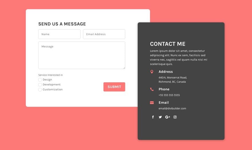
Divi’s contact form can be styled in many creative ways using the Divi Builder. One unique way to make your contact form standout is to overlap it with other content. You can overlap content with Divi easily. But today I’m going to show you something you may have never seen done before in Divi.
In this Tutorial, I’m going to show you how to create a unique contact form layout using these overlapping methods
Method 1: Overlapping Modules with Modules
Overlapping a module with another module is extremely simple to do. Here is an example of how to set this up.
Create a regular section with a one-half one-half 2 column structure. And then add a module to each of the columns.

For the module in the left column, update the following:
Custom Margin (desktop): -20% Right, 20% Left
Custom Margin (Tablet): 0px Right, 0px Left (setting the tablet margins will clean things up on mobile)
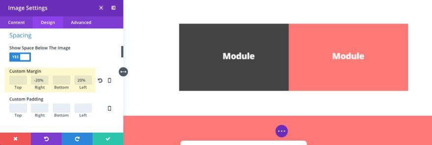
For the module in the right column, update the following:
Custom Margin (desktop): 20% Top, 20% Right, -20% left
Custom Margin (Tablet): 0px Top, 0px Right, 0px left
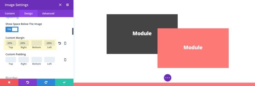
That’s it.
Depending on the module you are using, you may have to add some custom background colors, padding, box radius, etc. to get it looking right. You can also add a box shadow to create depth when overlapping modules.
Method 2: Overlapping Modules with Rows
You may be asking why you would need to overlap a row with a module. The reason is that you may want to move a group of modules as a single piece of content. This is a common occurrence when building sites with Divi. For example, the contact information in the screenshot below is made up of a text module, 3 blurb modules, and a social media follow module stacked on top of each other to create one single block of content.
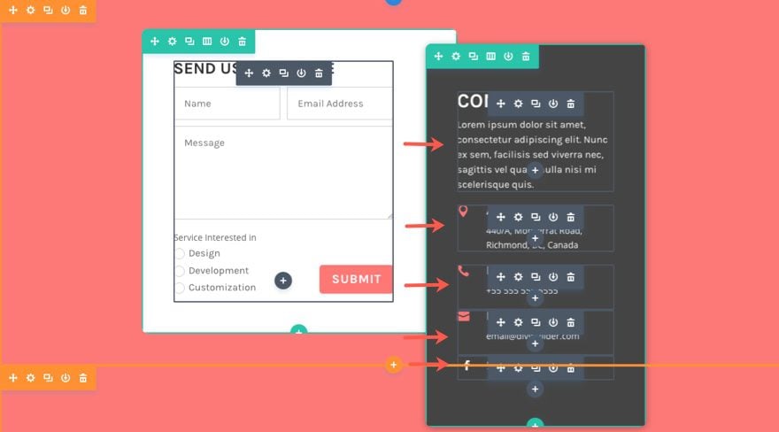
You could create custom margins and spacing for each of the modules to overlap another module, but you would have limitations. Adding a border radius to your group of modules would be more difficult. It wouldn’t be possible to add box shadow to the group of modules as a whole, since you would be forced to set a box shadow for each module. Therefore the easiest way to move a group of modules is to keep them in a row and move the row. That way you can easily add your border styles and box shadows to the row and add as many modules inside your row as you like.
The best I have found to overlap a module with a row is to use a specialty section. A specialty section is perfectly set up for this because all of the specialty section layouts have a designated sidebar area/column (for modules) on one side and a designated area/column on the other for rows. Once you have your module added to the sidebar and your row content in place, you can use custom margins and spacing to shift either the row or the module to overlap the other.
Here is an example of how to set this up.
Create a specialty section with a one-half one-half column structure and with the rows on the right side.

Then insert a one column row in the right column.

Add a module (or modules) to the row.
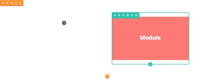
Then add a module to the left column of your specialty section.
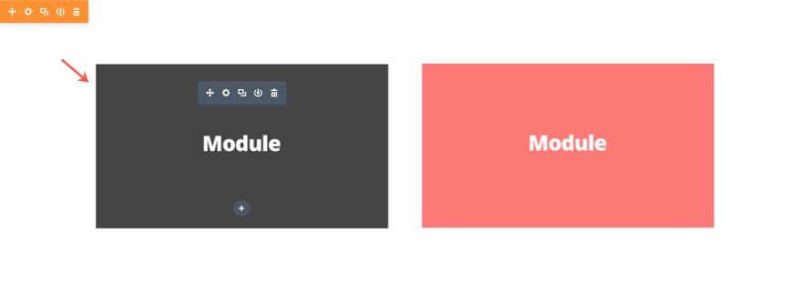
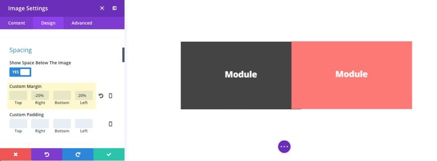
Update the settings of the module in the left column as follows:
Custom Margin (desktop): -20% Right, 20% left
Custom Margin (Tablet): 0px Right, 0px Left
Update the settings of the row in the right column as follows:
Custom Margin (desktop): 20% Top, 20% Right, -20% left
Custom Margin (Tablet): 0px Top, 0px Right, 0px left
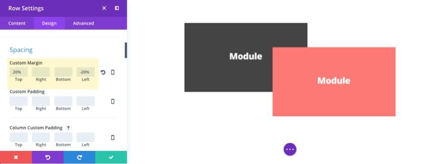
That’s it.
Now all you have to do is customize the row settings to add a background color, border radius, padding, box shadow, etc. And you can add more than one module inside your customized row.
Method 3: Overlapping Rows with Rows
To overlap a row with another row is a bit more involved. We need to figure out a way to get two rows side by side. I’ve tried a number of ways to do this in Divi and the best way I have found to do this is by creating two specialty sections. Since each specialty section has one column of the section designated to rows, you can create a section with a row on the left column and then another section below with a row on the right column. After that, all you need to do is move the row in the bottom section to overlap the row in the top section.
Technically you can do this with two regular sections as well, but it is more difficult to get the placement of the rows to render correctly on different browser sizes (at least in my experience). The two column setup of the specialty section helps to do this without having to bother with Custom CSS.
Here is how to do it.
Create a specialty section with a one-half one-half column structure and with the rows on the left side:
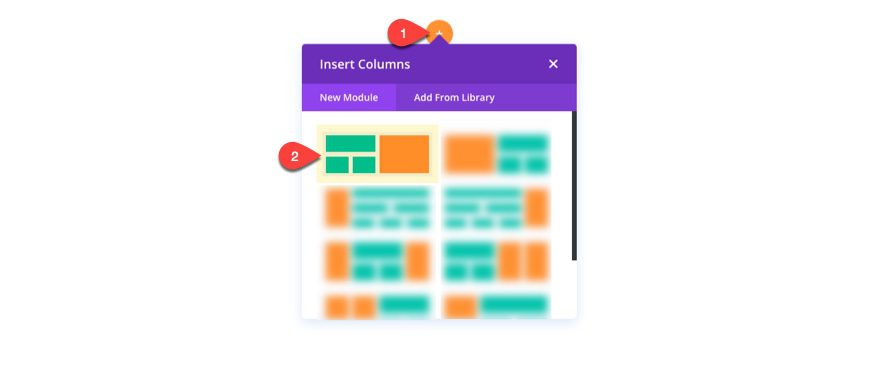
Then insert a one column row in the left column.

Add a module (or modules) to the row.

Then create another Specialty section below the current one and give it a one-half one-half column structure and with the rows on the right side. Insert a one-column row in the right column.
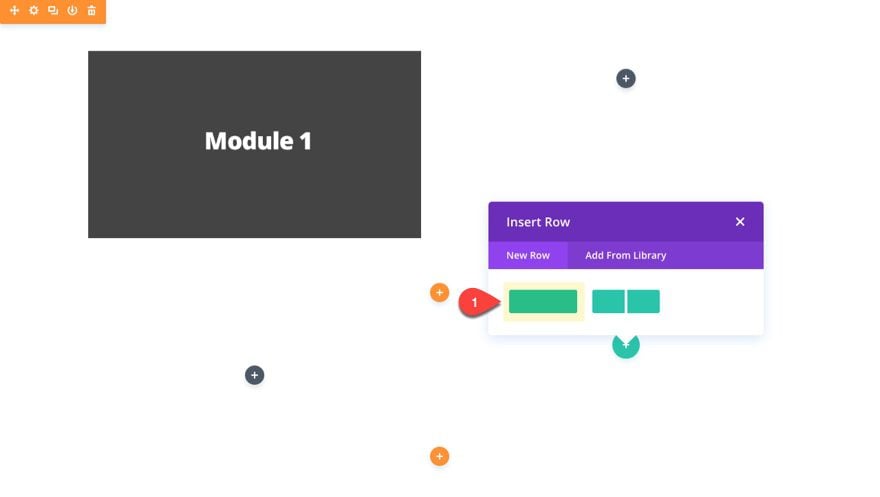
Then add a module (or modules) to the row.
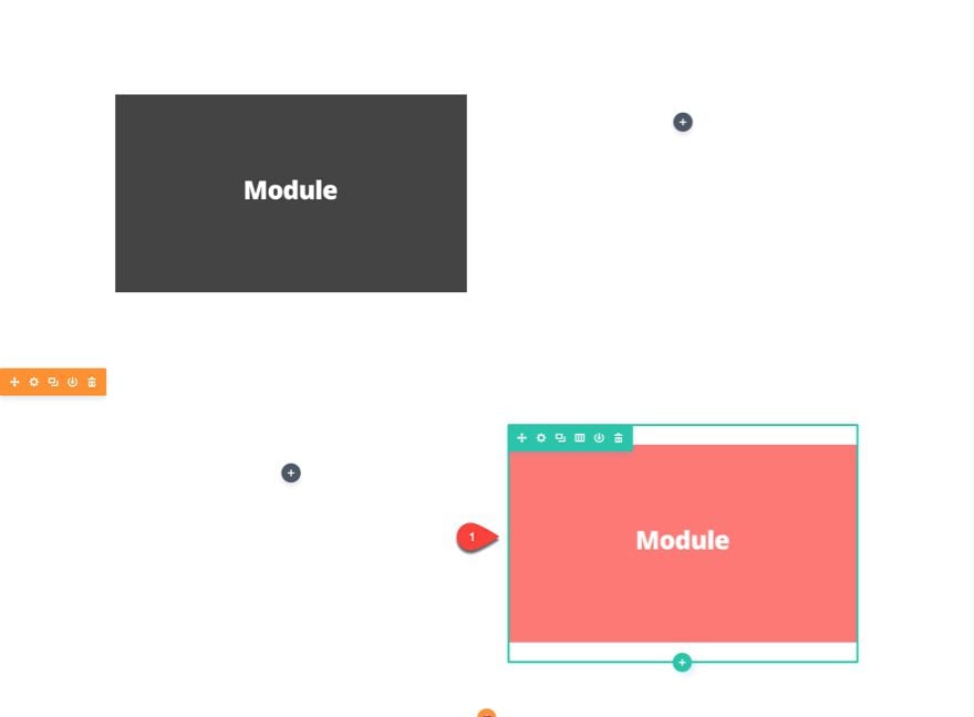
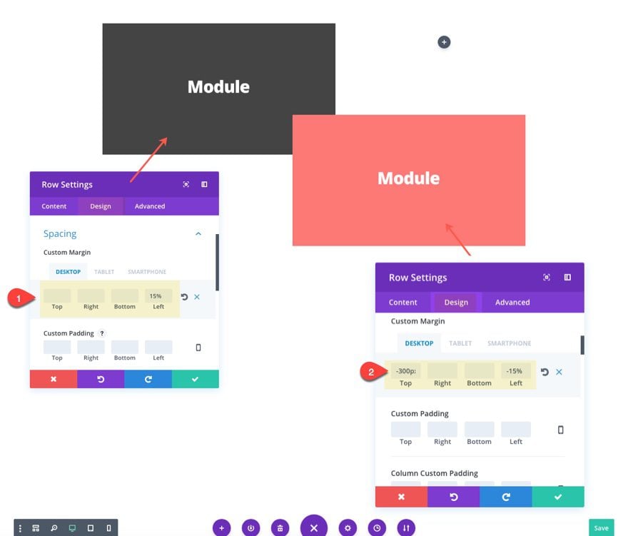
Next we need to add custom margins to each of our rows in order to make them overlap. First, add the following custom margins to the row in the left column of the first section:
Custom Margin (Desktop): 15% left
Custom Margin (Tablet): 0px left
Save settings and add the following custom margins to the row in the right column of the second section:
Custom Margin (Desktop): -300px Top, -15% Left (you may need to adjust these values depending on the size of your rows/modules. You may also need to add a negative value to your bottom margin if too much extra space is below the row)
Custom Margin (Tablet): 0px Top, 0px Bottom, 0px left
Creating a Unique Divi Contact Form Layout with Overlapping Rows
Now that you understand the power of overlapping, let’s put these techniques to use by building a unique contact form layout. For this layout I’m going to overlap two rows using two specialty sections. That way you can easily add additional modules to this layout with ease.
For the sake of time, I’m going to use the layout we created under “Overlapping Rows with Rows”.
Once your layout is in place, go to your section settings of the top specialty section and update the following:
Under the content tab
Background Color: #fd7978
Under the design tab
Use Custom Width: YES
Custom Width: 1350px
Use Custom Gutter Width: YES
Gutter Width: 1
This will give us some breathing for our content and rows.
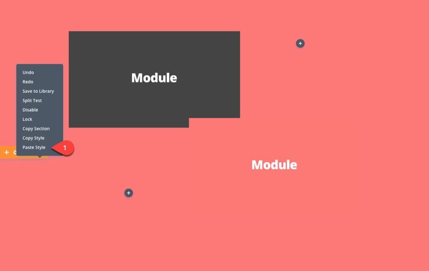
Now copy the style of the top section and paste it to the section below as well.
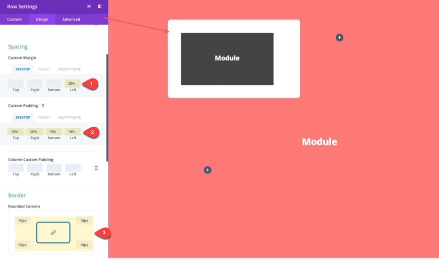
For the row in the left column of the top section, update the row settings as follows:
Under the content Tab
Background Color: #ffffff
Under the design tab
Custom Margin (Desktop): 20% left
Custom Margin (Tablet): 0px left
Custom Padding (Desktop): 10% Top, 20% Right, 10% Top, 10% left
Custom Padding (Tablet): 10% Top, 10% Right, 10% Top, 10% left
Border Rounded Corners: 10px
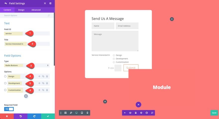
Next add a contact form to the row and update the following settings:
First Add a new field to your form with the following:
Field ID: service
Title: Service Interested In
Type: Radio Buttons
Option 1: Design
Option 2: Development
Option 3: customization
Under the design tab of your new field…
Make Fullwidth: NO
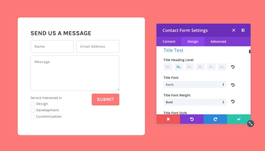
Save field options and go back to the content tab of the contact form settings and update the following:
Under the content tab…
Title: Send Us A Message
Display Captcha: NO
Under the Design tab…
Title Heading Level h2
Title Font: Karla
Title Font Weight: bold
Title Font Style: Capitalize (TT)
Form Field Background Color: #ffffff
Form Field Font: Karla
Form Field Text Size: 16px
Use Custom Styles for Button: YES
Button Text Color: #ffffff
Button Background Color: #ff7875
Button Border Color: #ff7875
Button Border Radius: 5px
Button Font: Karla
Font Weight: bold
Font Style: TT
Inputs Rounded Corners: 5px
Inputs Border Width: 1px
Inputs Border Color: #cccccc
Under the Advanced Tab…
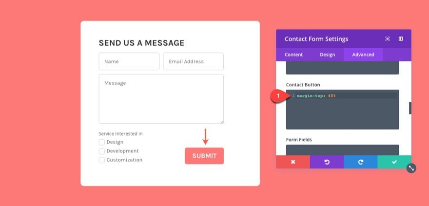
Add the following Custom CSS to the Contact Button Box:
margin-top: 45%
This will square off your form by dropping the button down a bit.
Save Settings
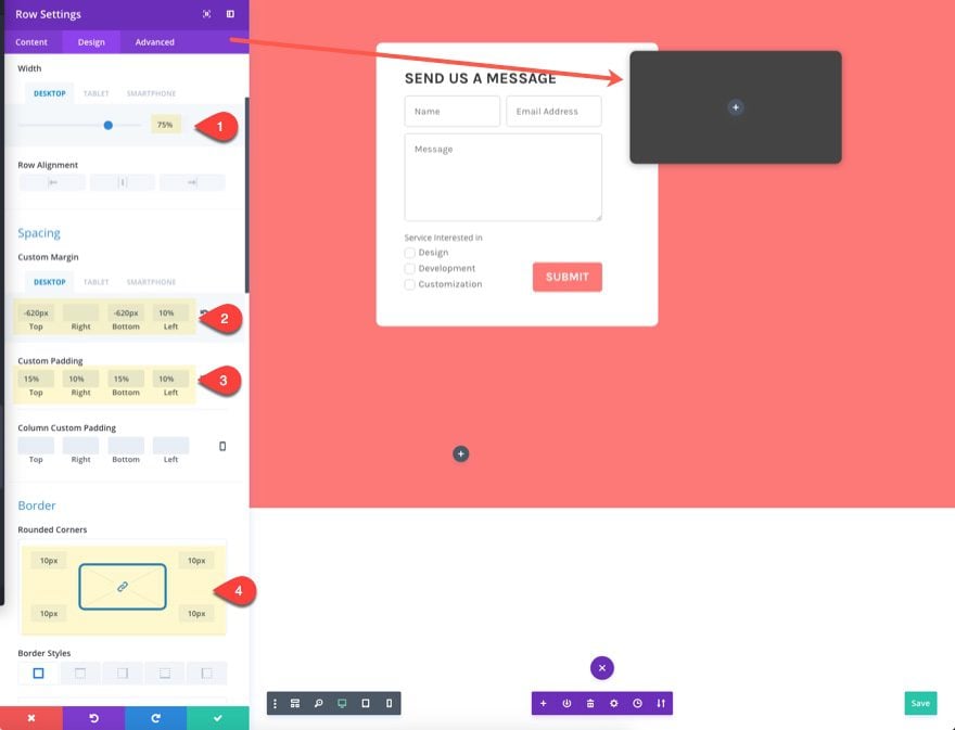
Now you are ready to add Modules to and edit the row in the right column of the second section. First let’s update the row settings as follows:
Background Color: #444444
Under the Design tab…
Width (desktop): 70%
Width (tablet): 100%
Custom Margin (desktop): -620px Top, -620px Bottom, 10% left
Custom Margin (tablet): 0px Top, 0px Bottom, 0px left
Custom Padding: 15% Top, 10% Right, 15% Bottom, 10% left
Rounded Corners: 10px
Box Shadow: [first selection]
Save row Settings
Next add a text module to the row and update the following:
Content:
<h2>Contact Me</h2>
Lorem ipsum dolor sit amet, consectetur adipiscing elit. Nunc ex sem, facilisis sed viverra nec, sagittis vel quam nulla nisi mi scelerisque quis.
Text Color: light
Text Font: Karla
Text Text Size: 16px
Text Line Height: 1.5em
Heading Text H2 tab
Heading 2 Font: Karla
Heading 2 Font Weight: Bold
Heading 2 Text Size: 32px
Heading 2 Letter Spacing: 3px
Heading 2 Line Height: 1.1em
Custom Margin: 20px bottom
Add Blurb Modules to display your Contact Info
Add a blurb module under the text module. Update the blurb settings by giving it the Title “Address” and then add the address to the content box. Then select to use the navigation icon.
Update the design tab settings as follows:
Icon Color: #ff7875
Image/Icon Placement: Left
Text Color: Light
Use Icon Font Size: YES
Icon Font Size: 20px
Title Heading Level: H$
Title Font: Karla
Title Font Weight: Bold
Title Text Size: 20px
Body Font: Karla
Body Text Size: 16px
Body Line Height: 1.5em
Custom Margin: 20px Bottom
Now duplicate this blurb module twice and update the content (title, content, and icon) of each module to include information for a Phone number in one blurb and an email address in the other.
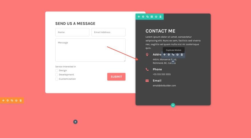
Next add a Social Media Follow module under the last blurb in the row. Add as many social networks as you like making sure that you delete the background color for each one so that only the white icon shows.
![]()
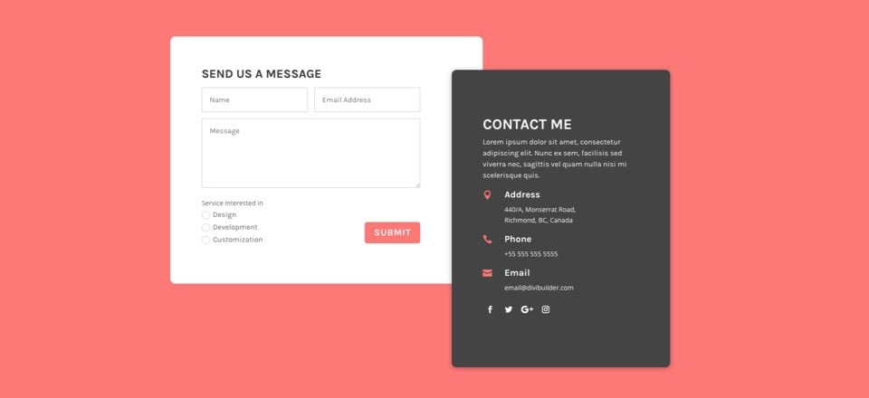
That’s it. Let’s check out the result.

Do More!
The layout we just created can be used for any content you want. Because these are overlapping rows, you can use the Divi Builder to add any modules to each of the rows and update the settings for each module. You may need to tweak the spacing some but that shouldn’t be too difficult. Pretty powerful stuff.
How to Change Overlapping Order
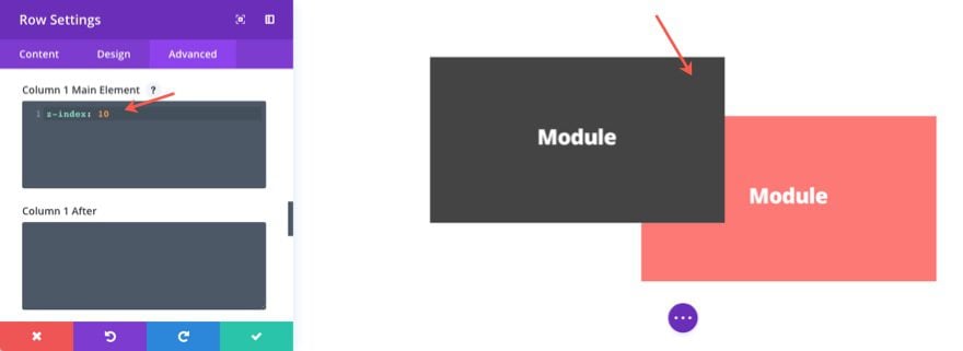
By default, the first element on the page will always sit behind the element that follows it if the two were to overlap. That is why the content on the right will always overlap the content on the left.
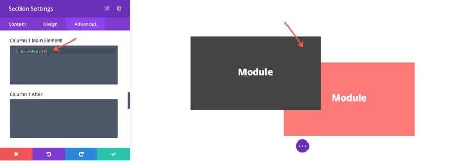
You can change this easily with one line of custom CSS. Go to the section (or row) that holds your first column (the one on the left) and, under the advanced tab, enter the following CSS into the box labeled “Column 1 Main Element”:
z-index: 10
The reason this works is because all columns have z-index: 9 as the default. Increasing the number to 10 will stack the element on top of the other. This will only work at the column level.
If you are overlapping two modules within a two column row, you will need to add this custom CSS to column 1 Main Element under the Advanced tab in the Row settings.
If you are using a specialty section to overlap a module and a row, you will need to add this custom CSS to column 1 Main Element under the Advanced tab in the section settings.
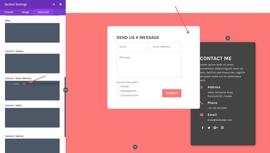
If you are using two specialty sections to overlap two rows, you will only add it to the top section.
For the contact form example we created, notice how the contact form row overlaps the right row when I add “z-index: 10” to the top section settings advanced tab under column 1 Main Element:
Making Overlapping Layouts Responsive
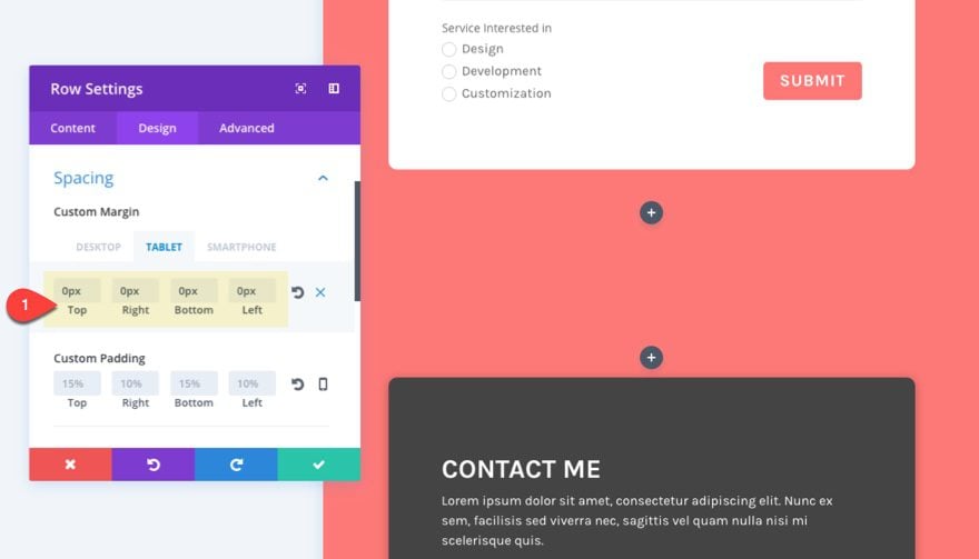
You need to make sure that you use overlapping methods that render well on all devices and browser sizes. To do this, use a combination of percentage values and pixel values when setting your custom margins. In general, I would use percentage values for left and right margins (so that they adjust nicely to the width of the browser) and a specific pixel value for top and bottom margins.
You should also make sure to set the custom margins for each specific device so that margins will render nicely on tablet and smartphones. A good rule of thumb is to change any custom margins you have set for desktop to 0px for Tablet (Smartphone devices will inherit the settings for Tablet automatically).
Download These Overlapping Examples
If you would like to download these overlapping examples to help kick off future designs, click the button below. To gain access to the download you will need to subscribe to our newsletter by using the form below. As a new subscriber you will receive even more Divi goodness and a free Divi Layout pack every Monday! If you’re already on the list, simply enter your email address below and click download. You will not be “resubscribed” or receive extra emails.
The download file is called “Overlapping-Content-Examples.zip”. Once you download and unzip the file, you will have two json files. The first contains the three overlapping templates from this post. The second contains the Overlapping Contact Form layout from this post.
Final Thoughts
You can build creative and unique layouts using these overlapping methods with the Divi Builder. These spacing combinations can be a real eye opener if you are just starting out with Divi. And of course, you aren’t limited to “overlapping”. You can use these techniques to place elements any way you like on a web page.
So, go for it!
I look forward to hearing from you in the comments.




Thanks Jason. Overlapping with the command “z-index: 10” works like a charm. Very easy solution.
This looks great on desktop, but this kind of negative margin work and overlapping typically creates a nightmare for mobile. Just FYI for anyone wanting to try it.
Thanks, beautiful 🙂
Can you provide a demo link to this? (My apologies if there was one that I missed)
Padding and margins defined in percentages don’t work in FireFox. I’d like to see how you are getting around this.
Thanks,
jules
Jules,
Sorry no demo link, but I do have a download available at the end of the article. Also, it seems to me that Firefox does support percentage values.
https://developer.mozilla.org/en-US/docs/Web/CSS/margin
Am I not understanding correctly? It renders correctly on firefox for me.
Thanks
Hi Jason
Thanks for the link and info. An example of why I’m confused is the free CrossFit layout, Sara Jade, services page.
http://montereydev.com/layouts/montereypremier/sarajade/services/
The percentage padding is not respected. But if you apply display:table to the column padding % works. I guess I’m not clear on when and why it works and when and why it doesn’t. Obviously, it’s associated with the display property. I’ve seen a number of Divi free layouts where the padding is not working in FireFox.
Appreciate your time and insights.
jules
I see what you mean, Jules.
It looks like this has to do with how firefox handles display:flex which is what gets applied to your row whenever you select “equalize column heights” in Divi. So whenever you want row columns to equalize/flex, you should set a pixel value (not a percentage value) for your column padding/margins so that it renders correctly on firefox as well.
However, you should be able to set a percentage value margin for the modules within the column that should give you a similar effect.
Hope that makes sense.
Perfect timing! I was just looking for a tutorial like this! 🙂
the images don’t load for me when i import the .json layout? just me?!
Sorry about that. I will see if I can get that resolved. However, the images aren’t that important to the layout. It is simply filler. Add any image you want to the image modules to see the result. Should still work find.
Thanks
the urls are like http://diviusecase.wpengine.com/wp-content/uploads/2018/02/module-red.jpg which have 401 Authorization Required
Thanks Jason, That’s quite informative and beautiful.
Thank you! I really appreciate that you made this available for download. That is extremely helpful with these kinds of blog posts.
Hi Jason,
This is a great article and really helped to clarify a few points for me. I especially liked the tip on how to change the overlapping order!
I would love to see an article on the best practices and tips/techniques for adjusting spacing settings as I often find these a fiddle. Whilst I understand them all theoretically, in practice these adjustments tend to be a bit of a hit and miss practice for me and I go back and adjust for mobile when I have it all right, but the couple of tips you mentioned (eg. % v’s pixels and any others) would be great to step through in an article. For example, I noticed that in each instance you changed the right margin you also created the opposite in the left (and vice versa) .. I’ve never done this but instead just tend to adjust one side or the other. Curious as to why you did this and what it’s actually doing.
Anyway, not sure if there would be enough meat in that topic to create a whole article, but it might be useful if possible?
Thanks 🙂
Excellent suggestion, Julia. I’ll see what I can do.
Great design, thanks 🙂
????
Hi Jason,
It’s great. Interesting and useful post on the module overlapping techniques. Thanks there!
Thanks Jason ,that is cool.