Welcome to the last part of this 2-part series on how to recreate our color filters, effects, and blend mode examples with Divi. You can check out our filter demo page for a look at these examples to get an idea of what we will be creating together.
In the last tutorial, I recreated sections #1, #2 and #3 of the filters demo page. I highlighted how to use Luminosity, Multiply, and Overlay blend modes combined with a number of filter and effects to create some inspiring examples. I’m excited to jump right end and finish where we left off.
Today, I’m going to show you how to recreate sections #4 and #5 of the demo as well as highlight the different filters, effects and blend modes (like Inclusion and Screen) used throughout those sections. I’ll even review how to use filters and effects for the map and video modules.
Let’s get started.
Sneak Peak
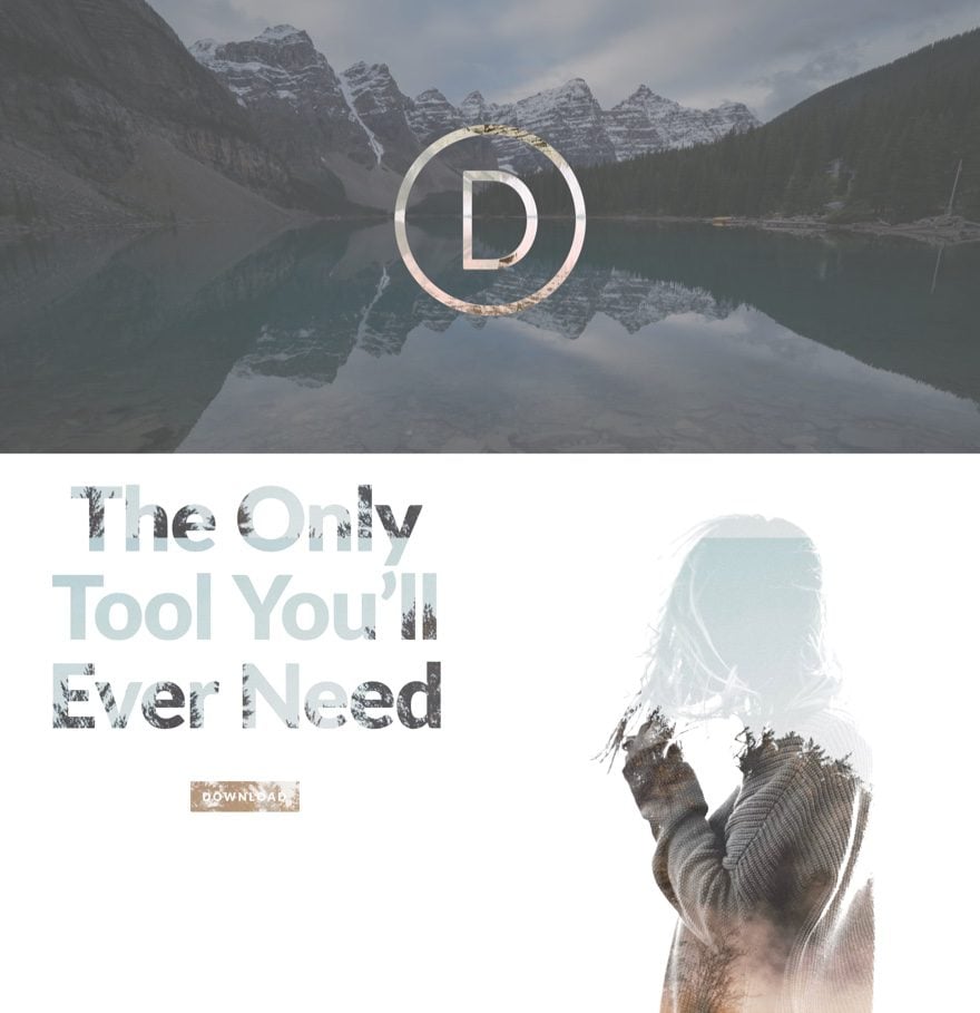
Here are the two sections we will be creating today.
How to Recreate The Color Filters, Effects & Blend Mode Examples with Divi (Part 2)
Subscribe To Our Youtube Channel
Recreating Section #4
Blend Mode Used: Exclusion
Filters and Effects Used: Hue, Saturation, Invert
This section uses the Exclusion blend mode combined with filters and effects in order to create a consistent gray color for the background image that doesn’t sacrifice too much saturation of color. This is a great alternative for using a overlay background whenever you want to maintain the details of a background image. The Exclusion blend on the logo is definitely a highlight in the way that it shows a lighter version of the background colors. Here is how you build it.
Add a Regular Section
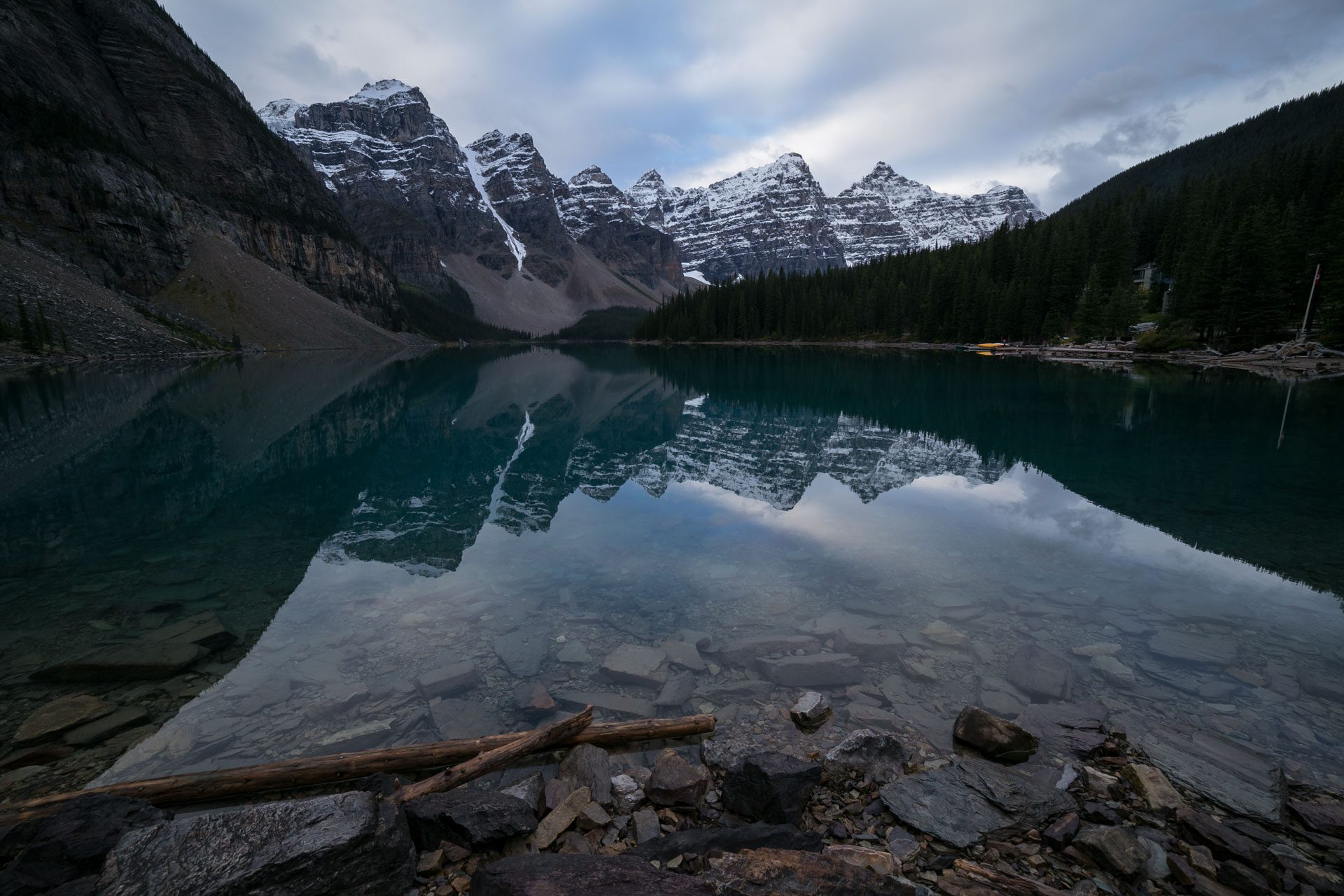
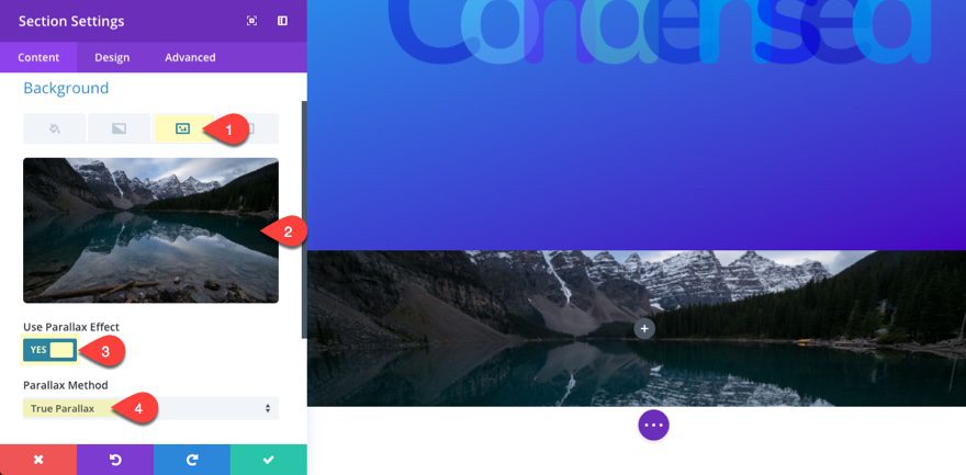
First Add a new regular section with a one column row. Before we add our first module, jump into the section settings and under the content tab add a background image. Here is the one I am using…
Also, select Use Parallax Effect to “YES” and use the True Parallax Method.
Under the Design Tab…
Custom Padding: 0px Top, 0px Right, 0px Bottom, 0px Left
Save Settings
Edit the Row
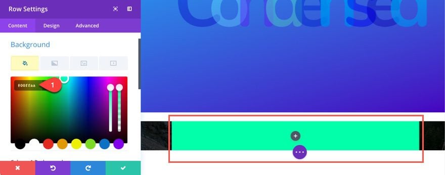
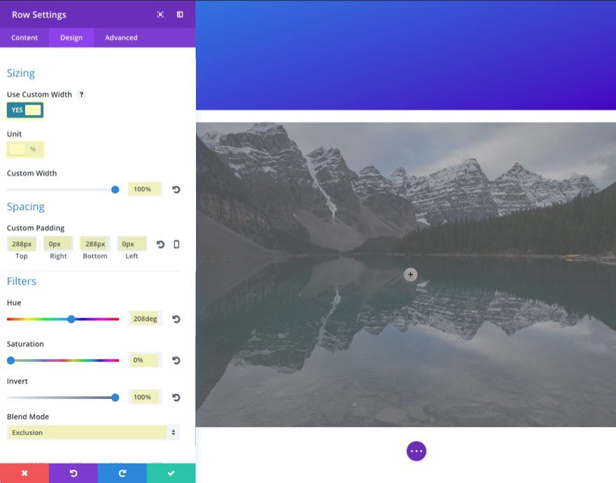
After your section backgroun image is in place, let’s make the row span the full width of the section and add a background color to use for our exclusion blend. Go to the Row Settings and update the Following:
Under Content Tab…
Background Color: #00ffaa
Under Design Tab…
Use Custom Width: YES
Unit: %
Custom Width: 100%
Custom Padding: 288px Top, 0px Right, 288px Bottom, 0px Left
Hue: 208deg
Saturation: 0%
Invert: 100%
Blend Mode: Exclusion
Add the Logo Image
Remember that whatever you add inside the row will inherit the blend mode that is set in the row settings
(in this case it is the Exclusion blend mode). Let’s add the logo in the center of the section by entering an image module in the one-column row and under the content tab of your image settings upload your logo image. Here is the one I’m using:

Under Design Tab…
Image Alignment: Center
Animation: Roll
Animation Intensity: 31%
Animation Starting Opacity: 100%
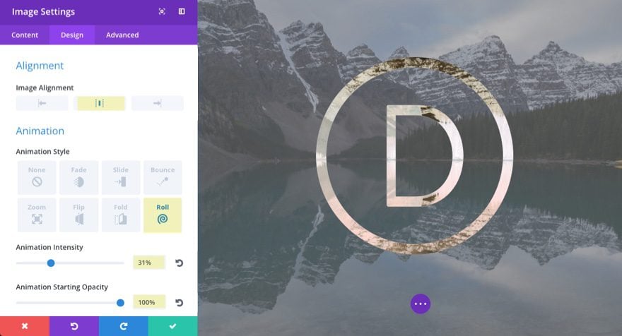
As you can see, the black logo is inheriting the exclusion blend by “cancelling out” any black behind it and the result is a brighter background for the logo. Cool!
That’s it for section #4.
Recreating Section #5
Blend Mode Used: Screen
Filters and Effects Used: Saturation, Brightness, and Contrast
This section is probably my favorite design of them all. I may be wrong, but this looks like it could take a designer hours to create, not minutes. I can’t help but think of the value this would bring to a freelancer who struggles with the design side of things (like me). The highlight here is the Screen blend mode that multiplies the layers below and produces a lighter version of the mix than that of the Multiply blend mode we saw in section 2. Here is how to build it.
Create a Regular Section
Create a regular section with a 2 column (1/2 1/2) Row and hold off on adding any modules so we can update our section settings.
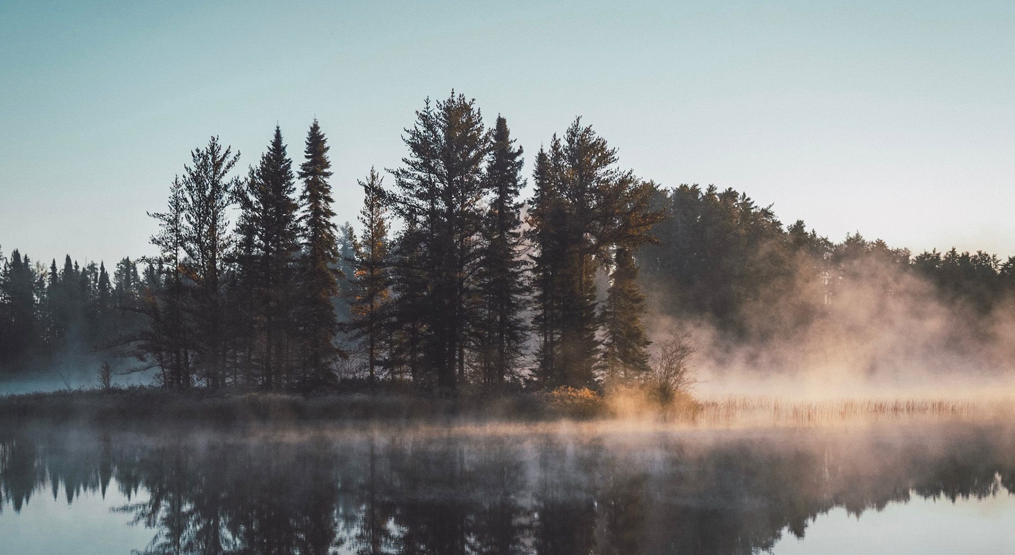
Since we have been using the same basic design settings for each of our sections throughout the demos, let’s go ahead and use the right click option and copy the style of the previous section and paste it into our new section. Now all we need to do is change the background image. Here is the one I’m using…
Edit the Row
Now that we have our section complete, let’ move on to editing our row settings.
Under the content tab…
Column 1 Background Color: #ffffff
Under the Design Tab…
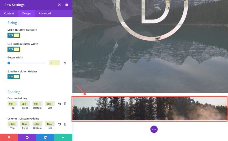
Make This Row Fullwidth: YES
Use Custom Gutter Width: YES
Gutter Width: 1
Equalize Column Heights: YES
Custom Padding: 0px Top, 0px Right, 0px Bottom, 0px Left
Column 1 Custom Padding: 40px Top, 40px Right, 40px Bottom, 40px Left
Blend Mode: Screen
Save Settings
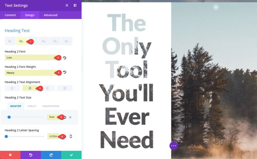
In the left column add a text module with the following header:
<h2>The Only Tool You'll Ever Need</h2>
The update the options under the Design Tab…
Select H2 tab
Heading 2 Font: Lato
Heading 2 Font Weight: Heavy
Heading 2 Text Alignment: Center
Heading 2 Text Size: 9vw (desktop), 16vw (tablet), 40px (smartphone)
Heading 2 Letter Spacing: -0.02em
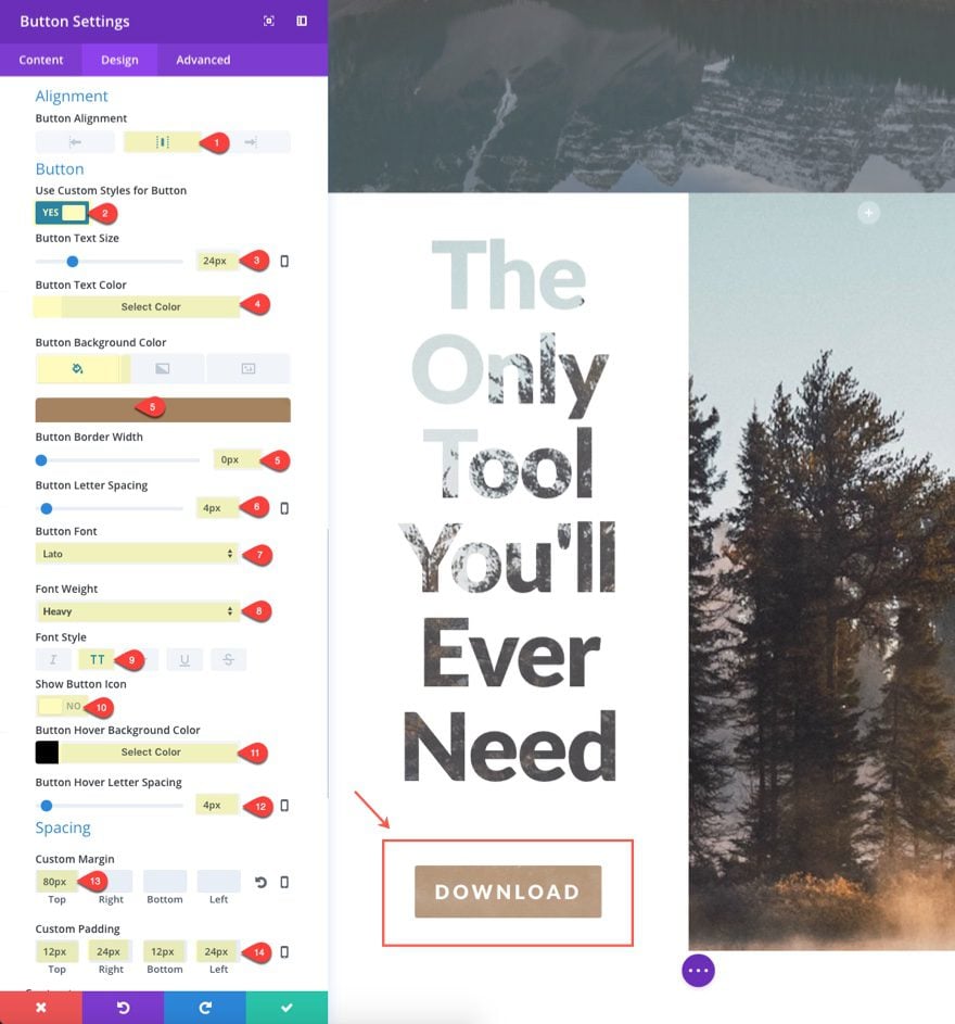
Let’s see what it looks like when you add a button with the Screen blend mode selected. Add a button module under the current text module and enter the button Text “Download” in the content tab.
Under Design Tab…
Button Alignment: Center
Use Custom Styles for Button: YES
Button Text Size: 24px
Button Text color: #ffffff
Button Background Color: #a58461
Button Border Width: 0px
Button Letter Spacing: 4px
Button Font: Lato
Font Weight: Heavy
Font Style: Uppercase (TT)
Show Button Icon: NO
Button Hover Background Color: #000000
Button Hover Letter Spacing: 4px
Custom Margin: 80px Top
Custom Padding: 12px Top, 24px Right, 12px Bottom, 24px Left
Add the Second Image in the Right Column
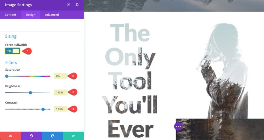
Now we are ready for our second image in the right column. Add an image module in the right column and upload your image under the content tab.
Under Design Tab…
Force Fullwidth: YES
Saturation: 0%
Brightness: 113%
Contrast: 173%
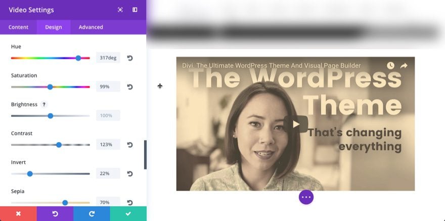
Using the Filter Options on Maps and Videos
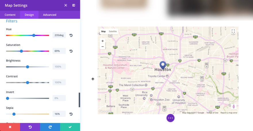
In the past, the map and video modules had limited design options. This is largely due to the fact that they are both embeds. The map module embeds a google map and the video module embeds a video. Changing the colors for a google map would require some advanced code to get it looking the way you want. And although you can adjust the colors settings on your own videos during the editing process, this is not so easy whenever the video is already created and embedded on your page. But these filter options have added a powerful design tool that gives you some control over the color settings on the front in.
The best way to learn how to use these filters with these modules is to try it out for yourself. If you are just starting out, it is a bit like adjusting the display settings on your tv or monitor. Sometimes you have to play around with it to get it exactly how you like it.
Note: You may notice that the Map Module has two sets of filters within the map settings design tab. This is because one set controls the filter effects for the map without changing the pin(s). The other set controls the pin as well.
If you get confused and want to learn more about all of these blend modes and filter effects, you can check out these links:
http://photoblogstop.com/photoshop/photoshop-blend-modes-explained
https://helpx.adobe.com/premiere-pro/using/blending-modes.html
Cross Browser Compatibility

The Blend Mode options within the visual builder makes use of the mix-blend-mode css property to create the blending effects. The mix-blend-mode css property is supported on most browsers. IE doesn’t support it currently and there are a few limitations within Safari as well.
The Filters effects for the builder use the Filter css property that is supported by almost all browsers (even Edge). However, IE is still not supported.
Wrapping Up
I hope you have enjoyed this 2-part series. My #1 goal in writing this is to introduce you to new design options that will inspire you to create better websites. The examples used here are not to be considered as a whole, but as individual snippets meant to spark your imagination to expore the possibilities. I chose not to tackle all of the sections on the demo page simply because the other sections used similiar blend and filter techniques and I didn’t want to overload the post with repetition.
Before I go, I want to encourage you to familiarize yourself with these blend modes and filters. They can get a little confusing but I have found that having even a rudimentary understanding of what these options do will save time and help aid in the creative process.
As always, I look forward to hear from you in the comments.
Cheers!



I really love these effects. Hope the blend mode will be supported all around soon !
Is it possible to get the links to the pictures you used in the part of the girl with the lake/trees background please (both the lake and the girl images)? I love them.
Thank you for whatever is possible.
Guys… filters are not working on Edge. Well, some does but not all. You write “supported by almost all browsers (even Edge)” then something is wrong with stuff that has to make filters work on Edge in Divi.