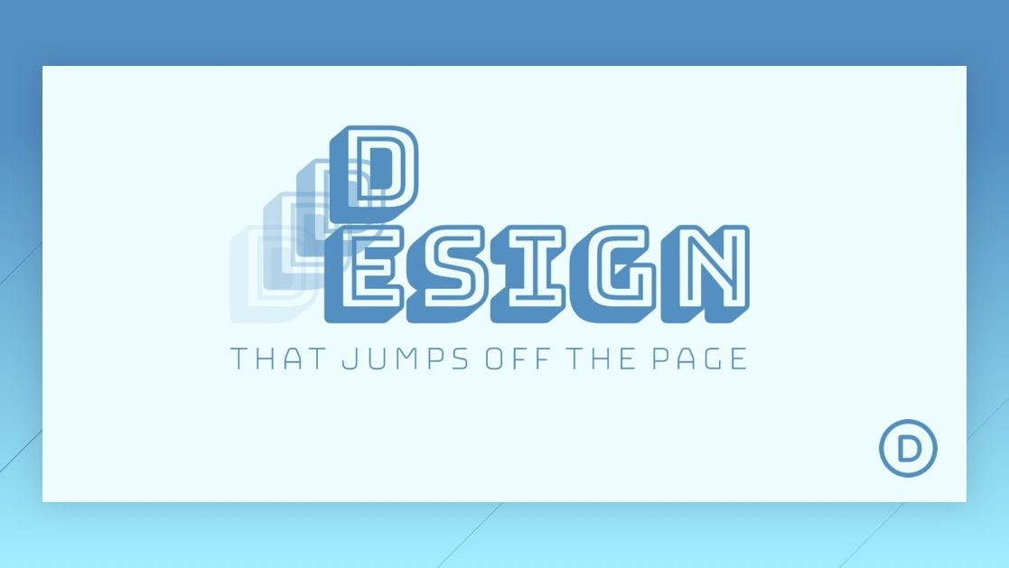
Using Divi and its scroll effects to stack and animate text on scroll is a unique design technique that can be used to bring life to your page headings. The trick is to use Divi’s position options to stack letters absolutely so that they sit directly on top of each other. Then you can move the letters horizontally and vertically using the scroll effects.
Check it out!
Sneak Peek
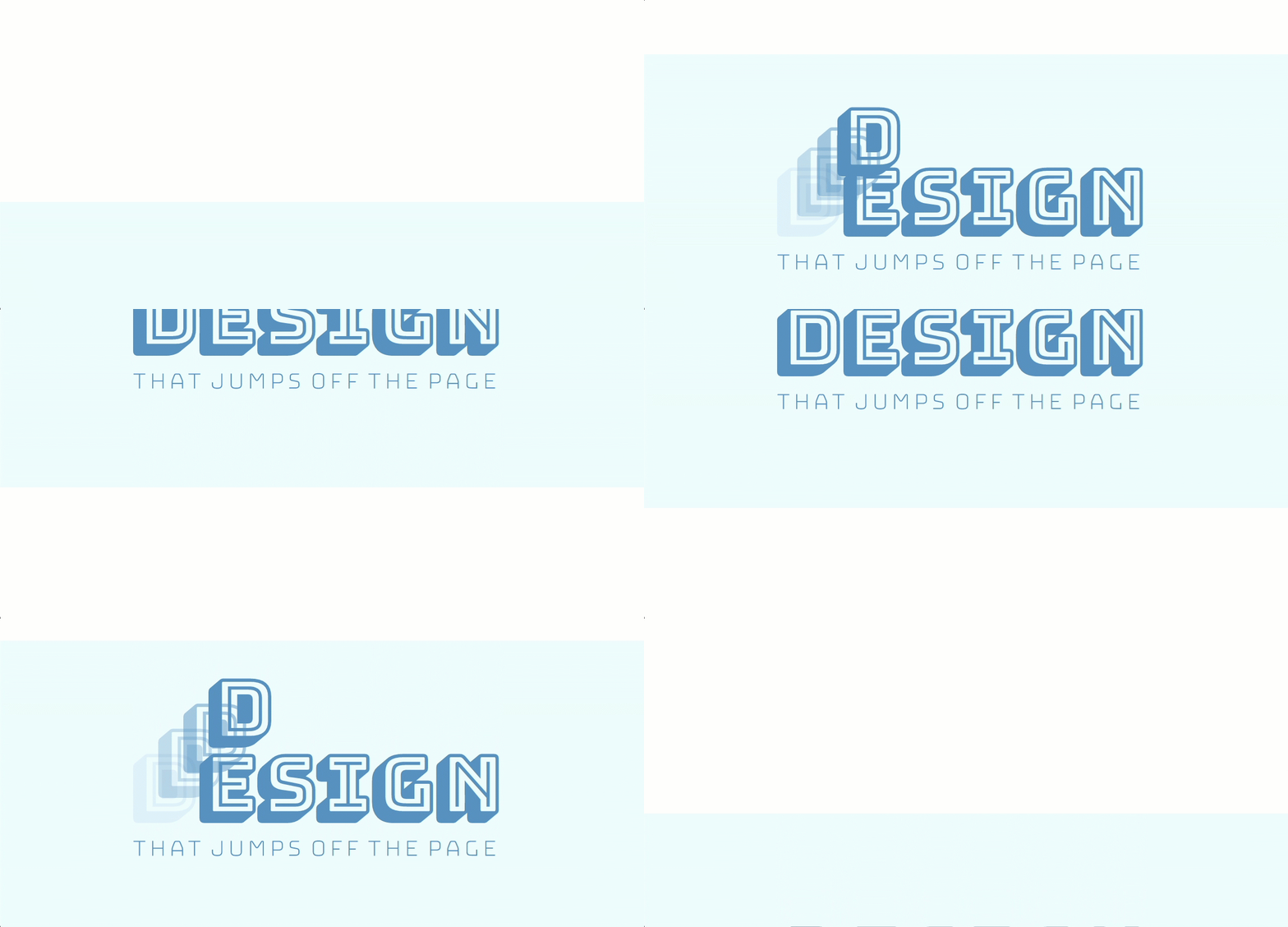
Here is a quick look at the text animation we will build in this tutorial.
Subscribe To Our Youtube Channel
Download the Layout for FREE
To lay your hands on the designs from this tutorial, you will first need to download it using the button below. To gain access to the download you will need to subscribe to our newsletter by using the form below. As a new subscriber, you will receive even more Divi goodness and a free Divi Layout pack every Monday! If you’re already on the list, simply enter your email address below and click download. You will not be “resubscribed” or receive extra emails.
To import the layout to your page, simply extract the zip file and drag the JSON file into the Divi Builder.
Let’s get to the tutorial, shall we?
What You Need to Get Started
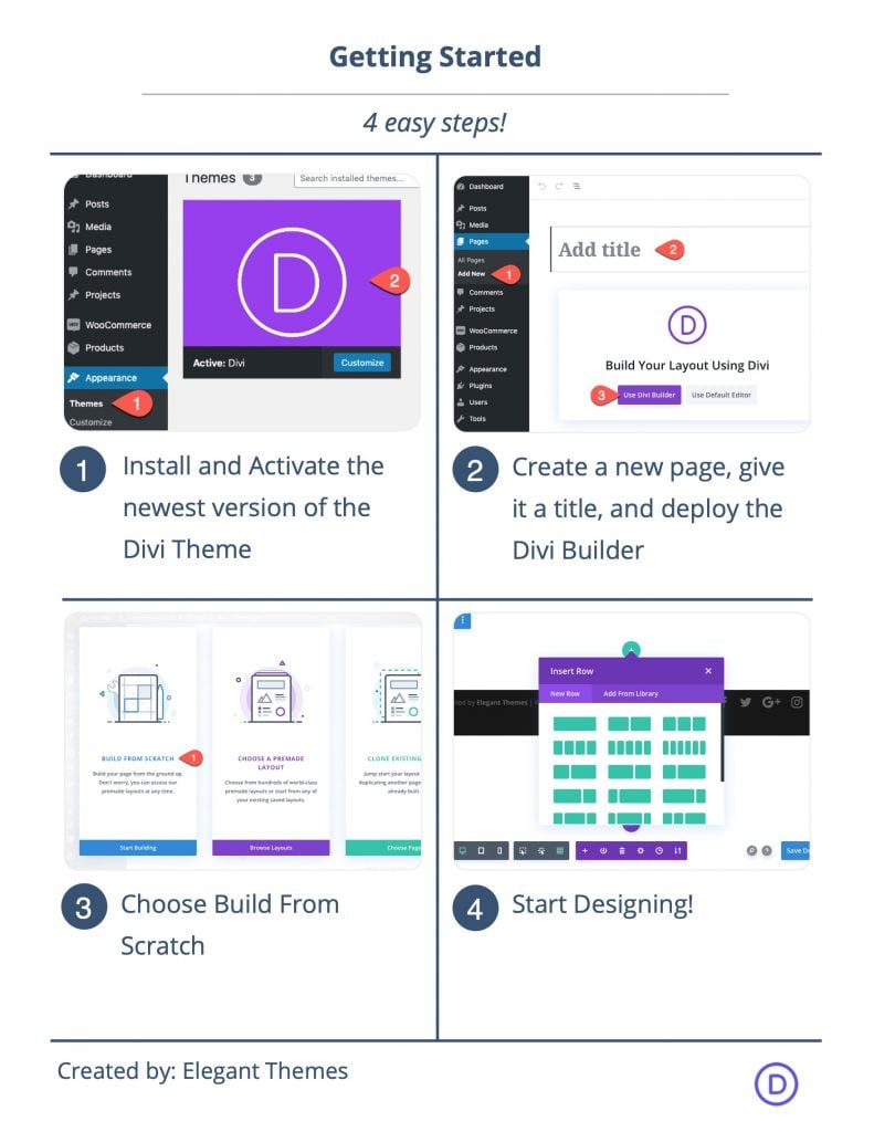
To get started, you will need to do the following:
- If you haven’t yet, install and activate the Divi Theme.
- Create a new page in WordPress and use the Divi Builder to edit the page on the front end (visual builder).
- Choose the option “Build From Scratch”.
After that, you will have a blank canvas to start designing in Divi.
How to Stack and Animate Text in Divi
Setting up the Section and Row
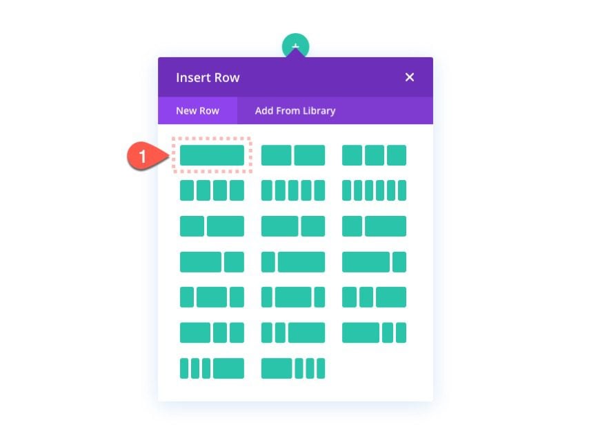
First, create a one-column row to the regular section.
Section Settings
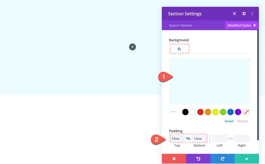
Before adding any modules, open the section settings and update the following:
- Background Color: rgba(201,245,255,0.35)
- Padding: 14vw top, 14vw bottom
Row Settings
Next, open the row settings and update the following:
- Max Width: 60%
- Row Alignment: Center
- Height: 20vw
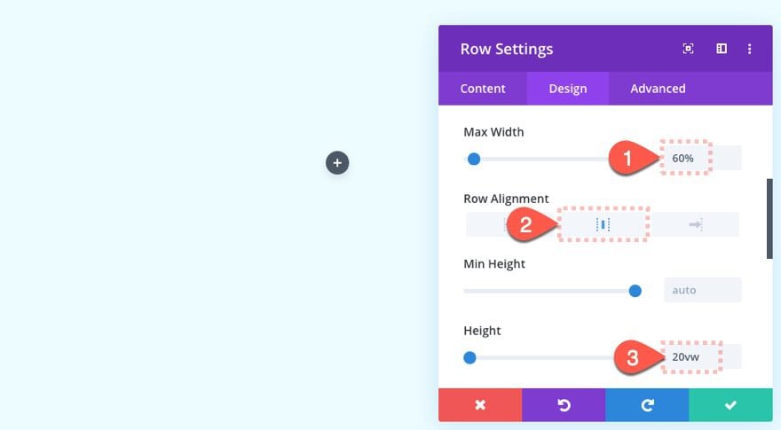
We are setting the height to a specified value because we are going to position the text modules inside the row absolutely.
Adding the Stacked Text Modules that Animate on Stroll
Now that the section and row are in setup, we can start adding the text modules that will make up our heading design. The first text module will include the main heading text. The next three text modules will contain a single letter that will be used to stack on top of the first letting of the heading and then animate on scroll.
Let’s start by adding the text module with the main heading.
Add Text Module #1
Add a new text module to the row.
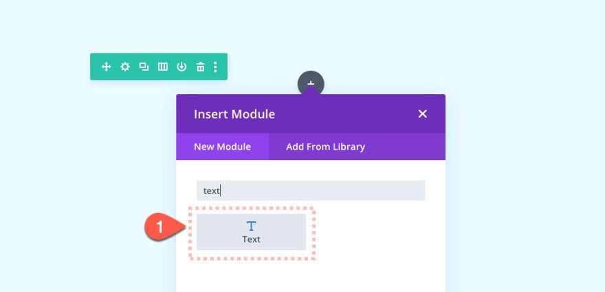
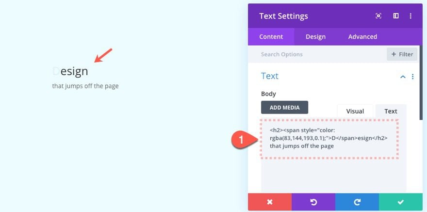
Then update the text module with the following content.
<h2><span style="color: rgba(83,144,193,0.1)">D</span>esign</h2>
that jumps off the page
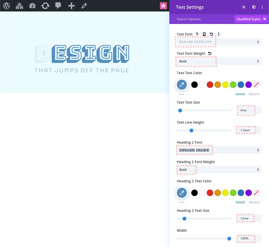
- Text Font: Bungee Hairline
- Text Font Weight: Bold
- Text Text Size: 4vw
- Text Line Height: 1.5em
- Heading 2 Font: Bungee Shade
- Heading 2 Font Weight: Bold
- Heading 2 Text Color:
- Heading 2 Text Size: 12vw
- Width: 100%
- Position: Absolute
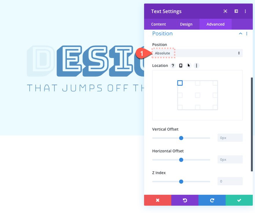
Add Text Module #2
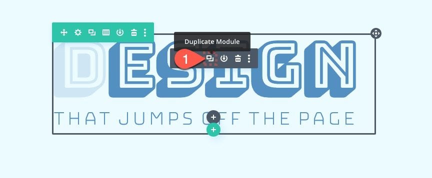
The next text module will be used as the first letter to overlap the first letter of the heading. To jumpstart the design of the text module, duplicate the first text module.
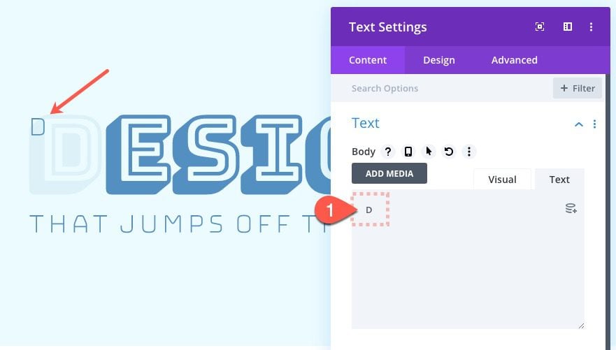
Then update the content of the duplicate text module with the first letter of the heading text (“D”).
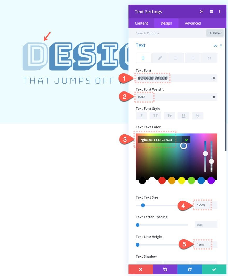
Then update the design settings as follows:
- Text Font: Bungee Shade
- Text Font Weight: Bold
- Text Text Color: rgba(83,144,193,0.3)
- Text Text Size: 12vw
- Text Line Height: 1em
Scroll Effects
The text module with the letter “D” is now stacked directly on top of the letter “D” in the first text module. We are going to move the letter slightly on scroll using a combination of vertical and horizontal motion.
Vertical Motion
Under the advanced tab, select the vertical motion tab and update the following:
- Enable Vertical Motion: YES
- Starting Offset: 0 (at 20%)
- Middle Offset: -0.5 (between 40% and 60%)
- Ending Offset: 0 (at 80%)
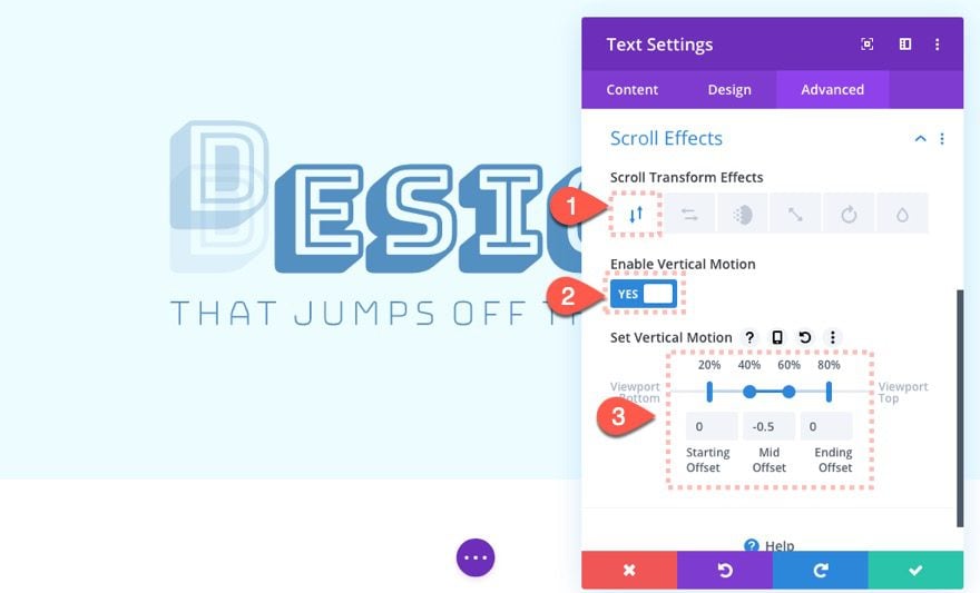
If you are new to the scroll effect options in Divi, the top percentage values indicate the location points within the browser window. Each percentage value corresponds to the offsets below (starting, mid, and ending). So, as the user scrolls, the letter “D” will start animating (from a “0” starting offset) when it reaches 20% from the bottom of the viewport. It will continue to animate (upward) until it reaches 40% from the bottom of the viewport and then holds at the “-0.5” offset until it reaches 60% from the bottom of the viewport. Once it reaches the 60% point, it will start animating back to the original “0” offset and stop animating when it reaches 80% from the bottom of the viewport.
Horizontal Motion
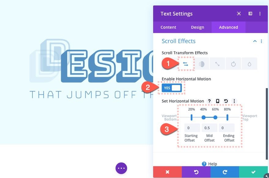
To give the text module horizontal motion, select the horizontal motion tab and update the following (the values will be the same as vertical motion):
- Enable Horizontal Motion: YES
- Starting Offset: 0 (at 20%)
- Middle Offset: -0.5 (between 40% and 60%)
- Ending Offset: 0 (at 80%)
Add Text Module #3
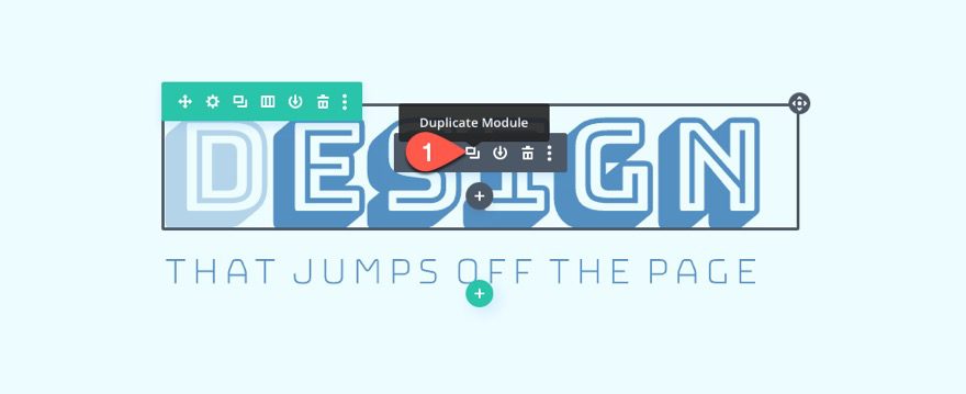
Create the third text module (or letter “D”) by duplicating the previous text module.
Update Scroll Effects
Then update the following scroll effects.
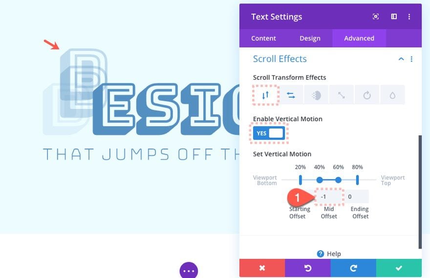
Vertical Motion
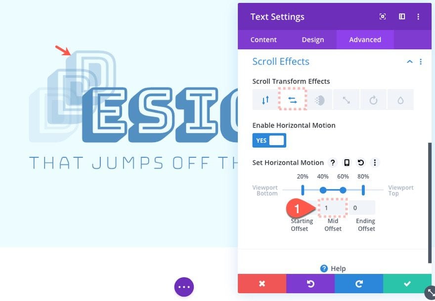
- Middle Offset: -1
Horizontal Motion
- Middle Offset: 1
Update Text Color
Update the text color as follows:
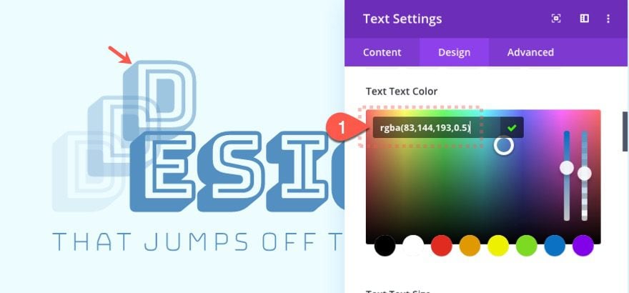
- Text Text Color: rgba(83,144,193,0.5)
Add Text Module #4
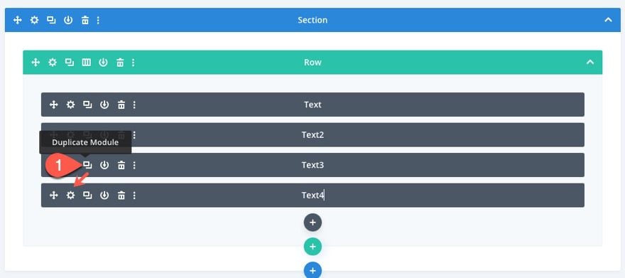
Things might get harder to select at this point in desktop view. Deploy the wireframe view mode and duplicate the previous text module to create our final letter.
Update Text Color
Update the text color as follows:
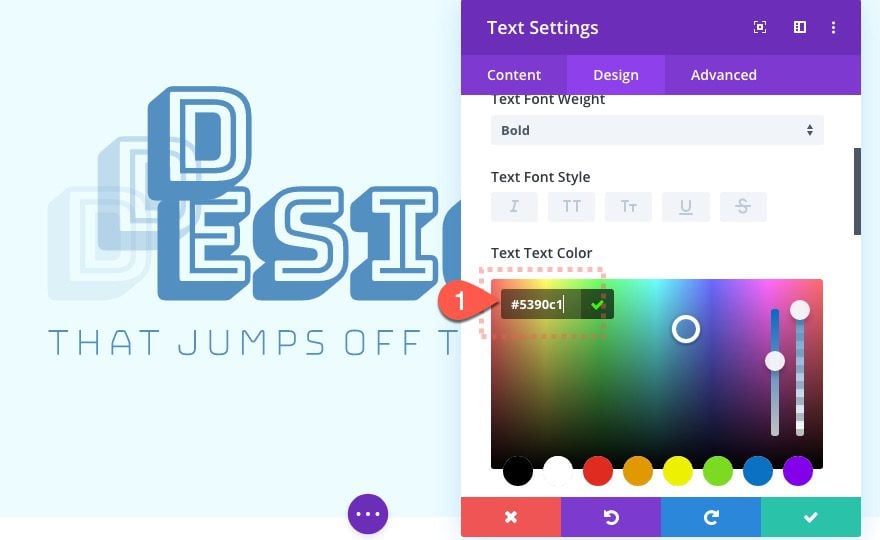
- Text Text Color: #5390c1
Update Scroll Effects
Then jump over to the advanced tab and adjust the scroll effects as follows:
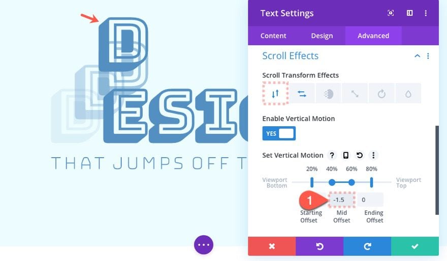
Vertical Motion
- Middle Offset: -1.5
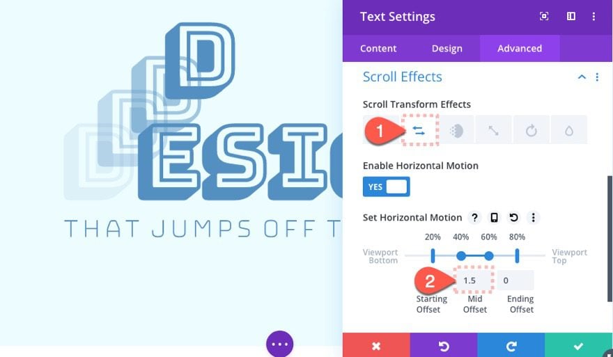
Horizontal Motion
- Middle Offset: 1.5
Add Margin to Section for Testing
To test the design on a live page, you will need some room to scroll. We can do this easily by adding some top and bottom margin to the section. Open the section settings and update the following:
- Margin: 40vw top, 40vw bottom
Final Result
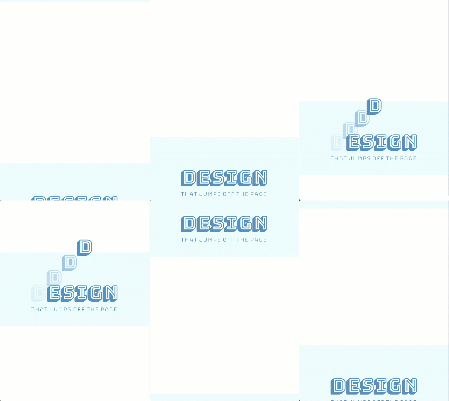
Now we can finally check out the final result on a live page.

Here it is on mobile.
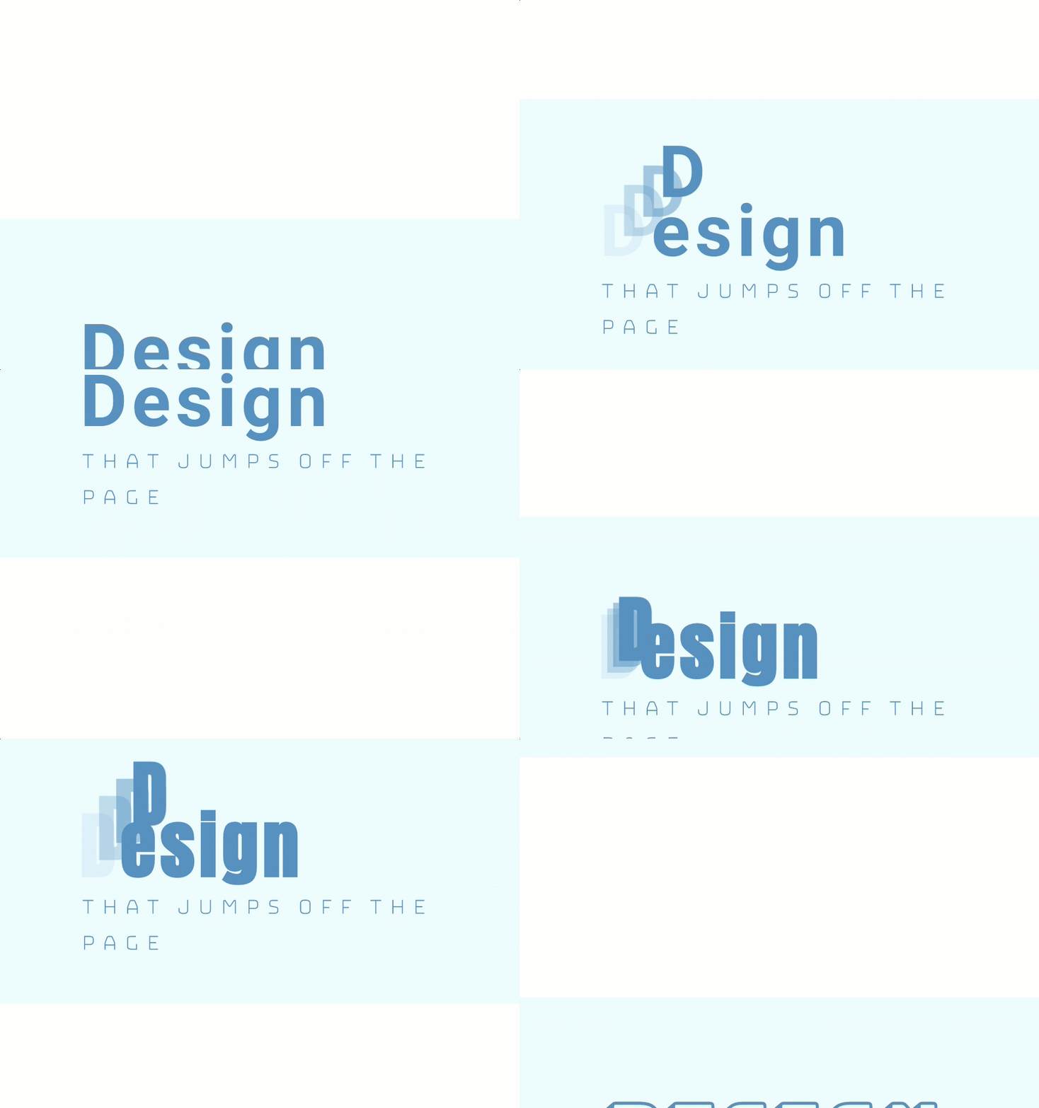
Feel free to experiment with different fonts using Divi’s find and replace feature.
Final Thoughts
This post should get your creative juicing running for new ways to animate text on scroll. This will work well for section headings since the user will have to scroll through the section (from top to bottom) and experience the full duration of the scroll effect.
And, come to think of it, this same concept would work for images and icons as well.
I look forward to hearing from you in the comments below.
Cheers!



Following the tutorial it’s not possible to get the multiple ‘D’ letters to overlap with the first layer. They are all offset slightly higher and I’m still too new to Divi to understand how to fix this bug. 🙁
nice…but that new scroll effects does not work in internet explorer 8, 9, 10 and edge.
my customer complains because text is not there..
This is a good feature to create scroll effects for your website. It looks creative. Does this make your website slower?
Excelent post, thanks Jason for sharing.
Cheers from Madrid
Luis
web-creativo.com