Using blurb icons as design accents can give your page layout a unique design that you may have never thought of before. In addition to positioning the icon of a blurb module to overlap a text module, you can use the text module background and border to style the icon. This creates a nice design accent that frames the content while giving your icons a completely unique design.
In this tutorial, I’m going to show you how to style blurb icons as design accents for your content in Divi.
Let’s dive in!
- 1 Sneak Peek
- 2 Download the Example Layouts for this Tutorial
- 3 Download For Free
- 4 Getting Started with Building the Design From Scratch
- 5 Creating the Text Module
- 6 Creating the Blurb Icon
- 7 Positioning the Blurb Icons Using Transform Translate
- 8 Creating the Two Column Row
- 9 Adjusting the Spacing of the Layout
- 10 Final Result
- 11 Trying out Other Icons
- 12 Final Thoughts
Sneak Peek
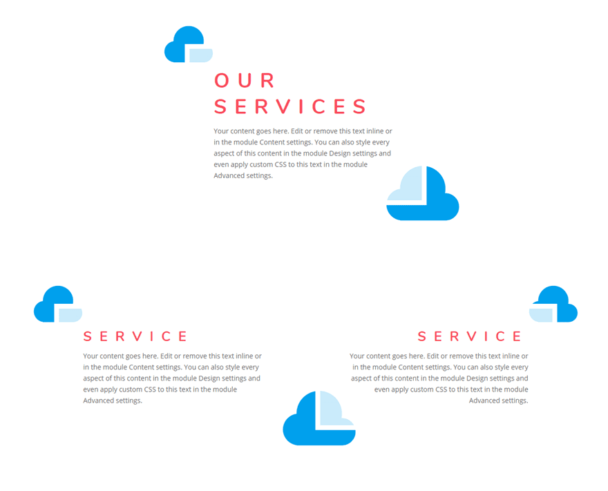
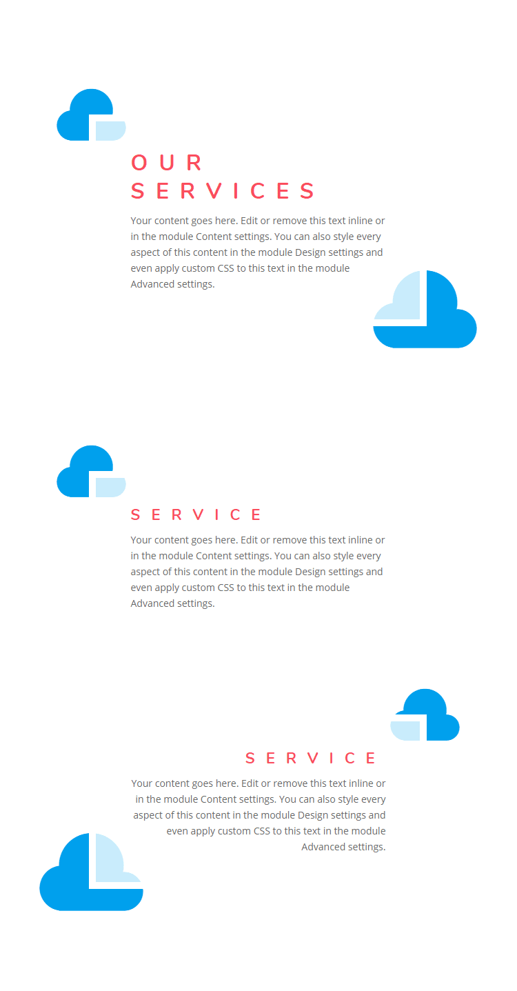
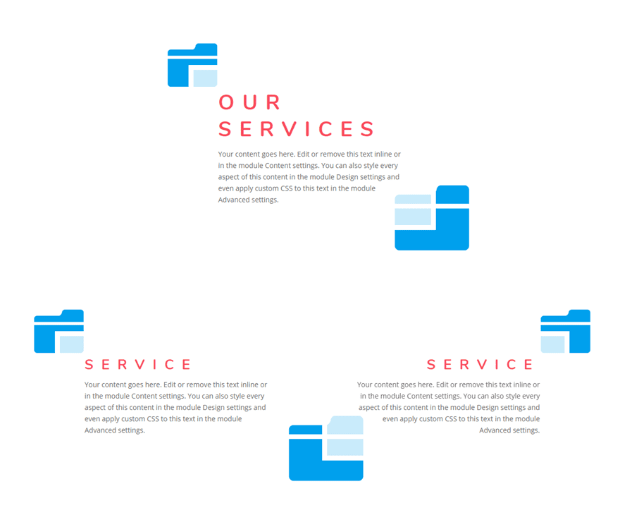
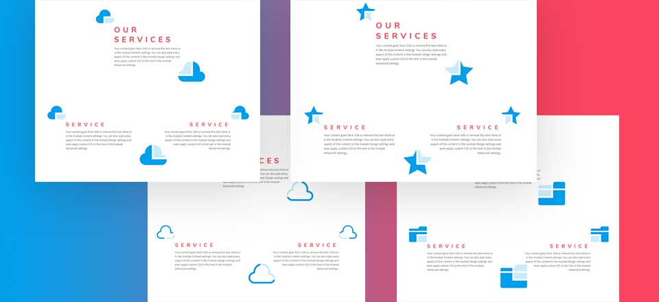
Here are a few examples of the design we will build in this tutorial.

Download the Example Layouts for this Tutorial
To lay your hands on the free blurb module accent designs layout, you will first need to download it using the button below. To gain access to the download you will need to subscribe to our newsletter by using the form below. As a new subscriber, you will receive even more Divi goodness and a free Divi Layout pack every Monday! If you’re already on the list, simply enter your email address below and click download. You will not be “resubscribed” or receive extra emails.
Getting Started with Building the Design From Scratch
To get started, create a new page and give your page a title. Then deploy the Divi builder on the front end. Add a regular section with a one-column row. Before adding your first module, update the row settings with the following:
Use Custom Gutter Width: YES
Custom Gutter Width: 1
This will get rid of any custom margins between modules.
Creating the Text Module
Next add a text module inside the row.
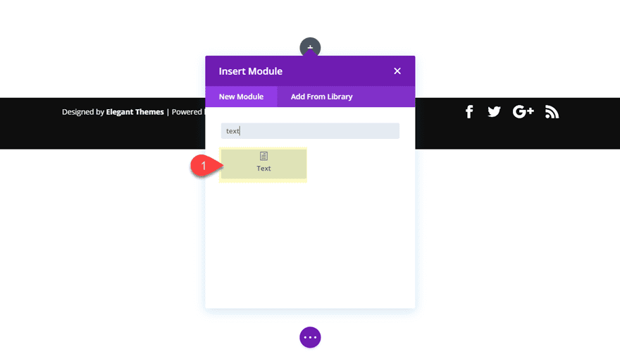
Update the text module with the following filler text:
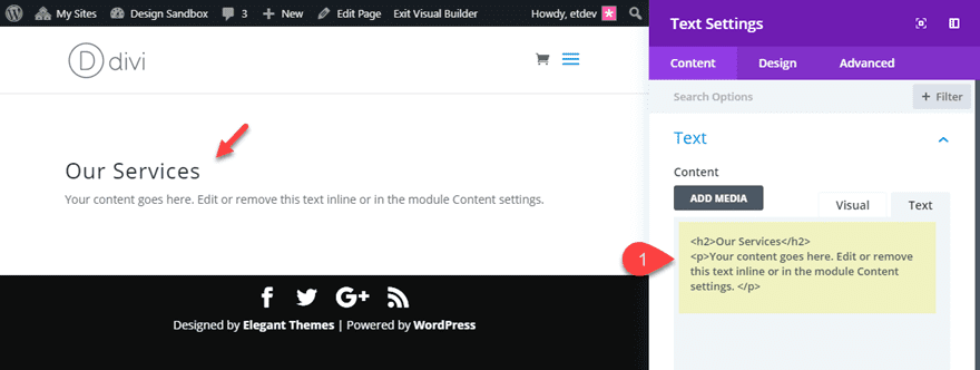
<h2>Our Services</h2>
<p>Your content goes here. Edit or remove this text inline or in the module Content settings. </p>

Styling the Text Module
Now update the rest of the Text module setting as follows:
Background Color: #ffffff
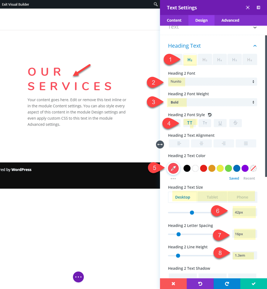
- Heading 2 Font: Nunito
- Heading 2 Font Weight: Bold
- Heading 2 Font Style: TT
- Heading 2 Text Color: #f24a5b
- Heading 2 Text Size: 42px (Desktop), 32px (tablet), 22px (phone)
- Heading 2 Letter Sp[acing: 16px
- Heading 2 Line Height: 1.3em
- Width: 500px (desktop), 490px (tablet)
- Module Alignment: center
- Custom Padding (desktop): 40px top, 40px bottom, 50px left, 50px right
- Custom Padding (phone): 20px left, 20px right
- Border Width: 10px
- Border Color: #ffffff
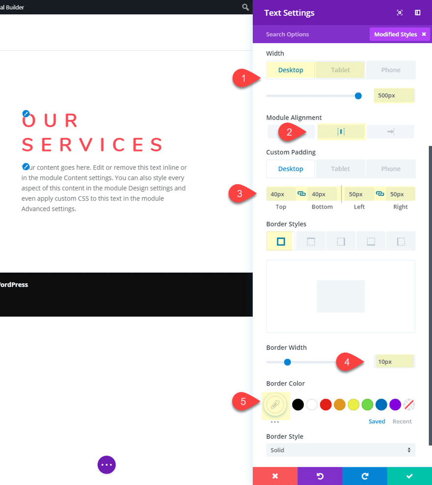
Since we will be overlapping the text module with blurb icons, we need to make sure the text module sits above the icons in z-space order. To do this we must first add the following snippet of CSS to the Text module Main Element CSS box:
position: relative;
Then set the z-index value to 1.
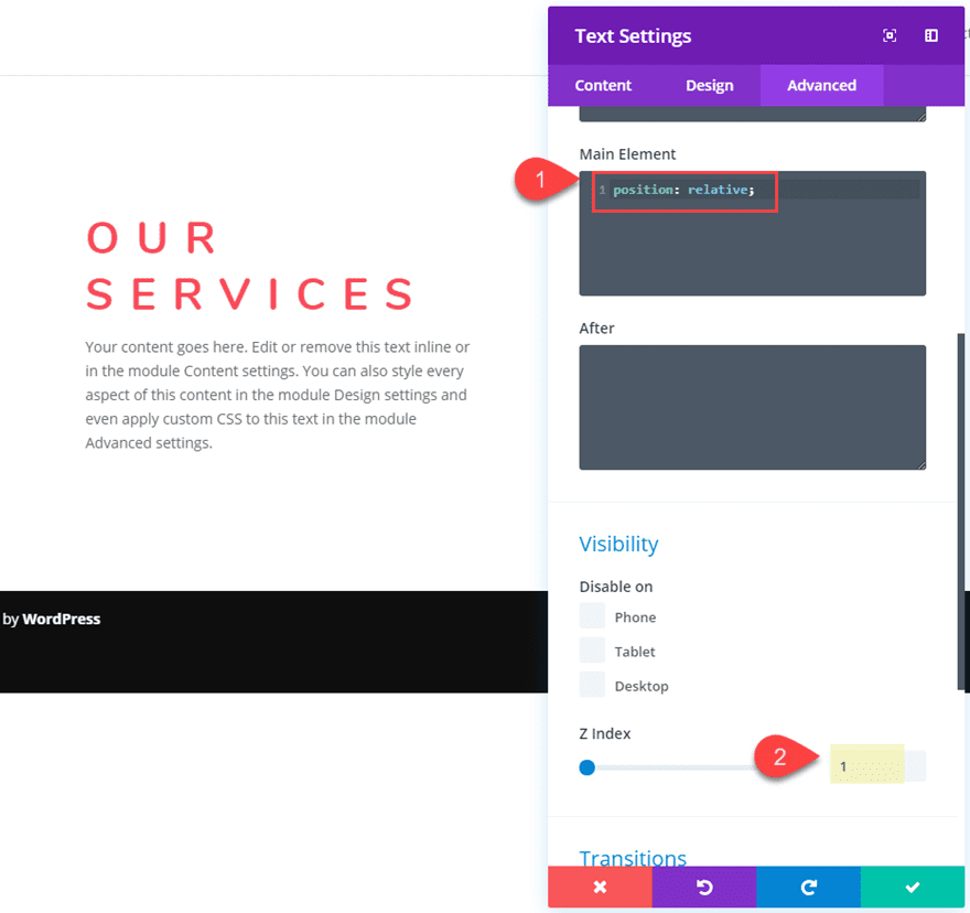
Now this text module will sit above any other overlapping modules which is important to the design.
Creating the Blurb Icon
Now we are ready to create the first blurb icon. To do that we must first add a blurb module and drag it to the top of the text module. Then delete the mock content (the title text and body text) and Click to use an icon instead of an image for the blurb.
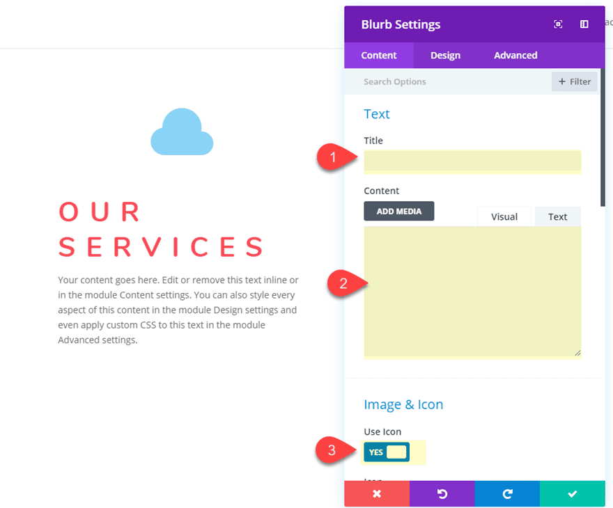
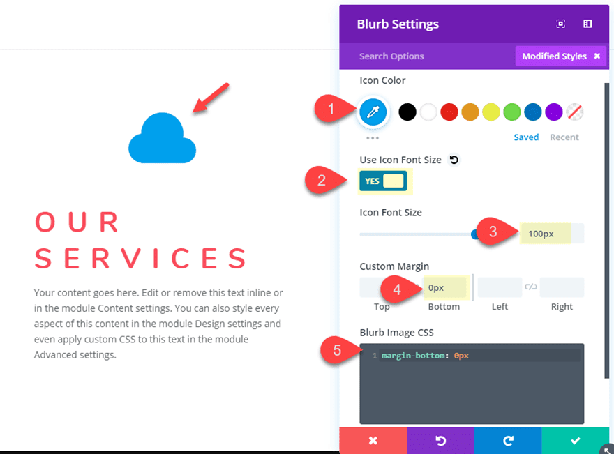
Then update the following design settings:
- Icon Color: #2ea3f2
- Use Icon Font Size: YES
- Icon Font Size: 100px
- Custom Margin: 0px bottom (this takes out the default bottom margin between modules; not necessary if you are using a row gutter width of 1)
Next, since we aren’t using any text with the module (only the icon), we can get rid of the default bottom margin under the blurb icon. To do this, add the following custom CSS to the Blurb Image CSS box:
Blurb Image CSS:
margin-bottom: 0px
Duplicate the Blurb Icon
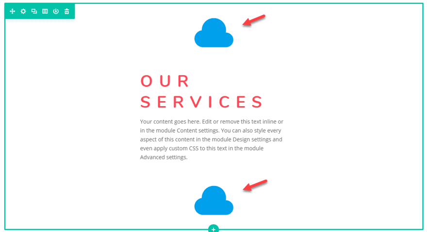
Before we start positioning the blurb, let’s go ahead and duplicate the blurb module and drag the duplicate under the text module. You should now have a blurb icon above and below the text module.
Positioning the Blurb Icons Using Transform Translate
To position the blurb icons, we are going to use Divi’s transform options which allow us to place the blurb module with the icon anywhere we want on the page.
Positioning Blurb Icon #1
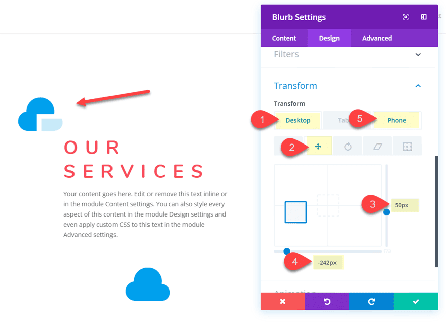
To position the top blurb icon, open the blurb module settings and update the following:
- Transform Translate X-axis (desktop): -242px
- Transform Translate Y-axis (desktop): 50px
- Transform Translate X-axis (phone): -170px
Positioning Blurb Icon #2
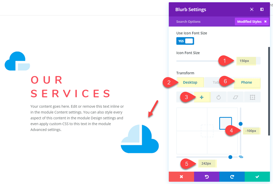
Before we position this blurb icon, let’s make it a bit larger. To do this, open the blurb module settings and change the Icon Font Size to 150px.
Then position the blurb icon by updating the following transform options:
- Transform Translate X-axis (desktop): 242px
- Transform Translate Y-axis (desktop): -100px
- Transform Translate X-axis (phone): 190px
Creating the Two Column Row
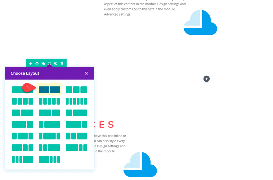
To create the next column, duplicate the existing row and change the row’s column layout to a two-column layout (1/2 1/2).
Next, use Divi’s multiselect feature to select the all three modules in the left column and then copy and paste them over into the second column.
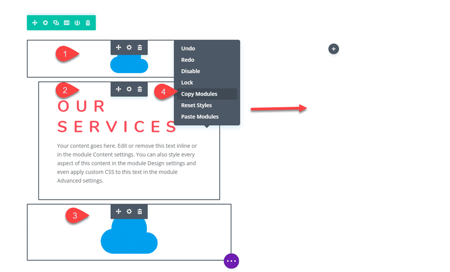
Then, delete the bottom blurb icon in column one.
Aligning the Blurb Icons in Column 2
For the Blurb Icons in column 2, we need to shift the top icon to the left and the bottom icon to the right. We can do this simply by changing the Transform Translate X-axis value.
Open the blurb module settings for the top blurb module in column 2 and update the following:
- Transform Translate X-axis (desktop): 242px
- Transform Translate X-axis (phone): 170px
Basically all you are doing is changing these values from a negative to a positive to shift it in the opposite direction along the x-axis.
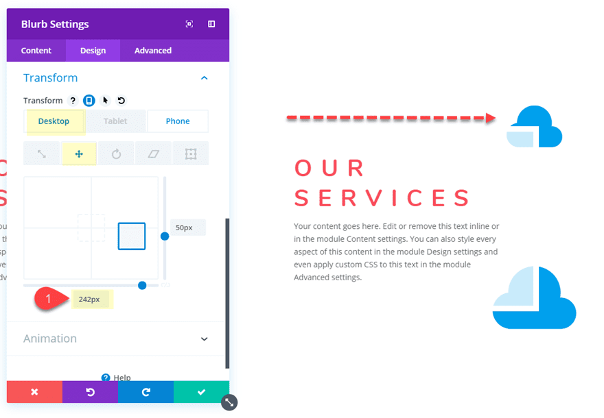
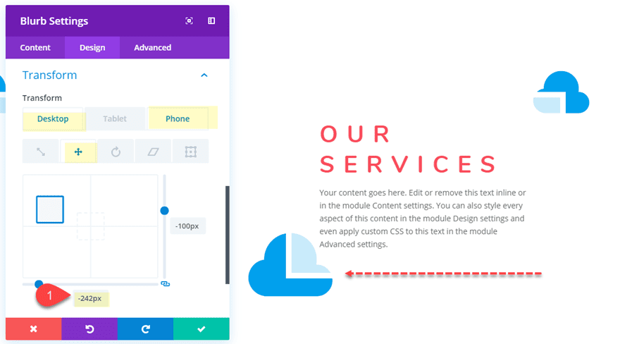
Next, update the transform translate value for the bottom blurb module in column 2 as follows:
- Transform Translate X-axis (desktop): -242px
- Transform Translate X-axis (phone): -190px
Update Text Module Styles in Second Row
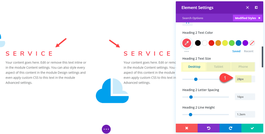
The second row of content serves as a subset of featured services. Therefore, we want the title font size to be different and smaller than our header. To update the two text modules at the same time, use multiselect to select both of the text modules. Then update the following:
Change the h2 heading content to read “Service”.
- Heading 2 Text Size: 28px (desktop), 22px (tablet), 18px (phone)
Save Settings.
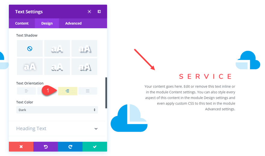
Now open the settings modal for the text module in column 2 and update the following:
- Text Orientation: Right
Adjusting the Spacing of the Layout
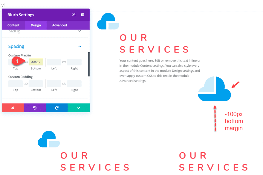
Right now there is probably a bit too much white (or negative) space between the two rows of content. To take away some of that space, we can add a negative bottom margin to the bottom blurb module in the top row as follows:
- Custom Margin: -100px bottom
Final Result
Now let’s take a look at the final result.


Trying out Other Icons
To try out different icons for your layout, you can use the find and replace feature. Open the blurb settings for one of the blurbs containing your icon. Then right click on the icon in the settings modal and select Find & Replace.
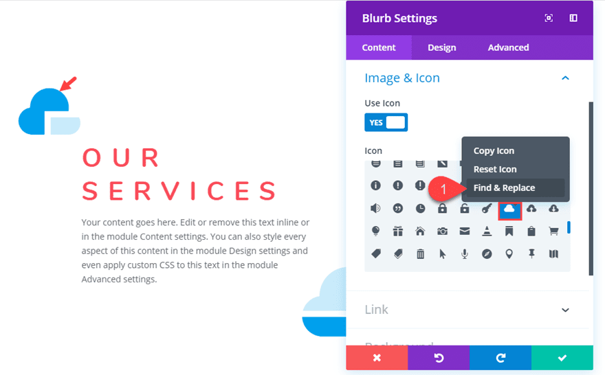
In the Find & Replace popup, update the following:
- Within: This Section
- Replace With: [select new icon]
After that, click the replace button.
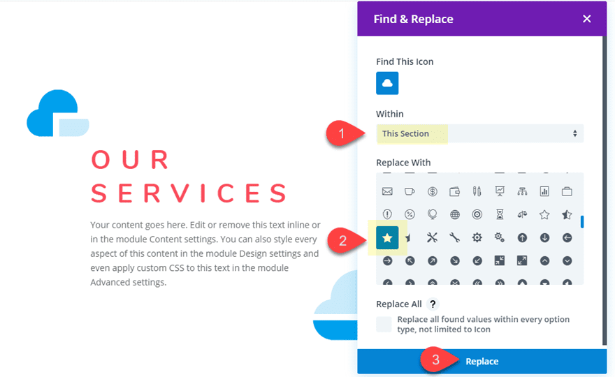
This will change all the blurbs in your section with a new one.
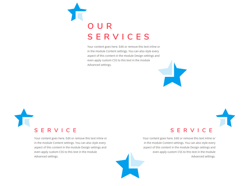
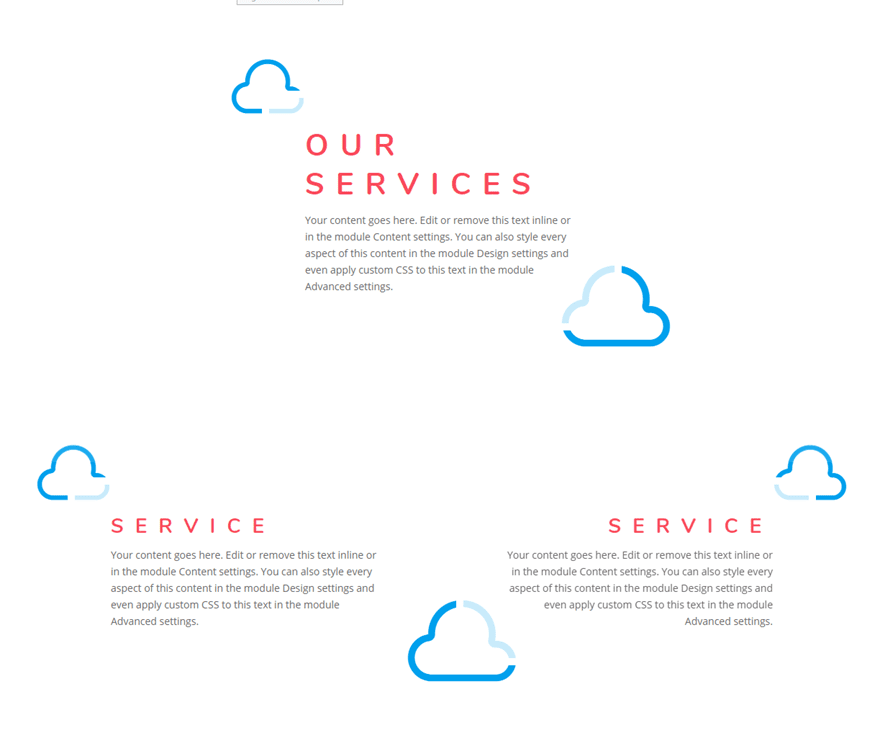
Here are some examples of the layout using different icons.


Final Thoughts
Adding blurb icons as design accents to your content is an example of how two modules can be combined to create a completely unique design. In this case, the text module background and border is serving as a partial overlay for the surrounding icons. The result is unique and opens the door for exploring more design variations. Feel free to explore different icons and color combinations to create something for your own needs.
I look forward to hearing from you in the comments.
Cheers!



Thanks for the tutorial, love the icon styles
Thank you for this. I haven’t played around with the blurbs function much. I do have a question though.
How come the blurb module can’t do this alone? As in instead of having one on top and one on bottom of a text module. Like for example, like using this for a testimonial with 2 quotations to on either end.
Chris,
You could do what you are describing with custom CSS in a single blurb module, but I thought this would be a good solution for those not familiar with CSS.
Thanks!
Thanks Jason.
file is 21kb @ Brandon … lol
I love using blurbs while building my page with DIVI but i had no idea blurb can be used in such ways as illustrated here….
This is the reason Divi is my all time favorite page builder plugin.
Glad you liked it, Sajid.
Trish,
Are you trying to import it to the divi library?
Have you tried simply dragging the file into a page with the divi builder activated?
yes to both questions. neither is working. successfully loaded several other JSON files 🙁
I just tested it and it works for me when I use the portability import on the Divi builder when editing a page. Sorry it isn’t working for you. Support should be able to help if we can’t figure it out.
Is the Json File 2 big for your Max Upload Size configurations on your hosting or Timeout Settings?
I have seen this happen before on hosts like GoDaddy a few times.
why do I get a ” This file should not be imported in this context.” message when importing the JSONfile please?
Looks great, is it possible to use your own icons? If so, how?
Gavin,
If you are referring to using an image icon, you can simply choose to use that image for the blurb instead of a Divi icon.