Pagination is one of those elements of a website that often gets overlooked, especially when it comes to design. And there are multiple places where pagination may be appropriate to use in your website. Basically, pagination (or a pagination menu) allows users to navigate through multiple pages of items (an archive of posts for example). This is especially helpful for cutting down on the initial page content.
Divi has multiple modules that include pagination (like the gallery module) which can be styled using built-in settings. Some of these modules (like blog and portfolio) inherit the default pagination of the Divi Theme (or WordPress) which can be over simplified for some sites. But with the help of a plugin, you can replace the pagination of your entire theme with a more complex one. Then you can style it with CSS however you need.
In this tutorial, I’m going to show you how to style pagination throughout Divi. Here is what we will be going over:
- Things to Consider When Styling Pagination in Divi
- Styling Divi Gallery Module and Filterable Portfolio Module Pagination
- Advanced Pagination Styles for Gallery Module and Filterable Portfolio Module
- Styling Blog Module and Portfolio Module Pagination
- Adding Complex Pagination to Divi Using the WP-PageNavi Plugin
- Styling WP-PageNavi Pagination with Custom CSS
Let’s get started.
- 1 Sneak Peek
- 2 Getting Started
- 3 Things to Consider When Styling Pagination in Divi
- 4 Styling Divi Gallery Module and Filterable Portfolio Module Pagination
- 5 Advanced Pagination Styles for Gallery Module and Filterable Portfolio Module
- 6 Styling Blog Module and Portfolio Module Pagination
- 7 Adding Complex Pagination to Divi Using the WP-PageNavi Plugin
- 8 Final Thoughts
Sneak Peek
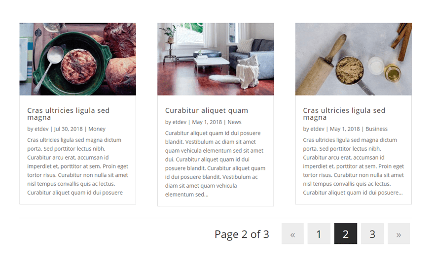
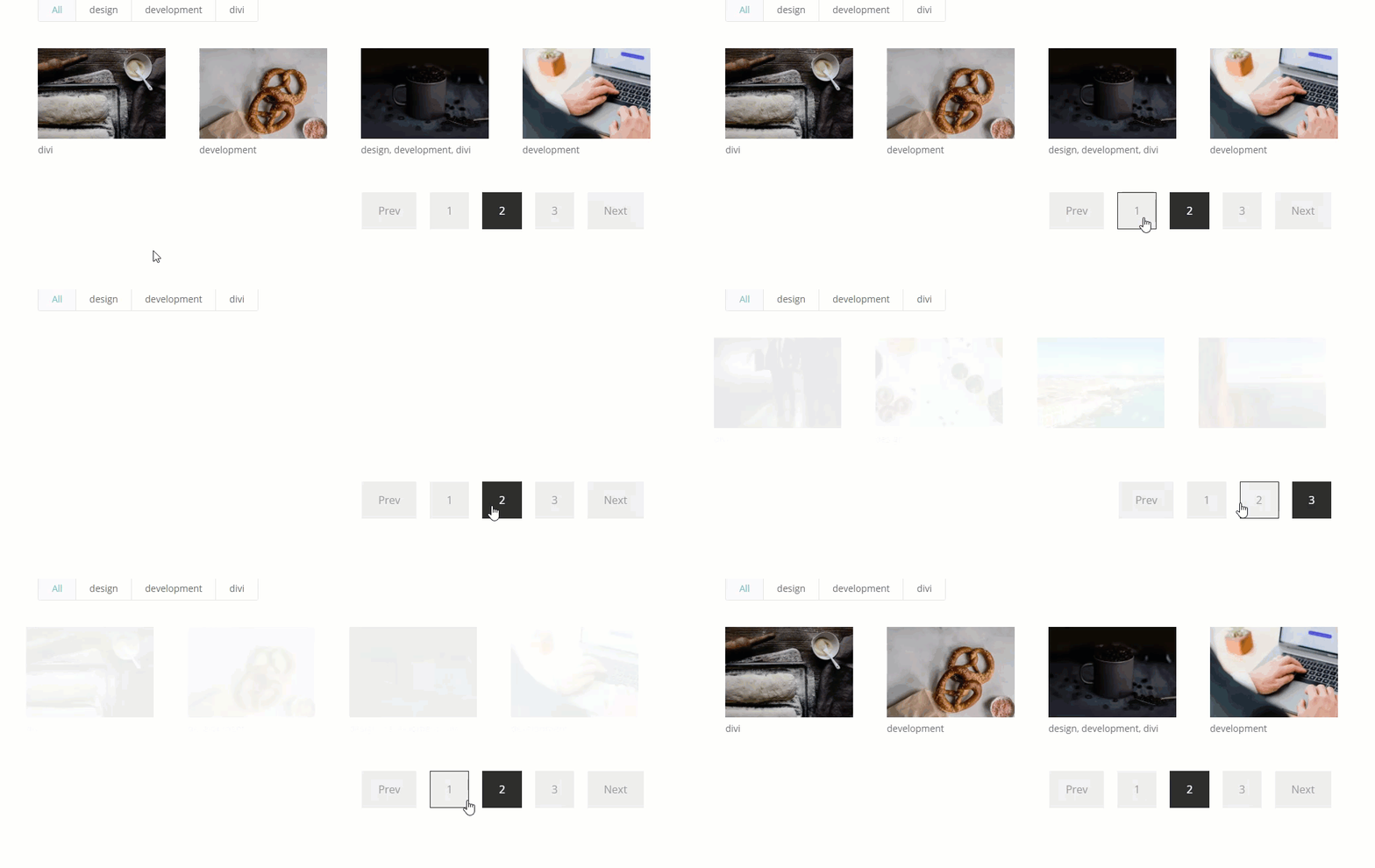
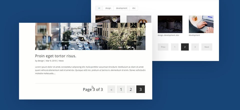
This post is mostly about how to style pagination. However, here are a couple of complex pagination styles I’ll be showing you how to build.
Getting Started
Subscribe To Our Youtube Channel
For this tutorial, you will need the following:
- the Divi Theme installed and active.
- To test out the pagination designs of different modules, you will need some mock content. For example, for designing the portfolio (or filterable portfolio) module pagination, you will need at around 12-16 projects added to your theme so you will have enough content to allow the pagination to take effect. For the gallery module, you will also need around 12-16 images to populate the gallery.
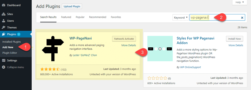
- If you are going to want to use the WP-PageNavi Plugin, you will need to install and activate the plugin. This is a free plugin that can be downloaded from the WordPress Directory from within the WordPress Dashboard of your site. Simply navigate to Plugin > Add New and search for WP-PageNavi.
Once you have some mock content in place, you are ready to create a new page. From your WordPress dashboard, navigation to Pages > Add New. Give you page a title and deploy the Divi Builder. Select the option to “Build from Scratch”. Then click to Build on the Front End.
Now you are ready to start testing out some pagination designs.
Things to Consider When Styling Pagination in Divi
Generally speaking, you probably don’t want to go too crazy with the design of pagination because, like any navigation menu, it is important to keep it simple and intuitive. However, here are a few things you might consider when designing pagination in Divi.
Pagination Font
Pagination is a great place to break away from the main fonts you are using for your site. You want to choose the best fonts geared toward user interfaces and navigation. And since pagination contains mostly numbers, you want to make sure the font displays all numbers with equal height and width (what typography experts call lining and tabular). A few of my conservative favorites include Oxygen, Nunito Sans, and Source Sans Pro. And if you have a lot of pages in your pagination, you may need to free up some space by going with a condensed font like Fjalla One or Roboto Condensed.
Pagination Font Style
You can also try out a few font styles to set your pagination apart. For example, you could use the uppercase font style to make the “next” and “previous” links more pronounced and equal to the height of the page numbers. However, adding the underline font style might be bit redundant considering the links are already in a navigation menu.
Pagination Letter Spacing
Letter spacing is a great way to add a bit more horizontal spacing to your pagination. This can add a nice design element and make the navigation stand out.
Pagination Text Alignment
In Divi you can easily align your pagination to the left, center, or right of the page. So don’t forget about this whenever you are designing your web page.
Clickable Space
It is important to have enough clickable space for your pagination links. By default, this will be fairly small. You can increase clickable space by using larger text or increasing the line height. But you can also add some padding around those links with some CSS.
Pagination Text Size
Pagination text size normally is fairly small. This is probably to keep it from distracting users from the content of the page. However, having a larger text size can increase the clickable space of the pagination link and make is more noticeable to users. I like to use a vw length unit for larger pagination text so that it scales with the browser and content nicely.
Pagination Line Height
Since pagination normally stays on one line, you can get away with adding a bit more line height to the links in order to add additional clickable space.
Pagination Text Shadow
Text Shadow can be distracting if used poorly. Best to leave it out unless you plan on keeping it subtle. It can also be used to add a creative glow around your text if you want to that kind of thing.
Pagination Active Page
This aspect of pagination is important for letting users know what page they are currently on when navigating. There should be a clear contrast between the style of the active page link and the non-active page links. By default, Divi will use the primary accent color set in the Theme Customizer as the color of the active page link in Divi. However, you can override this with line of CSS.
For modules that have pagination, Divi has built-in design options for styling different elements of the pagination. Plus you can easily add some snippets of CSS in the advanced tab for even more control over the design in one convenient place.
But for pagination at the theme level, you can get a complex solution using the WP-PageNavi plugin with custom CSS (more on this later).
For now, let’s start with how to style pagination in Divi Modules.
Styling Divi Gallery Module and Filterable Portfolio Module Pagination
With the Divi Builder active on a new page, create a new regular section with a one-column row. Then add a filterable portfolio module to the row. As mentioned earlier, make sure you have 12-16 projects created so you can see the pagination.
In the filterable portfolio settings, update the following:
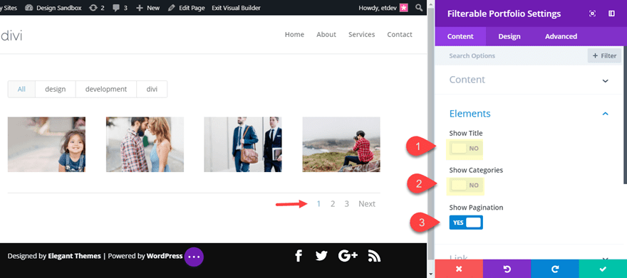
Posts Number: 4 (so you can see more page links in the pagination)
Show Title: NO
Show Categories: No
By default Divi will Show Pagination so leave that option set to YES.
You should see the pagination at the bottom right of the portfolio.
To style the pagination, go over to the design tab and open the Pagination Text toggle to see all the options available. Update the following:
Layout: Grid
Pagination Font: Source Sans Pro
Pagination Font Style: TT
Pagination Text Alignment: Center
Pagination Text Color: #cccccc
Pagination Text Size: 4vw (desktop), 38px (tablet and phone)
Pagination Letter Spacing: 1vw
Pagination Line Height: 2em
Then click the advanced tab and add the following snippet of CSS under Pagination Active Page:
color: #0096eb !important;
By making the text larger with a bigger line height, there is more clickable space for users. Changing the alignment to center and adding a little letter spacing helps make the pagination more noticable. And the custom pagination text color with the contrasting active page color helps the user know what page they are on.
Other Quick CSS Snippets
Here are a few quick and easy CSS snippets to change up the pagination design.
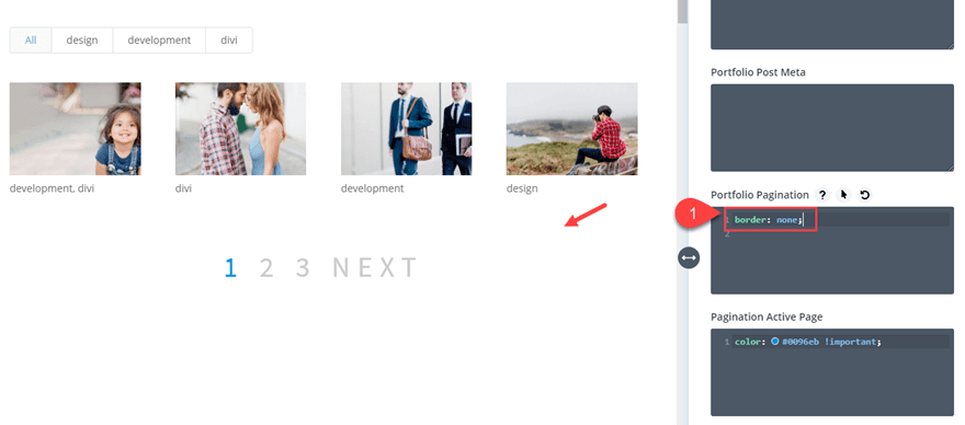
To take out the default border line that sits directly above the pagination, you can enter the following CSS under Portfolio Pagination:
border: none;
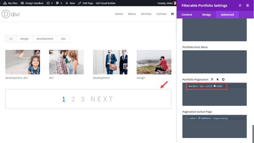
To give your pagination a complete border, you can enter the following CSS under Portfolio Pagination:
border: 2px solid #dddddd;
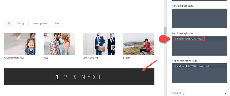
To give you pagination a background color, you can enter the following CSS under Portfolio Pagination:
background: #333333;
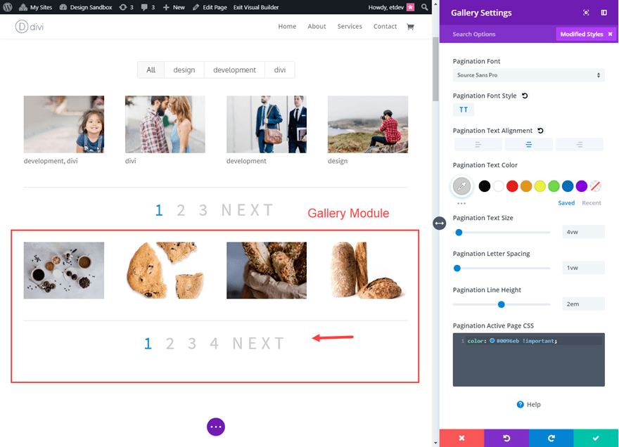
Works for Gallery Module as well
This same design settings will work for the Gallery Module as well. In fact you can copy the pagination text styles from the Filterable Portfolio Module and paste them into a Gallery Module! Just make sure you transfer over any CSS snippets as well.
Advanced Pagination Styles for Gallery Module and Filterable Portfolio Module
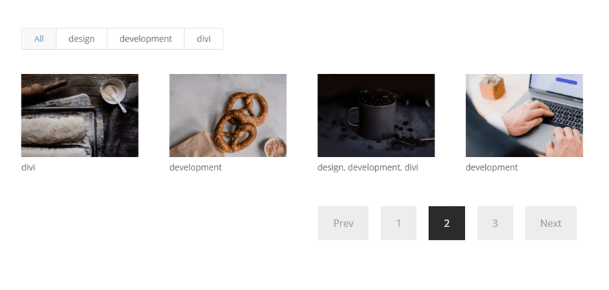
If you want to get a more advanced design for the pagination of you Filterable Portfolio and Gallery modules, you can use some more advanced custom CSS. What I like about this particular example is that the custom CSS works in tandem with the built in settings of the module.
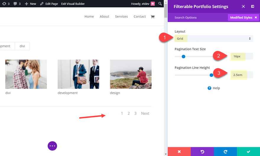
To demonstrate, let’s use the Filterable Portfolio again. This time, update the design options with the following:
Layout: Grid
Pagination Text Size: 16px
Pagination Line Height: 2.5em
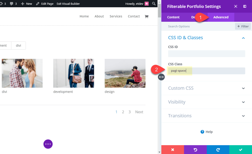
Under the advanced tab, add the following CSS class:
CSS Class: pagi-space
This will allow our CSS to be applied only to this module.
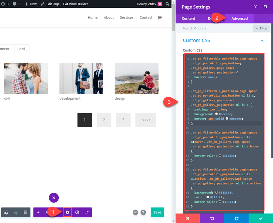
Now save your settings and open the Page Settings popup modal. Under the advanced tab, add the following CSS code inside the Custom CSS box.
.et_pb_filterable_portfolio.pagi-space .et_pb_portofolio_pagination, .et_pb_gallery.pagi-space .et_pb_gallery_pagination {
  border: none;
}

.et_pb_filterable_portfolio.pagi-space .et_pb_portofolio_pagination ul li a, .et_pb_gallery.pagi-space .et_pb_gallery_pagination ul li a {
  padding: 1em 1.5em;
  background: #eeeeee;
  border: 1px solid #eeeeee;
}

.et_pb_filterable_portfolio.pagi-space .et_pb_portofolio_pagination ul li a:hover, .et_pb_gallery.pagi-space .et_pb_gallery_pagination ul li a.hover {
  border-color: #333333;
}

.et_pb_filterable_portfolio.pagi-space .et_pb_portofolio_pagination ul li a.active, .et_pb_gallery.pagi-space .et_pb_gallery_pagination ul li a.active {
  background: #333333;
  color: #ffffff;
  border-color: #333333;
}
With the code in place, you can see that the pagination now has more clickable space for each of the page links. And the links also have background colors added so that they look more like clickable buttons. A subtle border is added to each of the links on hover as well. The active page link stands out with a contrasting dark background with lighter text color.
This code will style the pagination for both the filterable portfolio module and the gallery module. Just make sure you add the CSS class “pagi-space” to the module for it to take effect.
Here is the result on the filterable portfolio module.

Styling Blog Module and Portfolio Module Pagination
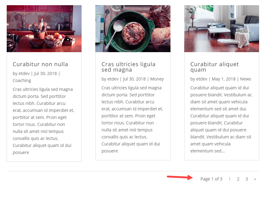
The Blog Module and Portfolio Module inherit the default WordPress pagination that allows you to navigate through your post archive with a link to “Older Entries” and a link to “Next entries”.
Here is what the default pagination looks like on the blog archive page in the Divi Theme:
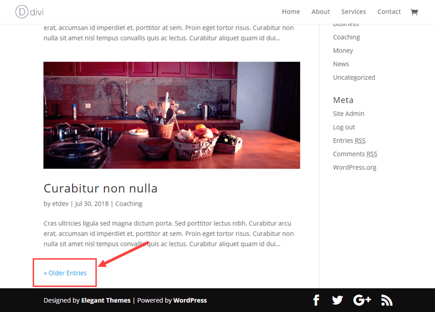
This same pagination is used by the blog module and portfolio module.
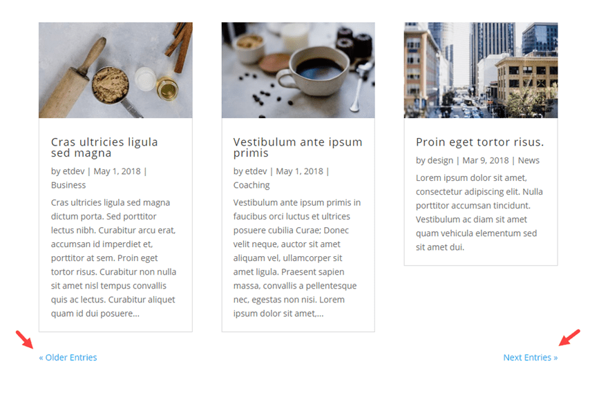
If you are using the Blog Module (or portfolio module), you can style the pagination text using the built-in settings.
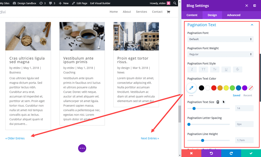
This is a simple and elegant solution for most cases. However, if you are looking for a more complex pagination to replace the default Divi/WordPress pagination, there is a solution that is so easy it may surprise you.
If you want a more advanced pagination for your entire Divi Theme, including the blog module and portfolio module, you can replace the default WordPress pagination with a different one using the popular plugin called WP-PageNavi. This plugin works well with Divi. The design is basic but can easily be customized using CSS.
Adding the Plugin to Divi
If you haven’t done so already, go ahead and install the plugin as described in the “Getting Started” section at the top of the post. Once the plugin is installed and active, the new form of pagination will show up automatically throughout your theme.
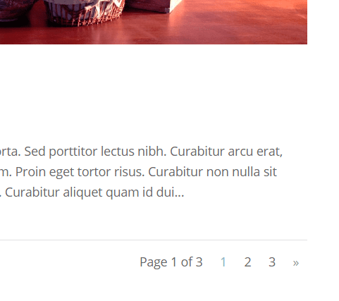
It will also affect the blog module and portfolio module as well.
Plugin Settings
You can locate the plugin settings from your WordPress dashboard by navigating to Settings > WP-PageNavi.
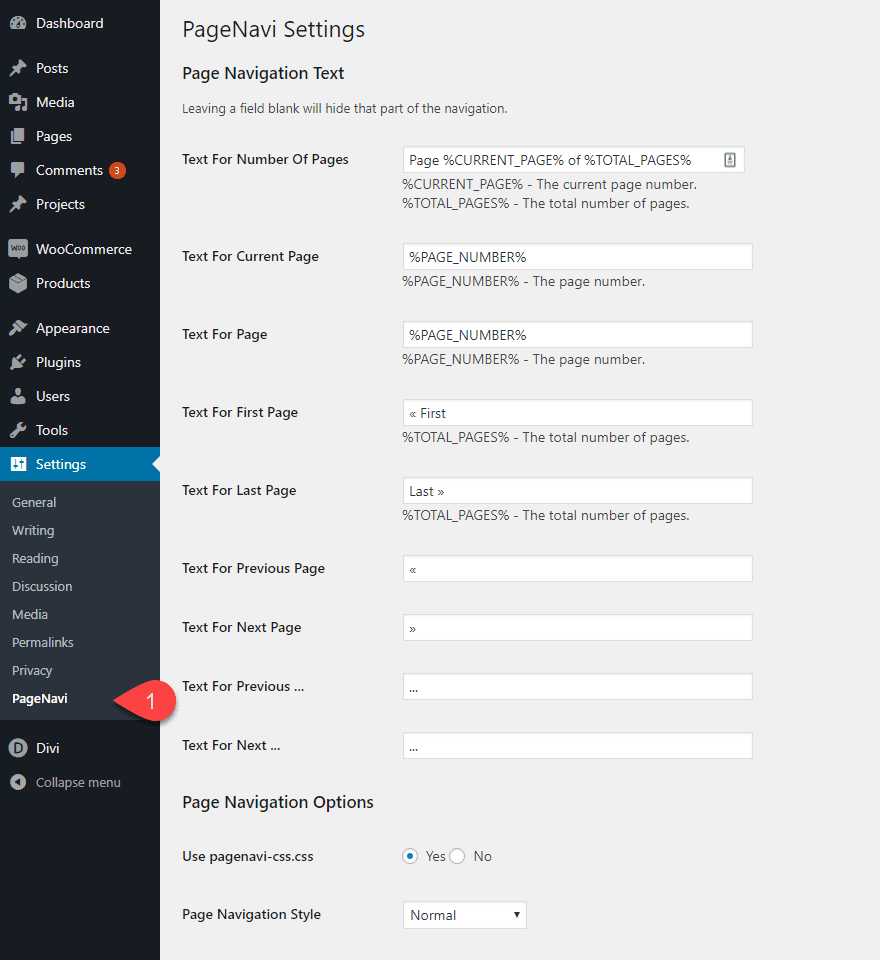
The settings are primarily for customizing the functionality and text content that is displayed. However, if you want to style the pagination, you will need to use some custom CSS.
Since you will probably want to style the pagination for the entire theme, it makes most sense to add the CSS to the Theme Customizer or your Child Theme style.css file. Go ahead and place the following CSS into the Theme Customizer Additional CSS box:
/*styles the wp-pagenavi pagination links*/
.wp-pagenavi a, .wp-pagenavi span {
  padding: 0.3em 0.8em !important;
  font-size: 2em !important;
  color: #333333;
  line-height: 2em;
  background: #eeeeee;
  transition: all .5s;
}

/*styles the wp-pagenavi current page number*/
.wp-pagenavi span.current {
  color: #ffffff !important;
  background: #333333 !important;
}

/*styles the wp-pagenavi pagination links on hover*/
.wp-pagenavi a:hover {
  color: #ffffff !important;
  background: #333333 !important;
}

/*styles the wp-pagenavi pages text*/
.wp-pagenavi .pages {
  background: none;
}
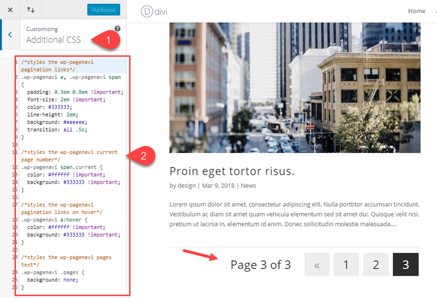
Here is the final result.
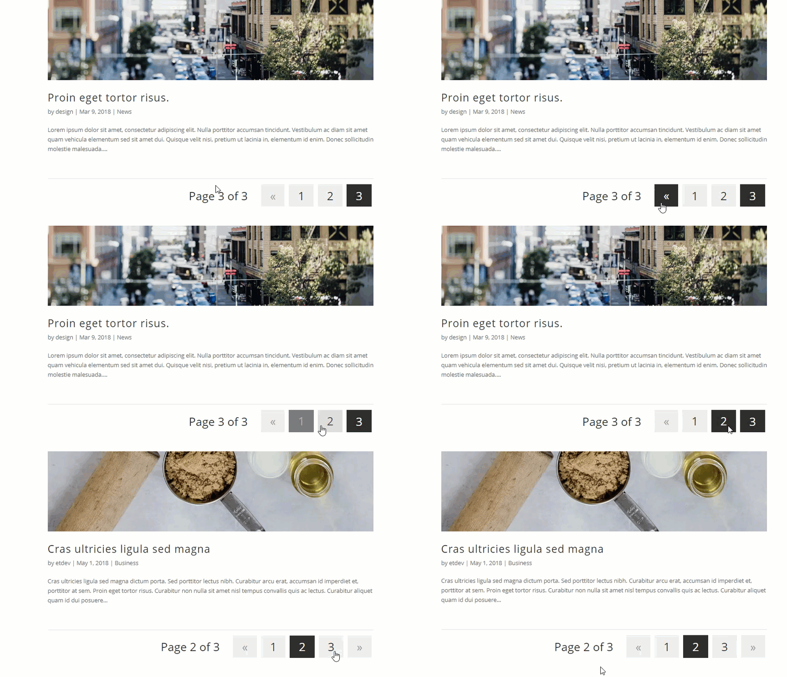
As mentioned earlier, the Blog Module and Portfolio Module inherit the default WordPress page navigation. Since this has been replaced with WP-PageNavi’s new complex pagination, the modules will display this new pagination as well.
You can use the built-in pagination text design options to add further styling to the pagination.
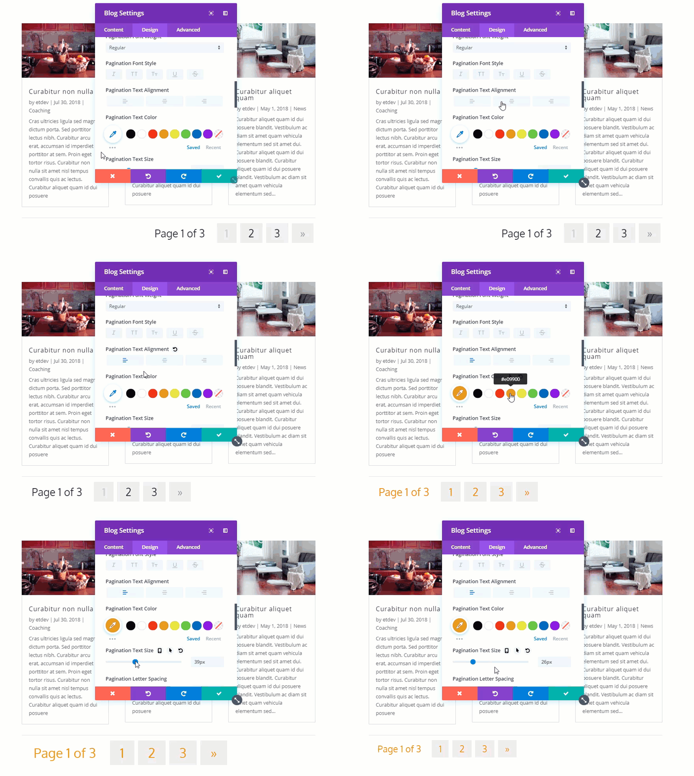
Just bear in mind that some of the options may not work as expected with external custom CSS in place.
Final Thoughts
Pagination doesn’t have to continue to be an afterthought when building a website in Divi. There are some helpful built-in options to help with those modules that use pagination. And with some custom CSS you can create any style you want. The WP-PageNavi plugin is an elegant solution for adding a complex pagination throughout the Divi Theme. Not only does it work seamlessly with Divi, it gives you additional options you can easily customize. Styling the WP-PageNavi pagination does require some CSS, but hopefully the template used in this article will put you on the right track.
The example designs in this post were purposefully simply.
I look forward to hearing from you in the comments.
Cheers!



I’ve been using Divi and I want my blog pagination to be different URLs, “/blog/page/2”, “/blog/page/3”. But now it’s all the same URL.
I’ve been searching for hours but still don’t know. Please help!
Great post! It works like a charm.
thanks a lot for the awesome post. This is what exactly I was searching for so long. I was facing difficulty in creating divi pagination in a styled manner.
So glad this helped you.
Thanks For sharing this Helpful Information about Style divi pagination. keep It Up
Hi Jason. This is EXACTLY what I have been after today. I’m designing a car dealership website for a client, (the largest client I’ve ever had as well, so a clean design is imperative!) who have over 150 vehicles in their inventory. I didn’t particularly want to place 150+ cars on one page (I’m using the car dealer layout from ET). This way I can actually place a smaller number of vehicles on each page. I was going to use a car dealer plugin, but having tried a few, none of them matched with the layout, and looked really unprofessional, taking away from the actual design aesthetic of the layout. This way I can actually place each vehicle onto a page without it looking too “third party plugin”. thank you to yourself and ET for once again coming up with such a helpful tip! Regards, Martin. 🙂
Awesome, Martin! Hope it works out well for you. Thanks for the comment.
Thank you for the nice tutorial. Though this is useful…. Is there a simple way to just switch the pagination to just large arrows for next and previous.
Unfortunately, I haven’t looked into this. Sorry. But I really love the idea.