This post is part 1 of 5 in our mini series titled 5 Interesting Ways to Style Divi’s Slider Module. Stay tuned for all five unique examples of the slider module and tutorials on how to achieve them!
In today’s slider tutorial we will be creating a slider used to feature team members. Traditionally team members have a “card” style look or are placed one per column. This is just another idea to display your staff as well as make use of the Divi slider module in a creative way.
Let’s get into it!
- 1 Today’s Before & After: The Divi Slider Module
- 2 How to Style Divi’s Slider for a Bold Team Members Area
- 3 The Concept & Inspiration
- 4 Preparing the Design Elements
- 5 Implementing the Design with Divi
- 6 The Slider Module Settings
- 7 The Slide Settings
- 8 Finishing Up with a Media Query
- 9 Tomorrow: How to Add Parallax Elements and a Slide-Down Transition to the Divi Slider Module
Today’s Before & After: The Divi Slider Module
The slider doesn’t come with any default images stored inside so I’ve added the background images and slide images ahead of time, but not changed any of the default settings in the module. The slide images I’ve chosen act as team member profile photos and the background images are chosen to represent their corresponding workspaces.
Below is a screenshot of the slider before applying settings, you’ll notice the slide images are perfectly square as we’ll be making them round using CSS.
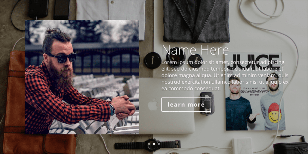
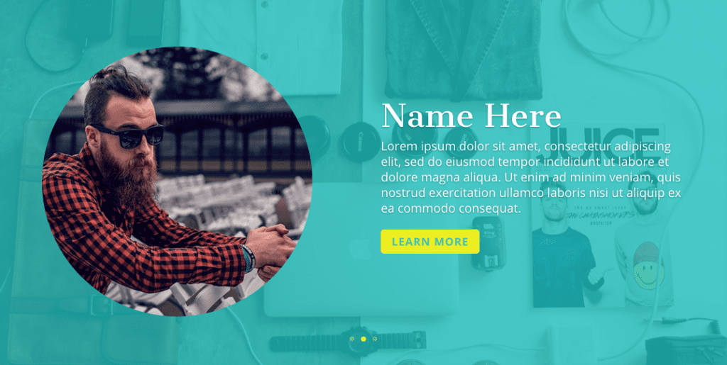
When we’re done, the above slider will look like the one below. I’ve chosen a pretty bright color scheme for this look but all the settings are in the modules so they’re very easy to change.
How to Style Divi’s Slider for a Bold Team Members Area
Subscribe To Our Youtube Channel
The Concept & Inspiration

When I was planning out these posts I just tried to think of ways to use the slider in different ways and team members was one of them. I’ve used it for that purpose before on client’s sites and when designing this look I had a young-ish startup in mind, so I thought I could get bold with the color choices.
Preparing the Design Elements
I’ve gathered my images ahead of time as well as chosen the menu titles I’d like to use. It’s best to optimize your images beforehand, and also size them down close to the size they’ll actually be appearing on the frontend when possible. There are many ways to optimize images, you can use software like Photoshop, you can have an image optimization plugin on your site like Imagify or EWWW, or you can use an online tool like TinyPNG (which also has a plugin available if you prefer to optimize on upload).
There are plenty of places online to purchase stock photos as well as find free photos, I tend to stick to pexels.com and that’s where I’ve found all the images being used in this post.
If you’d like to follow along with images of your own, here the dimensions used in my example below:
- Background images: 1200px by 800px
- Team member images: 400px by 400px
Implementing the Design with Divi
I’ll be using the classic backend builder because that’s what I’m most comfortable with, but everything we do can certainly be accomplished and edited with the new frontend Visual Builder–as you can see in the video above.
The Slider Module Settings
So we’re going to start with a standard 1-column section and add a slider module to it.

Next we’ll change some settings in the slider module itself. We won’t need to change any settings in the section module for this layout.
For the Slider Module General Settings set the following:
- show arrows
- show controls: yes
- automatic animation: on
- animation speed set to 8000
- continue automatic slide on hover: on
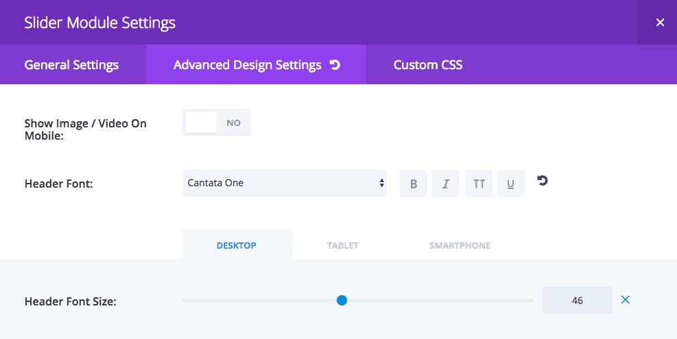
For the Slider Module Advanced Design Settings the header I’m using Cantata One and the font sizes are Desktop: 46 / tablet and smartphone: 30
For the Slider Module Custom CSS Settings the following bits of code go in their respective CSS boxes:
Slide Description – Here I’m changing the animation name (transition effect) to “flipInX” instead of the default “fadeBottom”. I like the flip effect for this because it’s whimsical nature fits with the bright color palette.
text-align: left !important;
animation-name: flipInX;

Slide Image – I’m turning all the square slide images to round and overriding Divi’s because I found when I didn’t the desktop size was a tad too small in relation to the rest of the slider elements.
border-radius: 50%;
overflow: hidden;
max-width: 400px;
max-height: 400px;

The Slide Settings
For the slide General Settings a picture works best, and the opaque teal you see is rgba(30,191,191,0.8).

The slide Advanced Design Settings are below, the yellow being used is #eeee22, the teal is #3cc4bb.

Finishing Up with a Media Query
We just need to finish up by adding a media query for small screen sizes. Without this the slide image gets cut off at the top and we don’t want that. This code can go in your Divi theme options panel at the very bottom in the Custom CSS box or in your child stylesheet.
@media only screen and (max-width: 767px) {
    .et_pb_slider_with_overlay .et_pb_slide_image {
        margin-top: 6% !important;
        padding-top: 0;
    }
}
Now you should be all set with a colorful team member slider that’s sure to stand out! We hope you’ve enjoyed today’s Divi slider tutorial, be sure to stay tuned for the rest in this mini series, and don’t forget to show us how you’ve used them on your own sites in the comments.
Tomorrow: How to Add Parallax Elements and a Slide-Down Transition to the Divi Slider Module
Tomorrow I will show you how to execute a design concept I call “foodie”. It’s perfect for pizzerias (or any restaurant, for that matter). In that tutorial I’ll show you how to add parallax elements and new slide transition to the Divi slider module. See you there!
Be sure to subscribe to our email newsletter and YouTube channel so that you never miss a big announcement, useful tip, or Divi freebie!



Great tutorial thank you!
I only have a little problem with the first slide image. It doesn’t show when I save the page.
Can you help, please!!
Nice. Thanks, neat design…
Is it possible to display several Team Members to fill the row (I want a narrow column for each) with arrows to navigate?
How to create an image like bold & bright shared in this post.
It is not full width even if i set up the section to full width. Is it normal?
@Leslie Bernal
Can I ask about the media query for small screen sizes, mentioned at the end of this tuturial?
When you say this CSS code goes into my child stylesheet (or into the Custom CSS box of the theme options panel), would that not affect each and every future slider design (independent from this particular slider layout)?
Or in other words, using:
.et_pb_slider_with_overlay .et_pb_slide_image
Are these specific to this particular slider you create in this tutorial?
What I like about Divi is that with sections, layouts and modules, you can add CSS code right inside these rather than into a style sheet, which I believe makes it easier to export and use ‘as is’ and it’s neater all around.
Thanks for clarifying the above.
Yes Roland it will affect every slider *that has a slide image*, so what you could do is assign your main section an id, OR you could put the media query only in the page CSS box and it will only affect the sliders with an image on that page.
and what is the perfect size for featured image in blog module
Thank you for great lesson.
I have a problem with post slider.
When I resize the browser, the image is collapsed.
Is the image should have a specific size.
Hi Nasser, please create a ticket in our support forum to get help with that. https://elegantthemes.com/forum
I love this idea! You’re so creative Leslie. You are also a great teacher.
Is anyone else having an issue with the media query? No matter where I put that, the slider image does not seem to seem to render any changes.
Hi Jerod! So is the image cutting off at the top for you, or what exactly is it doing?
Hi Leslie, thanks for making this. It’s much appreciated. Just one question: Can you provide a simple CSS snippet that stops the slide image from animating? There should of course be a setting in the module for this but there isn’t. Thanks! 🙂
Hi Leif! Actually I’m using that in tomorrow’s tutorial (#4) lol, but the snippet is
animation-name: none;
Hi Leslie, you said up top that you were going to list the transitions for the slider. I can’t see them. I’d love to experiment with this.
Thanks
Rob
Oh yes! So sorry, these posts go through several rounds of edits between myself and ET and the list didn’t make the cut, but I forgot to take my reference to them out. I don’t think they’d mind if I list them though. I haven’t tried them all with the slider so not sure which actually work with it:
fadeLeft
fadeBottom
fadeInLeft
fadeRight
fadeInRight
fadeOutRight
fadeInTop
fadeOutTop
fadeOutBottom
fadeOutLeft
fadeTop
fadeInRight
Grow
fadeIn
slideWidth
gridFadeIn
flipInX
flipInY
This is fantastic. Really appreciate the time taken to create these tutorials. They are a godsend to people like me trying to learn how to use this product.
Keep up the great work team!
Thanks so much Nev!
Wonder how you get the option of setting the Header Font Size to 30 for tablet and phone. My Divi 3.0.18 does not show the tabs Desktop, Tablet, Smartphone. ??
Hi Sharon! If you change your desktop font size number you should see a little phone icon show up. Click on that and you should see additional tabs for tablet and mobile.
Nice post Leslie, so comprehensive and easy to follow. Looking forward to the next one.
Thanks Olga!! 😀
Awesome production once again guys. Thanks for all you do.
Merci beaucoup.
Je t’en prie!
I really hope that’s correct cause that’s what Wiki told me LOL
Great tutorial, Im hoping to add a members area to my site in the future so this is useful.
Oh awesome, I hope some of you post how you use mine and other contributors’ tutorials in the comments!
Great Work Again Leslie!
i think with this serie of the slider module, you’re gonna answer a
question on eleganth theme users Facebook group!
i can hardly wait to see the rest of your work!
Thanks in advantage!
Oh ya, so many slider questions come up in those right? Lol I love being a part of the fb groups, thanks Jeroen!
Elegant Themes scored big time bringing Leslie on board as a guest blogger. This article is proof of that! Friendly, easy to read with plenty of really helpful screenshots. And design aspects that are what she is so good at. Nicely done!
Oh gosh thank you! <3 You're always so supportive and positive Terry!! I'm so appreciative ET even considered me to participate 🙂
Yeah, thanks for this nice tutorial Leslie!
Woohoo! Thanks so much, hope you enjoy the rest 🙂
Would be perfect to get it as wireframe to download.
Yes we are lazzy :p
Well done, Leslie! You’ve covered the *entire* process, from the concept/inspiration board, step by step, all the way to the final result, which is very stylish! Thank you!
Thanks Kathy!! I’m glad Nathan (and team) steered us to the more in-depth format. It was time-consuming but worth it!
Why you didn`t prepare json file with ready to go module ?? You create so nice export/import module in 2.6 so why you didn`t use it ? This tutorial is so cool. Thanks !!
Hi Naymapl, the goal of our daily tutorials is to help people learn how to do new things with Divi. If we simply give away a json file for everything we do, it will likely work against that goal. As people can simply download, upload, and go without going through the process themselves.
Don’t worry though, if freebies is what you’re after we’ve got plenty of those coming too.
Thanks Nathan for answer. You right about this 😉 But is many people who know how to create many thinks and json save a lot of time 😉 Anyway is good to hear from you if some freebies will coming soon 😀 All the best guys – you made some great job !!
You could do it once and share with the other people if this is your way of thinking 😉
It takes you maximum 5 minutes to create it. And as Nathan said is good to practice. We were taught to take everything ready made.
Great tutorial, Leslie! I’m loving this series! Following!
Hey thanks! This is sure to be one of ET’s more popular series with all the goodies they have lined up! 😀
Hey thanks! This is sure to be one of ET’s more popular series as so many goodies are lined up! 😀