The Divi filterable portfolio module is a great and easy way to display your work and projects on your website. You can use categories to create different filters for your portfolio module, and it offers an easy way to keep an updated portfolio without having to modify your website design every time. Simply add a new project in the WordPress dashboard, then it will auto-populate in the portfolio module on your website as long as it is properly categorized.
In this tutorial, we will show you 3 different ways to style the pagination in Divi’s filterable portfolio module. By customizing this design, you can make the portfolio module fit with the overall design of your website and draw attention to the work you want to display.
Let’s get started!
Sneak Peek
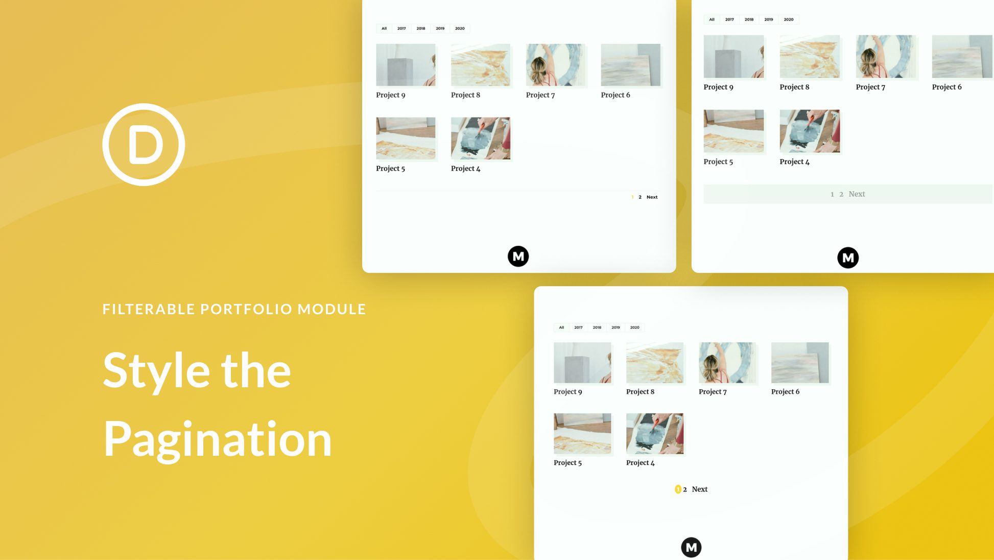
Here is a preview of what we will design
Pagination Style One

Pagination Style Two

Pagination Style Three


What You Need to Get Started
Install and Activate Divi
Before we begin, install and activate the Divi Theme and make sure you have the latest version of Divi on your website.
Add Portfolio Projects
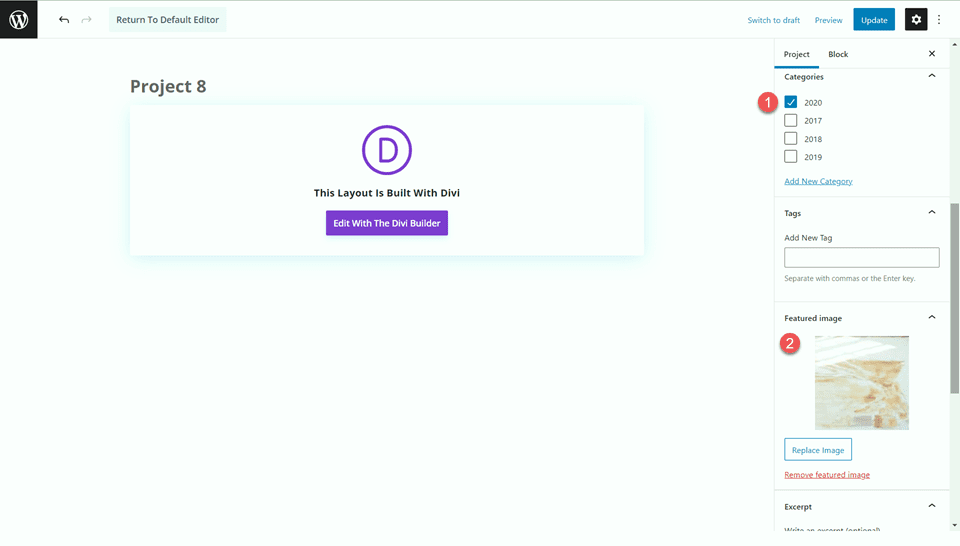
In order for the portfolio to populate with projects once we add it to our page, we first need to add the projects in the WordPress dashboard. Select Projects in the WordPress dashboard sidebar, then add a new project. Make sure the project has a featured image and a category so that it can be filtered.
Now, you are ready to start!
How to Style the Pagination in Divi’s Filterable Portfolio Module
Create a New Page with a Premade Layout
Let’s start by using a premade layout from the Divi library. We will use the Painter Portfolio Page from the Painter layout pack for this design.
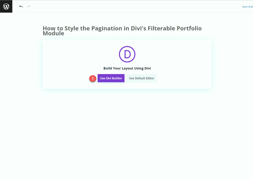
Add a new page to your website, give it a title, and select the option to Use Divi Builder.
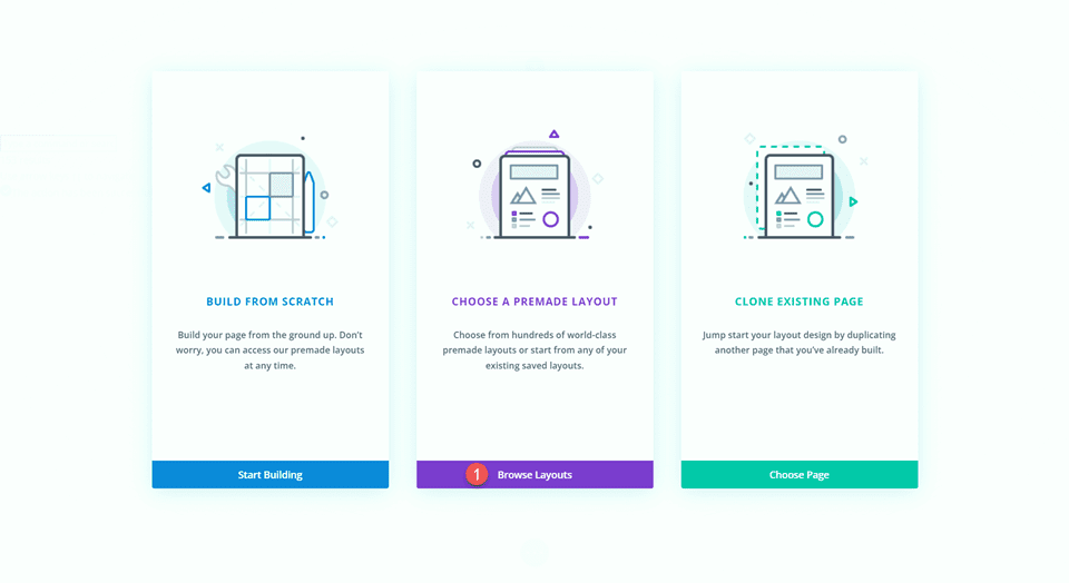
We will use a premade layout from the Divi library for this example, so select Browse Layouts.
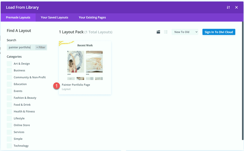
Search for and select the Painter Portfolio Page layout.
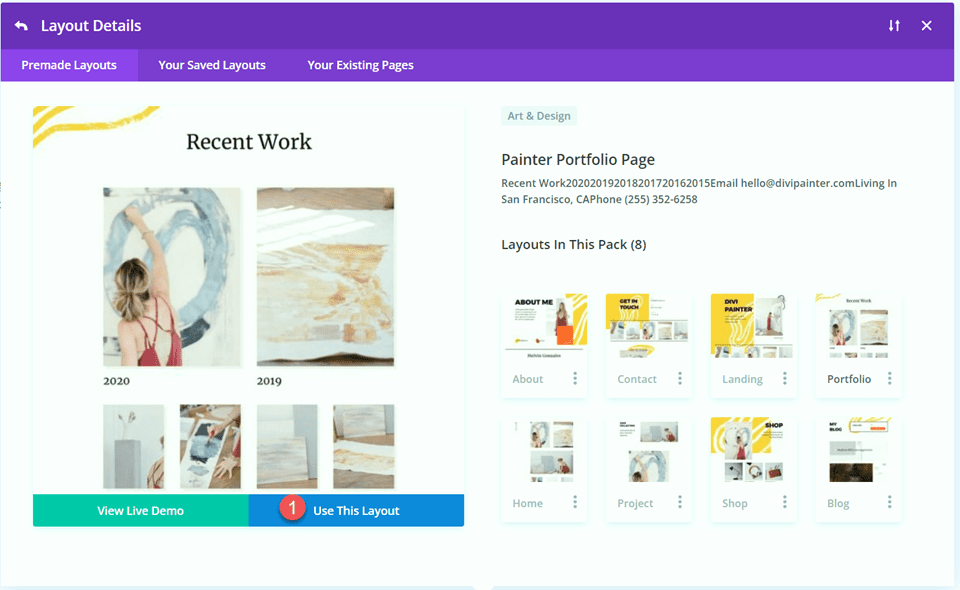
Select Use This Layout to add the layout to your page.
Now we are ready to build our design.
Add the Filterable Portfolio Module
We will be replacing the existing portfolio content on this page with the filterable portfolio module. First, delete the existing portfolio section.
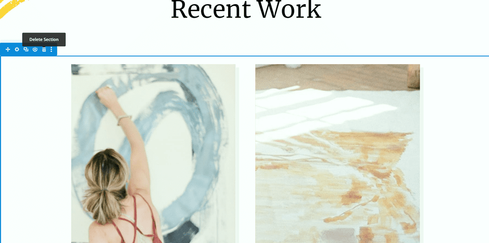
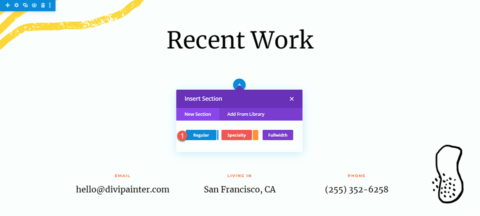
Next, insert a new section on the page, below the “recent work” section.
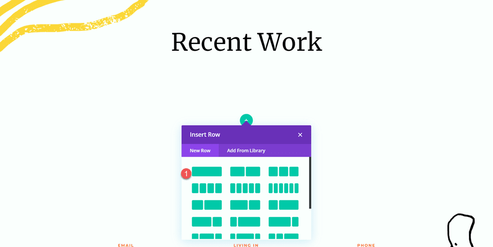
Then add a row with a single column to the section.
Add the filterable portfolio module to the new row.
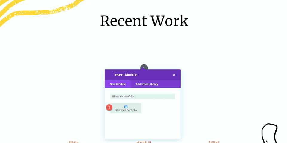
Your filterable portfolio should populate with your projects, as long as they have been added to the project section of the WordPress dashboard.
Filterable Portfolio Settings
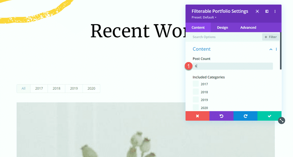
Now let’s customize the design of the filterable portfolio. Open the module settings, then change the post count to 6.
- Post Count: 6
Under elements, disable Show Categories.
- Show Categories: No
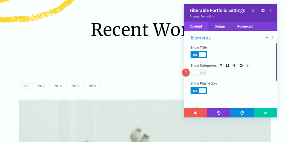
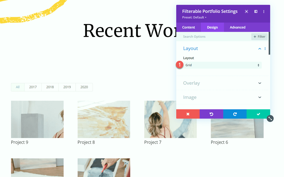
Move over to the Design tab and open the Layout settings. Set the layout to Grid.
- Layout: Grid
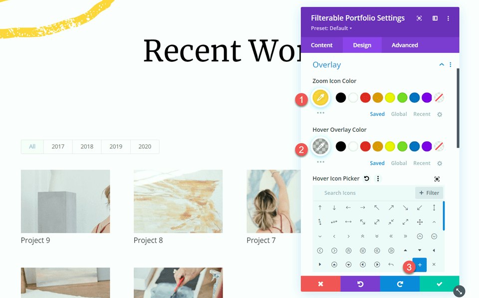
Next, open the overlay settings. Set the Zoom Icon Color, Hover Overlay Color, and Hover Icon Picker as follows:
- Zoom Icon Color: #fdd23a
- Hover Overlay Color: rgba(61,61,61,0.28)
- Hover Icon Picker: Plus Icon
Open the image settings, then add an image box shadow.
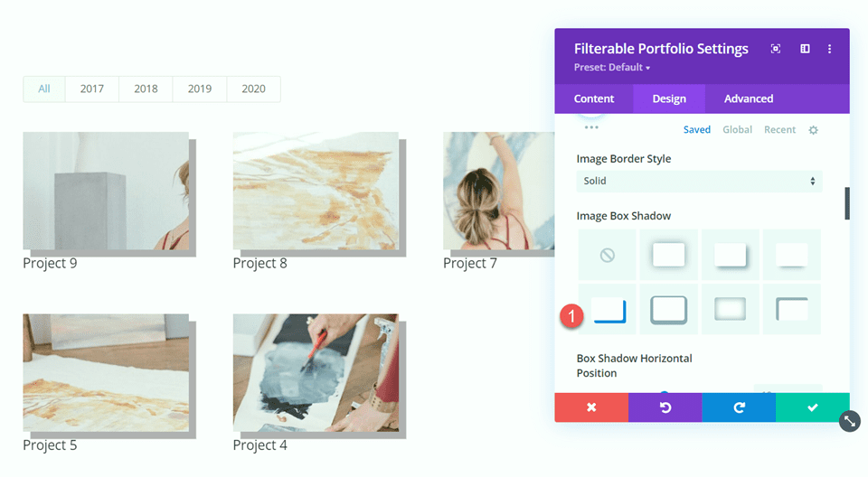
Then, set the shadow color.
- Shadow Color: #f2f2f2
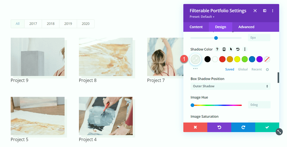
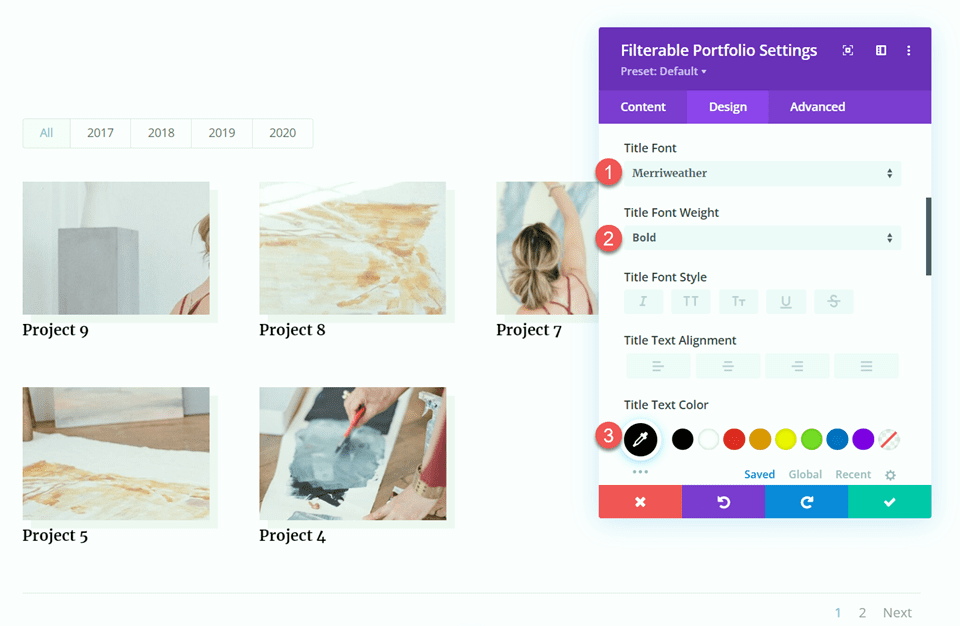
Next, change the title font settings as follows:
- Title Font: Merriweather
- Title Font Weight: Bold
- Title Text Color#000000
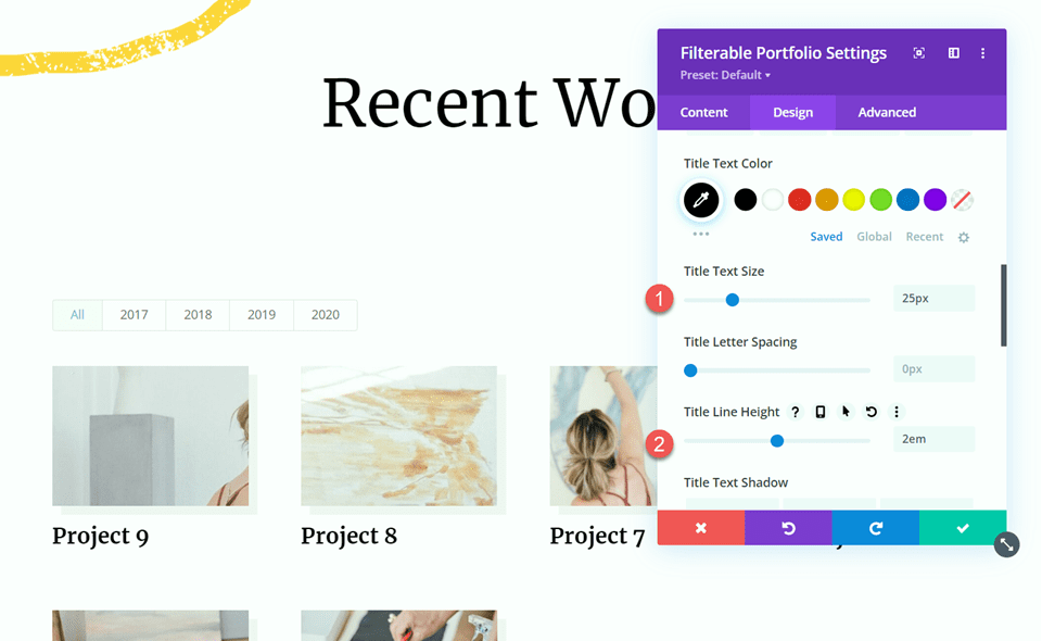
Set the title text size and line height.
- Title Text Size: 25px
- Title Line Height: 2em
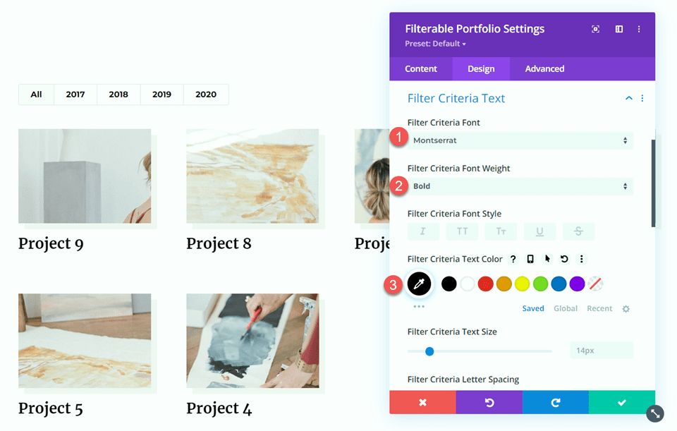
Move to the Filter Criteria Text section and change the font settings as follows:
- Filter Criteria Font: Montserrat
- Filter Criteria Font Weight: Bold
- Filter Criteria Text Color: #000000
Now that most of our module design is complete, we can move on to customize the pagination styles.
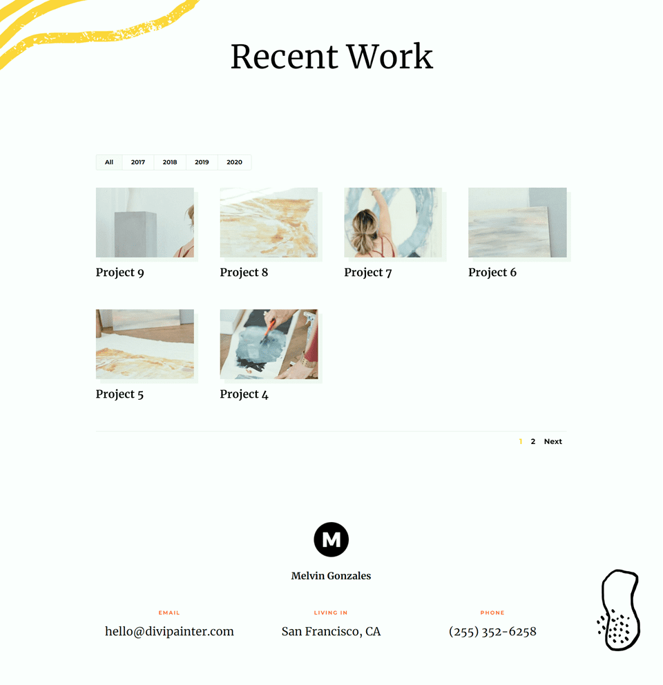
Pagination Style One
For the first pagination style, we will set a different font color for the active page. Additionally, we will set the pagination text size to increase on hover. Let’s get started.
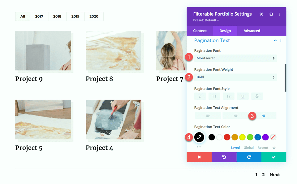
Within the filterable portfolio settings, open the pagination text settings. Customize the font as follows:
- Pagination Font: Montserrat
- Pagination Font Weight: Bold
- Pagination Text Alignment: Right
- Pagination Text Color: #000000
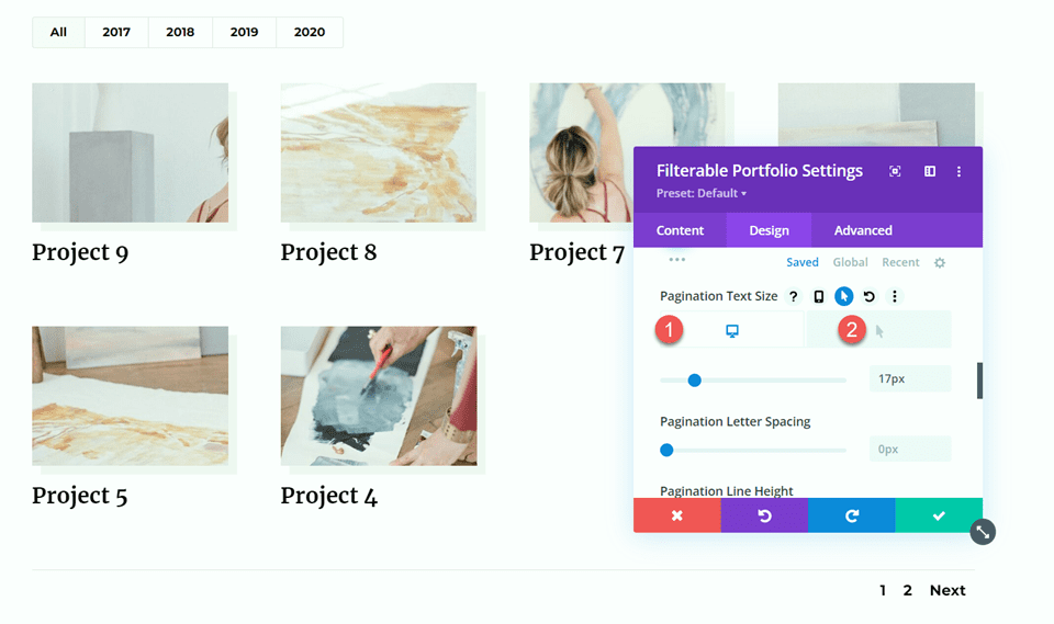
Set the text size. Then. use the hover settings to increase the text size on hover.
- Pagination Text Size: 17px
- Pagination Text Size on Hover: 21px
Finally, navigate to the Advanced tab and add the following custom CSS to the Pagination Active Page CSS section. This enables the yellow color on the active page.
color: #FDD23A !important;
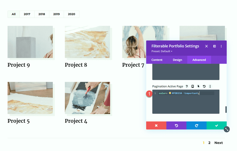
Final Design
And here is the final look for our first design.


Pagination Style Two
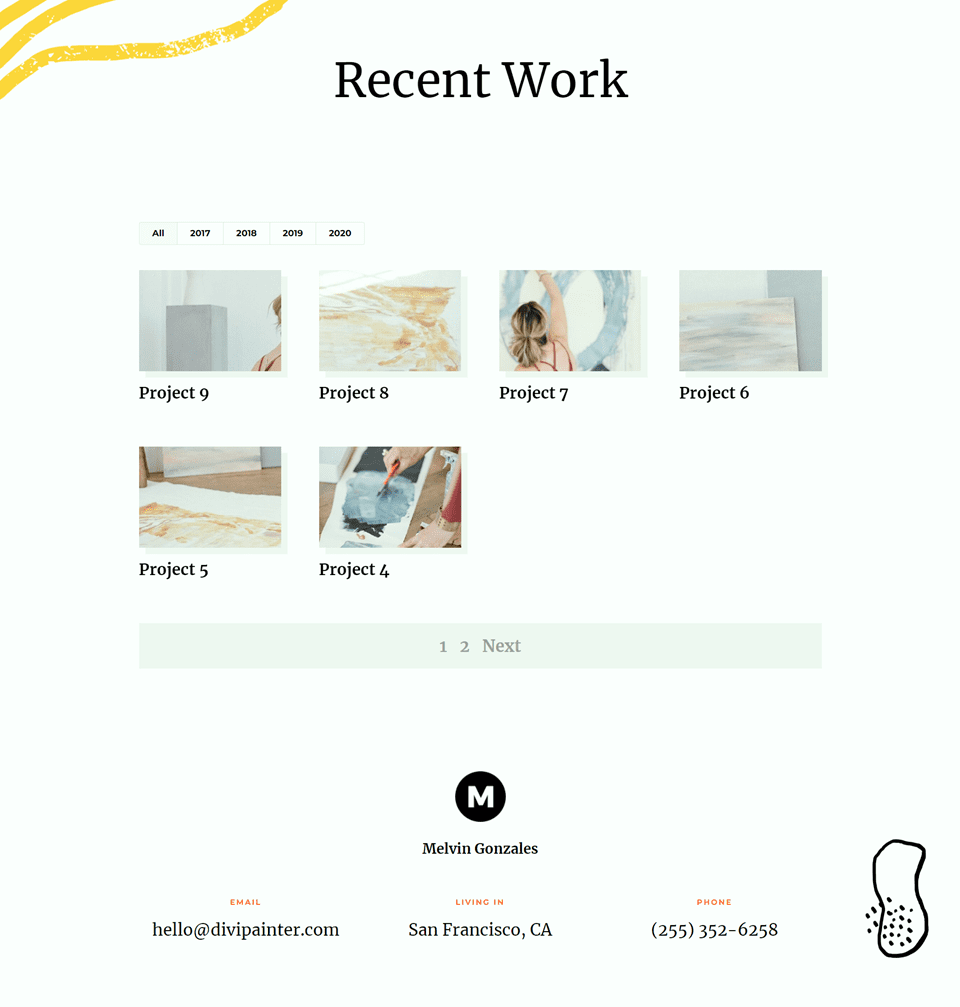
The second pagination style we will design includes a background color behind the pagination, some hover color effects, and a different color for the active page.
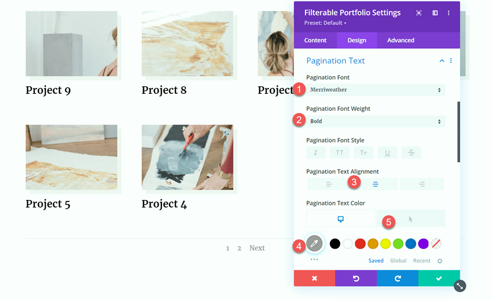
Within the filterable portfolio settings, open the pagination text settings. Customize the font as follows:
- Pagination Font: Merriweather
- Pagination Font Weight: Bold
- Pagination Text Alignment: Center
- Pagination Text Color: #9e9e9e
- Pagination Text Color on Hover: #000000
Next, set the text size and line height.
- Pagination Text Size: 26px
- Pagination Line Height: 2em
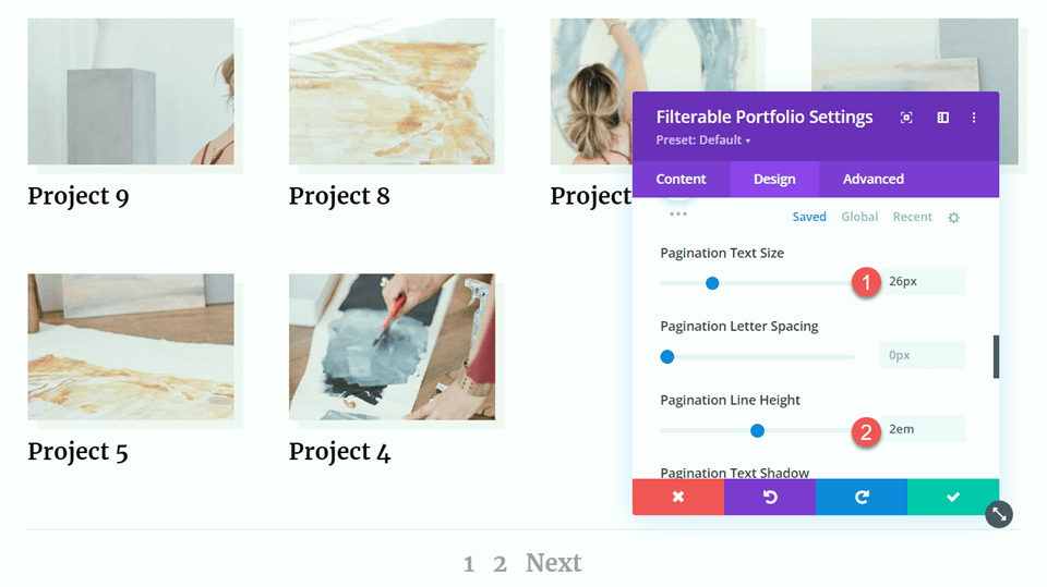
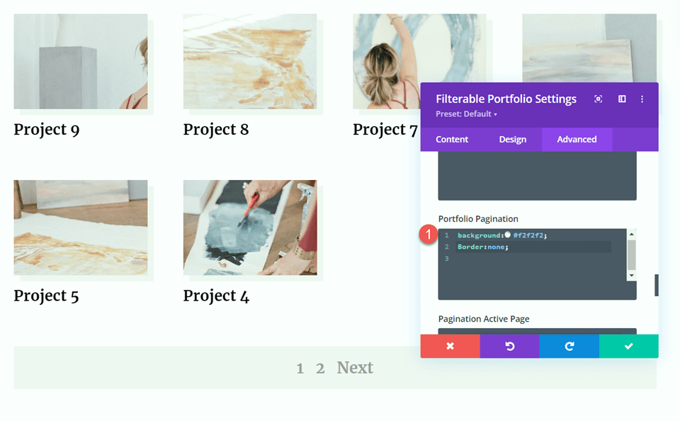
Move to the Advanced tab and add the following custom CSS to the Portfolio Pagination CSS section. This will add a background color and remove the border:
background:#f2f2f2;
border:none;
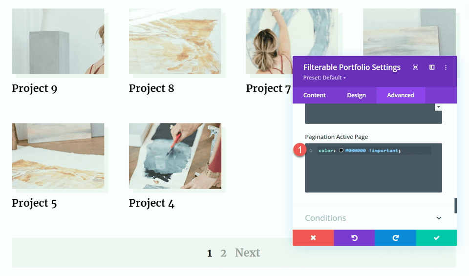
Finally, add the following CSS to the Pagination Active Page CSS section to set a different text color for the active page.
color: #000000 !important;
Final Design
Here is the final design for our second pagination style.


Pagination Style Three
For our final pagination design, we will add a yellow circle behind the active page. We will also set a different font color for the active page and on hover.
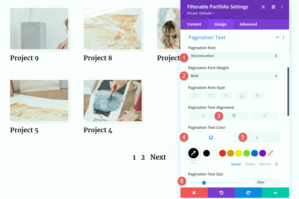
Within the filterable portfolio settings, open the pagination text settings. Then customize the font as follows:
- Pagination Font: Merriweather
- Pagination Font Weight: Bold
- Pagination Text Alignment: Center
- Pagination Text Color: #000000
- Pagination Text Color on Hover: #FDD23A
- Pagination Text Size: 26px
Move to the Advanced tab and add the following custom CSS to the Portfolio Pagination CSS section to remove the border:
border:none;
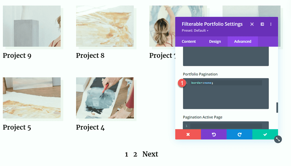
Finally, add the following CSS to the Pagination Active Page CSS section. This CSS will set a different text color and a circular background for the active page.
padding: 10% 60% 10% 60%;
background-color: #FDD23A;
border-radius: 80%;
color: #ffffe7!important;
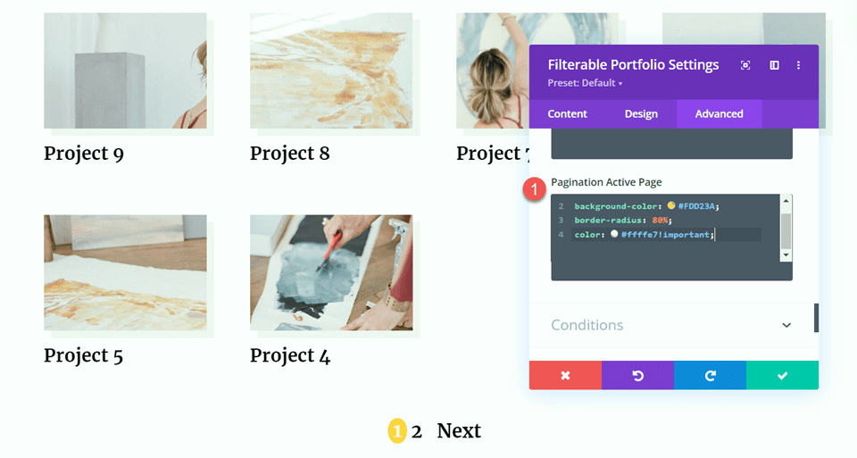
Final Design
Here is the final design for our last layout.


Final Result
Now let’s take a look at all three final designs with our different pagination styles.
Pagination Style One


Pagination Style Two


Pagination Style Three


Final Thoughts
The filterable portfolio module is easy to customize to fit with your website design, and you can quickly add new projects from the WordPress dashboard to keep your portfolio up-to-date. This module is great for designers, artists, photographers, and other creatives to show off their work with beautiful images and easy navigation. For more unique portfolio design ideas, check out this tutorial on creating a dynamic portfolio project template. Have you used the filterable portfolio module on your website? Let us know in the comments!




WHY? Why can’t we easily and responsively change the number of rows in either portfolio module? I’ve tried so many CSS options and none work properly (rows keep breaking).
This is a wonderful capability … just like so many of the fabulous features you have piled on to Divi over the years. Sadly, however, all the bloat used to produce all these features has made it impossible for those of us who would like to work efficiently with a lean, clean Divi (iike we bought a lifetime license to use) to even perform the most basic task like SAVING OUR WORK.
Every other month I’m banging on the door at ET support to get help with saving / updating a page. This is nonsense and I will ask again, could you PLEASE offer Divi Lite? A wireframe only GUI that is free from all the thousands of lines of code associated with the Visual Builder?