Your about page is one of the most important pages on your website. It allows people to get to know you better and decide if they’re comfortable to take the next step. If you’re looking for a smooth way to include storytelling in your about page, you’ll love this tutorial. We’ll use Divi and its scroll effects to create a smooth storytelling transition on scroll. As soon as a part of the story fades out, another part fades in. This gives visitors the feeling that they’re reading an interesting story. You’ll be able to download the JSON file for free as well!
Let’s get to it.
- 1 Preview
- 2 Download The About Page Story on Scroll Layout for FREE
- 3 Download For Free
- 4 You have successfully subscribed. Please check your email address to confirm your subscription and get access to free weekly Divi layout packs!
- 5 1. Create Page’s First Fullscreen Section
- 6 2. Add Animated Row
- 7 3. Insert Title with Scroll Effects
- 8 4. Clone Entire Section Once & Include Description Text with Scroll Effects
- 9 5. Clone Second Section up to As Many Times as You Want
- 10 6. Complete Page with CTA Section
- 11 Preview
- 12 Final Thoughts
Preview
Before we dive into the tutorial, let’s take a quick look at the outcome across different screen sizes.
Desktop

Mobile

Subscribe To Our Youtube Channel
Download The About Page Story on Scroll Layout for FREE
To lay your hands on the free about page story on scroll layout, you will first need to download it using the button below. To gain access to the download you will need to subscribe to our newsletter by using the form below. As a new subscriber, you will receive even more Divi goodness and a free Divi Layout pack every Monday! If you’re already on the list, simply enter your email address below and click download. You will not be “resubscribed” or receive extra emails.
1. Create Page’s First Fullscreen Section
Add New Section
Background Color
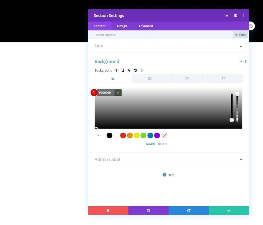
Start by adding a first section to your about page. Open the section settings and change the background color to black.
- Background Color: #000000
Sizing
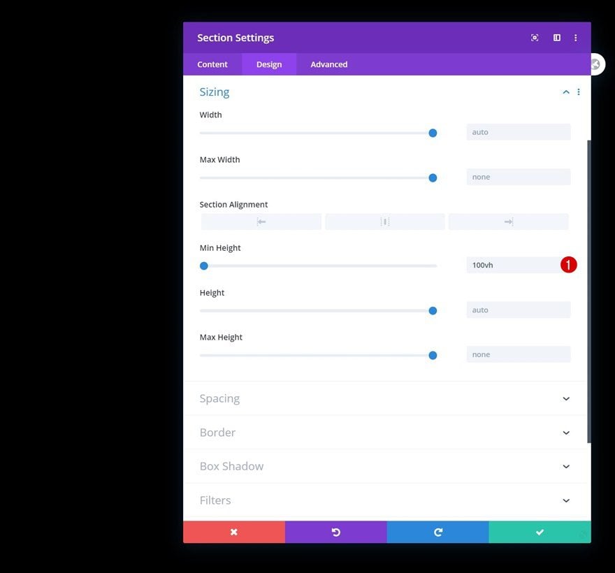
Turn the section fullscreen next by adding a min height in the sizing settings.
- Min Height: 100vh
2. Add Animated Row
Add New Row
Column Structure
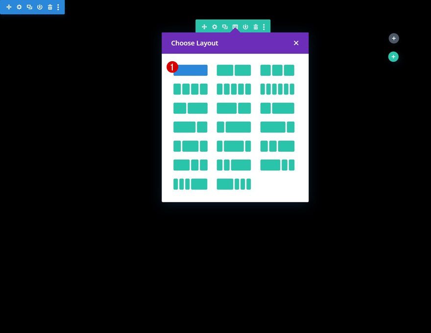
Then, add a new row to your section using the following column structure:
Sizing
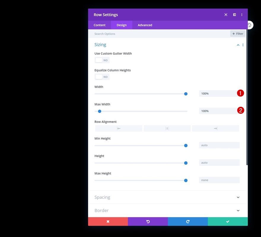
Open the row settings and allow the row to take up the entire section container’s width by modifying the sizing settings.
- Width: 100%
- Max Width: 100%
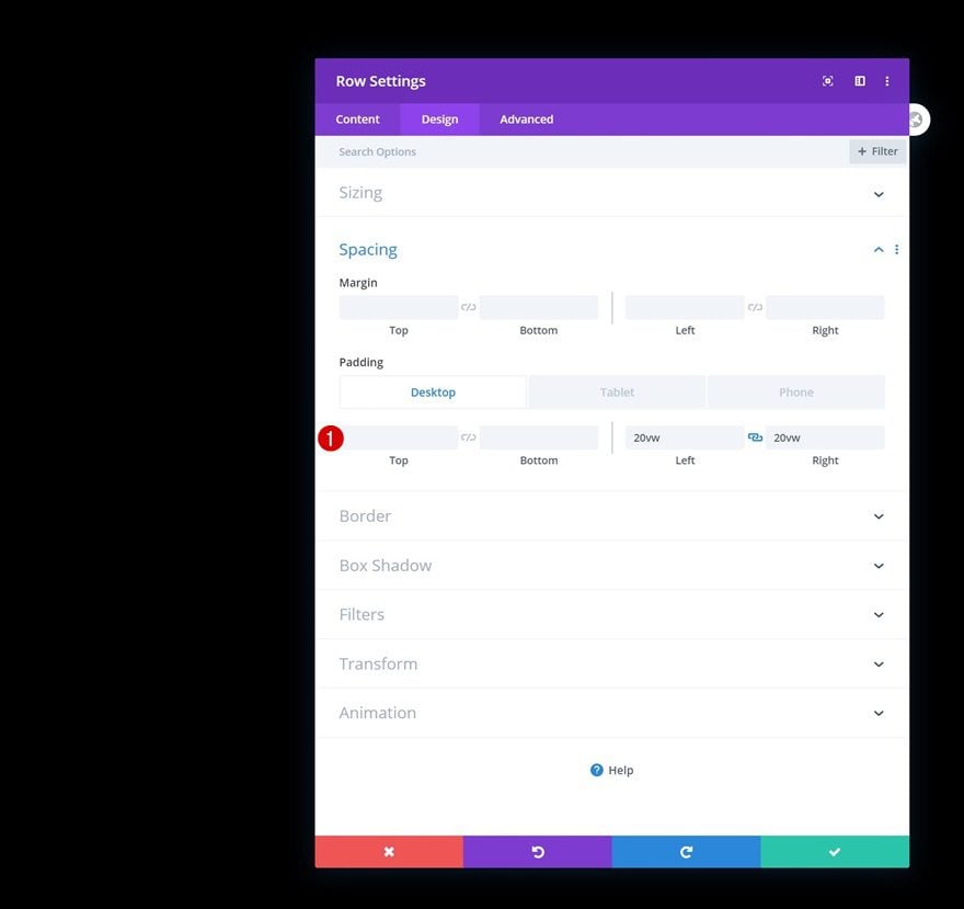
Spacing
Then, add some left and right padding across different screen sizes.
- Left Padding: 20vw (Desktop), 10vw (Tablet & Phone)
- Right Padding: 20vw (Desktop) 10vw (Tablet & Phone)
Animation
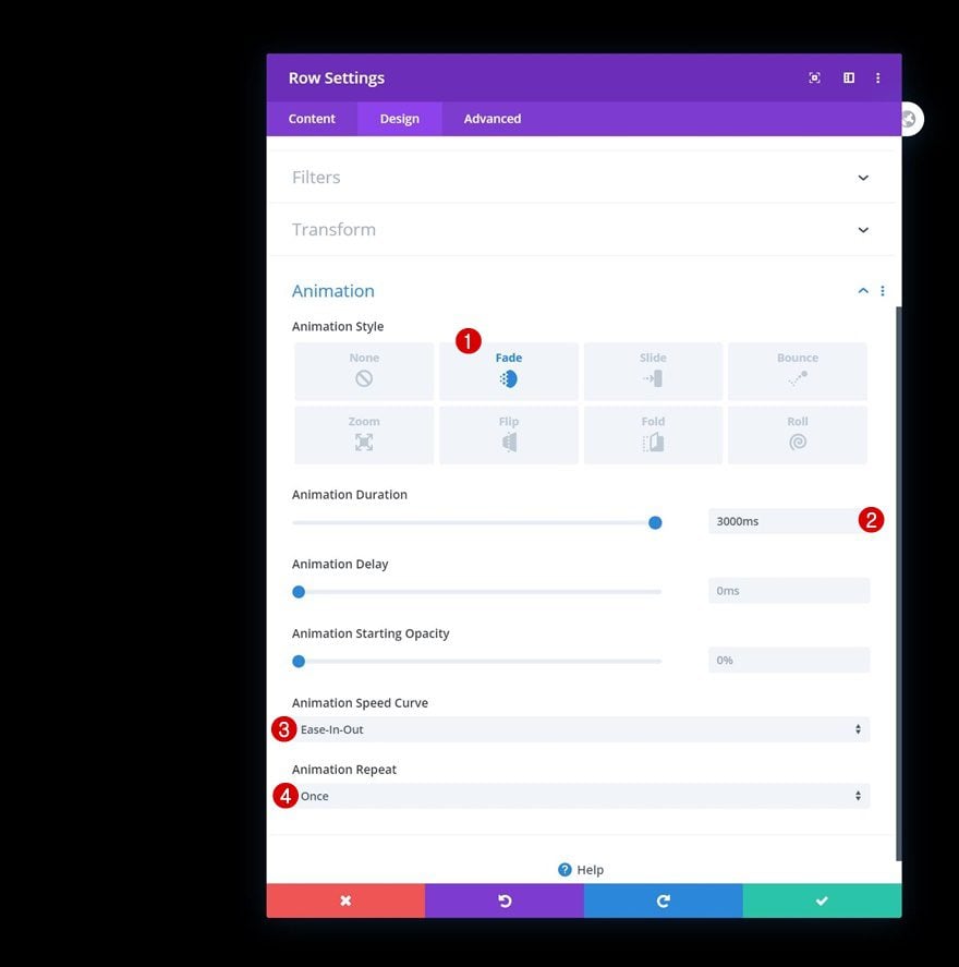
To increase the storytelling effect, we’ll also use a fade animation for the row.
- Animation Style: Fade
- Animation Duration: 3000ms
- Animation Speed Curve: Ease-In-Out
- Animation Repeat: Once
Position
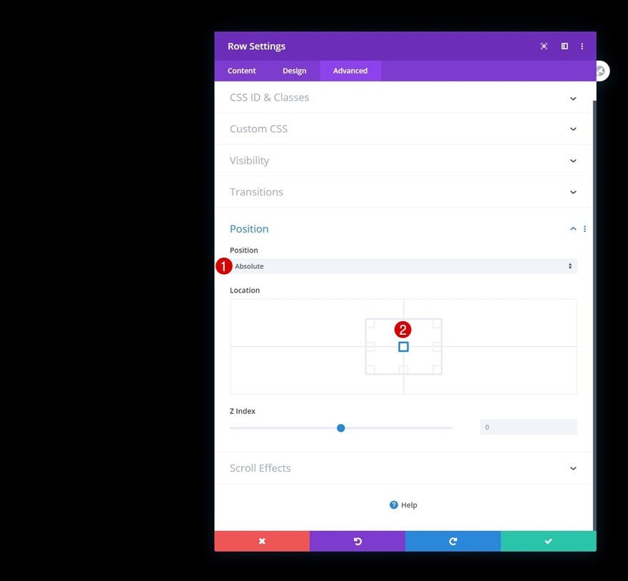
And last but not least, we’ll make sure the row is centrally positioned inside the section container by modifying the position options.
- Position: Absolute
- Location: Center
3. Insert Title with Scroll Effects
Add Text Module #1 to Column
Add H1 Content
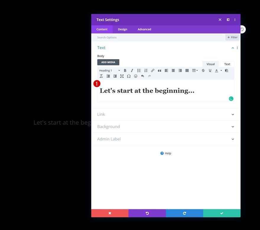
The only module we need in this row is a Text Module with some H1 content.
Heading 1 Text Settings
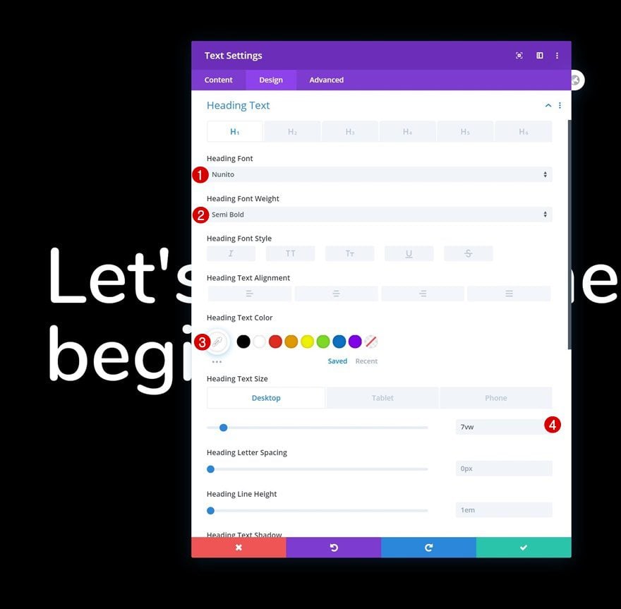
Move on to the module’s design tab and change the H1 text settings as follows:
- Heading Font: Nunito
- Heading Font Weight: Semi Bold
- Heading Text Color: #ffffff
- Heading Text Size: 7vw (Desktop), 9vw (Tablet), 11vw (Phone)
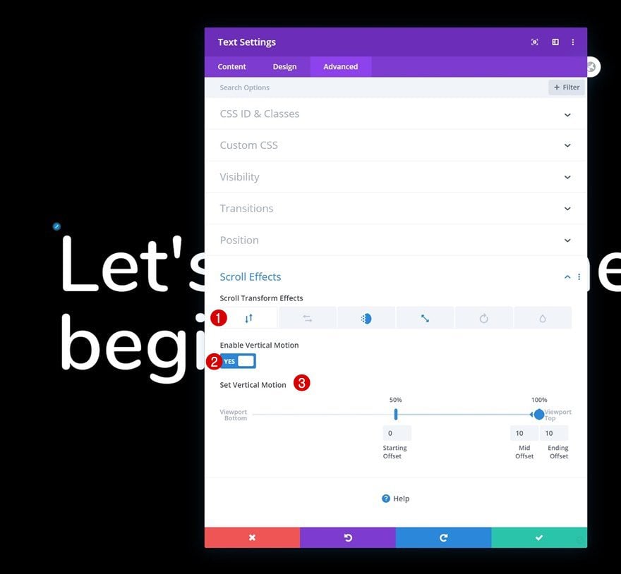
Vertical Motion
We’ll add a subtle vertical animation too.
- Enable Vertical Motion: Yes
- Starting Offset: 0 (at 50%)
- Mid Offset: 10 (at 100%)
- Ending Offset: 10
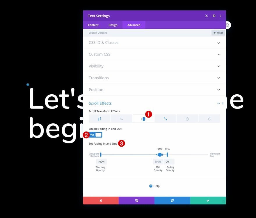
Fading In and Out Scroll Effect
Along with a fading in and out effect.
- Enable Fading In and Out: Yes
- Starting Opacity: 100%
- Mid Opacity: 100% (at 55%)
- Ending Opacity: 0% (at 62%)
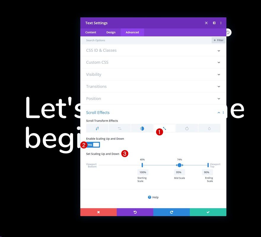
Scaling Up and Down Scroll Effect
Last but not least, we’ll also use a scaling up and down scroll effect.
- Enable Scaling Up and Down: Yes
- Starting Scale: 100% (at 40%)
- Mid Scale: 95% (at 74%)
- Ending Scale: 90%
4. Clone Entire Section Once & Include Description Text with Scroll Effects
Change Content Heading & Copy
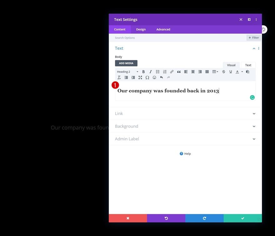
Once you’ve completed the first section, you can clone it entirely. Open the Text Module inside the duplicate section container and use some H2 copy.
Modify Text Module H2 Text Settings
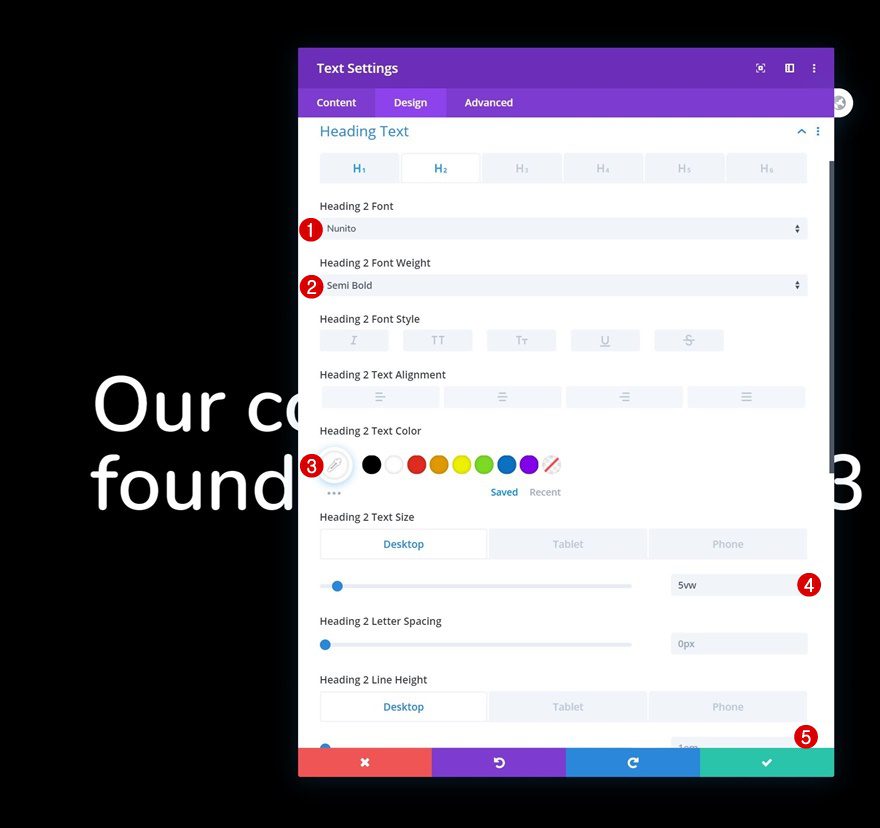
Change the H2 text settings accordingly:
- Heading 2 Font: Nunito
- Heading 2 Font Weight: Semi Bold
- Heading 2 Text Color: #ffffff
- Heading 2 Text Size: 5vw (Desktop), 7vw (Tablet), 8vw (Phone)
- Heading 2 Line Height: 1em (Desktop), 1.2em (Tablet & Phone)
Add Text Module #2 to Column
Add Content
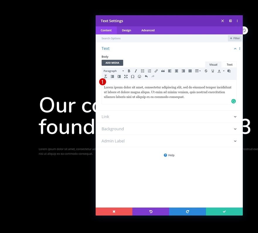
Next, add another Text Module to the column with some description content of your choice.
Text Settings
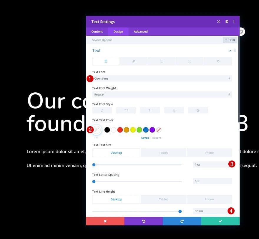
Change the Text Module’s text settings as follows:
- Text Font: Open Sans
- Text Color: #ffffff
- Text Size: 1vw (Desktop), 2.5vw (Tablet), 3vw (Phone)
- Text Line Height: 3.1em (Desktop), 2.5em (Tablet & Phone)
Spacing
Use some top margin too.
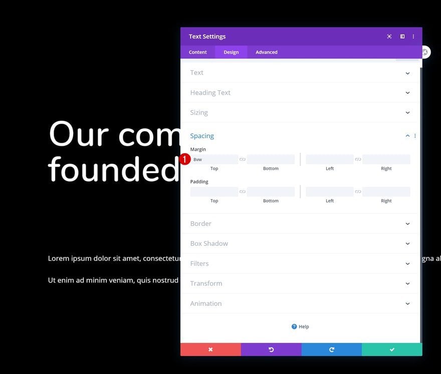
- Top Margin: 8vw
Fading In and Out Scroll Effect
Then, move on to the scroll effects in the advanced tab and use the following fading in and out settings:
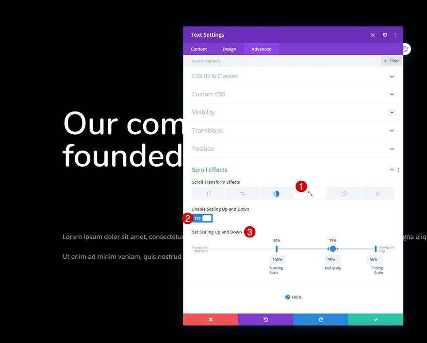
- Enable Fading In and Out: Yes
- Starting Opacity: 100%
- Mid Opacity: 0% (at 31%)
- End Opacity: 0% (at 35%)

Scaling Up and Down Scroll Effect
Add a scaling up and down effect too.
- Enable Scaling Up and Down: Yes
- Starting Scale: 100% (at 40%)
- Mid Scale: 95% (at 74%)
- Ending Scale: 90%
5. Clone Second Section up to As Many Times as You Want
Change Content as You Go
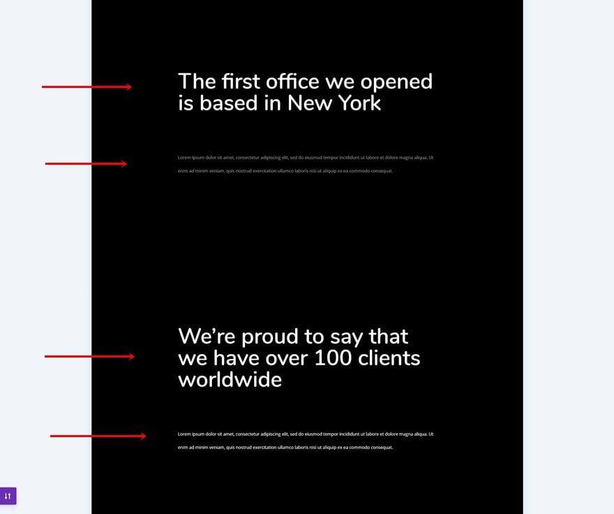
Once you’ve completed the second section on your page, you can clone it up to as many times as you want, depending on your about page’s storyline. Make sure you change the content in each section.
6. Complete Page with CTA Section
Change Description Text Module Spacing
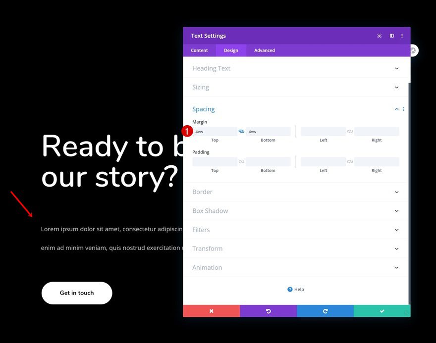
Complete the about page with a CTA section at the end. Open the description Text Module and modify the top and bottom margin.
- Top Margin: 4vw
- Bottom Margin: 4vw
Add Copy
Then, add a Button Module as well with some copy of your choice.
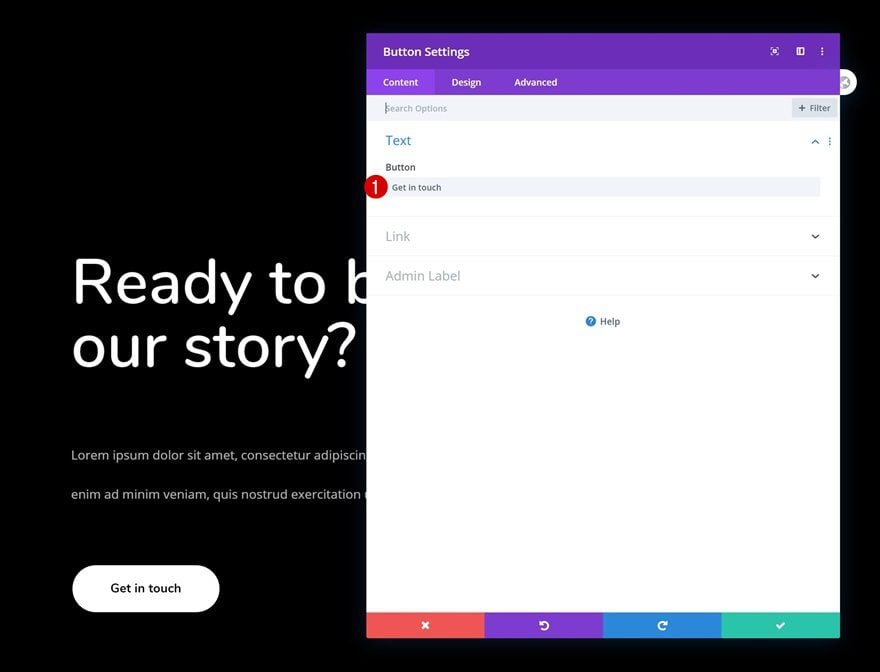
Button Settings
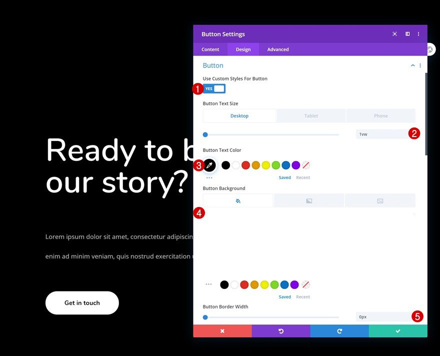
Move on to the module’s design tab and change the button settings as follows:
- Use Custom Styles For Button: Yes
- Button Text Size: 1vw (Desktop), 2.5vw (Tablet), 3.5vw (Phone)
- Button Text Color: #000000
- Button Background Color: #FFFFFF
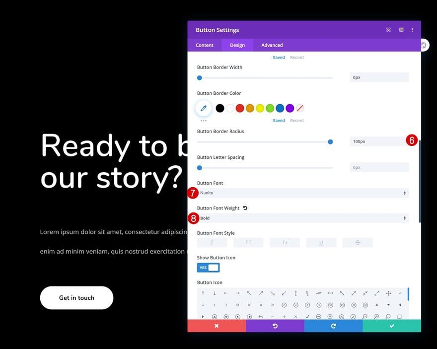
- Button Border Width: 0px
- Button Border Radius: 100px
- Button Font: Nunito
- Button Font Weight: Bold
Spacing
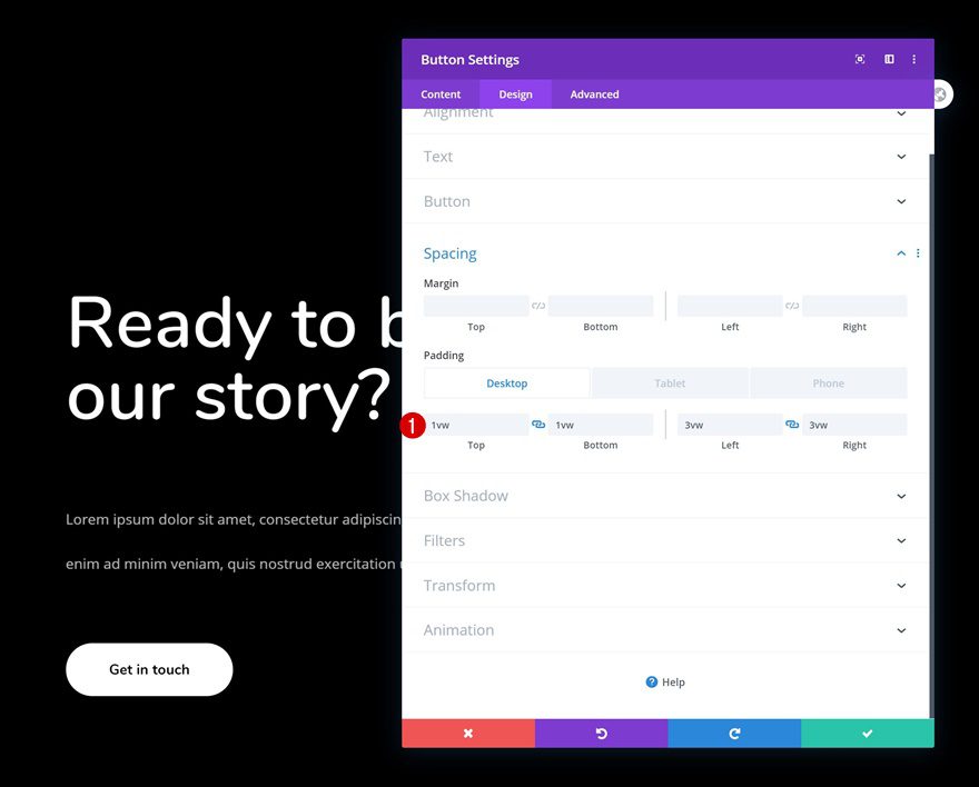
Complete the Button Module settings by adding some custom padding values across different screen sizes.
- Top Padding: 1vw (Desktop), 2vw (Tablet), 3vw (Phone)
- Bottom Padding: 1vw (Desktop), 2vw (Tablet), 3vw (Phone)
- Left Padding: 3vw (Desktop), 6vw (Tablet), 8vw (Phone)
- Right Padding: 3vw (Desktop), 6vw (Tablet), 8vw (Phone)
Preview
Now that we’ve gone through all the steps, let’s take a final look at the outcome across different screen sizes.
Desktop

Mobile

Final Thoughts
In this post, we’ve shown you how to tell a story on your about page using Divi’s built-in scroll effects. The effect we’ve created allows consecutive copy to fade in and out, giving visitors the impression that they’re reading a story. You were able to download the JSON file for free as well! If you have any questions or suggestions, feel free to leave a comment in the comment section below.
If you’re eager to learn more about Divi and get more Divi freebies, make sure you subscribe to our email newsletter and YouTube channel so you’ll always be one of the first people to know and get benefits from this free content.





Works great on phones and smaller screens, for some reason on my 32 inch 4k monitor, when the browser is opened all, the text is compressed horizontally, the animation stops working and the text sections overlap.
Another stunning tutorial. It’s really working and make it different. Story telling it’s very important. Thank you Divi.
well, storytelling could have some book-reading-appeal, that’s what I am looking for
your storytelling is like a slide-show with text…
I am looking for a way to get bookreading-alike-effect with divi for real storytelling, chapters not slides
is there a chance to realize that? I was not successful yet
yahh! Its really Working , Thanks For The informative Tutorial, Helping us to discover new new things.
Thanks for the detailed tutorial!
Trying to get smooth fade in at bottom of screen on mobile – but its not working. It either appears at 100% for a brief moment and then vanishes- only to fade in again a good way up the screen. Or if I offset the 0% start to counter this, its impossible to get the fade to start lower than 75% down the screen. i.e. the slider controls don’t seem to relate with any accuracy to real mobiles screen sizes. Recent update improved on the release version – but this is still an issue.