Blurb modules are great choices for Divi footers. They can display images or icons in different layouts and they have lots of customizations. They’re especially ideal for links with icons to create styled bullets. Fortunately, it isn’t difficult to create these types of links using the Divi blurb modules. In this article, we’ll see how to use blurb modules for footer items in your Divi footers.
Preview
Before we get started, let’s take a look at how our footer will look on a desktop and smartphone.
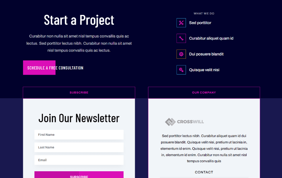
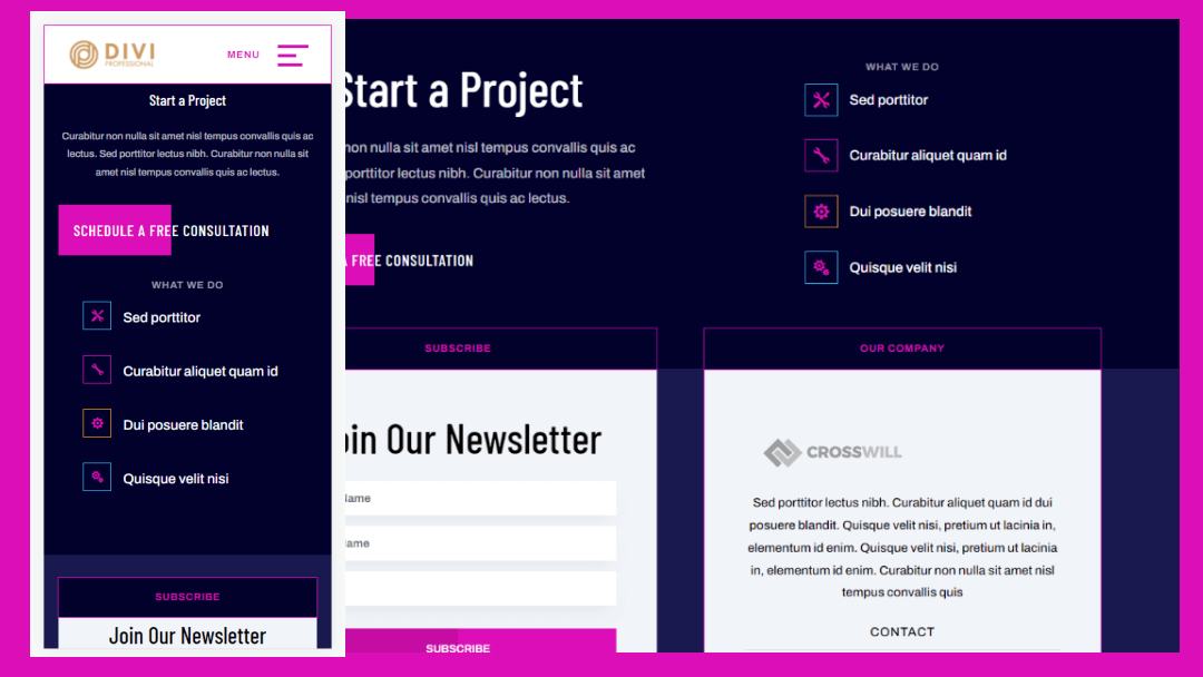
Here’s the desktop version of the footer that we’ll create. We’re using blurbs in the upper right corner to create links.
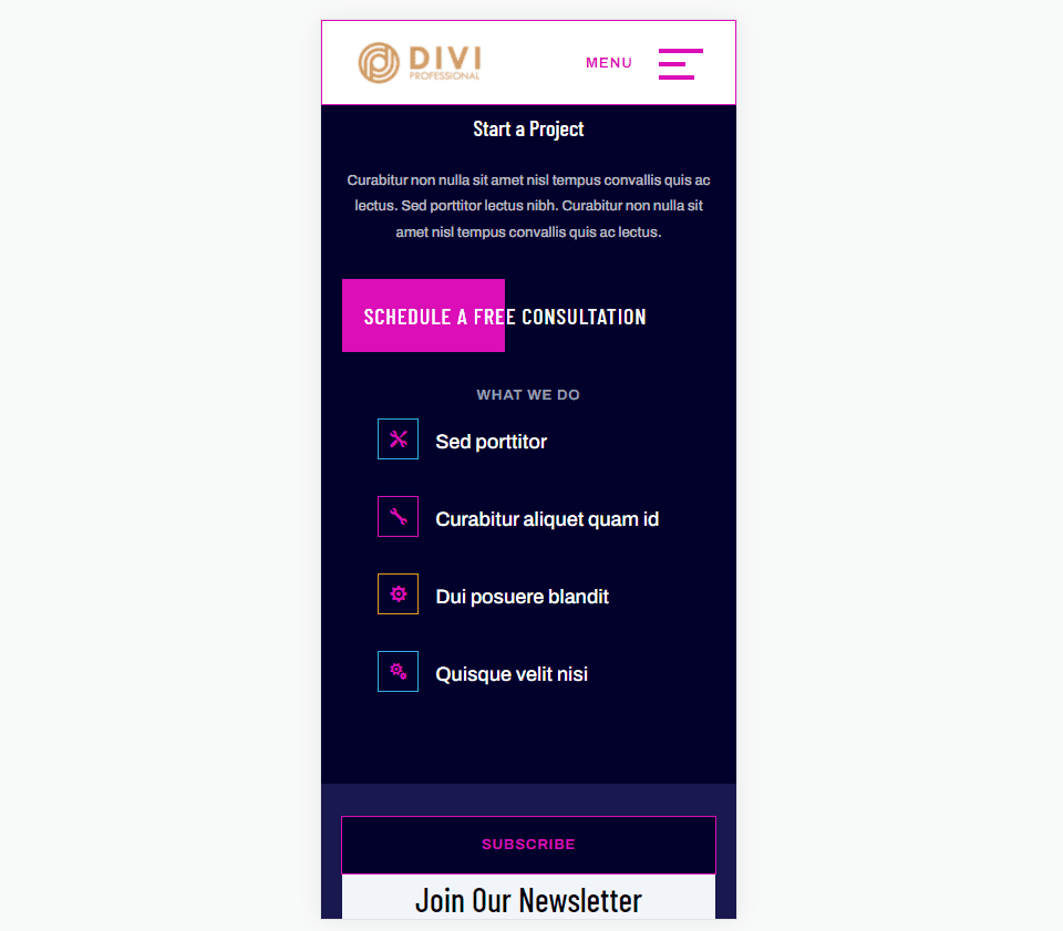
Here’s how the footer with our blurbs will appear on a smartphone.
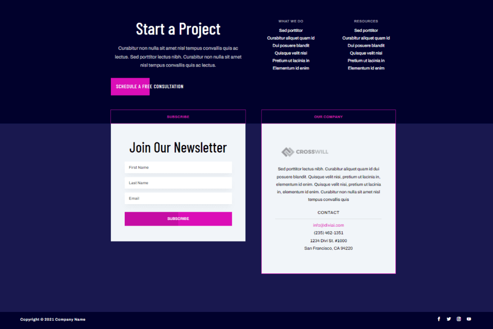
First, you’ll need a footer template for the Divi Theme Builder. You can create your own or use one of the free footers that Elegant Themes provides in the blog. You can find them by searching the blog for “free footer”. Download and unzip the folder on your computer.
For my examples, I’m using the free Header and Footer Template for Divi’s Artificial Intelligence Layout Pack.
Subscribe To Our Youtube Channel
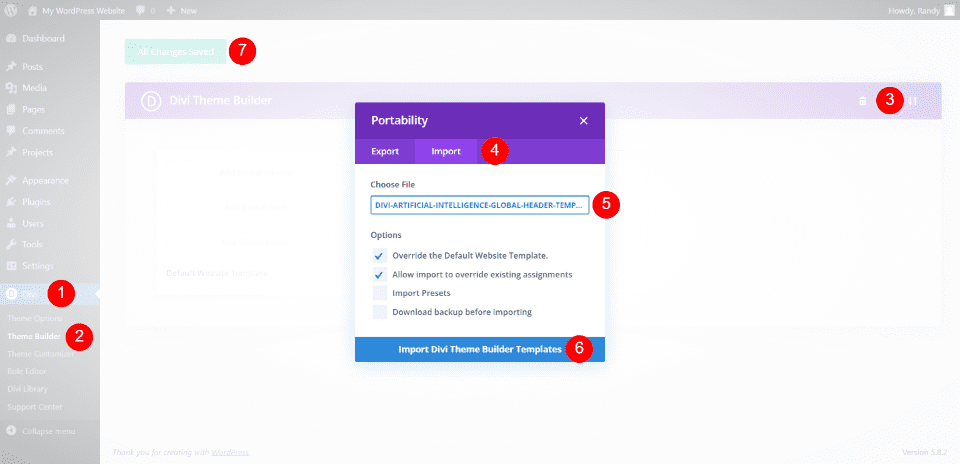
To upload your JSON file, go to Divi > Theme Builder in the WordPress dashboard. Select Portability and click the Import tab of the modal that opens. Click Choose File and navigate to the file on your computer and select it. Click Import Divi Theme Builder Templates and wait for the file to import. Delete the header if you don’t want to use it. Click Save Changes.
You’re now ready to customize your new Divi footer. You can edit the footer from here on the back end, or you can select it within the Visual Builder on the front end. I’ll edit the footer on the back end because the header has a custom menu, and it opens in the builder by default.
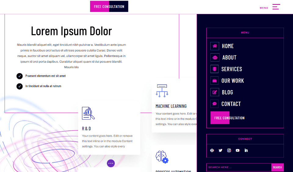
I’m also using the landing page from the Artificial Intelligence Layout Pack for my page elements. The layout and header both have lots of design queues to pull from. I especially like the design of the menu in the Artificial Intelligence header and footer template. I’ll use all of this to help me design the blurb links in the footer.
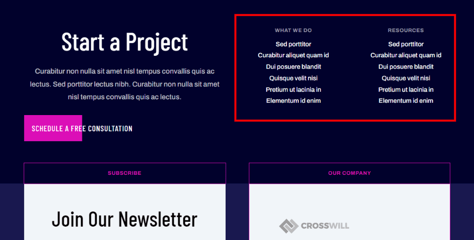
I will replace the links in the two sections called What We Do and Resources. This will get us the links we want and highlight them with icons. I will use the first heading and reduce the number of links. We will style the first one and then clone it to create the rest.
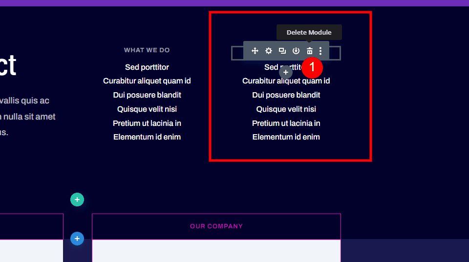
First, delete the modules in one of the two columns. We’ll turn this into a two-column layout, so we’ll only need one column for our blurb modules as footer items.
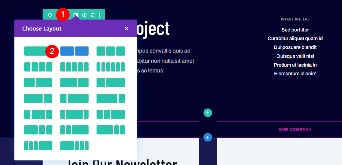
Open the Row settings and select a two-column layout.
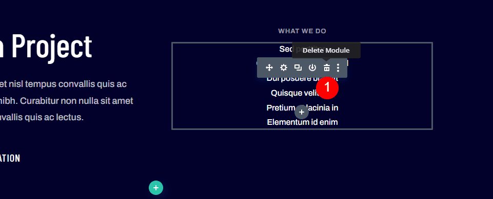
Finally, delete the text module that includes the links. We only need the title module.
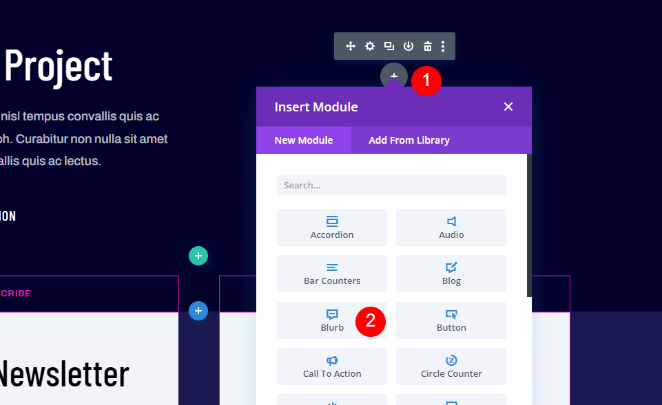
Hover over the area you want to add the module and select the plus icon. Choose the blurb module from the list.
Set Up the Blurb Module
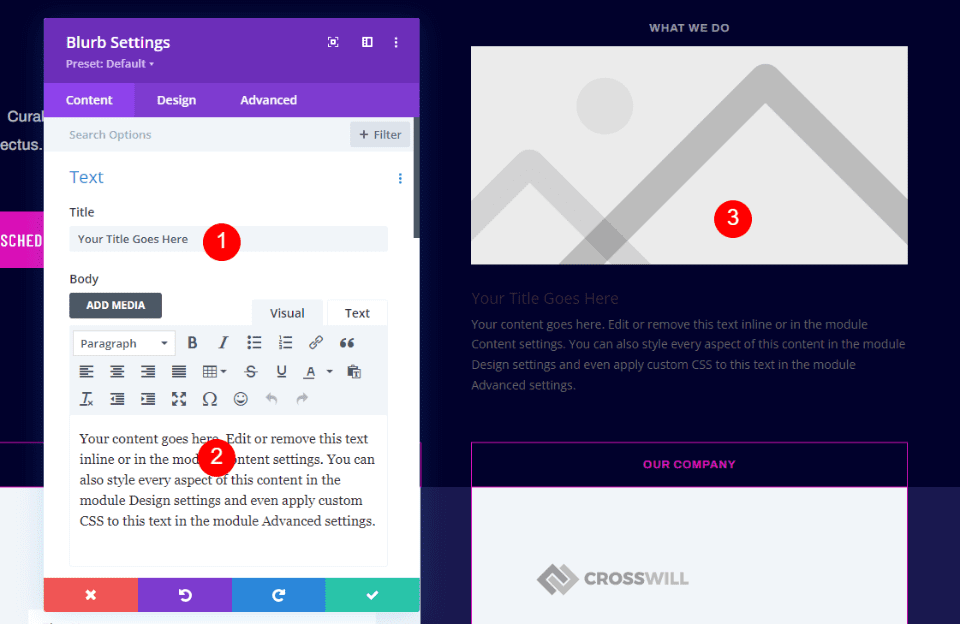
The blurb module includes a title, body text, and an image. We’ll use the title as the link. The body text can be used for short descriptions. I will delete it for this tutorial. If you do want to use it, I recommend keeping the text as short as possible and only using a couple of blurbs. In place of the image, we will use an icon.
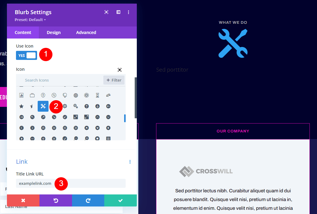
I’ve added the name of the link and deleted the body text. Next, select Use Icon under Image & Icon. Select your icon within the icon picker. Add the URL to the Title Link URL field under the Link section. Leave the rest of the link settings at their defaults. This is all we’ll do on this tab.
- Title: your link name
- Icon: Double Wrenches
- Title Link URL: your link
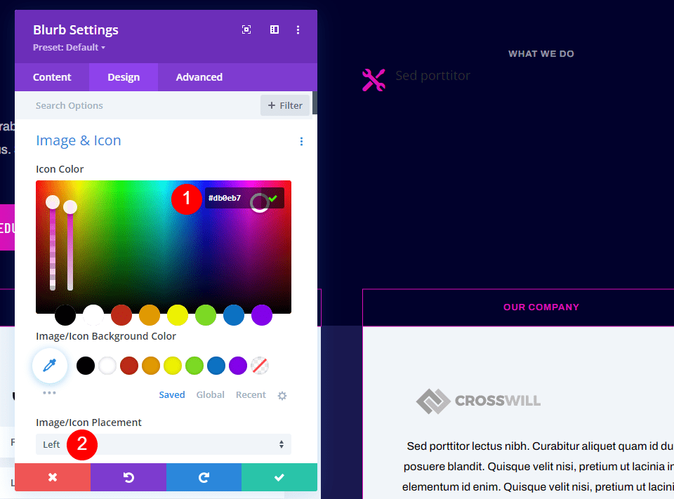
In the Design tab, enter #db0eb7 for the icon color. Set the Image/Icon Placement to Left.
- Icon Color: #db0eb7
- Image/Icon Placement: Left
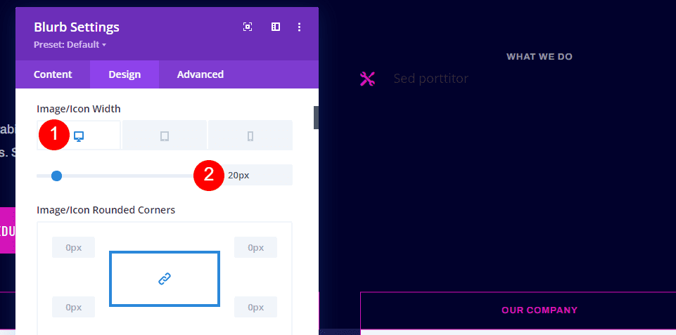
For Image/Icon Width, select Desktop and set it to 20px.
- Desktop Image/Icon Width: 20px
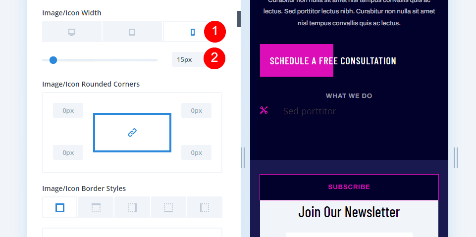
Select Phone under Image/Icon Width and set it to 15px.
- Phone Image/Icon Width: 15px
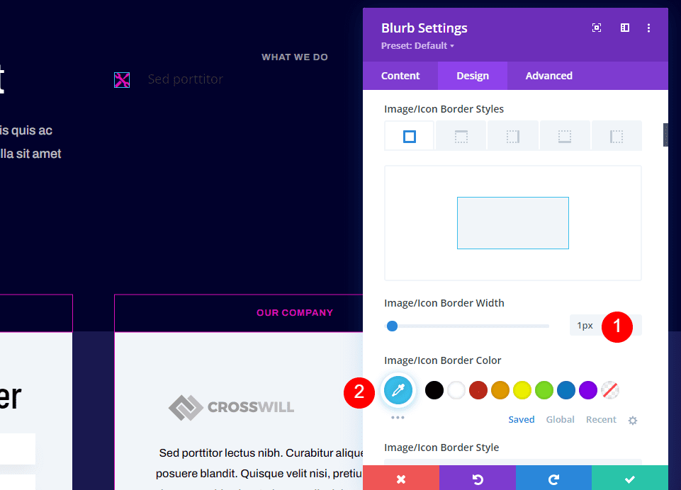
Set the Image/Icon Border Width to 1px and the color to #39c0ed.
- Image/Icon Border Width: 1px
- Image/Icon Border Color: #39c0ed
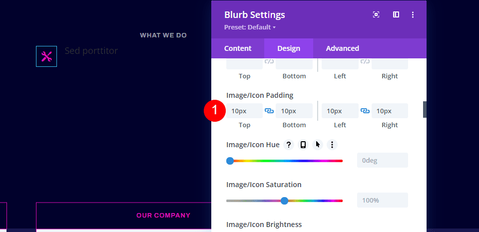
Add 10px to all four sides of the Image/Icon Padding.
- Image/Icon Padding: 10px (Top, Bottom, Left, Right)
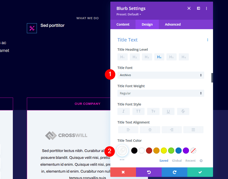
Scroll down to Title Text. Set the font to Archivo and the color to white.
- Title Font: Archivo
- Title Text Color: #ffffff
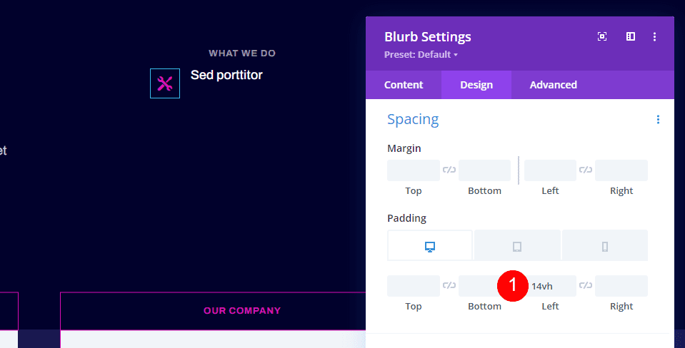
Scroll to Spacing and add 14vh to the Left Padding.
- Desktop Padding, Left: 14vh
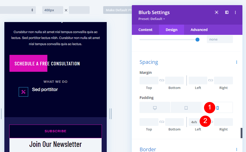
Select the phone icon and add 4vh to the Left Padding. This number can be adjusted to fit the length of your titles.
- Phone Padding, Left: 4vh
Advanced Tab
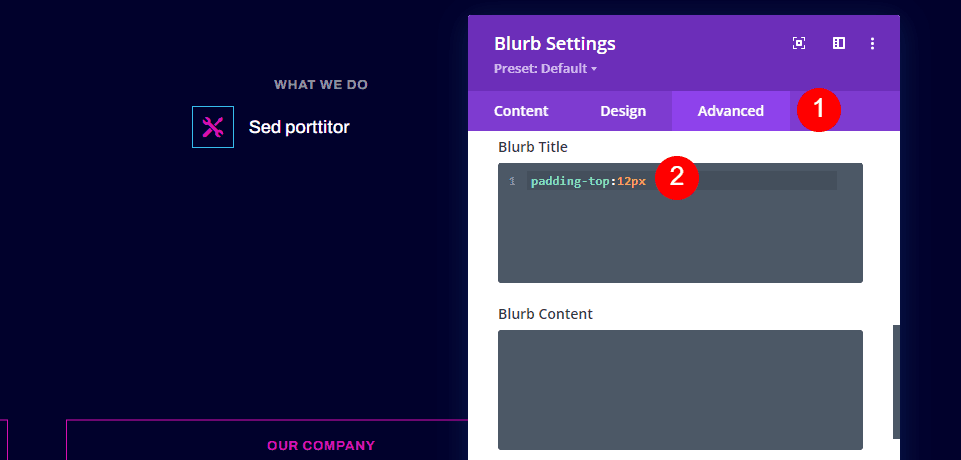
Next, we’ll add some custom CSS to the title, so it’s centered with the icon. Go to the Advanced tab and add 12px of top padding to the Blurb Title.
- Advanced tab Custom CSS Blurb Title: padding-top:12px
Duplicate the Blurb Module
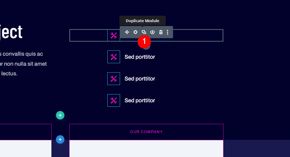
Next, create three copies of the blurb module by clicking the Duplicate Module button three times. This will let us use blurb modules for the footer items in place of the text links.
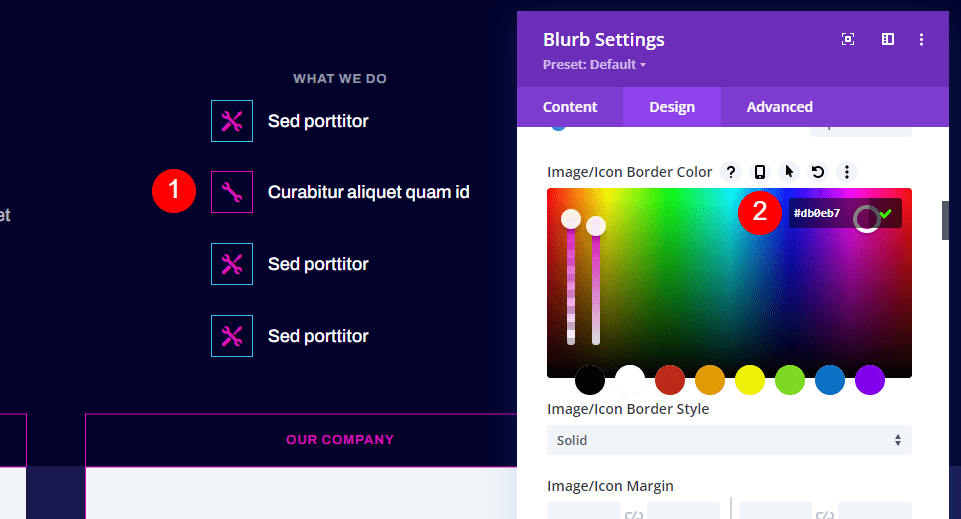
Open the second blurb module and add the link’s title, select a new icon, and add the URL. Open the Design tab and change the Image/Icon Border Color to #db0eb7.
- Title: your link name
- Icon: Single Wrench
- Title Link URL: your link
- Image/Icon Border Color: #db0eb7
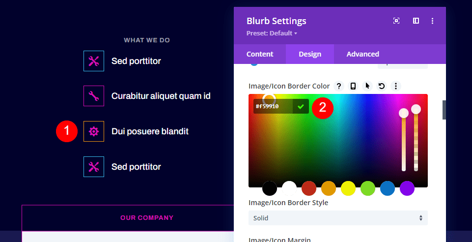
Open the third blurb module and add the link’s title, select a new icon, and add the URL. Open the Design tab and change the Image/Icon Border Color to #f59910.
- Title: your link name
- Icon: Single Gear
- Title Link URL: your link
- Image/Icon Border Color: #f59910
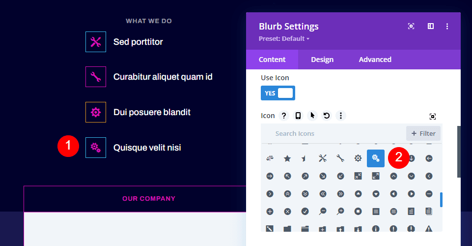
Open the fourth blurb module and add the link’s title, select a new icon, and add the URL. Open the Design tab and change the Image/Icon Border Color to #db0eb7. It’s already set to this color because you’ve cloned the first module.
- Title: your link name
- Icon: Double Gears
- Title Link URL: your link
- Image/Icon Border Color: #db0eb7
Results
Here’s a look at our Divi blurb modules as footer items for both the desktop and phone versions of my layout.

Here’s how our desktop version of the footer turned out.

Here’s how the footer appears on a smartphone.
That’s our look at how to use blurb modules for footer items in your Divi footers. Blurbs are great choices for links. They’re simple to use and they have lots of customization options with both images and icons. Use the icons with or without borders and make them as large as you want. The icons we’ve used here work perfectly with the design of the header menu.
We want to hear from you. Have you used blurbs modules for footer items on your Divi website? Let us know about your experience in the comments.



Do i need to install any external plugin for this or i can do it with the theme itself?
No need for any plugin