Creating color scheme mockups for your clients is an important step in the web design process. Sometimes, the client may have a company brand color palette already in place that you can use for the site. But a lot of times, you will need to offer a few suggested color schemes that you think will both fit the company brand and look great on their website.
With Divi, you can easily change the color scheme of any given page layout using design features like Find & Replace and Color suggestions within the visual builder. And you can also create multiple versions of a page (with different color schemes) for your client.
In this tutorial, I’m going to walk you through the process of using Divi to create new color scheme mockups for a home page. Hopefully, you will learn a few tricks along the way.
Let’s get started!
- 1 Setup Your New Page
- 2 Picking Your Color Scheme
- 3 Creating a Color Scheme for the Business Coach Home Page Layout
- 4 Using Find and Replace to Update Your Page Colors
- 5 Add Your New Color Scheme Layout to a New Page
- 6 Creating an Advanced Color Scheme Page Mockup
- 7 Creating a Menu to Preview Each Color Scheme Mockup
- 8 Final Thoughts
Setup Your New Page
I’m going use the Business Coach Homepage Layout for this tutorial. So if you haven’t already, create a new page, and deploy the visual builder. Then select “Choose Premade Layout”. From the Add From Library popup, select the Business Coach Home page layout.
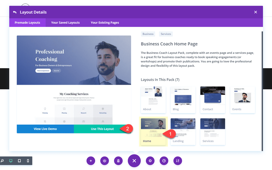
Once the layout is loaded to the page, don’t forget to publish it.
We are going to use this home page layout to create different color scheme mockups. But for now, we need to choose a new color scheme.
Picking Your Color Scheme
You may already have a color scheme in mind, but if not, you can either use Divi’s color suggestions or a third party color scheme generator. For more inspiration, you can browse the web for color schemes that work well for your industry.
Using Third Party Color Scheme Generators to Create Your Color Scheme
There are some wonderful third-party (and free) color scheme generators on the web to help you pick the perfect color scheme for you site. Some of my favorite color palette generators are from Coolers.co, Canva, and Adobe.
Most of these color scheme generators will generate at least five colors. Make sure you save all of the colors you need to make up your new color scheme.
Creating a Color Scheme Using Divi’s Built-in Color Suggestions
Since the launch of Divi’s new color manager and magic color suggestions, Divi automatically keeps track of your saved and recently used colors which can be accessed when changing a color option in the Divi Builder. You can view each palette by clicking the “Saved” or “Recent” tab.
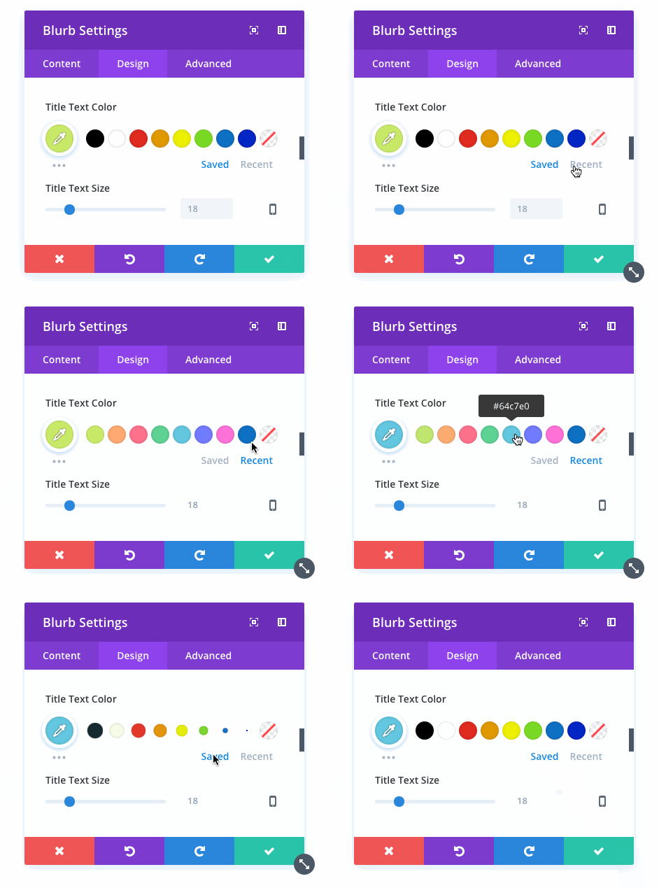
Divi also has a simple and smart color suggestion tool built right into the visual builder. I’m not going to go into all the details of the algorithm used (not sure that I could anyway), but in general terms, Divi will generate a palette of complementary (and analogous) colors based on the current base color (the color selected in the option). This will help you pick harmonious color combinations for your design.
To view the color suggestions (or color-scape), simply click the color-scape icon (the one with three dots) directly under the selected color option. There you will find palettes that are generated from complementary and analogous colors of your saved and recently used colors And each row has a new expanded color scheme for each color in your recent or saved color palette.
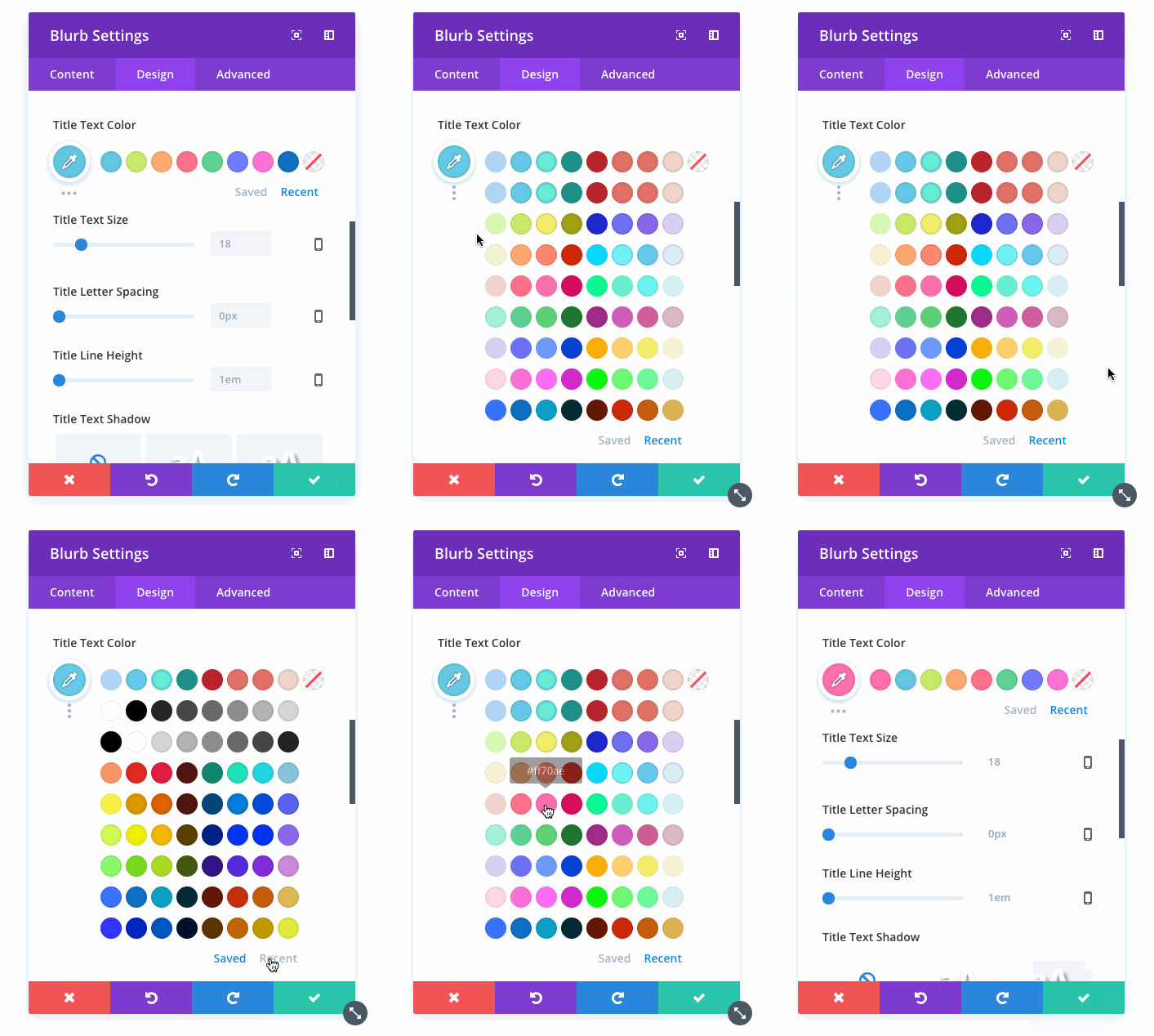
Although this color suggestion tool is designed to help with color selection at the section, row, and module level, you can easily use the suggested color palette as a new color scheme for each page.
Creating a Color Scheme for the Business Coach Home Page Layout
Now let’s start creating new color scheme mockups for the Business Coach Home Page layout that we added to our new page earlier. This premade layout currently has a basic color scheme. The main color is obviously the dark blue being used throughout. It also has some different shades of gray as accent colors as well. Their is also a standard white color for content backgrounds and a black color being used for text. So you can imagine that if you replaced every instance of that one primary dark blue color with another color, you will have a completely new color scheme.
From the visual builder, open the fullwidth header setting in the top section of the layout and find the Button One Text Color. This is the primary blue color this layout is using. Now click the color-scape icon to view the color suggestions for that current blue color. They will be found in the color palette of the very top row.
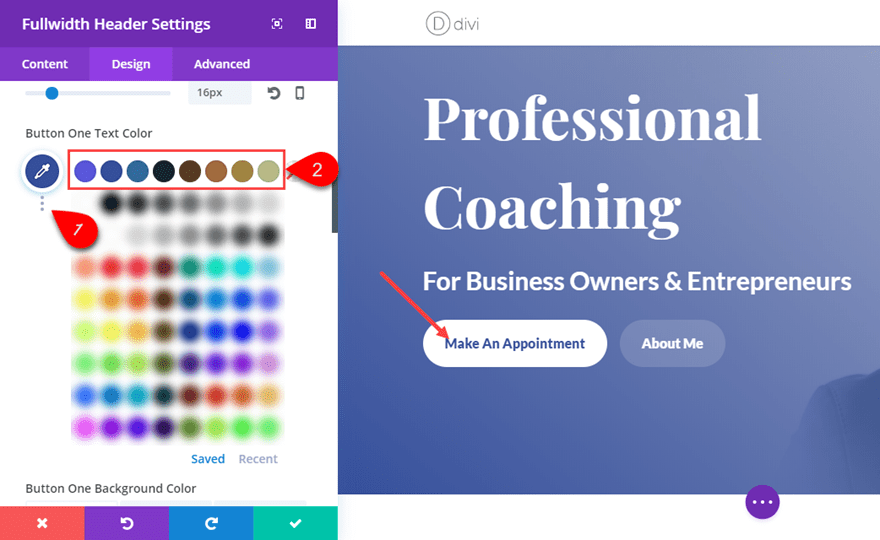
At this point you can select any color from the palette to see new color schemes, but for this example, I’m going to stick with the first one generated.
Saving Your Color Scheme to The Default Color Palette
In order to make things a lot more convenient down the road, you will want to update your new color palette colors to replace the color pickers default palette in theme options. That way your colors will be available under the saved color palette within the Visual Builder throughout the rest of your color changes.
In a new tab, navigate to Divi > Theme Options. You will see the default color palette option under the General tab. There is no real easy way to copy over the colors palette generated from the color suggestions for our blue color. I suggest opening up your page with the visual builder active in one window and the Divi Theme options in another window. Then copy each color code over to the default color palette.
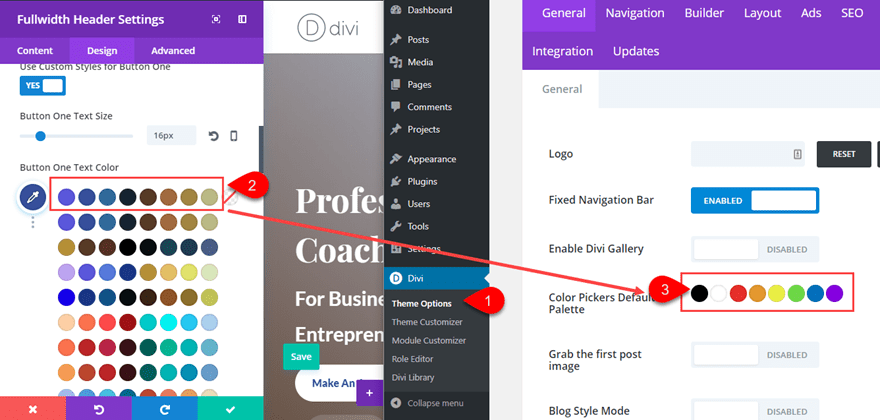
Save Settings.
Tip: You may not want to replace the first two default colors (black and white) for the convenience of editing text and backgrounds later on, but if you need all the color slots, feel free to use them.
The default color palette will not be updated on your current page since it has already inherited the previous default color palette. You will need to create a new page with the layout again to see the new saved color palette in your settings.
If this is too much of an inconvenience, you may choose to update the default color palette for your current page only. To do that, open the settings menu and click the Page Settings icon. Then update the palette under the design tab.
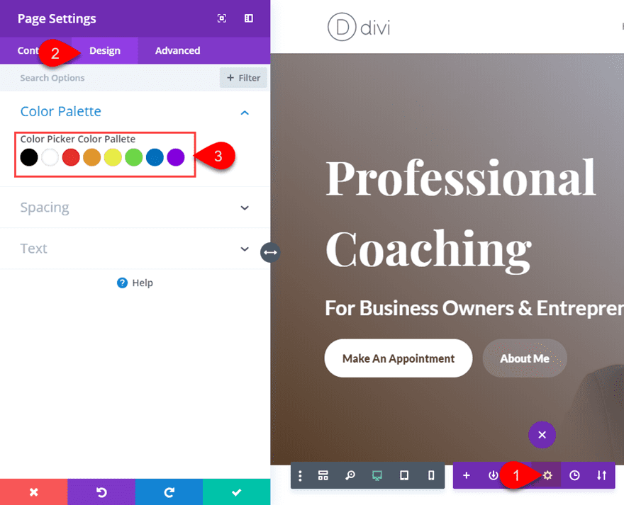
This will update the color palette for the entire page without having to create another page.
The reason I chose to update the default color palette for the theme (instead of just the page) was to avoid having to add new color palettes to each new page mockup I will create.
Using Find and Replace to Update Your Page Colors
Now go back to the home page layout with your visual builder active and go to the Button One Text Color option under the fullwidth Header settings (the same place you were before). Now your saved layout isn’t showing up yet but that’s okay. Make sure the original Dark blue color is selected and then click the color-scape icon to fan out the color suggestions. This will show our same color scheme in the top row.
Select the dark brown color (#54381c).
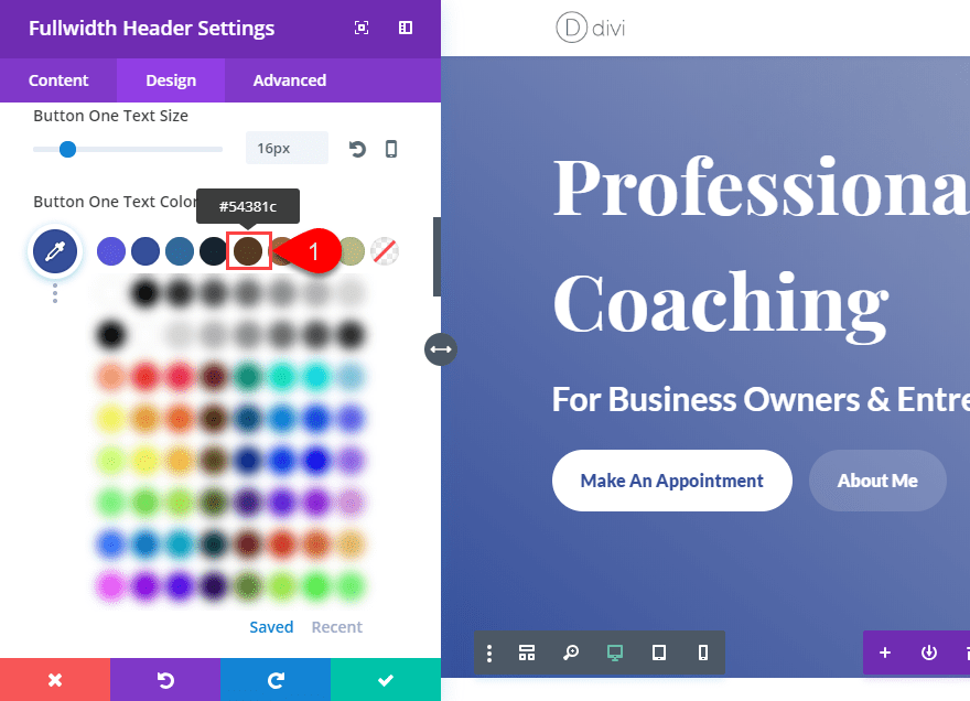
Then open the color picker to view the color code and copy the color code to your clipboard by highlighting it and pressing ctrl + C (or Cmd + C).
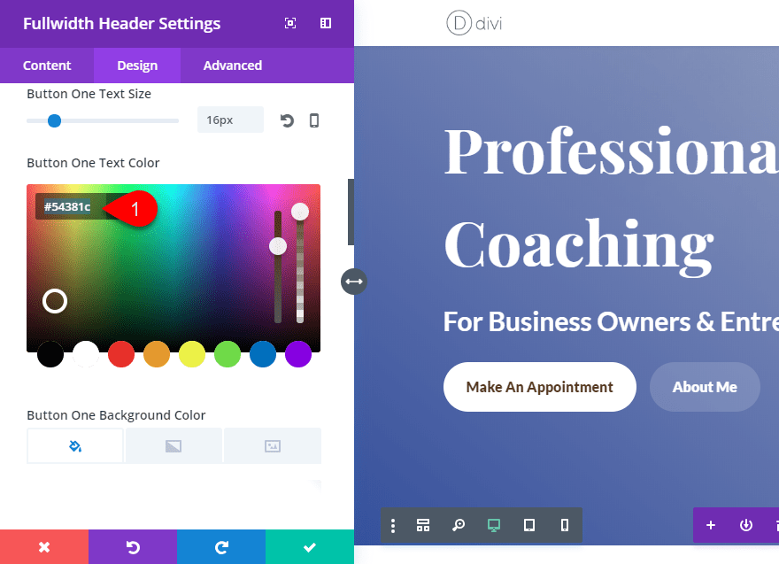
Since we don’t actually want to make the change quite yet, click the purple undo button at the bottom of the settings modal to bring back the original blue color we need to replace.
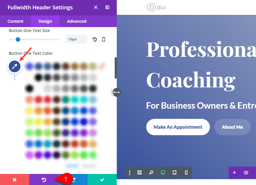
Now right click on the original blue color and click the Find & Replace option.
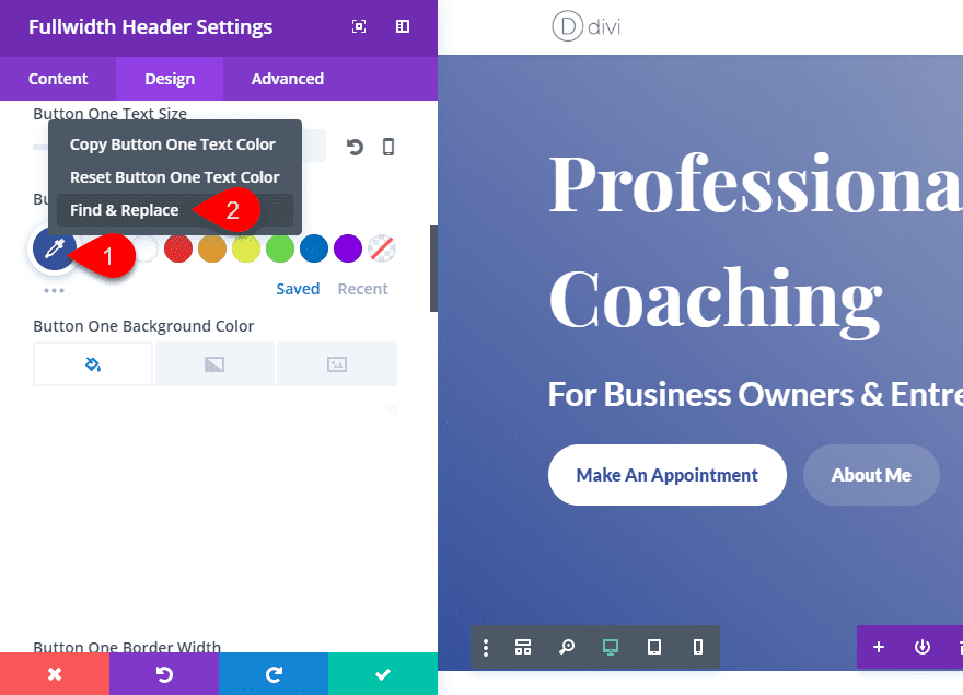
In the Find & Replace popup, paste in the brown color under “Replace with”. Since we want to replace the color on the entire page, you can keep the “Within” option as “This Page”. Make sure and select the “Replace All” option so that scope of the color change is not limited to only Button One Text Colors. Then click Replace.
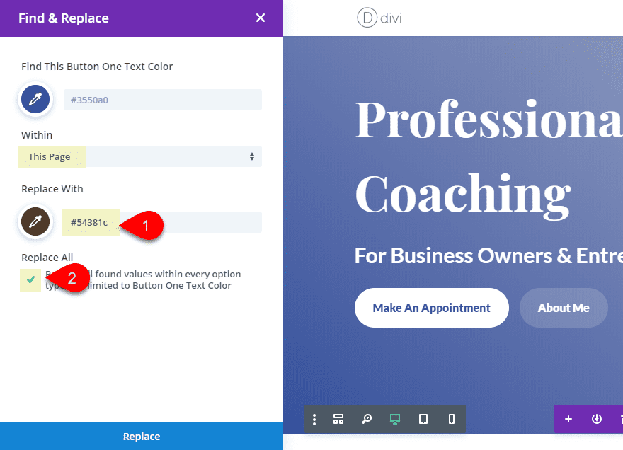
Don’t forget to save your settings.
Now check out the new color scheme.

Now go ahead and save the layout to your Divi Library by opening the settings menu and clicking the Save to Library icon. Give the layout a name like “Brown” and then click Save to Library.
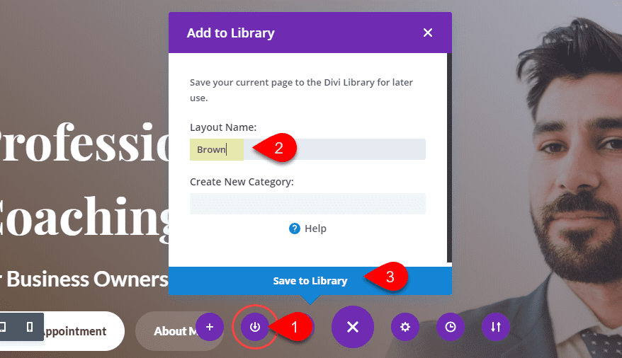
This will allow you to deploy that version of your layout on a new page.
Add Your New Color Scheme Layout to a New Page
To add your saved layout with your new brown color scheme to a new page, first you will need to create a new page. Then give your page a title (Something like “Brown”) and deploy the visual builder. Then select Choose a Premade layout. In the Load from Library popup, click the “Your Saved Layouts” tab and select the new layout you just saved to your library.
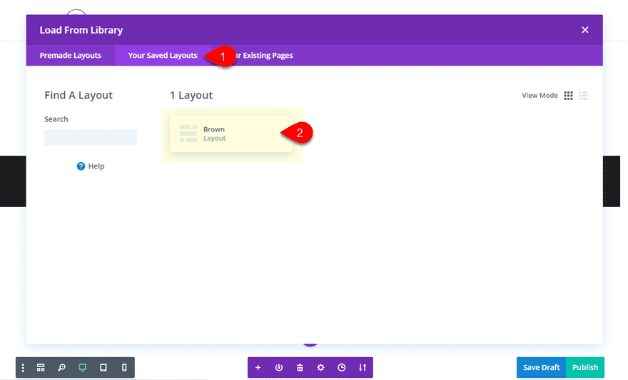
Don’t forget to publish Your page.
Now repeat the same process of creating a new page and adding the saved layout to the page. This time name your page “Purple”.
Once the layout is added to the page, make sure you publish it. Then open the visual builder and open the Fullwidth Header settings and find the Button One Text Color (just like before). Now you should see that the saved theme color palette has been updated with your new colors. This will come in handy. Right click on the color option (currently the dark brown) then click find & replace. Open the color picker under “Replace With” to select a new color from the saved color palette. This time select the purple color (#5a5ae2). Then select the replace all option. And don’t forget to save your settings.
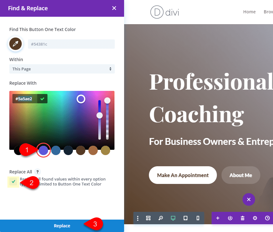
And like magic, you have a purple color scheme for you page!

Creating an Advanced Color Scheme Page Mockup
With your new color scheme available, you may want to experiment with multiple colors on your page. For example, you may choose to have a different color for each section of your page. This can easily be done with the “Find & Replace” feature as well.
For this next mockup, create a new page and name your page something like “Multicolor”. Then deploy the visual builder, select “Choose a premade Layout” and import the same (brown) saved layout to the page (just like you did before). In the visual builder, open the Fullwidth Header settings and find the Button One Text Color (just like before). Right click on the Button One Text Color and select “Find & Replace”. Then update the following:
Within: This Section
Replace With: #0f1f2e
Select Replace All
Then click the Replace button.
Don’t forget to save settings.
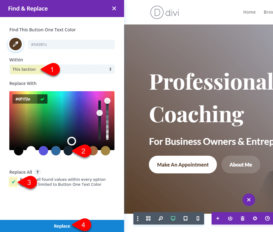
This updates on the top header section with the dark blue color scheme.
Now skip the second section (it can keep the brown color scheme) and go to the third section. Find the button at the bottom of the section with the title “Still Not Sure? Get In Touch”. Open the button settings, right click on the button background color, and select “Find & Replace”.
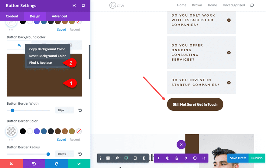
Then update the Find & Replace as follows:
Within: This Section
Replace With: #366ba2
Select Replace All
Then click the replace button. And don’t forget to save settings.
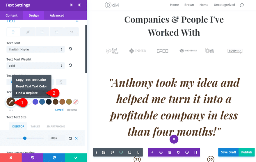
Skip the fifth section. Then repeat the same process to replace the brown color in the 6 section (the one with “Companies & People I’ve Worked With”) with the same dark blue color in the first section. You can do this by opening the text module with the big quote text under the Text Text Color option.
In the last section, find the text module in the right column and open the text module settings. Right click on the background color and select the Search & Replace option. Update the following:
Within: This Section
Replace With: #5a5ae2 (the purple color)
Select Replace All
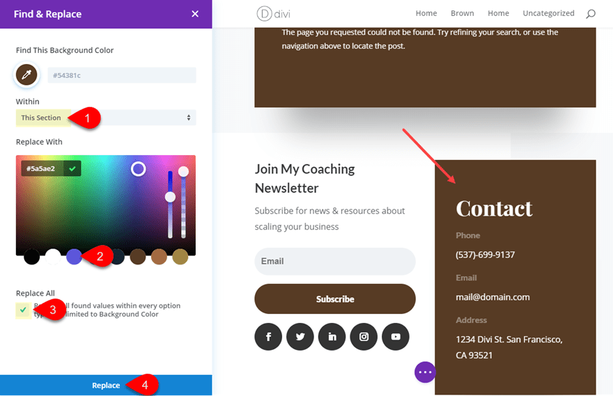
Then click the Replace button and save settings.
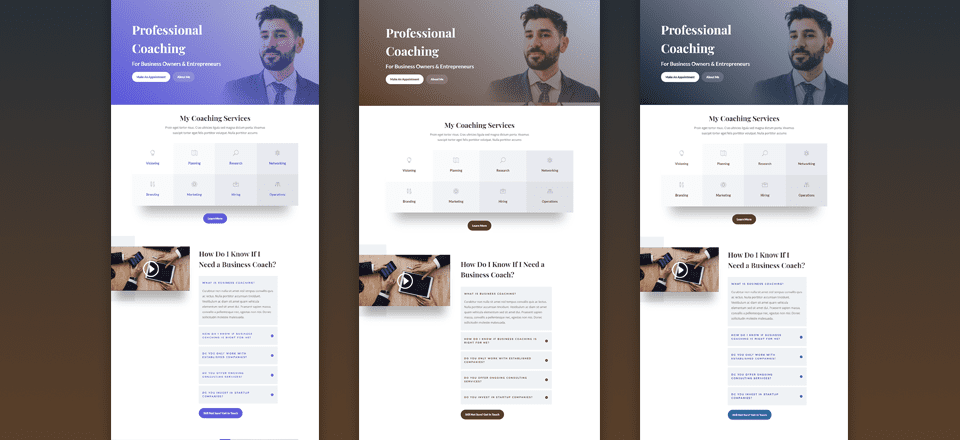
Now you have a home page mockup with multiple colors throughout each section.

The last step is to create a new primary menu to make it easy for clients to preview each color scheme mockup. From your WordPress Dashboard, navigate to Appearance > Menus. Then give you menu a title, click create menu, and add the pages you created to your new menu. Then make sure you select Primary Menu as your display location. And click Save Menu.
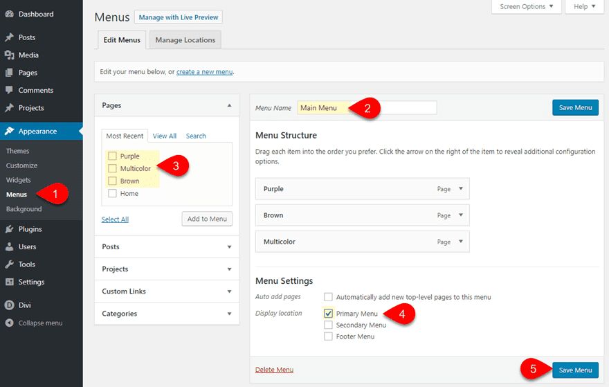
Now you have a site ready to showcase your color scheme mockups.

Final Thoughts
With Divi’s design options, you can easily deploy entirely new color schemes for your page layouts using built-in color suggestions and the “Find and Replace” option with the Visual Builder. This will make it convenient for showcasing different color scheme mockups for your clients. I hope this tutorial will help you find the perfect color scheme for you next project. I look forward to hearing from you in the comments.
Cheers!





Very cool! Will use part of this to supplement our Calgary Luxury Real Estate website.
Good question. Off topic, but I ran into the same issue. Would love to read more on this in a future post of you awesome ET guys. Kind regards Mike
Great job! Very interesting article. I have used this functionality and allows customize templates quickly and easily.
Wondering if you’ll ever be releasing new layouts for Extra?
I have researched online and found that Divi is a very popular theme and thus I want to install it on my website. But have a question. Can I install this theme in multiple websites?
Yes, our license is unlimited. So once you have a membership and an api key you can use Divi on as many websites as you would like.
I have to say that Divi just has to be the best blank (canvas) theme out there. Thanks for always improving it.
Great to hear George!
I have used DIVI as well as Visual composer plugin to build pages in WordPress. But to be honest one biggest difference i found in both plugin is that DIVI is faster then Visual composer. It loads very quickly in admin panel. So i will recommend DIVI to every one.
Great!
I would like to know how do the big (and long) screenshot of the page as you do.
It could be a fast way to share mockups with clients
I use the Nimbus Screenshot Chrome extension.
This is a great tip. I love Nimbus
This is a great article, Jason. Thanks for your consistent level of detail. I’m looking forward to using the Divi color schemes in my mockups. I also like using colorhunt.co for some color choices.
Thanks Keith. I wasn’t aware of colorhunt. Thanks for the suggestion.
This divi and Visual composer which is best for development with WordPress? I was thinking to purchase Divi but I came across visual composer which I thought could handle what Divi could do. Please help
For me, not a full time web developer, understanding the work flow best for Divi is difficult. This for example, “So if you haven’t already, create a new page, and deploy the visual builder.”
We create a page, go to the Dashboard, pull up the site, navigate to the new page, then deploy the Visual Builder. Right? If I deploy the VB while in the backend, it creates a lot of conflict. I would like to see more on using Divi from starting a site through creating a couple of pages.
It’s probably just me but I have a lot of trouble with VB.
I have the same issue with the Visual Builder.
When I switch to the VB, most of the Moduls shown up as a third party plugin.
And the Divider Module didn’t word anymore since the last DIVI Update.
-.-
If you have “Divi” Theme then there is no need to install “Divi Builder” Plugin.
Use any one of “Divi Theme” or “Divi Builder” plugin is needed not both of them at the same time.
hope this makes it clear.
Yes, we know. But with the Divi theme, I cannot see a smooth way to create a site without using the Divi Builder first and then using the VB. But you have to be careful about the DB conflicting with the VB.