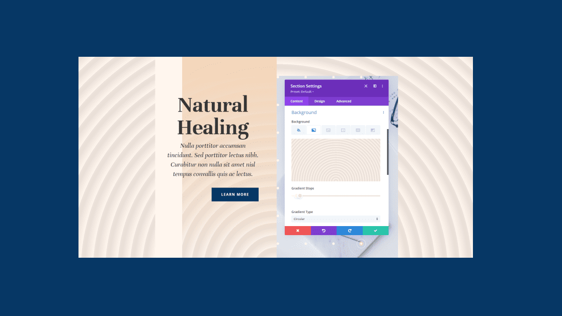
Divi’s background options provide lots of ways to create background patterns. You can even create background patterns using only gradients. The Gradient Repeat option makes this simple and easy. In this post, we’ll see how to use Divi’s Gradient Repeat option to create custom background patterns.
Let’s get started.
What is Gradient Repeat
The Gradient Repeat option creates a pattern based on the Gradient Stops. The Gradient Stops are measurements that determine where the colors appear and stop within the gradient. Divi and its Gradient Builder uses those stops to create the pattern.
The last color tells the gradient where the stopping point is within the gradient. You can have as many colors as you want before that stopping point. The Gradient Builder will then repeat it to fill up the screen which creates the pattern. The option can be added to any section, row, column, or module, and they can be used together.
Enable the Gradient Repeat Option
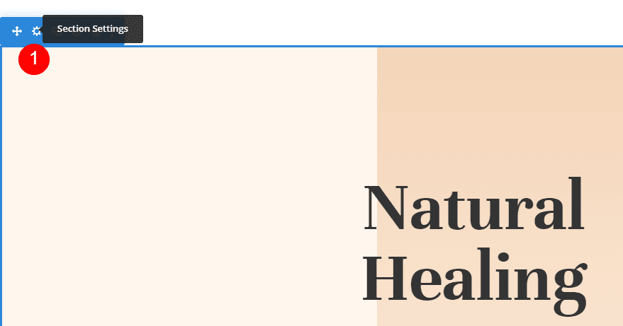
To enable the Gradient Repeat option, open the section’s settings by clicking its gear icon. This also works with rows, columns, and modules.
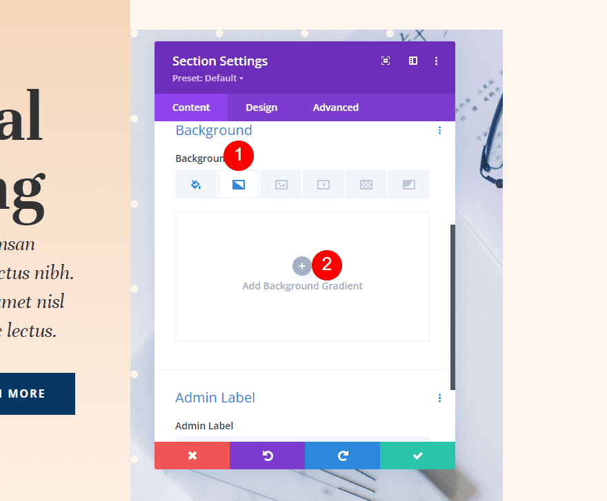
Scroll down to Background. Select the Background Gradient tab and click Add Background Gradient.
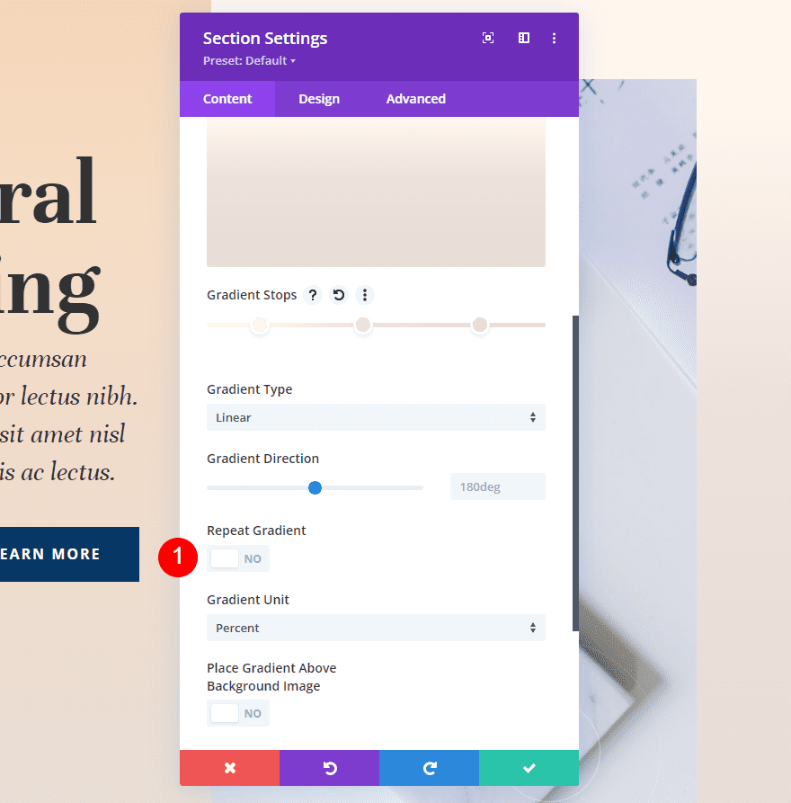
Under the Gradient Stop bar is a setting called Repeat Gradient. This is disabled by default. Simply click it to enable it.
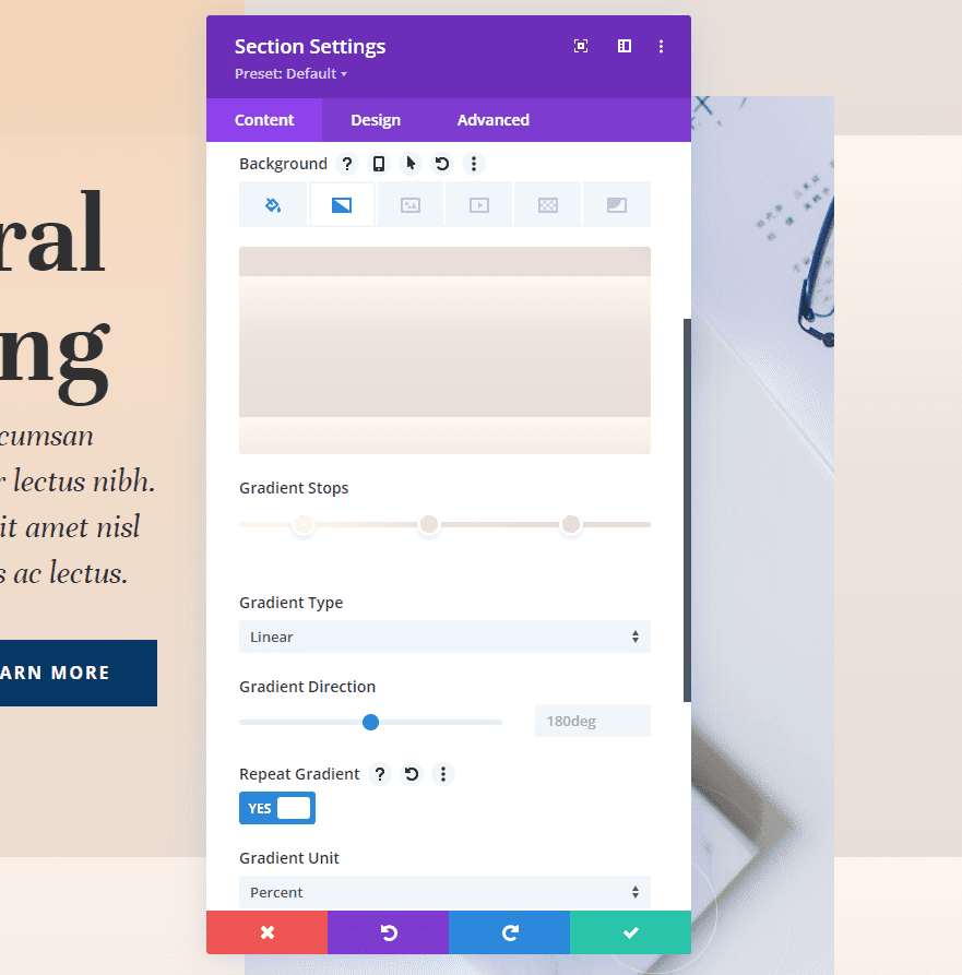
The gradient will now repeat, creating a pattern based on your Gradient Stops and your other gradient settings, such as the Gradient Unit.
Gradient Units
The Gradient Unit is the unit of measurement. This specifies what the Gradient Stop numbers on the gradient bar indicate, which determines how the Gradient Stops are measured. It affects the pattern created by the repeat option.
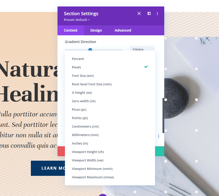
Divi’s Background Gradient Builder has 15 units to choose from. Let’s look at an example of the four most popular options. As we’ll see in our examples, the result will change based on your number of Gradient Stops and settings. I’m using colors from our examples, and I’ve set it to repeat to make it easier to see. I’ll use three colors with these settings:
- Color 1: #fff6ee (14% Position)
- Color 2: #ede3dc (46% Position)
- Color 3: #e8ded7 (82% Position)
Gradient Settings
- Type: Linear
- Direction: 214deg
- Repeat Gradient: Yes
- Unit: Percent
- Place Gradient Above Background Image: No
Percent
Percent measures the Gradient Stops by percentage. This calculates the gradient points based on the parent element. The smaller the last gradient point is, the tighter the pattern it creates. When adjusting the position of any of the colors, that color moves while the others remain in place.
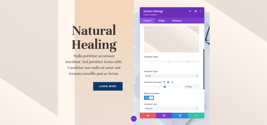
Pixels
Pixels measure the number of pixels for each Gradient Stop. This gives the gradient a smaller pattern than many of the other unit types. Moving the first or last color’s position changes the position of each color.
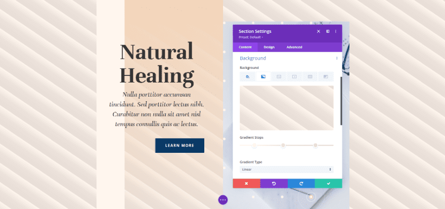
Viewport Height (vh)
The viewport is the area of the browser window that’s visible. It’s measured in height and width separately. Viewport Height uses the Gradient Stops to measure the percentage of the viewport size’s height. Adjusting the position of the first or last colors affects all the colors.
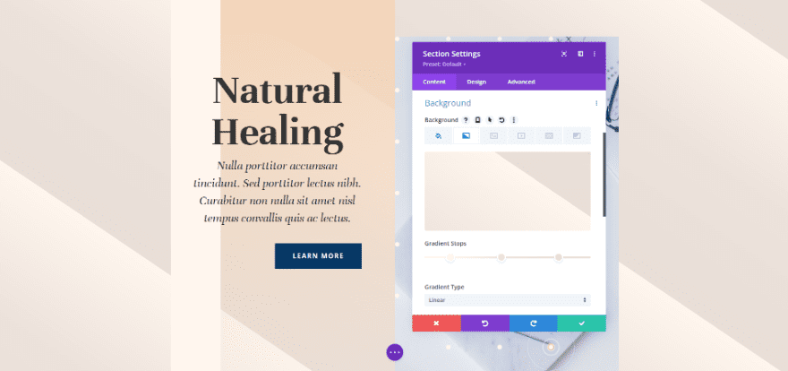
Viewport Width (vw)
Viewport Width uses the Gradient Stops to measure the percentage of the viewport size’s width (or browser width). The adjustments change based on the width. When you adjust the larger or smaller number, that specific color changes position while the others remain the same.
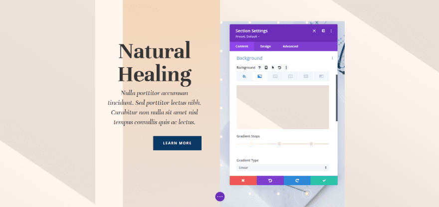
Gradient Repeat Option Examples
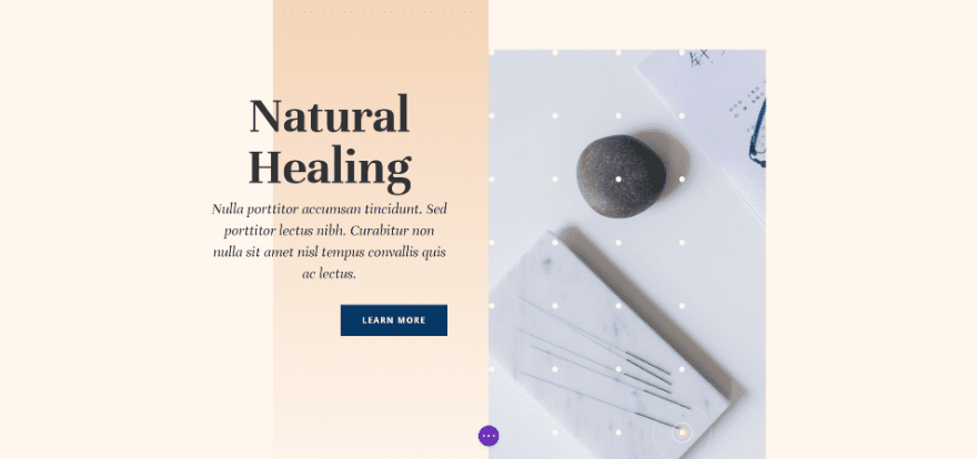
For our examples, I’m using the Call-to-Action section from the landing page of the free Acupuncture Layout Pack that’s available within Divi.
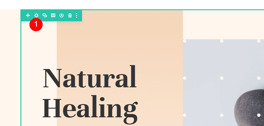
We’ll need to make one adjustment to the first column in the section. Open the row’s settings by clicking its gear icon.
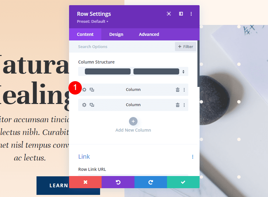
Next, select the gear icon for the first column.
Column One Gradient
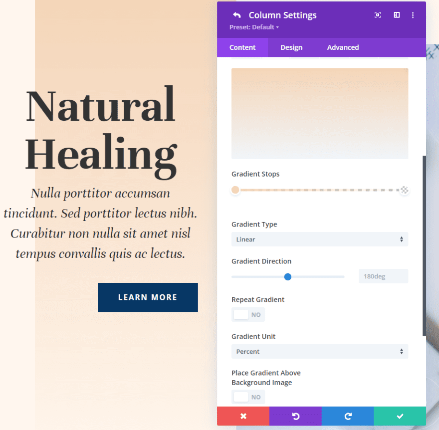
Column one has its own background gradient. This is part of the layout. We won’t change this. We’ll use this same gradient in all four of our examples. Here are the settings in case you need them.
- Color 1: #f4d5b8 (0px Position)
- Color 2: rgba(244,213,184,0) (100px Position)
Gradient Settings
- Type: Linear
- Direction: 180deg
- Repeat Gradient: No
- Unit: Percent
- Place Gradient Above Background Image: No
Spacing
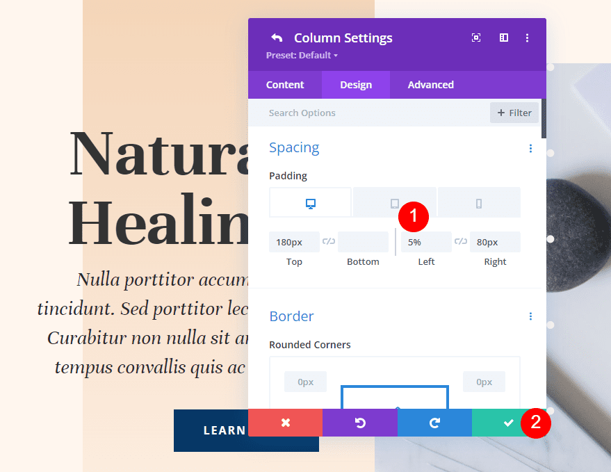
We will add some spacing to the left of the column. Go to the design settings, scroll down to Spacing, and select the tablet icon to open the device options. Add 5% Padding to the Left for the desktop and tablet tabs. Choose the phone tab and remove the Left Padding. Leave the Top and Right at their current settings.
- Top Padding: 180px
- Left Padding: 5%
- Right Padding: 80px
Example One
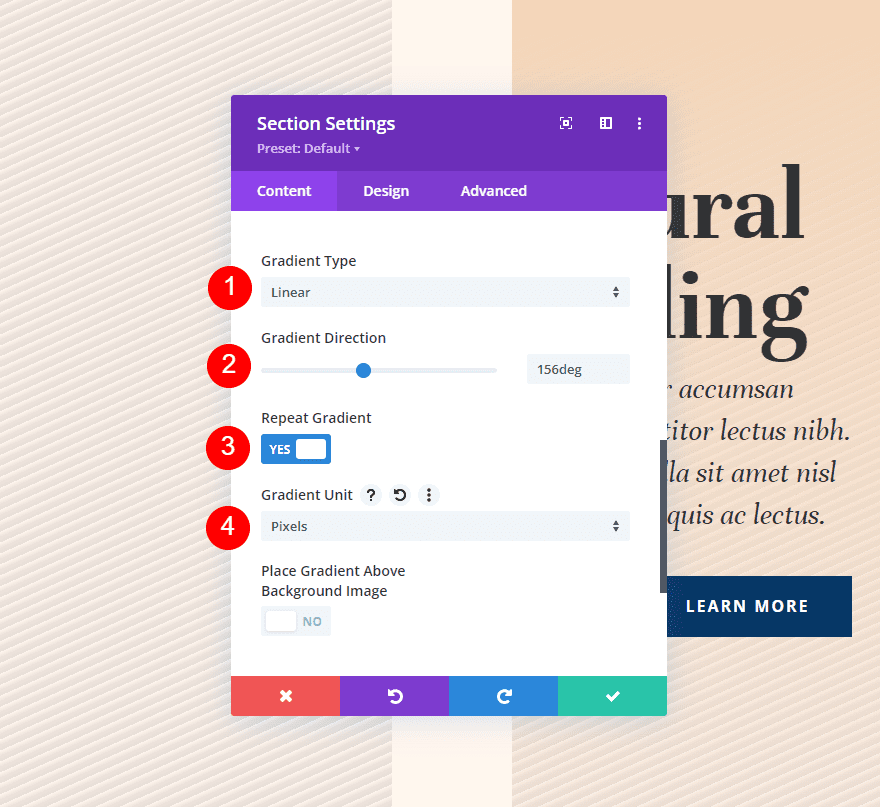
Our first example creates a diagonally repeating pattern with fine lines.
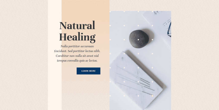
This one has three Gradient Stops. The first color is #fff6ee, placed at the 4px Position. The second is #ede3dc, placed at the 9px Position. Last is #e8ded7, placed at the 14px Position. This means the gradient stops at 14 pixels, which is where the repeat will start. The color stops are close together, keeping the pattern small.
- Color 1: #fff6ee (4px Position)
- Color 2: #ede3dc (9px Position)
- Color 3: #e8ded7 (14px Position)
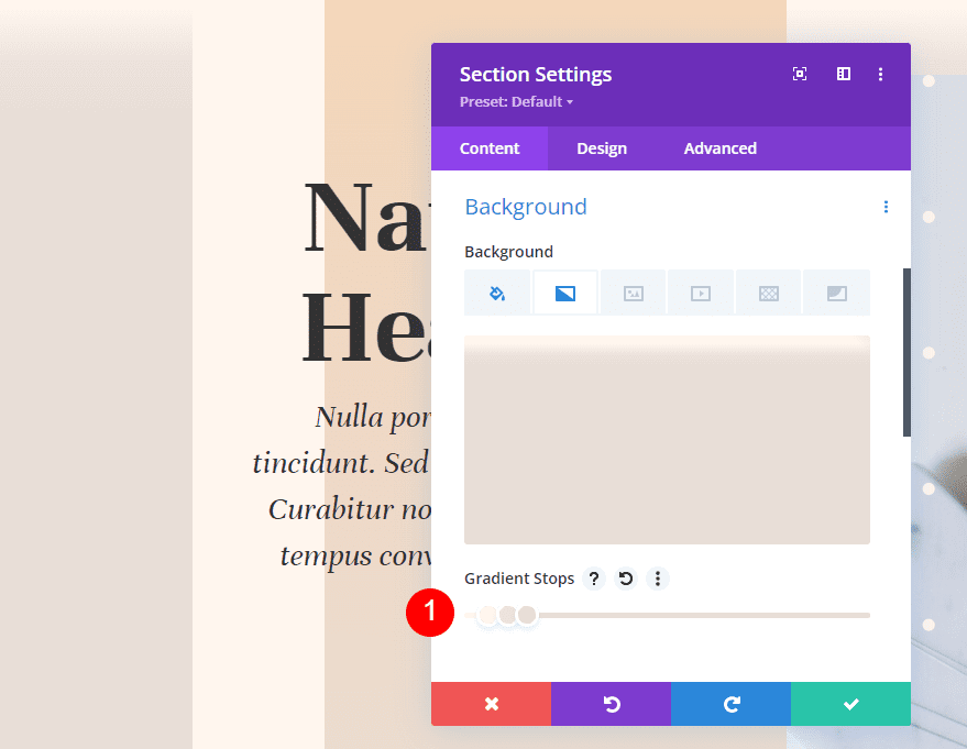
For the gradient settings, change the Gradient Type to Linear and set its Direction to 156deg. Enable Repeat Gradient. Select Pixels for the Unit.
- Type: Linear
- Direction: 156deg
- Repeat Gradient: Yes
- Unit: Pixels
- Place Gradient Above Background Image: No
Example Two
Our second example creates a diagonal repeating pattern with larger lines.
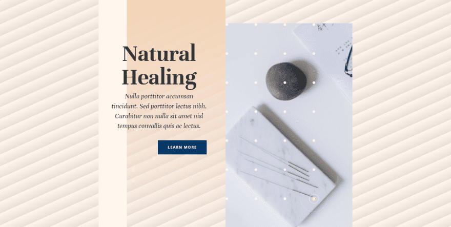
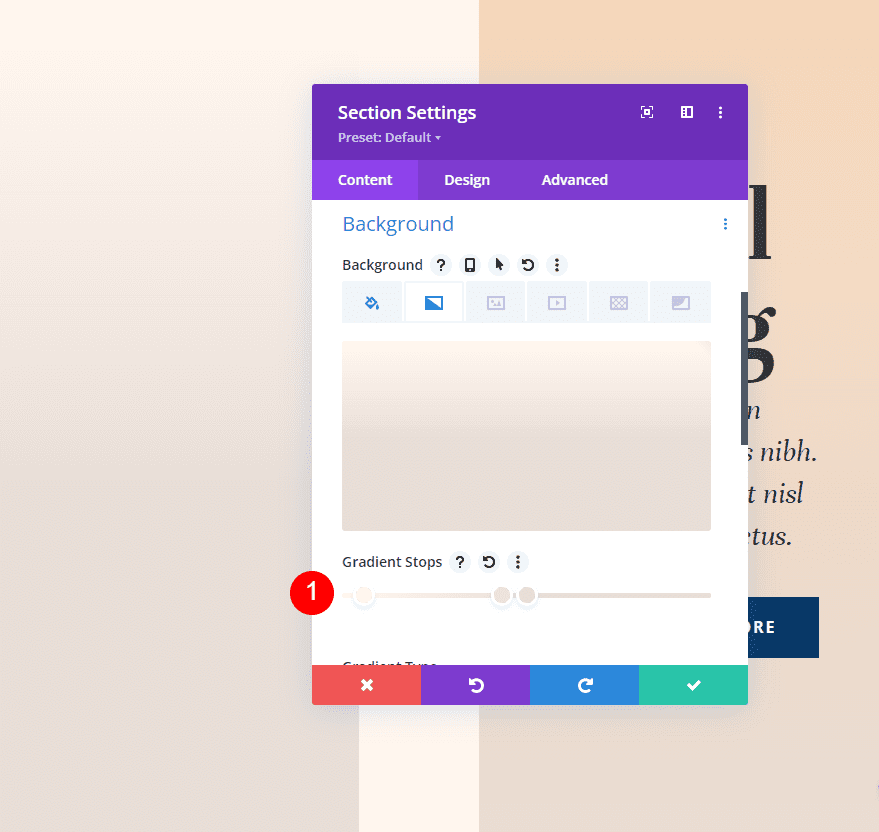
This one has three Gradient Stops. The first is color #fff6ee, placed at the 4px Position. Our second color is #ede3dc, placed at the 43px Position. Last is #e8ded7, placed at the 50px Position. This gradient will stop at 50px and repeat the pattern.
- Color 1: #fff6ee (4px Position)
- Color 2: #ede3dc (43px Position)
- Color 3: #e8ded7 (50px Position)
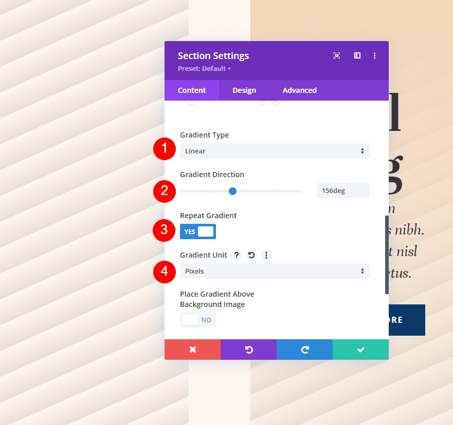
For the gradient settings, select Linear for the Type and set the Direction to 156deg. Enable Repeat Gradient and change the Unit to Pixels.
- Type: Linear
- Direction: 156deg
- Repeat Gradient: Yes
- Unit: Pixels
- Place Gradient Above Background Image: No
Example Three
Our third example creates a repeating circular pattern with medium-sized circles.
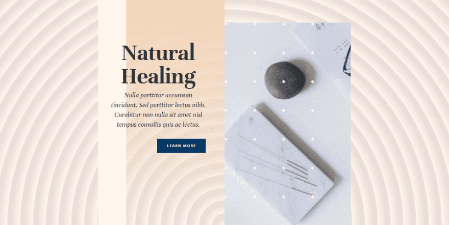
This one has three Gradient Stops. The first color is #fff6ee, placed at the 4px Position. Color 2 is #e8ded7, placed at the 7px Position. The last color is #ede3dc, placed at the 8px Position. This gradient will stop at 8 pixels and the other colors are close together, creating a tight pattern.
- Color 1: #fff6ee (4px Position)
- Color 2: #e8ded7 (7px Position)
- Color 3: #ede3dc (8px Position)
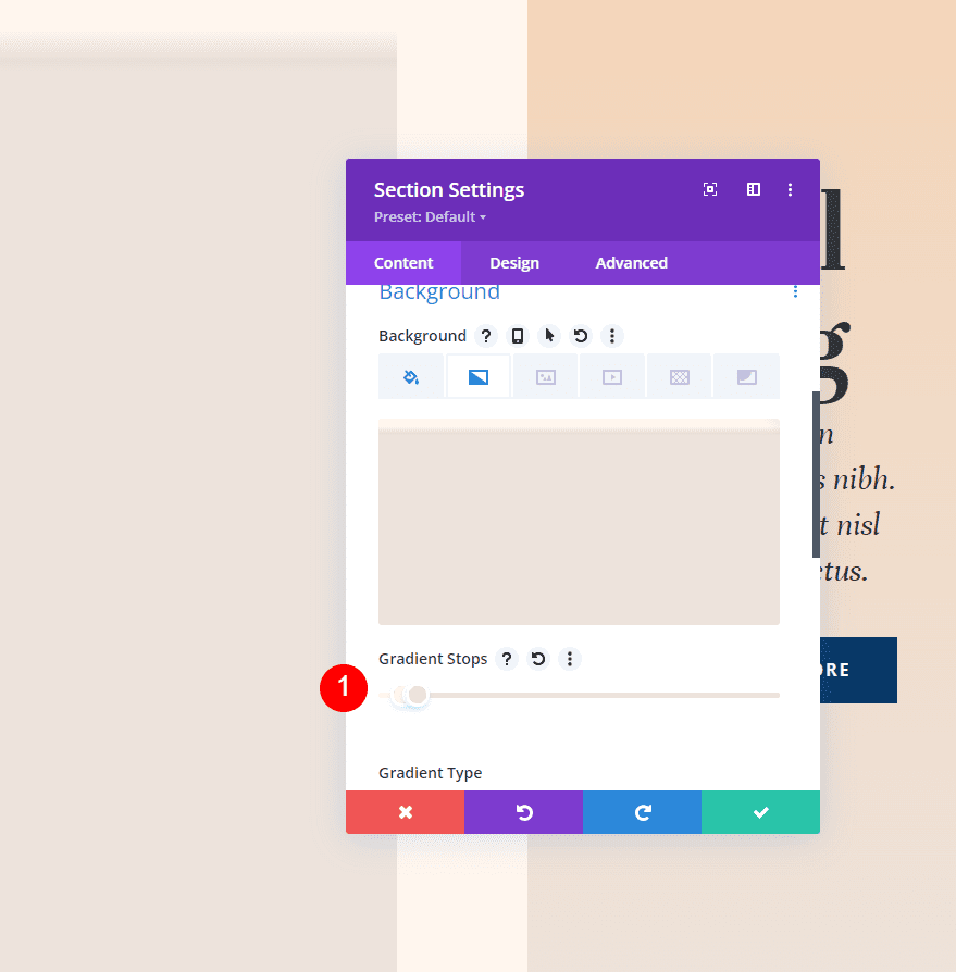
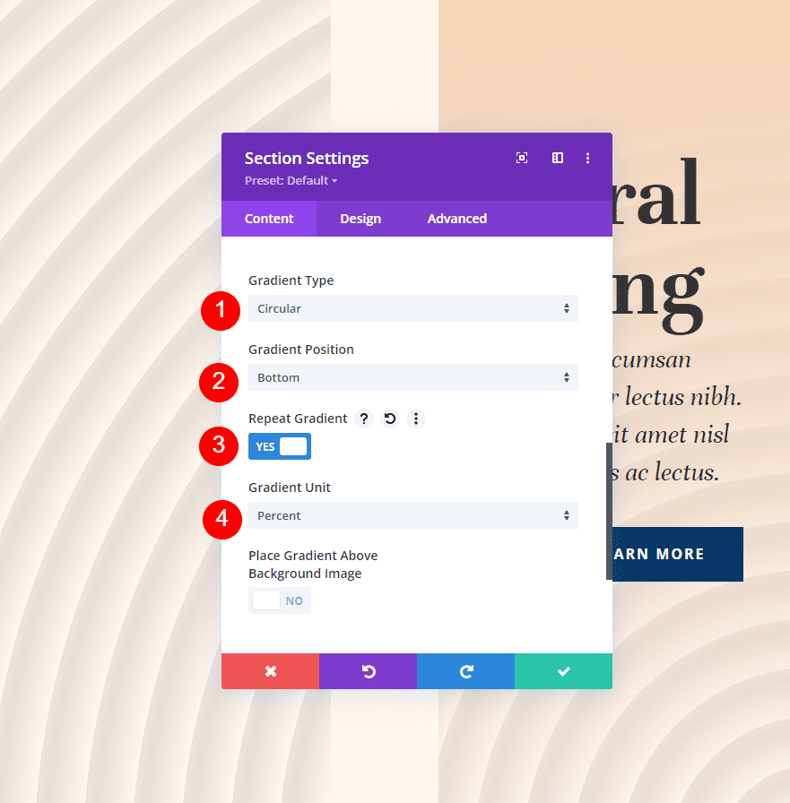
For the gradient settings, change the Type to Circular and set the Direction to Bottom. Enable Repeat Gradient and change the Unit to Percent.
- Type: Circular
- Direction: Bottom
- Repeat Gradient: Yes
- Unit: Percent
- Place Gradient Above Background Image: No
Example Four
Our fourth example creates a circular pattern with large circles.
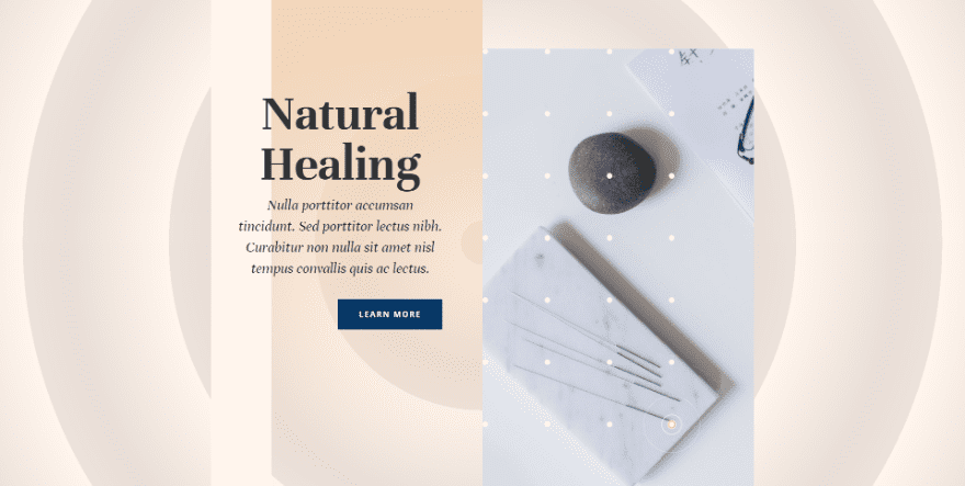
This one has three Gradient Stops. The first is #fff6ee, placed at the 4px Position. Second is #e8ded7, placed at the 23px Position. Third is #ede3dc, placed at the 31px Position. This gradient creates a larger pattern with the colors further apart and stopping at 31 pixels.
- Color 1: #fff6ee (4px Position)
- Color 2: #e8ded7 (23px Position)
- Color 3: #ede3dc (31px Position)
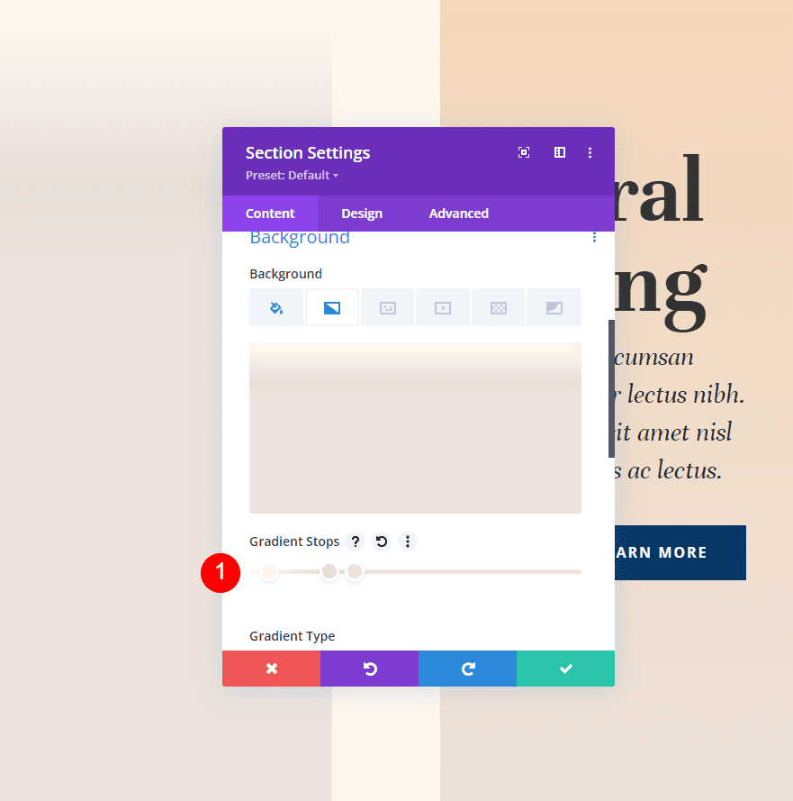
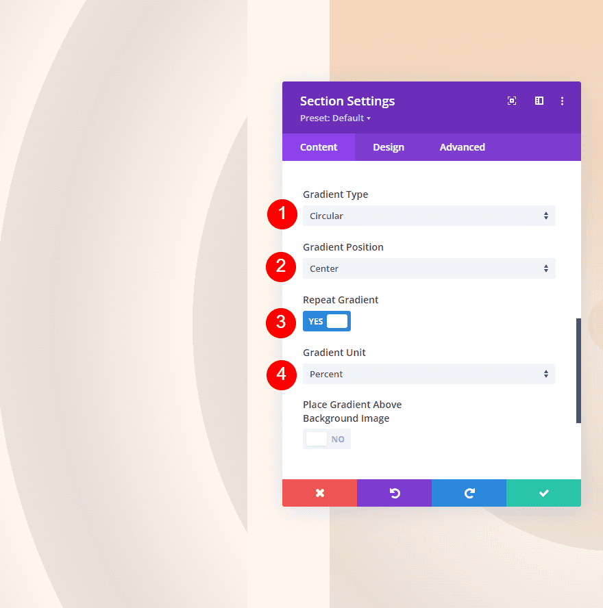
For the gradient settings, change the Type to Circular and set the Direction to Center. Enable Repeat Gradient and change the Unit to Percent.
- Type: Circular
- Direction: Center
- Repeat Gradient: Yes
- Unit: Percent
- Place Gradient Above Background Image: No
Ending Thoughts
That’s our look at how to use Divi’s gradient repeat option to create custom backgrounds. There are lots of adjustments within the gradient settings that affect the gradient’s design. Gradient Repeat works well with all these adjustments to create interesting custom background patterns with ease. I recommend trying the examples we’ve provided here and making changes to see how the gradients are affected and create your own custom background gradients.
We want to hear from you. Do you use Divi’s gradient repeat option with your custom backgrounds? Let us know about it in the comments.





Very detailed post and has a lot of images to explain.
Easy to understand!