Every week, we provide you with new and free Divi layout packs which you can use for your next project. For one of the layout packs, we also share a use case that’ll help you take your website to the next level.
This week, as part of our ongoing Divi design initiative, we’re going to show you how to use Divi’s new column structures to create stunning section transitions. We’ll combine different column structures with some of Divi’s built-in options to take our page design to the next level.
Let’s get to it!
Preview
Let’s start by taking a look at the three different examples that we’ll create from scratch using Divi’s built-in options only. These examples look equally as good on smaller screen sizes.

Use Divi’s Makeup Artist Layout Pack’s Landing Page
We’re going to use the landing page of Divi’s Makeup Artist Layout Pack. If you want to check out the layout pack, go to the following blog post. Although we’re demonstrating this tutorial using a specific layout pack, you can easily use the techniques on other layouts as well.
Section Transition #1

Add New Section
Locate
Open the Makeup Artist Layout Pack’s landing page using Divi’s Visual Builder. Then, add a new regular section right below the hero section:

Spacing
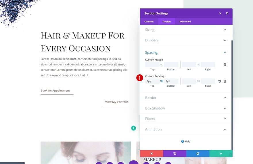
Remove all the default spacing of your section next:
- Top Padding: 0px
- Bottom Padding: 0px
Add New Row
Column Structure
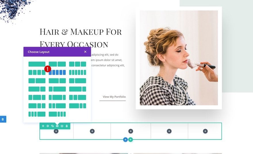
Continue by adding a new row to the section with the following column structure:
Sizing
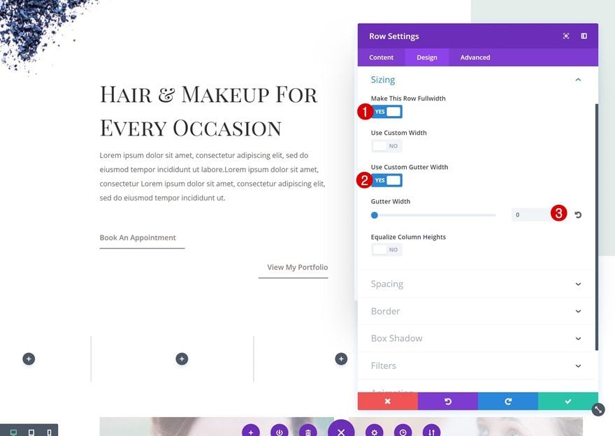
Increase the width of the row as well:
- Make This Row Fullwidth: Yes
- Use Custom Gutter Width: Yes
- Gutter Width: 0
Spacing
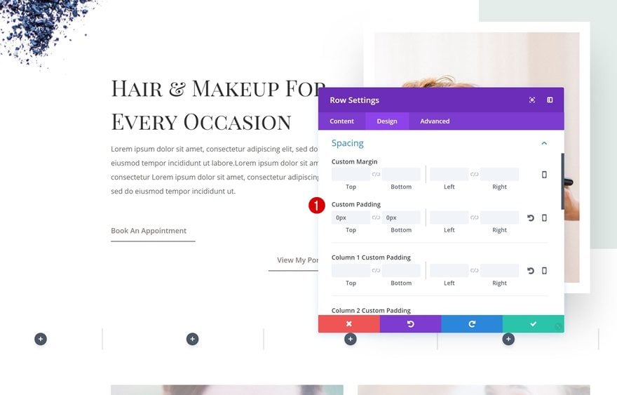
Remove the default top and bottom padding next:
- Top Padding: 0px
- Bottom Padding: 0px
Filter
To make the row more vibrant, increase the saturation in the Filter settings:
- Saturation: 200%
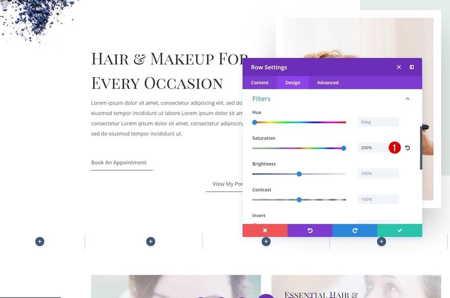
Add Divider Module #1 to Column 1
Hide Divider
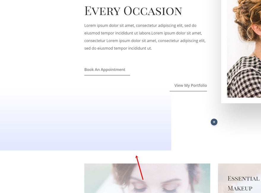
To create the first square in our design, we’re going to add a Divider Module to column 1. Disable the ‘Show Divider’ option.
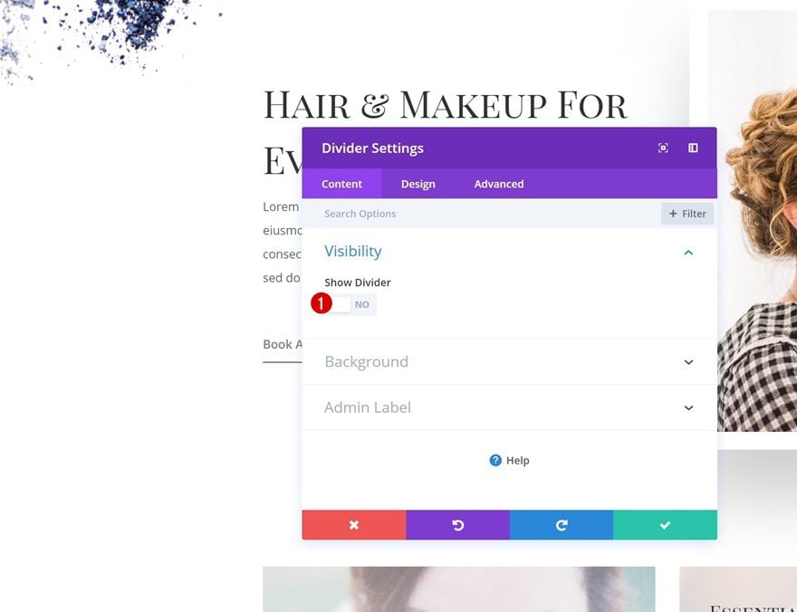
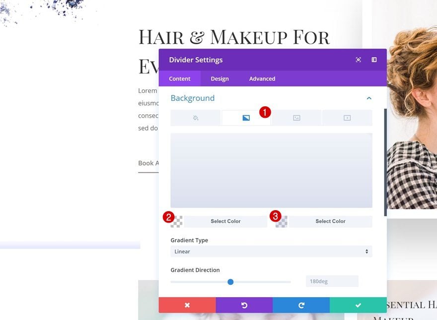
Gradient Background
Next, add a gradient background to the Divider Module:
- Color 1: rgba(255,255,255,0)
- Color 2: rgba(176,182,219,0.34)
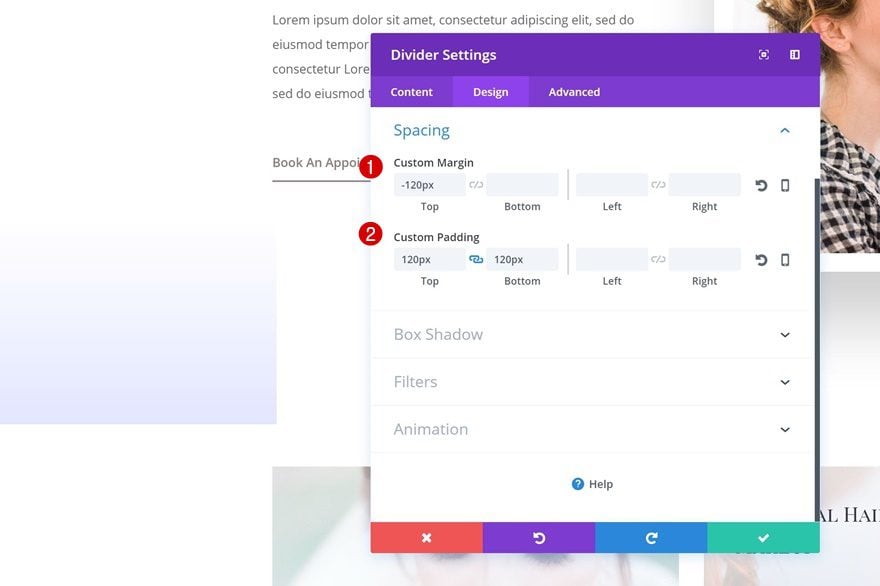
Spacing
To create the square, change the Spacing values:
- Top Margin: -120px
- Top Padding: 120px
- Bottom Padding: 120px
Clone Divider Module & Place in Column 2
Once you’re done modifying the DIvider Module, clone it and place it in the second column.
Change Gradient Background
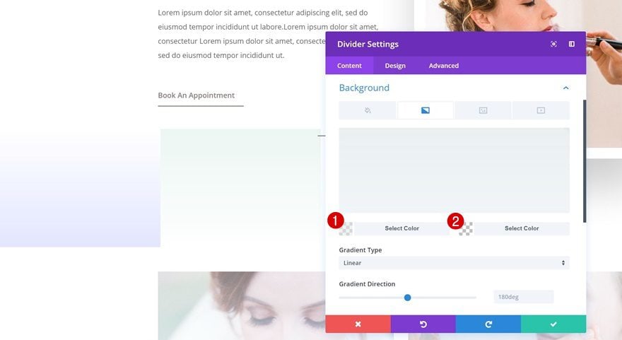
Some changes need to be made to this duplicate, starting with the gradient background:
- Color 1: rgba(228,237,234,0.58)
- Color 2: rgba(255,255,255,0)
Change Spacing
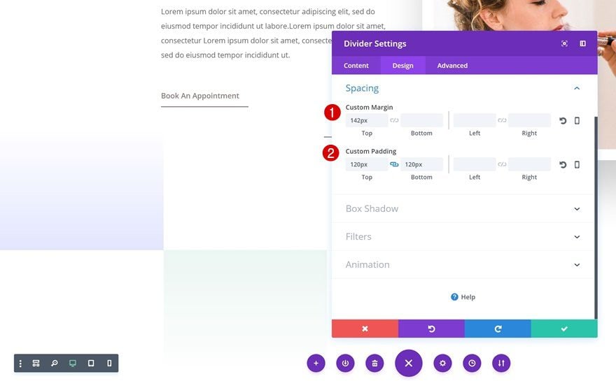
Change the Spacing settings as well. This will increase the distance between this Divider Module and the one in the first column.
- Top Margin: 142px
- Top Padding: 120px
- Bottom Padding: 120px
Clone Divider Module #1 Twice and Place in Column 3 & 5
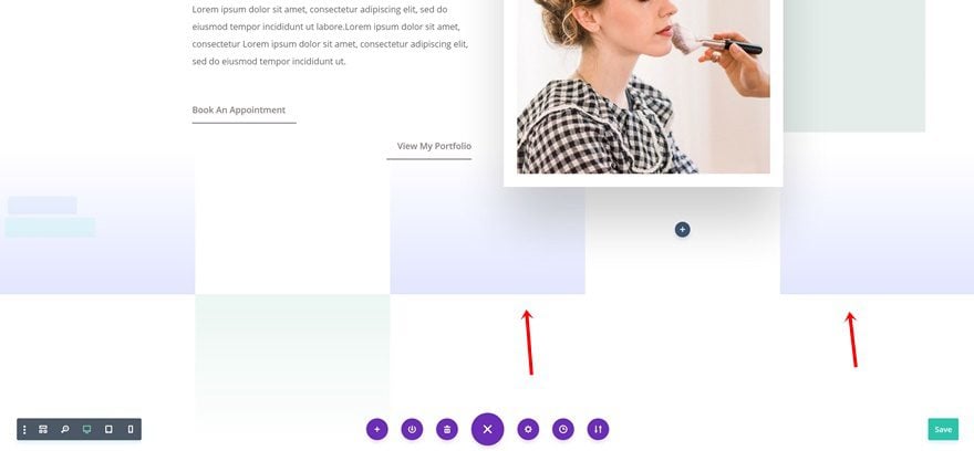
Clone the purple Divider Module twice and place the duplicates in column 3 and 5.
Clone Divider Module #2 and Place in Column 4
Clone the green Divider Module as well and place it in column 4.
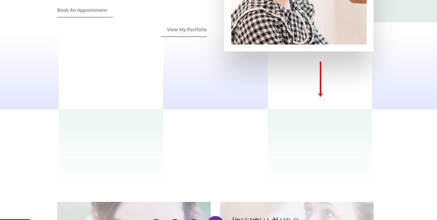
Hide Divider Module in Column 3, 4 & 5 on Tablet & Phone
Open Divider Module in Column 3
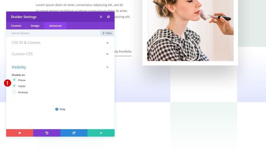
Of course, we want these section transitions to look equally as good on smaller screen sizes. That’s why we’re going to hide some of the modules we’ve used. Start by opening the settings of the Divider Module in column 3.
Hide on Tablet & Phone
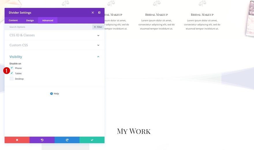
Go to the Advanced tab and disable the module on phone and tablet.
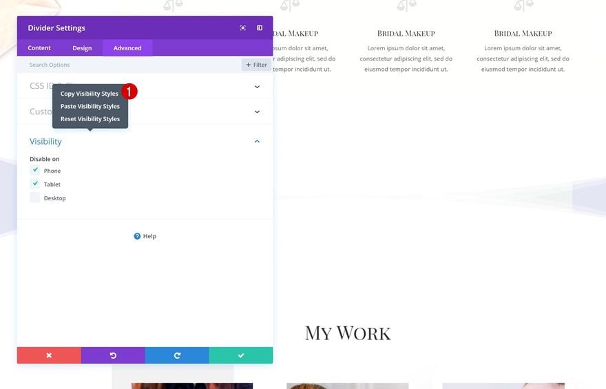
Copy Visibility Styles
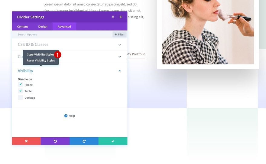
We’ll need to hide the dividers in column 4 and 5 as well. To speed up the process, copy the visibility settings of the divider in column 3:
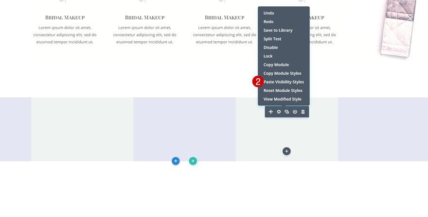
Paste Visibility Styles
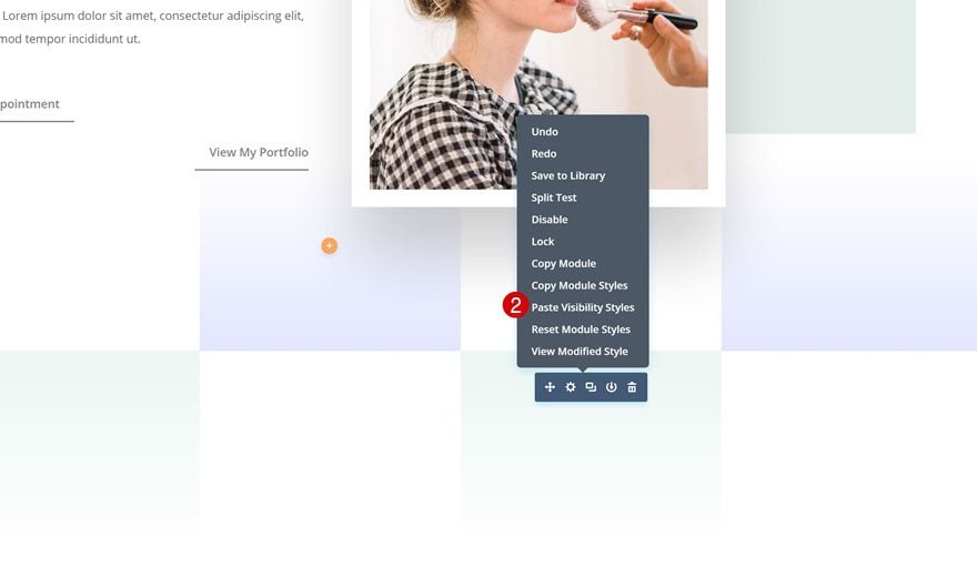
And paste them into the Divider Modules in column 4 and 5.
Section Transition #2
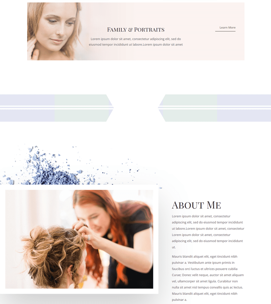
Add New Section
Locate
To create the second section transition, add a new section here:
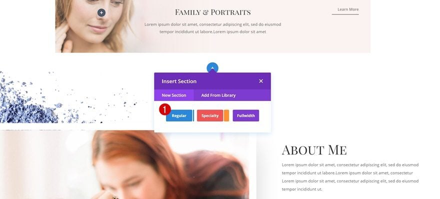
Top Divider
Open the section settings and add the following top divider:
- Divider Style: Find in List
- Divider Color: #ffffff
- Divider Height: 236px
- Divider Flip: Vertical
- Divider Arrangement: On Top Of Section Content
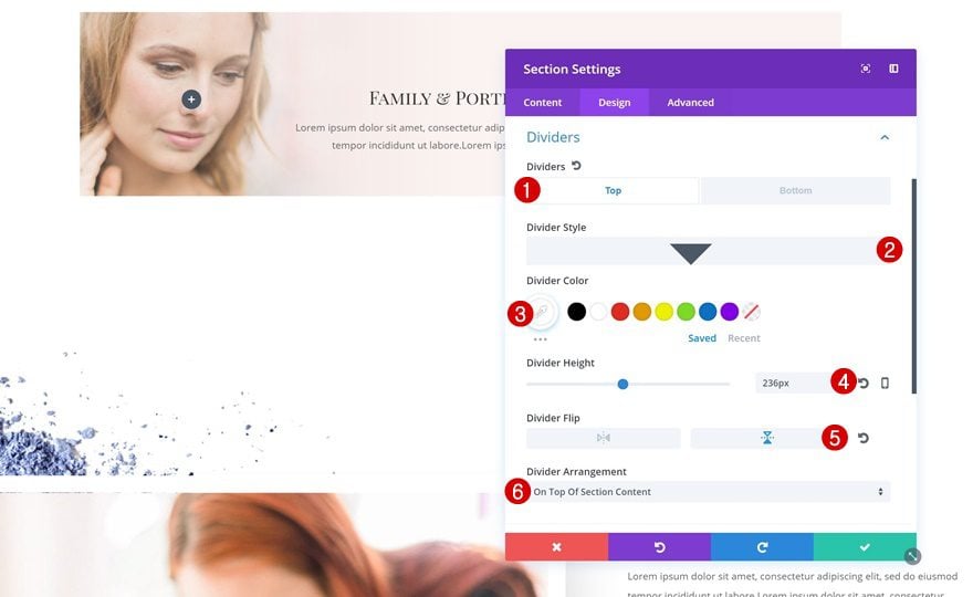
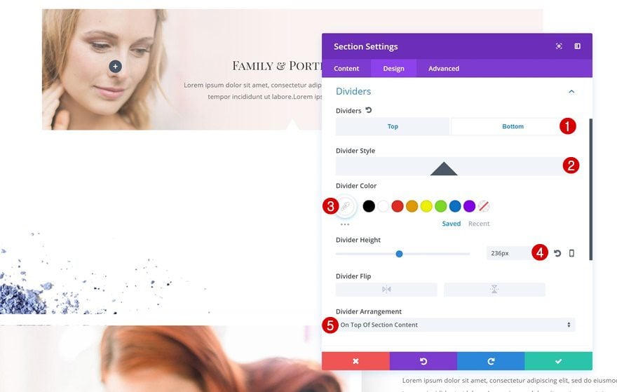
Bottom Divider
Likewise, add a bottom divider as well:
- Divider Style: Find in List
- Divider Color: #ffffff
- Divider Height: 236px
- Divider Arrangement: On Top of Section Content
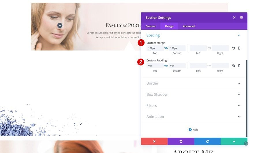
Spacing
Change the Spacing settings next:
- Top Margin: 100px
- Bottom Margin: 100px
- Top Padding: 0px
- Bottom Padding: 0px
Add New Row
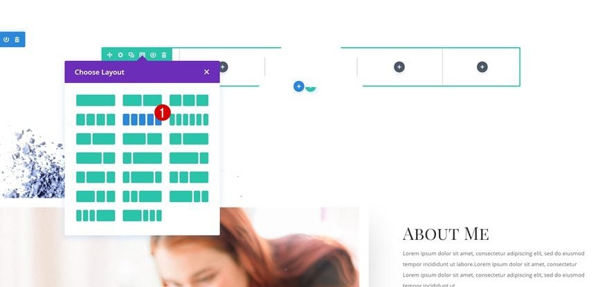
Column Structure
Time to add a row to the new section! Choose the following column structure:
Sizing
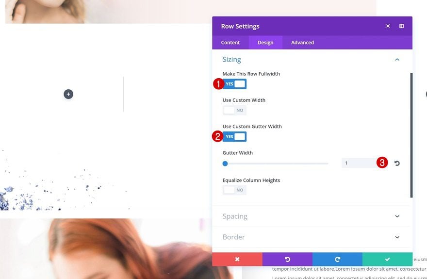
Without adding any modules, open the row settings and change the width:
- Make This Row Fullwidth: Yes
- Use Custom Gutter Width: Yes
- Gutter Width: 1
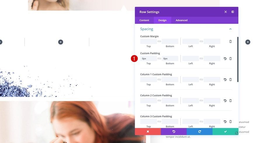
Spacing
Remove all the default top and bottom padding as well:
- Top Padding: 0px
- Bottom Padding: 0px
Add Divider Module #1 to Column 1
Background Color
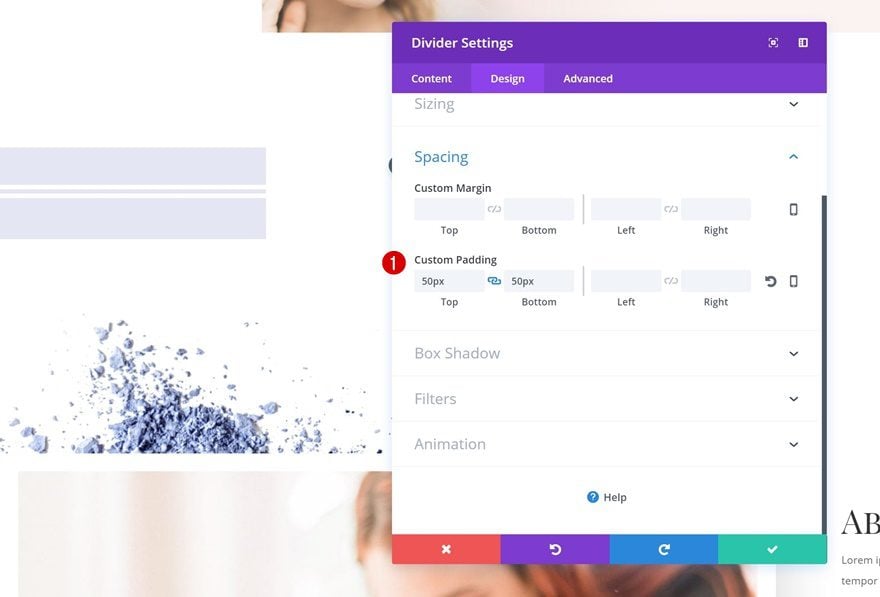
Next, add a Divider Module to the first column. Open its settings and add a background color:
- Background Color: rgba(176,182,219,0.34)
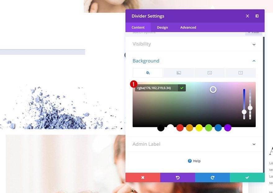
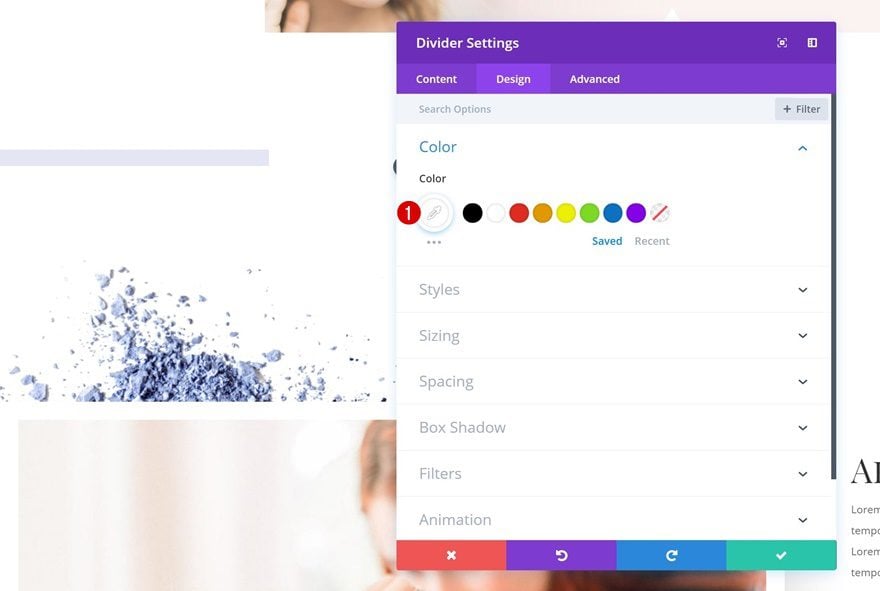
Divider Color
Change the divider color as well:
- Divider Color: #ffffff
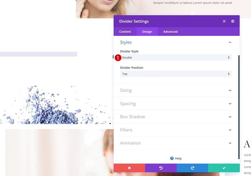
Divider Style
Then, go to the Styles settings and use the following Divider Style:
- Divider Style: Double
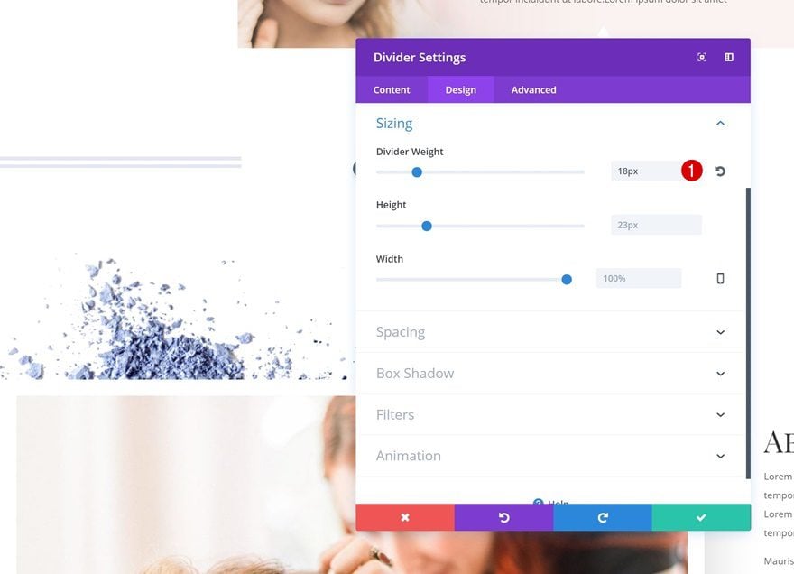
Divider Weight
The weight of the divider should be as follows:
- Divider Weight: 18px
Spacing
Last but not least, increase the size of the Divider Module using custom padding:
- Top Padding: 50px
- Bottom Padding: 50px
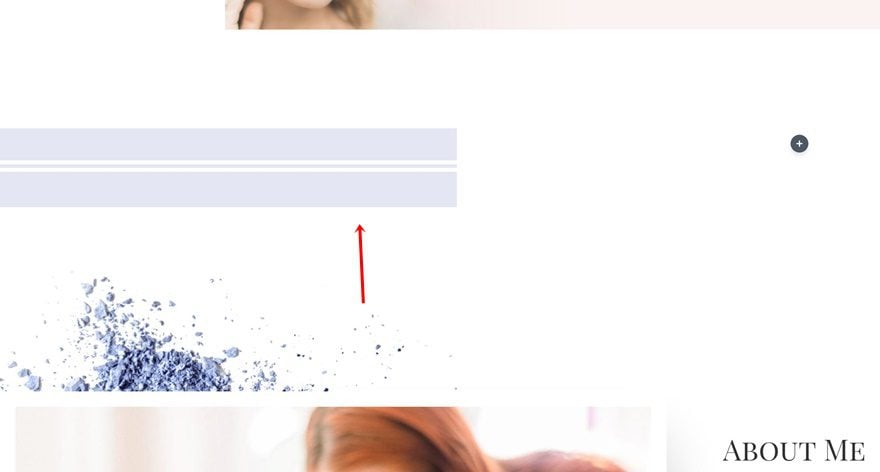
Clone Divider Module & Place in Column 2
Once you’re done with the Divider Module in the first column, clone it and place the duplicate in the second column.
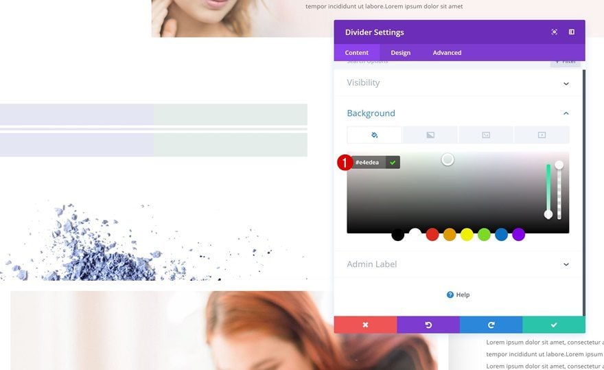
Change Background Color
Change the background color of this duplicate accordingly:
- Background Color: #e4edea
Clone Divider Module #1 and Place in Column 3 & 5
Continue by cloning the purple Divider Module twice and placing the duplicates in column 3 and 5.
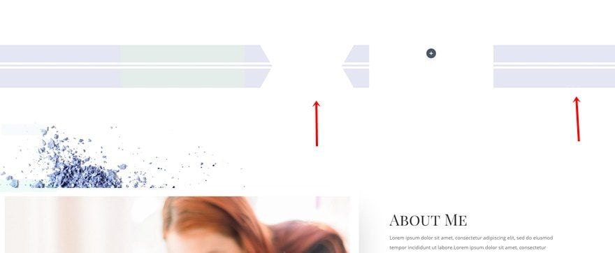
Clone Divider Module #2 and Place in Column 4
Clone the green Divider Module as well and place the duplicate in column 4.
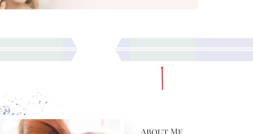
Hide Divider Module in Column 3, 4 & 5 on Tablet & Phone
Hide on Tablet & Phone
We’re going to do the same thing we did for the first section transition example. Open the settings of the Divider Module in column 3 and hide it on phone and tablet.
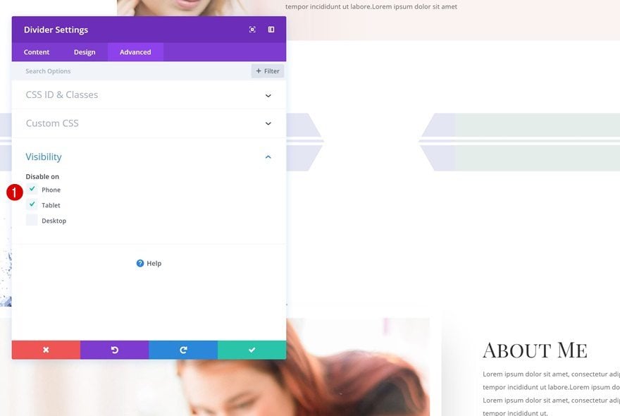
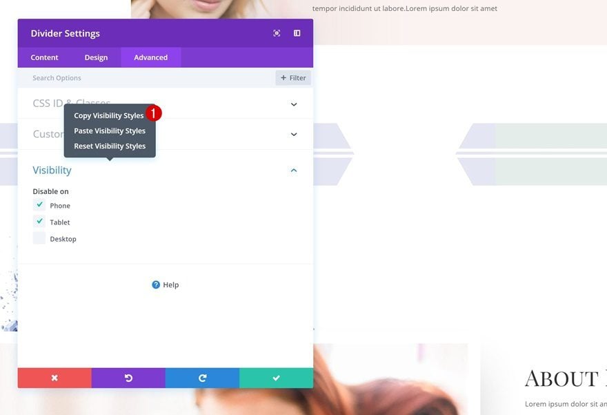
Copy Visibility Styles
Copy these Visibility Styles.
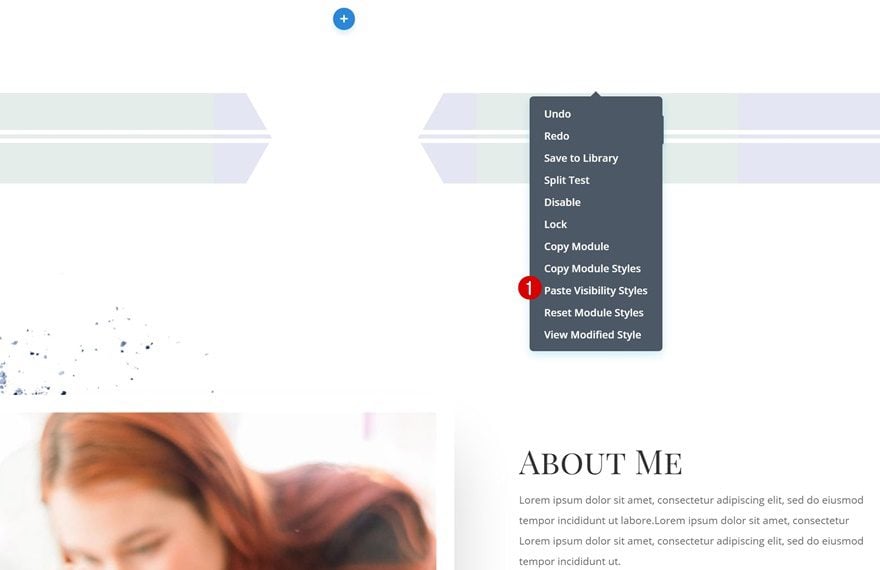
Paste Visibility Styles
And paste them into the Divider Modules in column 4 and 5.
Section Transition #3

Add New Section
Locate
To add the last section transition to your page, add a new section here:

Top Divider
Open the section settings and add a top divider:
- Divider Style: Find in List
- Divider Color: #ffffff
- Divider Height: 150px
- Divider Arrangement: On Top Of Section Content
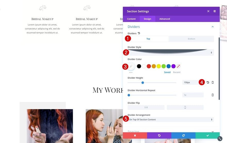
Bottom Divider
Add a bottom one next:
- Divider Style: Find in List
- Divider Color: #ffffff
- Divider Height: 150px
- Divider Flip: Vertical
- Divider Arrangement: On Top Of Section Content
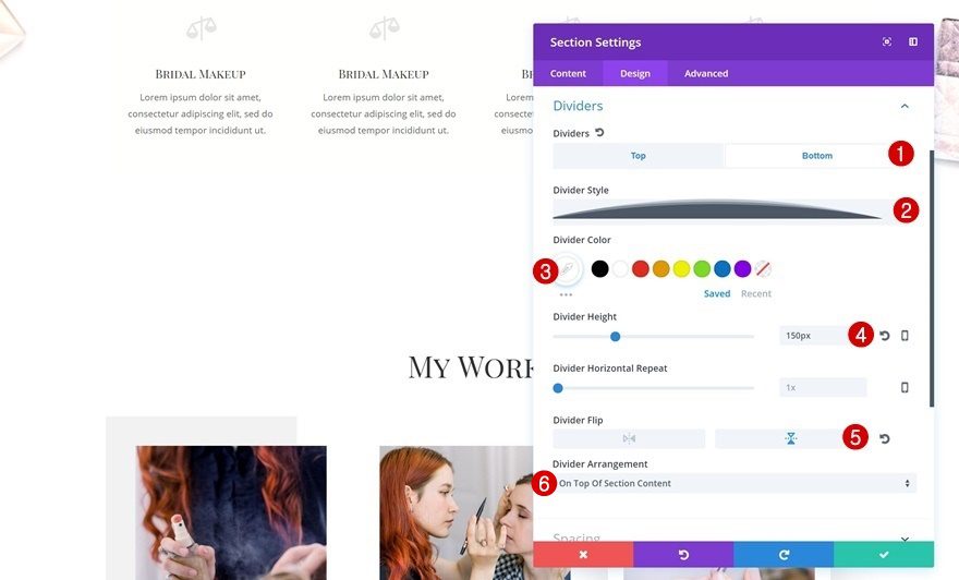
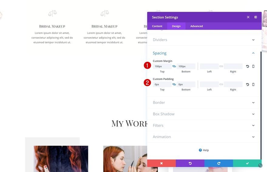
Spacing
Then, go to the Spacing settings and make some changes:
- Top Margin: 100px
- Bottom Margin: 100px
- Top Padding: 0px
- Bottom Padding: 0px
Add New Row
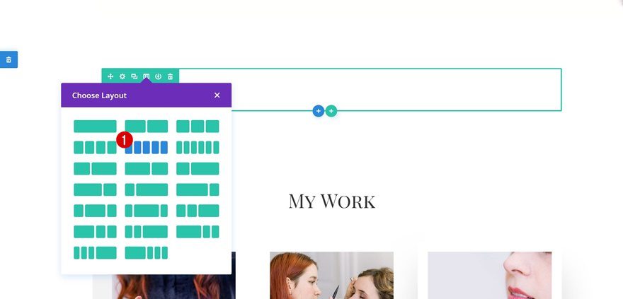
Column Structure
The row we’ll need in this section has the following column structure:
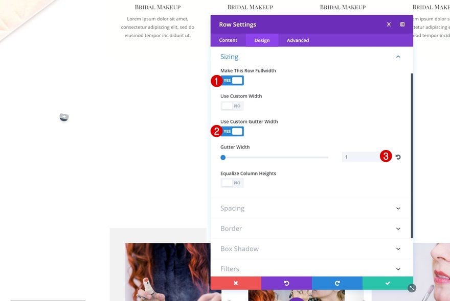
Sizing
Without adding any modules, open the row settings and increase the width of your row:
- Make This Row Fullwidth: Yes
- Use Custom Gutter Width: Yes
- Gutter Width: 1
Spacing
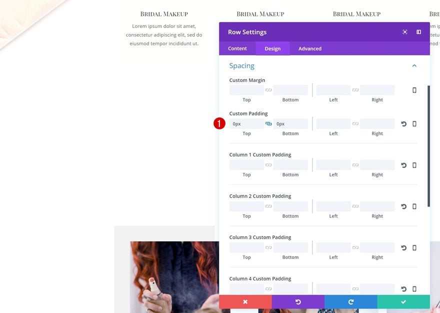
Remove all the default top and bottom padding next:
- Top Padding: 0px
- Bottom Padding: 0px
Add Divider Module #1 to Column 1
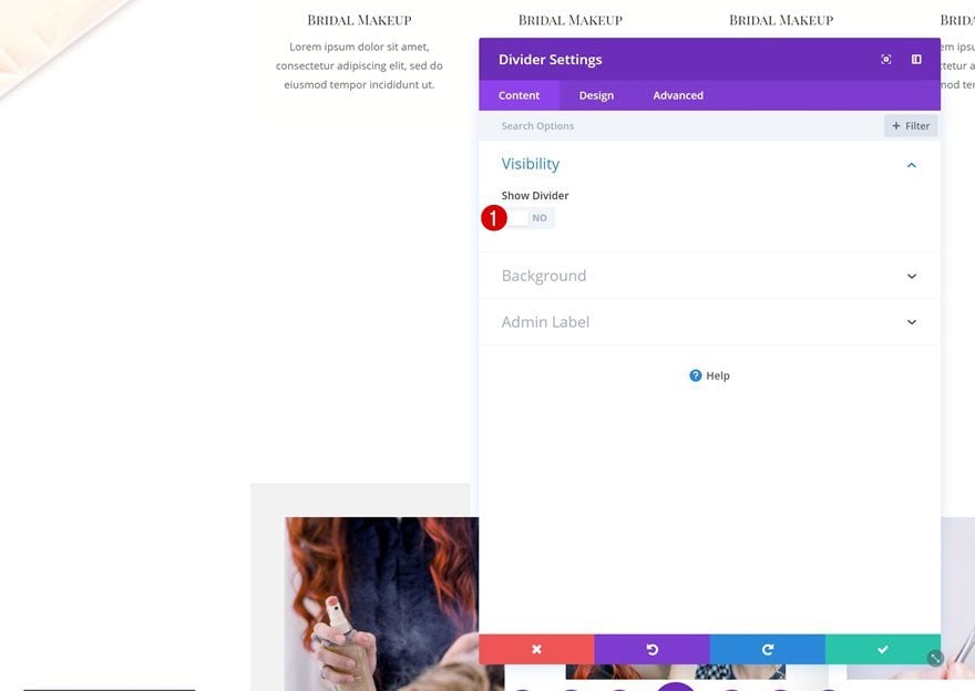
Hide Divider
Continue by adding a Divider Module to the first column. Disable the ‘Show Divider’ option.
Background Color
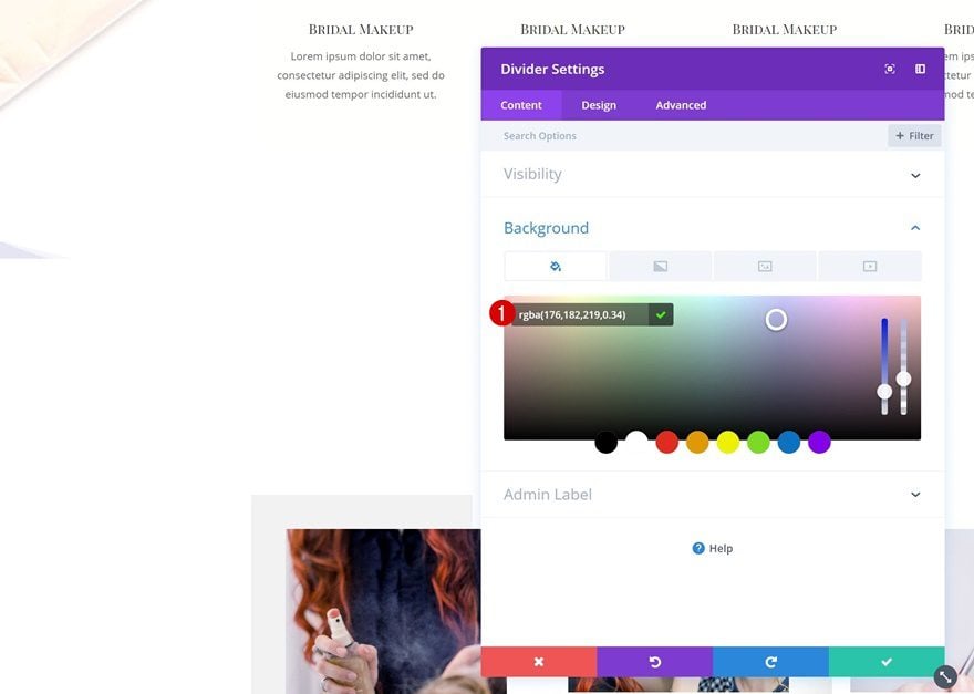
Add a background color to the divider instead:
- Background Color: rgba(176,182,219,0.34)
Spacing
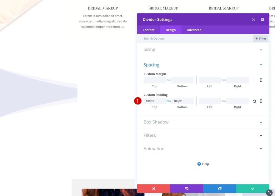
Increase the size of the module by using top and bottom padding:
- Top Padding: 100px
- Bottom Padding: 100px
Clone Divider Module & Place in Column 2
Change Background Color
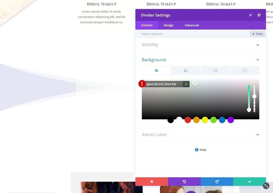
Clone the Divider Module in the first column and place the duplicate in the second one. Open its settings and change the background color:
- Background Color: rgba(228,237,234,0.58)
Clone Divider Module #1 and Place in Column 3 & 5
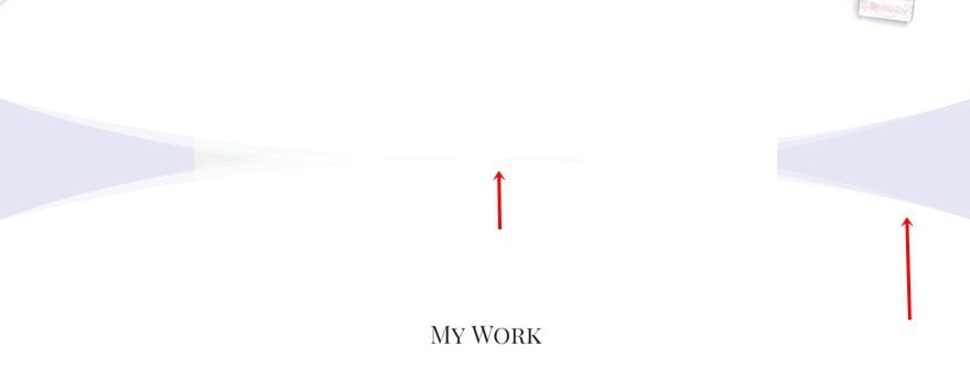
Clone the purple Divider Module twice and place it in column 3 and 5.
Clone Divider Module #2 and Place in Column 4
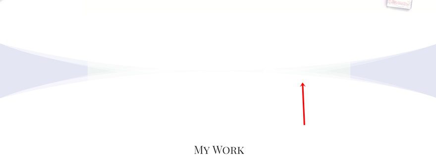
Clone the green Divider Module as well and place the duplicate in column 4.
Hide Divider Module in Column 3, 4 & 5 on Tablet & Phone
Hide on Tablet & Phone
Hide the Divider Module in column 3 on tablet and phone.
Copy Visibility Styles
Copy these Visibility Styles.
Paste Visibility Styles
And paste them on the Divider Module in column 4 and 5 and you’re done!
Preview
Now that we’ve gone through all the steps, let’s take a final look at the three different examples we’ve created.

Final Thoughts
In this use case blog post, we’ve shown you how to use Divi’s new column structures to create stunning section transitions. This tutorial is part of our ongoing Divi design initiative, where we try to put something in your design toolbox each and every week. If you have any questions, make sure you leave a comment in the comment section below!




Hi i cant find the bottom divider used in this tuto for the transition 3
Thanks for this tutorial
You have a lot of good ideas
in your tutorials.
Thanks, Bruno! Happy you like it 🙂