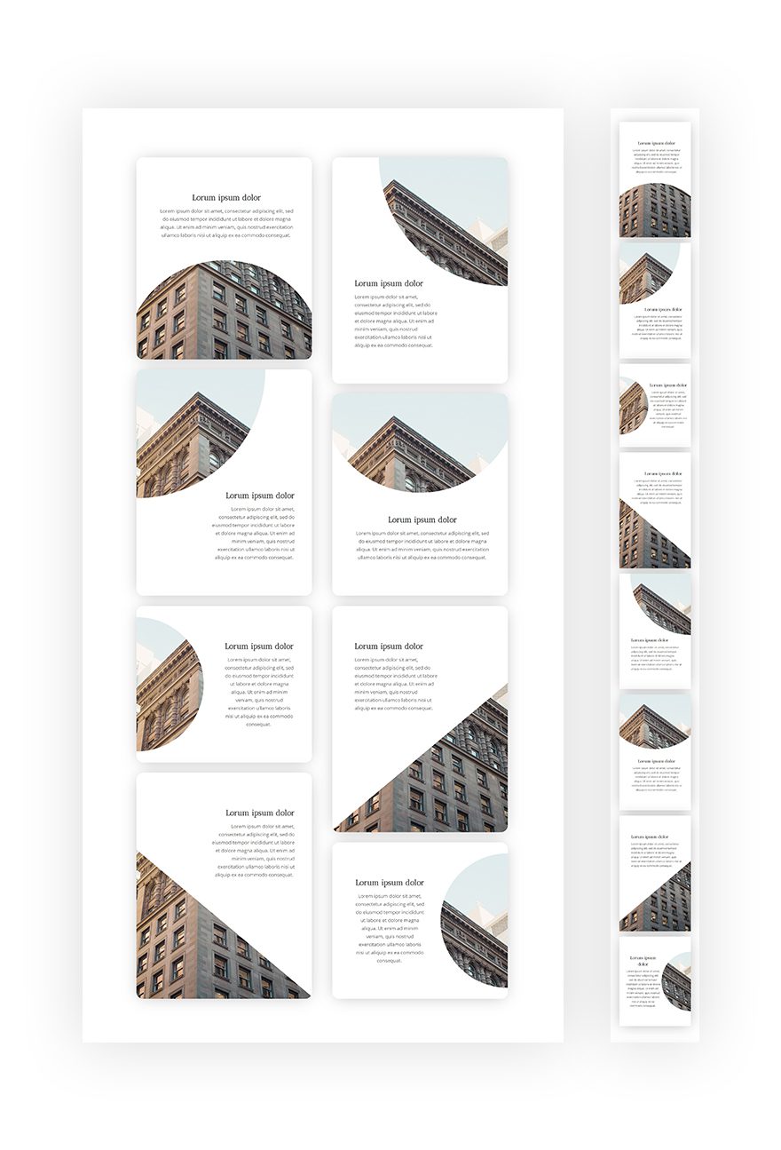
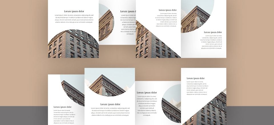
If you’re familiar with image editing software, such as Photoshop, you’re probably familiar with masks as well. Masks help you bring two layers together and create a unique outcome. With Divi, you can get creative and create your own kind of masks inside your pages using gradient backgrounds in combination with background images. In this tutorial, we’ll show you step by step how to create 8 different background masks for any kind of design you’re working on. This tutorial will help you make quick design tweaks to your pages without having to touch any image editing software at all.
Let’s get to it!
- 1 Preview
-
2
Let’s Start Creating!
- 2.1 Add New Section
- 2.2 Add New Row
- 2.3 Add Blurb Module to #1
- 2.4 Clone Blurb Module 7 Times & Place 4 Duplicates in Second Column
- 2.5 Modify Blurb Module #1
- 2.6 Modify Blurb Module #2
- 2.7 Modify Blurb Module #3
- 2.8 Modify Blurb Module #4
- 2.9 Modify Blurb Module #5
- 2.10 Modify Blurb Module #6
- 2.11 Modify Blurb Module #7
- 2.12 Modify Blurb Module #8
- 3 Preview
- 4 Final Thoughts
Preview
Before we dive into the tutorial, let’s take a quick look at the outcome on different screen sizes.
Let’s Start Creating!
Subscribe To Our Youtube Channel
Add New Section
Spacing
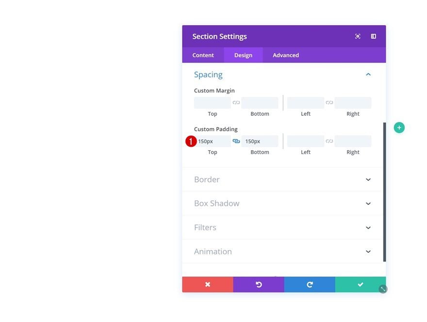
Add a new section to your page, open the section settings and add some custom top and bottom padding.
- Top Padding: 150px
- Bottom Padding: 150px
Add New Row
Column Structure
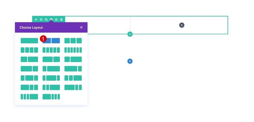
Continue by adding a new row using the following column structure:
Add Blurb Module to #1
Add Content
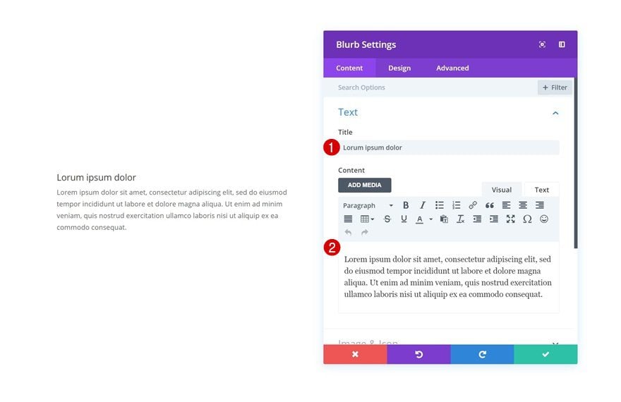
Time to start adding modules! We’ll need 8 Blurb Modules in total. We’ll start with the first one, make the general changes and clone it 7 times afterward before making unique changes to each Blurb Module. Add a new Blurb Module to the first column and add some content of choice.
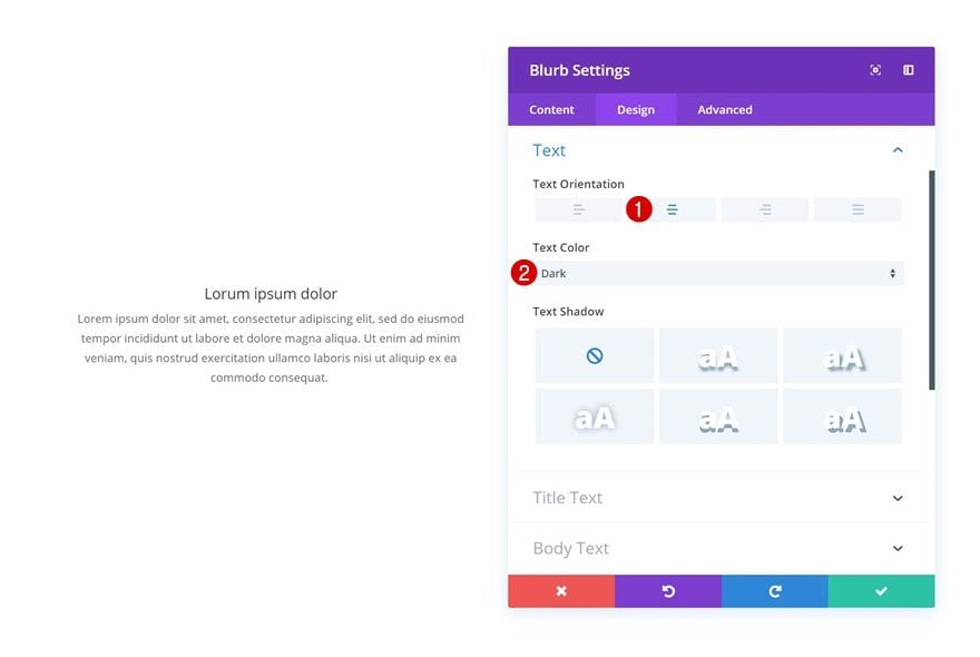
Text Settings
Move on to the design tab and change the text settings next.
- Text Orientation: Center
- Text Color: Dark
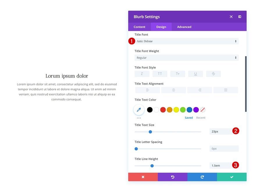
Title Text Settings
Open the title text settings as well and change things around.
- Title Font: Antic Didone
- Title Text Size: 23px
- Title Line Height: 1.5em
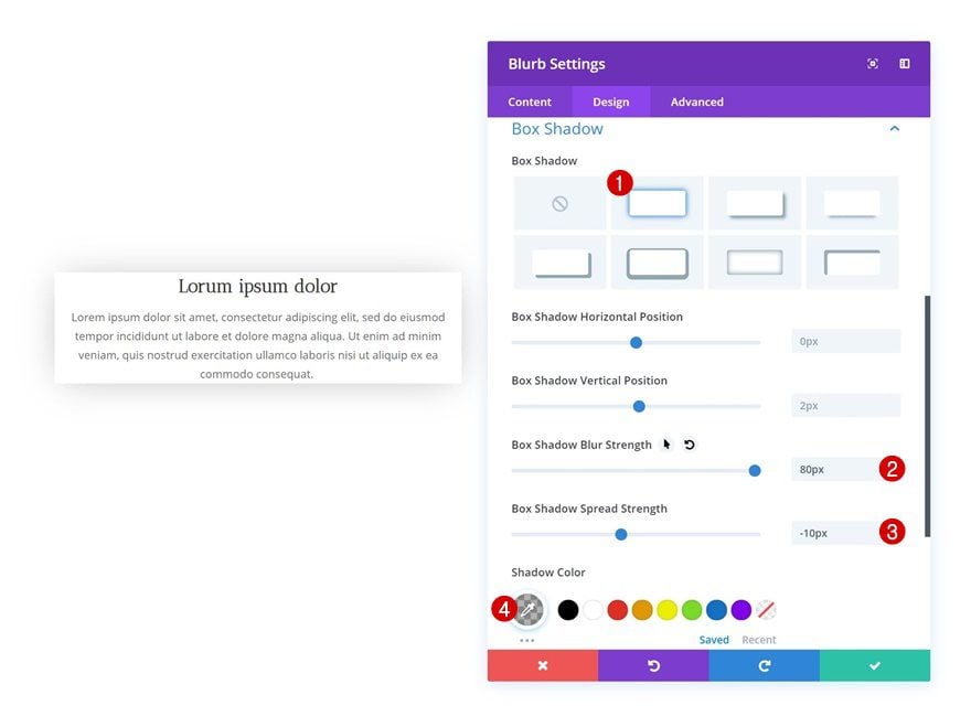
Box Shadow
Lastly, add a subtle box shadow to the Blurb Module as well.
- Box Shadow Blur Strength: 80px
- Box Shadow Spread Strength: -10px
- Shadow Color: rgba(0,0,0,0.3)
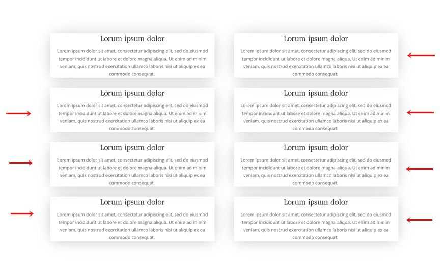
Clone Blurb Module 7 Times & Place 4 Duplicates in Second Column
Once you’ve made all the overall changes, you can go ahead and clone the Blurb Module 7 times. Place four of the duplicates in the second column of the row and leave three in the first.
Modify Blurb Module #1
Gradient Background
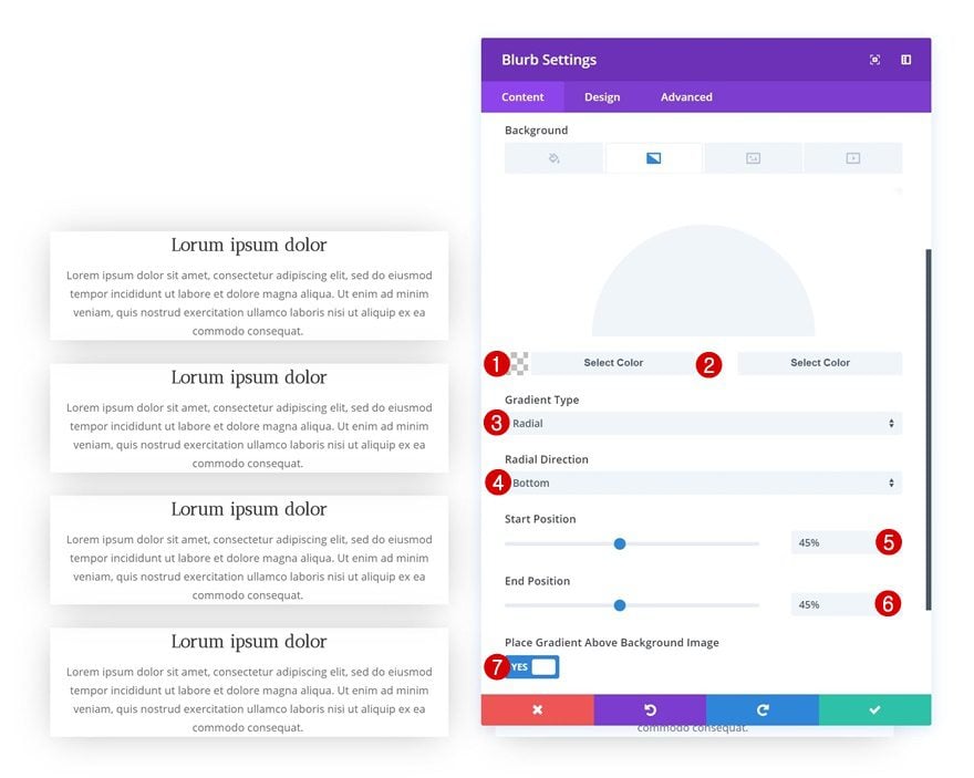
Now we can start adding unique settings to each one of the Blurb Modules. Open the first Blurb Module in column 1 and add a gradient background to it.
- Color 1: rgba(255,255,255,0)
- Color 2: #ffffff
- Gradient Type: Radial
- Radial Direction: Bottom
- Start Position: 45%
- End Position: 45%
- Place Gradient Above Background Image: Yes
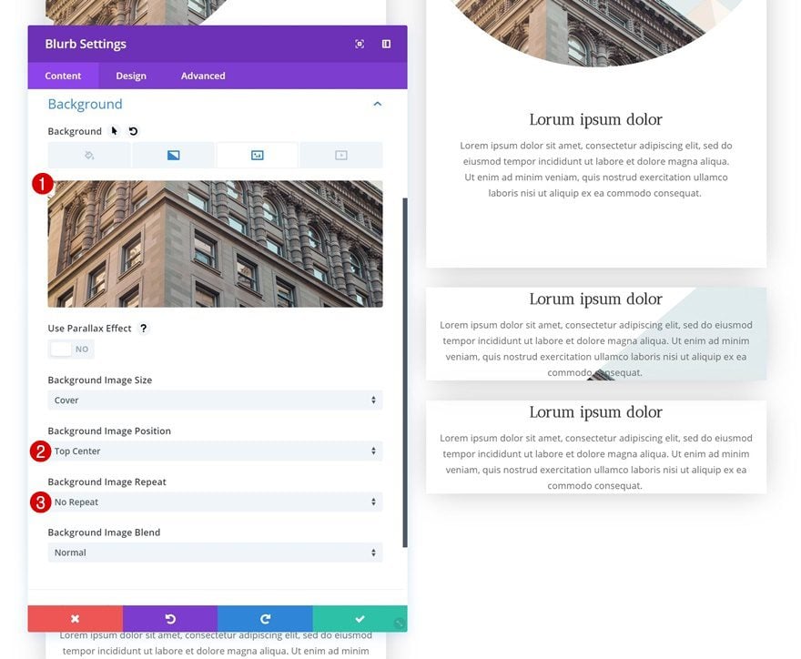
Background Image
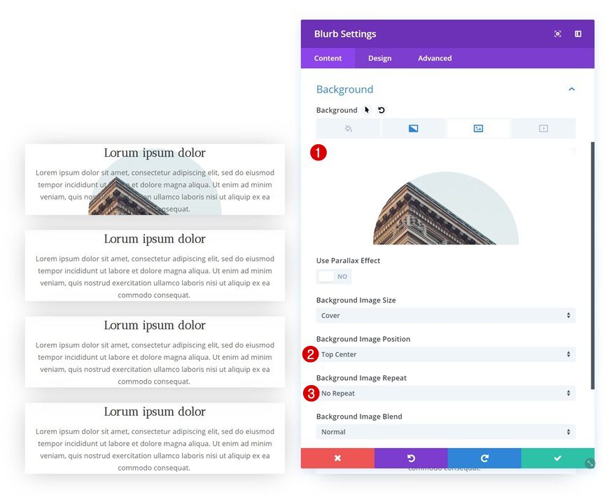
Once you’ve added the gradient background, you can add the background image as well and combine it with the following background settings:
- Background Image Position: Top Center
- Background Image Repeat: No Repeat
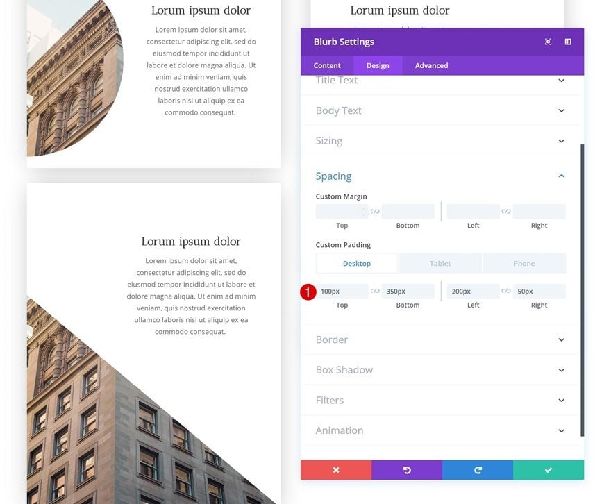
Spacing
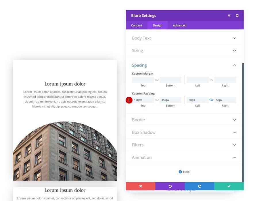
Last but not least, add some custom padding for everything to fall into place.
- Top Padding: 100px
- Bottom Padding: 350px
- Left Padding: 50px
- Right Padding: 50px
Modify Blurb Module #2
Gradient Background
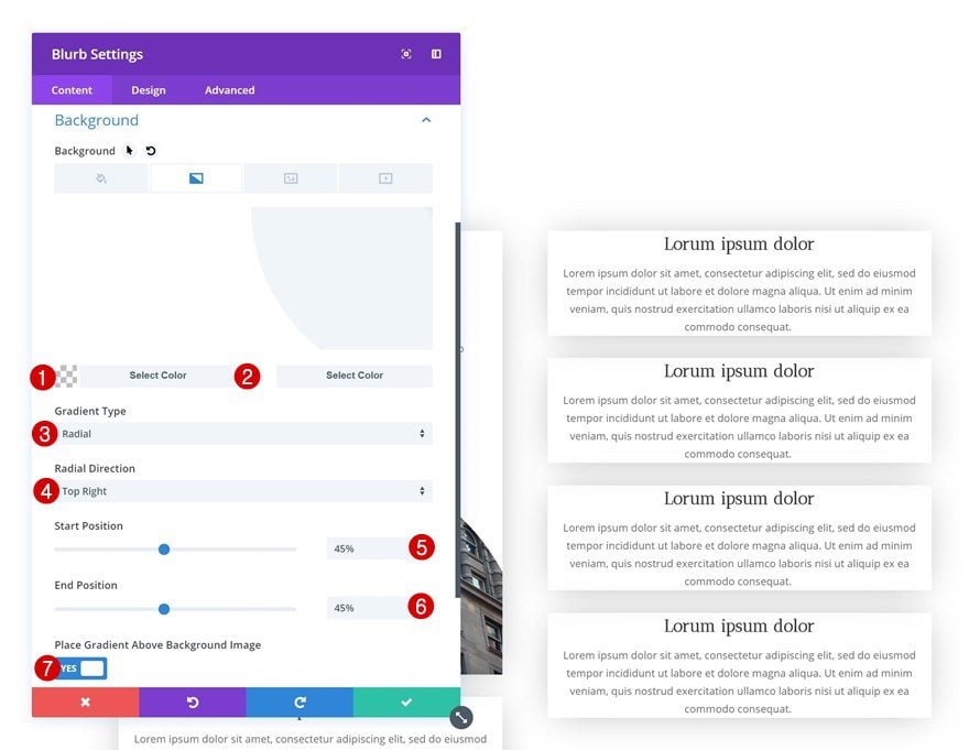
Let’s move on to the next Blurb Module (the first module in the second column) and add a gradient background.
- Color 1: rgba(255,255,255,0)
- Color 2: #ffffff
- Gradient Type: Radial
- Radial Direction: Top Right
- Start Position: 45%
- End Position: 45%
- Place Gradient Above Background Image: Yes
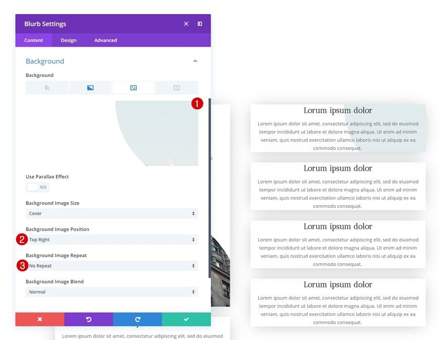
Background Image
Continue by adding a background image combined with the background settings below.
- Background Image Position: Top Right
- Background Image Repeat: No Repeat
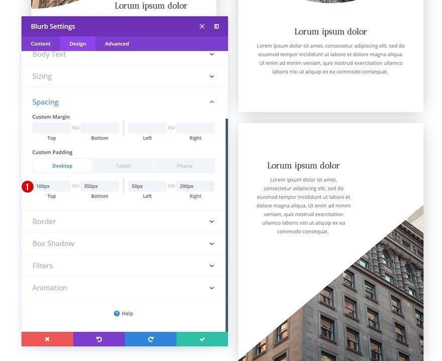
Spacing
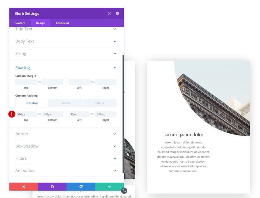
And finish the design by adding custom padding values in the spacing settings.
- Top Padding: 350px
- Bottom Padding: 100px
- Left Padding: 50px
- Right Padding: 200px (Desktop & Tablet), 50px (Phone)
Modify Blurb Module #3
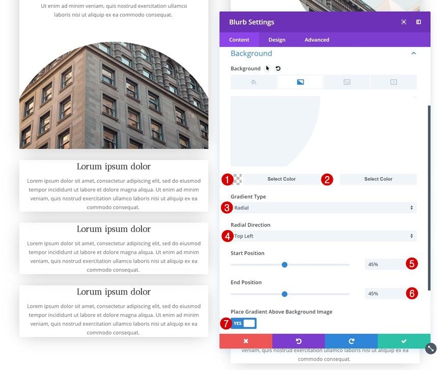
Gradient Background
On to the third Blurb Module (the second blurb module in the first column). Open the settings and add a gradient background.
- Color 1: rgba(255,255,255,0)
- Color 2: #ffffff
- Gradient Type: Radial
- Radial Direction: Top Left
- Start Position: 45%
- End Position: 45%
- Place Gradient Above Background Image: Yes
Background Image
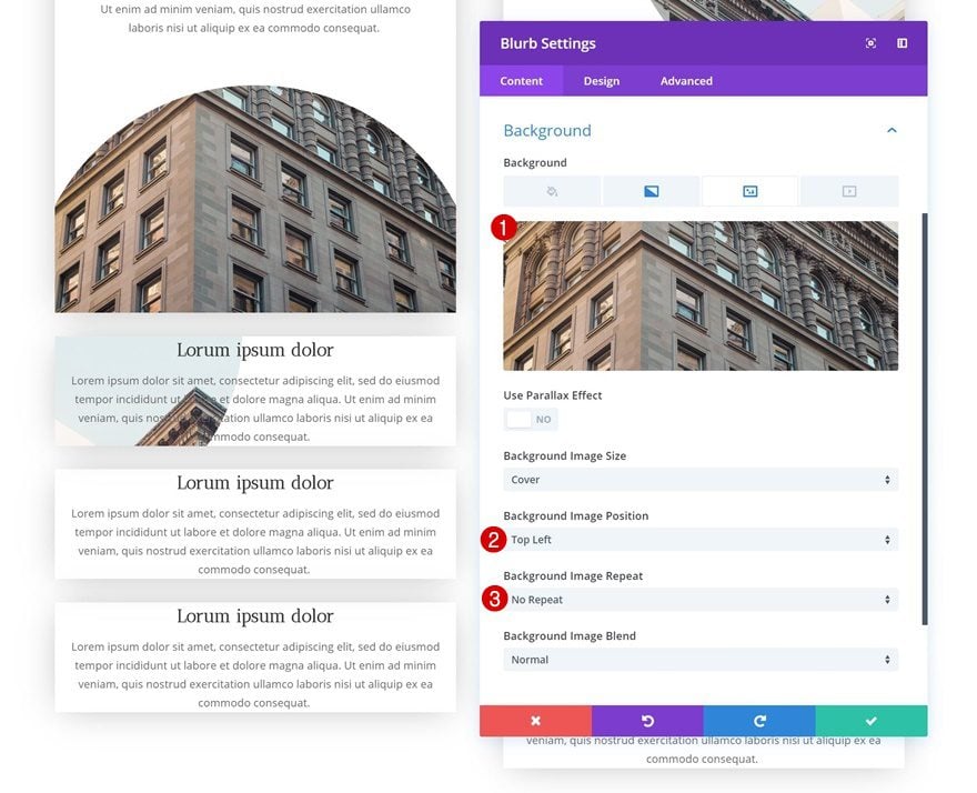
Continue by adding a background image next.
- Background Image Position: Top Left
- Background Image Repeat: No Repeat
Spacing
And add some custom padding to the module for it to take its shape.
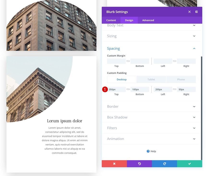
- Top Padding: 350px
- Bottom Padding: 100px
- Left Padding: 200px (Desktop & Tablet), 50px (Phone)
- Right Padding: 50px
Modify Blurb Module #4
Gradient Background
On to the second module in the second column! Open the Blurb Module’s settings and add a gradient background.
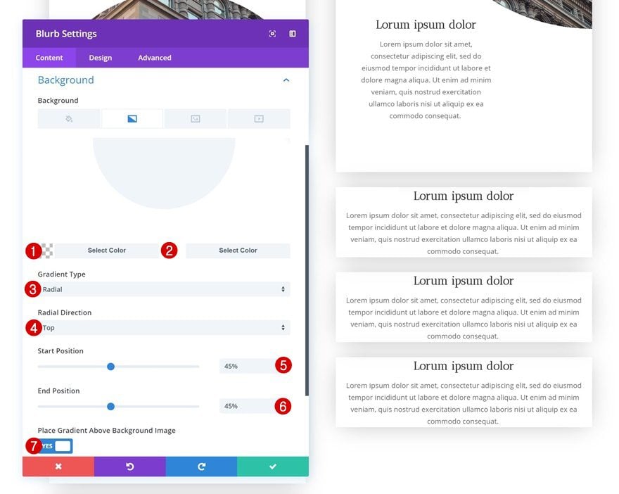
- Color 1: rgba(255,255,255,0)
- Color 2: #ffffff
- Gradient Type: Radial
- Radial Direction: Top
- Start Position: 45%
- End Position: 45%
- Place Gradient Above Background Image: Yes
Background Image
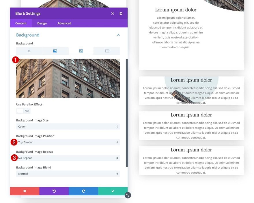
Continue by adding a background image next.
- Background Image Position: Top Center
- Background Image Repeat: No Repeat
Spacing
And finish the design by adding custom padding values in the spacing settings.
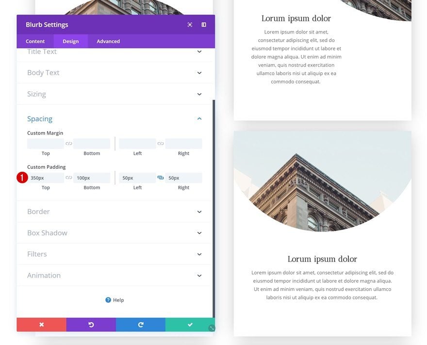
- Top Padding: 350px
- Bottom Padding: 100px
- Left Padding: 50px
- Right Padding: 50px
Modify Blurb Module #5
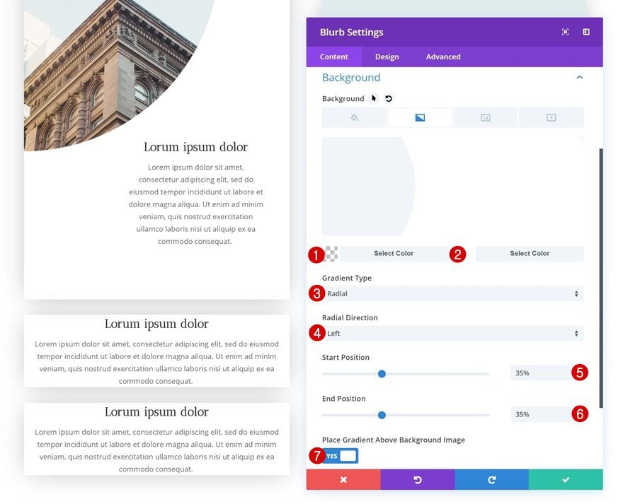
Gradient Background
On to the next module, which is the third module in the first column. Open the module and add a gradient background.
- Color 1: rgba(255,255,255,0)
- Color 2: #ffffff
- Gradient Type: Radial
- Radial Direction: Left
- Start Position: 35%
- End Position: 35%
- Place Gradient Above Background Image: Yes
Background Image
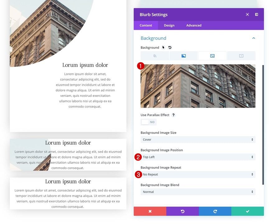
Continue by adding a background image in combination with the following background settings:
- Background Image Position: Top Left
- Background Image Repeat: No Repeat
Spacing
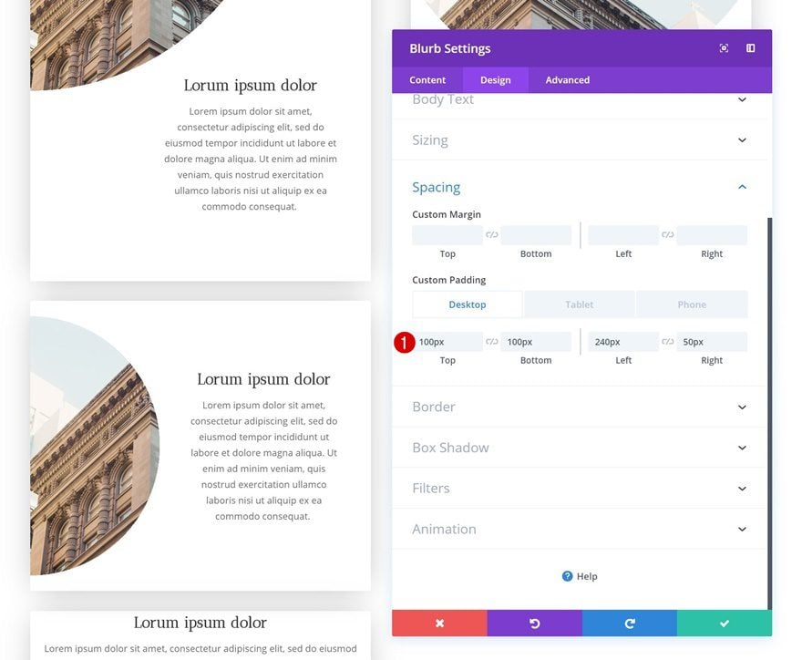
And add some custom padding values in the spacing settings as well.
- Top Padding: 100px
- Bottom Padding: 100px
- Left Padding: 240px (Desktop & Tablet), 150px (Phone)
- Right Padding: 50px (Desktop & Tablet), 20px (Phone)
Modify Blurb Module #6
Gradient Background
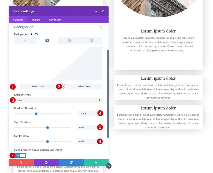
On to the third module in the second column! Open the settings and add a gradient background.
- Color 1: rgba(255,255,255,0)
- Color 2: #ffffff
- Gradient Type: Linear
- Gradient Direction: 140deg
- Start Position: 60%
- End Position: 60%
- Place Gradient Above Background Image: Yes
Background Image
Add a background image with the matching background settings next.
- Background Image Position: Top Center
- Background Image Repeat: No Repeat
Spacing
And complete the design using some custom padding values in the spacing settings.
- Top Padding: 100px
- Bottom Padding: 350px
- Left Padding: 50px
- Right Padding: 200px (Desktop & Tablet), 50px (Tablet)
Modify Blurb Module #7
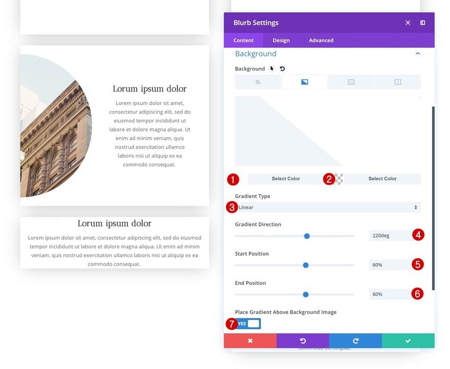
Gradient Background
The next Blurb Module in column 1 uses the following gradient background:
- Color 1: rgba(255,255,255,0)
- Color 2: #ffffff
- Gradient Type: Linear
- Gradient Direction: 220deg
- Start Position: 60%
- End Position: 60%
- Place Gradient Above Background Image: Yes
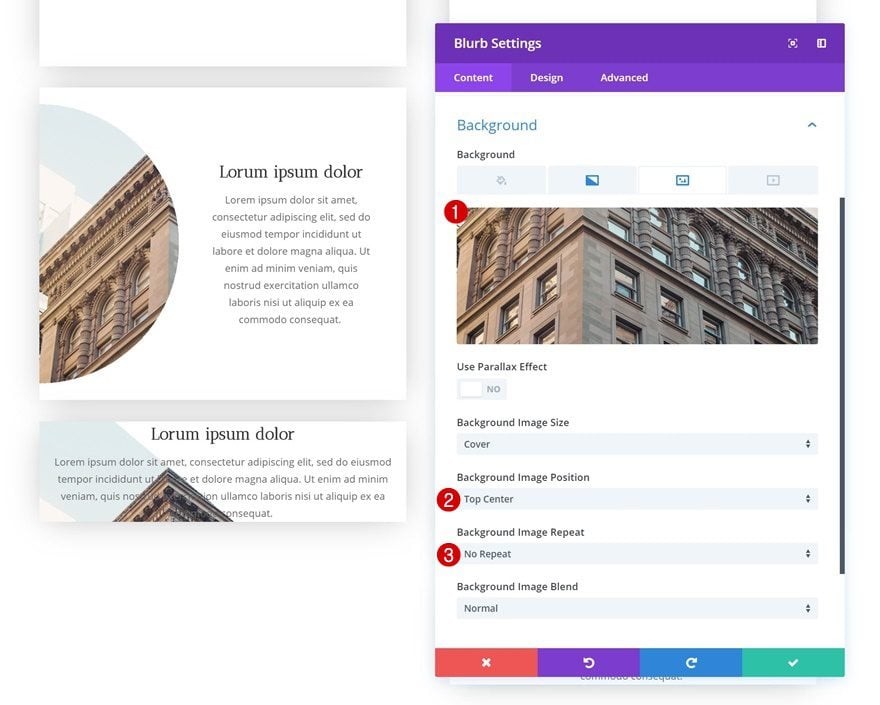
Background Image
Add a background image as well.
- Background Image Position: Top Center
- Background Image Repeat: No Repeat
Spacing
And add the needed custom padding values in the spacing settings.
- Top Padding: 100px
- Bottom Padding: 350px
- Left Padding: 200px (Desktop & Tablet), 50px (Phone)
- Right Padding: 50px
Modify Blurb Module #8
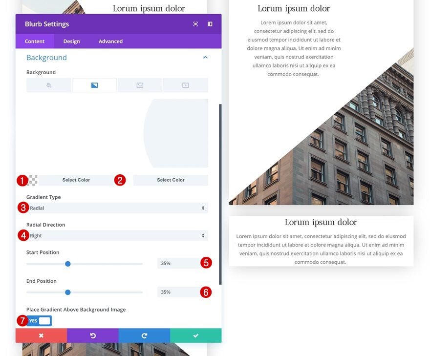
Gradient Background
On to the last Blurb Module! Open the settings and add a gradient background.
- Color 1: rgba(255,255,255,0)
- Color 2: #ffffff
- Gradient Type: Radial
- Radial Direction: Right
- Start Position: 35%
- End Position: 35%
- Place Gradient Above Background Image: Yes
Background Image
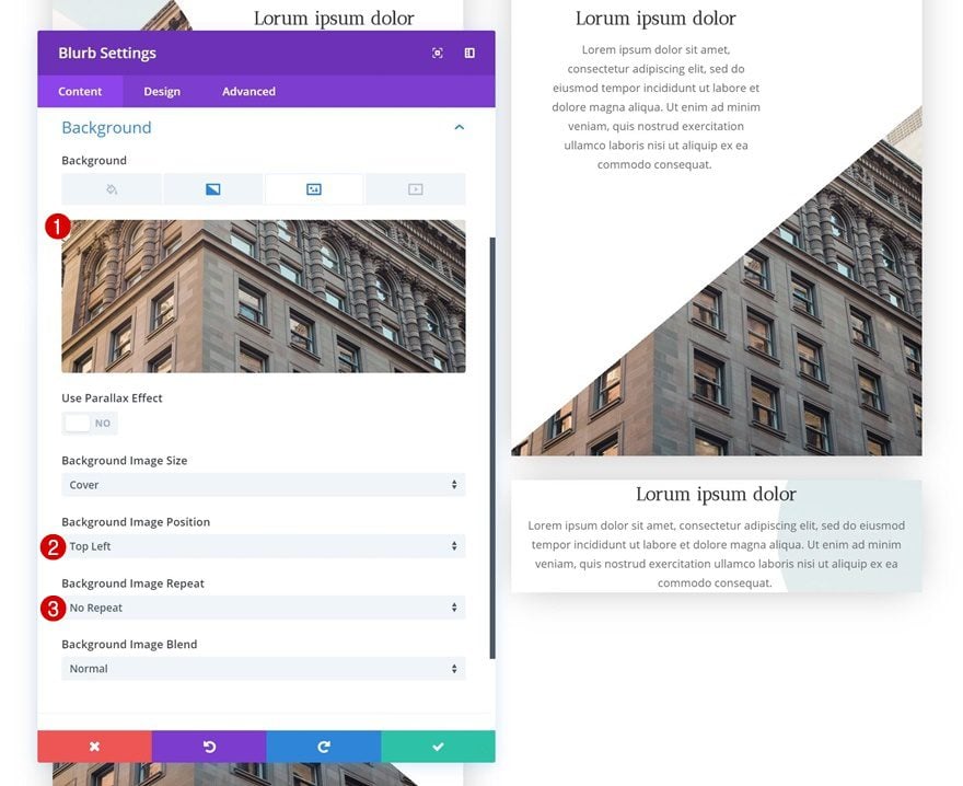
Upload the background image next.
- Background Image Position: Top Left
- Background Image Repeat: No Repeat
Spacing
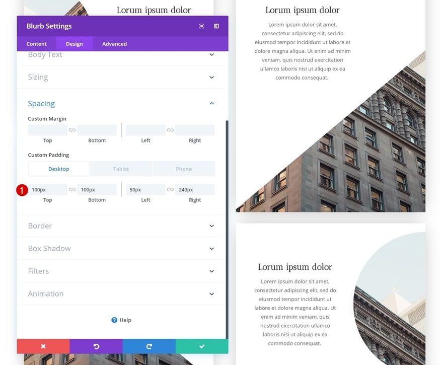
And finish the design and tutorial by adding some custom padding to the spacing settings of the module.
- Top Padding: 100px
- Bottom Padding: 100px
- Left Padding: 50px (Desktop & Tablet), 20px (Phone)
- Right Padding: 240px (Desktop & Tablet), 170px (Phone)
Preview
Now that we’ve gone through all the steps, let’s take a final look at the outcome on different screen sizes.

Final Thoughts
In this tutorial, we’ve shown you how to get creative with Divi’s built-in options. More specifically, we’ve used radial backgrounds and background images to create background masks. If you have any questions or suggestions, make sure you leave a comment in the comment section below!



Anyway, why not give a download?
Number 7 same confusion like image 6
Maybe it differs from one divi version to the next?
Image 6 is confusing – does not match at all
Thank you for this very concise tutorial. It helped me understand a lot more about gradients and how they work in Divi. You’ve given me some ideas for library module items for a site I’m working on. 😀
If I would add anything, It would have been some more “why” explanation. When it comes to Divi, which is so feature rich, module type choice is something I struggle with. Explaining why a blurb module is better for this than a text module, for example, helps us put some deeper context around this.
Thanks, again! This was really great.
Sure wish you guys would go back to doing videos. It is much easier to learn a tactic when following a video than reading all the text. Any chance you will start doing videos again?
For this, the video was made so much fun, please post and post a video.
Awesome use of gradients!
good idea.
Thank you