Divi’s built-in background pattern settings allow you to create eye-catching designs and add some flair to the background images on your website. You can use the blend modes settings to fine-tune the way that the pattern blends with the background image. Combine background images, patterns, and blend modes to create unique backgrounds and design elements for your layout. With 24 patterns to choose from and 16 blend modes, not to mention all of the other settings you can use to fine-tune the look of the pattern, the sky is the limit for your background design!
In this tutorial, we will show you a few examples of how to add a pattern blend mode to the background images on your page. Follow along to recreate these looks on your own, or use them as inspiration to create your own custom designs.
Let’s get started!
Sneak Peek
Here is a preview of what we will design in this tutorial.
First Layout
Second Layout
Third Layout

What You Need to Get Started
Before we begin, install and activate the Divi Theme and make sure you have the latest version of Divi on your website.
Now, let’s begin!
How to Use Pattern Blend Modes on Your Divi Background Images
Create a New Page with a Premade Layout
We’ll start by using a premade layout from the Divi library. For this design, we will use the Marina Landing Page from the Marina Layout Pack.
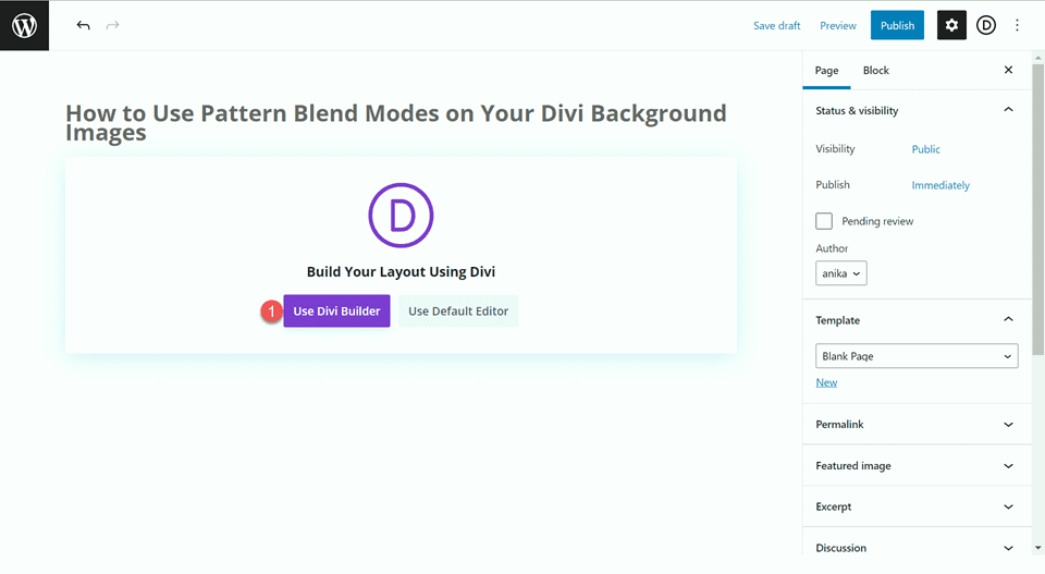
Add a new page to your website and give it a title, then select the option to Use Divi Builder.
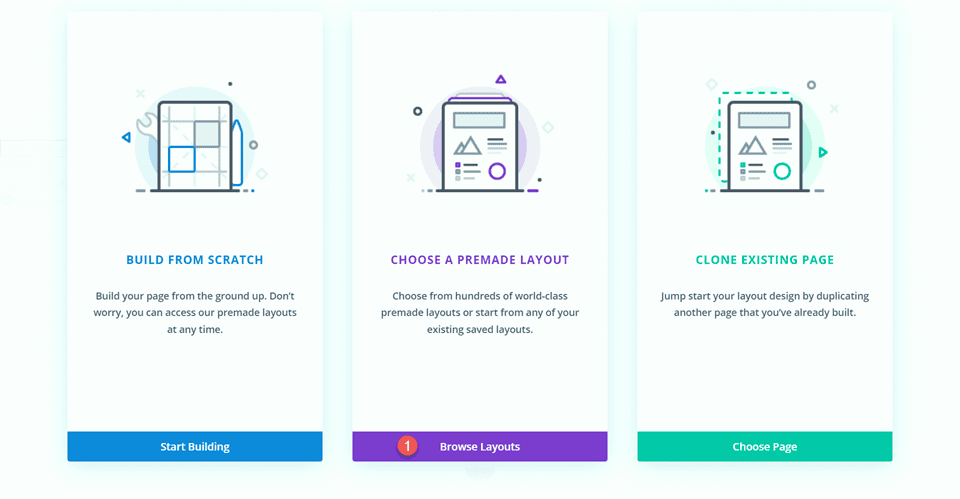
We will use a premade layout from the Divi library for this example, so select Browse Layouts.
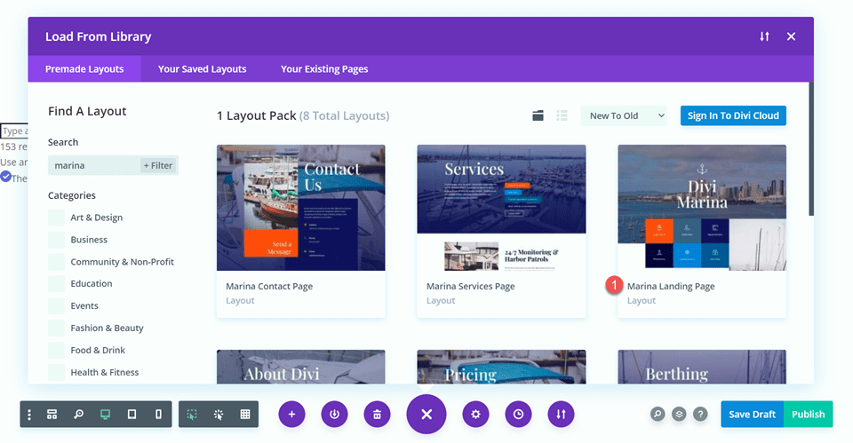
Search for and select the Marina Landing Page layout.
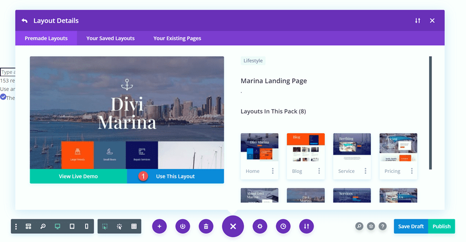
Select Use This Layout to add the layout to your page.
Now we are ready to build our design.
First Layout
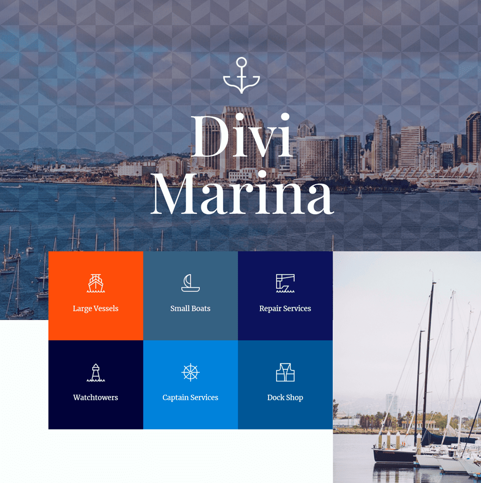
For our first design, we will add a chevron pattern to the first header image. This will add some visual interest to the header. Because of the blend mode we will apply, the pattern will be more subtle and still allow the background image to be visible.
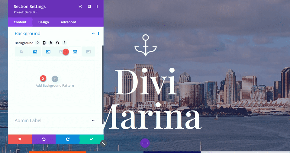
First, open the section settings and navigate to the Background section. Click on the pattern tab and select Add Background Pattern.
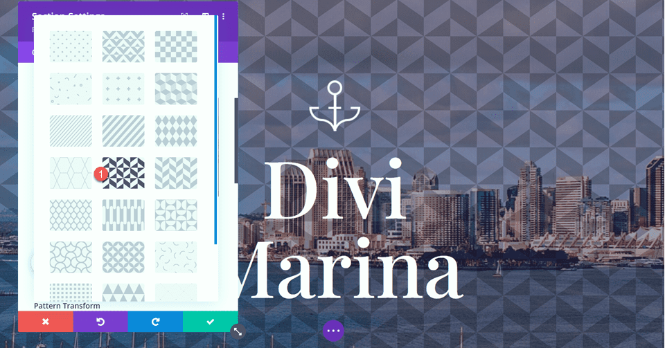
Next, select the pattern type. As you can see, there are many different patterns to choose from, and they can all be further customized by the pattern settings below.
- Pattern Type: Inverted Chevrons 2
Adding the Pattern Blend Mode
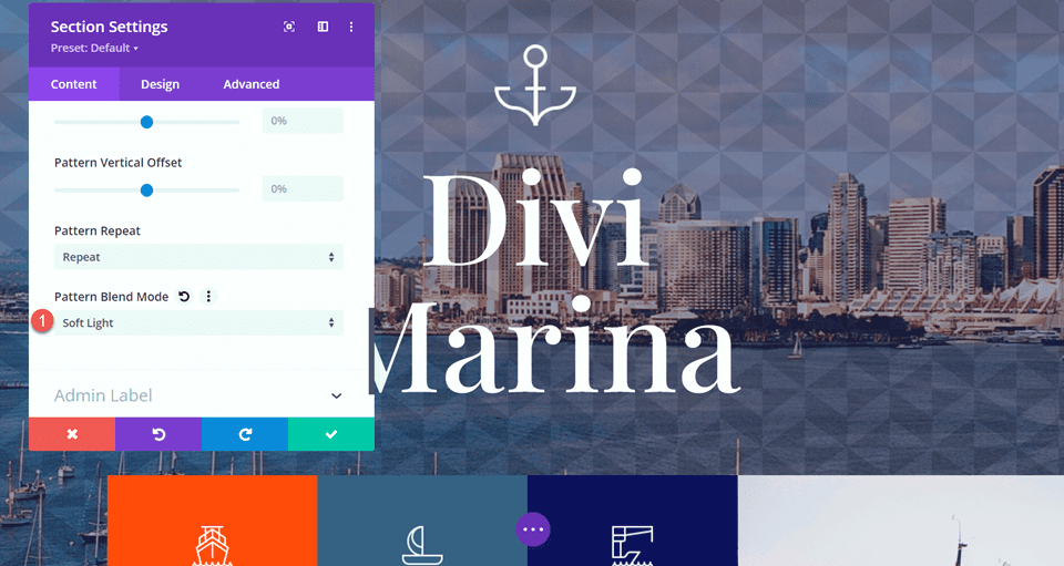
Finally, set the pattern blend mode. We will be using the Soft Light blend mode for this header. This blend mode makes the pattern more subtle so that it doesn’t distract from the background image.
- Pattern Blend Mode: Soft Light
Final Design
Here is the final design for our first layout.

Here is the mobile view for this design.

Second Layout
For the second layout, we will add a pattern to the How it Works section of the Marina landing page layout. We will use a wave pattern overlaid on the background image and gradient, which goes well with the nautical theme of the page. Let’s get started.
First, navigate to the How it Works section and open the Section Settings. Open the Background settings, then select the Pattern tab and then click Add Background Pattern.
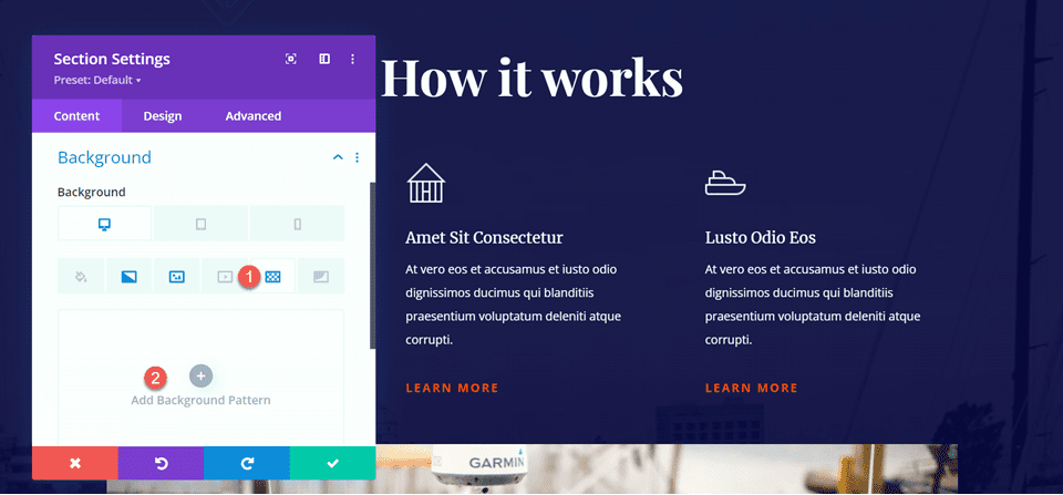
For this design, we will use the Waves pattern type.
- Pattern Type: Waves
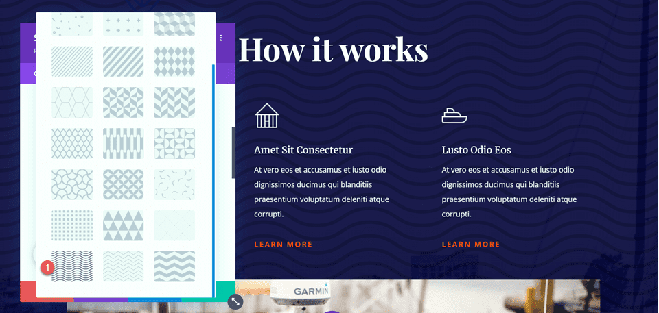
Next, change the pattern color to white.
- Pattern Color: #FFFFFF
Adding the Pattern Blend Mode
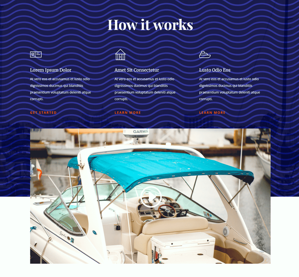
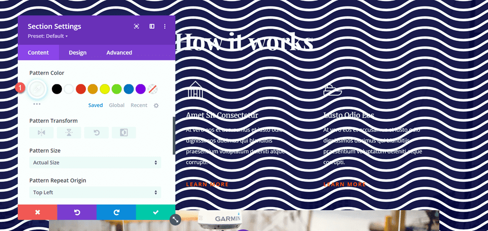
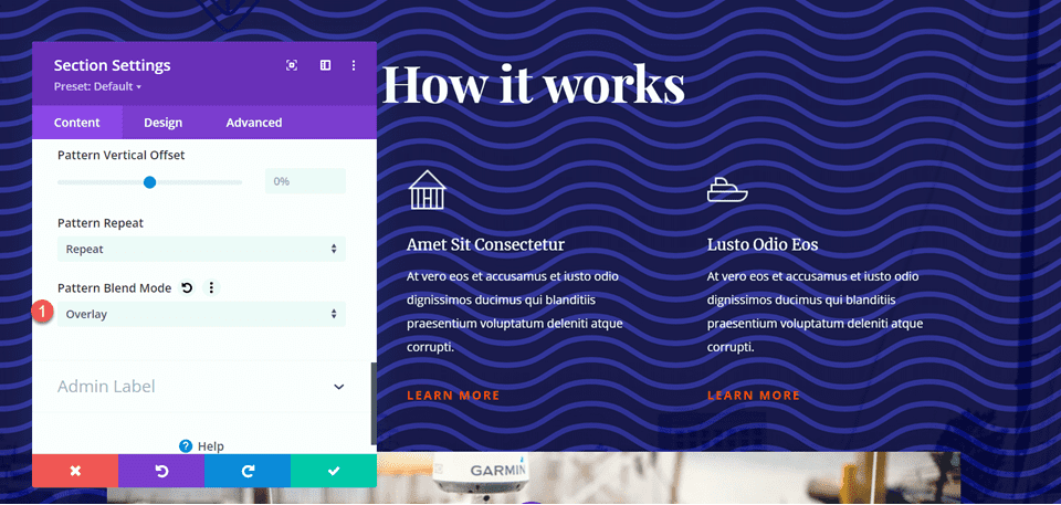
Now we can add the blend mode to our pattern. Set the pattern blend mode to overlay. This blend mode makes the dark colors in the background image darker and the light colors lighter. When the blend mode is added to this section, the white wave pattern turns shades of blue, creating an interesting pattern effect that looks great with the design of this page.
- Pattern Blend Mode: Overlay
Final Design
Here is the final design for the How it Works section.

And here is the mobile design.

Third Layout
Let’s get started on our third layout. For this layout, we will add some opaque diagonal stripes to the background of the “Top notch security and repairs” section.
Start by opening the section settings and navigating to the background section. Click the pattern tab and then select Add Background Pattern.
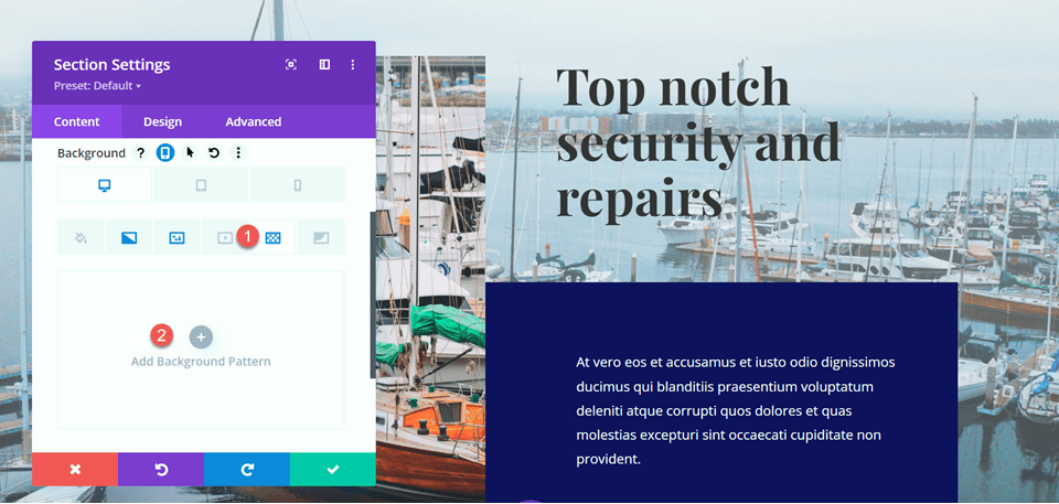
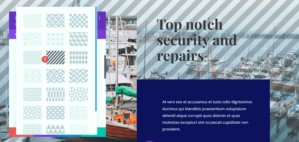
Select the Diagonal Stripes pattern.
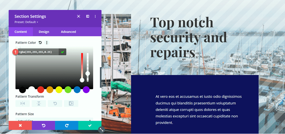
Next, set the pattern color.
- Pattern Color: rgba(255,255,255,0.25)
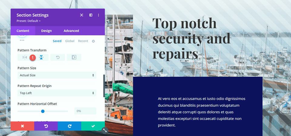
Flip the pattern horizontally using the Pattern Transform settings. This is another setting that can help you fine-tune the pattern to your liking.
- Pattern Transform: horizontal
Adding the Pattern Blend Mode
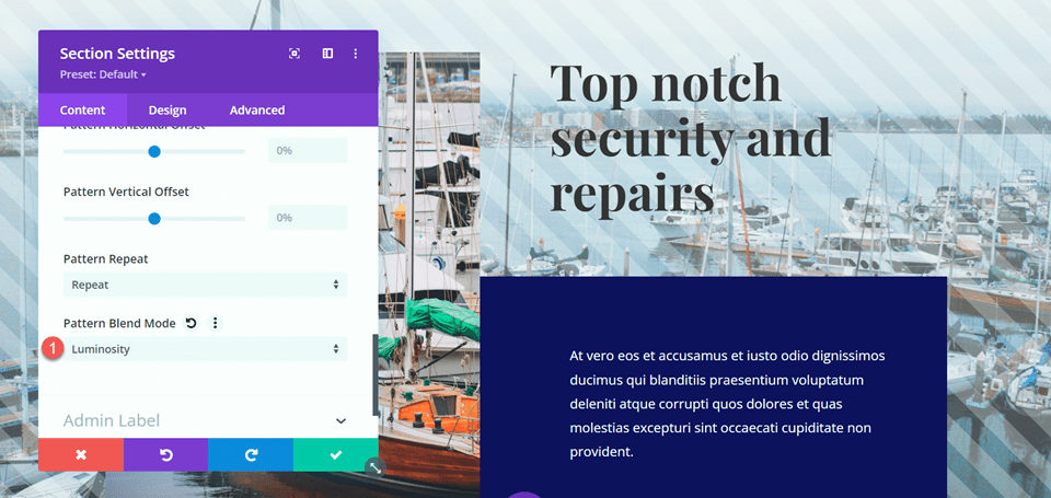
Finally, set the pattern blend mode. For this design, we will use the luminosity blend mode. This combined with our pattern color adds a light screen to the image but still allows the photo to show through. With this design, the image of the boat stands out more from the background as the pattern adds a distinctive contrast.
- Pattern Blend Mode: Luminosity
Final Design
Here is the final design for this section.

And here is the mobile design for this section.

Final Result
Now let’s take a look at the full design of the page with the pattern blend modes.

Final Thoughts
Adding a pattern can be a great way to add visual interest to your background image, but sometimes the pattern can overwhelm the background image. Or maybe you want your pattern color to change based on the image behind it. Thankfully, Divi comes with many blend modes so that you can customize the patterns as much as you would like. You can play around with different combinations of patterns, blend modes, pattern colors, pattern sizes, and many more Divi settings to create a totally unique design for your background images.
Hopefully, this tutorial has inspired you to incorporate some patterns and use blend modes in your website designs! For another design tutorial using patterns, check out this tutorial to learn to create subtle background pattern masks. And for an overview of the different filters, effects, and blend modes you can use with Divi, take a look at these articles: Part 1 and Part 2. Have you used Divi’s patterns and blend modes on your background images before? Let us know in the comments!





Great tutorial, so helpfull. Thanks a lot.