The ability to vertically align content when building a site with Divi can be a convenient addition to your design tool belt. Sometimes a certain layout calls for content to be vertically aligned in different ways (centered, bottom, top). The most common need is to have your content vertically centered. It provides a delightful touch of symmetrical spacing that really comes in handy when using multiple column layouts for your content. Plus, vertically centered content stays centered on different browser widths, which takes the grunt work out of applying custom padding or margins to get similar responsiveness.
In this tutorial, I’m going to show you how you can add a few small snippets of CSS to any column to vertically align the content. I’ll be using some of Divi’s premade layouts for examples of how to do this. If you don’t know much about CSS, you don’t have to worry. This will be easy enough to apply to your own layouts in seconds.
- 1 Understanding Flex and Divi
- 2 Is This Really Necessary?
- 3 Load the Premade Layout to Your Page
- 4 Method 1: How to Vertically Align Content using Flex and Auto Margin
- 5 Method 2: Vertically Aligning Content using Column Flex Direction
- 6 Making Blurbs with Various Amounts of Text Vertically Aligned
- 7 What About One Column Layouts?
- 8 Lots of Applications
- 9 Final Thoughts
Understanding Flex and Divi
The Flex (or Flexbox) css property is simply a way for positioning elements in horizontal and/or vertical stacks (kind of like a table). Except, unlike traditional tables, the flex property allows you to create boxes that adjust or “flex” to the size of the content it holds.
Divi does use the flex property whenever you select “Equalize Column Heights” as your row setting. This simply makes sure the size of your columns will all adjust to the size of the column with the most content. And since “Equalize Column Heights” activates the flex for the row container, you can easily take advantage of that by adding css to your columns to adjust the contents of each column (or box).
For example, if you add “margin: auto” to any column in a row, the content of that column (whether it be one or more modules) will become vertically centered.
Also, if you add “align-items:center;” to your row, all of your columns (and their content) will be vertically centered.
Of course, there are many more uses for the flex property in web design along with more advanced CSS that you can apply to your theme. But for this tutorial, I wanted to keep things simple.
Is This Really Necessary?
Technically, no. You can vertically align your content/modules within a column using custom spacing (padding and margin). For example, you can use Divi’s spacing options to give a column equal top and bottom padding to center the module(s) vertically within the column. Or, you can add only top padding to a column to make the content bottom aligned. However, you may have to adjust the spacing when updating your page with more content. Plus, it may be difficult to keep this alignment on different browser widths.
So, if you are looking for a solution to vertically aligning content without having to think about custom spacing, I think you will find this useful.
Let’s get started!
Load the Premade Layout to Your Page
To kick things off, I’m going to use the Interior Design Company Portfolio Page Layout. To get this layout on your page, create a new page. Then give your page a title. Click “Use Divi Builder” and then “Use Visual Builder”. Then select the option “Choose a Premade Layout”. Then select the Interior Design Company Layout Pack from the Load From Library popup. Finally, select the Portfolio page from the list of layouts and click “Use this Layout”.
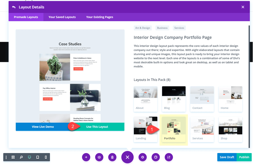
Once the layout has loaded to your page, you are ready to go.
Method 1: How to Vertically Align Content using Flex and Auto Margin
Open the row settings of the second row on the page (the one directly under the row with the page title). Under the design settings toggle open the Sizing option group and notice that “Equalize Column Heights” is already active. This means that the row now has the flex property (“display: flex;”) added to it.
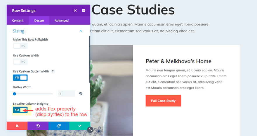
Now go to the Advanced tab settings for the same row and add the following css snippet under the Column 2 Main Element input box.
margin: auto;
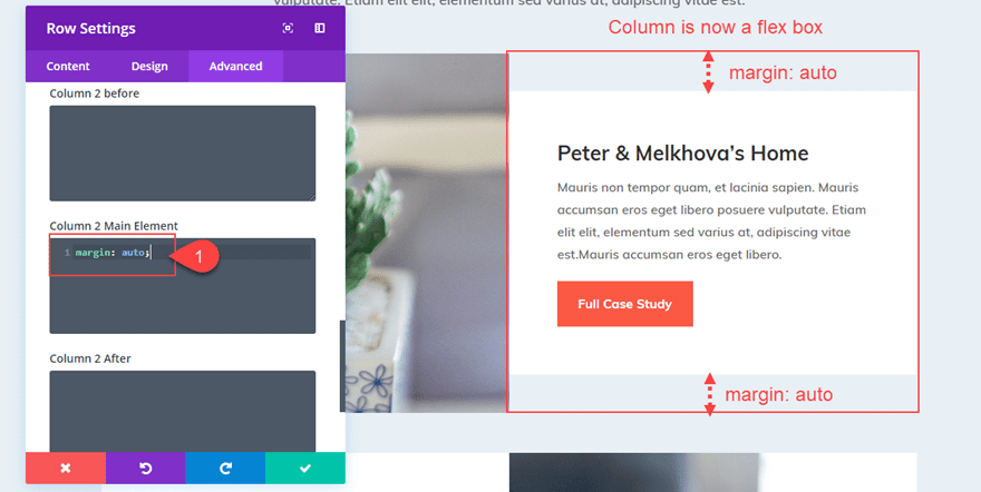
Now the second column content has shifted to become vertically centered.
Making the Content Bottom Aligned
If you want to make your content bottom aligned so that all modules will stack on the bottom of your column, you can adjust the margin value as follows:
margin: auto auto 0;
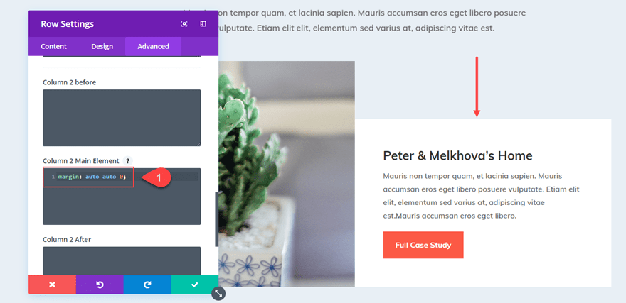
Aligning Content Vertically for All Columns in Your Row
Instead of adding “margin:auto” to each column individually, You can also vertically center the content of all columns in your row by adding the following snippet to the main element of your Row settings.
align-items: center;
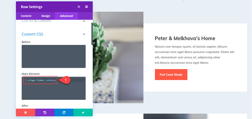
Or if you want all the content of your columns to be bottom aligned, you can add this snippet:
align-items: flex-end;
And, don’t forget that you could take advantage of Divi’s Extend Styles feature by right clicking on the main element with your css snippet and clicking “Extend Main Element”.
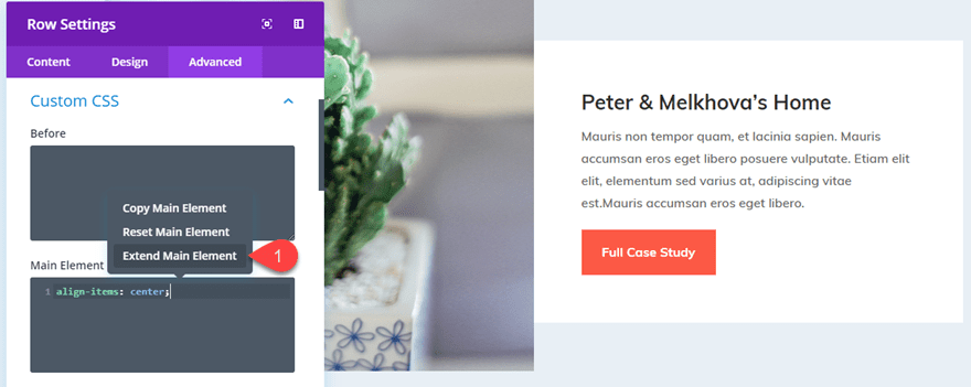
Then extend that main element css to all rows throughout the page (or section) to vertically center all the content of every column on the page.
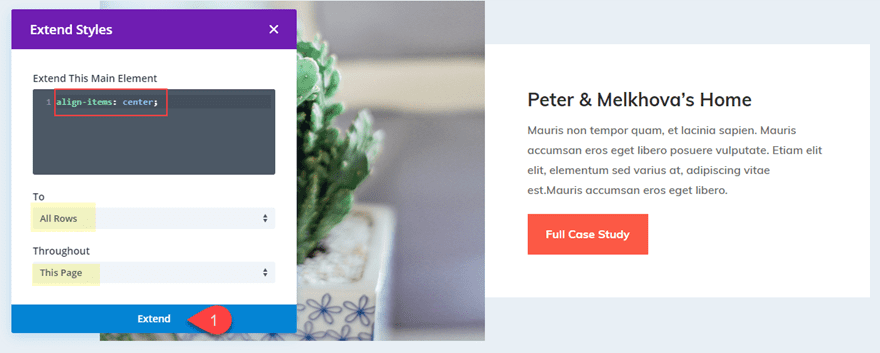
Now everything is vertically centered.
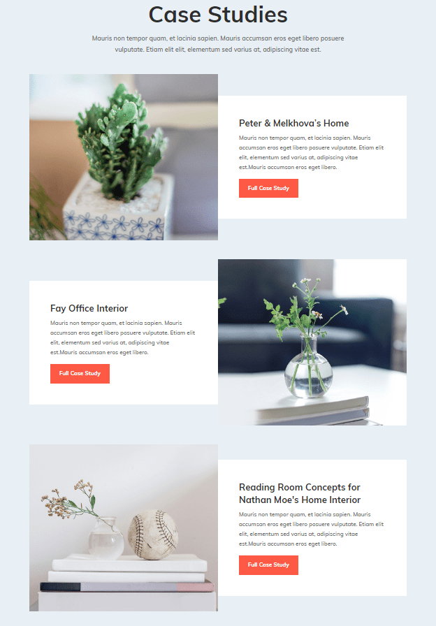
But, you may have noticed the white column background color no longer spans the full height of the row. This is because we added “margin: auto” to the column. To fix this, you could change the row background color to white and get rid of the row padding. But instead, I’m going to show you a way for you to center the content of your column without changing the margin.
Method 2: Vertically Aligning Content using Column Flex Direction
In the first method, we took advantage of the flex property being added to the row. This made each of our columns a “flex box” that can be vertically aligned simply by adjusting the margin.
But there is also a way for use to flex-direction to align the content of our column without losing the “Equalize Column Height” effect that keeps our columns (and column backgrounds) the same size. To do this we are simple going to add a few lines of CSS to our column so that all the modules within the column will be stacked vertically and then centered.
Let’s go back to our row in the previous example. Open up the Row Settings and take out any custom css you may have in there by right clicking on Custom CSS and clicking “Reset Custom CSS Styles”
Then add the following CSS under Column 2 Main Element:
display: flex;
flex-direction: column;
justify-content: center;
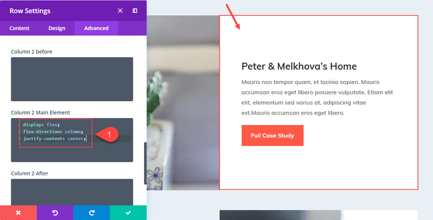
Or if I wanted to bottom align the content, simply change “justify-content: center” to “justify-content: flex-end”.
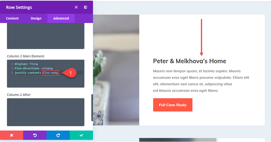
What is great about this setup is that if I have my content vertically centered and I make the row full width, the content stays centered.

Making Blurbs with Various Amounts of Text Vertically Aligned
Making your column content vertically centered can also come in handy for blurbs. As you know, not every blurb will have the exact amount of text used to describe the feature or service. Making these blurbs vertically centered can create a nice design for your layout.
For this example, I’m going to vertically align the blurbs on the Digital Payments Home Page Layout.
I’m going to first add some differing amounts of body text to the blurbs to give a more realistic representation of what a site might look like.
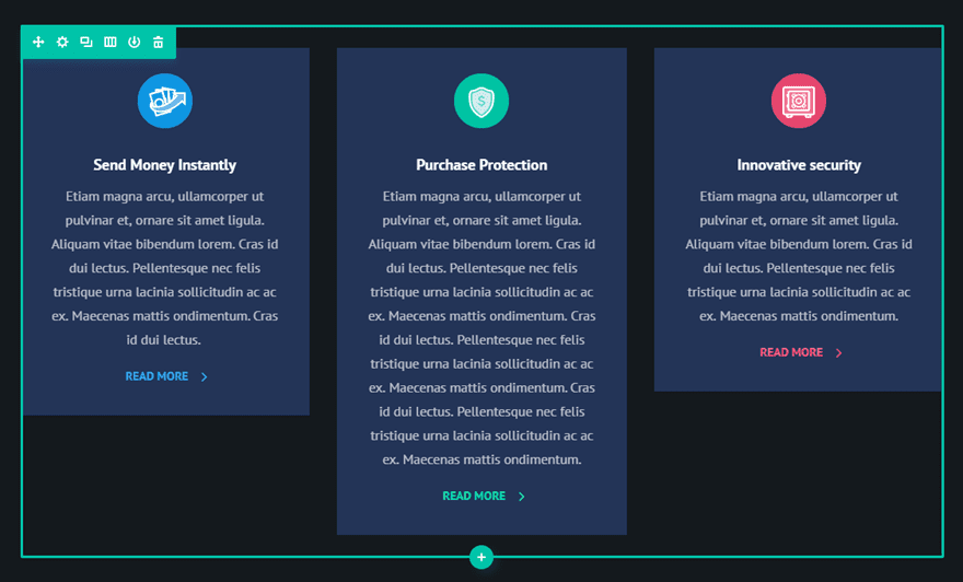
Now, I need to go to the row settings and “Equalize Column Heights”.
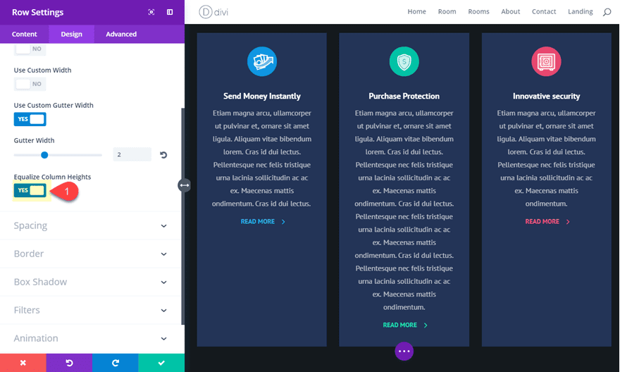
Now I can add my CSS snippets to align my content and change the design.
Under the Advanced tab of your Row Settings, we can vertically center the content of our columns by adding the following under Main Element:
align-items: center;
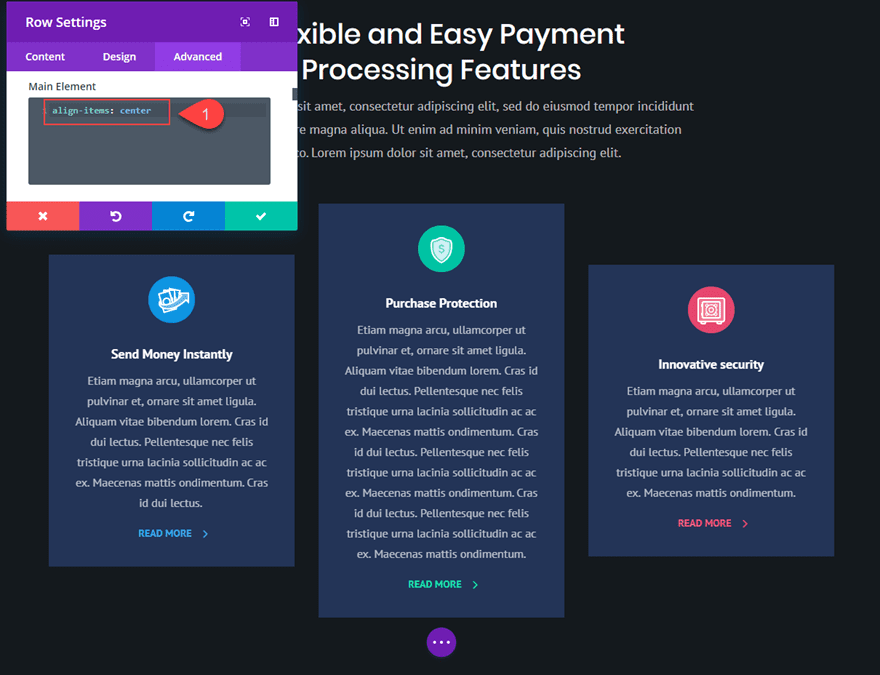
Or change it to the following to make them bottom aligned.
align-items: flex-end;
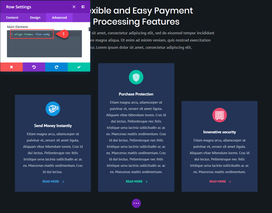
Or you can reset your custom css styles and add the following custom margins to make the first column bottom aligned and the third column top aligned.
Column 1 Main Element CSS:
margin: auto auto 0;
Column 3 Main Element CSS:
margin: 0 auto auto;
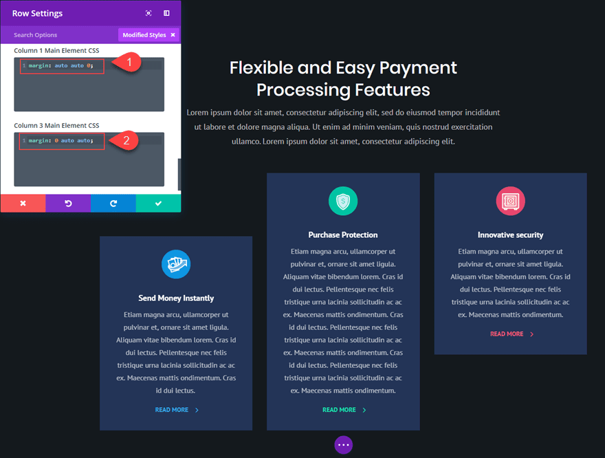
What About One Column Layouts?
Technically, you don’t need a css snippet or flex to get your one column content vertically centered. All you need to do is make sure you have equal spacing above and below your content (or modules). Most of the time, people need vertical centered content on layouts with multiple columns because they want the adjacent content to line up perfectly.
Lots of Applications
There are a lot of useful applications vertically aligning your content in Divi. This would come in handy for headers with a two column layout with the heading text in one column and you want to make sure a CTA (button) in the other column is vertically centered. It would also be helpful for vertically centering logos in a six column layout (especially if the logos have slightly different dimensions).
Final Thoughts
Even though this method does rely on a few small snippets of custom CSS, I believe the application can be extremely useful for those looking for a quick fix to a sometimes cumbersome process. I would love to hear of other examples where this might come in handy.
Feel free to share your ideas and comments below.
Cheers!



Yes, Elementor has a vertical align toggle, and it’s the only only thing I like about Elementor! 😉
Can you assist with the following…. If we have 3 col row on desktop, each containing a text module with headline of varying length. Each Module has a different background colour.
So we use “Margin:auto” to vertically centre the content of a column. “Align-items: center” to vertically centre all the columns in the row. But how do we go about making the height of all the text modules the same as the tallest. I can see how using ‘min-height’ would work manually, but might need changing every time new content is added. Is there a flex-box setting for such a scenario?
You don’t need to add custom CSS. Set the background colors on the Columns and not on the Text Modules and then use the Equalize Columns feature in the Row settings. Check this screen recording: https://bit.ly/40m905D
Need to create a 3×2 grid, that is responsive to fill whole browser viewport for desktops and tablets. Can it be done with 6 blurbs?
Can this be achieved using flexbox or any other methods within Divi?
This isn’t possible without some custom css to keep the 3 column layout on tablet. However, you could accomplish this with 2 six-column rows and then extend the blurbs to fill the adjacent column. See this post… https://www.elegantthemes.com/blog/divi-resources/how-to-extend-modules-to-create-unique-column-layouts-in-divi
I’m confused about when too use
margin-top:auto;
margin-bottom:auto;
vs
align-items: center;
Blue,
Thanks for the comment. In this example, “Margin:auto” is used to vertically center the content of a column. “Align-items: center” is used to vertically center all the columns in a row. Hope that helps.
Useful – learning flexbox was on my list for my next flight. Any chance of an article on using Flexbox to determine order ? Given what currently happens with Divi and module stacking/ordering when sites are viewed on mobile – this would remove the need for mobile only sections.
Thanks! Maybe this will be helpful… https://www.elegantthemes.com/blog/divi-resources/how-to-change-divis-column-stacking-order-on-mobile-devices
I would suggest learning CSS grid in addition to flex. I can’t believe I didn’t learn it sooner. With a few lines in the column main CSS you can move and format the modules within that column anyway you like including complex layouts. It was time well spent for me.
Thanks for the suggestion, Gary. I’ll keep that in mind.
Had a quick scan it looked very useful. Will run though later.
Just switched from Visual Composer to Divi and I’m super happy. I can build in half the time and I’m earning a bit more per hour. You guys seriously rock!
Awesome, Jake. Thanks for sharing
Will this be in column update #2?
Not sure on that one, but I like the way you are thinking. 🙂
This is a very useful website.This article is really helpful.Thanks for sharing, keep up the good work.
Very useful. Thanks.
You are most welcome, Britt. Glad to help.
Try to make form field and button aligned v-align: middle by default, save our time please.
That’s a good suggestion. Thanks, Haljava.
Really nice tutorial – a must try on my sites soon.
Thanks!
Glad you liked it, Dennis. Hopefully it will help.
Great job 🙂
Equalize Column Heights” never works as well at my home :/
Hi, Valentin! Add this CSS to your Divi’s Custom CSS under Theme Options to make the items vertical align when equalize column hights is on… I use it on everysite I work.
/**Vetical Align when Equalize Column Heights is On**/
.et_pb_equal_columns >.et_pb_column {
margin-top:auto;
margin-bottom:auto;
}
Thanks Julio. This is a useful snippet!
Hey, Jason.
That snippet works for Desktop size… but I can’t seem to vertical align on mobile!
I’m using a snippet to prevent my columns from stacking but I’m yet to figure how to align them!! None of the CSS above helped me solve this 🙁
Julio,
This is because when “equalize column heights” is selected for your row, “display:flex” only applies to desktop (anything larger than 981px wide). To override this, simply add “display:flex” to your row under the Custom CSS Main Element box. This will keep flex active on mobile as well.
I know I’m alone here, crying in the wilderness, nonetheless, this is true: Vertically centered type is hard to read. When you scan the lines, you don’t go back to the same place each time and this makes your brain work harder. Eventually, it will tell you “this is too hard, let’s find something else to read.”
The same is true for reversed type. Black on white is your brain’s default. Everything else (everything!!!) has to be translated back by your brain to black on white to be understood. Eventually, the reader quits trying.
Yes, I know, we’re not talking about huge amounts of time. But that’s only using our conscious awareness of time in seconds. In your brain’s time system, a second is a hugely long time.
So, when I can, I don’t center type. Unless I design the lines of type so that each one is complete thought, regardless of punctuation. In that way, I can ensure that the reader feels like she has a complete thought in her head and can more easily take the time to find the start of the next line.
Also, I limit my lines to 2 or 3. This is also true of my use of white on black. If I MUST use light type, I try to make sure there is the appropriate leading and kerning to make the reading as easy as possible.
You can choose to believe me or not. But I studied this when I was limited to designing in print, so I know it to be true. If you’re not sure, look for examples of centered/reversed blocks of copy and see if you feel any level of discomfort both deciding to read it and during the reading.
Randy,
Thanks for the comment. I tend to agree with you about centered text as a text alignment for paragraphs and such. Things do feel better left aligned especially for content that take up more than a few lines.
Did you mean to say in your comment that “vertically centered type” is hard to read? I think that is where I got a little confused.
You are right mostly. Web isn’t print so the reverse thing doesn’t hold up according to most of what I’ve read. In fact, having text on a color background enhances readability when done well.
I used the technique above without centering my text and, the point being a vertical centering of containers, worked out perfectly. Having a quote net to an image for example makes this very useful.
I do agree with long bouts of text that are centered. I don’t care for it.
Super timely and informative – I was just dealing with unequal blurbs. I didn’t realize the equalize column heights activated flexbox! Really great knowing that we can apply vertical alignment to Rows or columns. I’ll def be using this every day now ;P I had already been flexbox to reverse column order on mobile to control whether an image appeared before or after a section of text.
I think ET should make a few of the flexbox attributes part of the UI for Rows and Modules especially for vertical alignment and display order.
Cheers,
Emilio, noticed you mentioned using flexbox to reverse column order on mobile. Could you share the snippet is possible? Thanks
Noticed you mentioned using the flexbox to reverse column order on mobile. Could you share the snippet if possible? Thanks
This may help you, Coach. https://www.elegantthemes.com/blog/divi-resources/how-to-change-divis-column-stacking-order-on-mobile-devices
Thanks for the suggestions, Emilio. Glad you liked it.
I wish there was a toggle to do this. It’s a pagebuilder after all.
Allas the flexbox is not well implemented in IE.
svg images won’t align well either. something to note.
Thanks for input, Tom. Didn’t realize svg images didn’t align.
Thank you so much! These tutorials are so helpful. While it’s great to have lots of layouts available, knowing how to tweak and adjust is far more useful in my opinion. If we can easily do these things, as you show us here, we can do anything with any layout.
I appreciate learning to understand more about how Divi “acts” and how to exploit Divi’s power. In the last couple days, I’ve grown in my appreciation of Divi. Thank you.
That’s really awesome to hear, Chris!
This is very helpful. IE 10 and 11 are still buggy on flexbox though.