
When creating your global header, chances are high you’re going to include a blog menu item. If you don’t have many blog post categories on your website, going for one blog menu item might be enough. However, if you have a set of different categories and you want to highlight each one of them, you might want to try a different approach, such as visually showcasing each blog category inside a dropdown menu.
In this tutorial, we’ll show you exactly how to do that using Divi’s Theme Builder. We’ll build the dropdown menu using Divi and its built-in elements and options and we’ll combine it with some code that’ll allow us to place the dropdown menu inside the blog menu item. You’ll be able to download the JSON file for free as well!
Let’s get to it.
- 1 Preview
- 2 Download The Global Header for FREE
- 3 Download For Free
- 4 1. Add CSS Class to Blog Menu Item
- 5 2. Create Custom Header with Divi’s Theme Builder
- 6 3. Create Blog Dropdown Design
- 7 4. Add CSS & JQuery Code
- 8 5. Enable CSS Class Once You’re Done Customizing the Blog Dropdown Items
- 9 6. Adding More Post Category Dropdowns
- 10 Preview
- 11 Final Thoughts
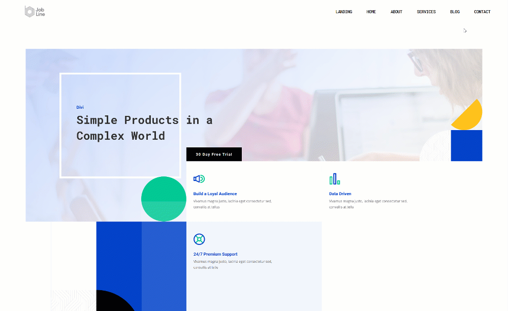
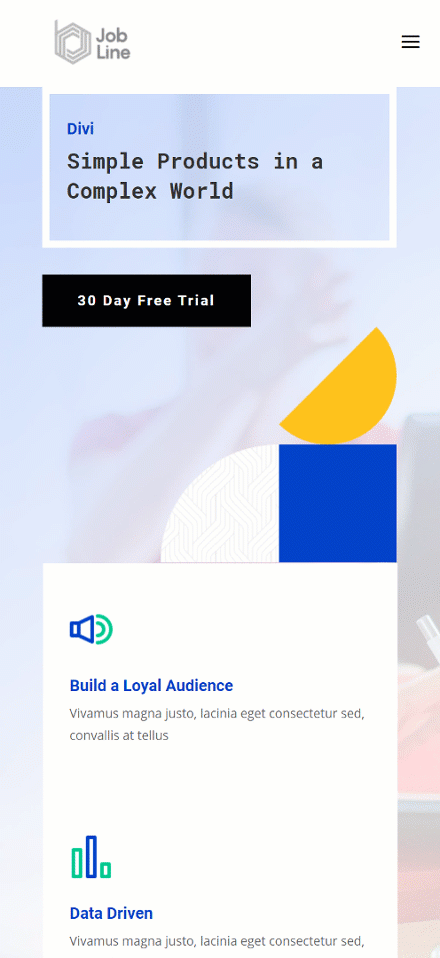
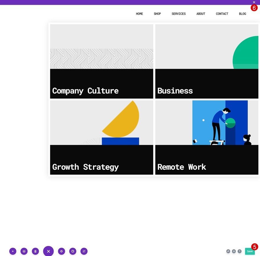
Preview
Before we dive into the tutorial, let’s take a quick look at the outcome across different screen sizes.
Desktop
Mobile
Download The Global Header for FREE
To lay your hands on the free global header, you will first need to download it using the button below. To gain access to the download you will need to subscribe to our newsletter by using the form below. As a new subscriber, you will receive even more Divi goodness and a free Divi Layout pack every Monday! If you’re already on the list, simply enter your email address below and click download. You will not be “resubscribed” or receive extra emails.

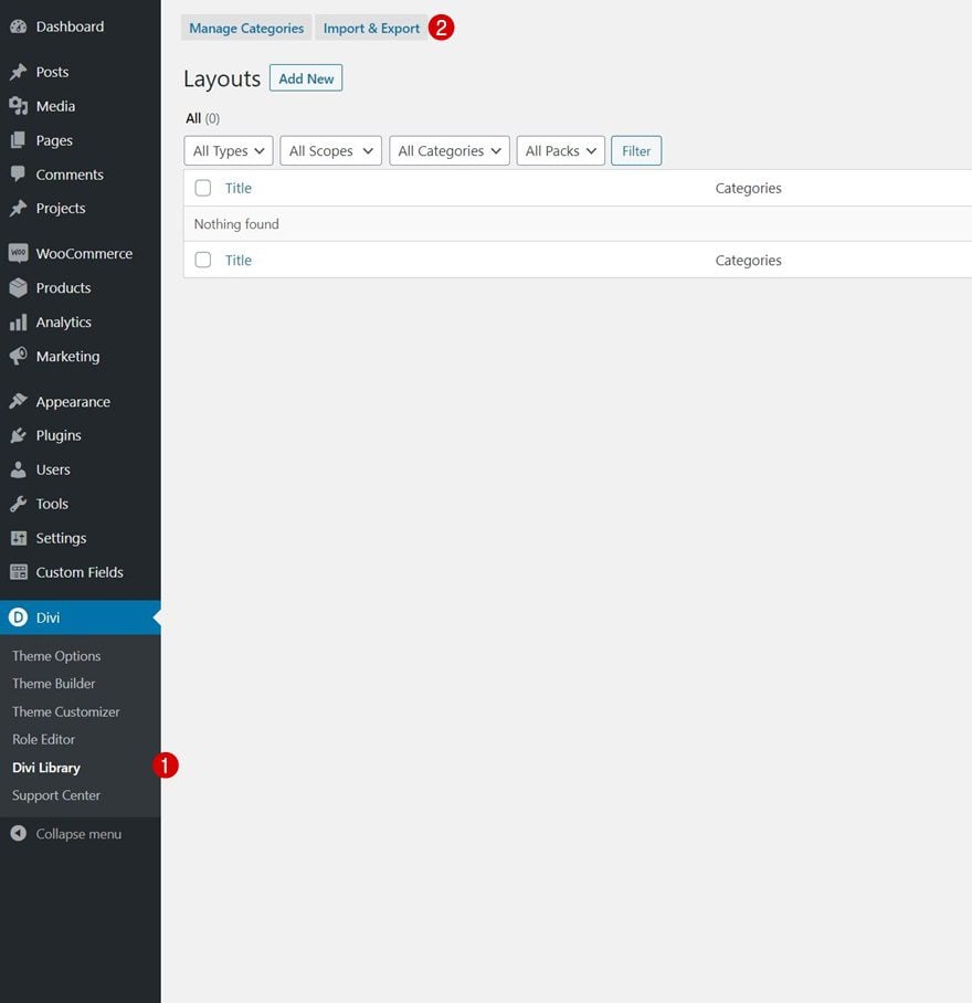
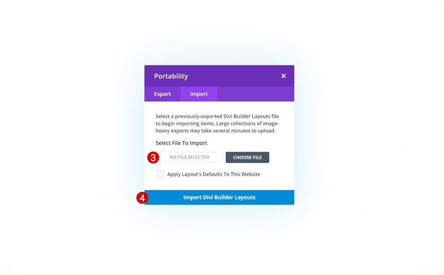
How to Upload the JSON File
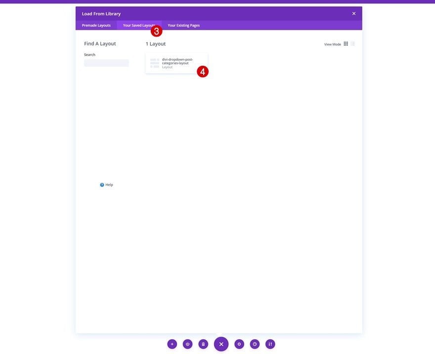
Unzip the zipped folder you were able to download above. Then, navigate to your WordPress website > Divi > Divi Library and upload the JSON.
Once your layout is saved in the Divi Library, you can navigate to the Divi Theme Builder and import the saved layout by clicking on ‘Add Global Header’ or ‘Add Custom Header’ and selecting ‘Build Global/Custom Header’. Go to the ‘Your Saved Layouts’ tab in the Divi Library, select the layout you’ve uploaded in the previous step and save all Divi Theme Builder Changes.
To have a functioning menu right off the bat, you’ll be required to go through the first part of this tutorial below; adding the CSS classes to menu items on an individual level. You’ll also need to enable one of the CSS classes inside the Code Module as is shown in part 5 of this tutorial.
In the first part of this tutorial, we’ll add two custom CSS classes to the blog page menu item inside the WordPress menu. To do that, navigate to menus inside your WordPress dashboard.
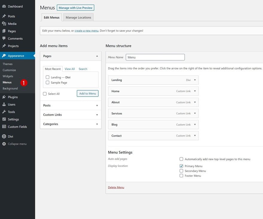
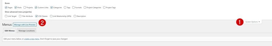
Enable CSS Class Option
At the top of the page, make sure you enable the CSS classes option inside the screen option.
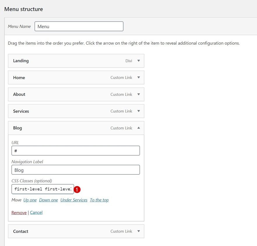
Then, find your blog menu item and add two CSS classes to it. Make sure you leave a space between CSS classes.
- CSS Classes: first-level first-level-1
2. Create Custom Header with Divi’s Theme Builder
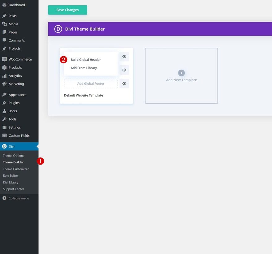
Go to Divi Theme Builder
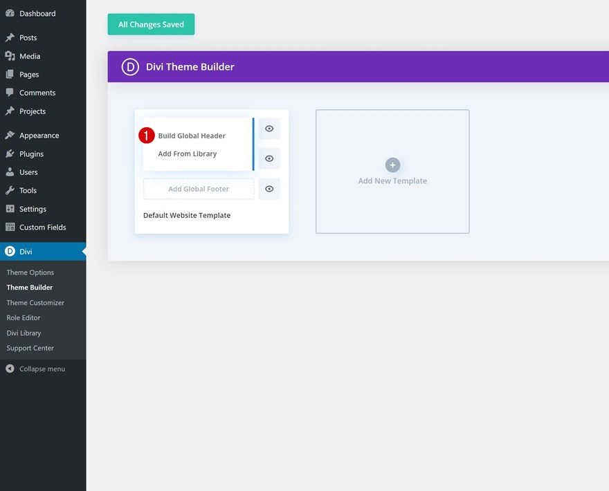
Once the menu item CSS classes are in place, it’s time to switch over to Divi. Go to the Divi Theme Builder and select ‘Add Global/Custom Header’.
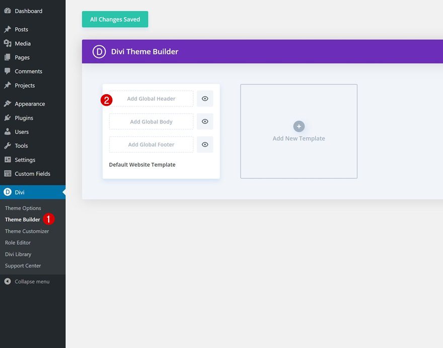
Start Building Global Header
Then, select ‘Build Global Header’ to be redirected to the template editor.
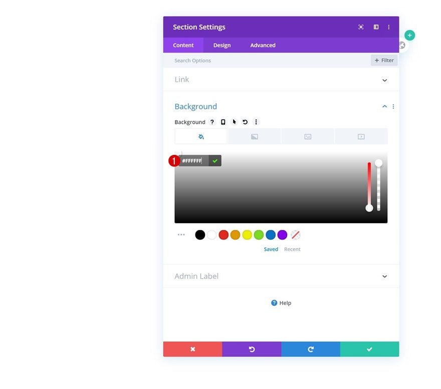
Section Settings
Background Color
Inside the template editor, you’ll notice a section. Open that section and apply a white background color.
- Background Color: #FFFFFF
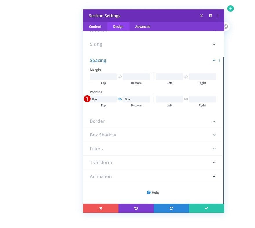
Spacing
Move on to the design tab and remove all default top and bottom padding.
- Top Padding: 0px
- Bottom Padding: 0px
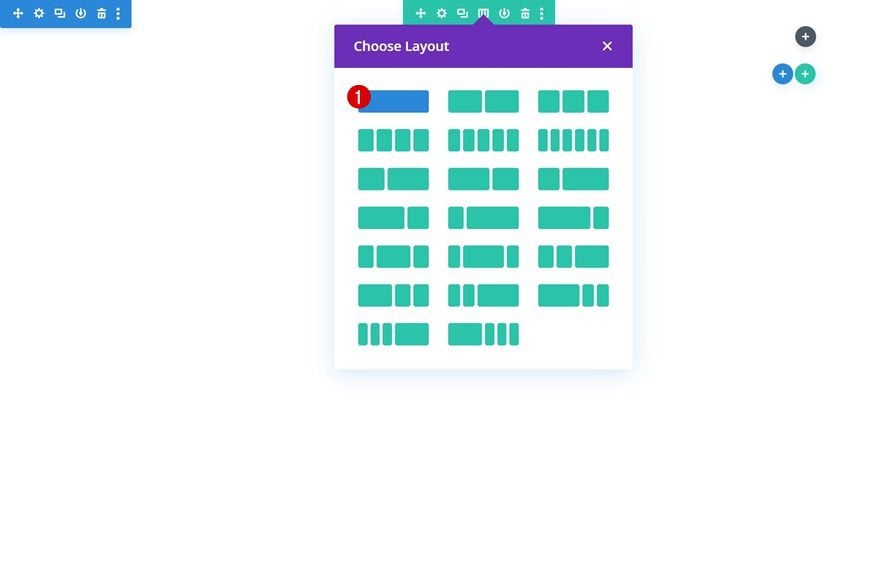
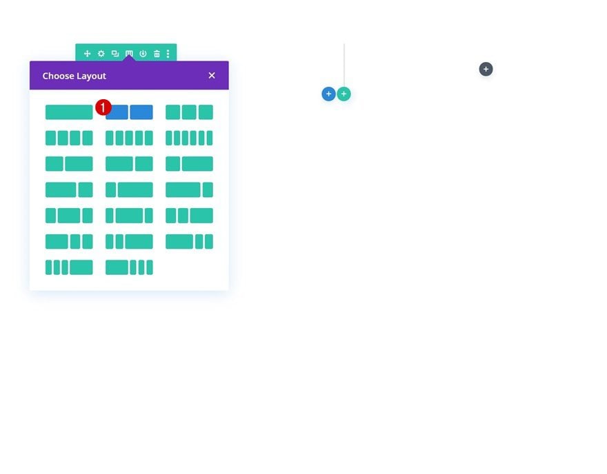
Add Row #1
Column Structure
Continue by adding a new row using the following column structure:
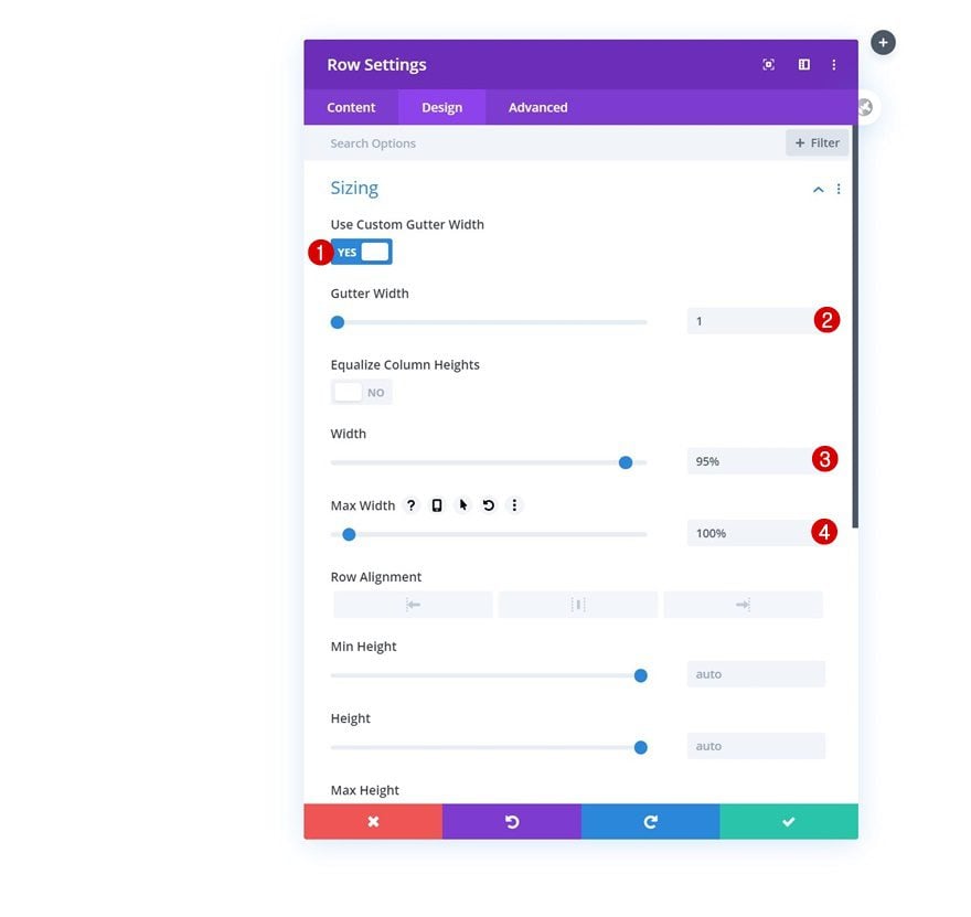
Sizing
Without adding any modules yet, open the row settings and modify the sizing settings accordingly:
- Use Custom Gutter Width: Yes
- Gutter Width: 1
- Width: 95%
- Max Width: 100%
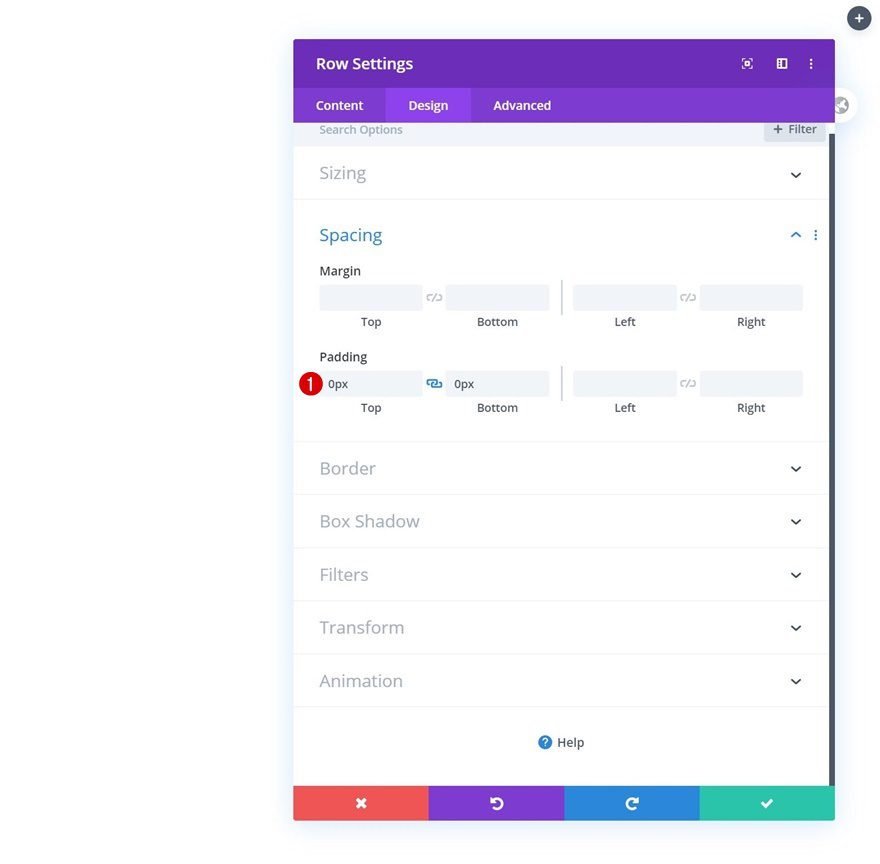
Spacing
Remove all default top and bottom padding next.
- Top Padding: 0px
- Bottom Padding: 0px
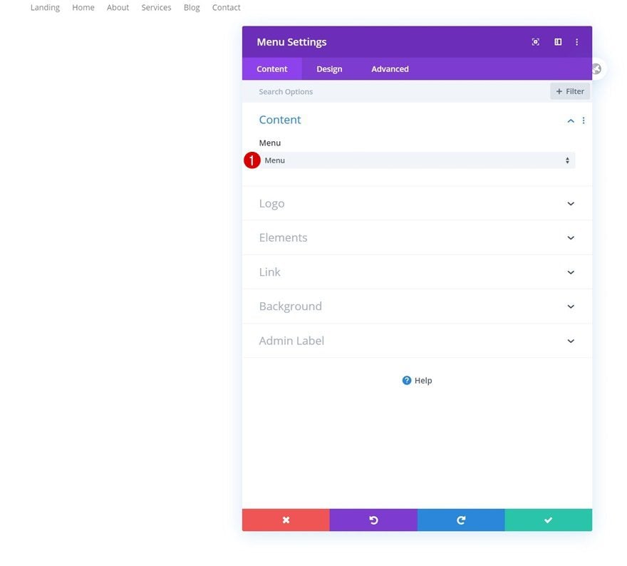
Select Menu
Then, add a Menu Module and select the menu you’ve modified in the first part of this tutorial.
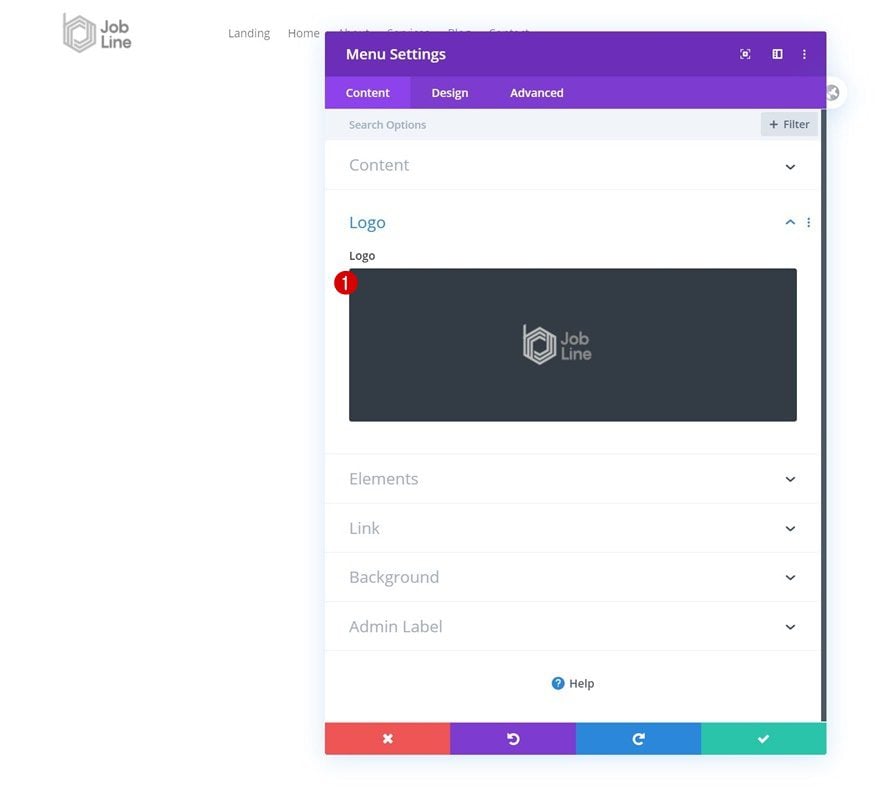
Upload Logo
Upload a logo next.
Menu Text Settings
Move on to the design tab and modify the menu text settings as follows:
- Menu Font: Roboto Mono
- Menu Font Style: Uppercase
- Menu Text Color: #000000
- Menu Text Size: 18px
- Menu Letter Spacing: -1px
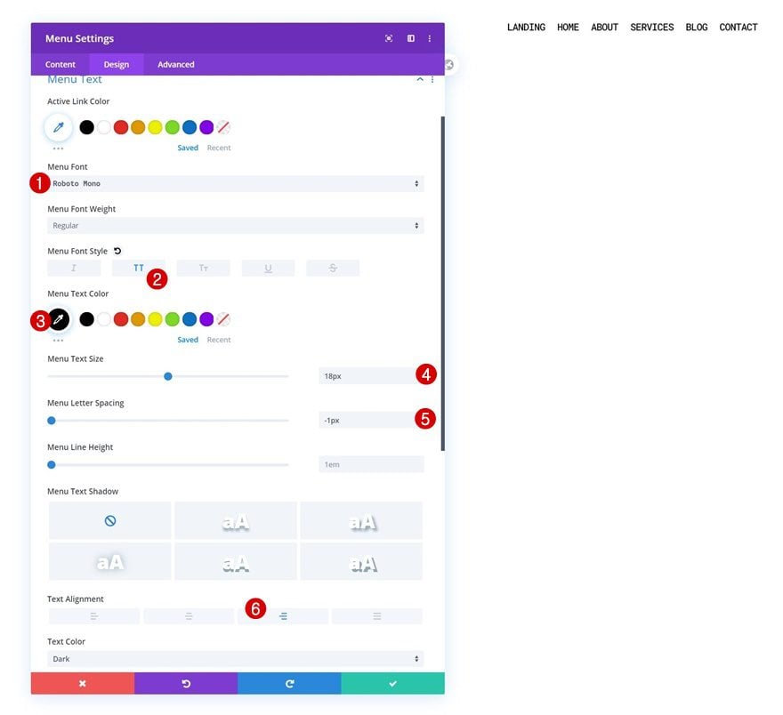
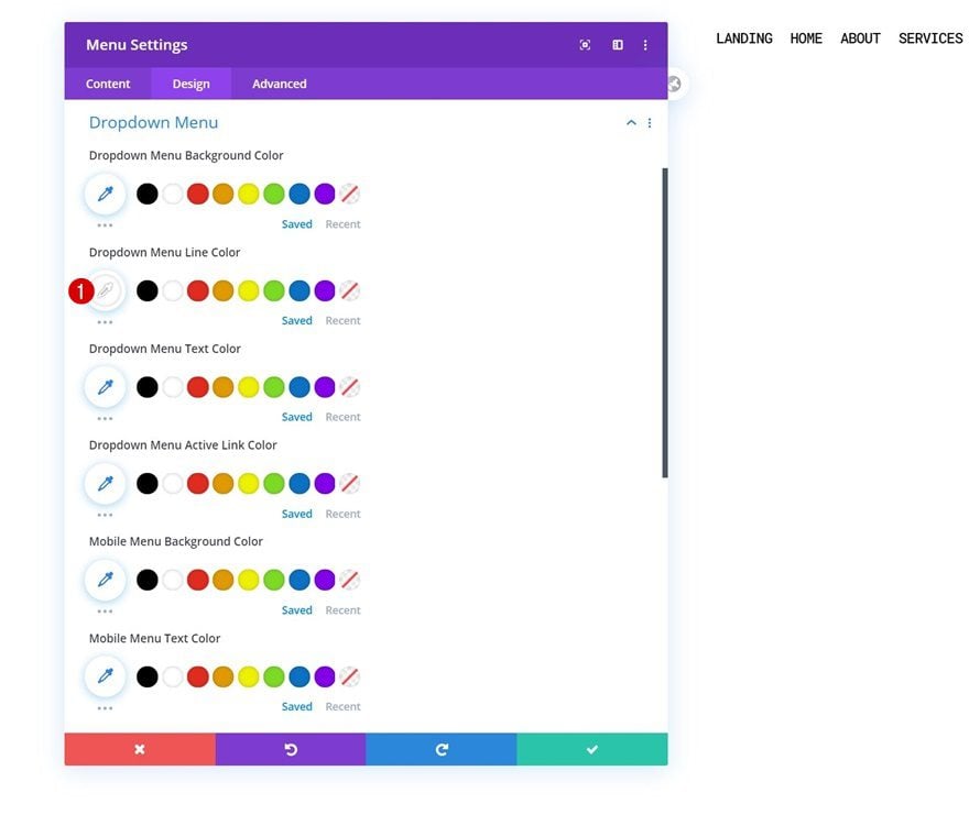
Dropdown Menu Settings
Change the dropdown menu line color too.
- Dropdown Menu Line Color: #FFFFFF
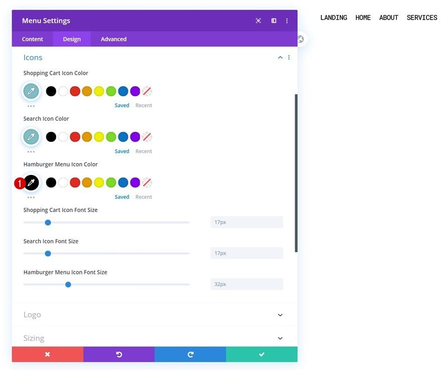
Icons Settings
Next, change the hamburger menu icon color in the icons settings.
- Hamburger Menu Icon Color: #000000
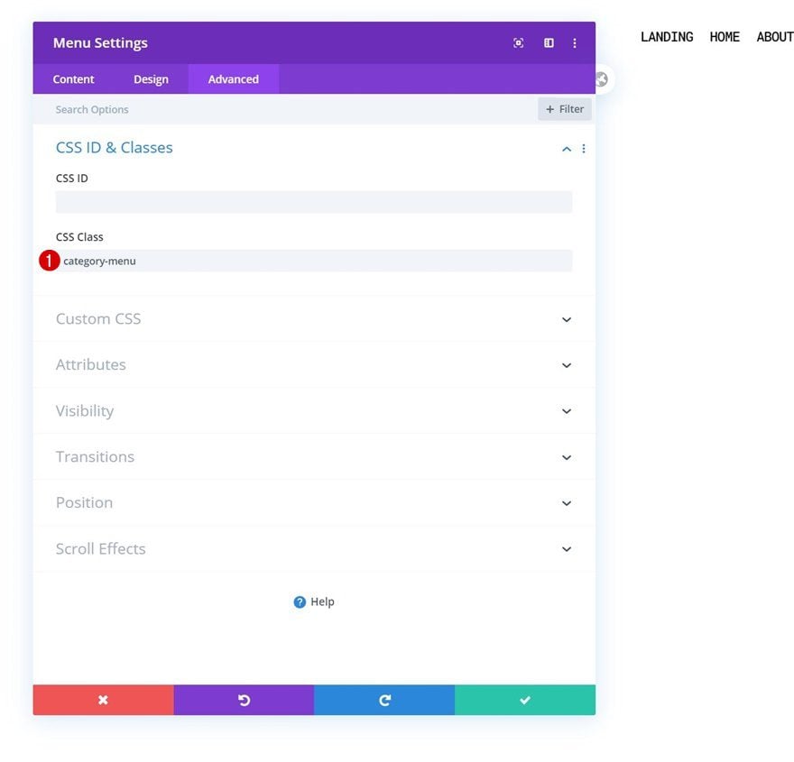
CSS Class
And complete the module settings by adding a CSS class.
- CSS Class: category-menu
3. Create Blog Dropdown Design
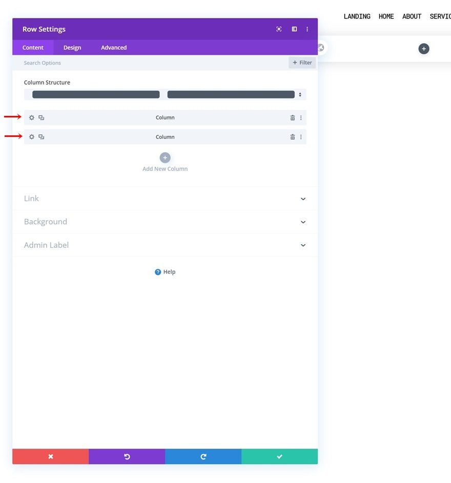
Add Row #2
Column Structure
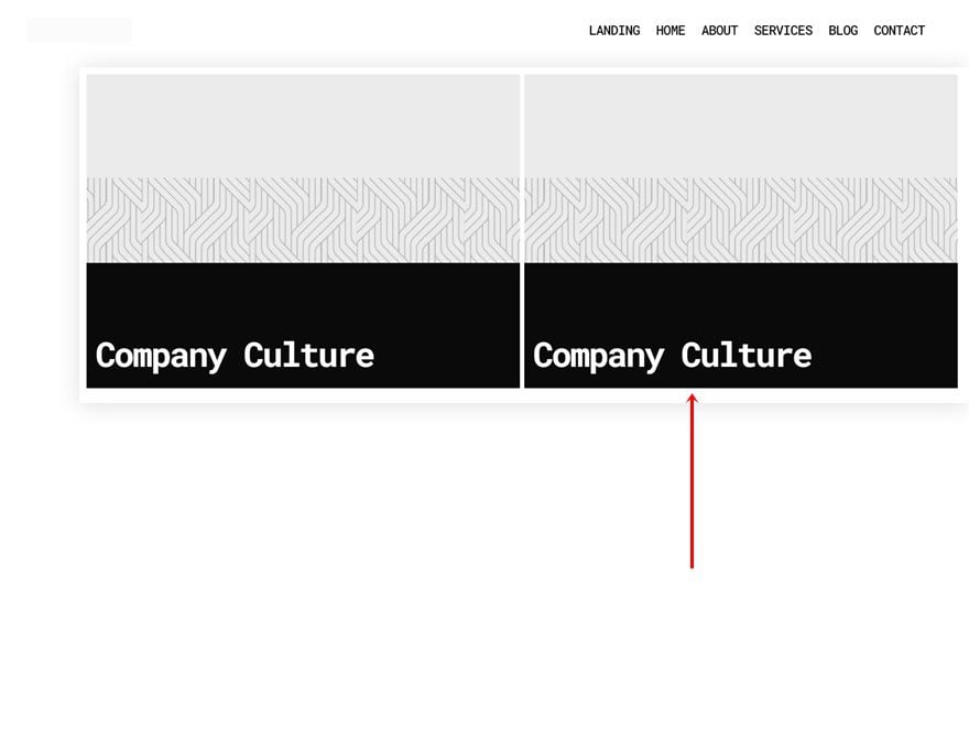
Once your row, containing the Menu Module, is in place, it’s time to build the dropdown menu containing visual blog categories. To do that, add a new row with two equally-sized columns. The entire row will be our dropdown menu for the blog menu item.
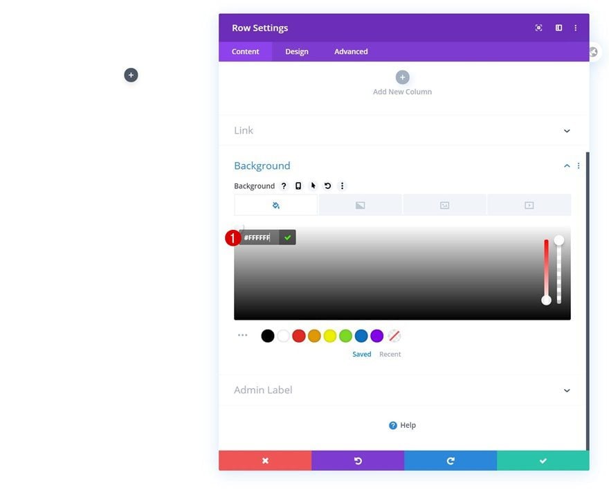
Background Color
Open the row settings and use a white background color.
- Background Color: #FFFFFF
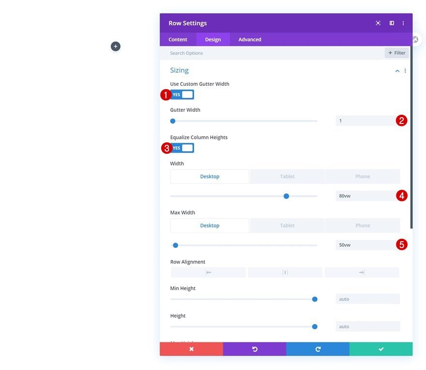
Sizing
Move on to the design tab and change the sizing settings as follows:
- Use Custom Gutter Width: Yes
- Gutter Width: 1
- Equalize Column Heights: Yes
- Width: 80vw (Desktop), 100% (Tablet & Phone)
- Max Width: 50vw (Desktop), 100% (Tablet & Phone)
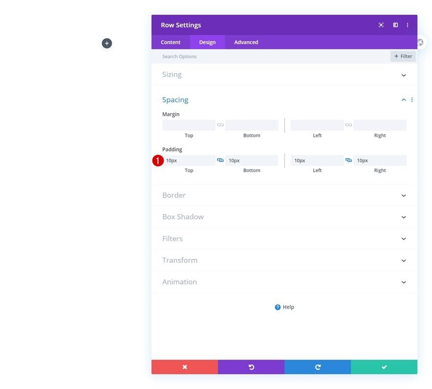
Spacing
Modify the padding values next.
- Top Padding: 10px
- Bottom Padding: 10px
- Left Padding: 10px
- Bottom Padding: 10px
Box Shadow
We’re using a subtle box shadow too.
- Box Shadow Blur Strength: 30px
- Shadow Color: rgba(0,0,0,0.13) (Desktop), rgba(0,0,0,0) (Tablet & Phone)
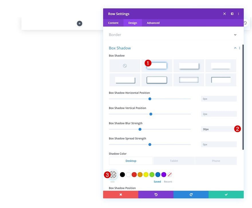
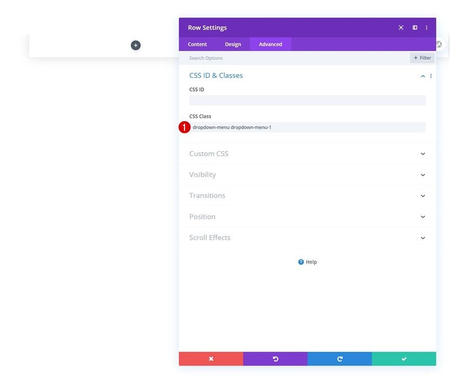
CSS Class
Then, we’ll add two CSS classes to our row. These CSS classes (in combination with some code later on) will help us place the entire row container inside the blog menu item as a dropdown.
- CSS Class: dropdown-menu dropdown-menu-1
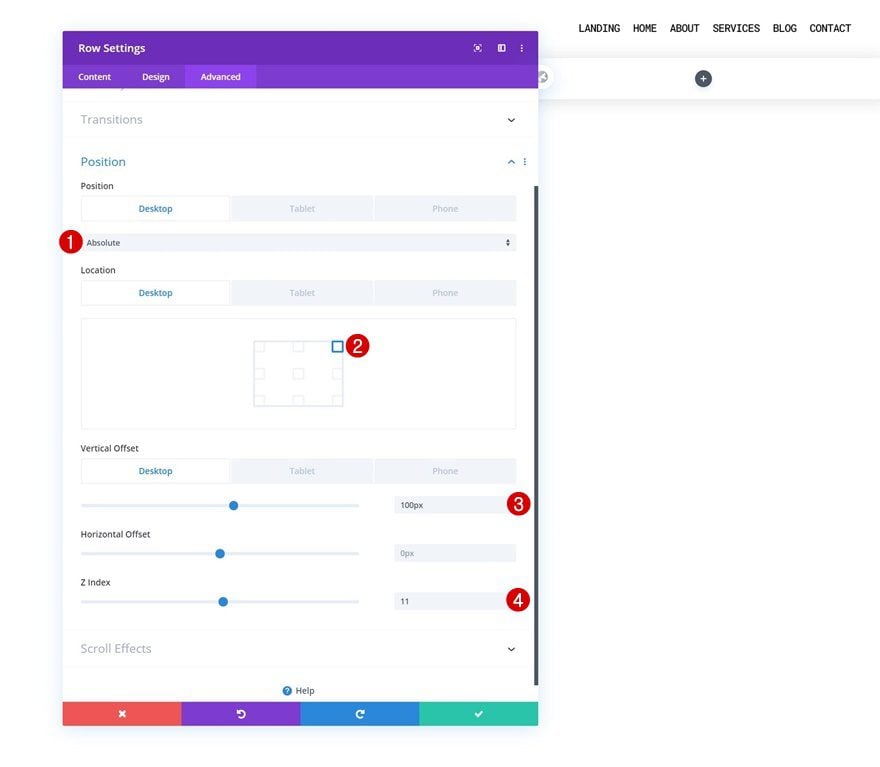
Position
Move on to the advanced tab and reposition the row as well.
- Position: Absolute (Desktop), Relative (Tablet & Phone)
- Location: Top Right
- Vertical Offset: 100px (Desktop), 0px (Tablet & Phone)
- Z Index: 11
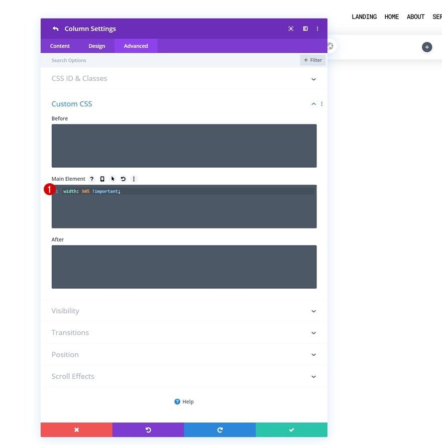
Both Columns Main Element
Last but not least, complete the row settings by adding one line of CSS code to each column’s main element. This will help us keep the column structure on smaller screen sizes.
width: 50% !important;
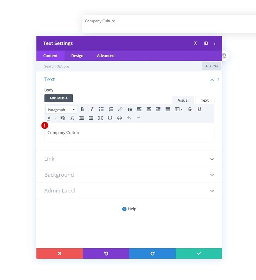
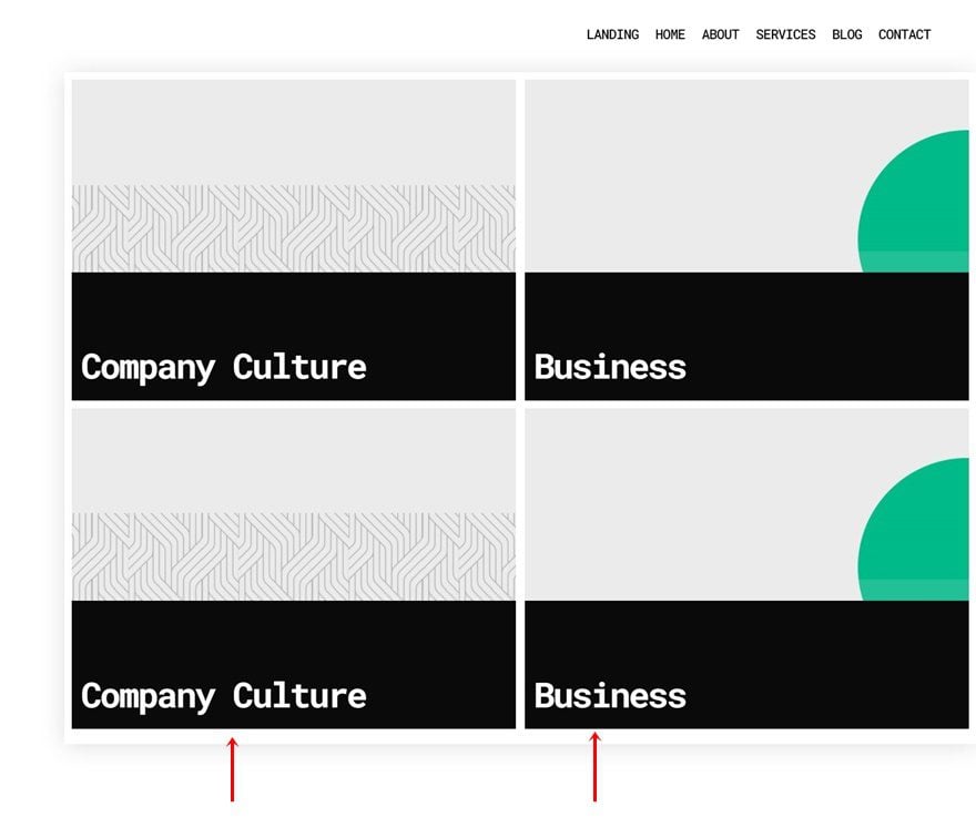
Add Text Module to Column 1
Add Category Name
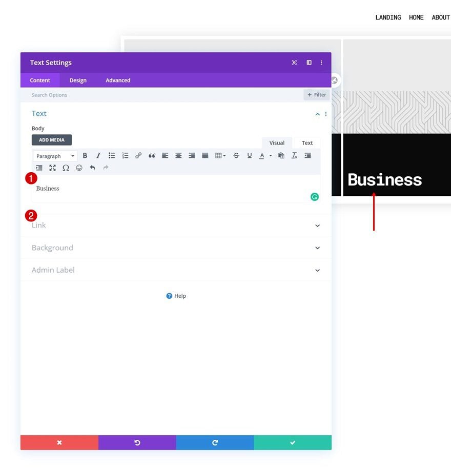
Time to visually display our blog categories! Add a first Text Module to column 1 and add the category title to the content box.
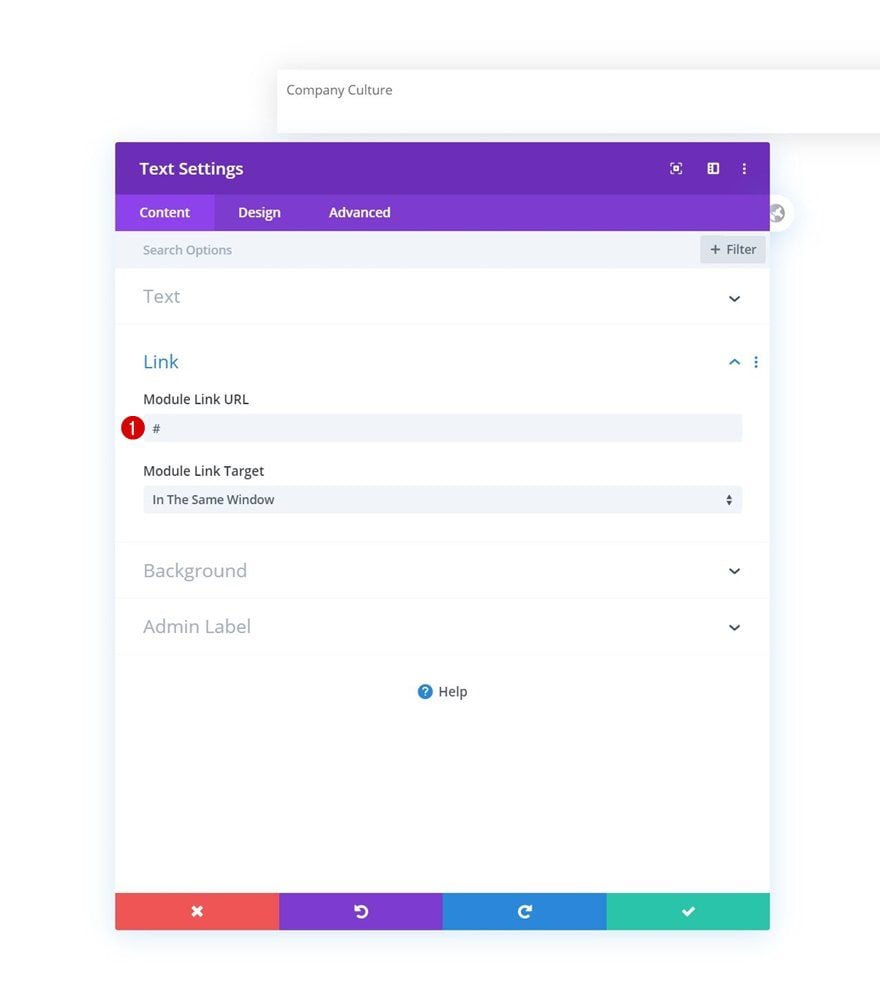
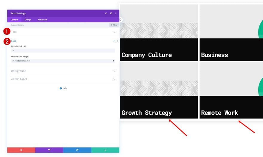
Add Category Link
Add a link to your category next.
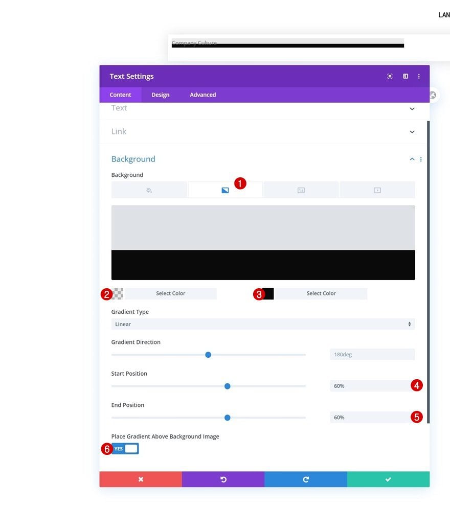
Gradient Background
Then, apply the following gradient background:
- Color 1: rgba(0,0,0,0.08)
- Color 2: #0a0a0a
- Start Position: 60%
- End Position: 60%
- Place Gradient Above Background Image: Yes
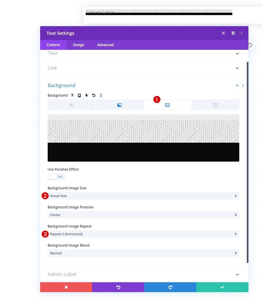
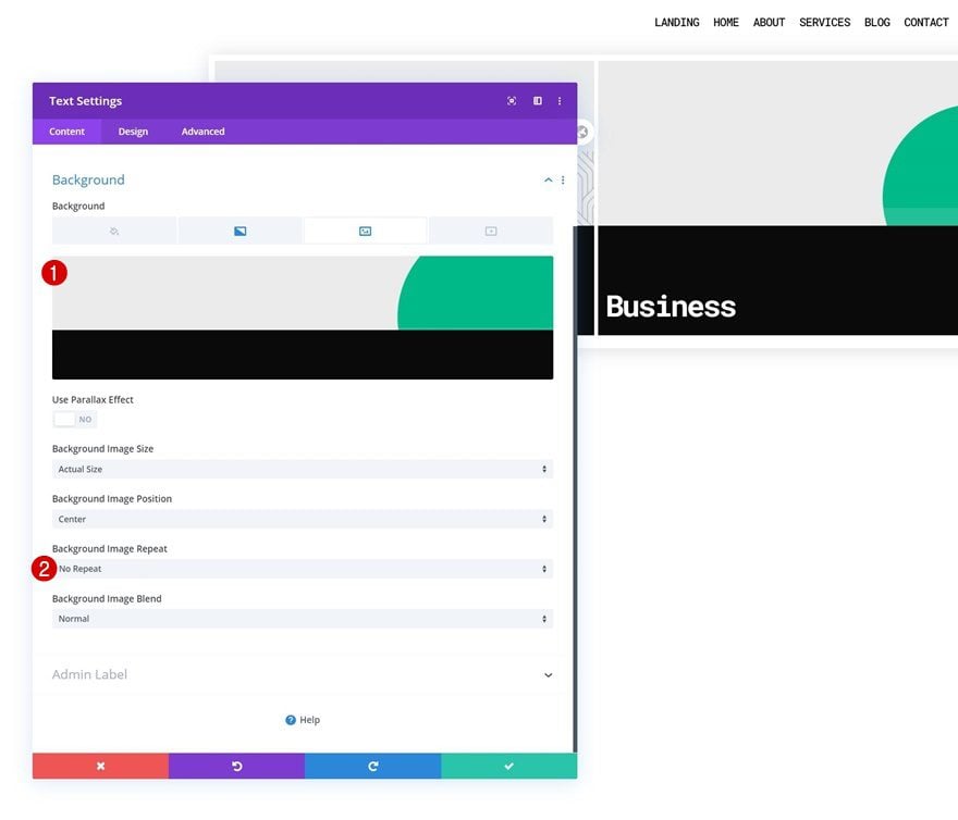
Background Image
Upload a background image of your choice. If you want the exact same outcome as in this tutorial, upload one of the illustrations you can find in the folder that you were able to download at the beginning of this post.
- Background Image Size: Actual Size
- Background Image Repeat: Repeat X (horizontal)
Text Settings
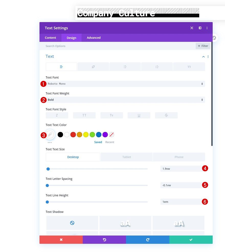
Move on to the module’s design tab and change the text settings accordingly:
- Text Font: Roboto Mono
- Text Font Weight: Bold
- Text Color: #ffffff
- Text Size: 1.9vw (Desktop), 3vw (Tablet), 3.5vw (Phone)
- Text Letter Spacing: -0.1vw
- Text Line Height: 1em
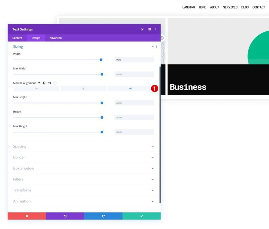
Sizing
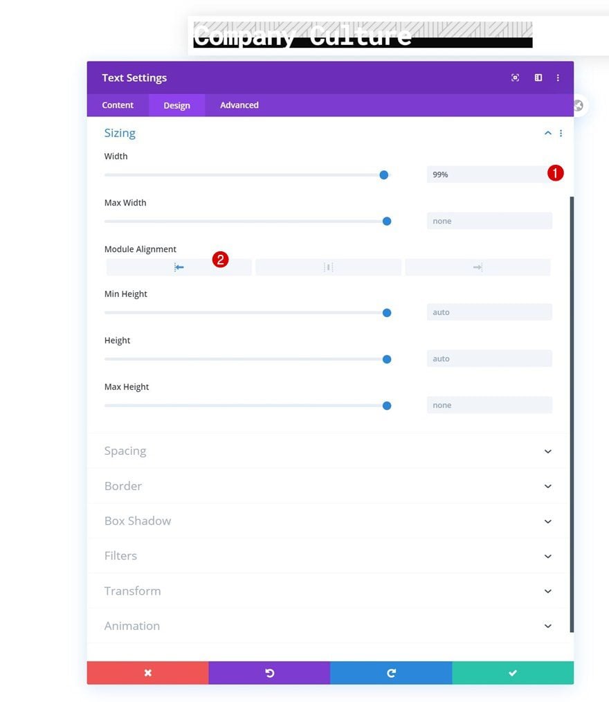
Change the sizing settings next.
- Width: 99%
- Module Alignment: Left
Spacing
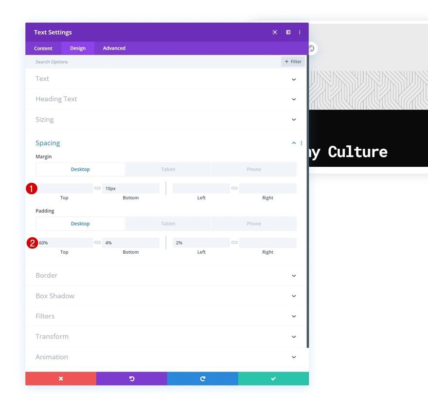
Modify the spacing settings too.
- Bottom Margin: 10px
- Right Margin: 1% (Tablet & Phone)
- Top Padding: 60% (Desktop), 40% (Tablet & Phone)
- Bottom Padding: 4%
- Left Padding: 2%
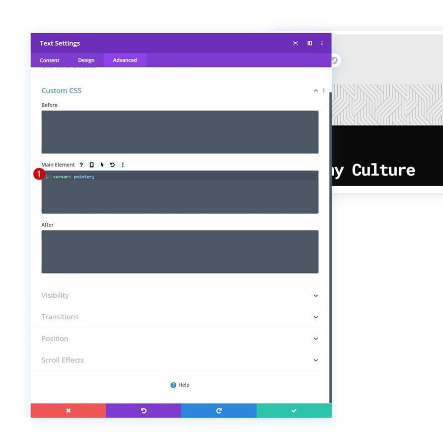
Main Element CSS
And complete the module settings by adding one line of CSS code to the module’s main element.
cursor: pointer;
Clone Text Module & Place Duplicate in Column 2
Once you’ve completed the first Text Module, clone the module and place the duplicate in column 2.
Modify Text Module in Column 2
Change Category Name & Link
Modify the category title and link in the duplicate module.
Change Background Image
Change the background image too. You can find the illustration in the download folder.
- Background Image Repeat: No Repeat
Change Sizing
Change the module alignment in the sizing settings next.
- Module Alignment: Right
Clone Both Modules Once
Once you’ve completed both modules (one in each column), you can clone both of them once.
Change Category Names & Links
Change the category names and links inside the duplicate modules.
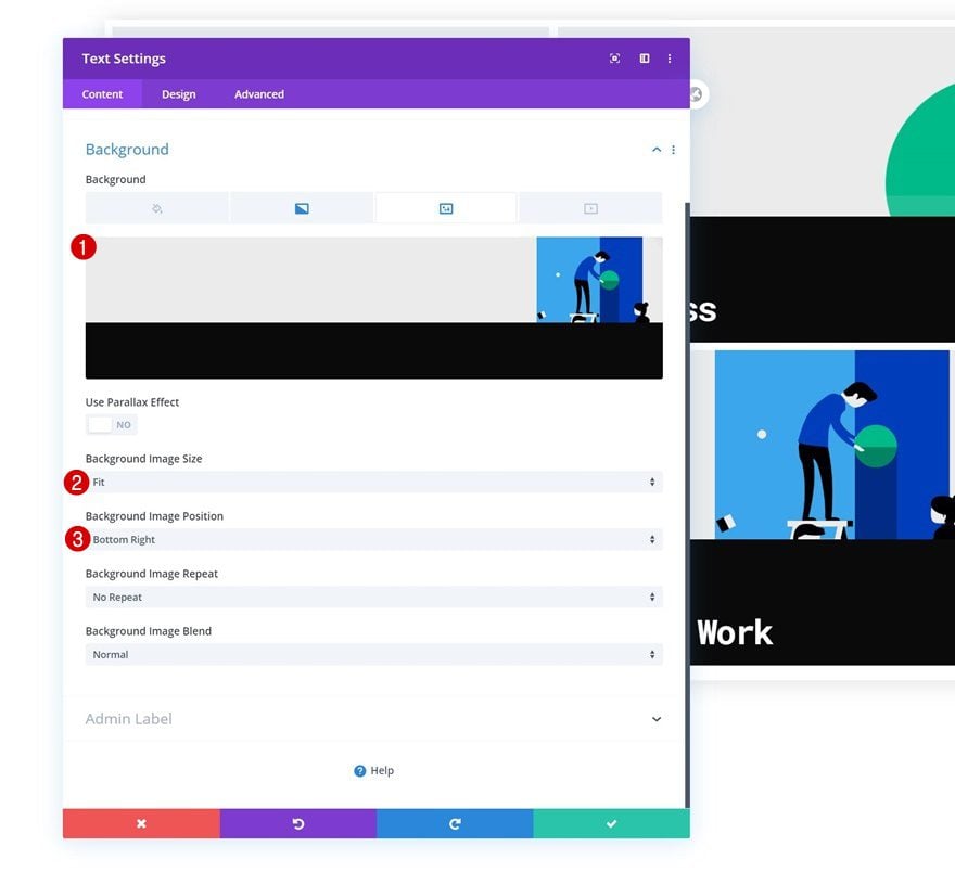
Change Background Images
Along with the background images. You can find the new illustrations in the folder you were able to download at the beginning of this post.
- Background Image Size: Fit
- Background Image Repeat: No Repeat
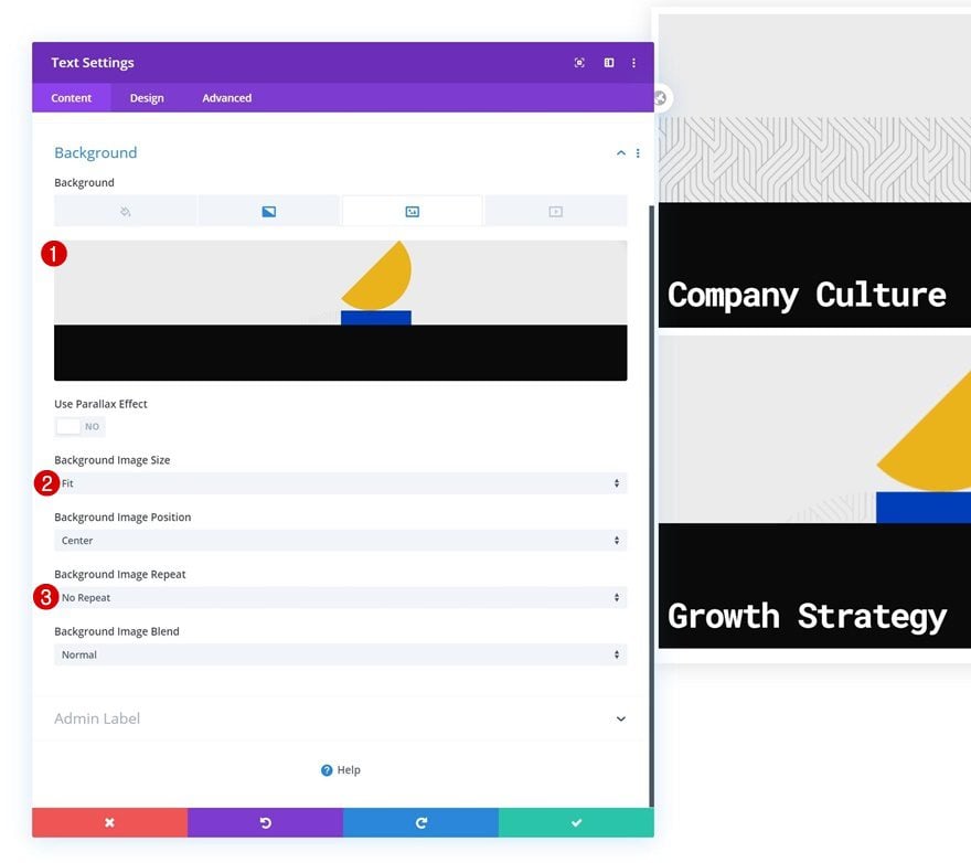
- Background Image Size: Fit
- Background Image Position: Bottom Right
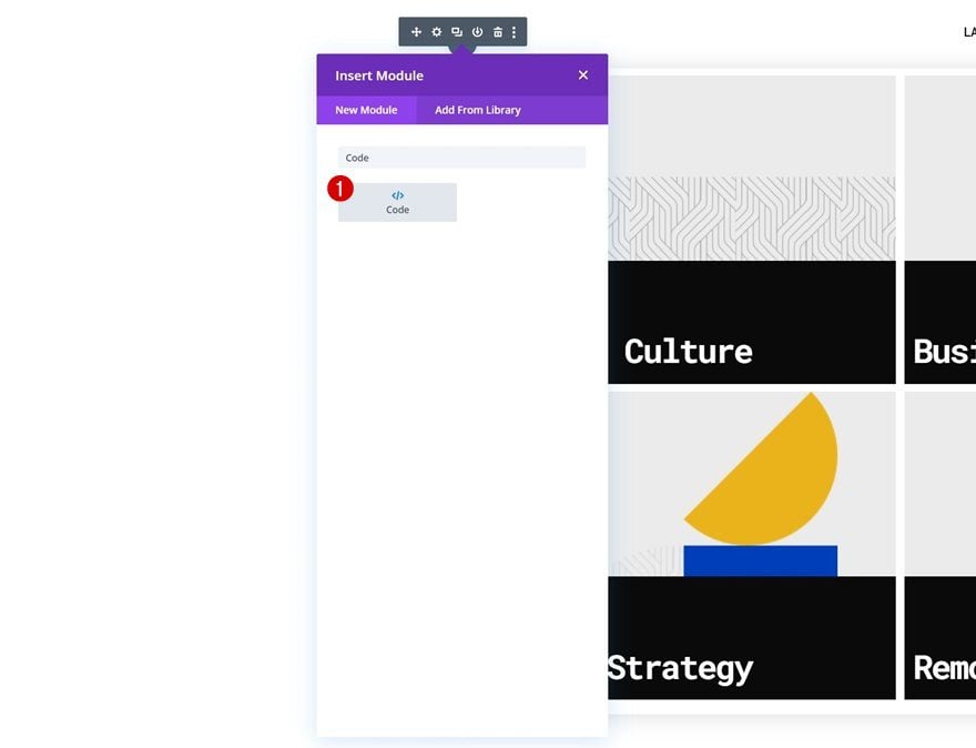
4. Add CSS & JQuery Code
Once you’ve completed the row containing the dropdown menu category names, add a Code Module to the first row in your section, right below the Menu Module.
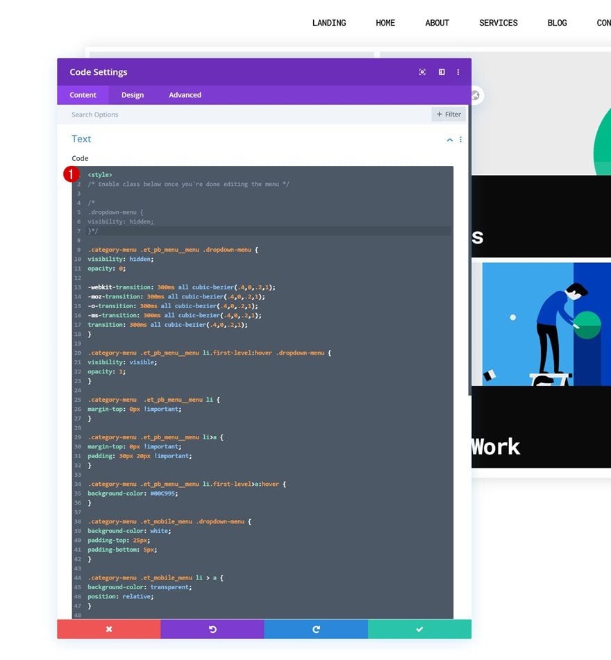
Add CSS Code
Add the following lines of CSS code to the Code Module:
<style>
/* Enable class below once you're done editing the menu */

/*
.dropdown-menu {
visibility: hidden;
}*/

.category-menu .et_pb_menu__menu .dropdown-menu {
visibility: hidden;
opacity: 0;

-webkit-transition: 300ms all cubic-bezier(.4,0,.2,1);
-moz-transition: 300ms all cubic-bezier(.4,0,.2,1);
-o-transition: 300ms all cubic-bezier(.4,0,.2,1);
-ms-transition: 300ms all cubic-bezier(.4,0,.2,1);
transition: 300ms all cubic-bezier(.4,0,.2,1);
}

.category-menu .et_pb_menu__menu li.first-level:hover .dropdown-menu {
visibility: visible;
opacity: 1;
}

.category-menu  .et_pb_menu__menu li {
margin-top: 0px !important;
}

.category-menu .et_pb_menu__menu li>a {
margin-top: 0px !important;
padding: 30px 20px !important;
}

.category-menu .et_pb_menu__menu li.first-level>a:hover {
background-color: #00C995;
}

.category-menu .et_mobile_menu .dropdown-menu {
background-color: white;
padding-top: 25px;
padding-bottom: 5px;
}

.category-menu .et_mobile_menu li > a {
background-color: transparent;
position: relative;
}

.category-menu .et_mobile_menu .first-level > a:after {
font-family: 'ETmodules';
content: '\37';
color: black;
font-weight: normal;
position: absolute;
font-size: 16px;
top: 13px;
right: 10px;
}

.category-menu .et_mobile_menu .first-level > .icon-switch:after{
content: '\36';
color: #c9c9c9;
}

.category-menu .et_mobile_menu .dropdown-menu {
display: none;
visibility: visible;
}

.category-menu .et_mobile_menu .dropdown-menu.reveal-items {
display: block;
}

</style>
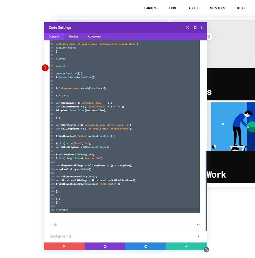
Add JQuery Code
Along with some JQuery coe that’ll help place the row, containing categories, inside your blog menu item. Make sure you place the JQuery code between script tags as you can notice in the print screen below.
jQuery(function($){
$(document).ready(function(){


$('.dropdown-menu').each(function(i){

i = i + 1;

var $dropdown = $('.dropdown-menu-' + i);
var $mainMenuItem = $('.first-level-' + i + '>a');
$dropdown.insertAfter($mainMenuItem);

});

var $firstLevel = $('.et_mobile_menu .first-level > a');
var $allDropdowns = $('.et_mobile_menu .dropdown-menu');

$firstLevel.off('click').click(function() {

$(this).attr('href', '#');
var $thisDropdown = $(this).siblings();

$thisDropdown.slideToggle();
$(this).toggleClass('icon-switch');

var dropdownSiblings = $allDropdowns.not($thisDropdown);
dropdownSiblings.slideUp();

var $thisFirstLevel = $(this);
var $firstLevelSiblings = $firstLevel.not($thisFirstLevel);
$firstLevelSiblings.removeClass('icon-switch');

});

});
});
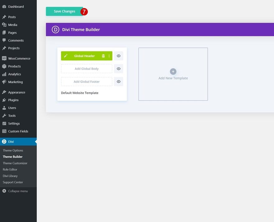
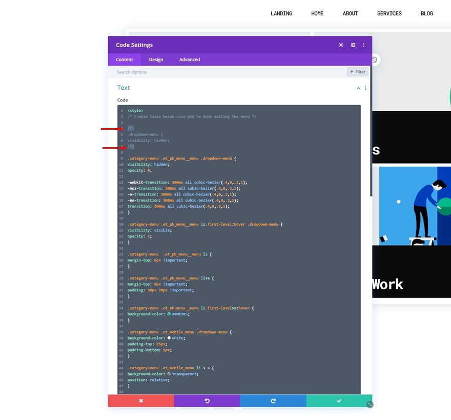
5. Enable CSS Class Once You’re Done Customizing the Blog Dropdown Items
As soon as you’re done customizing all the dropdown items, you’ll have one thing left to do: hiding the entire row containing the dropdown menu items. This, in combination with a load function inside our code, will prevent the dropdown menu from showing up when loading the page. Once you enable this CSS class, you won’t see the second row inside the Visual Builder anymore, but you’ll be able to access it in the wireframe mode and/or temporarily disable the CSS class when making changes to your dropdown menu. To enable the class, remove the ‘/* */’ brackets at the beginning and end of the CSS class.
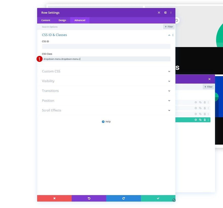
6. Adding More Post Category Dropdowns
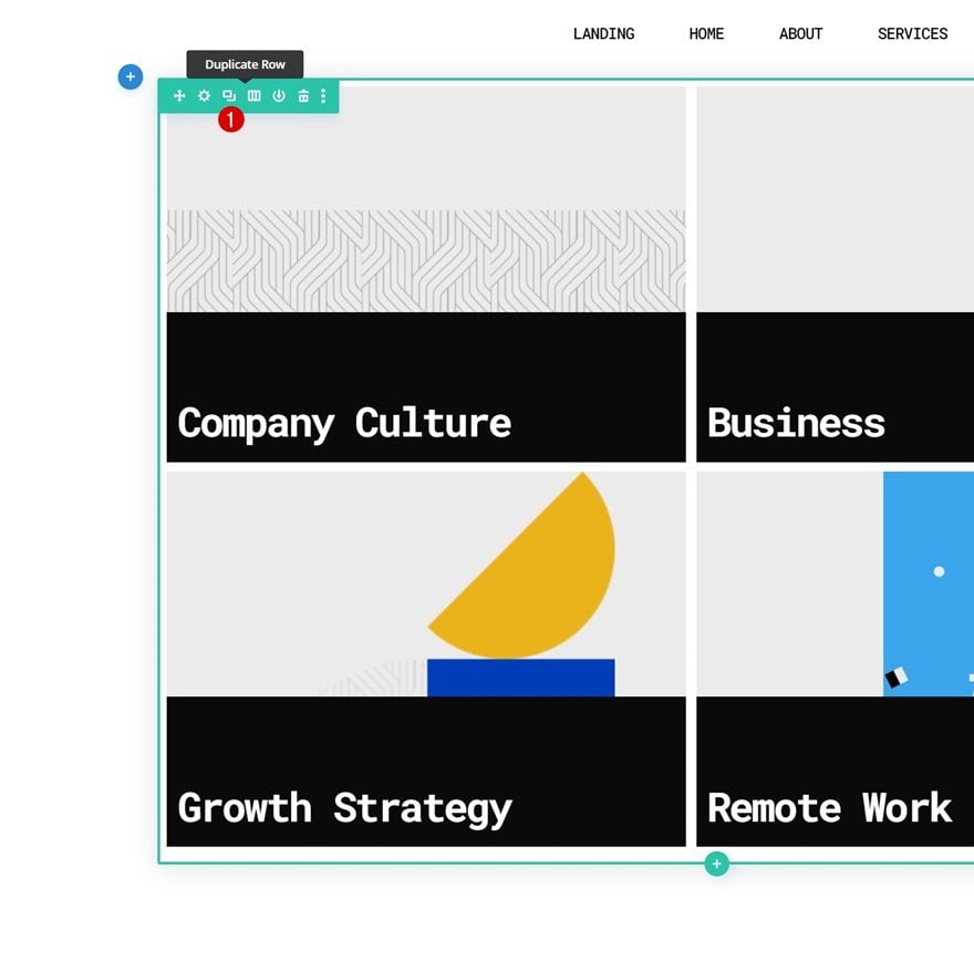
Clone Blog Category Row
If you’re looking to add more category dropdowns, you can clone the entire dropdown row you’ve created.
Access Duplicate Row in Layers Panel
Since we’re using absolute positioning on desktop, the rows will be placed on top of each other. To access the rows individually, open the layers panel inside your Divi Builder and open the duplicate row’s settings.
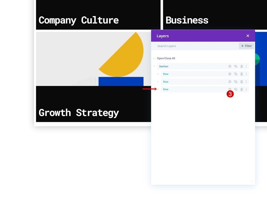
Change Duplicate Row CSS Class
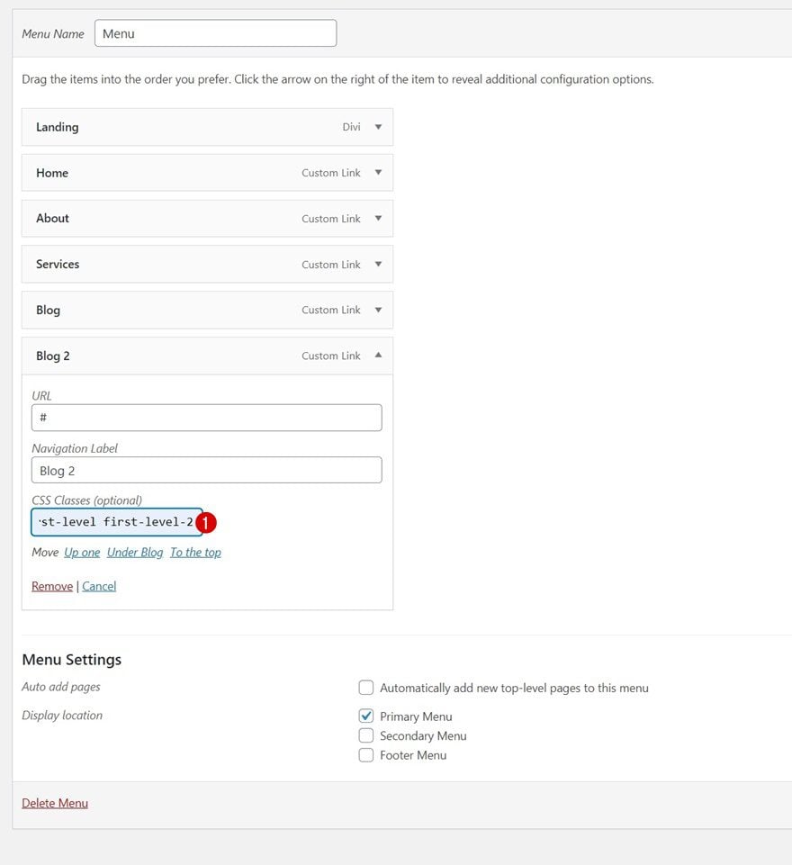
Change the second CSS Class in your duplicate row. Make sure the number you’re using is consecutive.
- CSS Class: dropdown menu dropdown-menu-2
Then, navigate back to your WordPress menu inside your dashboard and add the following CSS classes to another menu item and you’re done:
- CSS Classes: first-level first-level-2
Preview
Now that we’ve gone through all the steps, let’s take a final look at the outcome across different screen sizes.
Desktop
Mobile
Final Thoughts
In this post, we’ve shown you how to get creative with your Divi header and the blog menu item. More specifically, we’ve shown you how to visually include blog categories as dropdown menu items that look great across all screen sizes. This approach will help you highlight each different blog category while still keeping a minimal look and feel at first sight. You were able to download the JSON file for free as well! If you have any questions, feel free to leave a comment in the comment section below.
If you’re eager to learn more about Divi and get more Divi freebies, make sure you subscribe to our email newsletter and YouTube channel so you’ll always be one of the first people to know and get benefits from this free content.


I got frustrated as after removing ‘/* */’ brackets everything stopped working , went through tutorial 3 times to find the problem
finally played around and just left the first /
”
/
.dropdown-menu {
visibility: hidden;
}
”
now it works
extensively explained the process with screenshots. really it was informative and I have subscribed too… to get more updates. thank you for this insightful article