Welcome to Day 48 of our Divi 100 Marathon. Keep tuning in for 100 days in a row of awesome Divi resources as we count down to the amazing release of Divi 3.0 on the final day of the series!
Lacking an online presence is a mistake that no business can afford to make nowadays, but having a shoddily built website can be even worse on some occasions. Customers need to know that they can trust your business without having ask around, and a professional site goes a long way towards assuaging their fears.
Our own Divi theme is a great fit for business websites of all shapes and sizes, and it comes with all the bells and whistles you need to launch a site that will make your competitors tremble in their boots. The best part is that you don’t even need to take our word for it – we’ll let this compilation of ten of our favorite business sites built using Divi do all the talking for us!
10 Outstanding Business Websites Built Using Divi
1. Kissmetrics
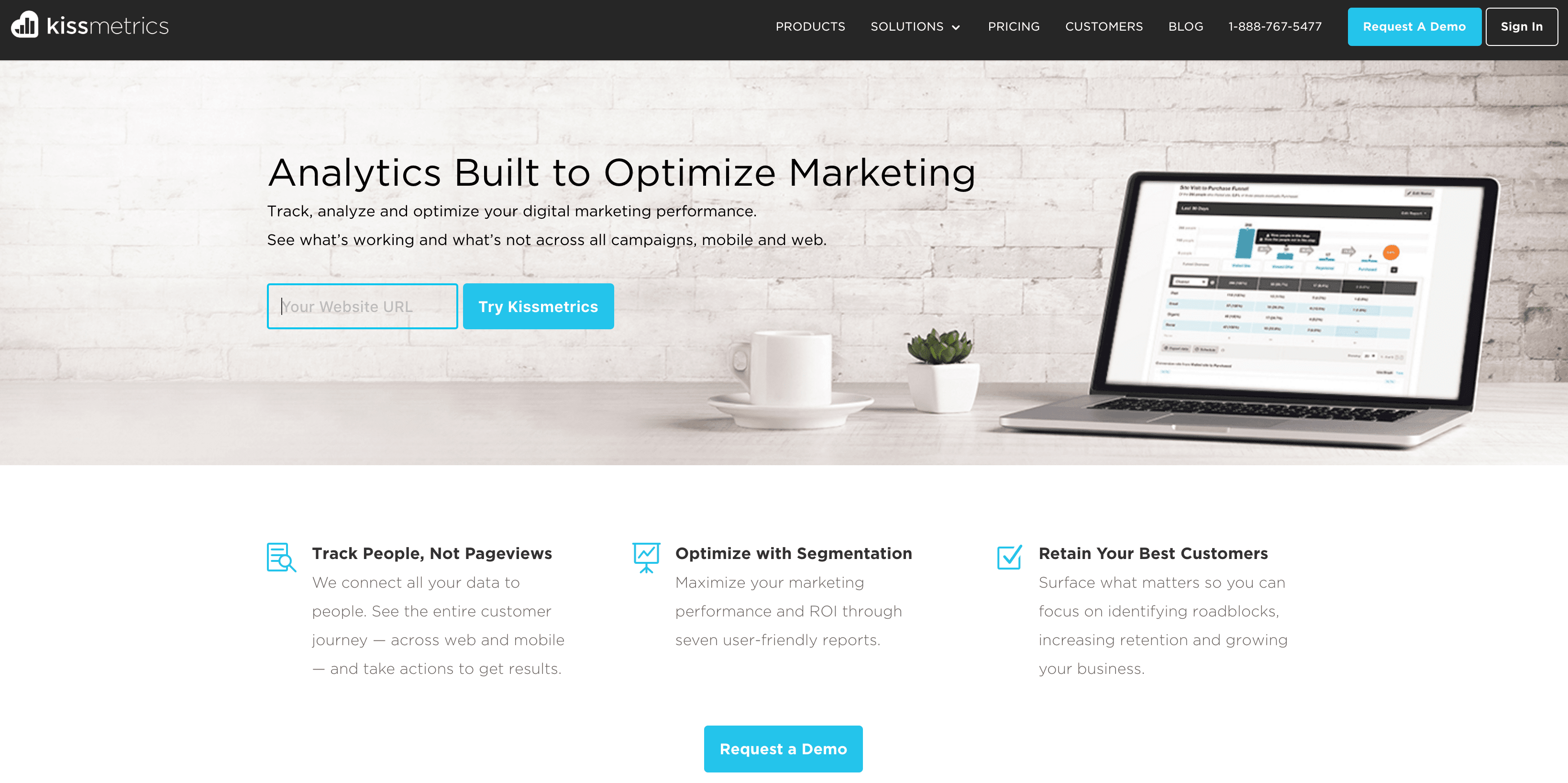
If you’re in any way serious about online marketing, you’ll no doubt have heard of Kissmetrics. Their blog is pored over by thousands of people daily, and is considered one of the go-to resources for online marketing and branding. In addition to publishing stellar blog content, Kissmetrics is a premier authority in marketing analytics, with their Analyze and Engage tools both helping you to optimize your digital marketing performance.
The Kissmetrics website is a great example of how to build a simple yet effective homepage. Above the fold you’ll find a call to action (colored in blue for prominence) asking you to Try Kissmetrics, and below that is a simple use of the Blurb module. Call to action buttons are stand out in all the right places.
Below the fold is where the Kissmetrics website begins to build trust, by using the Circle Counters module to showcase Kissmetrics’ strengths in statistics, the Testimonial module, and a showcase of recent clients – bookended by a final call to action to take their services for a test drive.
2. Offbeat Creative
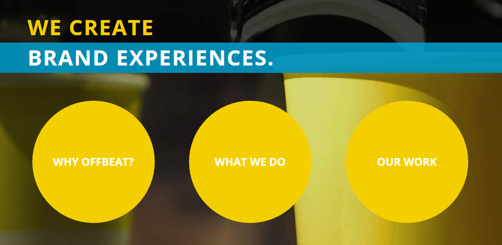
Offbeat Creative is a recently launched website for a creative agency that focuses on brand identity, interior design, digital applications, and general business consultations. It was built by Andrew Palmer, a longtime friend of the Elegant Themes blog, who also happens to be part of the team over at Elegant Marketplace and an administrator on the Divi Theme Users Facebook group. We think it’s pretty safe to say that he knows his way around Divi, and you can see that for yourself on this website.
The site features a very minimalistic homepage, with strong taglines and blurbs that direct viewers to the most important sections of the website. The navigation bar features a subtle hover animation and makes good use of social media icons as well as including key contact information, both of which are crucial for business websites.
Our favorite part of the site is the case studies gallery, which make great use of relevant imagery while interspersing tidbits of information.
3. Apricum
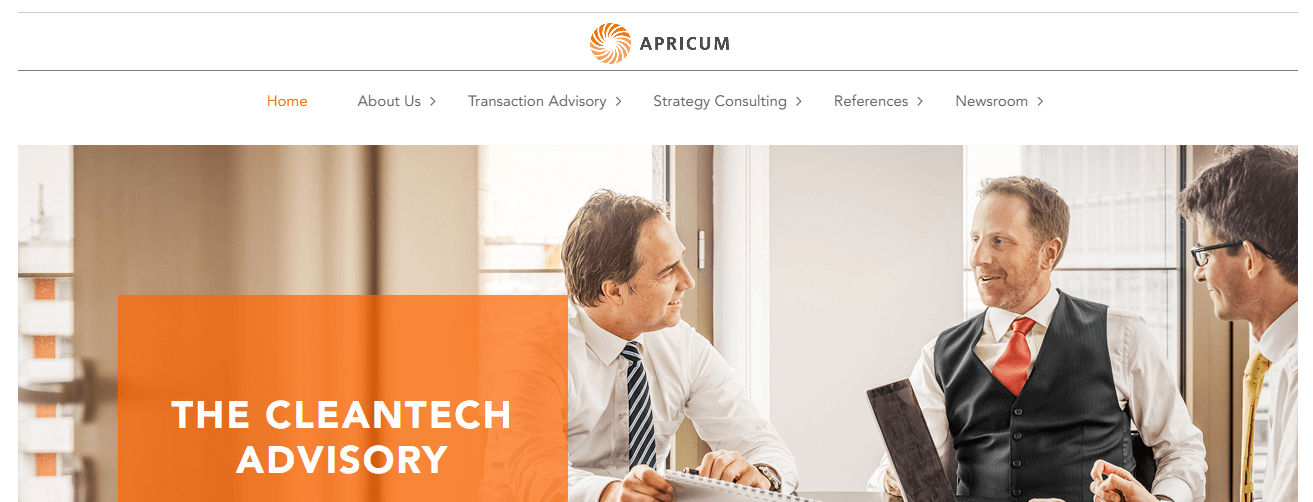
Apricum is a transaction advisory and strategy consulting firm that operates in the field of clean technology – and if you didn’t understand most of the words we just used, that’s alright. All you need to know is their site is a great example of a clean-cut, corporate look achieved using Divi.
How exactly does one go about achieving this coveted look? Well, we would point you towards their homepage, where you can see a good example of how to utilize contrasting colors to highlight key information in a measured way – so only what’s absolutely necessary jumps out at you, while the rest of the information remains understated.
As you can see, the site uses the Header module with a text overlay and an orange background. The background makes the key information pop out, and the same color combination is re-used throughout the site for important sections and calls to action.
4. Katie Bee Jewelry
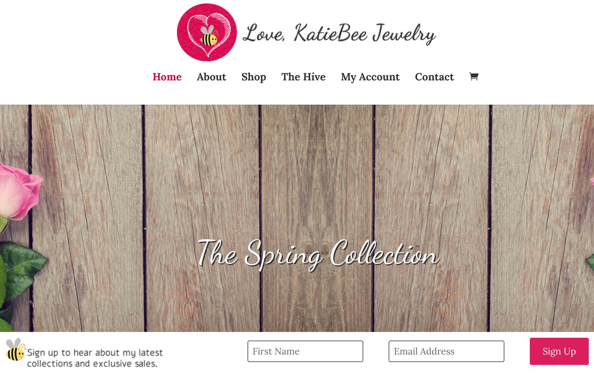
Katie Bee Jewelry create unique earrings, bracelets, necklaces, and more for women of all ages. The business began back in 2013 when Katie was just 13 years old, and from its humble beginnings, the business has now grown to sell jewelry directly from a Divi-powered website!
Katie’s design is understandably feminine, with salmon and pink colors accenting the white background and black font. The design is elegantly simple, and the Email Optin and Social Follow modules are featured prominently on the homepage.
Of course, with KatieBee selling jewelry, the Shop module is central to the site’s design, with a number of featured products also shown on the homepage.
5. Clear Solutions Acne and Skin Care Clinic

Kellie Campbell runs Clear Solutions – a skin care business specializing in acne treatment, based in New York. Learning her trade studying under a number of experts, Kellie knows what it takes to have clear skin – and her website is as equally pleasing to look at.
A transparent header (incorporating an animated navigation drop-down) enables the Fullwidth Header module to take center stage. Further on down the page, several brightly colored modules display the various treatments available, while the footer makes use of the Map module to assist customers in finding their establishment.
Finally, while Clear Solutions have used the Social Follow module throughout the site, they’ve also pressed our Monarch Social Sharing plugin into service, enhancing Divi’s built-in functionality.
6. Mendocino Farms
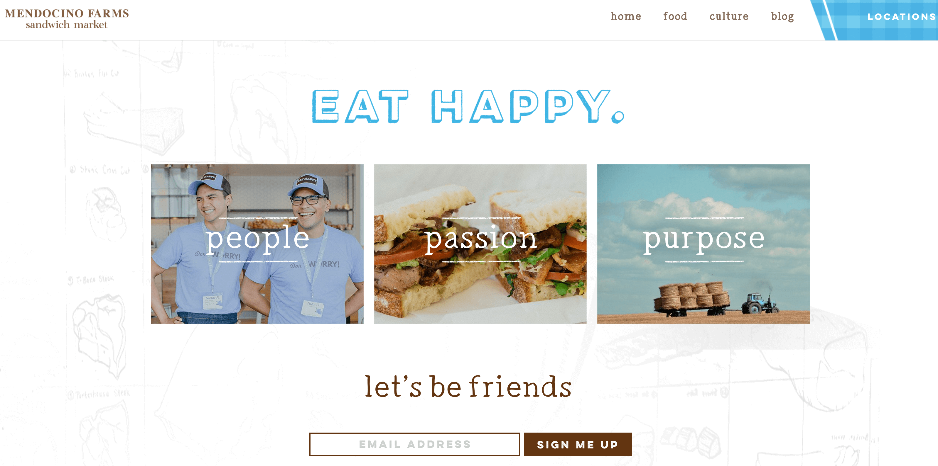
For a lot of people, good food equals happiness, and it’s certainly the mantra of Mendocino Farms. They currently operate thirteen eateries throughout California, and have another two establishments coming soon. What’s more, their website is powered entirely by Divi!
Their website is a bold and bright affair, with a clever use of the Image module to display not only images, but header text too. The header and navigation is well-designed, with subtle use of shadows on drop-down menus, and the footer has also been designed to resemble a second navigation menu – a nice touch.
Elsewhere, the Locations page features the Code module heavily – in fact, the further you dig into the site, the more there is waiting to be found. We recommend everyone to take a look at this site, just to see what you could potentially achieve using Divi!
7. Vintage Sugar
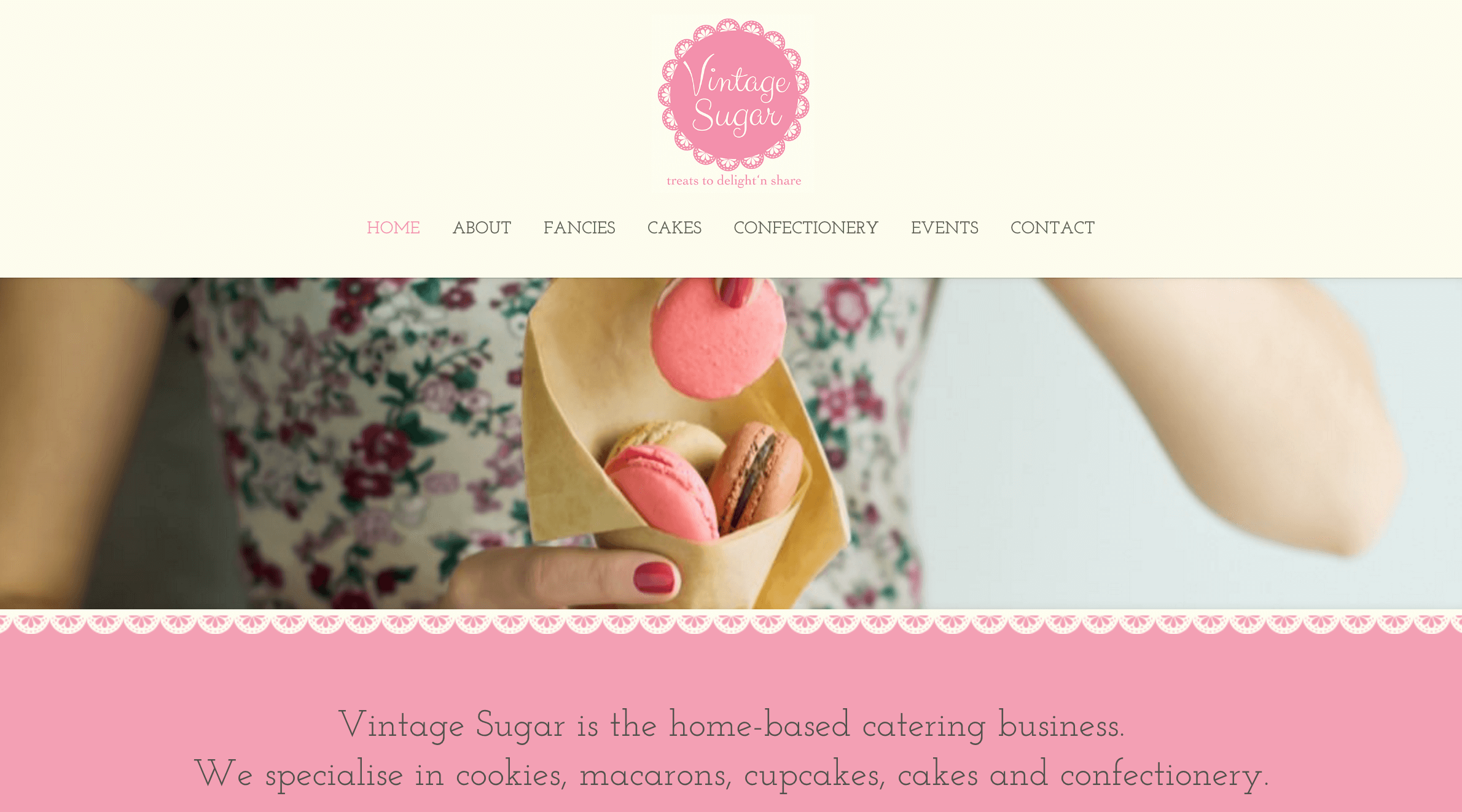
Australian-based Vintage Sugar specialize in cakes and confectionery – so they’re welcome to swing by any time! They’re a home-based business with an old-fashioned focus – and while they don’t have a brick and mortar shopfront, they cater to all manner of events and functions.
In keeping with their old-fashioned bent, they’ve gone for a simple and elegant design for their website – overall, it shows that you only need to harness a little of Divi’s power to create an outstanding website.
There are no sticky headers, full-screen images, or fancy animations here. Instead, they’ve gone for using the Blurb module to showcase their products, and the Image module to display the fruits of their labor. Finally, the Fullwidth Header and Fullwidth Slider modules have been used on each page to give some separation between the navigation and the rest of the content.
8. Brindabella Gas and Plumbing

Another Australian-based company with a Divi-powered website, the clue to Brindabella Gas and Plumbing’s line of work is in their name. Established in 2003, Brindabella is a family-owned business run by Matt Graham, who has over 15 years experience in the gas, plumbing, and heating industry.
The website makes use of the Fullwidth Header module right off the bat, and the sticky header has been designed with a completely different look to the standard navigation – it really shows off Divi’s flexibility. The rest of the website is neat and tidy in order to achieve its main goal – pushing the available services. The Blurb module has been used to showcase each service with a bright logo, and elsewhere on the site, the Testimonial module helps to convey a level of trust to the customer by displaying some well-chosen quotes.
Finally, the Contact page has been well designed with great use of the Map module to provide the company location, and the Social Follow module to add another point of contact for potential customers.
9. Brighton Paintworks
Brighton Paintworks is the colorful website of a Brighton (UK) painting and decorating business. It also happens to be the only website in this list that doesn’t feature a fancy header, but that’s not necessarily a bad thing! The site makes good use of that space by enabling viewers to decide which of the site’s two portfolios they’d like to peruse, and follows it up with a colorful bio box for Brighton Paintworks’ owner.
It’s a very simple site from all angles, but it’s also remarkably well put together. One of our favorite touches are the contrasting navigational bar and footer, which use the same color palette with contrasting backgrounds.
10. Castle Moore Design
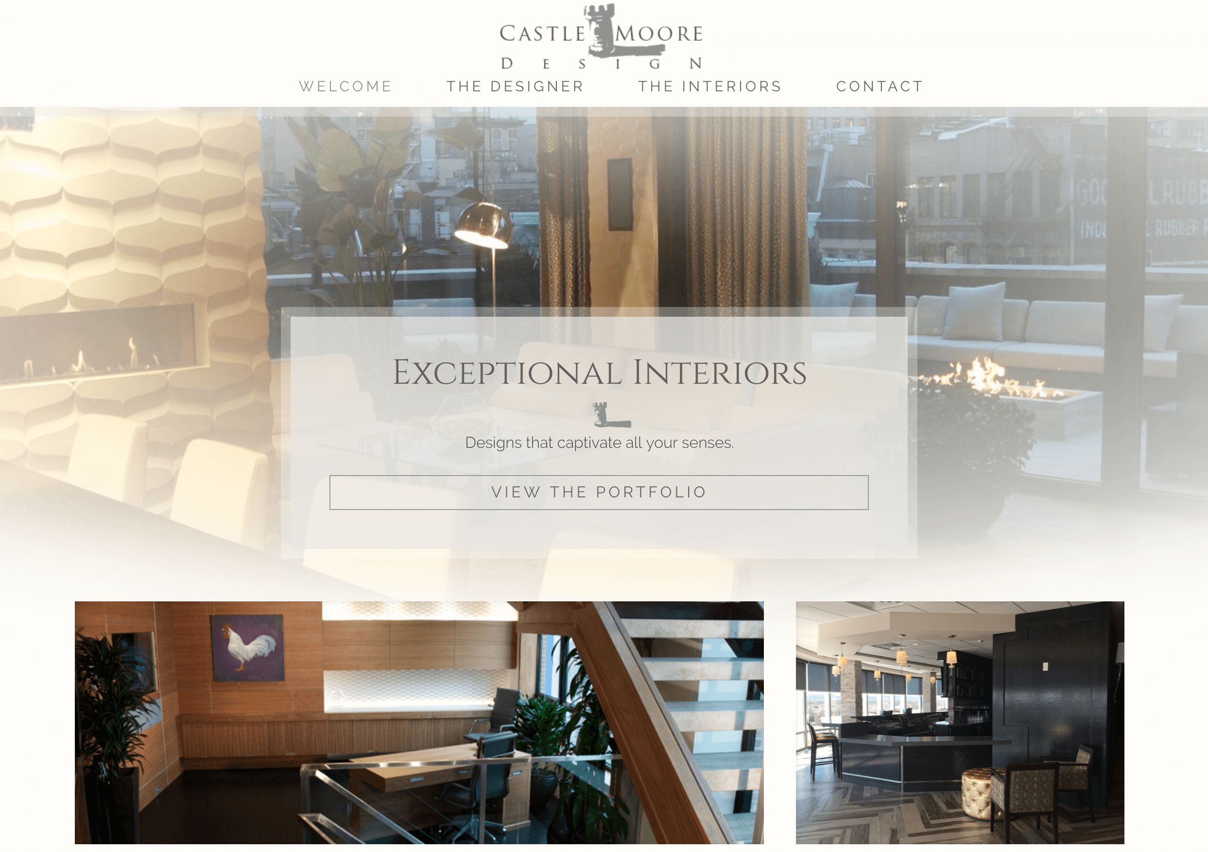
With over 20 years experience of interior architectural design, Glenn Moore can be considered an expert in his field. Castle Moore Design focuses mainly on the high-end markets of Lower Manhattan and suburban New Jersey, so it goes without saying they need to utilize Divi’s power to create a compelling website.
Unlike other websites, each page of Castle Moore Design displays a title and tagline centrally using the Call To Action module. It gives each page focus, and it’s a neat design choice that makes the website stand out as a whole. Further on down the homepage, creative use of multiple Fullwidth slider modules showcase various past projects. Finally, the Social Follow module has been used to link to Castle Moore’s social media profiles along the bottom of each page.
Conclusion
Regardless of your field, having a solid business website will reward you with a bounty of opportunities to make your way forward, and the Divi theme includes all the necessary tools to help you achieve this.
If we’ve got you all pumped up about the idea of improving your WordPress business site, take a look at some of our past articles that focus on helping businesses grow:
- Small Business Owners: Guide to Improving Your Website Presence With Google Search Console
- Become a Better Blogger: Essential Blogging Skills Every Business Needs
- The 5 Best Ways to Provide Excellent Customer Service in Your WordPress Business
Be sure to subscribe to our email newsletter and YouTube channel so that you never miss a big announcement, useful tip, or Divi freebie!
Article thumbnail image by Macrovector / shutterstock.com

Divi 100 Day 48
The Countdown To Divi 3.0
This post is part of our Divi 100 marathon. Follow along as we post free Divi resources for 100 days in a row! This 100-day countdown will end with the game-changing release of Divi 3.0, including our brand new visual editor built from the ground up using React. Divi 3.0 will change the way you build websites with the Divi Builder forever!
Let the countdown begin.




Great websites. In today’s business word, it is extremely vital to have a good website that can attract visitors and improve website traffic and sales. And this can be achieved by hiring an experienced and professional designer and developer to create your business website.
Thanks for sharing the information. You have really put together a nice collection of websites built using Divi Theme.
Thanks, Imad. 🙂
WOW.!! I was amazed to see Kissmetrics in the list.
How can I add a lead form like https://www.kissmetrics.com/ has on their home page slider?
It appears as though they’ve used the Code module and added some custom code for the form and button.
Hope that helps!
It’s year 2016, and “Outstanding website” is not even responsive (Brighton Paintworks)?
Only purchased Divi a few days ago. I have started setting up a website with vertical navigation. First time for everything! Anyway, loved the examples here, they are all great looking sites. The one that stood out for me was off beat creative. Its a great looking site. If anyone can help, id love to get the same social media and contact details added to my menu like they did?
Thanks for the kind words, Ben! The first port of call should be our forums, which can be found at this link – https://www.elegantthemes.com/contact/.
There are many Divi users there who could give you a helping hand! 🙂
I really like the menu CTAs Kissmetric is using.
Brighton Paintworks is very well put together.
We loved everything about Kissmetric’s site, Eugene. It’s a great example of a website designed correctly. 🙂
They are indeed outstanding! I didn’t suppose Divi can be so beautiful. Amazing work! Inspirational too.
Thanks for the kind words!
My previous comment, in which I said the examples had not moved far from a hero image and revised navigation, plus pretty colours and pictures, was taken down.
I also mention that all the sites, except Katie Bee, were slow to load. And that only Kissmetrics had the quantity and quality of content required to do well for SEO.
I don’t understand how any of those points required censorship.
Let me know.
Kind regards
Brian
Your comment wasn’t censored directly. It was lost because it was part of a thread that was deleted. When a comment is deleted, you lose all comments related to it.
The thread was deleted because it was full of hateful, hurtful language that has no place on this blog. Furthermore, it was fueling a fight that inspired threats and harassment. If someone wants to act in such a manner, they can do so on their own website. If you want to participate here, you need to be respectful. It’s not a policy that’s up for debate and I am surprised I have to defend it at all.
So delete the offending comments – NOT the entire thread. It’s not rocket science Nick.
I’m sorry Nick but that sounds like sophistry. Whether you call it censored or deleted the questions remain. Either you allow discussion in all its styles – positive and negative – or you don’t.
The original comment that I replied to did not contravene the etiquette and nor did my reply. If some other comments were at fault then delete them.
But to delete a whole thread of comments, especially when they are a serious discussion rather than uncritical cheerleading, appears very biased.
I’d say it a loss for the blog rather than us individuals. If you squash constructive criticism, especially when it is well intentioned, you lose many opportunities for growth and development of your themes.
Deleting the comment thread had nothing to do, in any way, with your critique. We have a policy when it comes it social etiquette and common decency here, and we don’t have time to moderate flame wars. We also require that comments be on topic and add value to the post. A flame war between two people doesn’t help the community and it does not add value for people visiting the page. If you are part of a thread that derails into such activity, it’s going to be deleted. Feel free to be critical, just do so in a respectful manner and be sure to criticize something related to the post itself.
Your comment was great, unfortunately it was part of a thread that broke our rules and was deleted. We never delete comments because they are critical of Elegant Themes, in fact we have a long history of allowing negative posts about ourselves to exist on the blog. I know because I personally managed the comments section for 7 years and personally approved all of them. It’s great for me to see each piece of criticism, and it’s something I value. Valuable criticism and hateful, meaningless arguments are two different things.
Sorry Nick but I don’t understand. What have I ever said that is not respectful? Claiming that I am guilty of some generic and non-specific misdemeanour is showing a complete lack of respect for readers of your blog. More than that, it demeans and lessens any learning that may come from the content of the blog and the discussions that follow.
Instead of concentrating on the wide points of view that a strong blog can encompass, you have chosen to delete and censor people who took the time to offer constructive feedback. In simple terms, your claims of “outstanding” were questioned and you have censored people who raised the questions.
Not sure how else to explain it Brian. Your comment was not deleted. The comment you replied to was.
Don’t expect a response Brian. ET is very good at ignoring anything they deem as controversial (example: not being able to edit the footer directly in Divi has been ignored for *years*). Censoring comments is yesterdays news around here. 🙂
So no-one is allowed to be critical of Elegant Themes when it claims “outstanding” and some of us find the examples far less than outstanding. If the blog is only allowed to be a cheerleader forum in favour of Elegant Themes, please let us know.
Then I don’t need to read the blog and don’t need to offer feedback. Rather than the blog being a learning resource it becomes a censored and uncritical forum.
You are free to criticize us all your want Brian. We don’t censor criticism, but we do censor harassment, threats, vulgarity, racism, sexism or anything else we decide is immoral or unacceptable due to its negative impact on the community.
With the first comment on this post (before it was deleted) I offered some very honest and very valid constructive criticism for 2 of the sites listed.
For some reason it was decided to censor that comment and everything in that thread (yes – some of it needed to go including my subsequent comments – my bad – won’t happen again).
Is this going to be the way it is moving forward? Puppies and unicorns and nothing remotely negative (no matter how helpful it may be)?
Just want to be clear so I don’t use up the 3RD AND ONLY CHANCE I have left.
Thanks for including the Katie Bee website. This was my favorite project because it was a young client with limited resources. We are both happy with her start in online businesses. She loves her site and will continue to make improvements over time. We rescued her from a Wix site and couldn’t be happier with the outcome.
Thanks for stopping by and giving us the lowdown, Tammy. 🙂
Whilst we all have different views on what works regarding design, it is interesting to note from the technical side of things quite a few of these websites have space for improvement when it comes to performance.
Nice to show example work like this. The focus of ET and this blog is on design not conversion and marketing.
What is nice to see is here is the sharing of ideas in an open forum like this. It does take some guts to put any selection of sites and call them 10 outstanding sites out there. Some good ideas. With that aside, thanks for sharing!
Thanks for your insight, John. 🙂
Is it really possible for the 2 to be mutually exclusive though John? I’m speaking specifically about business sites that want you to complete some sort of action.
I’d personally take higher conversions over great design but feel that a business site should work towards both. A great design with 0 conversions is just a dead site that looks pretty. 🙂
Great sites! But personally the one I like is Kissmetrics. It’s a clean and elegant site.
So, “para gustos los colores” how we say in Spain. I think there are many sites more outstanding than these.
Cheers 🙂
Thanks for your comment!
Hello,
Great articles and awesome websites. I just have a question that how divi plays role while building/creating business website with LMS? Is it very well compatible?
Cheers
Hi Barrick, I built an LMS recently with LearnDash and Divi. It’s a password protected site so I can’t share it with you, but I had no compatibility issues at all. Everything worked as advertised.
Hello Barrick,
See our two previous articles on the subject: https://www.elegantthemes.com/blog/tips-tricks/how-to-use-wordpress-as-a-learning-management-system https://www.elegantthemes.com/blog/tips-tricks/how-to-create-a-school-website-with-wordpress
I hope they help. 🙂
Some are wonderful, some are plain, but what I think is the absolute best about this is that they are all very different and lend inspiration for many different types of businesses and types of companies. I love your blog and look at it frequently for education as well as inspiration!
Thanks for the kind words, Mattea!
Thank you for featuring the Apricum site. That was quite a lot of work in fact and I’m glad others liked it, too. 🙂
Excellent work Oliver! That one particularly stood out to me among this great list.
No worries, Oliver – it’s getting a lot of love. 🙂
Thank you for sharing these sites. Interesting range. I love DIVI.
Cheers, Doug. 🙂
Great examples, i have a question related to blog module. There is two options show content or excerpt , i don’t need both only need to show post featured image and post title. do you know how to filter or hook blog module post excerpt.
Thanks
Jav, that sounds like a question for our Elegant Themes community!
Head on over to our forums at this link – https://www.elegantthemes.com/forum/, post your question, and you’ll get advice and support from lots of other Divi users out there.
Good luck. 🙂
I would like to request some of the following (using Divi examples, of course!):
– creating / examples of Squeeze/Landing pages,
– creating / examples of Sales pages (including ‘Video’ sales pages),
– creating / examples of pages using ‘Grids’,
– examples of Color palettes
– more examples of how to use Zapier integrations with Divi
– creating / examples of eCommerce sites using Divi with plugins or integrating with eCommerce platforms
Maybe you could interview some experts in these fields on the podcast, then get your in-house designers to create samples / templates using the guests’ recommendations.
Cheers again,
DJ
Thanks for the suggestions, Dean! We’ll definitely consider them for future articles. 🙂
I think that many people here have a fairly high level of design sense and an understanding of internet marketing. So this is the ‘bar’ they are measuring any sites you highlight with (and as you see that bar is set fairly high).
In the past year, I have noticed that readers of this blog seem to get very excited whenever you post examples by your in-house Divi designers, then proceeded to explain ‘how-to’ duplicate them (or use the great templates!).
Please continue with those highly valuable and much appreciated type of posts. They make all of use better and allow us to put our design/marketing understanding to greater use.
Cheers,
DJ
PS – it may also be good to have a ‘Ratings System’ that lets the reader know what ‘level’ of knowledge the post covers. Eg. Basic / Intermediate / Expert, so that we can decide whether to read something that we will understand / be able to use based on our current level of knowledge.
Really disappointed at most of the comments here. As a new Divi user and community member I would have hoped to see more support of each other.
Hi Lenny, I agree that some of the comments on this post were pretty disappointing. It’s actually very uncharacteristic of the comments on most ET posts, and very uncharacteristic of the Divi community in general. The Divi community is typically extremely positive, encouraging, supportive, etc. So I hope these comments don’t discourage you from being active in the Divi community in the future, because your work is phenomenal! 🙂
I am a big fan of Kissmetrics and constantly read their blog posts to enhance my SEO skills. I didnt know they used one of your theme, I guess I have to say congrats for both companies… I will come back here to buy my premium theme when I can afford it hehe
Thanks, Jan!
Cool, everything here sparks an idea, even the gas plumbing one. Not every business needs a 10 page artsy website. I read through their text it goes straight to the point…and I’d call their number for a plumber.
Cheers for your insight. 🙂
All of them look fantastic specially the Vintage Sugar, wow!
Hopefully it can give you some inspiration for your own sites. 🙂
Thanks Rambo 🙂 My client will love to hear that comment!
Nice examples!
Thanks. 🙂
KissMetrics looks really clean and the calls to action are clear and inviting. Divi is a great theme for sure but it’s what you do with the theme that matters at the end of the day. Defining what you want the website to convert and have those clear CTA’s is key for sure. Nice work!
Yes Noah I do like the KissMetrics website as it does look really clean with a solid call to action.
Thanks for offering your insights, Noah. 🙂
AWESOME inspirations here. I’m loving these posts.
Thanks, John!
It’s an honor to have one of the sites I built (Mendocino Farms) on this list! Thanks for including it! There’s lots of great inspiration here! Great post! 🙂
tim, i LOVE the mendocino farms site… i have it tucked away in my “kickass sites” reference list. i was shocked when we went to dinner the last day of WCOC and THERE IT WAS… i was like wait, how do i know this place???? then i saw the blue and white cow 🙂
Thanks Tami! That means a lot coming from you 🙂
That’s awesome! Yeah I’ve been to their Irvine location a few times. It’s always so packed! They have amazing food! 🙂
How did you get the logo to change on the scroll down. Business name to a cow head? Great effect.
Thanks, Tim! We loved the Mendocino Farms website!
I would like to see a huge list with sites created with Divi. Great inspiration! Where can I find a list?
Ask and you shall receive! http://winningwp.com/divi-wordpress-theme-examples/
Hmm, this is my second attempt to post a reply. First time, after clicking “Submit Comment”, I got a duplicate message error. Lost my reply … bummer.
—–
One of the things I look for in “outstanding” websites using themes, is for it to not be immediately identifiable as an out-of-the-box website. There was only one site on this list I was inspired to check out. Offbeat Creative initially caught my eye, in part, due to the three large yellow circles. My initial thought was that they were a bit clunky, but clicked through just to see if my suspicions were confirmed. They weren’t. The live site looks really nice, and I love the style of navigation, use of space, and font sizing/style and colors. As I moved through the site, I quickly began to envy their client work and felt a strong connection between how they sell their business (look of the site) with they actual client work. There was no disconnect for me. Too many times, websites are used to claim that business as being a list of admirable and great things, and are not. It’s so easy these days to say your service or product is wonderful … so for me, it’s refreshing to find a company website that represents themselves and their work in an honest way, with integrity and consistency of design, and doesn’t take themselves too seriously.
Well done!
Thanks for your insights, Matt. It’s great to read people’s thoughts on design, especially when we could all potentially do the same using Divi. 🙂
The only site on this list I was inspired to check out was Offbeat Creative … and I’m glad I did. Looking through their site, I wouldn’t know it was a Divi site. I love the use of space on the page, and clever (useful) method of navigating. The composition of portfolio images is good, and quickly gives you a clear impression of the quality work they do in their business for food-related companies. Frankly, I’m a little jealous of the outstanding work they get to do, and the results are indeed “tasty”. Many of the other examples are easily detectable as a Divi based theme, and for this alone (if nothing else), is one aspect of the Offbeat Creative site I appreciate … it looks more like a handcoded site than an out-of-the-box website. Well done!
Wow, didn’t know that popular brands like KissMetrics & VintageSugar are using Divi. I am using Divi on one of my websites but having difficulty in updating the theme. Under the themes options, it is not showing the option “Update Theme”. How do I fix it?
P.S: The site I am talking about is different than I used in the comment section.
Tauseef, drop us a line here – https://www.elegantthemes.com/contact/ – and we can take a look for you.
I like the KissMetrics and Mendocino Farms ones.
The KissMetrics site is clean and the color palette is easy on the eyes while the Mendocino Farms website keeps it business yet still brings some originality (plus gorgeous bold titles).
Thanks for your insight, Kaycinho. 🙂
#2 Offbeat Creative I liked as this was the first site far listed in the DIVI 100 lineup with an up and down menu.
#5 Clear Solutions Acne and Skin Care Clinic seems like it was posted before in another list
#6 Mendocino Farms I like for the font work.
#7 Vintage Sugar I like for the images, but the site is not special at all.
#9 Brighton Paintworks I like for the background images.
Thanks for your insights! It’s good to take in a number of different styles and layouts, if only to see what you would do differently on your own site. 🙂
I appreciate seeing these. As a newbie to using Divi, seeing what others have done with the theme is inspiring. Thanks!
No problem, Jean!
Jean, there is more inspiration on the Facebook group, Divi Theme Examples (+ Extra too), and if you are a newbie and looking for help here or there checkout the Facebook group, Divi Theme Help & Share.
Great resources, Adam!