Welcome to Day 20 of our Divi 100 Marathon. Keep tuning in for 100 days in a row of awesome Divi resources as we count down to the amazing release of Divi 3.0 on the final day of the series!
Anyone can throw a dart and set a price for their products or services. Setting the right price, however, is an art unto itself. While there are a lot of people who are only concerned with getting the cheapest services, others will shop around, comparing benefits and prices. How do you convince them to choose you over everyone else?
Offering the highest possibly quality of products and services within your means is a great way to do this, of course, but there are also a few simple tricks and best practices that you can put to great use with the Divi Pricing Table module.
In this article, we will cover five best practices to help you maximize conversions and show you how Divi can help you put them into action. Are you ready to make (more) money? Of course you are! So let’s get cracking 🙂
1. Focus on the Benefits to the Customer
What do we mean by this? A lot of experts make the mistake of framing the tiers of their service in the terms that they find most compelling, without taking the needs of their clients into consideration. Take the pricing table below as an example, while it doesn’t look too shabby and does a decent job of outlining the key features included with each tier, it merely focuses on the technical aspects rather than highlighting direct benefits for the customer.
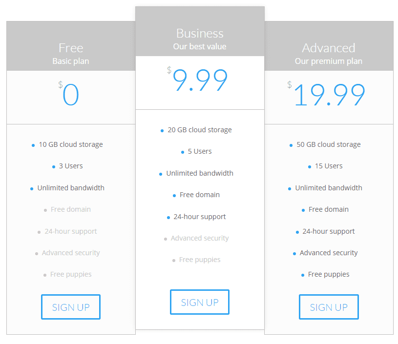
Let’s update this table with a few more detailed descriptions to exemplify our point:
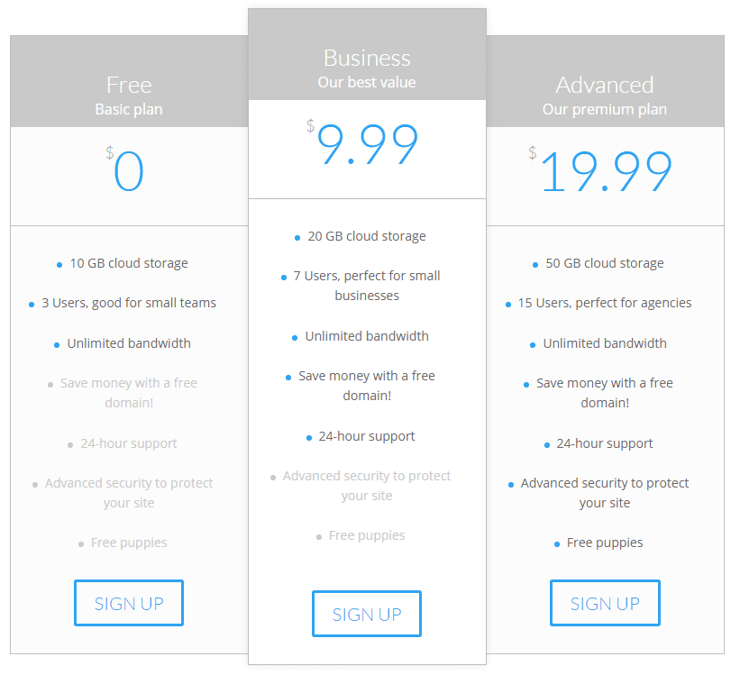
Whereas our first example communicated the features of each tier adequately, here we’ve expanded on a few of them — mainly those which we feel that customers looking for a hosting service would crave. There are, of course, a couple of points that are pretty self-explanatory, such as storage and unlimited bandwidth, but aside from those, there were several areas which had the potential to be improved.
Customers might not know exactly how many users accounts they’d need, so we provide them with a little context to help their decision-making process. As for a free domain, it may not be a huge get, but why not remind potential clients that they’re saving money by choosing a paid tier? The same goes for site protection, which could be considered a premium service.
If you understand what customers are looking for in your field of work, it should be pretty easy to identify the features which can be used as hooks to reel them in.
2. Assign Meaningful Names to Your Plans
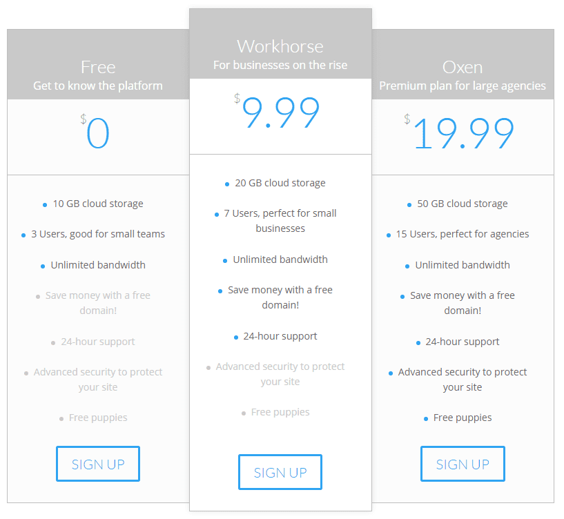
The names we’ve been using for our pricing tables in this post so far have been quite bland. Not only do they lack in originality but they don’t provide any meaningful “identity markers” for potential customers to latch onto. We’ve updated the table below so that the plans we’d like people to gravitate toward have descriptions they will (hopefully) want to be associated with.
3. Highlight Your ‘Best’ Deal
When it comes to pricing tables, chances are there’s a sweet spot somewhere among your tiers which are, ideally, where you’d want your customers to start off, rather than settling for the cheapest (or free) plans. To make this happen, you need to make sure that this tier offers your customers a great deal, and that they’re able to quickly identify it.
In our case, that sweet spot would be the Workhorse tier, so how do we go about making sure that customers understand they’re getting a good deal? First, we’ll use a technique called anchoring. Anchoring revolves around the fact that people tend to treat the first piece of information they get on any subject as an anchor for the rest of their thought process.
If we were to switch around the order of our pricing table, we’d be left with the most expensive plan at the beginning. The Oxen plan would then serve as our customer’s anchoring point, and the Workhorse tier arrives as a welcome surprise.
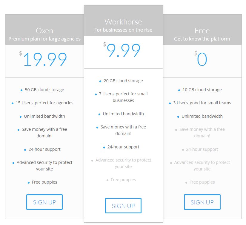
Things are already looking good, but we can do better. To help customers quickly identify your ‘best’ deal, we should take advantage of Divi’s customization capabilities to help it stand out.
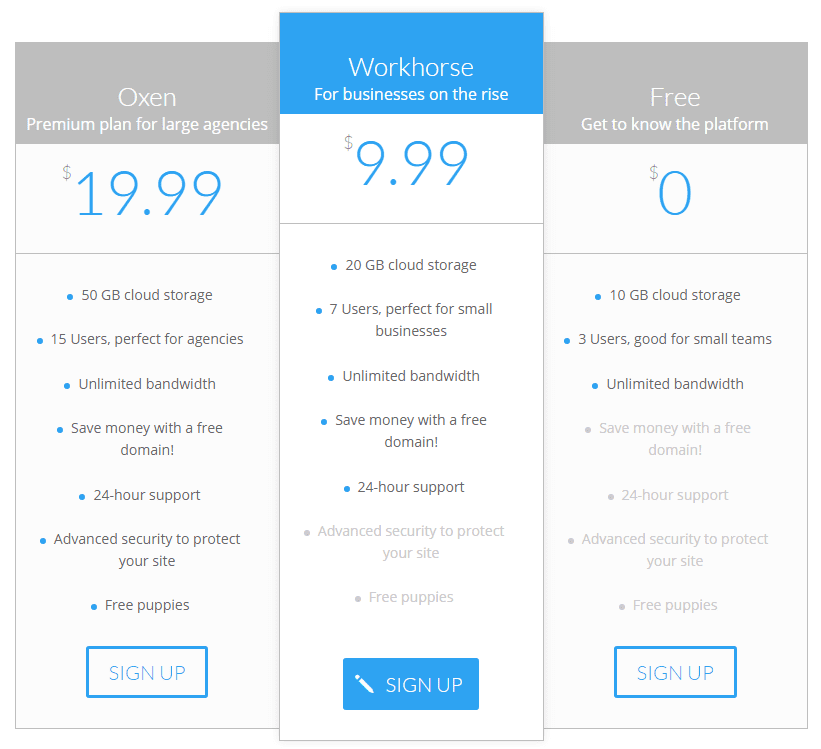
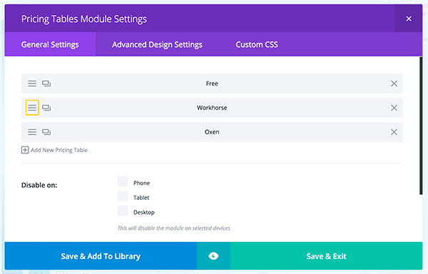
A simple color change to both the table header background and its call to action are enough to make it clearly stand out among the other choices. To achieve this, all we had to do was go into the Pricing Table Module Settings window, select the table we’d like to highlight…
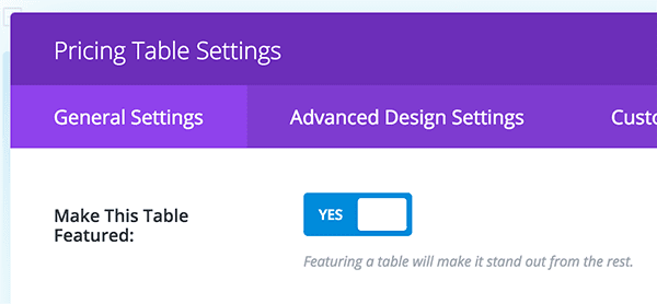
…inside that specific table, we want to go into its Advanced Design Settings. Inside, there is an option to “feature” that table. When enable this will highlight that pricing options so that it stands out from the rest.
4. Include Testimonials
This tip isn’t related to the Pricing Tables module per se, but it works quite well when paired alongside it. We’re talking, of course, about the Testimonials module. One of the biggest hurdles to overcome when dealing with new customers is convincing them that your services are indeed worth their time, and sometimes even the fanciest of pricing tables can’t accomplish that alone.
Testimonials work well for this purpose because they serve to establish trust and overcome doubts. Let’s check out how one would look paired with our fancy pricing table.
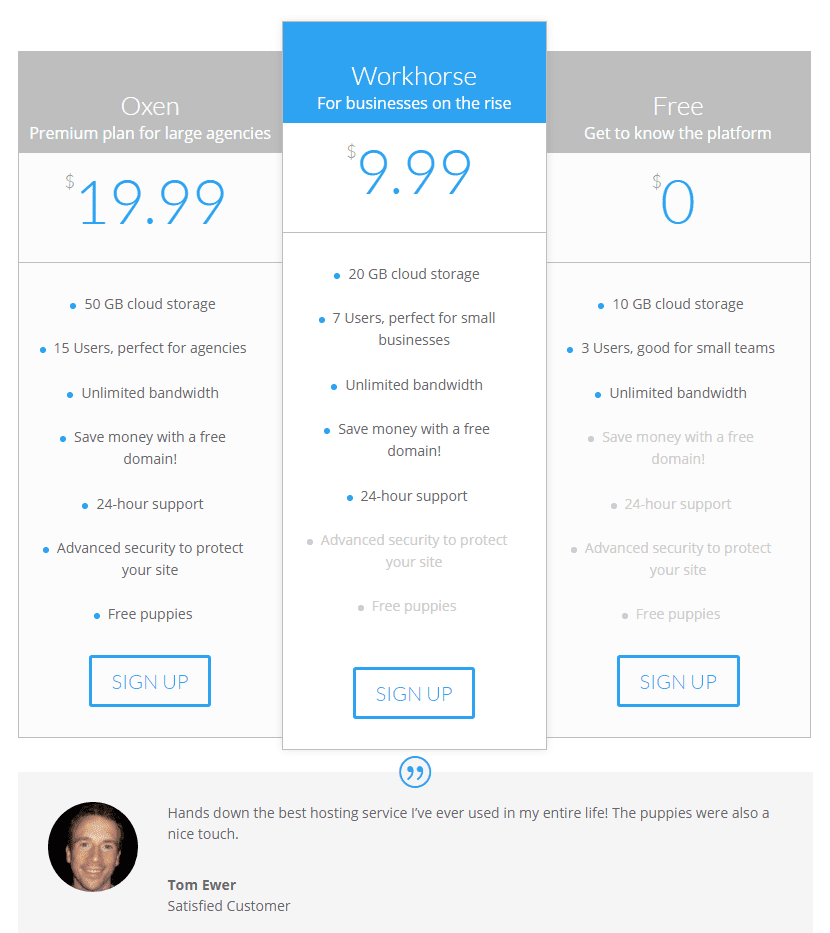
It goes without saying that in real life, you might want to avoid testimonials that sound too perfect. Listen to what your customers have to say about your services —the good and the bad – and ask them if they wouldn’t mind having their words featured on your site.
5. Keep It Simple
Our final piece of advice may seem rather generic, but it’s altogether too important when it comes to pricing tables. Considering the compact format we’re dealing with, every design choice you make and every word you use counts.
The design of your table shouldn’t distract customers from the information contained within, and said information should present itself in a concise manner. If you feel that there’s any particular feature that would require additional explanation, feel free to drop an asterisk in there and come back around to it below your table.
Even better, you could use the Divi Accordion module as sort of a FAQ to expand on your tier’s features:

Conclusion
Good price points alone aren’t enough to propel a business forward. You need to back them up with excellent work and great customer service to keep customers rolling in and returning for more. While Divi can’t help you as far as work ethic is concerned, it can provide you with all the tools you need to build gorgeous pricing tables that are capable of converting.
Before we wrap things up, let’s do a quick recap of the best practices we covered today for using the Divi Pricing Tables module:
- Focus on the benefits to the customer.
- Assign meaningful names to your plans.
- Highlight your ‘best’ deal.
- Include testimonials if possible.
- Keep your tables simple.
If you could share one single pricing tip with your fellow readers, what would it be? Subscribe and let us know in the comments section below!
Article thumbnail image by 3Art / shutterstock.com

Divi 100 Day 20
The Countdown To Divi 3.0
This post is part of our Divi 100 marathon. Follow along as we post free Divi resources for 100 days in a row! This 100-day countdown will end with the game-changing release of Divi 3.0, including our brand new visual editor built from the ground up using React. Divi 3.0 will change the way you build websites with the Divi Builder forever!
Let the countdown begin.




All great and soild advice.
Thanks, Derek. 🙂
This blog is great for showing pricing for services. I’m in an artisan’s coop planning a Divi site, and want to sell some of our work online. We are grappling with how to charge for shipping. Some goods will work in USPS flat rate boxes, but others will not. Where do we go for advice on this?
Have you looked at woocommerce – I think you will find that it had everything you need and seamlessly works with Divi.
Thanks. We’re looking into it.
I think Google will be your friend on this one, Nancy! I’m sure you won’t be the only one needing this kind of information. 🙂
I like the pricing tables. The bullet point body copy look great on my PC (even at the bottom) but the spacing is irregular on other sites. Is there a way to have a fixed height for the copy box so the bottom lines are all even?
Not that I’m aware of Janet. There’s always our forums – https://www.elegantthemes.com/forum/. Other users may have wanted to do the same thing, and you may find the solution there.
looking good.. thank you for the article
No problem, Christopher. 🙂
Goes to show some great tips here, always learning…
Thanks, Spencer!
Great tips! I’m loving these 100 days countdown posts and freebies. I will miss them… but I suppose I’ll be too busy loving Divi 3.0 instead.
Thanks for the kind words, Chuck! Once Divi 3.0 is here you’ll have your hands full, that’s for sure. 🙂
Thanks you This Lesson is very Nice! Good!
Awesome tips. Thank you so much for the article =)
No problem!
I need 5 columns! 🙁
You need fewer plans…
Florian, you could always try asking in our forums to see if anyone has done this previously – https://www.elegantthemes.com/forum/.
Great, solid advice and very timely as I’m just about to overhall the pricing tables on my site.
Glad we could be of service, Lee. 🙂
Great tips. Pricing is most important which may create huge difference in conversion if they are not presented wisely to the prospective customers. I like your advise on highlighting the best deal. Would like try it for my projects.
Thanks, Stephen. Your kind words are much appreciated. 🙂
Thanks yet again for the tips. You guys are awesome!!!
Thanks, George. 🙂
Tom,
I was pleased to read your article which was well composed and informative with lots of good advice. Thanks for sharing.
While I do like the Pricing Table Module, I dislike the limitation it has on the number of Prices you can list.
3 looks great.
4 – not so much… the 4th column has the same styling as the 1st and 3rd columns.
5 – kind of works on a balance, but is starting to look crowded.
6 – forget it.
I’ve been working on a website for a Motel and really wanted to use the Pricing Table Module for an overview on their 6 different room types, but it just doesn’t work well. Had to switch to using Tabs or Accordion.
What it really needs is the option to “carousel” the tables. Where your focus column is at front, level 2 columns appear to be set back and faded, level 3 (and so on) appear even more set back and maybe even partially obscured (as if to appear behind) by the level 2 tables. Then, you can click on any of the tables to make it the focus and ‘spin the carousel’.
Maybe this is a whole different module…?
That might be something a little coding could solve, or maybe you could make a suggestion on our forums (https://www.elegantthemes.com/forum/)?
Thanks for your insight into the different designs too – it’s important to know what you don’t like, as well as what you do. That way you can create something even better. 🙂
Great lesson. do you have video tutorial as well? Although your blog is amazing but sometimes, I feel lazy reading. 🙂 and is it easy to edit or do you always need an expert to work on it?
Hello Jessica,
Some tutorials have video, but the best course of action is to follow along with our articles and try the examples – you can do it!
You definitely don’t need an expert to create a great looking website with Divi – as some of our other commenters can testify to. We have a wide-range of Divi users in here. 🙂