

The web design trends that emerge every year help expand design possibilities for designers and DIY users everywhere. More and more, asymmetrically positioned elements, bright colors, and font families traditionally used in print are being appreciated. In this post, we’re going to provide you with a tutorial that uses these elements. The design that we’ll recreate can be used for any website but works especially well for eCommerce websites. While keeping your product images in the spotlight, we’re going to recreate a design that fits 2018 perfectly.
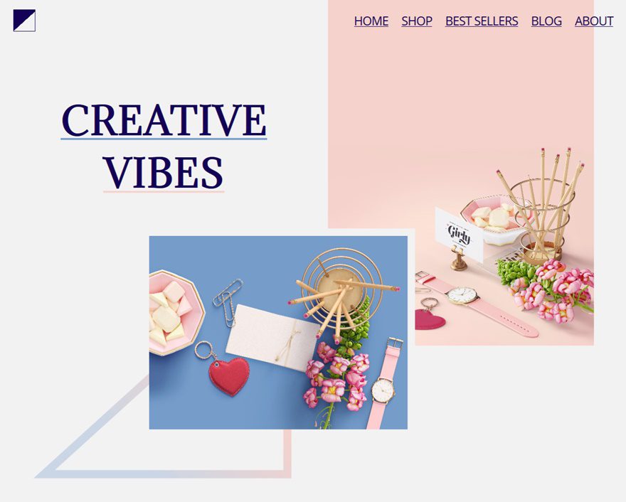
Result
On Desktop
On desktop, we’re going to recreate the following stunning result using Divi:
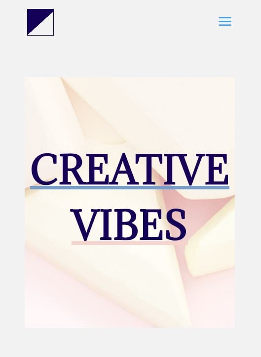
On Tablet
We will need an alternative for tablet and phone which is more simple and effective at the same time. Therefore, we’re recreating the following design:

On Phone
We’re using the same design for phone as we did for tablet:
What You Need
- One product image with 1600 height and 1187 width
- Another product image with 1600 width and 1200 height
- You can download the exact product image (and modify it with Photoshop) by going to the following link
- The triangle image which you can save below:

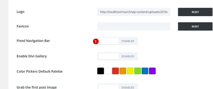
The first thing you can do, depending on your preference, is disabling the Fixed Navigation Bar option to keep the primary menu at the top of your page at all times. To do that, go to your WordPress Dashboard > Divi > Theme Options > General > Disable Fixed Navigation Bar.
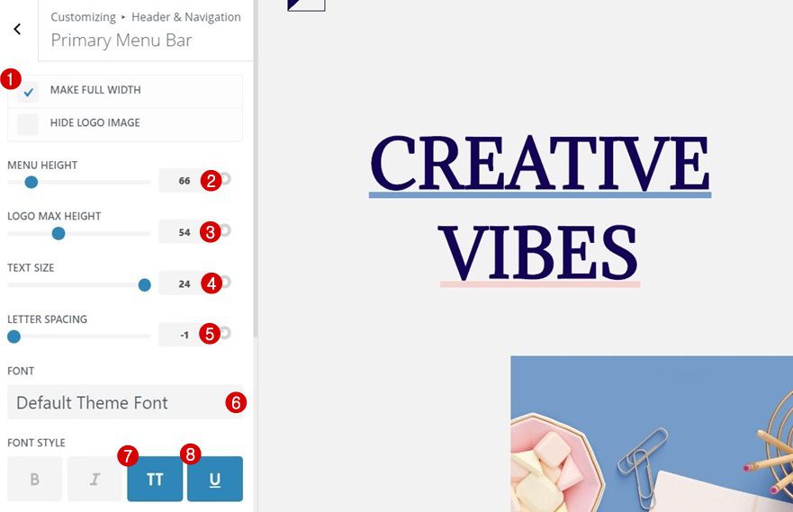
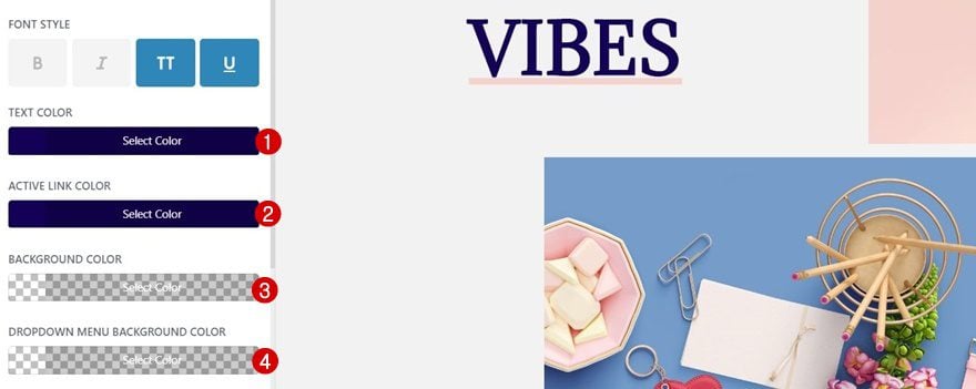
Then, you’ll need to make some changes to the Primary Menu Bar by going to your WordPress Dashboard > Appearance & Customize. Once you’re there, navigate to your Primary Menu bar and apply the following settings to your primary menu to achieve the exact same result:
- Make Full Width: Yes
- Menu Height: 66
- Logo Max Height: 54
- Text Size: 24
- Letter Spacing: -1
- Font: Default Theme Font
- Font Style: Uppercase & Underline
- Text Color: #140056
- Active Link Color: #140056
- Background Color: rgba(255,255,255,0)
- Dropdown Menu Background Color: rgba(255,255,255,0)
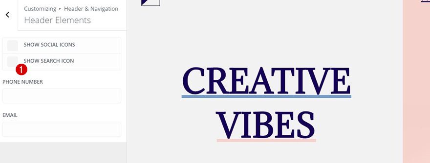
Disable Search Icon
Another thing you can do is disable the search icon by going to Header & Navigation > Header Elements > Disabling the ‘Show Search Icon’ option. But again, this depends on what your preferences are. There’s no harm in leaving the search icon to show.
Recreate Desktop Version
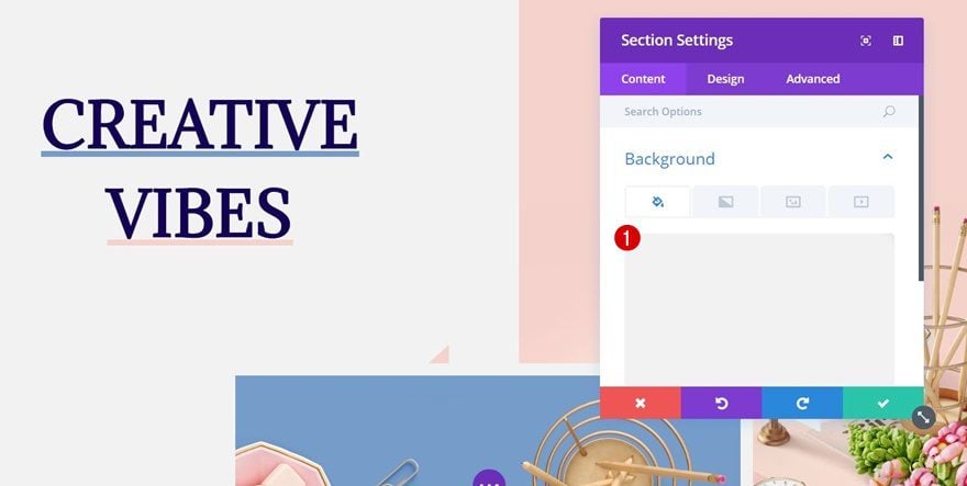
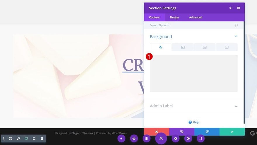
Create New Section
Background Color
Now that we’ve modified the primary menu, we can get started with the desktop layout that we’re going to recreate. Open a new or existing page, add a new section and choose ‘#f2f2f2’ as its background color.
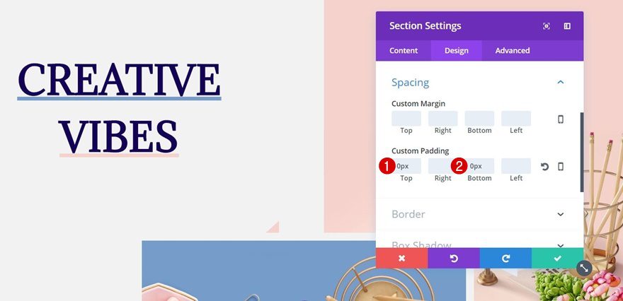
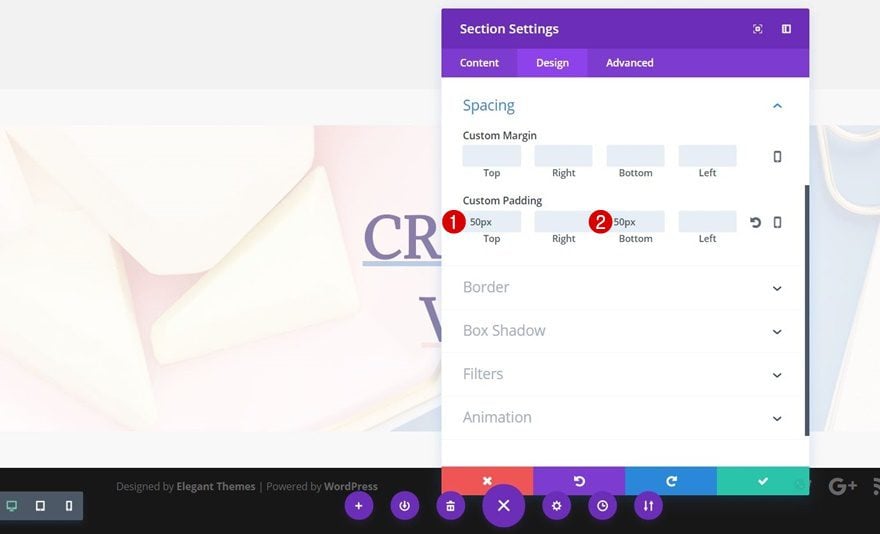
Spacing
Move on to the Design tab of that same section and make sure the top and bottom padding are set to ‘0px’. That way, there won’t be any distance between the section and the row you’ll add afterwards.
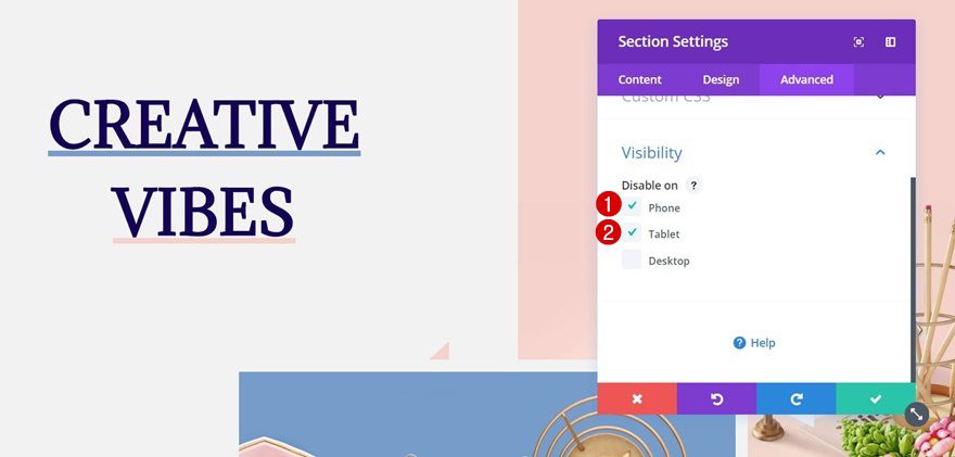
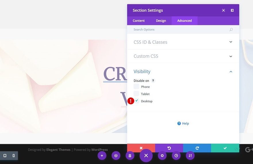
Visibility
Lastly, open the Visibility subcategory within the Advanced tab and disable this section on phone and tablet. As you could notice at the beginning of this post, we’re recreating a simpler hero section for these screen sizes to maintain a responsive design across all screen sizes.
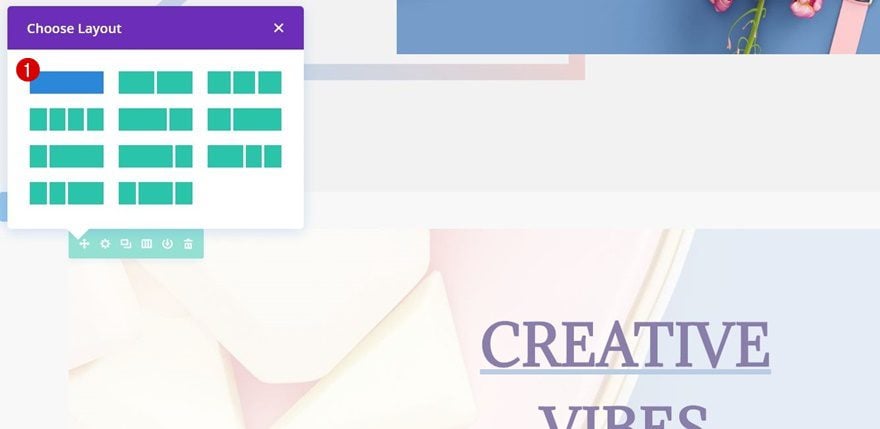
Add New Row
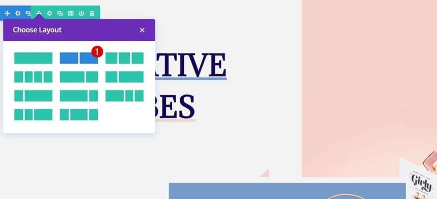
Column Structure
Now that we’re done with the section settings, we can go ahead and add a new row to it with the following column structure:
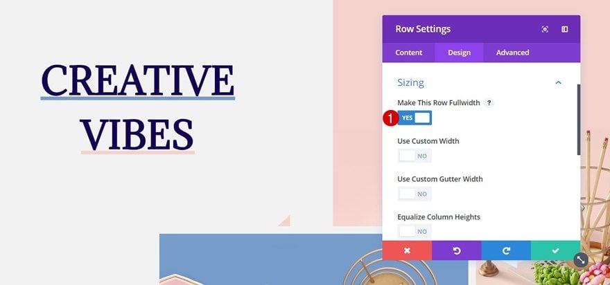
Sizing
Without adding any modules yet, open the row settings, go to the Sizing subcategory of the Design tab and enable the ‘Make This Row Fullwidth’ option. This will allow us to take up the majority of the screen for all of the modules we’ll be adding.
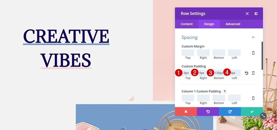
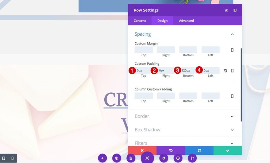
Spacing
Then, open the Spacing subcategory and apply the following custom padding to your row:
- Top: 0px
- Right: 0px
- Bottom: 135px
- Left: 0px
Add First Text Module to First Column
Text Settings
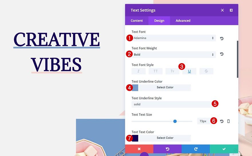
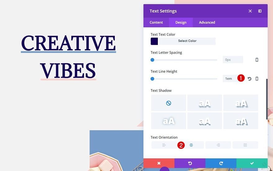
The row settings are all done! We can now add the different modules we need to create the stunning result. The first thing you’ll need to do is add a Text Module to the first column of the row. The ‘Creative Vibes’ copy you can read is split into two Text Modules. This allows us to use different underline colors for each Text Module. Once you add the first copy to your Text Module, move on to the Design tab and apply the following settings to the Text subcategory:
- Text Font: Adamina
- Text Font Weight: Bold
- Text Font Style: Underline
- Text Underline Color: #769cc9
- Text Underline Style: Solid
- Text Size: 73px
- Text Color: #140056
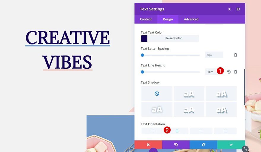
- Text Line Height: 1em
- Text Orientation: Center
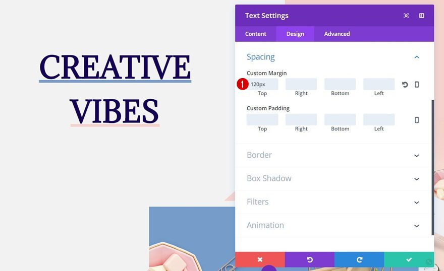
Spacing
Then open the Spacing subcategory and add ‘120px’ to the top margin. This will create enough space between your primary menu bar and this Text Module.
Add Second Text Module to First Column
Text Settings
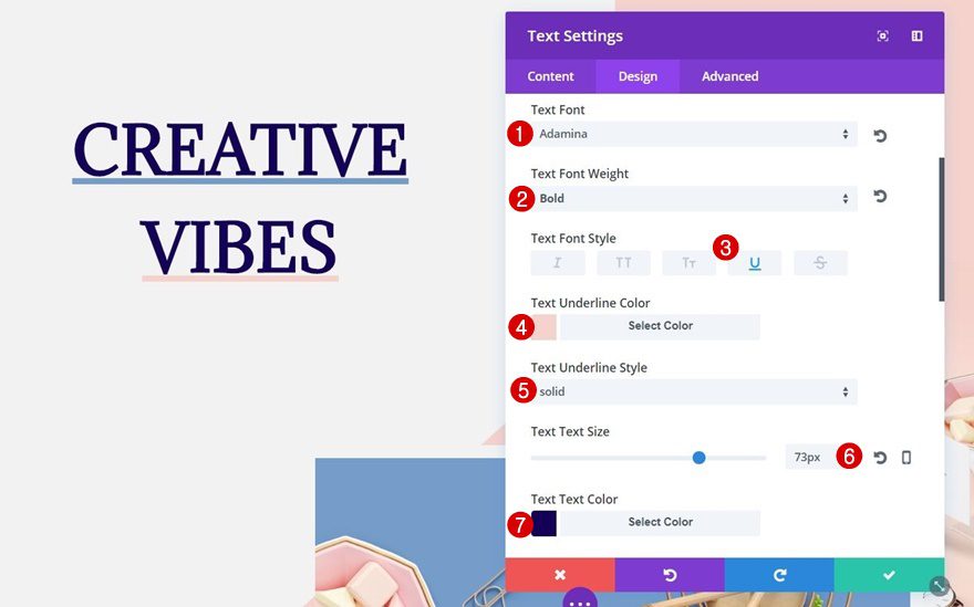
You can simply clone the previous Text Module, remove the top margin and change the Text Underline color into ‘#f5d2cc’, or you can build the same Text Module from scratch again using the following text settings:
- Text Font: Adamina
- Text Font Weight: Bold
- Text Font Style: Underline
- Text Underline Color: ##f5d2cc
- Text Underline Style: Solid
- Text Size: 73px
- Text Color: #140056
- Text Line Height: 1em
- Text Orientation: Center
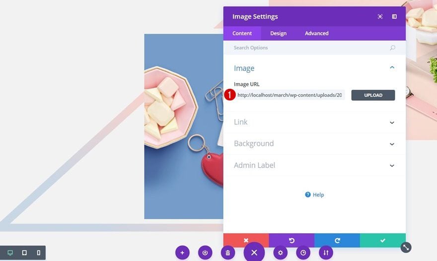
Add Image Module to First Column
Save The Transparent Image
To make this tutorial a bit easier, we’ve provided you with the transparent triangle image that is placed in the first column as well. Save the following image on your computer and go from there:
Upload Image
Once you’ve saved the image, add an Image Module to your first column (this is the last module within this row) and upload the triangle image file you’ve saved.
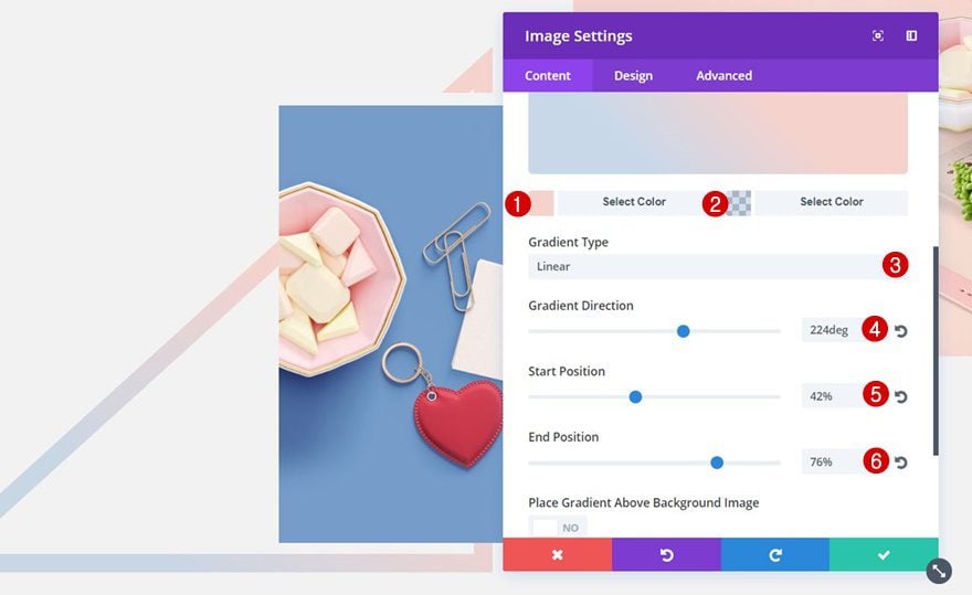
Gradient Background
You can give this triangle whatever kind of gradient background or background color you want. But to match it with the color palette we’re using, we’re applying the following settings:
- First Color: #f5d2cc
- Second Color: rgba(118,156,201,0.32)
- Gradient Type: Linear
- Gradient Direction: 224deg
- Start Position: 42%
- End Position: 76%
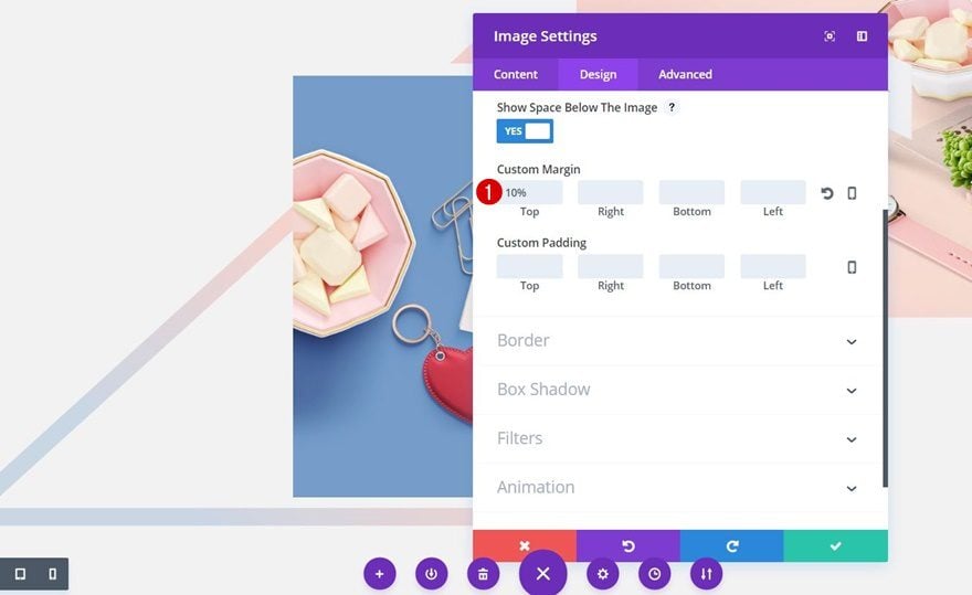
Spacing
Move on to the Design tab, open the Spacing subcategory and add ’10px’ to the top margin. This will create enough distance for the triangle to show up beneath the product image we’ll add in the upcoming steps. The reason why we’re using percentage instead of pixels is to make it match with different screen sizes. The percentage option takes that into consideration and makes sure the distance is calculated correctly.
Add First Image Module to Second Column
Image Dimensions
Now that we’ve finished adding modules to the first column and modifying them according to our design, we can move on to the second column. For this column, the first thing we’ll need is one of the product images with the following dimensions:
- Width: 1600px
- Height: 1187px
The product images that we’ve used for this example are a free resource which you can find here. Each one of the images has a Photoshop file which you can modify to your own needs, changing the products is one of those things you can do.
Upload Image
Once you have your product image in place, go ahead, add a new Image Module and upload your Product Image.
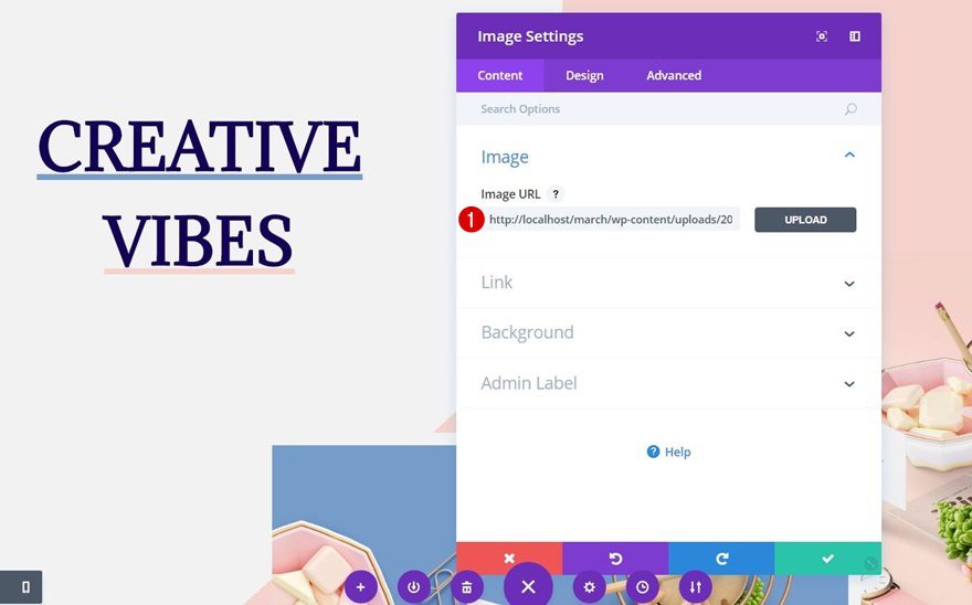
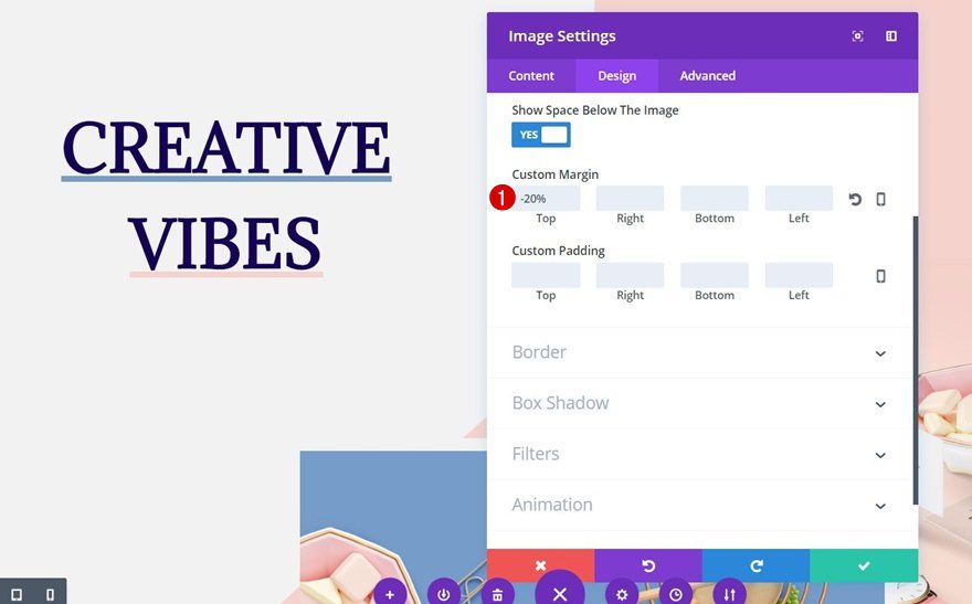
Spacing
Then, move on to the Design tab, open the Spacing subcategory and add ‘-20%’ to the top margin. As you can recall, we’ve used a transparent background color for our Primary Menu Bar in the first part of this tutorial. By doing so, we allow this Image Module to appear right beneath the primary menu bar without being covered by a primary menu background color.
Add Second Image Module to Second Column
Image Dimensions
Right below the image we’ve added in the previous step of this tutorial, we’re going to add another product image. This time, we’re using the following dimensions for the image:
- Width: 1600px
- Height: 1200px
Upload Image
Go ahead, add an Image Module and upload the product image you’ve chosen.
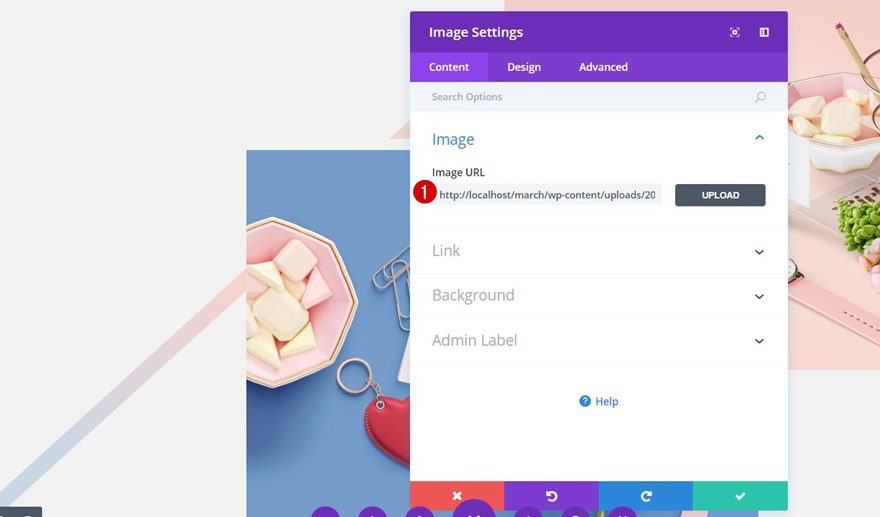
Spacing
Then, move on to the Design tab and open the Spacing subcategory. We’re going to make this module overlap both the previous image and the first column to create a more complex design. To achieve that, use the following custom margin:
- Top: -50%
- Right: 350px
- Left: -350px
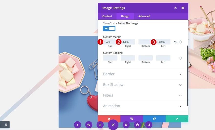
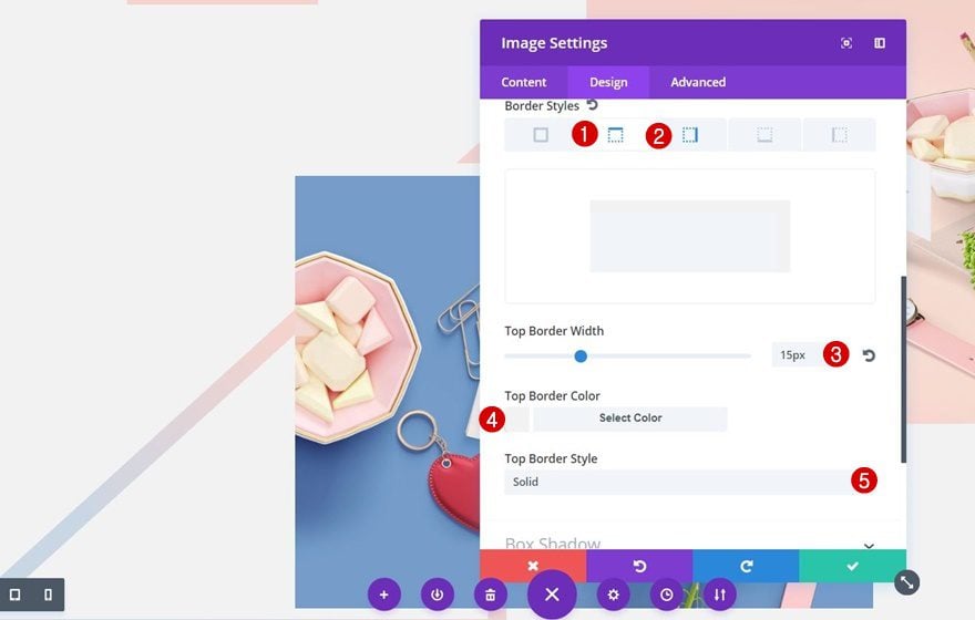
Border Styles
We’re also using top and right Border Styles with the same color as the section background:
- Border Width: 15px
- Border Color: #f2f2f2
- Border Style: Solid
Recreate Tablet & Phone Version
Create New Section
Background Color
The tablet & phone version were creating for this example is much more straightforward and appropriate for tablet and phone screen sizes. Although the desktop version might be more appealing, it’s just not functional on a tablet or phone screen. Add a new section right below the previous one and add ‘#f2f2f2’ as its background color.
Spacing
Then, open the Spacing subcategory of this section and add ’50px’ to the top and bottom padding to create the needed space between the section and the row that is about to follow.
Visibility
Lastly, disable this new section on desktop, as we already have a desktop version for this hero section.
Add New Row
Column Structure
Continue by adding a new row with one column:
Background Color
Open the row settings and add the following color to the row’s background: ‘rgba(237,237,237,0.73)’. We’re using this color on top of the background image so the text becomes more readable.
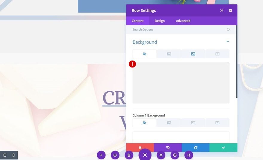
Background Image
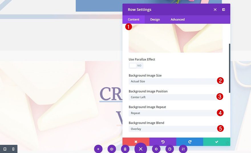
Switch over to the background image tab and add one of your product images as the background along with the following options:
- Background Image Size: Actual Size
- Background Image Position: Center Left
- Background Image Repeat: No Repeat
- Background Image Blend: Overlay (this makes the overlay happen)
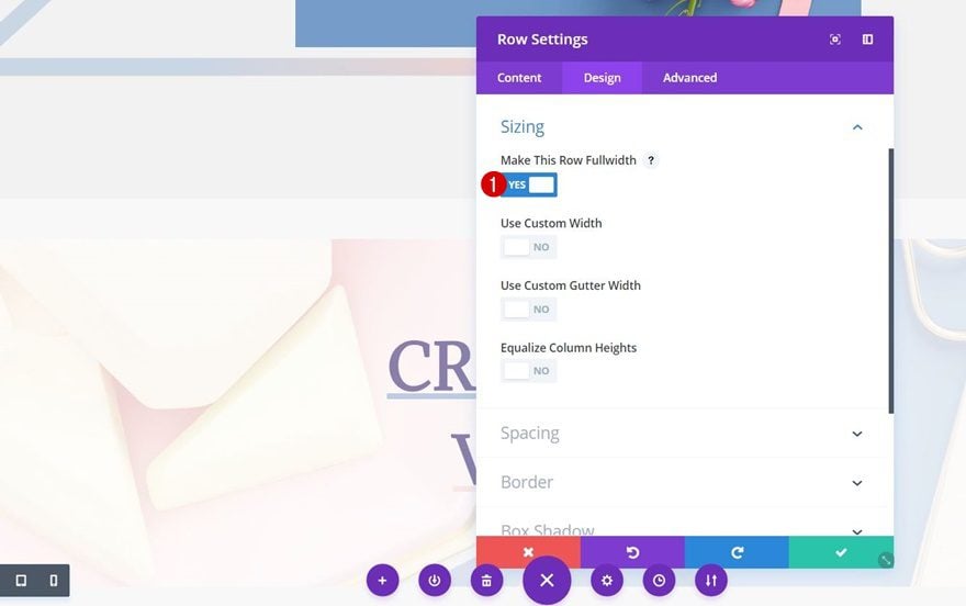
Sizing
Continue by opening the Sizing subcategory and enable the ‘Make This Row Fullwidth’ option.
Spacing
Lastly, make sure the following settings apply to the Spacing subcategory as well:
- Top: 0px
- Right: 0px
- Bottom: 120px
- Left: 0px
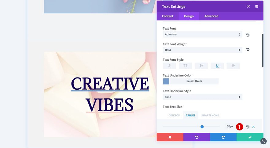
Clone First Text Module of Desktop Version
Text Settings
You can basically clone the two previous Text Modules you’ve created for the desktop version and add these to this new row (or create them from scratch). If you choose to clone and modify the Text Modules, the only thing you’ll need to change is Text Size for both tablet and phone:
- Tablet: 70px
- Phone: 60px
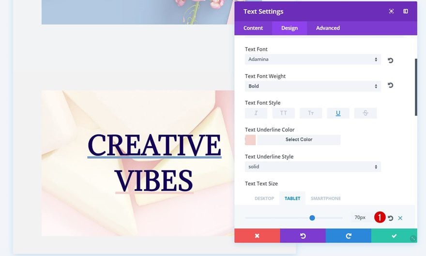
Clone Second Text Module of Desktop Version
Text Settings
Do the same thing for the Text Size of the second Text Module as well and you’re done:
- Tablet: 70px
- Phone: 60px
Result
Let’s take a final look at the result we’ve recreated on different screen sizes.
On Desktop
On Tablet
On Phone
Final Thoughts
Well, that’s all for this tutorial! This eCommerce hero section will save you time and stimulate your creativity to create your own designs using this technique. You can use this eCommerce hero section for any type of website, but it specifically matches an eCommerce website that focuses on showcasing product images in a creative and trendy way. If you have any questions or suggestions make sure you leave a comment in the comment section below!


Thanks you for the interesting design, I accomplished the look, but I thought that the complete design will show up on the screen without scrolling down. Have I done sg incorrectly or this is how the design supposed to look like . Please, let me know.
hi, I always wonder the size of this “visibility” approach. So when we hide the images via buider when visiting from mobile, would be hidden images still be downloaded? if yes this makes page size bigger. bad for site speed.
Hi Donjete,
Another great tutorial, every time I read one of your tutorials I learn heaps more about the potential of Divi!
I had a query from a potential client who wants something similar to this, but she wants the overlapping module to spread across three vertical rows, not just one. Have you ever tried to do anything like that, and what was the result?
Terry Chadban