The Sales Mart Divi child theme from PennyBlack Templates was designed for WooCommerce sites and blogs. It comes with lots of pages and special features designed for online sales. In this article, we’ll look at Sales Mart’s pages and features to help you decide if it’s the right Divi child theme for your website.
Installing Sales Mart Divi Child Theme

Installing the Sales Mart Divi child theme is simple. It does take a couple of steps. First, with Divi activated, upload and activate the child theme as you would any WordPress theme.

Once it’s activated, you’ll see a message with a link to install the required plugins. Install and activate them. This adds:
- WooCommerce Menu Bar Cart
- Yith WooCommerce Quick View
- Yith WooCommerce Wishlist
Some of the plugins did need some setup, but it’s easy to do.
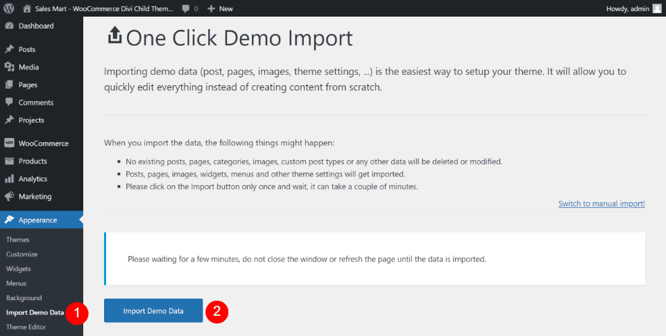
Once the plugins are activated, you can import the demo data. Wait for the demo to import and then your website will look like the demo complete with pages, menus, and products.
Everything matched the demo except the footer. Mine had the default widgets, which I deleted after the demo imported. I also had to select the correct menu, enable the wish list, and the shopping cart.
Sales Mart Divi Child Theme Header Features
The header is created with the Divi Builder. Several pages include breadcrumbs.
Sales Mart Header
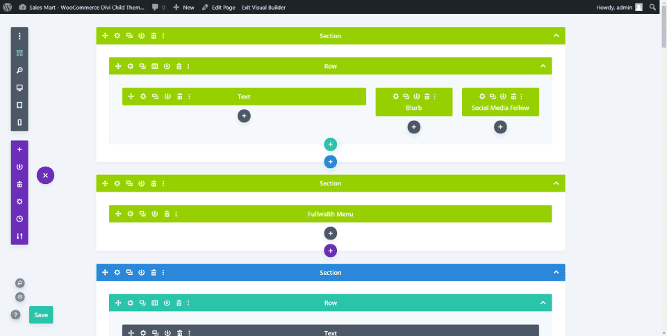
The global header includes two sections. The first displays text, a blurb, and social media follow modules. The second displays a full-width menu.

The global header also includes a shopping cart with the number of items and total price. This is added with the WooCommerce Menu Bar Cart plugin.

Most of the pages include a header with a background image, title, and breadcrumbs.
Sales Mart Divi Child Theme Pages
Sales Mart added 31 pages including 5 home pages, 3 blog pages, and 2 about pages, shop pages, team pages, testimonial pages, cart pages, and lots more. This is one of the few Divi child themes I’ve seen with a 500 internal server error page. It also includes a 404 page, coming soon page, and maintenance page. Let’s look at a few of them.
Sales Mart Home Pages
The five home pages have some things in common and something unique. I’ll show the details of the first one and then look at what’s different in the others.
Sales Mart Home Static
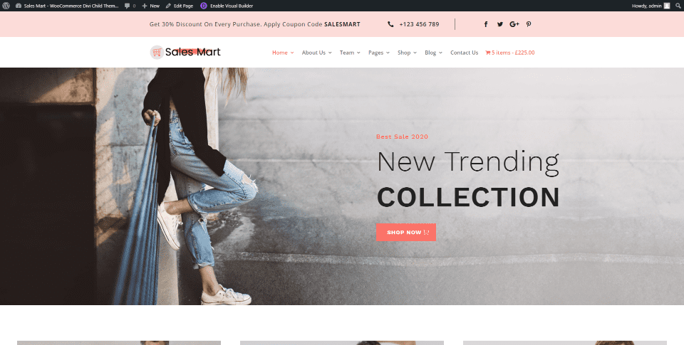
The main home page is set up by default. It includes a global header and a full-width background image with a CTA in the foreground. The CTA includes a button for the shop page.

CTAs to the various shop categories show images with a description and link to the shop.
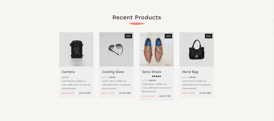
Recent products display in 4 columns over a tan background. The title includes an image that creates a styled underline. Styled cards display WooCommerce products. Yith Wishlist will add the wish list link under the Add to Cart link.

A countdown timer showcases a product on sale with two columns. Greate total replacement for a countdown timer plugin. An image includes a styled border.
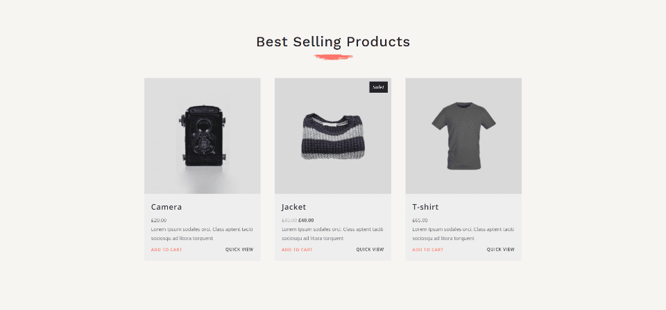
Best-selling products display in 3 columns. This section matches the recent products section.

A full-width CTA displays a background image and places a shop button on the left.

Sales CTAs show images in 2 columns and include information about the sale and links to the shop.

The testimonial slider displays a dark background image with a circled image of the person with their testimony in the foreground. They include arrow and dot navigation.

The section for news looks like blog cards. It’s built with images, blurbs, and text modules. Dates and categories display icons.

Client logos display in 5 columns.
Sales Mart Home Parallax
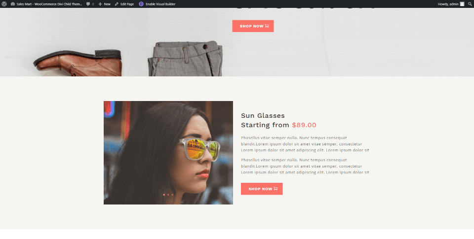
The hero section for the parallax home page displays a parallax background image. The next section shows a product image with a button for the shop page.

Images for product categories display in a multi-column layout. They include titles and links.

A full-width CTA shows information about a sale and includes a button to the shop.
Sales Mart Home Form
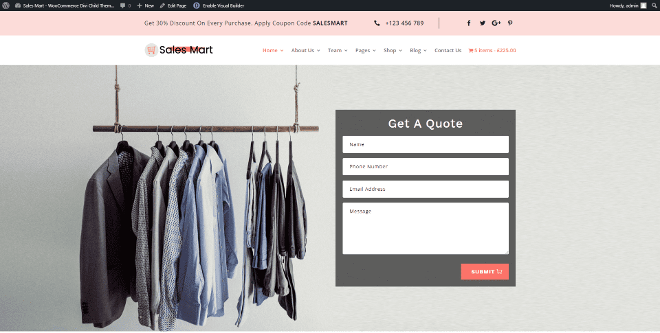
The form home page displays a quote form in the hero section. Everything else matches the static home page.
Sales Mart Home Slider
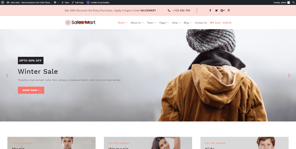
The slider home page displays a full-width slider in the hero section. It has arrows and dot navigation. Each slide has a category title and a link to the shop. It also includes the multi-column product layout from the parallax home page.
Sales Mart Home Video

The video home page displays a background video in the hero section. The foreground shows the title and button. It also includes the second section from the parallax home page.
Sales Mart Divi Child Theme Shop Pages and Features
Sales Mart includes all the expected WooCommerce pages such as the shop page, cart, checkout, and account. It also adds a wish list page. Each is styled to match the site. Several include shortcodes for Bloom.
Yith Quickview
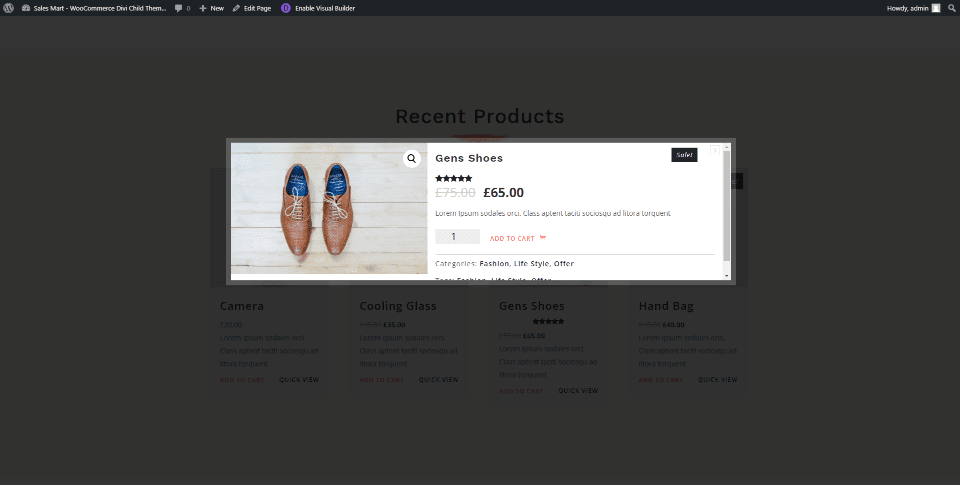
The Yith Quickview plugin adds a product lightbox feature. Clicking on a product quick view opens a lightbox with information and an add-to-cart link. Hovering over the image zooms in within the image container and scrolls around with your mouse. Clicking the image opens it in a lightbox. This is one of several plugins that you can use to add image zoom effects to WooCommerce.
Sales Mart Shop List
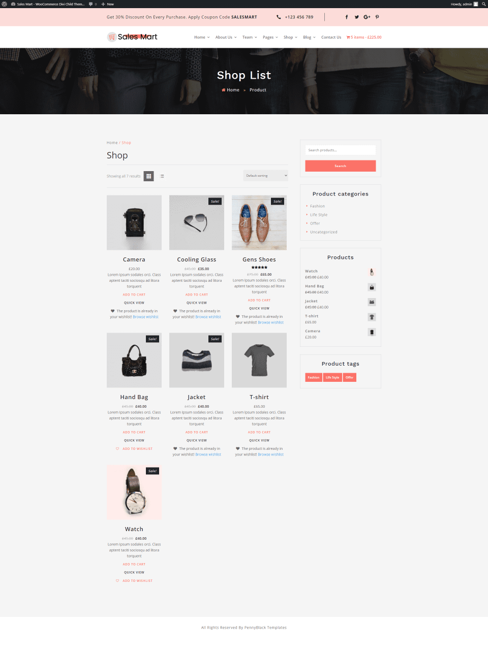
The Shop List is the shop page. It displays the header with breadcrumbs, WooCommerce products with styling, and the styled sidebar. I did need to choose the page and add the widgets.
Sales Mart Product Page
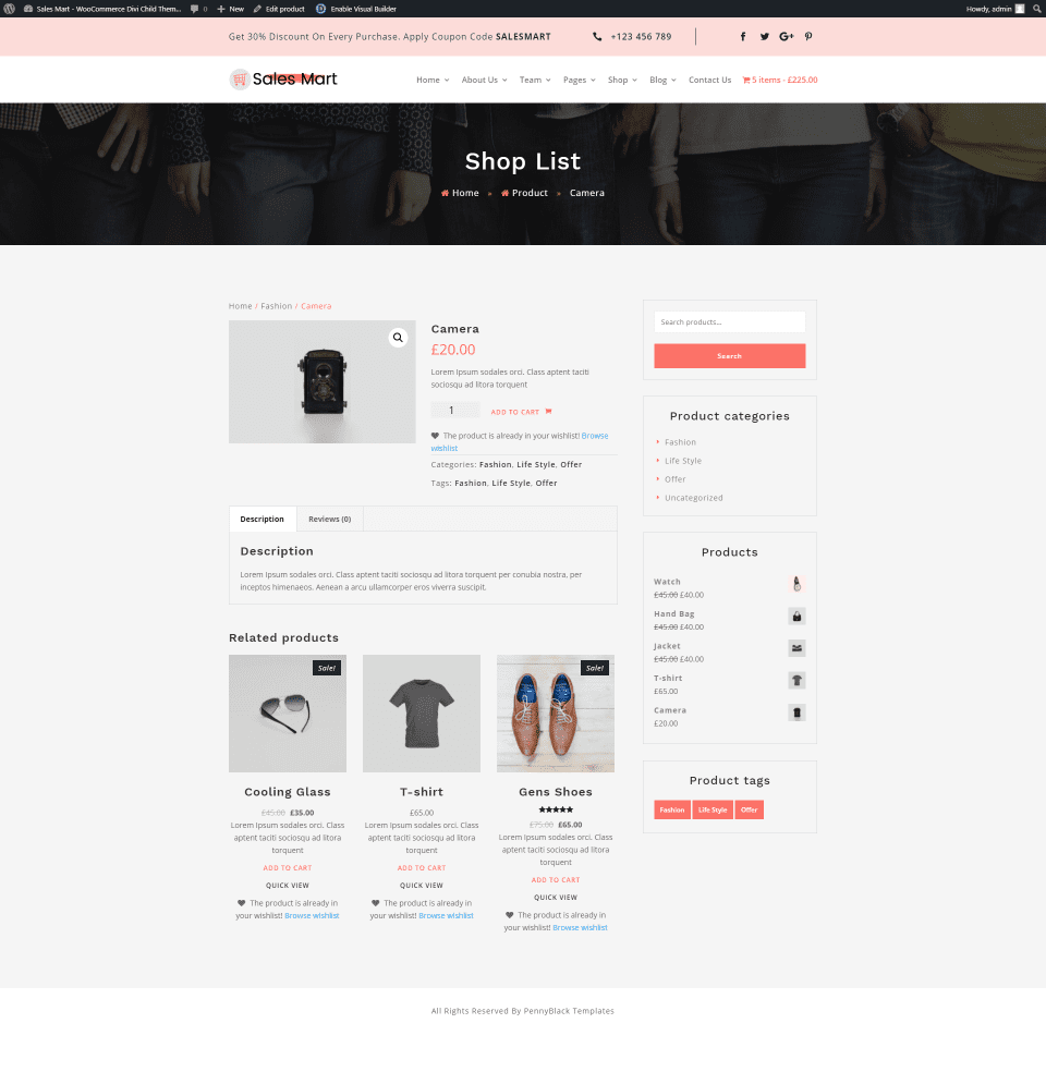
The product page matches the site and includes related products and the product sidebar. You’ll also see a link to add the product to your wish list or a note that it’s in your wish list.
Sales Mart Wish List
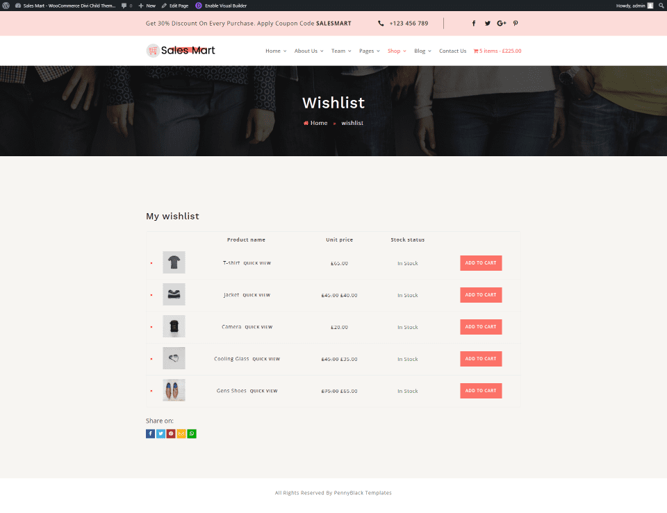
This shows your wish list as a table. The bullets and buttons are styled to match the site. This page also adds social buttons for sharing your wish list on social media.
Sales Mart About Us Pages

The first About Us page displays a small section with information on one side and an image on the other. A full-width section shows an image on one side and number counters on the other side. The team section shows four team members with images, their names, and titles. The page also includes client logos.
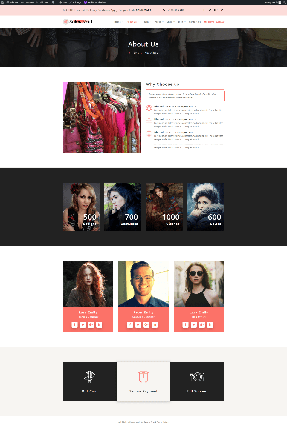
The second About Us page includes a section on why to choose us. It displays a slider on one side and blurbs with icons on the other side. Number counters are placed over four images. The team members have larger person modules with social buttons. The images slide down on hover. CTAs are created with text modules.
Sales Mart Team Pages

The first Team page displays styled person modules with hover animations. I’m hovering over the module on the right. Section two is a full-width section with number counters.
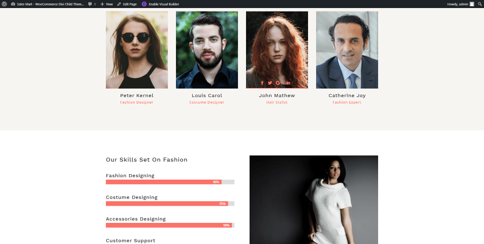
The second Team page adds a different style for the person modules. I’m hovering over one to show the social buttons. It also adds a section with bar counters for skills and an image.
Sales Mart Testimonial Pages

The first Testimonial page displays the testimonial slider and an image. The slider matches the home page, but it’s placed in a smaller column.
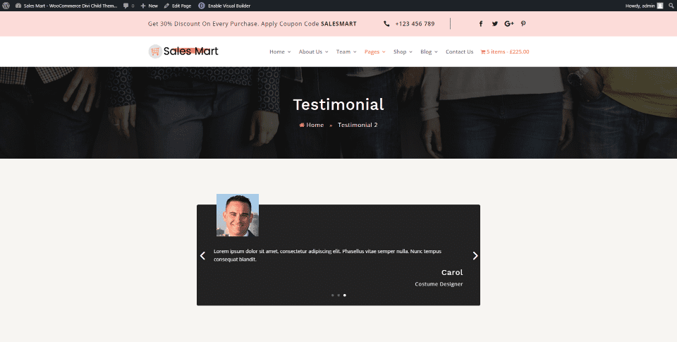
The second Testimonial page displays a different type of slider. It places the image at the top of the slide and overlaps the slider. This is done with a CSS class.
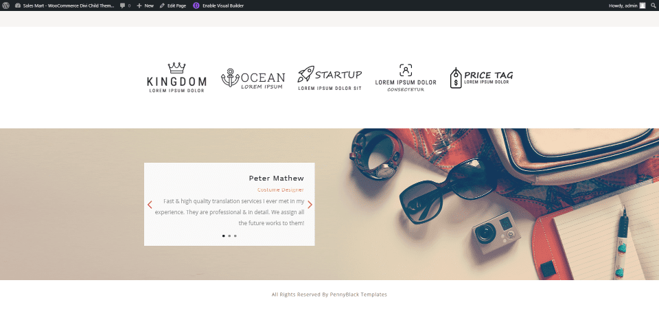
The bottom of the page displays another type of testimonial slider without an image. Both are created with a standard slider module.
Sales Mart FAQ Page
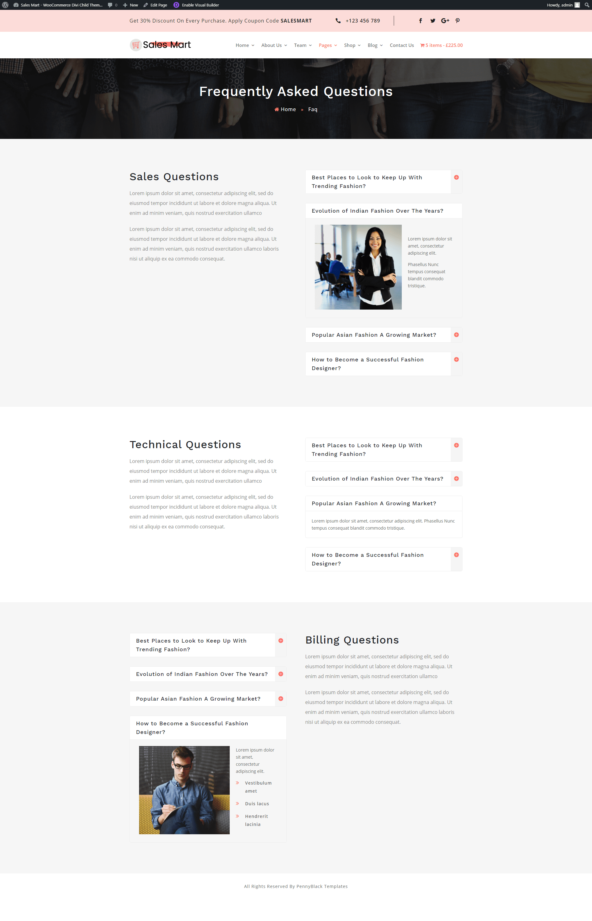
The FAQ page shows accordions on one side and text on the other. The display in alternating layouts and with light gray or white backgrounds.
Sales Mart Blog Pages
Three different blog layouts and a styled post page are included.
Sales Mart Blog List
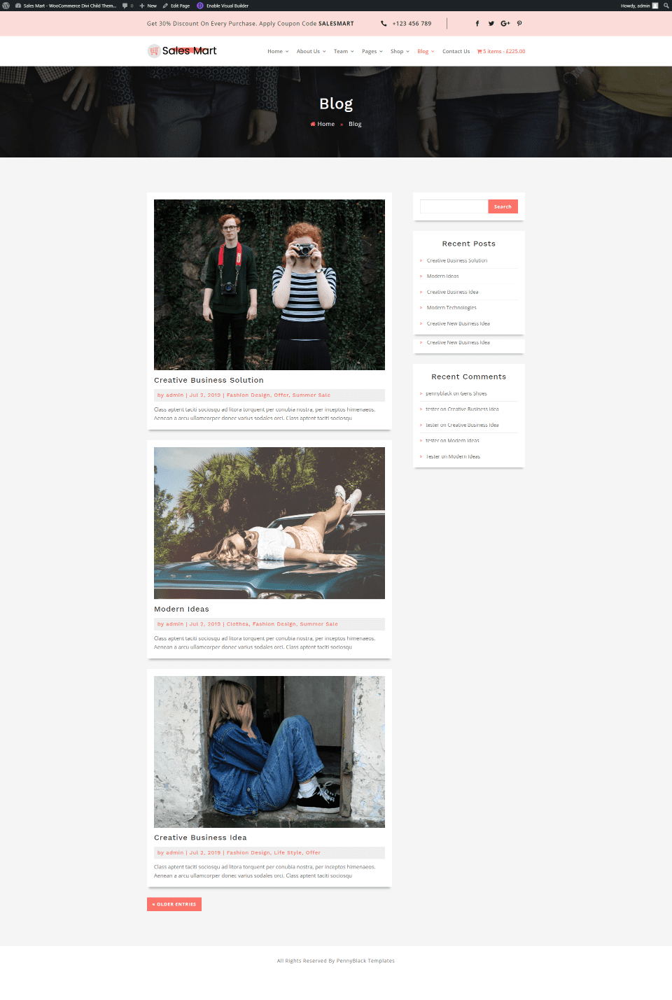
The Blog List page displays posts in a single column with a sidebar. The page also includes the header with breadcrumbs. Posts, the older entries button, and the sidebar are styled to match the site.
Sales Mart Blog Two Column Grid Page

The two-column grid page places posts in two columns and does not include the sidebar.
Sales Mart Blog Three Column Grid Page
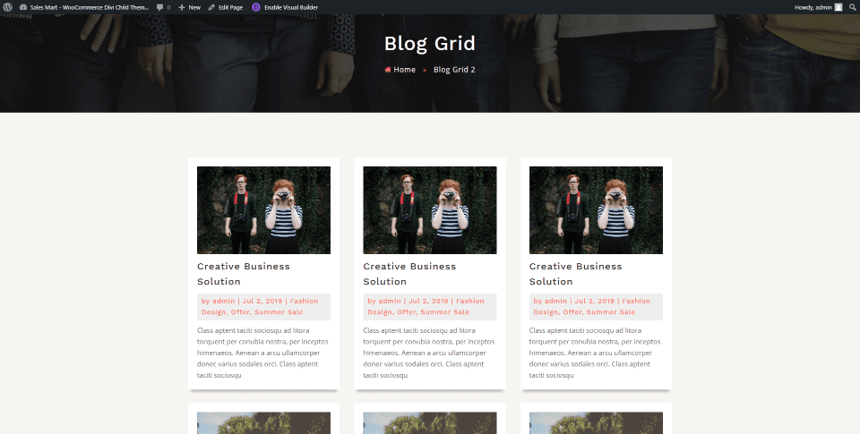
The three-column grid places posts in three columns without the sidebar.
Sales Mart Blog Posts
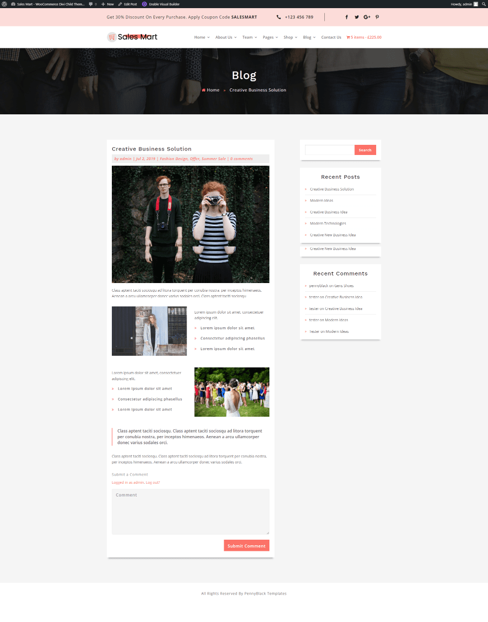
Blog posts include styling that matches the blog list pages and includes the sidebar.
Sales Mart Contact Us Page
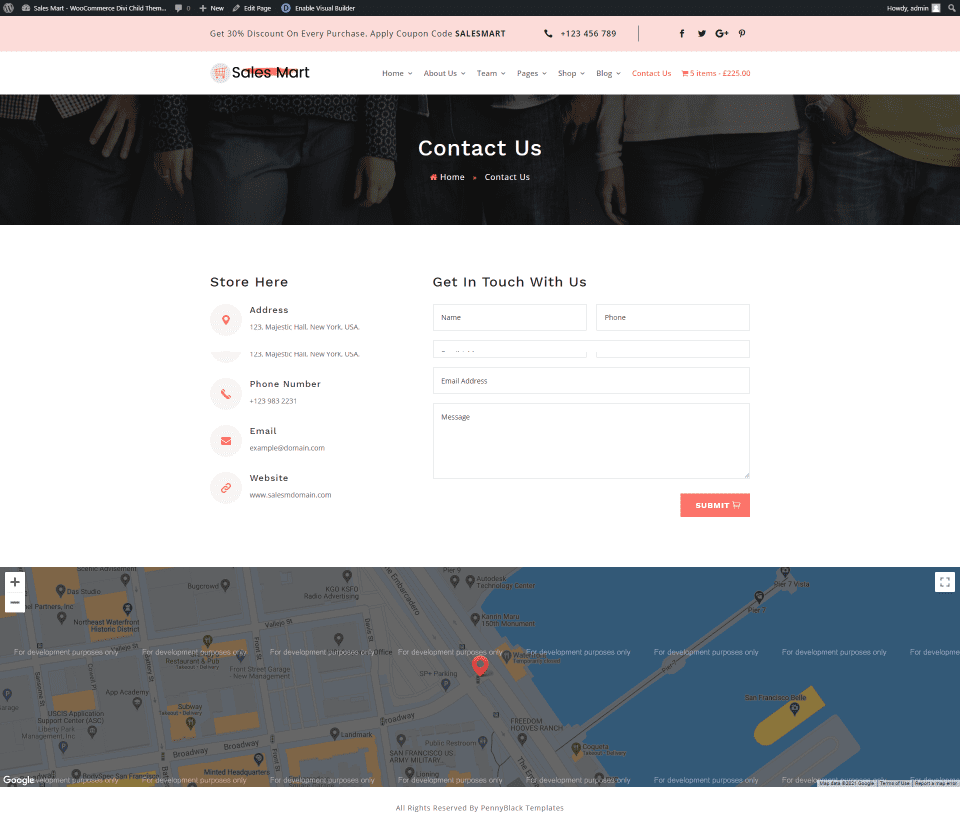
The Contact Us page displays the contact information next to a form. Across the bottom of the page, you’ll find a full-width map to show directions to the location.
Purchase Sales Mart Divi Child Theme
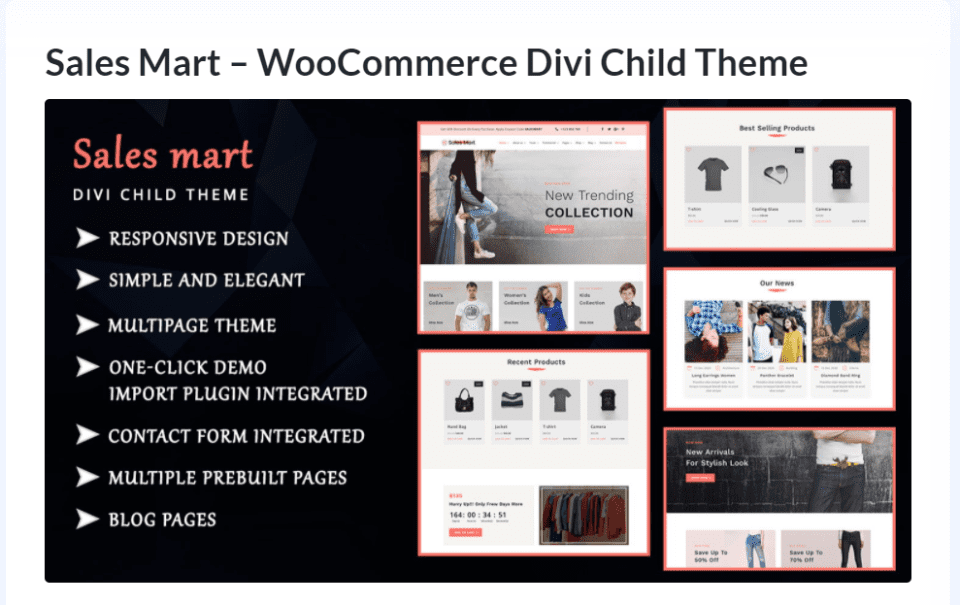
You can purchase the Sales Mart Divi child theme in the Divi Marketplace for $49. It includes unlimited website usage and one year of updates and support.
Ending Thoughts
That’s our look at the Sales Mart Divi child theme from PennyBlack Templates. The many pages and features in this child theme make it ideal for any kind of WooCommerce shop. It’s also a good choice for blogs that want to add online shopping. There are a few things to set up after installation, but they’re not difficult. The extra features work great and help the shop stand out. If you’re looking for a Divi child theme with a WooCommerce focus, this is a good choice.
We want to hear from you. Have you tried the Sales Mart Divi child theme? Let us know what you think about it in the comments.
Featured Image via Newgate666 / shutterstock.com


Leave A Reply