Caldera Forms is one of the most popular and highly-rated (FREE) form plugins in the WordPress repository. It’s drag and drop user interface makes it incredibly easy to build all kinds of forms. If you’re used to using the Divi builder then the Caldera builder should come pretty naturally to you.
How to Make a Caldera Form Look Like Divi
Subscribe To Our Youtube Channel
The Divi style has become one of the most recognizable styles amongst the most popular WordPress themes today. Divi is often chosen for it’s clean, minimal look so it’s no wonder users want to style third party plugins to look just like it.
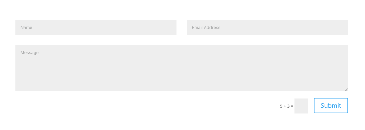
This is what the Divi contact form looks like before any styling or module settings are applied:
And this is the basic starter form that the Caldera plugin comes ready with:
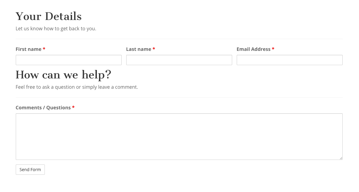
As you can see you’ll need to play with the column widths, remove some of Caldera’s header fields, and remove the labels from above the fields and replace them with placeholders if you want it to look as close to Divi as possible (or you can start your own from scratch). The first two changes you can do on your own, you may even want to keep the headers and text, but I’ll show you how to add placeholders in the fields and give you the CSS to make it look like Divi’s form.
Add Placeholders to the Fields
This is what Caldera’s basic starter form looks like in the backend. Take some time to get familiar with it, move things around and see what they do; learn by doing. If you need to you can always start fresh with a new starter form after.
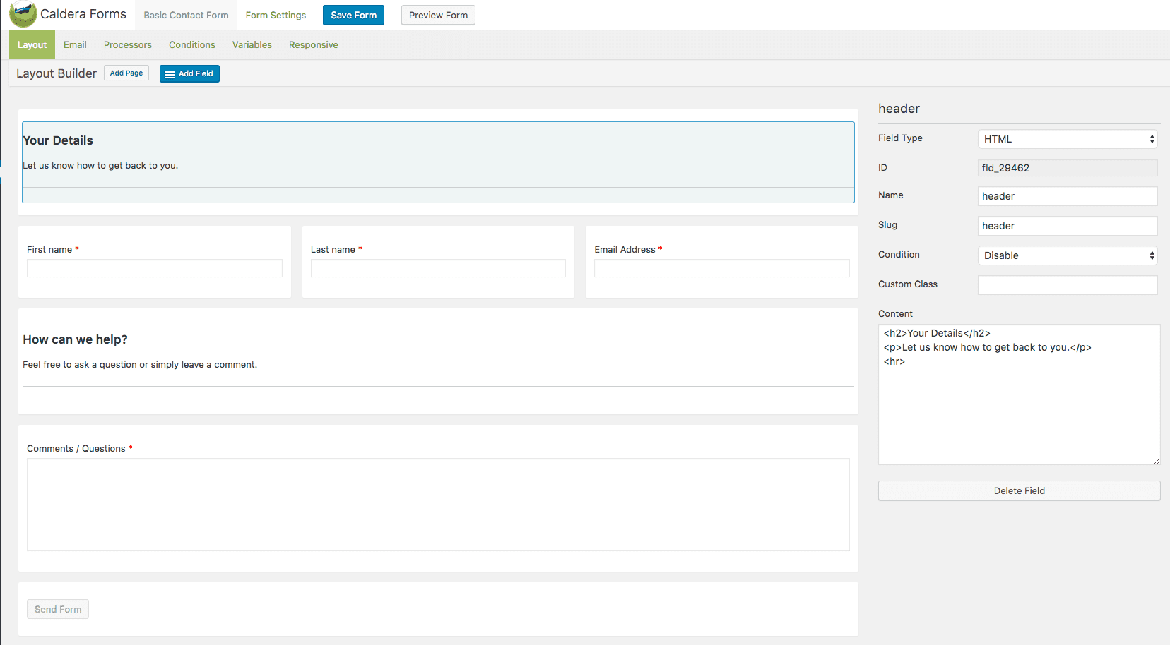
Wherever you have input text in your form is where you’ll want to use placeholders instead. I’ll use the email module as my example. You want to check the box that says “hide label” and fill the field titled “placeholder”.
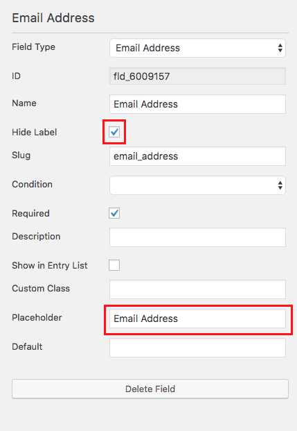
When you have your form as you want it, save it. Then, add it by using a Divi text module to your page (a nifty Caldera button will appear in your text editor).
The CSS code
Next you’ll need to add the following CSS to your Divi options custom CSS panel OR your child theme stylesheet:
/*** THIS CHANGES THE LOOK OF THE FORM FIELDS ***/
.caldera-grid .form-control {
 padding: 16px;
 height: auto;
 box-shadow: none;
 background: #eee;
 color: #999;
 border: none;
}

/*** THIS CHANGES THE BUTTON STYLE ***/
.caldera-grid input[type=submit] {
 padding: 10px 20px;
 border-radius: 2px;
 background: transparent;
 color: #2ea3f2;
 font-size: 20px;
 border: 2px solid #2ea3f2;
 float: right;
 transition: all 0.3s ease-in-out;
}

/*** THIS CHANGES THE BUTTON HOVER STYLE ***/
.caldera-grid input[type=submit]:hover {
 background: rgba(0, 0, 0, 0.05);
 border-color: transparent;
 color: #2ea3f2;
}
I didn’t need !important anywhere in here but if you see something won’t apply try adding it.
And voilà, you should end up with a contact form that looks identical to the Divi contact form:

Bonus Looks!
I’m going to give you some CSS that you can use to achieve three more looks. You’ll want to place this code in the exact same place as you did the above code: either inside Divi’s Custom CSS Panel with Theme Options or in your child theme’s stylesheet. Obviously, you won’t want two of these styles active at the same time, so only use one of these blocks of css at a time.
Style 1: Ghost Form
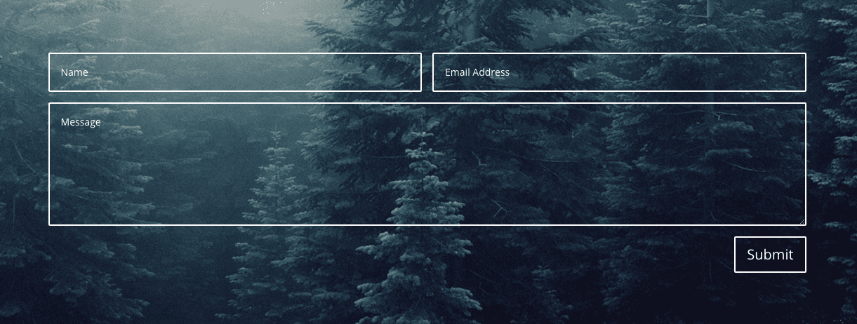
The first is really popular, it uses a background image with transparent form fields for a see-thru effect, I’m placing the background image area in the Divi section. Keep in mind you’ll want to consider readability when picking your image, a darker image would be best in this case:
The CSS Code
/*** THIS CHANGES THE LOOK OF THE FORM FIELDS ***/
.caldera-grid .form-control {
 padding: 16px;
 height: auto;
 box-shadow: none;
 background: transparent;
 color: #fff;
 border: 2px solid #fff;
}

/*** THIS CHANGES THE BUTTON STYLE ***/
.caldera-grid input[type=submit] {
 padding: 10px 16px;
 border-radius: 2px;
 background: transparent;
 color: #fff;
 font-size: 20px;
 border: 2px solid #fff;
 float: right;
 transition: all 0.3s ease-in-out;
}

/*** THIS CHANGES THE BUTTON HOVER STYLE ***/
.caldera-grid input[type=submit]:hover {
 background: rgba(255,255,255, 0.2);
 border-color: transparent;
 color: #fff;
}

.caldera-grid .form-control:focus {
 border-color: #fff;
 box-shadow: inset 0 1px 1px rgba(255, 255, 255, .075), 0 0 8px rgba(255, 255, 255, .6);
}

/*** THIS CHANGES THE PLACEHOLDER TEXT COLOR WHICH IS IMPORTANT FOR THIS PARTICULAR STYLE ***/
input::-webkit-input-placeholder {
 color: #fff !important;
}
input:-moz-placeholder {
 /* Firefox 18- */
 color: #fff !important;
}
input::-moz-placeholder {
 /* Firefox 19+ */
 color: #fff !important;
}
input:-ms-input-placeholder {
 color: #fff !important;
}
textarea::-webkit-input-placeholder {
 color: #fff !important;
}
textarea:-moz-placeholder {
 /* Firefox 18- */
 color: #fff !important;
}
textarea::-moz-placeholder {
 /* Firefox 19+ */
 color: #fff !important;
}
textarea:-ms-input-placeholder {
 color: #fff !important;
}
You may be wondering why that last bit of CSS for the placeholder text isn’t condensed. Well when I condensed it it stopped working lol, not sure why but feel free to play around.
Style 2: Ghost Form Variant
This is similar to the look above but instead of completely transparent fields we’ll make them have a dark opacity. This will give you a little more leeway when choosing your photo because this opacity helps solve the readability issue.

The CSS Code
/*** THIS CHANGES THE LOOK OF THE FORM FIELDS - I RAISED THE FONT SIZE THIS TIME ***/
.caldera-grid .form-control {
    font-size: 22px;
    padding: 16px;
    height: auto;
    box-shadow: none;
    background: rgba(0, 0, 0, 0.7);
    color: #f5f5f5;
    border: none;
}

/*** THIS CHANGES THE BUTTON STYLE ***/
.caldera-grid input[type=submit] {
    padding: 10px 16px;
    border-radius: 4px;
    background: #27c9b8;
    color: #fff;
    font-size: 20px;
    border: none;
    float: right;
    transition: all 0.3s ease-in-out;
}

/*** THIS CHANGES THE BUTTON HOVER STYLE ***/
.caldera-grid input[type=submit]:hover {
    background: #f15640;
    color: #333;
}

/*** THIS REMOVES THE GLOW EFFECT COMPLETELY ***/
.caldera-grid .form-control:focus {
    border-color: transparent;
    box-shadow: none;
}
Style 3: Text Field Bottom Border Only
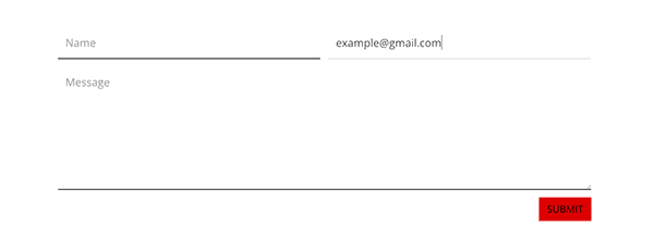
Lastly this example shows the fields with only a bottom border. This look is very sleek and fairly trendy right now. You can see when the user is typing in their text the bottom border changes to a lighter color, a very small but nice detail.
The CSS Code
/*** THIS CHANGES THE LOOK OF THE FORM FIELDS ***/
.caldera-grid .form-control {
    font-size: 22px;
    padding: 16px;
    height: auto;
    box-shadow: none;
    border-radius: 0!important;
    border-top: none;
    border-left: none;
    border-right: none;
    border-bottom: 2px solid #333;
}

/*** THIS CHANGES THE BUTTON STYLE ***/
.caldera-grid input[type=submit] {
    text-transform: uppercase;
    padding: 10px 16px;
    border-radius: 0;
    background: #dd0000;
    color: #000;
    font-size: 20px;
    border: none;
    float: right;
    transition: all 0.3s ease-in-out;
}

/*** THIS CHANGES THE BUTTON HOVER STYLE ***/
.caldera-grid input[type=submit]:hover {
    background: #000;
    color: #f5f5f5;
}

/*** THIS CHANGES THE BOTTOM BORDER COLOR WHILE USER IS TYPING ***/
.caldera-grid .form-control:focus {
    border-color: #e0e0e0;
    box-shadow: none;
}
Final Thought
I hope you’ve enjoyed these examples and can use these CSS snippets to help you style your Caldera forms. These are great as is but playing and adding to them can result in some really fun form looks, enjoy! 😀






Hey! I followed the instructions but once I exit the Visual Builder, all of the styling just disappears, the only thing that remains with the style is the button. Could someone help, please?
I had the same problem (although I am making changes in my child theme’s style.css file). I finally was able to get the styling to stick by adding !important on each of the lines.
Hi Lisa, Ron Edgar. Same problem, going round and round in circles trying to solve it. Painful. Lisa, would you mind pasting the code you used please?
Same for me. I can actually see the styles change as I’m making changes in the Page Settings > CSS > Custom CSS field of the Visual Builder but as soon as I save (yes, I did save) and exit the Visual Builder, the only styling that remains is the button style.
Also, is it possible to get some help with how to style the Caldera Forms Toggle Switch? I used Inspect Elements in Google Chrome to try and figure it out, but what looks like the right CSS to target (at least to me), doesn’t seem to work at all.
I added the form to a temporary page on the site if you would like to see what I mean. You can see the toggle switch there, which has some conditional logic applied to it where it hides a phone number field by default, but displays it when the “Yes” toggle switch is clicked. I’m trying to style those switches/buttons (as well as the 1px borders around the form fields) to match the site colors.
Thank you!
Woops…I thought the URL of the temporary page would show up. Here it is: https://condosat3000farnam.com/caldera-test-form-page/
This is the best article so far..!
It would be awesome if you create a plugin that can style this caldera forms
or integrate into Divi and Caldera forms.. collaboration win-win situation.
Keep rolling! I am definitely going straight away edit my form.
Thank you! I am wondering if and how it is possible to have a form submission log with Caldera. Can you help with this?
I am very sorry in advance for this rookie question but I am lost at the point we get to “dd the following CSS to your Divi options custom CSS panel ”
I presumed what is meant here is the customer css section of the text module that contains the caldera form?
There are three sections. Before / main element / after. there are two input fields (css id and CSS class). I don’t quite understand where to put the code what part of the code to put in, if I have to fill in the fields. Does the code have to be altered to reflect my specific form…
if someone could please give me the completely CSS clueless version I would really appreciate it.
I have always used Contact Form 7 in the past, but am going to give Caldera a shot. Thanks for the advice!
Thanks for share us this useful tip.
I just only add this code for the style 2 for see the row when detect error (not fill). I hope that this will be useful too.
.caldera-grid .form-control.parsley-error, select.form-control.parsley-error, textarea.form-control.parsley-error {
color: #e53633;
background-color: rgba(0, 0, 0, 0.2);
border: none;
}
.caldera-grid .form-control.parsley-success, select.form-control.parsley-success, textarea.form-control.parsley-success {
color: #fff;
background-color: rgba(0, 0, 0, 0.2);
border: none;
}
Nice work as usual Leslie and very useful, as it is my favourite form plugin!
Thanks.
I love it! Looking perfect! Thank you!
Really useful. I use Caldera forms on several sites. Now the style can match the functionality.
BTW one issue I have if I use the Code module to insert the shortcode, often extra tags get added. So am using the the old text module. Any ideas?
Thanks again.
I love the fact that Caldera enables the population of a CSV file on the backend. So now Divi is fully lead generation-enabled. Great job dev guys.
I just finished my custom claldera design yesterday, might style my field also like Divi.
Couldn’t you just add the Divi field class names to the CalderaForms fields in the form options? Pretty sure you can add custom class names and they should get applied from the Divi stylesheet.
That wouldn’t help in the case of your Bonus styles, but the default styles should get applied much more easily that way.
I like the Bonus Styles a lot. Nice write-up overall!
Your question about “CalderaForms fields in the form options” was like mine, just better worded. I really want to know. If you name them that way, do you need to add a “.” or a “#” before class or ID names? I know this seems basic but I never see this detail explained.
Caldera Forms with DIVI surly make a great match. Being able to style Caldera is that cherry on top. Nice 🙂
Thanx Leslie,
You did a fine job (again) !
Hope to see more from you!
Great work Leslie 🙂 Thank you!
Really appreciate the CSS code. This will be helpful. Thanks! 🙂
Great info! I’ve been using Caldera and really like it. Many more options to it than just a simple contact form. Good to know how to style it up some.
This was the next thing I was going to ask Divi tech support about! I don’t see any instructions on how to use Caldera Forms Custom CSS Box. Watched Caldera’s videos on YOUTube but couldn’t find answers.
•Why did you leave Caldera’s Custom CSS Box blank?
•Where did you get “.caldera-grid .form-control” class from? Is that the default code?
• What if you want to remove vertical spacing between individual fields??
• How can I control form overall height? height of section with a dotted line around only the part that if printed should be scissored out and mailed?
Hi! This CSS can go in your Divi options custom CSS box or your child stylesheet, I should have added that. I take it for granted and assume everyone knows where to put it, my apologies. As far as where I got the classes anyone can grab them by using inspect element in chrome (what I use) or similar browser tools.
This is meant to be a starting point for hopefully people to experiment with, but the other issues you’re asking about certainly can be accomplished with CSS. You should search for another blog post by ET that discusses the several helpful Divi facebook groups, they’re perfect for helping with topics like this.
Thanks! 🙂
Thank you Leslie. I do know I can put your CSS into the Divi options custom CSS box, but glad you mentioned this anyway.
I was mainly asking about Caldera Forms OWN CSS fields (right-hand panel where you build the form one field at a time.) Could you, for ex., name it “street” or “.street” in a Caldera’s street field CSS? I never know if I need to enter a “.” or an “#” when naming CSS or only styling it.
Would that make it easier for Divi to style EACH Caldera field INDIVIDUALLY if need be? Caldera doesn’t explain how to use their CSS fields anywhere that I can find. Is that ultimately a better way to style with more control?
Oh I did say where to put it lol