When designing a sticky header on your website, switching the logo can open up new design opportunities. For example, you may want to use a different background color for the sticky header but need a different logo to make the design work. Or, you may need a different version of the logo that doesn’t stand out as much and distract users.
In this tutorial, we are going to show you how to switch your logo on a sticky header in Divi. Using the Divi theme builder, we are going to build a new header with two logos that switch when the user engages the header’s sticky state.
Let’s get started!
Sneak Peek
Here is a quick look at the design we’ll build in this tutorial.
Download the Layout for FREE
To lay your hands on the designs from this tutorial, you will first need to download it using the button below. To gain access to the download you will need to subscribe to our newsletter by using the form below. As a new subscriber, you will receive even more Divi goodness and a free Divi Layout pack every Monday! If you’re already on the list, simply enter your email address below and click download. You will not be “resubscribed” or receive extra emails.
Import the Header Template to the Divi Theme Builder
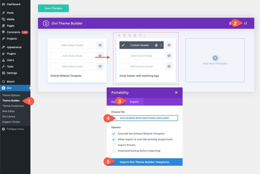
To import the header template, you will need to navigate to Divi > Theme Builder.
Then use the portability icon at the top right of the page to import the JSON file.
Let’s get to the tutorial, shall we?
Switching Your Logo on a Sticky Header in Divi
Part 1: Building a New Header in the Divi Theme Builder
For this tutorial, we are going to build a new header using the Theme Builder.
To do this, navigate to the Theme Builder.
Add a new template and assign it to All Pages (or to a test page). Then click to build a new header inside the new template.
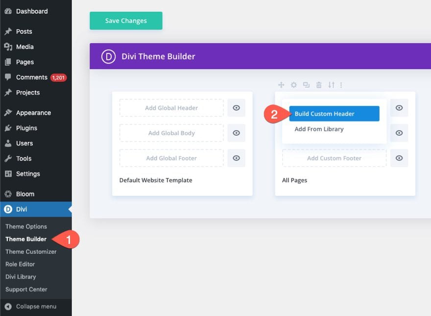
This will open the header template editor so we can start building the header from scratch.
Part 2: Creating the Sticky Section and Row
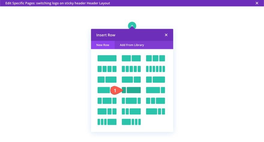
Add Row
To kick things off, go ahead and add a one-fourth three-fourths column row to the default regular section.
Section Settings
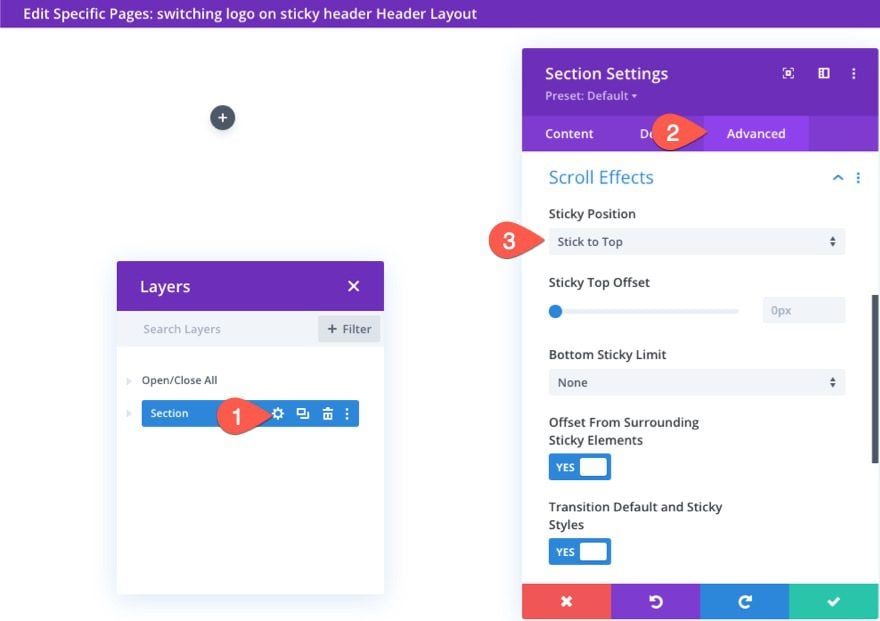
To make this a sticky header, we are going to add a sticky position to the section. Open the section settings and, under the advanced tab, update the sticky position as follows:
- Sticky Position: Stick to Top
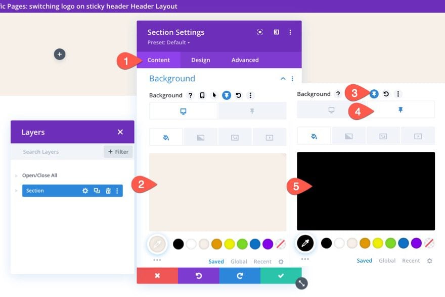
Under the content tab, add a background color for the desktop and for the sticky state as follows:
- Background Color (desktop): #f6f0e7
- Background Color (sticky): #000000
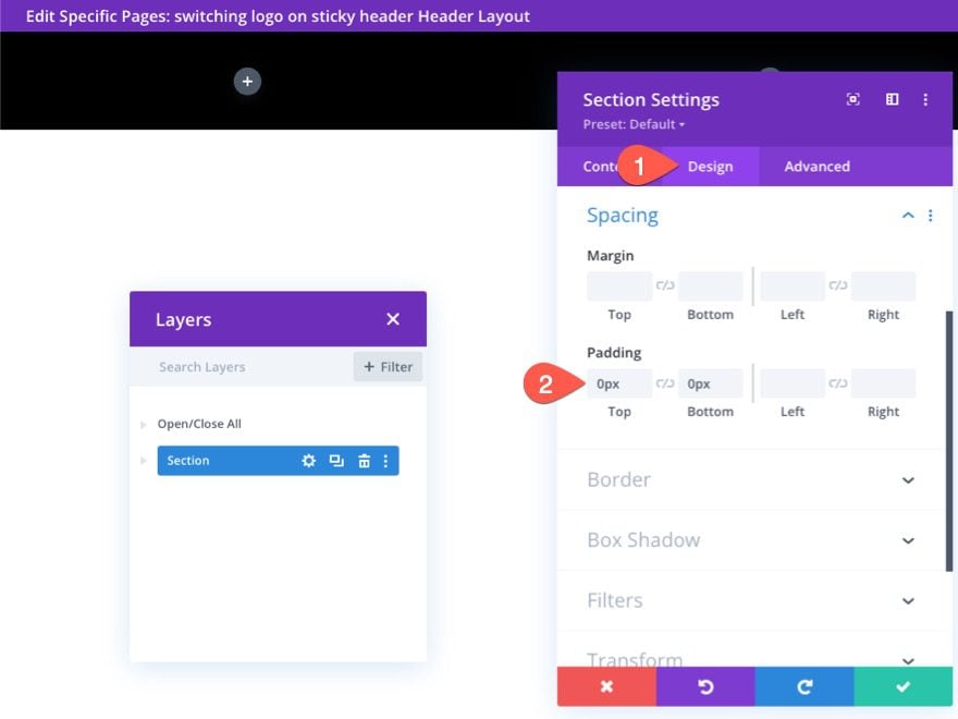
Under the design tab, update the padding:
- Padding: 0px top, 0px bottom
Row Settings
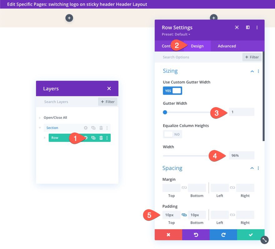
Now that the section is complete, we are ready to update the row settings. Open the settings for the row and update the following design settings:
- Gutter Width: 1
- Width: 96%
- Padding: 10px top, 10px bottom
Part 3: Adding the Switching Logos
In order to create the switching logo effect whenever the header is in the sticky state, we are going to create two images that slide in and out of view. The main logo will be displayed initially and then a new sticky state logo will slide into view once the user scrolls down the page
Creating the Main Logo
To create the main logo, add a new image module to the left column.
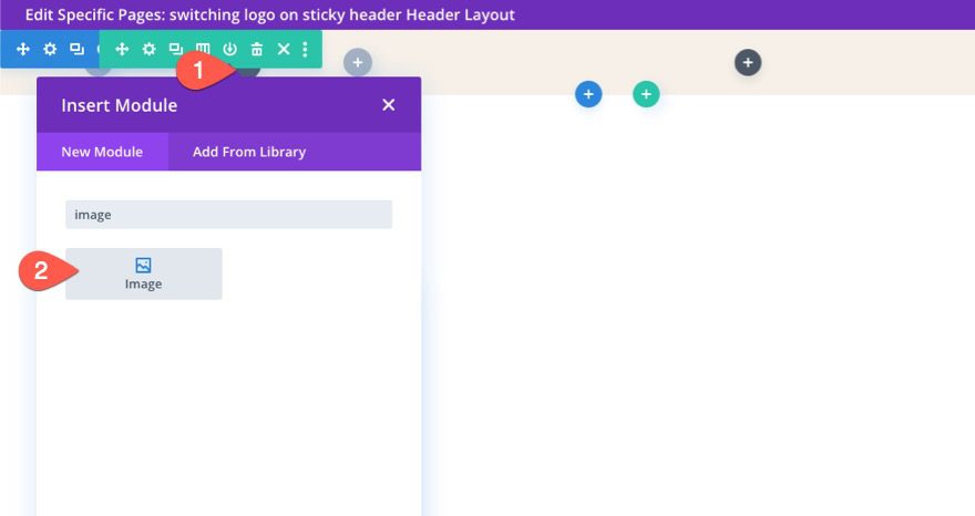
Upload a logo image to the module (around 200px by 67px). You can also add a dynamic link to the homepage as well.
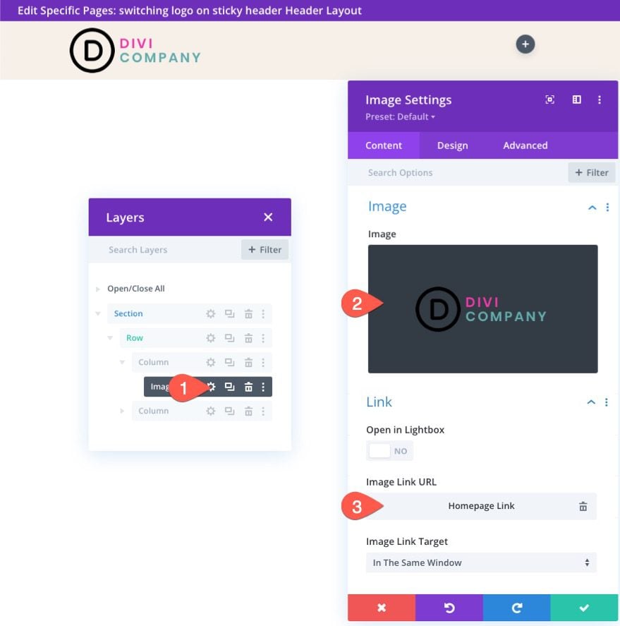
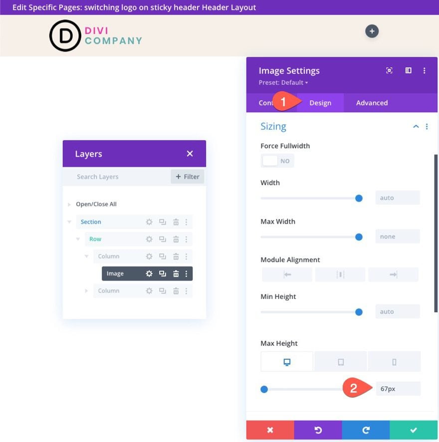
Under the design tab, give the image a max height as follows:
- Max Height: 67px (desktop), 45px (tablet and phone)
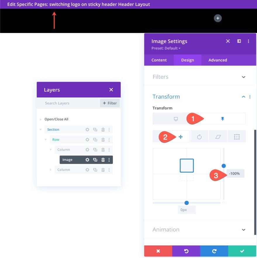
Then update the following transform translate option in the sticky state:
- Transform Translate Y-axis (sticky): -100%
This will move the logo up outside of the column to hide it from view in the sticky state.
Creating the Sticky State Logo
To create the sticky state logo, duplicate the image module with the logo we just created.
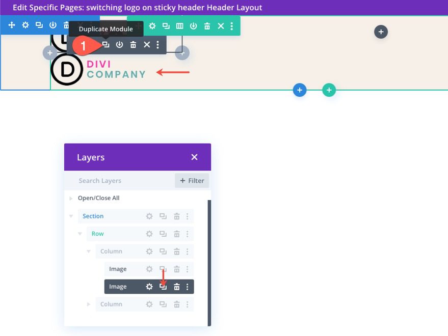
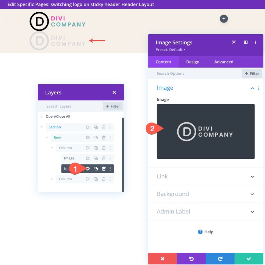
Open the settings of the duplicate image module and upload a new logo image (the one you want to show in the sticky state. For best results, the logo should be the same size.
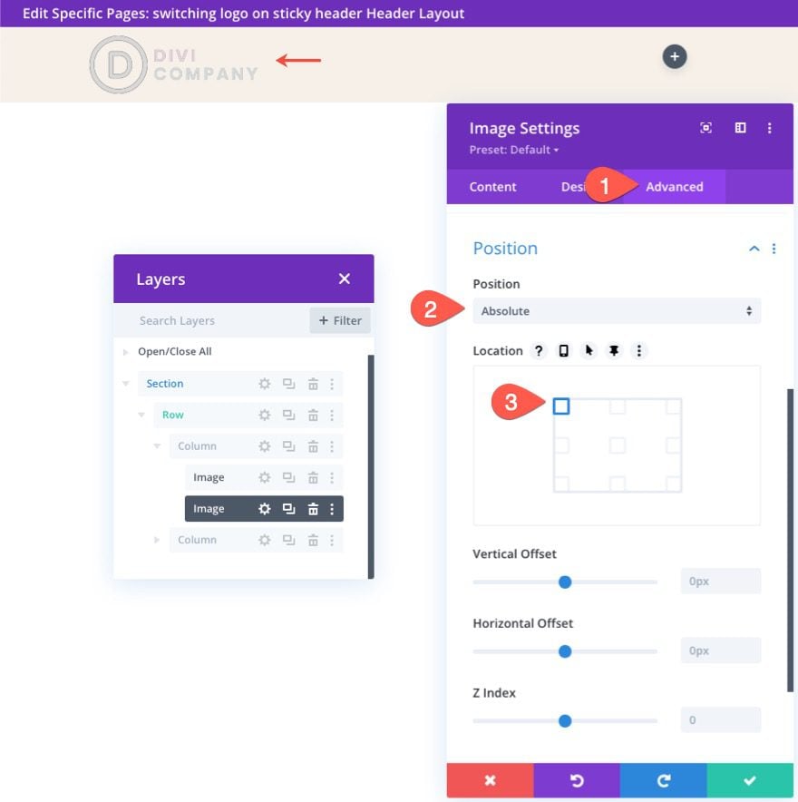
Under the advanced tab, give the image an absolute position.
- Position: Absolute
The logo should now sit directly on top of the main logo.
Under the design tab, update the transform options as follows:
- Transform Translate Y Axis (desktop): 100%
- Transform Translate Y Axis (sticky): 0%
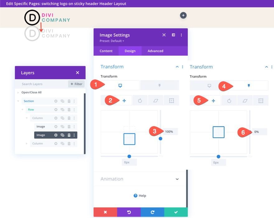
This will make the logo sit below the main logo image initially and then slide up into place once the header is in the sticky state.
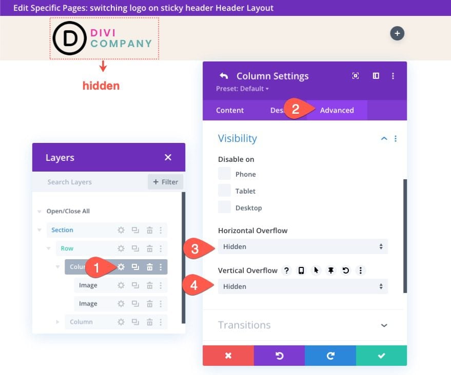
Currently, the sticky state logo will remain visible outside of the column. To change this, we need to update the overflow visibility of the column as follows:
- Horizontal Overflow: Hidden
- Vertical Overflow: Hidden
The Result
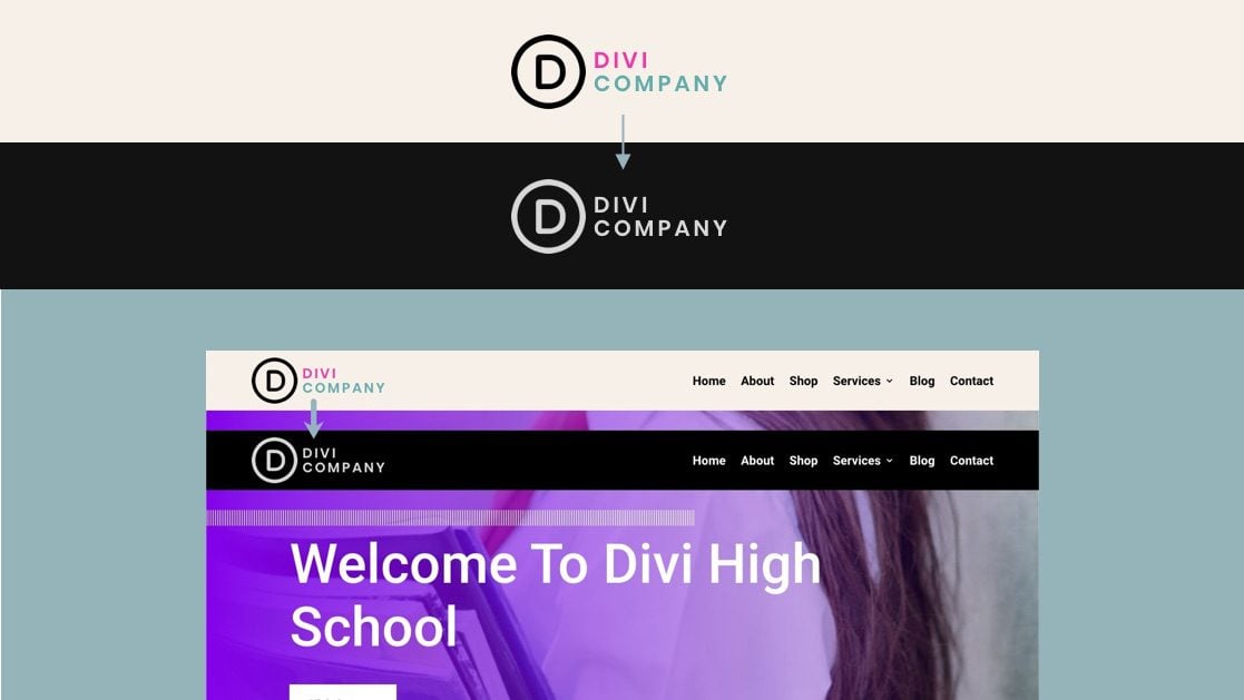
At this point, the switching logo functionality is in place. Here is a preview of the switching logos.
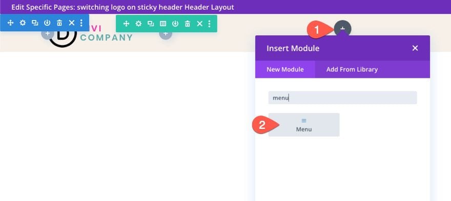
To finish off the design, we need to add a menu to the header. To do this, add a new menu module to the right column of the row.
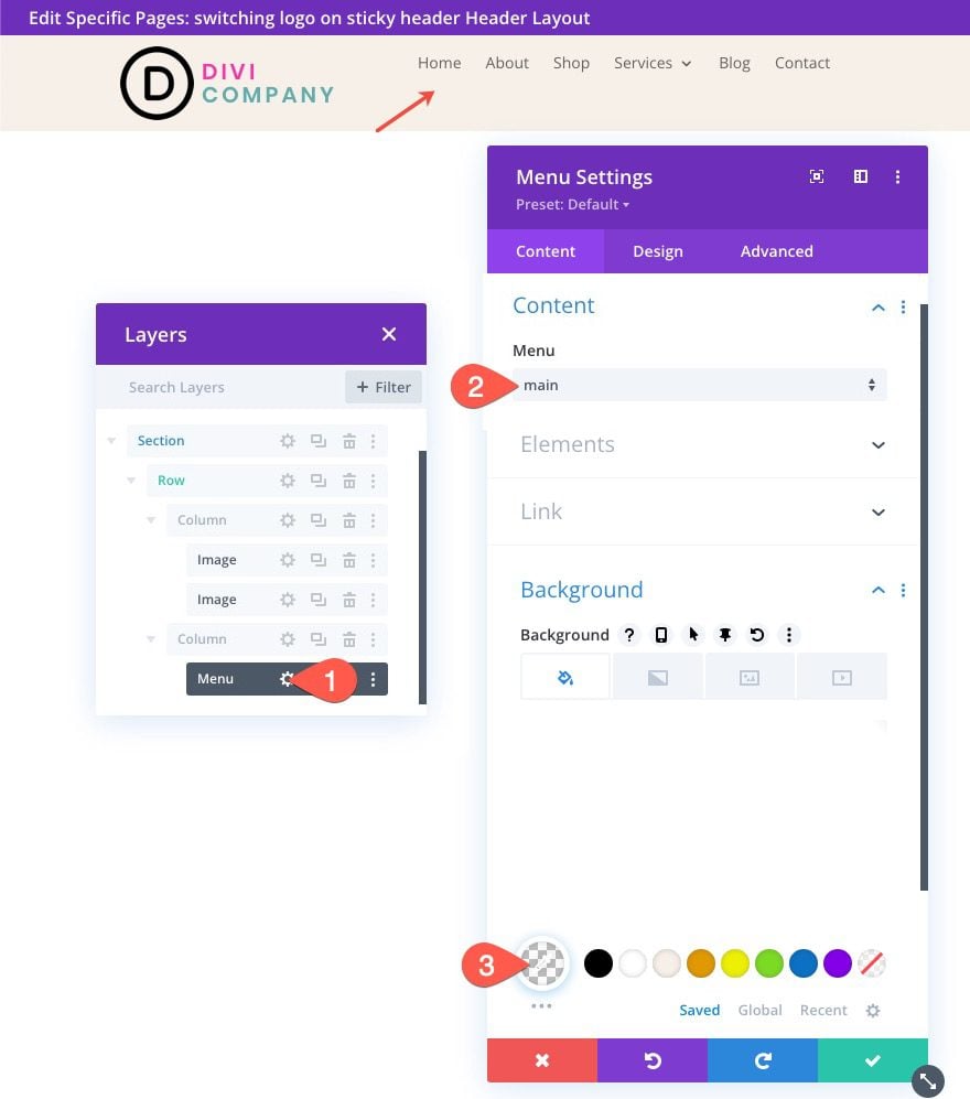
Under the menu settings, select the menu you want to use and give the menu a transparent background.
Under the design tab, update the following:
- Menu Font: Roboto
- Menu Font Weight: Bold
- Menu Text Color: #000 (desktop), #fff (sticky)
- Menu Text Size: 18px
- Menu Line Height: 1.3em
- Text Alignment: right
- Dropdown Menu Background Color: #fff
- Dropdown Menu Line Color: #000
- Dropdown Menu Text Color: #000 (desktop), #000 (sticky)
- Mobile Menu Background Color: #fff
- Mobile Menu Text Color: #000 (desktop), #000 (sticky)
- Hamburger Menu Icon Color: #000 (desktop), #fff (sticky)
- Margin (desktop): 14px top
- Margin (tablet and phone): 5px top
- Padding (tablet and phone) 5px bottom
- Rounded Corners: 3px
- Border Width (tablet and phone): 1px
- Border Color : #ddd (desktop), #333 (sticky)

Final Result
Final Thoughts
With Divi, you don’t have to keep the same logo for your sticky headers. We just showed you how easy it is to do using Divi’s built-in options. No extra code is needed. Once you unlock the power of Divi’s sticky options, you can get pretty creative with how you transition the logos in and out of view. Hopefully, this little trick will come in handy on your next project!
I look forward to hearing from you in the comments.
Cheers!





Okay, this is something I did not had much idea about it but now after reading it in details, I can surely apply on my work, thanks for the post thou!
WoW!
it’s great that you have a fantastic blog filled many good articles.
and even better it Divi theme.
thank for this usefull tips.
Thanks, webtamim! Glad you find them helpful.
DIVI seems to be next after ELEMENTOR. Designing of websites would be in good hands. Great Job
As always, thanks Jason for the awesome write up!
I’m guessing going from transparent to black is a little more involved?
I can’t quite get it to work, appreciate your thoughts.
Josh,
Not quite sure what you mean by transparent. Could you explain a bit more? Maybe I can help.
Thank you very much for your work, Jason! That’s exactly what I’ve looking for!
I have one question: Can we achieve the same effect for mobile, but with the logo and the menu module at the same line, as same as the desktop version? (e.g. the logo get into the contour of the menu module)
Nikola,
One way you could do this (without custom CSS) is by adding a logo in the menu module on mobile and giving the logo an opacity of 0 in the sticky state. Then add an image module with the new sticky state logo and give the image an absolute position so that it sits directly above the logo in the menu. Also give the image/logo a 0 opacity initially and then a 100% opacity in the sticky state. If you want the new image/logo to slide up you can add transform translate Y: 100% initially and then transform translate Y: 0% in the sticky state as well. That should work.
Thanks Jason for this post, this is super helpful one.
Thanks Jason for this post, this is super helpful one. I’m going to share this post so Divi user can take help from it.
Great to hear. Thanks!
Good content,
Congratulations on an unwavering sheer will to be great at offering your product (DIVI), and all-around add-on services.
Great job, guys!
We appreciate the support, Gustavo. Thank you very much!