The Divi Theme Customizer is a powerful and convenient tool for making customizations to the Divi Theme. Like the Visual Builder, the Divi Theme Customizer allows visual front-end customizations and design changes that take the guessing game out of the customization process. If used effeciently, this tool can be a great time saver and jumpstarter for future projects.
Todays post is meant to help you better understand how the Theme Customizer works so that you can use it to increase productivity for future projects. I cover almost all of the options available in the Theme Customizer with an emphasis on those options that are specific to Divi. In a way, this post serves as a documentation piece that offers some in-depth explanations and design tips along the way. I will also show you how to export the Customizer settings to use on your next project.
We have a lot to cover, so let’s start at the beginning.
Built with WordPress in Mind
The theme Customizer was introduced in WordPress 3.4. This convenient feature allows WordPress users to preview changes they make to their themes in real time and then save those changes in one click. What used to take multiple windows and countless refreshes, now can be done quickly in one browser window.
Here is an example of the Theme Customizer options on the theme TwentySeventeen:
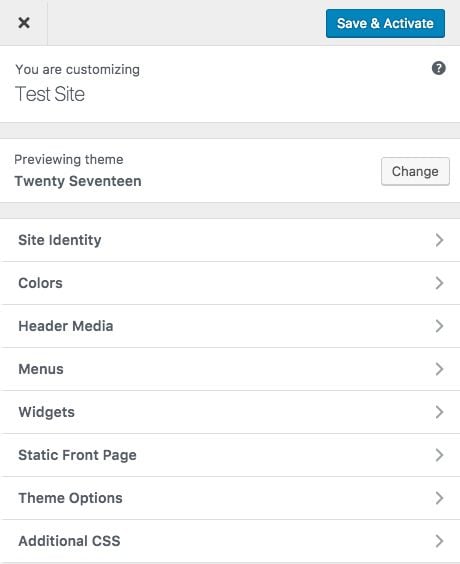
As you can see, many of the features of WordPress that used to reside in different pages in the backend of WordPress (Site Identity, Menus, Widgets, etc…) can now be accessed in this front-end customizer all in one place.
On the other hand, the Divi Theme Customizer was built as an enhanced version of this Theme Customizer with all kinds of Divi specific options. For users, this makes the process of customizing Divi a lot easier. And the fact that you can actually see the customizations while editing (simultaneously) makes this a convenient design tool.
The Divi Theme Customizer still has many of the standard WordPress Customizer options, but it also has a lot more.
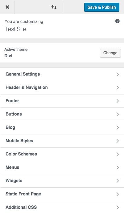
As you can see there are a lot more settings that have been added to the Divi Theme Customizer. Now let’s start exploring these in more depth.
General Settings
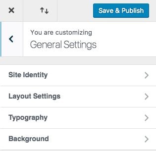
When you start customizing your theme, I think it is best to start at the top with General Settings and work your way down.
Site Identity
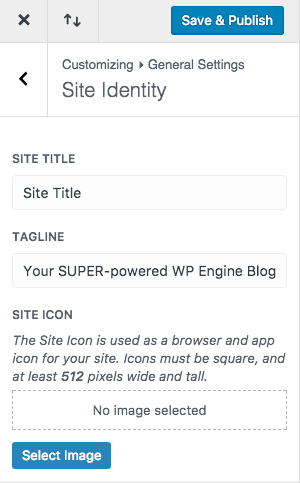
This is section is not unique to Divi. This is a convenient place to change the site title and tagline for your site. You can also enter a site icon which is used for browsers and apps, different from the favicon icon you can add in Divi Theme Options.
Layout Settings
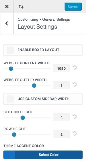
The layout settings allow you to adjust the framework of your theme by determining how much space is between sections and rows and what the max width of your main content section is going to be.
ENABLE BOXED LAYOUT
Here you can change your site into a box layout which frames the content of your site and exposes a background that can be customized.
WEBSITE CONTENT WIDTH
This is where you can set the max width of your content section. Since your content is on a responsive layout, it will adjust to smaller sizes but will not expand any wider than the max width set here.
The default is set to 1080px. This is a good width for most standard laptops and desktops.
WEBSITE GUTTER WIDTH
Gutter width corresponds to the amount of horizontal space (margin) between the columns in each row.
Optional values for gutter width range from 1 to 4.
1 represents zero margin between columns.
2 represents a 3% right margin between columns.
3 represents a 5.5% right margin between columns.
4 represents a 8% right margin between columns.
USE CUSTOM SIDEBAR WIDTH
This sets the default sidebar width for your theme. This applies to all pages on your theme that have a sidebar and are not built using the Divi Builder.
SECTION AND ROW HEIGHT
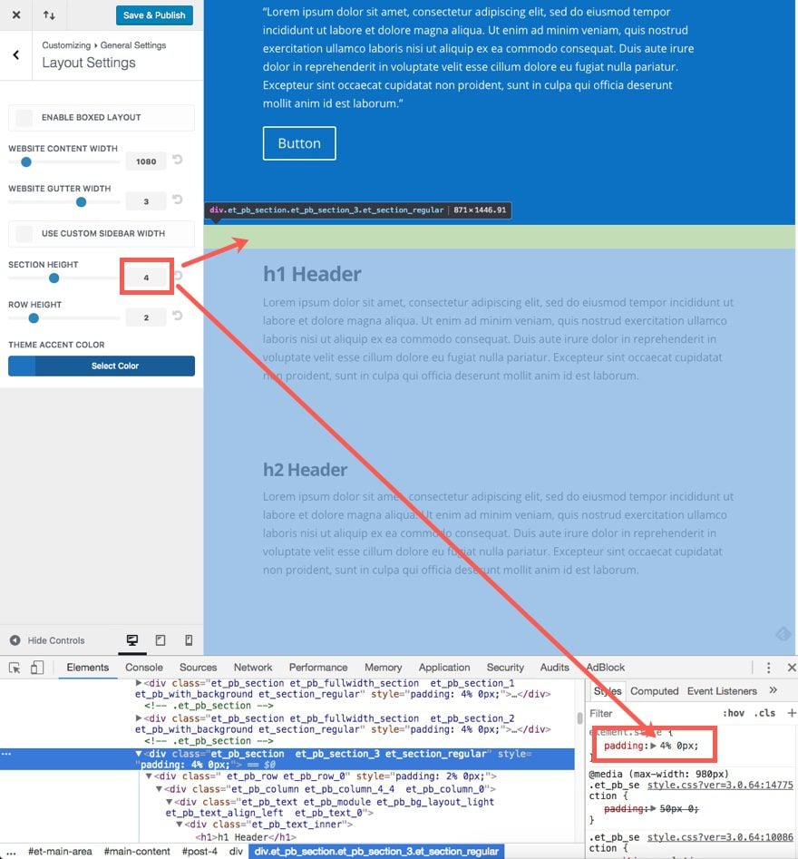
These options adjust the amount of vertical spacing (top and bottom padding) for each section and row.
By default, the section padding is 50px on the top and bottom. For the Row, the default padding is 30px on the top and bottom. However, by changing the section or row padding using the Customizer, the padding value turns into a percentage that corresponds to the number on the option dial on the theme customizer.
For example, “0” represents 0% of top and bottom padding, “1” represents 1% of top and bottom padding, “2” represents 2%, and so on. The percentage of padding is based on the width of the container (the section or row). So if the actual width of the section is 1080px and you have set the section height to 1, this means that you will have…
1080px x 0.01 = 10.8px
… 10.8px of padding on the top and bottom.
The options range from 0 to 10 so you can have as much as 10% of padding.
THEME ACCENT COLOR
Before you start changing the colors for your other elements, you should change this first. Once you change it, save & publish your settings and refresh your page. Now the updated Theme Accent Color should have populated other elements automatically.
Updating the Theme Accent Color will also update the following:
- Body Link Color
- Widget Header Color
- Widget Bullet Color
- Footer Social Icons Hover color
- Default color for icons
- Footer Menu Active Link Color
- Secondary menu background color
- Slide In and Fullscreen Header Style background color
- Hamburger Menu Icon for mobile menu color
- Primary Menu Active Link Color
- Dropdown Menu Line Color
- Secondary Menu Background Color
- Secondary Dropdown Menu Background Color
- Secondary Menu Background Color
- Active Primary Menu Link Color
- Footer Menu Active Link Color
Typography
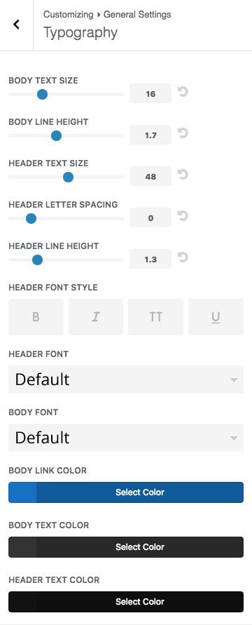
This is one of the most important aspects of your website that tends to be neglected by users and developers. Don’t make the mistake of overlooking these options. Getting these details right can make a big difference. Taking the time to set your default typography for your theme can also save you time in the long run because you won’t have to do customizations at the module level.
BODY TEXT SIZE
This changes the default body text for your theme. The default size is 14px.
Design Tip: It seems that 14px is a little too small for a standard body text size. You really shouldn’t go less than 16px for your base level body font size. Those of us close to 40 years of age and older will thank you. Even most browsers use 16px as their standard base level font size.
BODY LINE HEIGHT
The line height of each individual line of text.
Design Tip: Line-height is measured in the length value “em”. Divi’s default is 1.7em for body text. This em value is better than a pixel (px) value because it is based on the current font-size of the element and so it scales with the parent inline value (or in our case, the current font size). The value “1.7em” basically represents 1.7 times the current font size. So if your current font size is 16px, the line height will be 27.2px. This give you 5.6 pixels of extra space on the top and 5.6 pixels on the bottom. This seems to be a good leading (space between lines of copy) for readability.
HEADER TEXT SIZE
Divi allows you to set your default h1 Header text size here. This effects elements of Divi like the Fullwidth Header Module titles. If you want to adjust the size of the other header levels (h2, h3, etc…), then I suggest adding those in Additional CSS (this is covered later in the post).
Design Tip: In most cases, you will have only one header per page, so make it count. Think of it as the title on the cover of a book. It is the first thing a person notices. And, contrary to the popular slogan, people still do judge books by their covers, especially in this case.
The default value for Header text size is 30px. This is a good safe size to start with. Especially since some headlines will require longer copy. However, I tend to gravitate to a larger header size to accommodate the growing size of monitor displays. Plus, most clients need websites with simple and short headlines like “About us” and “Contact Us” which looks better with larger font sizes. I like to set my h1 headers to at least 48px.
HEADER LETTER SPACING
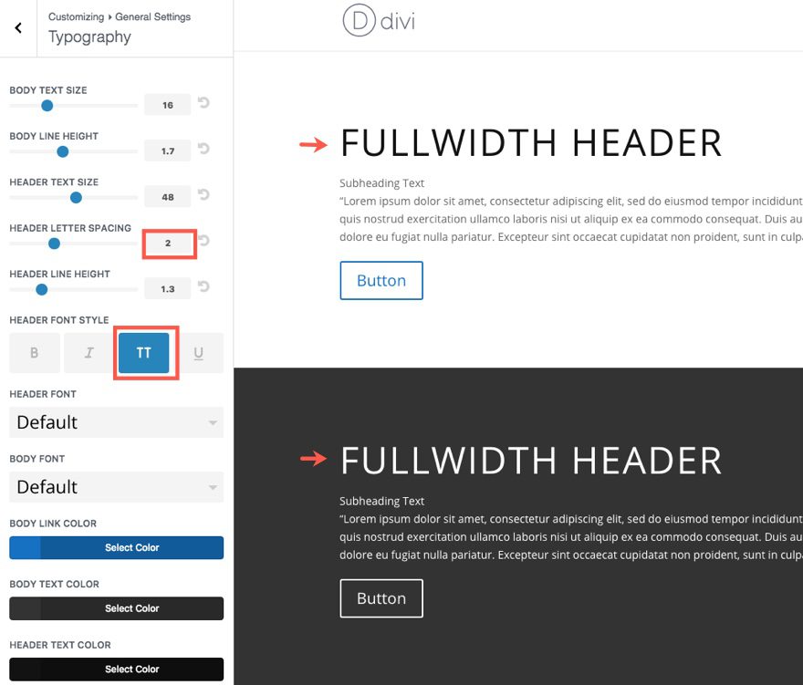
Letter spacing adjusts the horizontal space between letters. The Header Letter Spacing value affects all of the header levels (h1, h2, h3, h4, h5, h6), blockquotes, and slide titles.
Design Tip: It is a good design technique to decrease letter spacing for larger text and increase letter spacing for smaller text. When it comes to headers, the larger text with a greater font-weight (bold) can look better with a decreased letter spacing of -1px.
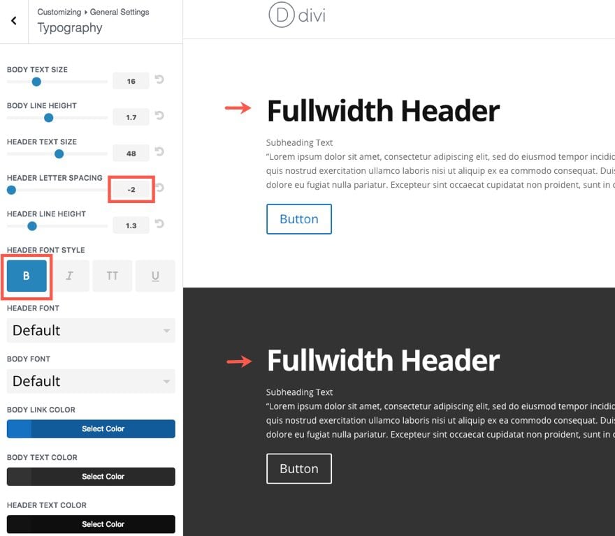
However, if you put that same header in uppercase, you may find that increasing the letter spacing to 1-2px will look better.
HEADER LINE HEIGHT
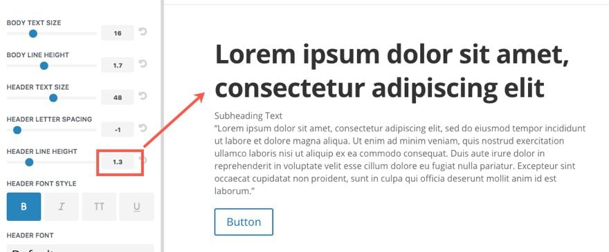
Just like for the letter spacing value, the header line height value affects all of the header levels (h1, h2, h3, h4, h5, h6), blockquotes, and slide titles. Because of the larger font size, 1em is the default settings. I think a line height somewhere between 1em and 1.3em looks good, especially when the header goes to two lines or more.
HEADER FONT STYLE
Use these options to change the font style of your headers.
HEADER AND BODY FONT
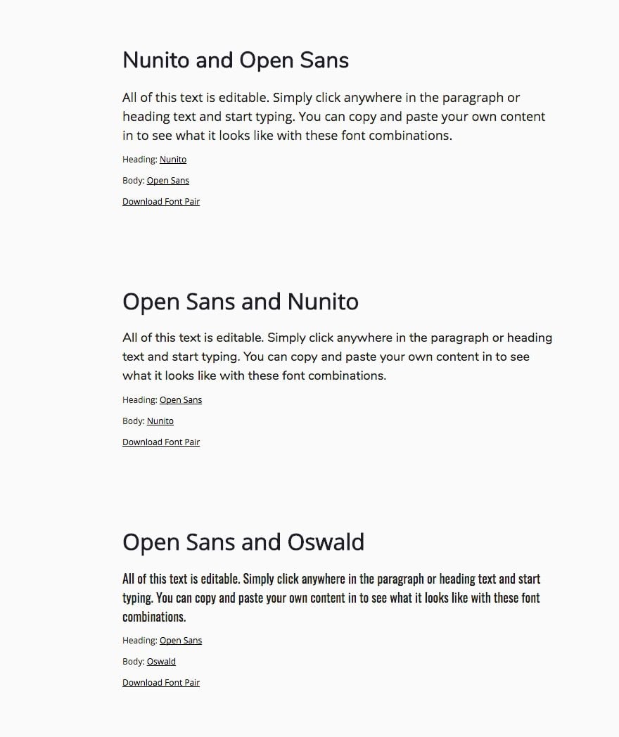
The default font in Divi is Open Sans , but the Divi Theme Customizer has almost a hundred fonts to choose from! Take advantage of these built-in fonts and test which ones work best for your theme.
Design Tip: For inspiration for font pairings, you can check out fontpair.co which helps to pair Google Fonts together. Divi won’t support all of these fonts out of the box, but you could do a search for the ones Divi does support to see pairings that work well together.
BODY LINK COLOR
The body link color is inherited by your theme accent color. But you can always change it here.
Design Tip: If you want, you can add an underline attribute for all your body links using Additional CSS (see end of post).
BODY TEXT COLOR
Here you can change the color of your body text. Popular Blogs like the New York Times and Smashing Magazine use #333333 for their body text color. This tends to read better on a white background in my opinion.
HEADER TEXT COLOR
Here you can change the color of your headers. If you are sticking with a shade of black, I would go a tad darker than the body text to make it stand out a bit. Something like #121212 would work.
Background
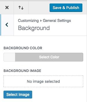
This option sets the background for your theme. For the Divi Theme, this option really only applies to the box layout. The default background color is white (#ffffff) unless you change it here. You can also add a background image if you like.
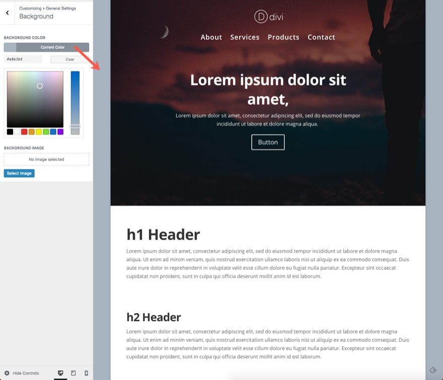
That’s it for the Layout Settings. After you have the layout in place, you can start looking at more specific elements.
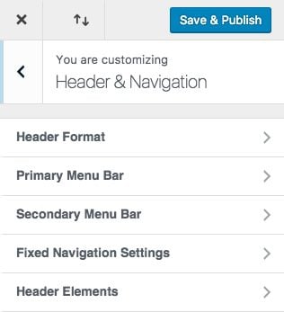
The header and navigation menu is probably the most important element on your theme. This section has a lot of options to create almost any kind of header you want.
Header Format
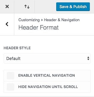
Header Style
The four header styles can give your website a brand new look with only one click. These styles include Centered, Centered In-line Logo, Slide-in, and Fullscreen.
You can also add vertical navigation to your site which can be a unique feature. And, you could choose to hide the navigation until you scroll. This would be useful for a single page site that wants to highlight more content above the fold without the distraction of the navigation bar.

Your Primary menu bar is the main menu inside the header of your website. You can completely customize the way your primary menu looks.
Design Tip: You really need to know what your menu links are going to be before you start perfecting the menu with the Divi Theme Customizer. Don’t forget you are going to be styling a responsive menu so take the time to make sure the menu looks great on all screen sizes. You can do this by clicking on the device icons at the bottom of the customizer or by simply adjusting the size of your browser. If you are interested, you can find out how to fix your responsive navigation here.
Make Full Width
This extends the menu the full width of the browser window.
Hide Logo Image
If you want, here you can completely hide the logo image from your menu.
Menu Height
Here you can change the menu height to whatever you want. Although, be careful not to make your menu height too large since you could be wasting valuable real estate on a menu instead of your homepage content.
Logo Max Height
Here you can increase or decrease the max width percentage of your logo to make it bigger or smaller.
Text Size, Letter Spacing, Font, Font Style, Text Color, Active Link Color
These options allow you to customize the menu links any way you want.
Background Color
This allows you to change the background color of your primary menu.
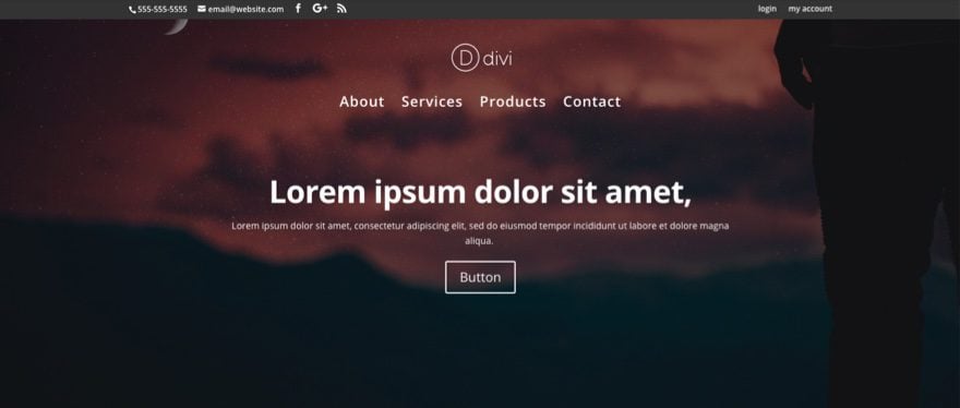
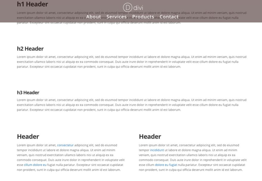
Design Tip: If you use the semi transparent (or completely transparent) colors for your header, Divi will automatically overlap the header over the section underneath seemlessly. This creates a pretty cool effect. For example, this is a centered header style with a transparent background and a fullwidth header directly under it. Notice how Divi automatically adjust the background image to fit nicely behind the header:
Dropdown Menu Settings
Your dropdown menu doesn’t have to inherit the style of the main menu. Here you can create a unique design for your dropdown menu. You can even add custom animation when displaying the dropdown menu.
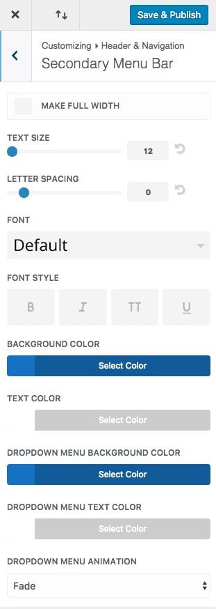
Here you can customize your secondary menu bar using the options provided.
When enabled, the secondary menu bar sits above the primary menu bar at the very top of your browser. It can hold additional elements including an email address, social media links, and a secondary menu.
By default, the secondary menu will remain hidden unless you enter a secondary menu or add elements under the Header Elements section. You may need to save and refresh the theme customizer to see the menu.
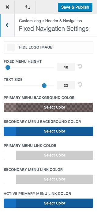
Fixed Navigation refers to the state of the menu being “fixed” or stuck to the top of the browser window when the user scrolls down the page. By default the fixed navigation shrinks in height to provide a larger viewport for displaying the site’s content.
Design Tip: You can also set your Fixed Primary Menu Background Color to a semi transparent color to reveal some of the content behind it. This make it even less intrusive but still accessible.
Header Elements
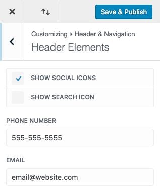
Header elements are additional elements that you can add to your header. These elements include social icons, a search icon, a phone number, and an email. Aside from the search icon, all of these elements will be displayed in the secondary menu.

Social Icons
By default Divi displays icons for Facebook, Twitter, Google+, and RSS. You can edit these profiles in Divi’s Theme Options.
![]()
By default, the footer section is hidden unless populated by content. Also, the footer should not be confused with the Bottom Bar which is displayed at the very bottom of the site by default and includes the footer credits and social icons.

Layout
Here you can choose between 5 layouts for your footer section.
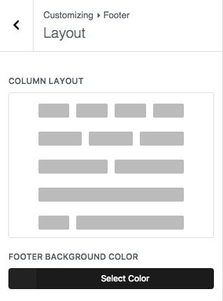
You can also set a footer background color which is set to #222222 by default.
Design Tip: This section will be displayed on all pages of your site (unless you choose a blank page template). Therefore, it makes sense to make the color more neutral so that it matches all the pages of your site.
Widgets
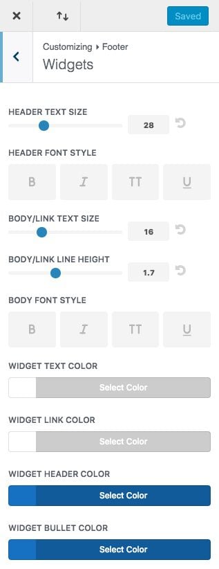
If you added widgets to your Footer Sections, you can style what those widgets look like here.
Widgets are not unique to Divi. These are built in to wordpress and can be found in the wordpress dashboard under Appearance > Widgets. There you can see four Footer Areas where you can add widgets. Any widgets you add to these sections will show in your footer area.
However, you can also access the widget areas without ever having to leave the theme customizer (one of my favorite things about it).
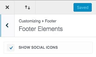
Here you can choose to show your social icons on your bottom bar just like in the secondary menu.
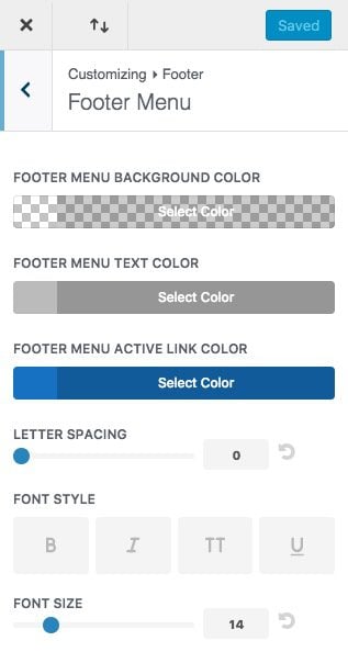
If you have a footer menu, you can style it here.
Bottom Bar
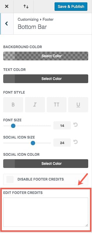
The bottom bar sits at the very bottom of your website and it displays your footer credits and social icons by default. Here you can customize the style of these elements including changing the social icon font size and color.
Edit Footer Credits
You can also replace the default footer credits with whatever html you want inside this box.
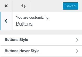
This section controls what you want the default button styles to be.
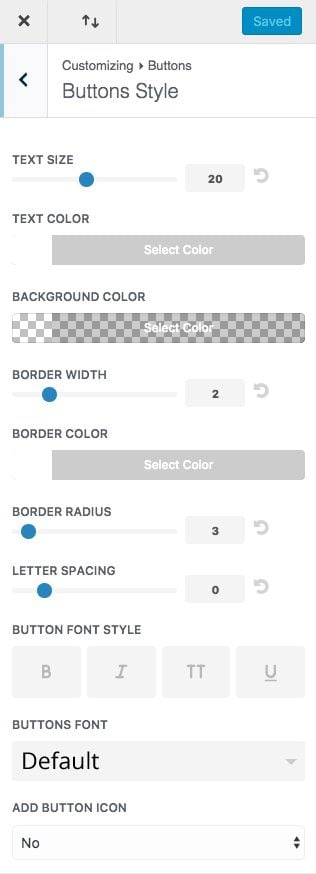
Here you can customize the style of your buttons for your theme. I’m not going to go into great detail on each option here. You can go to our documentation on the button module for more info on how to style buttons.
Text Color
If you notice, by default, the button color is inherited by the Theme Accent Color set in General Settings. This is only for modules that have their text set to “dark”. And the buttons are white when module text is set to “light”. But, as soon as you set a custom text color for you buttons, this color is set for both dark and light text versions within a certain module.
Design Tip: Let your Theme Accent Color set the text color of your buttons so that you can keep the keep the ability to add dark and light versions of your button in your Modules.
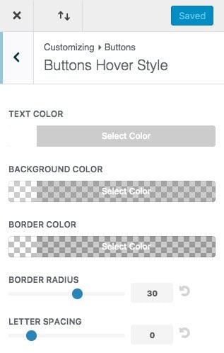
This is where you can customize the style of the hover state of your buttons.
It is important for users to understand that what they are about to click is actually a button. Adding a hover effect solidifies this in there minds and encourages them to interact. Be default Divi adds a light background and animates an arrow icon to the right. But, you can change it to whatever you want.
Design Tip: Whether you change the background to a darker or lighter color isn’t as important as just making sure that the button change in some way. You could also increase the letter spacing or adjust the border radius to give your button a unique effect on hover.
Blog
Post
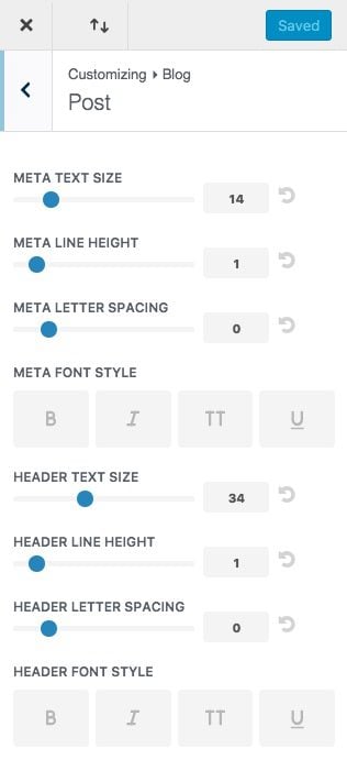
This section changes the style of the post header content within a single post. This doesn’t change the look of your blog excerpts on your blog page or blog module. At times your blog post headers will need to look different from the headers on the rest of your site. This is where you would make those adjustments.
If you choose to use the Post Header Module, these options would not be effective.
Mobile Styles
I love this section. Here you can adjust how your site looks on mobile devices and see the results in real time.
Tablet and Phone Styles
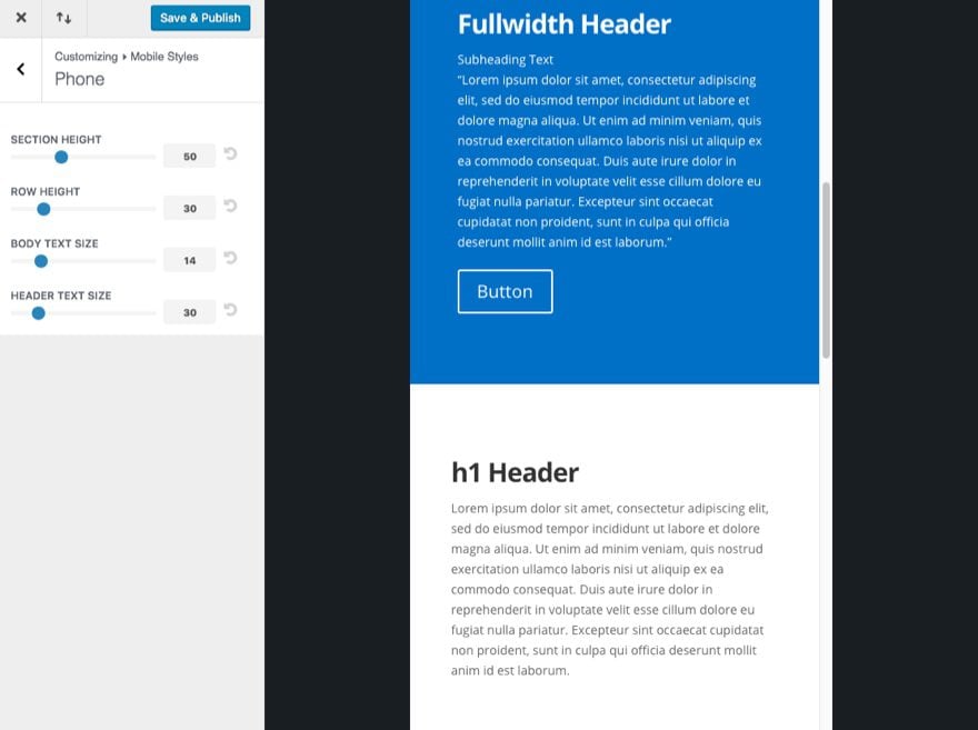
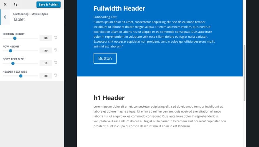
You can select Tablet or Phone and the window on the right of the Customizer will adjust automatically to show you how the page looks on the device. Then much like we did in General Settings under Layout, you can adjust the Section Height, Row Height, Body Text Size, and Header Text Size.
Design Tip #1: One customization I like to make for phone layouts is to set the Row Height to “0”. This creates a better flow of content when scrolling on a phone since it takes out that spacing between rows.
Design Tip #2: Find a font scale that works for your site. Here is a good one I like to follow for my headers:
Desktop: 48px
Tablet: 40px
Phone: 32px
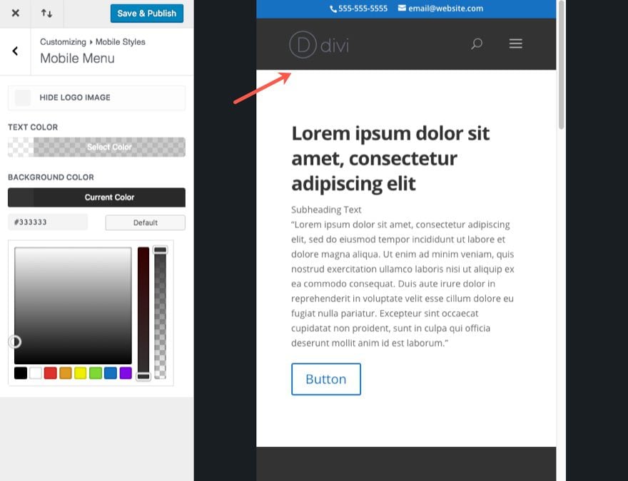
Don’t overlook this or you may miss out creating a completely unique header for your mobile menu. You can Hide the logo just on mobile devices and change the background and text colors.
Color Schemes
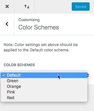
These can be convenient for a quick solution. But I wouldn’t advise using the color schemes if you plan on changing some of these colors later on in the theme customizer. Once set, these colors cannot be overridden in the Customizer because the CSS generated contains the !important rule.

In my opinion, it is best to leave this set to default.
No longer to you have to blindly edit your menus or widgets in the wordpress dashboard. Now you can add and customize these items and see them come to life on your page in real time. I love the convenience!
Static Front Page
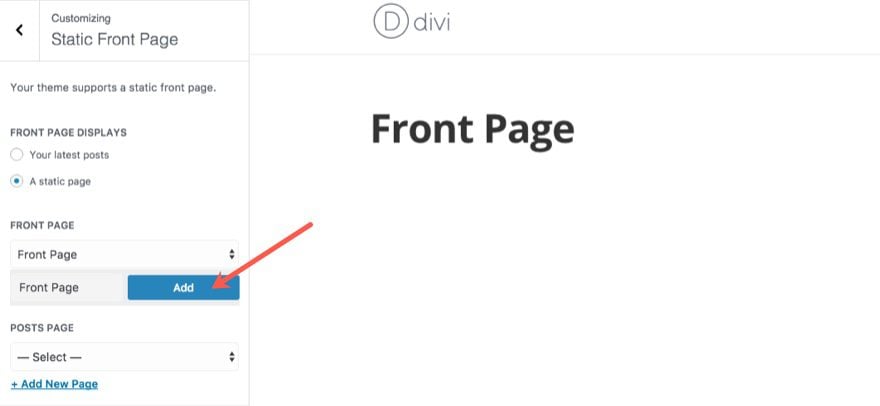
By default, WordPress displays your latest post on your front page (homepage). You can change this to be any static page you want in this section. And you can also designate your Posts Page (or blog page).
I didn’t know this until writing this post, but you can actually deploy a new page from within the Theme Customizer to serve as your Front Page or Blog Page without ever having to leave the customizer.
Additional CSS
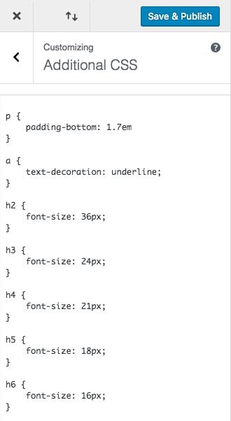
The Additional CSS section offers a great opportunity to put the final touches on your theme setup. Whatever style changes that the Divi Theme Customizer can’t control, you can do here with some custom CSS. Because the Customizer allows you to see the CSS changes in real time, you can make those necessary adjustments to your theme much easier than going back and forth on an external stylesheet.
Additional CSS Examples
Example #1: Adjust the Size of All Headers
One good example of additional CSS would be styling for your remaining header tags. Divi allows you to customize the setting for your heading font, but that is just for your h1 headers. You can use the Additional CSS box to enter the rest of the header tags (h2, h3, h4, etc…) customizations. I like to use the following scale: 16, 18, 21, 24, 36, 48.
h2 {
	font-size: 36px;
}

h3 {
	font-size: 24px;
}

h4 {
	font-size: 21px;
}

h5 {
	font-size: 18px;
}

h6 {
	font-size: 16px;
}
Example #2: Match Bottom Paragraph Padding with Body Line Height
If you set the body text line-height to 1.7em you may also want to set the same value to your bottom padding between paragraphs in order to keep a consistent baseline grid and vertical rhythm. In other words, the distance between paragraphs is equal to the line-height. To do this you would simply add the following:
p { padding-bottom: 1.7em}
Because the length value em is based on the parent font-size, if you changed the base font size to something else in the theme customizer, the 1.7em value will adjust accordingly.
Example #3: Add Underline Attribute to Your Links
Add underline attribute to body links.
a {
    text-decoration: underline;
}
Exporting and Importing Divi Customizer Settings for Your Next Project
The Divi Theme Customizers has a portability option that allows users to export or import Customizer Settings. This presents a great opportunity for developers to make a sort of customizer setting template to use on their future projects.
First, I suggest taking the time to figure out what customizations you tend to make when building a website. Once you identify those settings, you can enter those customizations into the Divi Theme Customizer and then export those settings so that you have headstart on your next projects. Why keep doing the same things over and over when you can already have it done? Plus, this will help make sure you don’t skip any important customizations.
To export your settings, click the portability icon at the top the Divi Theme Customizer.
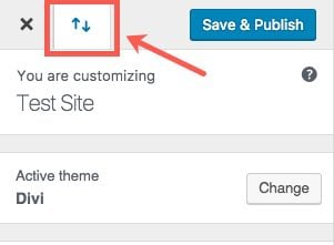
Give you export file a name and click the button “Export Divi Customizer Settings”
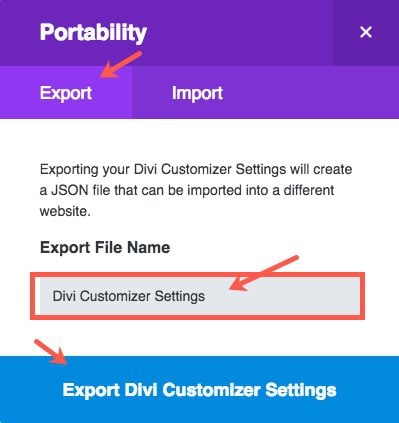
Now you can use this .json file in the future by clicking the same portability icon in the Divi Theme Customizer and selecting Import instead of export. Then all you need to do is upload the .json file and click “Import Divi Customizer Settings”.
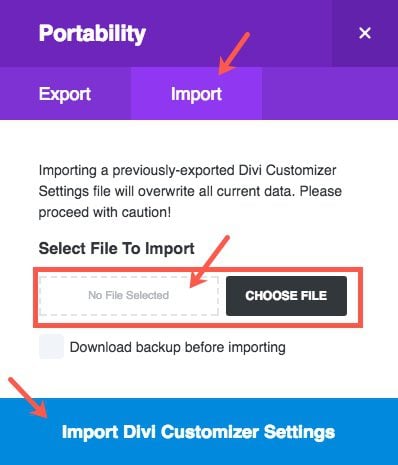
And that’s it.
What Does the Divi Customizer Settings Include?
The customizer settings include basically everything in the first 7 sections.
- General Settings
- Header & Navigation
- Footer
- Buttons
- Blog
- Mobile Styles
- Color Schemes
The last 4 sections are WordPress specific and will not carry over to other Divi Installs. These sections include:
- Menus
- Widgets
- Static Front Page
- Additional CSS
It’s important to note that the Additional CSS does not carry over. You may be relying on those settings to give you a time saving boost on your next build. If this is the case, I suggest creating a child theme with that CSS so that you can add it with your Customizer Settings on your next project.
How the Divi Customizer Styles Are Stored
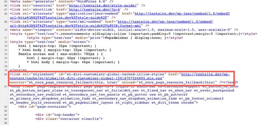
For the Divi Customizer (along with Divi Options and the Divi Builder), Divi serves static CSS resources that can be cached by the browsers to decrease page load time. This means the styles are not printed on the page but stored in a separate static CSS file. Everytime you save your Customizer Settings, the static CSS file is updated. This includes any Additional CSS you have added as well.
Closing Thoughts
The Divi Theme Customizer comes with some pretty powerful options and the customization process is both conventient and enjoyable to work with. And gaining a deeper understanding of what these options can do will definitely improve how you build websites with Divi. If you haven’t already, take some time to explore what your optimal baseline settings would be for a project, plug those into the Customizer, and create an export file. You will be surprised at the boost (and confidence) this will give you when starting a new project.
I look forward to hearing from you in the comments.
Cheers!



HI!
I would like to build a global header via the theme builder, but I previously built the nav header with the theme customizer. When I try to create something in the global header it does not show on the website. It’s like the theme customizer has more authority over the theme builder. I feel like the two should be coordinated together. I assumed the global header from the theme customizer would automatically show in the theme builder’s global header.
I can’t find documentation on how to work between the two. Do you have any advice on how to transfer the header from the theme customizer to the theme builder?
I appreciate any advice on this issue.
-M
There are few technical article types less rewarding to write or more essential to have on-hand than the focused deep dive into a single aspect of a product. “Less rewarding,” because typically somewhere between one-third and one-half of the way through the painful documenting of each context-sensitive sub-sub-sub-menu item, the goal is no longer finding neat yet little-known capabilities hiding in that afore-mentioned sub-sub-sub-menu to share but has become finding some way to survive this death march by fingertip. Essential because inevitably there *are* neat yet little-known capabilities hiding in sub-sub-sub-menus one would otherwise never find. A huge thanks to Jason Champagne, not only for taking one for the team but for doing it so well.
W. Vann,
Wow. Thanks for taking the time to dig me out of the trenches of sub menu items (which I enjoy very much) and put me on a pedestal :). I assure you it is appreciated. You made my day.
Perfect timing! I recently signed up with ET and am now starting a new project.
I’m so excited!
Great post. Thank you.
Where can I find this as a pdf?
What a great comprehensive article! I loved it so much I created a pdf and posted it in some of the FB groups. Hope a lot of people will find it helpfull.
That’s great to hear, Marleen. So glad you liked it. Thanks for the comment.
Hi there!
It would be great to add these features for BOXED LAYOUT:
· DISABLE BOXED LAYOUT ON MOBILE
· DISABLE BOXED LAYOUT SHADOW
· DISABLE BOXED LAYOUT ON CERTAIN PAGES
(Last feature is very useful to use it on Home or Fullwidth pages)
Here the suggestion with a screenshot:
https://www.elegantthemes.com/forum/viewtopic.php?f=22&t=733978&p=4027762#p4027762
Cheers!
unocoma,
Great suggestion. Thank you.
Great work, come in the mornings attentive to see if you have a new post, you are adding and a lot in my business
Thank you for this guide. It is a nice recap of what you can achieve with Divi using the customizer.
Great guide! I miss the “mobile” icon, to specify diffrent settings for different devices, in the Blog module settings.
If I set the blog header to 42 px, it might look good on a big desktop screen but not on a small mobile display.
Is there any other way to tweak this?
Looks good but needs to test it first. Does it need the visual composer plugin or not?
A really useful guide and I appreciate your personal preferences which provide a great framework. Thanks Jason
Hi, why my posting is vanished? I answered to the question from Steve nearly the same as Mathias did with the pdf, whatsoever my posting was awaiting moderation, now several other postings are here visible, mines is vanished.
May I ask gently – why? What is needed to get postings visible – how do the others get their postings not moderated
Where can I set the default section background color? I know it can be done on a per-page basis, but it should be a global setting. Right now I override it using the style sheet in my child theme, but that’s not ideal…
Thanks for the comment. I’m not sure if there is a setting specifically for that other than making a section global and adding your sections that way.
Great post, and very informative and helpful. Thanks.
HI Mathias..
.. I wanted to thank you for your unsolicited attempt to help out.
( seriously, very considerate ) and second, to maintain and refine
my inherent abilities and skills as a profiler, I wanted to ask..
gender and age.. pls don’t be bothered or upset, be as vague as
you want or do not answer at all.. I could share many brilliantly
interesting and fascinating things about you.
Hi Johanna,
Please forgive the late reply. I didn’t visit this post again until now, or I would have responded sooner.
At the time I wrote my response to Steve, his was the only message I saw. There were no other replies at the time. Steve was asking directly about whether a PDF version was available, so I didn’t think my feedback was of an unsolicited nature.
From the tone of your message, it appears I did something that was discourteous towards you. Perhaps it looks to you like I responded after you (Johannes?), and rudely copied your solution; I assure you that this is not the case! I figure that because of the moderation process and timing, your response simply hadn’t shown up for me yet. If it had, I certainly wouldn’t have duplicated it.
If I’m misinterpreting the nature of your message to me, feel free to clarify. But know that I’m not looking to be disrespectful to people, and only trying to help.
Cheers!
***enter link***
Thanks Jon. Updated.
+1
Hmm, I think there is an error in this blog because when I change the value of HEADER TEXT SIZE, it’s not only my H1 that changes (contrary to what is stated here).
Alain,
Thanks for pointing this out. You are correct. I will update the post.
Hi there, thank you very much for the guide. I’m new with Divi, so it is very appreciated.
I still have a problem : my blog page is fine, but when I clic on one particular article, the page with the article on it has a right side bar but I want it at left. Can you help me with that ? Thank you in advance for your help.
Cyrille,
Glad the article is helpful. You can change the layout of your page using the Divi Post Settings at the top right of your page when editing your post. There you have the option to change the page layout to a left sidebar. Make sense?
Oh my goodness, yes! I am in the same boat: new to Divi and can’t get rid of the right side bar – I want text to display across the whole width. When I change the “Divi Post Settings” on the top right as you mention, “Page Layout” to “Full Width” and then “Update” nothing happens. 🙁
Thank you so much for helping us newbies.
Finally! someone is finally thinking in HTML5 and not plug & play! My clinets don’t have a clue what they want and I need to write out pieces of paper to at least get started. Then there are changes, and more changes…. at some point they need to step up and accept the first couple of pages!
This seems more realistic….
thanks, I was about to GIVE up on WP & DIVI
Great to hear!
Great blog! Thanks so much!
Is this available for download as a .pdf for easy reference?
Thanks Steve. Sounds like printfriendly is a good option. Great idea.
Thanks Jason and everyone …. the printfriendly solution worked perfectly! Wahoo!
Hi Steve!
For a PDF reference file, I would recommend sending the page to printfriendly. You can do so with the sharing features to the left, and select printfriendly from the list (…). The output file works well enough for me, with images and all.
Or were you looking for a more refined document to use?
You can use https://www.printfriendly.com and give in the URL from here, it prints this site as pdf for you. Other way: on the left side here you see the social icons floating box, click on the “…” and in the left column, the fifth is printfriendly.com prefilled with this url, simply click it.
I noticed that printfriendly.com can print websites to pdf, where other local installed pdf printer drivers were not able to do, or missing parts from the website.
Great idea!
I agree. Would be very helpfull.
One of the best posts ever about the basics of design and typography. When in doubt, i just copy or follow the Divi Theme settings and the guides on the ET blog. TX
Thanks Paulo.
Thank you very much. Every day I’m more happy with Divi