Twice Divi child theme was designed with blogs in mind. It’s a simple theme that works well with any type of blog including photography, travel, personal, and more. In this article, we’ll take a close look at Twice to help you decide if it’s the right Divi child theme for your needs.
Installing Twice Divi Child Theme

Installation is simple, but it doesn’t install the required plugins automatically. Fortunately, it steps you through it and it isn’t difficult. With Divi activated, upload and activate the Twice Divi child theme as with any WordPress theme.
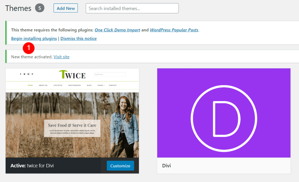
Once you’ve activated Twice, you’ll see a message that you need two plugins installed. Click Begin installing plugins.
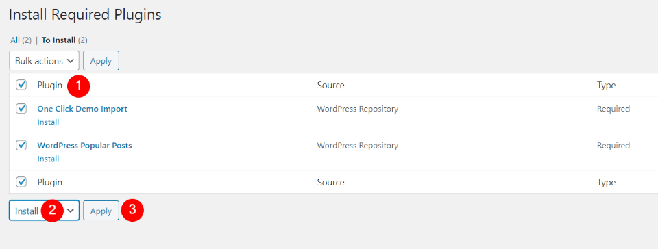
Select the plugins and install them. I did this by clicking the box next to Plugin to select all plugins, choosing Install from the Bulk Actions dropdown, and clicking Apply.
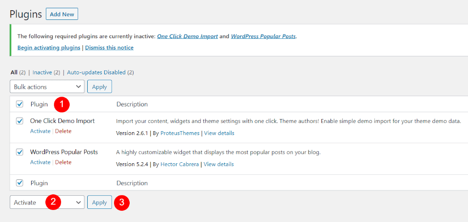
Next, activate the plugins by going to the Plugins list and performing a bulk activation.
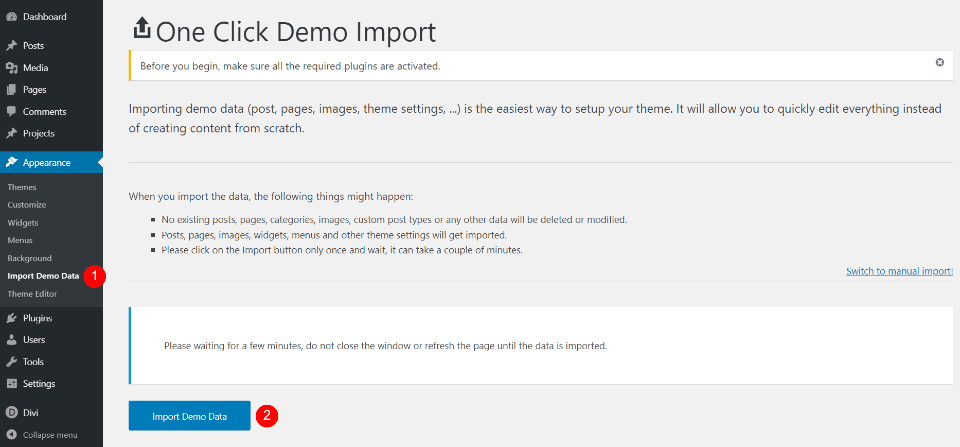
Import Demo Data is now an option in the Appearance menu. Open this screen and click Import Demo Data. It will ask if you’re sure. Click Yes and stay on this screen and wait for it to finish. Your website will now look like the demo.
Twice Divi Child Theme Pages
Twice adds 8 main pages. Here’s a look at each one.
Twice Divi Child Theme Home Page
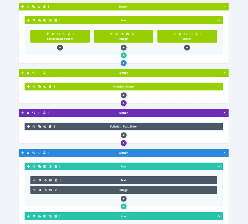
The Twice Divi child theme home page displays a global header, post slider, blog module, and more. Let’s look at each of the sections.
Hero Section
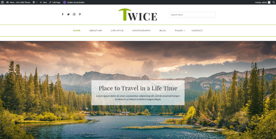
The hero section displays posts in a full-width post slider with a full-screen featured image and the title in an overlay. Light green highlights, such as those in the header, appear throughout the site.
Author’s Favorite Blogs
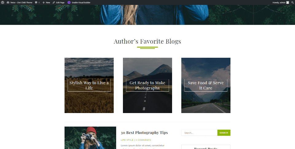
Author’s Favorite Blogs are created with text modules in three columns. The modules display background images and a styled title in the foreground. They’re used to link to blog posts of your choosing. These are a great way to highlight tutorials, posts, etc. A faint line separates it from the blog section.
Blog Section
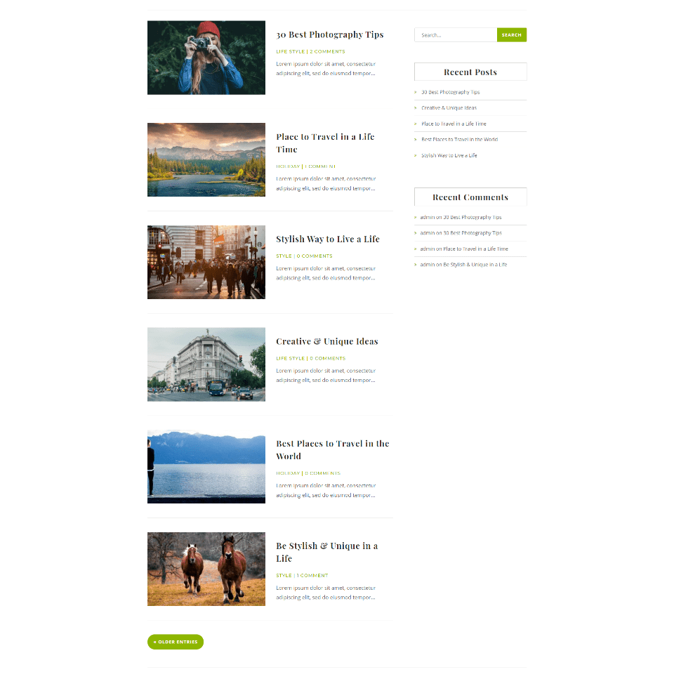
The Twice Divi child theme blog section displays the latest blog posts in a single column with a sidebar. The meta text, more entries button, search button, bullets, and the hover animations for the borders and links in the sidebar are styled in green.
Popular Post
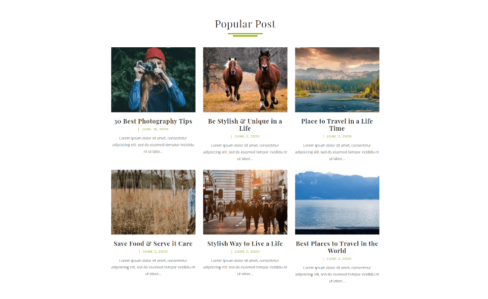
Popular Post displays the 6 posts with the most traffic. It includes the featured image as a thumbnail, the title, meta, and excerpt. It’s created with the WordPress Popular Posts plugin that is recommended when you install the Twice Divi child theme.
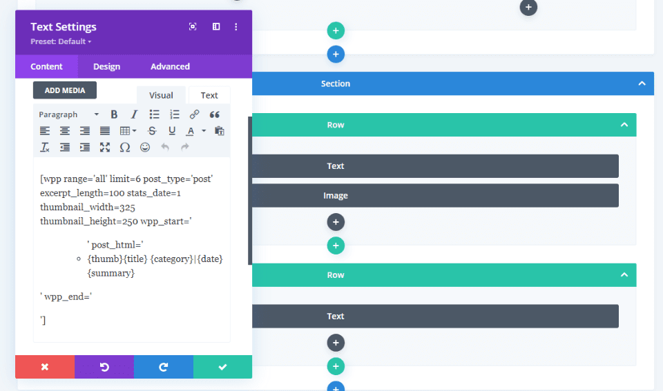
This is created with the plugin and placed within a text module with code. The code specifies the number of posts, post type, thumbnail height, width, etc. This is already set up for you, but you can customize it easily.
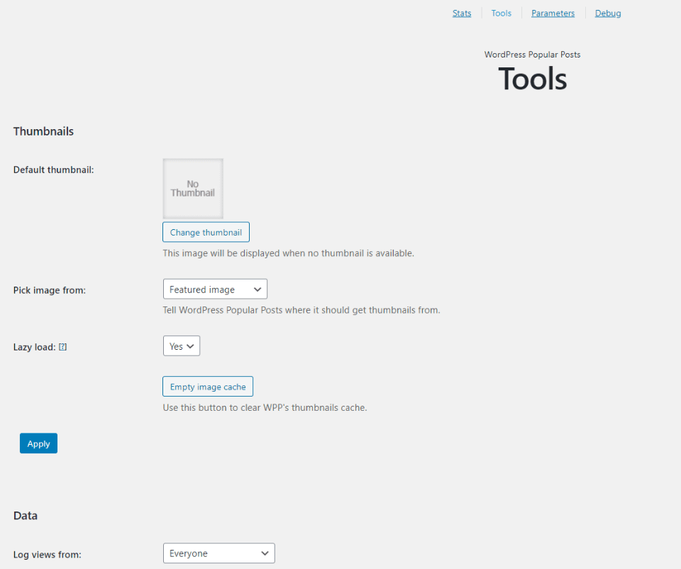
You can modify the plugin’s parameters in its settings screen. Change the thumbnails, data, if links open in a new window, and enable a stylesheet for the plugin.
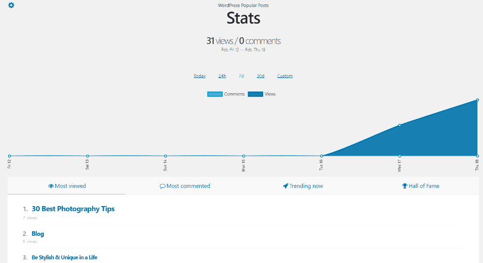
You can also view stats of your popular posts. See the number of views and comments. View stats for today, 24 hours, 7 days, 30 days, or a custom range. This is helpful in knowing what’s trending on your website.
About Us
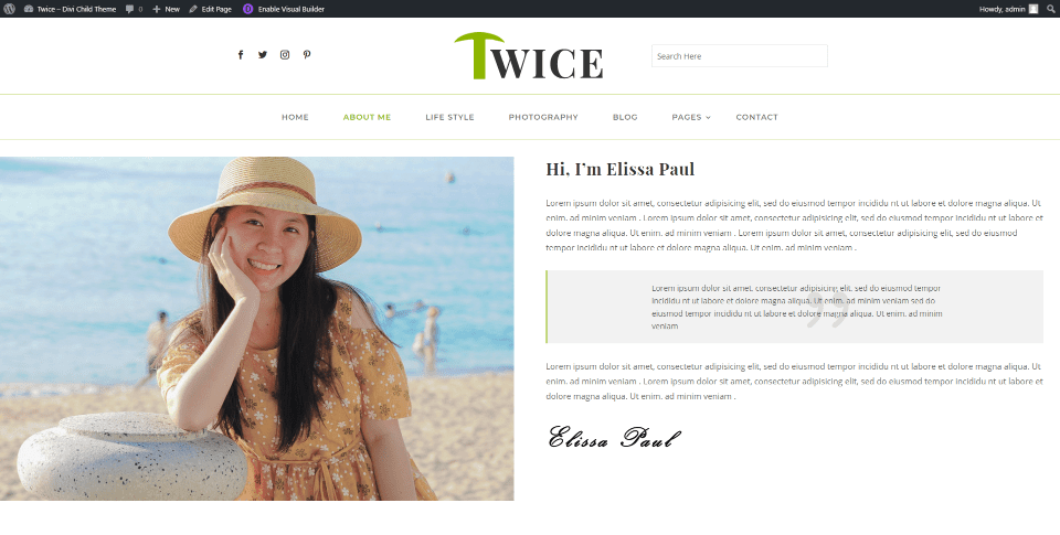
About Us displays a single row with two columns. Column one shows a large image while column two shows an introduction, a detailed description with a quote, and a signature.
Blog and Category Pages
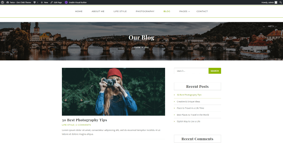
Blog and category pages introduce the page with a section that includes a full-width image, title, and breadcrumbs. Category and blog pages work the same. They display the most recent posts and include green styling for the meta-text, search box, hover animation for the sidebar, and the link to read more posts.
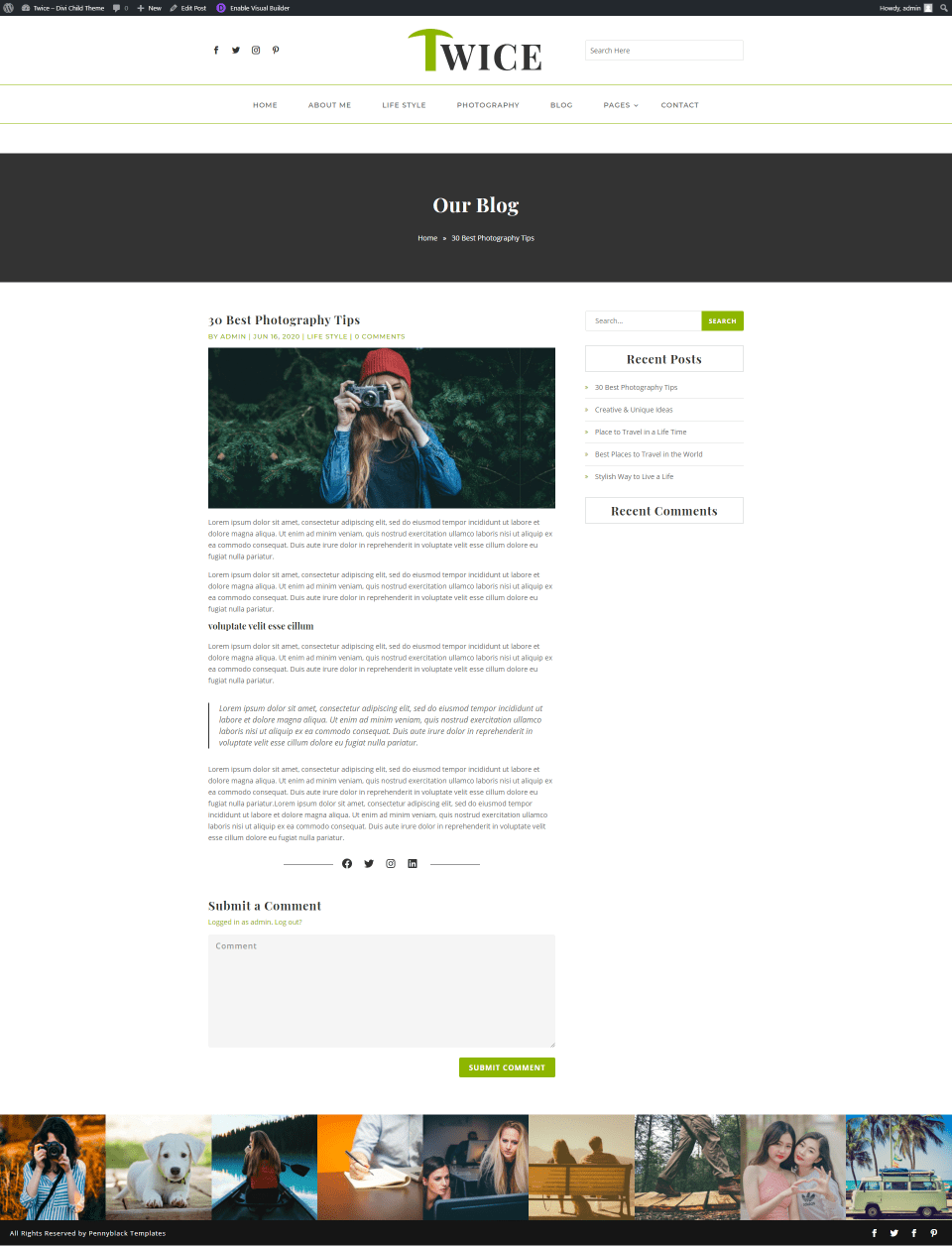
Post layouts include the featured image, social media links under the content, and a styled sidebar.
Gallery
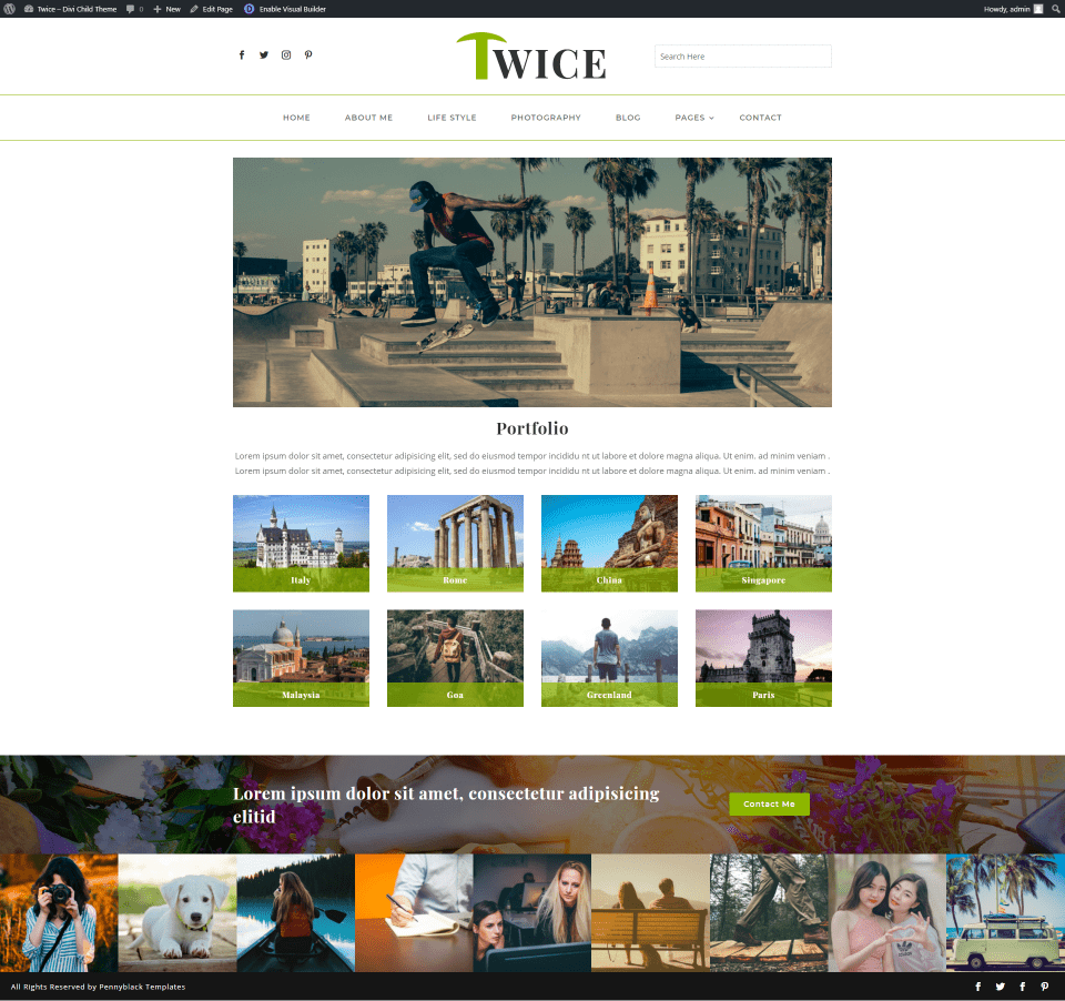
Twice Divi child theme’s Gallery page works as a portfolio and displays an introduction with an image and text, images that open in a lightbox, and a full-width CTA with a background image and a contact button. I like the gallery styling that displays a title over a small overlay that sits at the bottom of the image.
Twice Divi Child Theme 404 Page
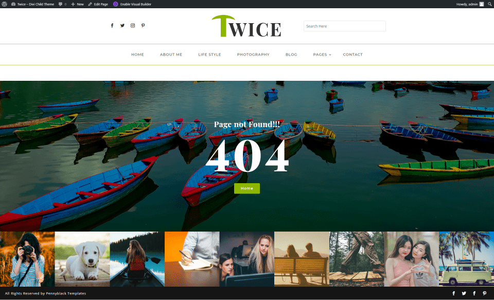
Twice’s 404 page displays a full-width image with a message and a button to the homepage. This page also includes the header and footer. It’s clearly labeled so visitors will know what’s going on.
Coming Soon

Coming Soon displays a full-width background image with a message, countdown timer, and social follow links. This page doesn’t display the header or footer, so you can set it as your homepage until you’re ready to reveal your website.
Contact
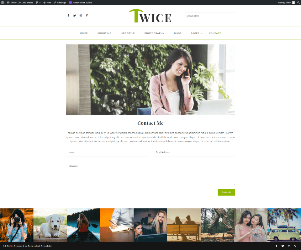
The Contact page shows a large image with an invitation to contact the website. The form is simple and easy to use, providing a clean design that doesn’t draw attention away.
Twice Divi Child Theme Library Layouts
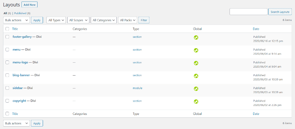
Elements such as the header, footer, blog banner, sidebar, etc., are created as layouts in the Divi Library. They’re added to the layouts with code in the theme’s files. Fortunately, you don’t need to dig into the code to make changes. All changes to these files are done in the library. Let’s look at a few of the layouts.
Twice Header
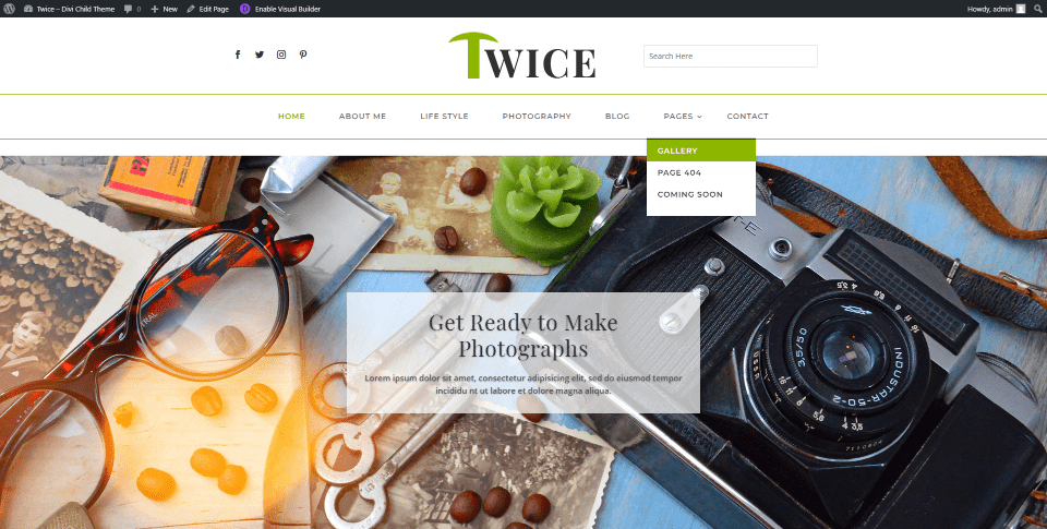
The global header was created in the Divi Library with two different layouts to create two layers. Layer one displays social media icons, the logo, and a search box. Layer two displays the menu. Both are separated by a styled border.
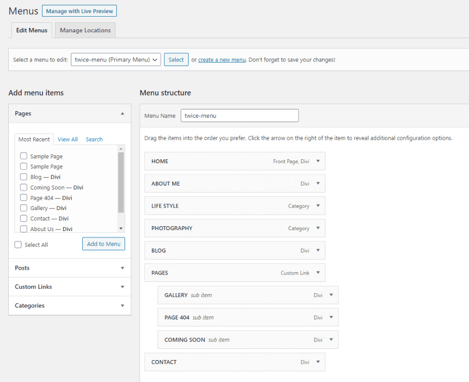
The primary and footer menus match the demo and are easily changed in the Menus dashboard. This is the primary menu. Menus are not assigned in this screen because they’re selected and displayed with a header made with the Divi Builder.
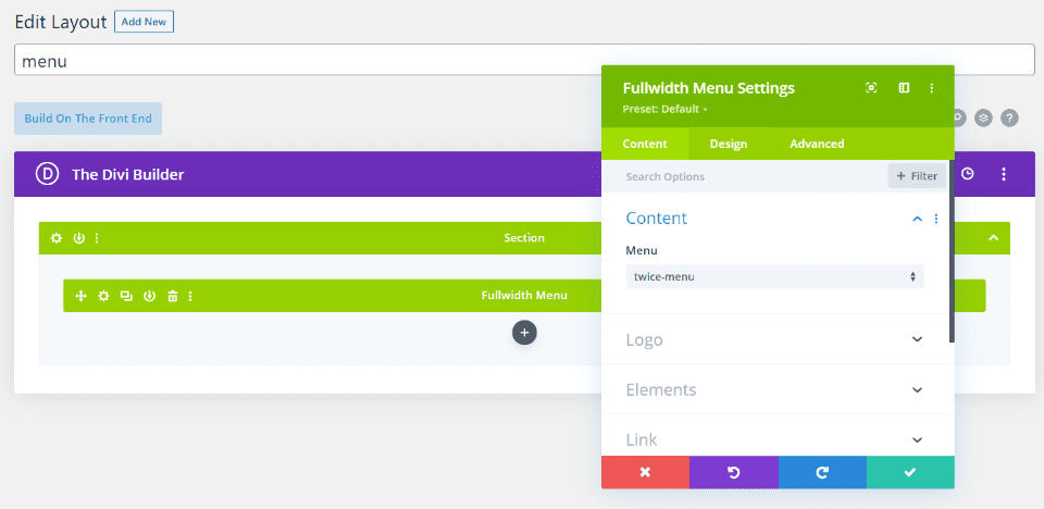
Here’s the menu built with the Divi Builder in the library. To customize it, simply choose the menu you want to display in the menu module and style it as you would any Divi layout.

The footer includes two areas. The first is created with code in the theme’s files and displays a gallery. Each image opens in a lightbox. The bottom section is the information and social media icons. These are also created with the Divi Builder so images and information can be changed easily.
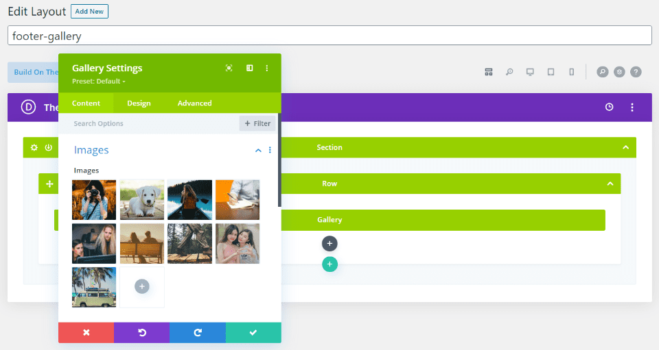
Here’s the footer gallery. It’s created in the Divi Library and added to the footer in the theme files.
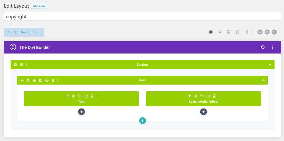
Here’s the bottom row that displays the copyright and social media modules. It’s also created with the Divi Builder in the library.
Where to Purchase the Twice Divi Child Theme
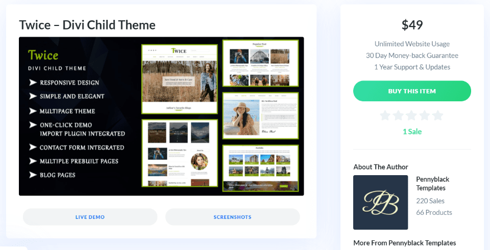
You can purchase the Twice Divi child theme in the Divi Marketplace for $49. It includes unlimited website usage and one year of support and updates. The sales page also includes links to the live demo, more screenshots, and documentation that steps you through every detail of using the child theme.
Ending Thoughts
That’s our look at the Twice Divi child theme. The pages are clean and are the pages that most blogs would need to highlight their most popular categories. CSS and extra features are added in the theme’s template files. Many of the headers, footers, etc., are made in the Divi Library and added to the theme files. Some of the files can be overridden or added to by adding templates to the Theme Builder, while others can be changed in the library. The code is commented well, and I found it easy to follow.
If you’re looking for a blog child theme for Divi that’s both simple and effective, Twice is worth a look.
We want to hear from you. Have you tried the Twice Divi child theme? Let us know what you think about it in the comments.
Featured Image via SpicyTruffel / shutterstock.com


Leave A Reply