The relative position property is perhaps the most mysterious of the position types. However, once we understand how it works, we can use it to our advantage when designing a site in Divi. What we discover may surprise you.
Overview of Divi’s Four Types of Positioning
The relative position is one of four position types available in Divi. Here is a quick overview of each one below.
Static (Default)
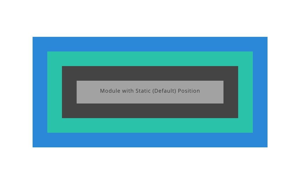
Static elements technically aren’t “positioned” since they stay with the normal flow or order of elements on the page, and they don’t respond to the top, right, bottom, and left properties like other positioned elements (which is why no offsets are available in Divi for elements in the static/default position). In Divi, when we choose the default position for a module, we are choosing the static position. It is also worth mentioning that some elements in Divi (like rows and sections) will have a relative position by default (not the static position).
Relative
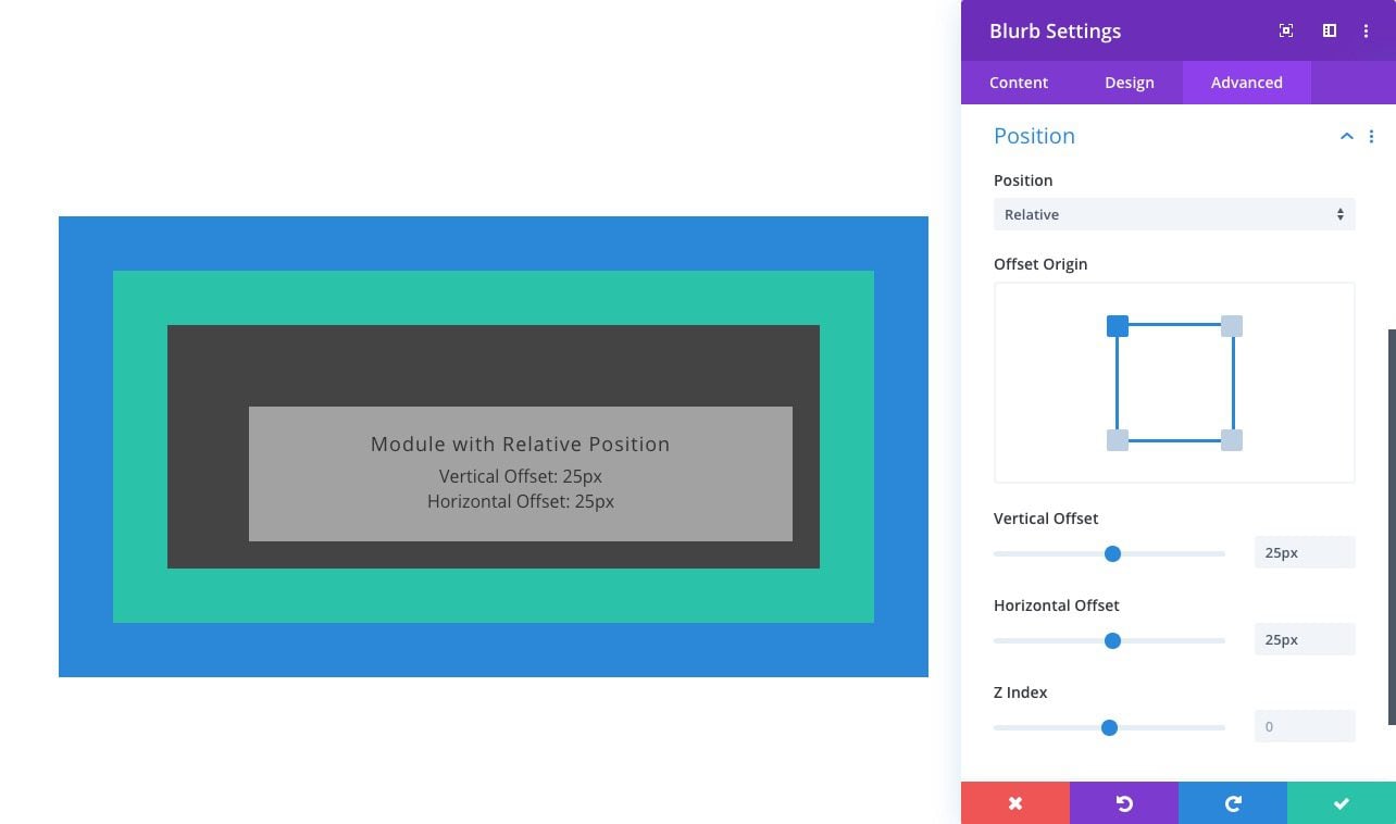
Relatively positioned elements are kind of like static elements in that they follow the normal flow of the page. The main difference is that relatively positioned elements can be positioned using the top, bottom, left, and right properties. Also, unlike static elements, they can also be positioned using the Z Index property.
Absolute
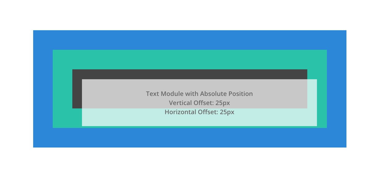
An absolutely positioned element breaks out of the normal document flow and therefore no actual space is created on the page for the element. We can think of it as an element that is floating on top of the other elements on the page that take up actual space. It will be positioned relative to the nearest positioned parent container.
Fixed
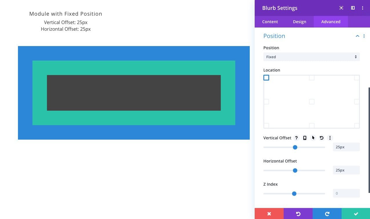
Like the absolute position, elements with the fixed position will break out of the normal flow of the page and have no actual space created within the page. The key difference between absolute and fixed is that the fixed position is relative to the browser window or viewport. In other words, no matter where the element is within the normal flow of the page, once it is given a fixed position, its position will now directly relate to the browser window. We can use the top, bottom, left, and right properties to position the element within the viewport. Because fixed elements will often hover behind or in front of other elements on the page, Z Index will help order fixed elements above others.
NOTE: There is another type of positioning in CSS called sticky. A stickily positioned element behaves like a relatively positioned element until we scroll to its container (at some point determined by the top value). Then the element becomes fixed (or stuck) until the user scrolls to the end of the container. However, the sticky position can be a bit unpredictable since other factors may inhibit the functionality. In Divi, the sticky option isn’t available within the built-in options for this reason. However, there are ways to use “position:sticky” in Divi.
How the Relative Position “positions” an element in Divi
As mentioned in the overview, the Relative position type is similar to the static “position” because the element remains in the normal flow of the document (the HTML on the page). The real difference is that once we assign an element with the relative position, it now has new options available for positioning the element. These options include the top, bottom, left, and right properties as well as the Z Index property.
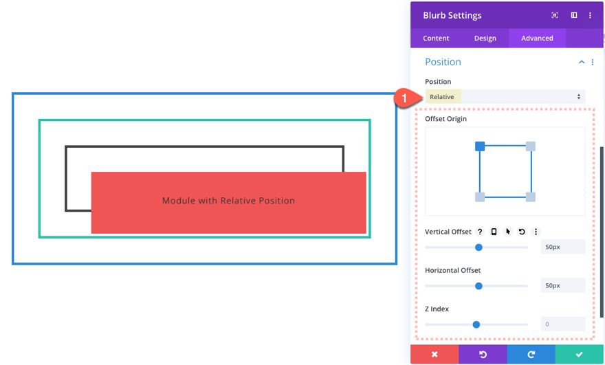
In Divi, these additional position options can be found under the position option group once the relative position has been selected.
Using Offsets with the Relative Position
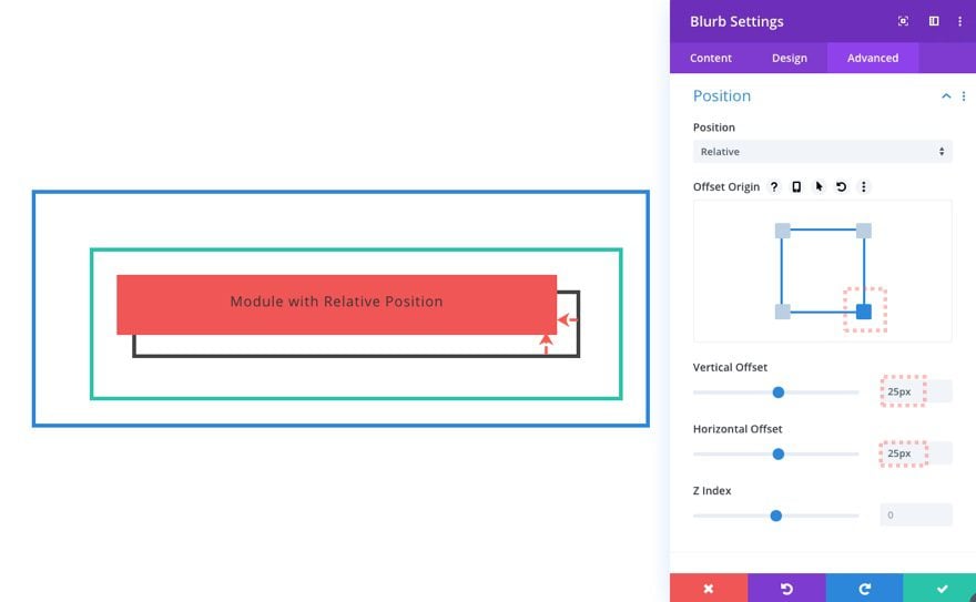
The Offset Origin and the Offset values will work together to position our element anywhere we want within the parent container. In this example, we have a module that has a relative position, a top-left offset, a vertical offset of 25px, and a horizontal offset of 25px. Notice how the offset values will move the element away from the offset origin horizontally and/or vertically.
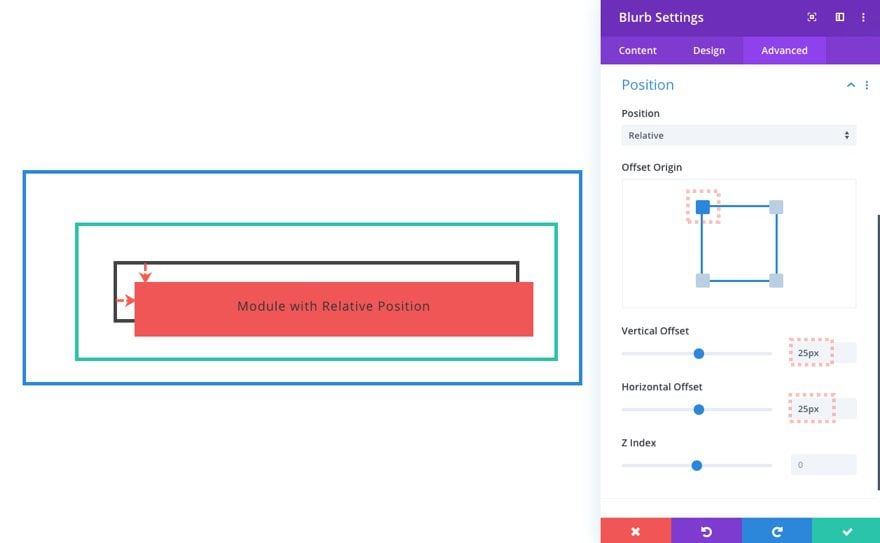
Here is the same module with the same offsets but with a top-right offset origin.
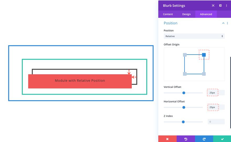
Here is the same module with the same offsets and a bottom right offset origin.
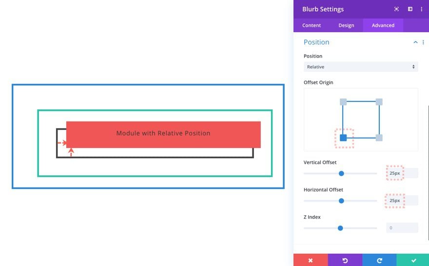
And here is the same module with the same offsets and a bottom left offset origin.
No Spacing Surprises
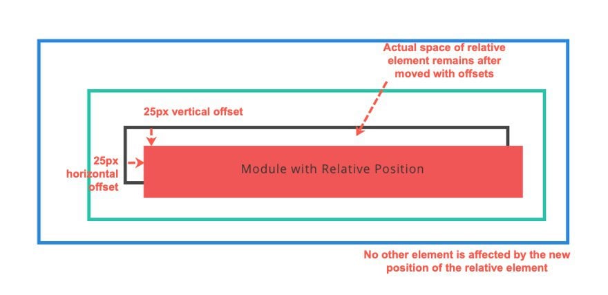
With relative positioning, the actual space of the element remains in its original place after the element is moved using the offsets (top, bottom, left, right). The element’s new position doesn’t move or affect any of the spacing of the rest of the elements on the page. It basically hovers over the other elements like a spirit that left its body.
Reasons to Use the Relative Position
#1 To Render a Parent Container for Absolutely Positioned Elements
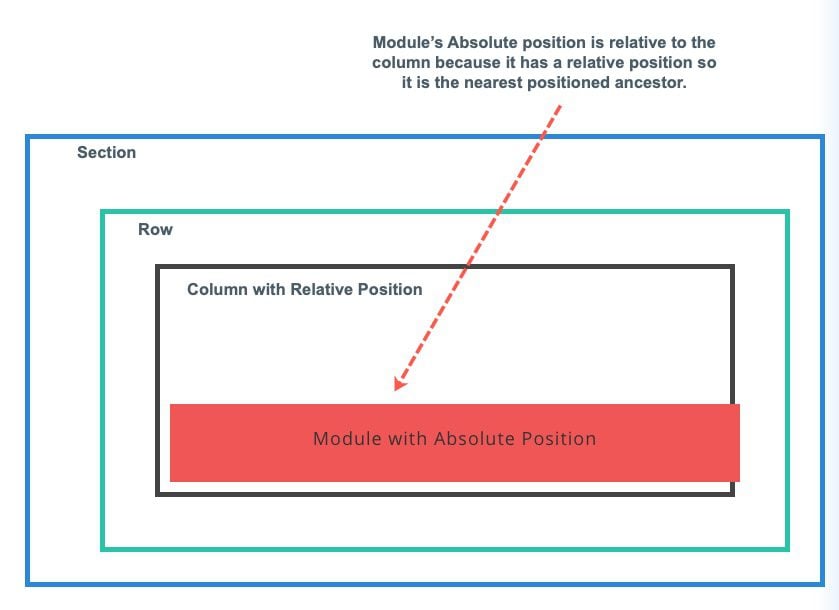
This is probably the most popular application of the relative position type. Since any absolutely positioned element is relative to the nearest positioned ancestor, we can choose to make one of its ancestors a positioned element simply by giving it a relative position (the default static position isn’t technically “positioned”). This keeps the document flow in place (like static) and allows us to choose a container for the absolute elements.
#2 To Move Elements without Affecting the Other Elements on the Page.
With the relative position, we can use the offsets to nudge items into alignment without affecting any other elements. And With Divi, we can take advantage of the draggable UI to position elements visually in real-time.
#3 To Use Z Index for Overlapping Other Elements
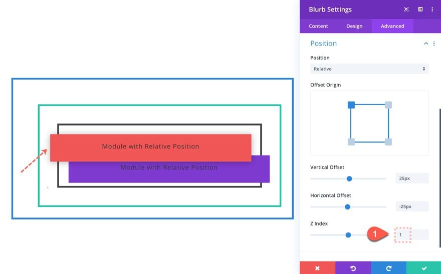
By default, static elements aren’t able to be reordered in the z-axis unless given the relative position. Once in the relative position, the element will stay positioned in the normal flow of the document. Only now, we have the ability to take advantage of Z Indexing to place elements in a particular order when overlapping one another.
#4 To Avoid Using Negative Margin for Position Purposes
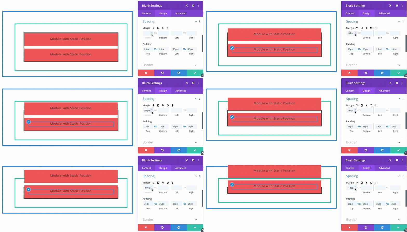
Relative positioning will leave behind the space of its original position. However, with a negative margin, both the content and its original space both are relocated. For example, if we add a negative top margin to a row in Divi so that the row overlaps the row above it, all the rows/content will move up with it. This leaves a bit of a mess to clean up that could be avoided by using the relative position offsets instead.
Here’s an illustration of what happens when we use a negative top margin to move a module upward. Notice how the rest of the elements below are brought up with it.
If we give the same module a relative position, we can use the vertical offset to bring the module upward without it affecting the rest of the spacing on the page.
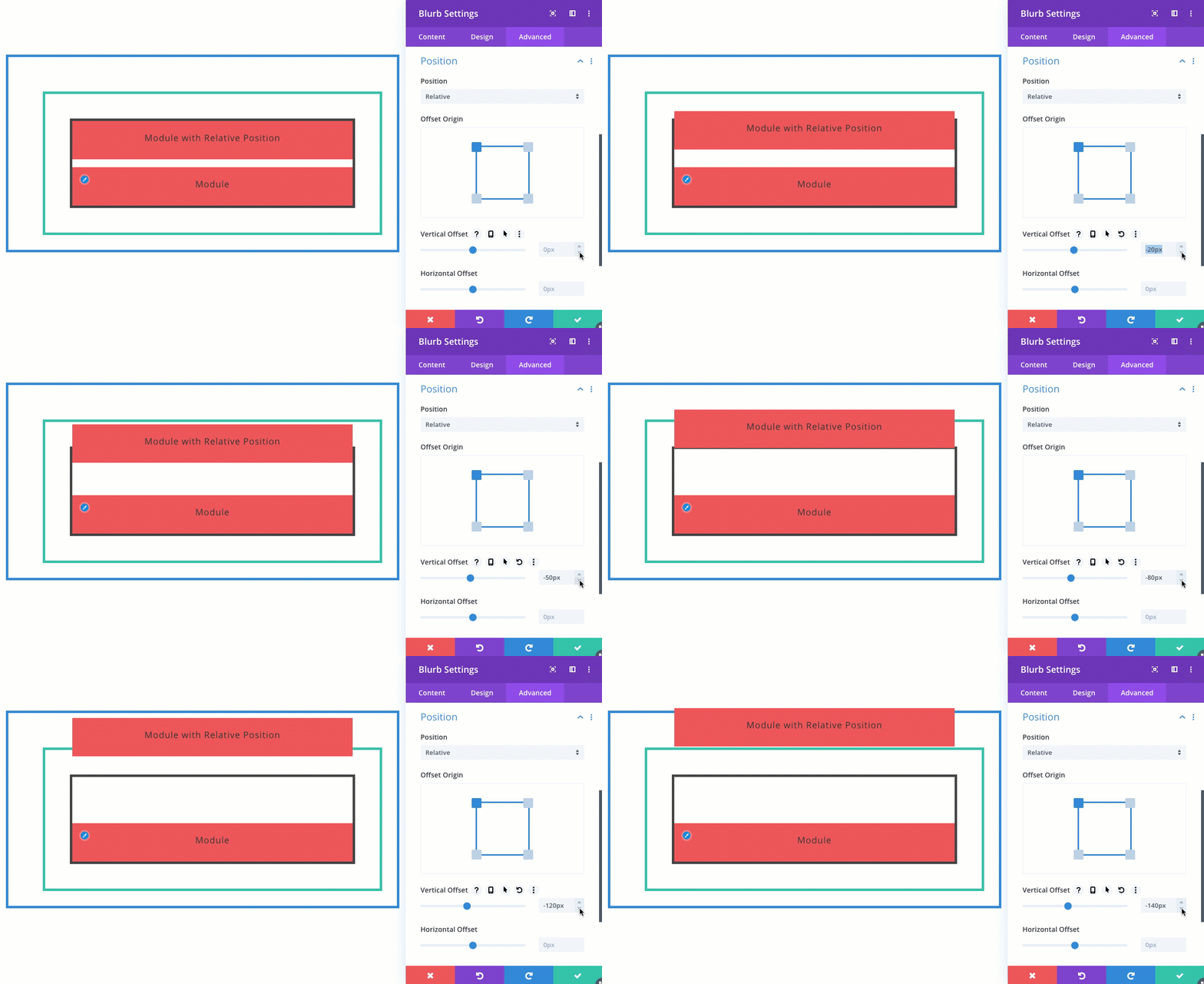
Although I’ve often used a negative margin to position elements in Divi, it probably isn’t a good idea if we can use relative positioning instead. Margin relates to the element’s box module so it is really meant to add spacing in and around the element itself, not so much for positioning the element offset from its parent container like with relative positioning.
Relative Position vs Transform Translate
The relative position is really similar to using transform translate to position elements on a page. They both move the element while leaving the actual space in its original place and without affecting the other elements on the page.
Translate is Better for Animation and Transitions (like hover effects)
However, it seems that translate is best for animation and transitions (like hover effects) because it provides quicker and smoother transitions. Using the top, bottom, left, and right offsets to animate or transition a relative element could be more choppy and could make our browser work harder than it needs.
Relative Length Units Respond Differently
If we are using relative length units (like % or vw) for responsive design, these will work differently with relative position and transform translate.
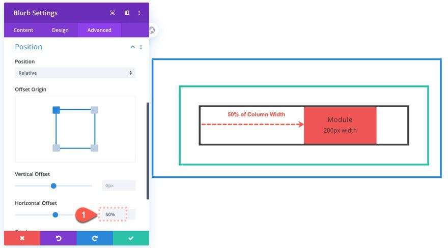
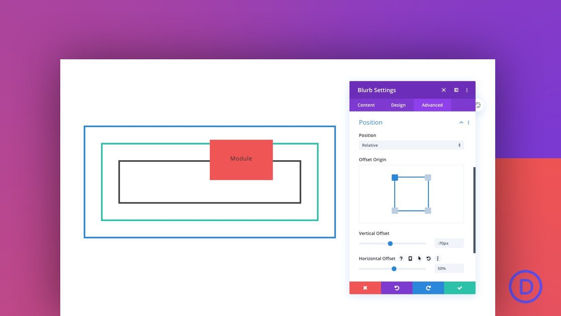
A Divi module with a relative position and a horizontal offset of 50% will move the module horizontally the amount equal to 50% of the width of the parent container (or column).
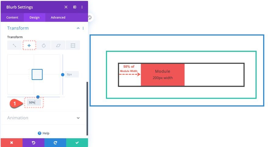
A Divi module with a transform translate (X-axis) of 50% will move the module horizontally the amount equal to 50% of the width of the module itself.
Combining Relative Position and Transform Translate to Center Elements
As we just covered, the relative position is relative to the parent and the transform translate property is relative to the element itself. Because of this, we can use both in combination for positioning elements just the way we want. We can even use this technique to center elements in their container.
For example, we can use the relative position horizontal offset to position the module to the right exactly 50% of the column width.

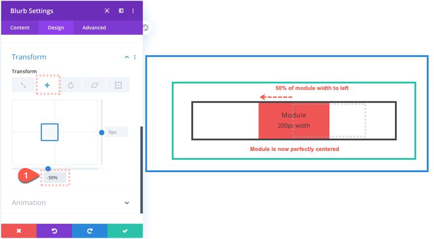
Then use the translate property to move the module 50% (of the module width) to the left. This will make sure the module stays in the center of the column no matter the width of the module.
Final Thoughts
If you are like I was before writing this article, you probably didn’t understand or use the relative position type very well. Perhaps the most surprising aspect of this relative position is how it impacts (or doesn’t impact) the rest of the design on the page. Not only does it work in tandem with the absolute elements, but it also works well with transform translate to position elements in the perfect spot.
What has been your experience with the relative position type?
I look forward to hearing from you in the comments.
Cheers!



I am using a pre-layout . I wanted to check about the “Position” field in the module but I coudnt find the option within the “Advanced ” section, how can I find if I want to add a new module or whatever, the “Position” field to adjust as you mention in this article?
Thanks in advance,
L
Very helpful, thank you.
Thanks Jason
Do you have any examples of real websites that uses the relative position?
I’m asking as I would like to understand a bit more about you can use relative position before I try to implement it.
Thanks for this post, I’ve been waiting for someone to elaborate on why Divi includes both Translating and Positioning. It was also good to know that you set positioning back to default on mobile. I’d really like ET to add a “mobile landscape” breakpoint because I find the “vw” units when configured to look great on mobile in portrait, look poor when you rotate the device to landscape or vice versa.
I’d really like to see a post when you develop a nice design with fancy positioning, and then use a “landscape”-scoped media query to adjust tweak the design further.
Thanks so much!
Emilio,
Glad you liked the post. That’s a great point about the landscape view. Thanks for sharing.
Somehow overdone – divi is pressing more and more features and handling adjustments gets spreading all over different places, not to find easily.
And I have no use for many features as to understand the concept and use of this takes to much time for little gimmicks.
Dieter,
Are you saying that Divi has too many features?
Very helpful, thank you.
Latest and friendly idea to match with user demand.
Thanks Jason,
Great explanation. Just one thing…
Is it possible to use the positioning to center a module in a “tall” row?
eg: H1 text in a text module to be vertically centered in a standard row that’s size is set to 80vh tall.
Donal,
Yes that is possible. However, remember that the column is the parent of the module, so if you have a 80vh tall row, you will need to absolutely position the column to be centered. If you want to center the module, make sure to add a custom height of 80vh to the column as well. Hope that makes sense.
It would be great to have a non-techie intro as to what this is and applications for use. I just don’t understand the specific terms and therefore not the rest of the description. Although I’m sure that I would like to use this function.
Sorry about that. Basically, it allows you to position a module, section, row, column using the built-in Divi settings, much like you would do if you used the transform (translate) option in Divi. It can be more reliable than using margins as well. Hope that helps.
Thanks for sharing! I always use static (default) positions
You’re welcome, Rooudle.
Great job! I like your theme.Thanks for sharing this nice list !! The information you give will be of great value to me.
Thanks, Ahmad. That’s great to hear.