Divi’s Filterable Portfolio Module gives you two layout options to choose from. Both options have advantages and work great for certain purposes. In this post, we’ll compare the fullwidth and grid layouts in Divi’s Filterable Portfolio Module to help you decide which you need for your website. We’ll also style both layouts to see how they work within a Divi layout.
Let’s get started!
- 1 Preview of the Filterable Portfolio Module Layout Options
- 2 How to Change the Filterable POrtfolio Module Layout
- 3 How the Filterable Portfolio Module Layouts Compare
- 4 When to Use Each Filterable Portfolio Module Layout
- 5 How to Style the Filterable Portfolio Module Layouts
- 6 Results
- 7 Ending Thoughts on Divi’s Filterable Portfolio Module Layout Options
Preview of the Filterable Portfolio Module Layout Options
First, let’s take a look at what we’ll build in this tutorial.
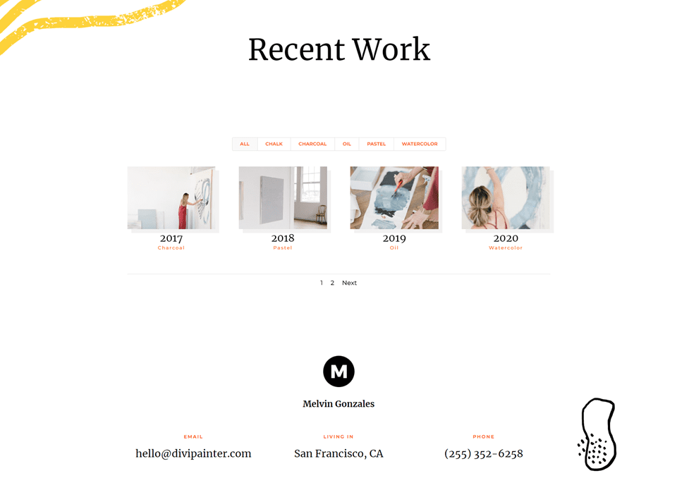
Grid Portfolio Item Desktop
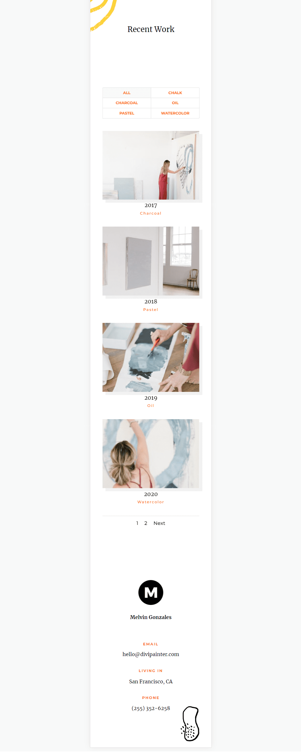
Grid Portfolio Item Phone
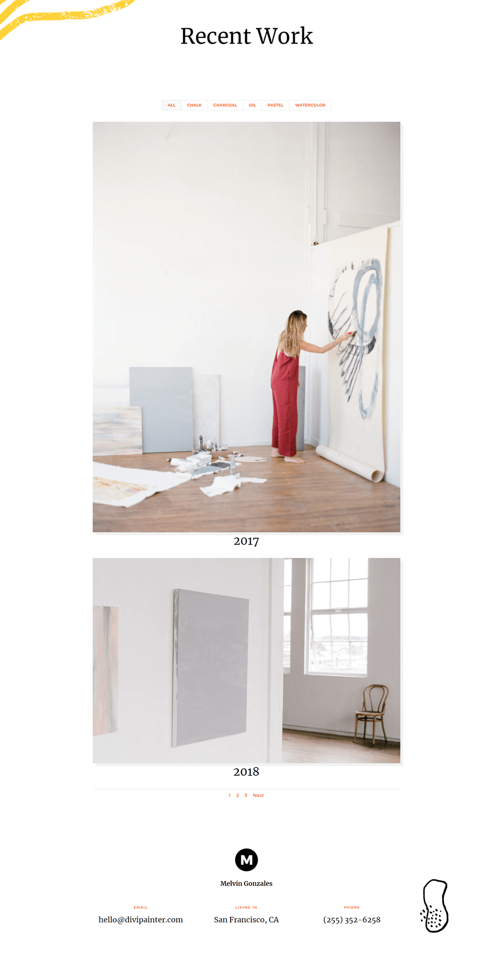
Fullwidth Layout Portfolio Item Desktop
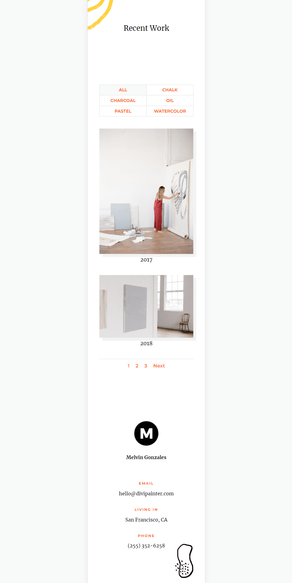
Fullwidth Layout Portfolio Item Phone
How to Change the Filterable POrtfolio Module Layout
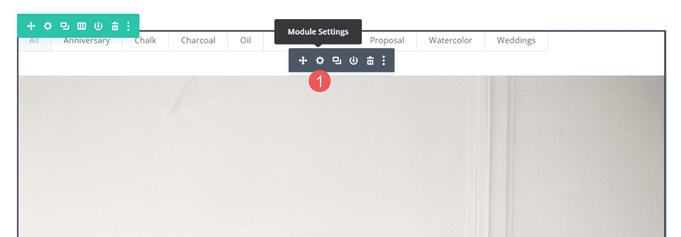
By default, the Filterable Portfolio Module displays the layout in full width. You can change the layout to display the portfolio items in a grid. First, open the module’s settings as normal
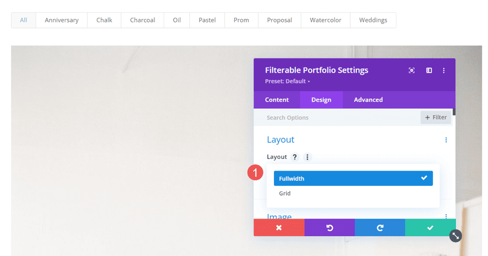
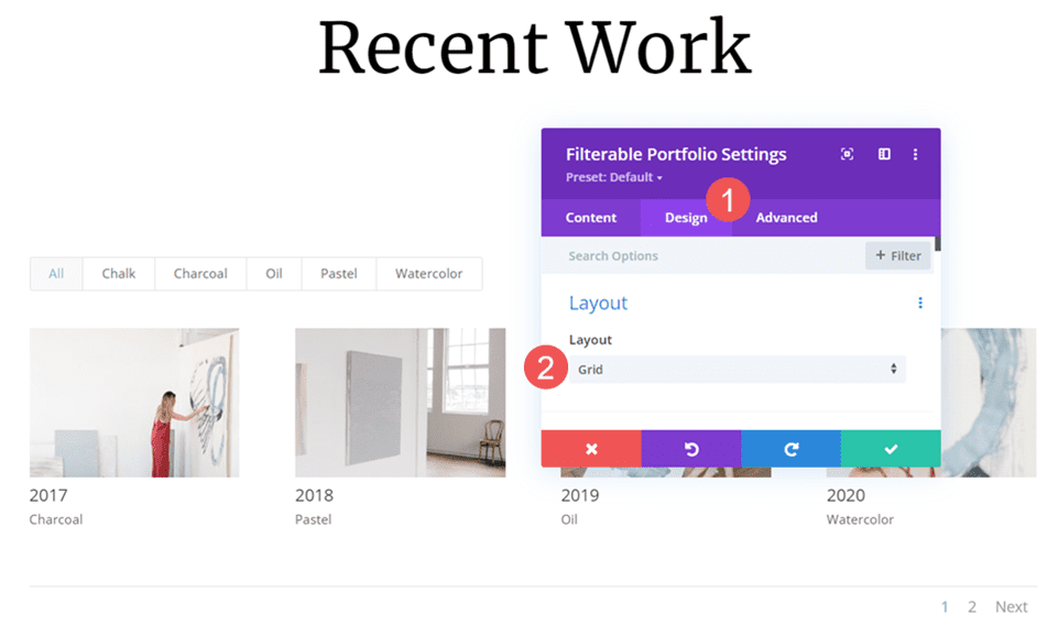
Next, select the Design tab. The first option is Layout. It has a dropdown box with a couple of choices. Select it to choose between Fullwidth and Grid.
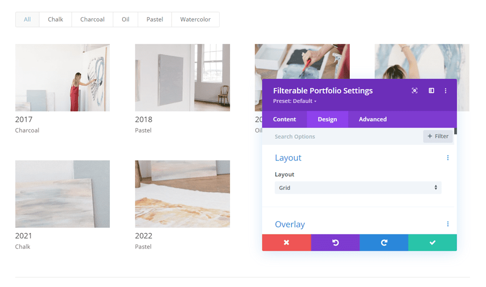
If you choose the option that isn’t currently selected, the module will reload and display the portfolio items in that layout. The example below shows the Grid layout.
How the Filterable Portfolio Module Layouts Compare
The two layouts are very different, but they do have some similarities. Both display the filter at the top of the module, the title and meta below the item images, and the pagination at the bottom of the module.
Here’s a look at how they’re different.
Fullwidth Layout
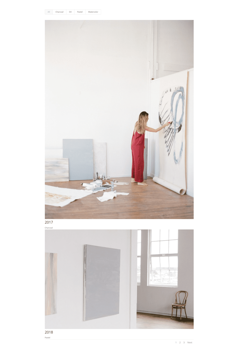
Fullwidth displays a large image with one portfolio item taking the full width of the portfolio area. This shows a lot more detail because of the larger image, but it can get large. The images display in their native shape and expand to fit the available width. It doesn’t add a lot of space between the portfolio items. I recommend limiting the Post count to just a few. The example below shows the Fullwidth layout with a Post Count of 2.
Grid Layout
The Grid layout displays up to 4 items on a line. It adds more space between the items. The images are cropped to create thumbnails that are the same size regardless of the size and shape of the image.
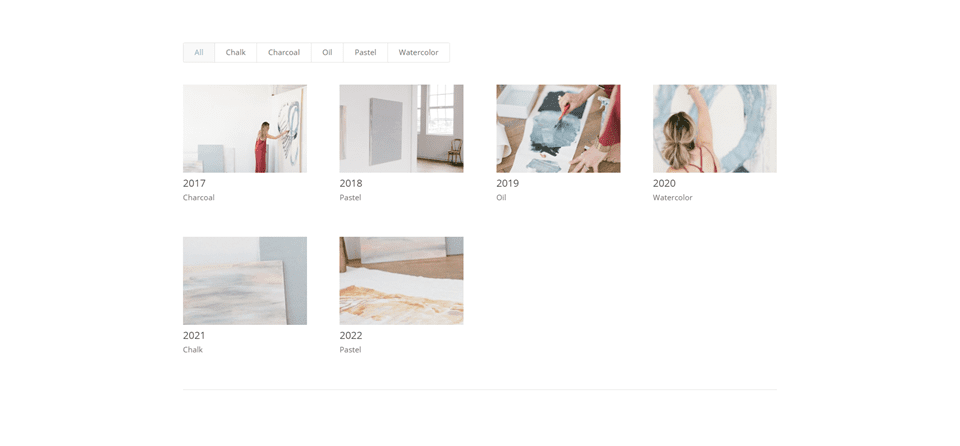
For this one, I’ve limited the module to display four posts to show the pagination.

When to Use Each Filterable Portfolio Module Layout
Both layouts have their advantages. Here are some tips on when to use each layout.
Fullwidth Layout
Use the Fullwidth layout when you have just a few items to show, or you want to focus on a few items. Also, use this layout when you want to highlight or draw attention to the featured images.
Grid Layout
Use the Grid layout when you want to show lots of items or when you want a layout to show more items in a smaller space.
How to Style the Filterable Portfolio Module Layouts
Now that we’ve seen how to select the layouts, how they work, and when to use them, let’s see how to style both layouts. I’ll use the Portfolio page from the free Painter Layout Pack that’s available within Divi. Here’s the original page.
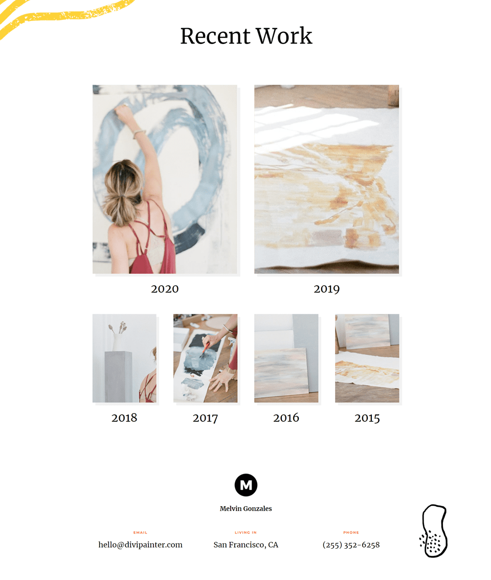
I’ll replace the portfolio with Filterable Portfolio Module and use the same images and titles. I’ll create two versions: one with a fullwidth layout and one with a grid layout and style them.
How to Style a Grid Filterable Portfolio Module Layout Item
We’ll start with the Grid layout. I’ll use colors and fonts from the original layout.
Content
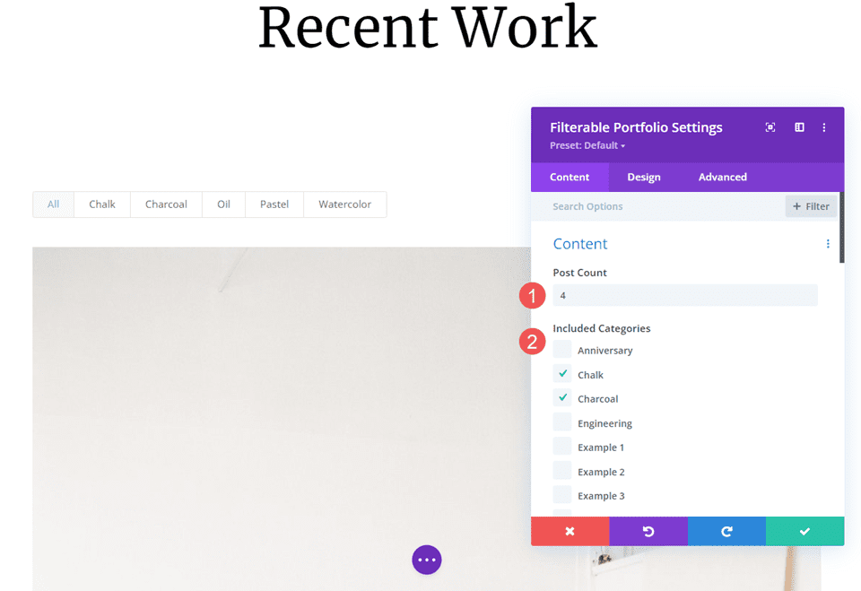
Open the module’s settings and enter 4 for the Post Count. Select all the categories you want to display in the module.
- Post count: 4
- Included Categories: each category
Layout
Next, select the Design tab and choose Grid from the Layout options.
- Layout: Grid
Image
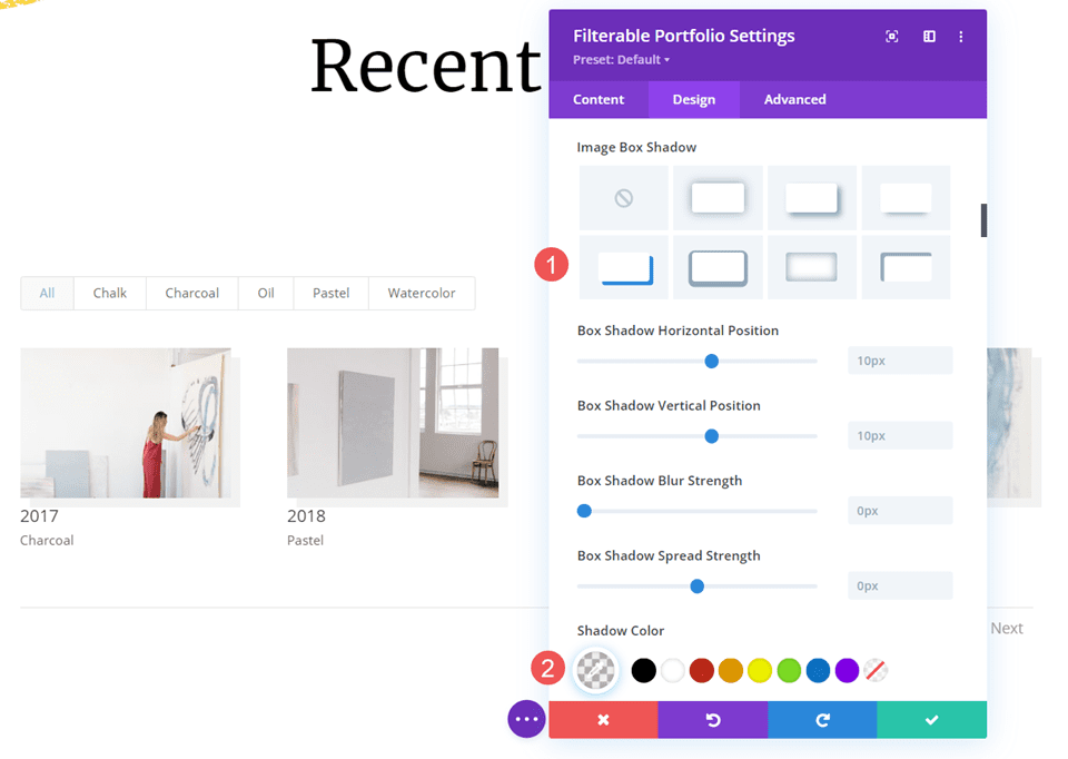
Scroll down to Image and choose the 4th Box Shadow option. Change the Shadow Color to rgba(0,0,0,0.05).
- Box Shadow: 4th option
- Shadow Color: rgba(0,0,0,0.05)
Text
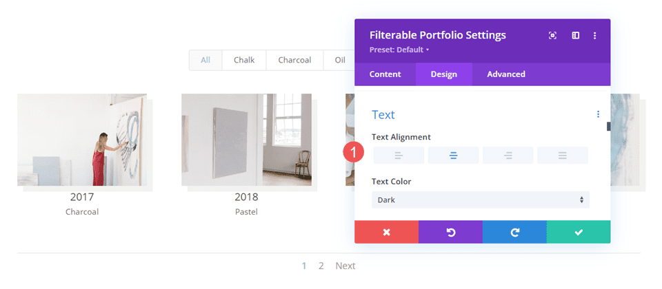
Next, scroll down to Text and change the Alignment to Center. This centers the filter, title, meta, and pagination.
- Alignment: Center
Title Text
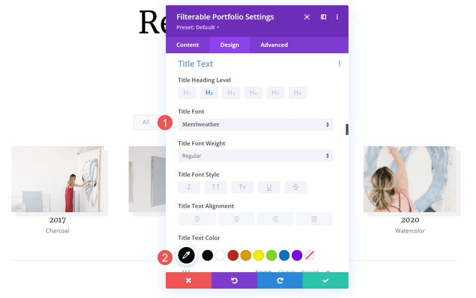
Next, scroll to Title Text. Change the Font to Merriweather and change the Color to black. Leave the other settings at their defaults.
- Font: Merriweather
- Color: #000000
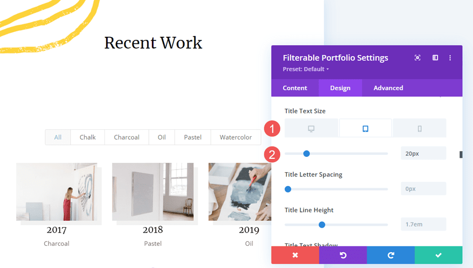
Change the Font Size to 26px for desktops, 20px for tablets, and 18px for phones.
- Size: 26px desktop, 20px tablet, 18px phone
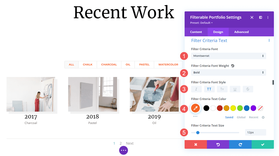
Filter Criteria Text
Next, scroll down to Criteria Text. Change the Font to Montserrat. Set the Weight to bold and the Style to TT. Change the Color to #fd6927 and the Size to 12px.
- Font: Montserrat
- Weight: Bold
- Style: TT
- Color: #fd6927
- Size: 12px
Meta Text
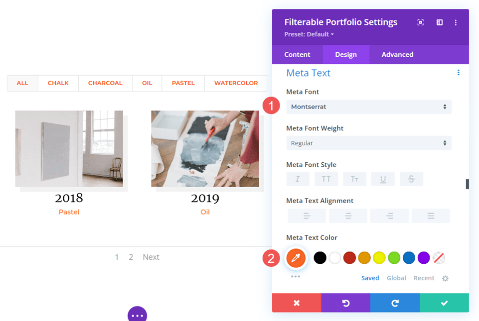
Next, scroll down to Meta Text. Change the Font to Montserrat and the Color to #fd6927.
- Font: Montserrat
- Color: #fd6927
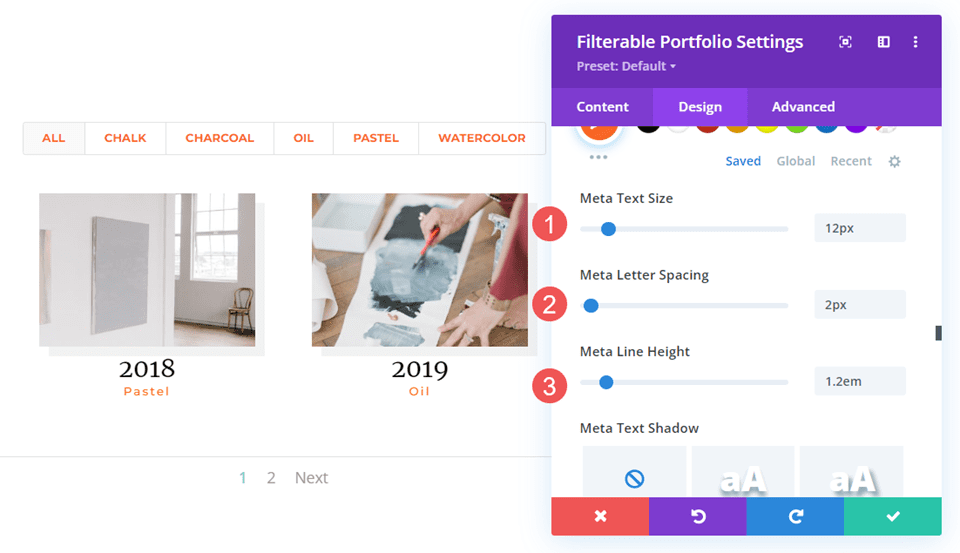
Set the Size to 12px, the Letter Spacing to 2px, and the Line Height to 1.2em.
- Size: 12px
- Letter Spacing: 2px
- Line Height: 1.2em
Pagination Text
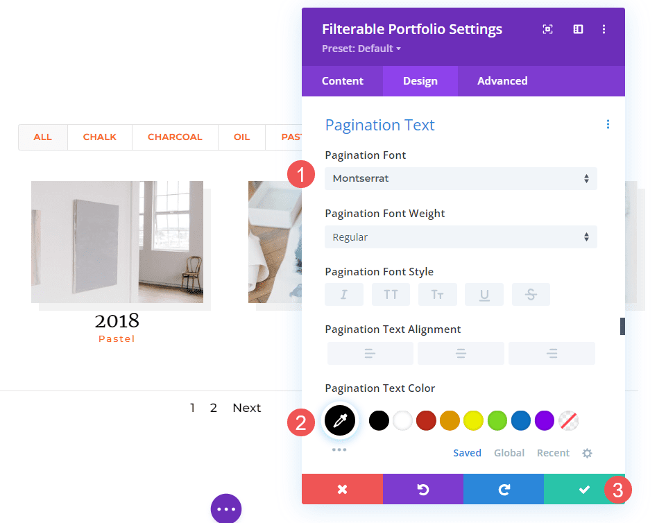
Finally, scroll down to Pagination Text and change the Font to Montserrat, and set the Font Color to black. Close the module and save your settings.
- Font: Montserrat
- Color: #000000
How to Style a Fullwidth Layout Portfolio Item
Now, let’s set up a Fullwidth layout portfolio. We’ll use the same design cues as the Grid layout, but we’ll make some tweaks that work well for this layout. We’ll use some simple CSS to make some minor adjustments.
Content
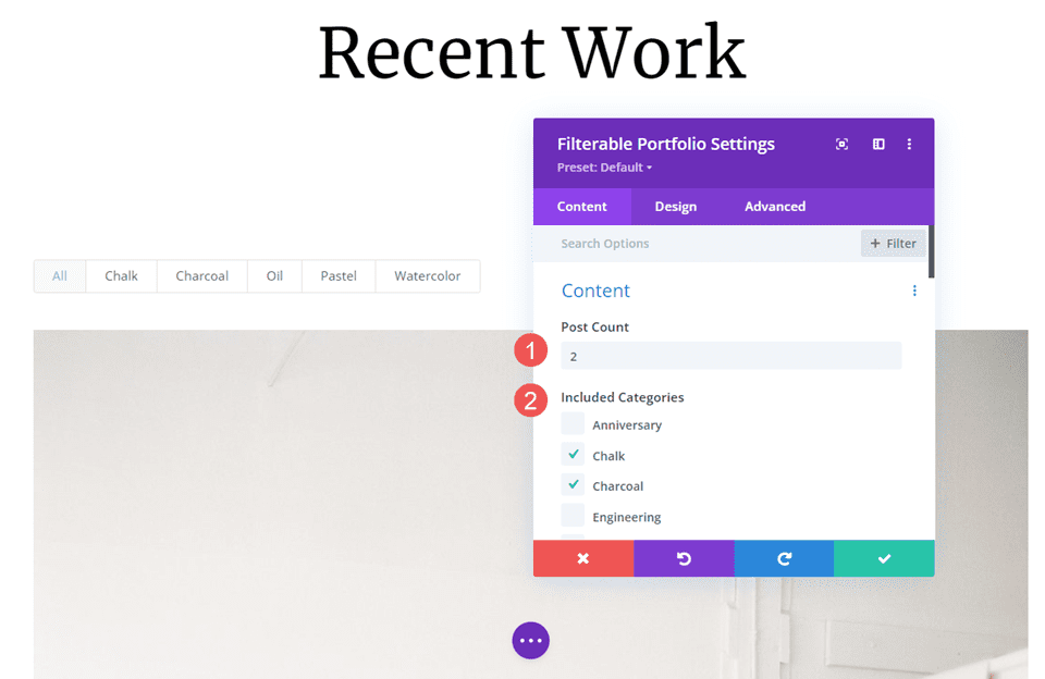
Open the module’s settings and change the Post Count to 2. This keeps the page smaller and easier to manage with the large images. Select all the categories you want to display in the module.
- Post count: 2
- Included Categories: each category
Elements
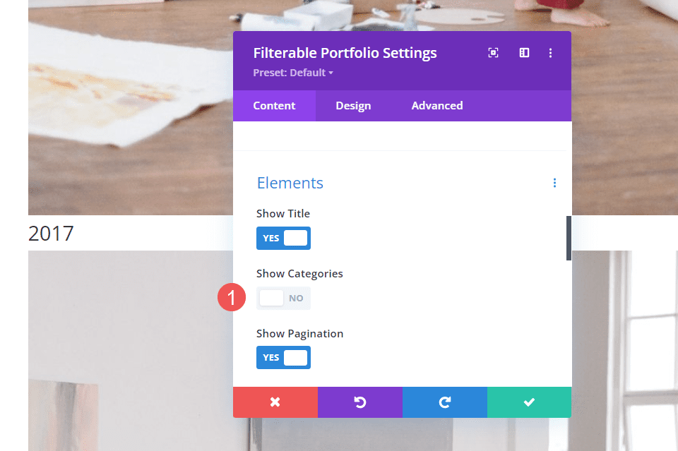
Scroll down to Elements and disable Show Categories. Leave the others enabled. The categories will still be enabled for the filter, but they won’t display with the title.
- Show Title: Yes
- Show Categories: No
- Show Pagination: Yes
Layout
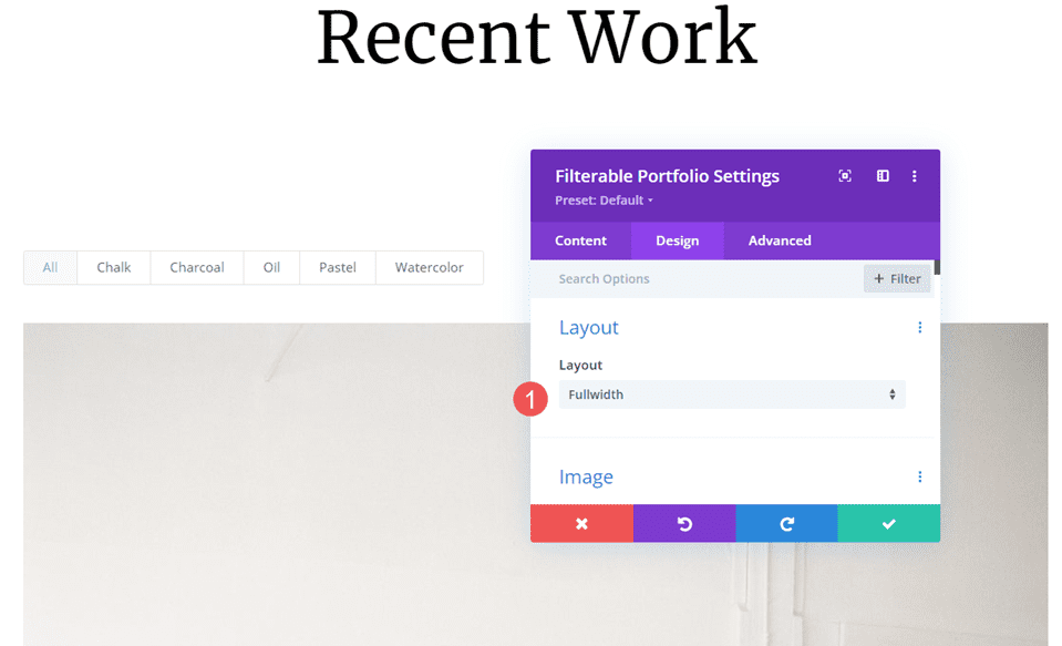
Select the Design tab. Under Layout, leave the Layout set to Fullwidth, which is its default setting.
- Layout: Fullwidth
Image
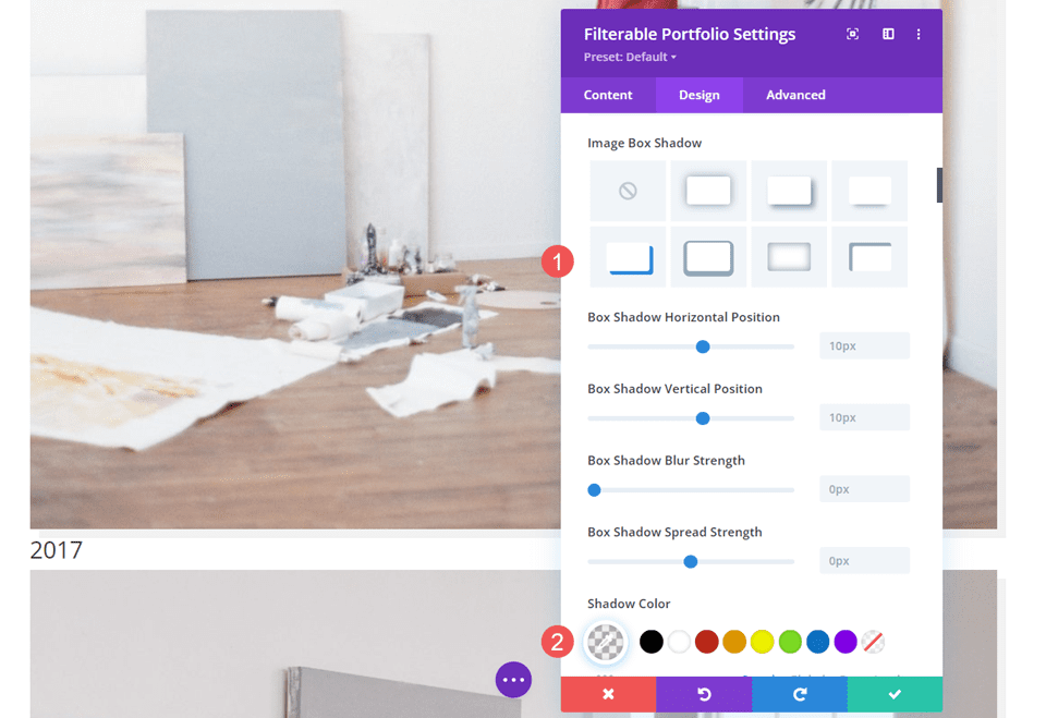
Next, scroll down to Image. Choose the 4th Box Shadow option and change the Shadow Color to rgba(0,0,0,0.05).
- Box Shadow: 4th option
- Shadow Color: rgba(0,0,0,0.05)
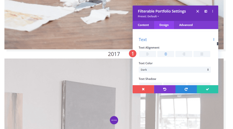
Text
Next, scroll down to Text. Change the Alignment to Center. The filter, title, and pagination will be centered with the images.
- Alignment: Center
Title Text
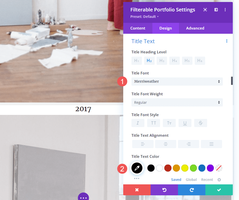
Next, scroll to Title Text. Change the Font to Merriweather and change the Color to black.
- Font: Merriweather
- Color: #000000
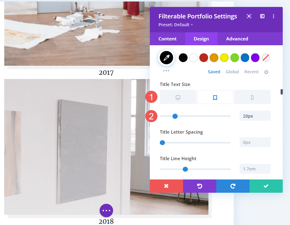
Change the Font Size to 40px for desktops, 20px for tablets, and 18px for phones.
- Size: 40px desktop, 20px tablet, 18px phone
Filter Criteria Text
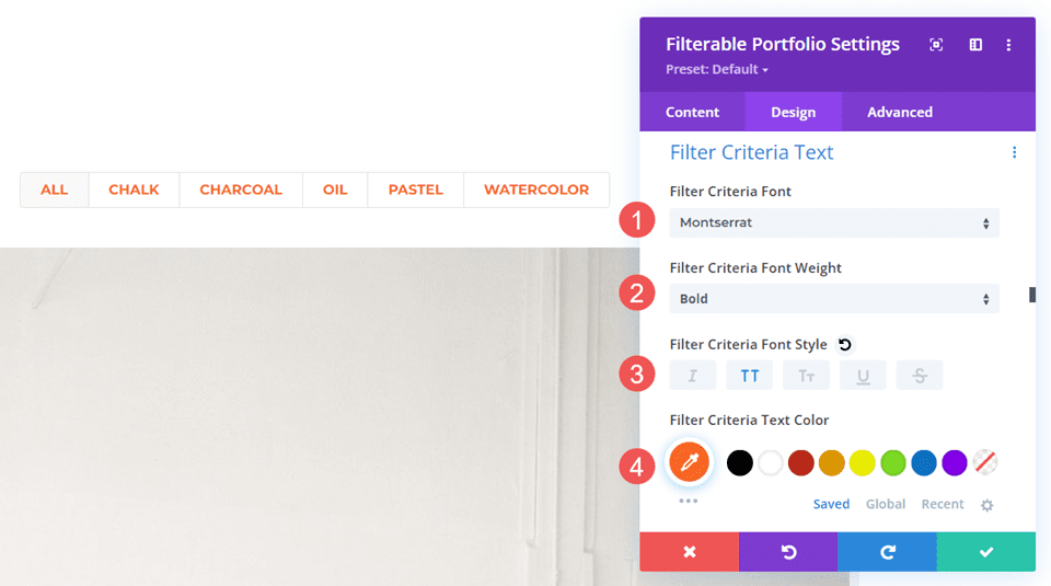
Next, scroll down to Criteria Text. Change the Font to Montserrat, set the Weight to bold, and the Style to TT. Change the Color to #fd6927. Leave the Size at its default setting of 14px.
- Font: Montserrat
- Weight: Bold
- Style: TT
- Color: #fd6927
Pagination Text
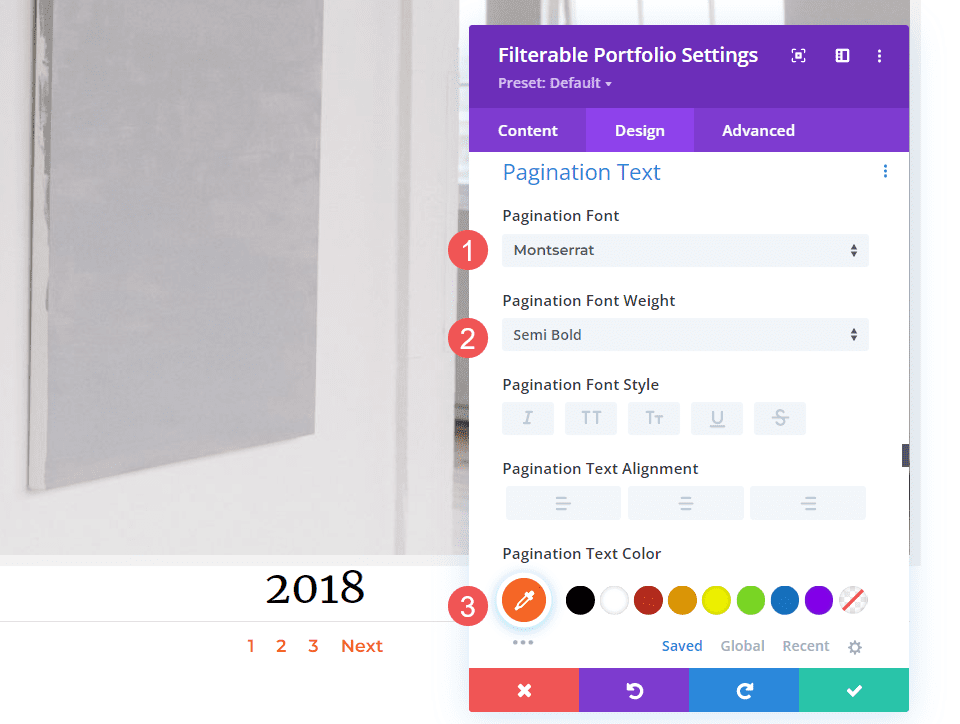
Next, scroll down to Pagination Text. Change the Font to Montserrat, change the Weight to semi-bold, and set the Font Color to #fd6927. Close the module and save your settings.
- Font: Montserrat
- Color: #fd6927
- Weight: Semi Bold
Title Text CSS
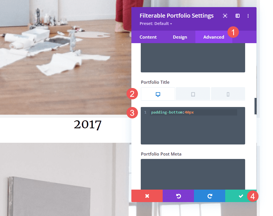
Finally, I’m sure you’ve noticed that there isn’t much space between the images in this layout. We can add padding to the images or titles. Let’s add some padding under the title. This will not only give the title more space, but it will also make it easier to know which of the images the title belongs to.
Open the Advanced tab and scroll down to Portfolio Title. Select the device icon. We’ll add CSS for padding based on the screen size. We’ll add 40px Bottom Padding for desktops, 30px for tablets, and 20px for phones. Close the module and save your settings.
- Portfolio Title (desktop):
padding-bottom:40px
- Portfolio Title (tablet):
padding-bottom:30px
- Portfolio Title (phone):
padding-bottom:20px
Results
Grid Portfolio Item Desktop

Grid Portfolio Item Phone

Fullwidth Layout Portfolio Item Desktop
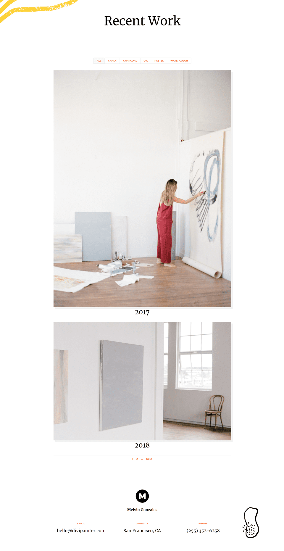
Fullwidth Layout Portfolio Item Phone

Ending Thoughts on Divi’s Filterable Portfolio Module Layout Options
That’s our look at using a fullwidth layout vs grid in Divi’s Filterable Portfolio Module. It’s easy to select between the two layout options. Each option has advantages and should be styled differently to work with your website. Just making a few adjustments will ensure your Filterable Portfolio Module works well with any Divi layout.
We want to hear from you. Which do you use between the fullwidth and grid layouts in Divi’s Filterable Portfolio Module? Let us know in the comments.



This is very usefully, and I wish that it also had the option to filter.
appreciated information thanks for sharing
I’m a big fan of the full-width portfolio, for the simple reason that there is no grid spacing and the meta information displays on hover. It makes for a sleek presentation, but I wish that it also had the option to filter. In my opinion the filtering option should be made available for the full-width portfolio.