
 In Divi 5 For Dynamic Spacing")
Let’s talk spacing in Divi, something every designer knows can make or break a layout. With Divi 5, things got easier and more efficient, thanks to the integration of the calc() function as part of Divi’s Advanced Units feature update. This CSS trick is here to level up how you approach spacing, and it’s too good to ignore.
In this post, we’ll explore what calc() is, how to use it for dynamic spacing in Divi 5, and why it streamlines your website’s responsiveness. Let’s get to it!
👉 Divi 5 is ready to be used on new websites, but we don’t recommend converting existing websites to Divi 5 just yet.
What Is Calc()?
If you’ve ever felt limited by static spacing values in your designs, calc() will become your new favorite hack. Let’s break it down and see why it’s a helpful addition to Divi 5.
Calc() is a native CSS function that works like a mini calculator for your styles. With calc(), you can perform mathematical operations (addition, subtraction, multiplication, and division) right in Divi’s Visual Builder, without the need for custom coding. It lets you mix and match different units, like pixels (px), percentages (%), ems, rems, or even viewport units (vw). For example, something like calc(100% – 50px) takes the full width of the element’s parent container and subtracts 50 pixels. The result adjusts dynamically as the container resizes, making it perfect for responsive layouts. It’s a straightforward formula, and in Divi 5’s Visual Builder, you can see the outcome live as you design.
Why does this matter? Because calc() gives you the power to create flexible and responsive layouts without writing much code. By combining static units (like pixels) with relative ones (like percentages or viewport widths), you can create spacing that adapts to any screen size or context. Fixed values alone might leave you stuck — too wide on mobile, too narrow on desktop. With calc(), you can handle those tricky scenarios effortlessly.
Here’s a table that will help you understand the units we’ll be discussing in the article with a brief description of what each one does along with an example:
| Unit Type | Unit | Description | Example using Calc |
|---|---|---|---|
| Static | px (pixels) | Fixed size, relative to the screen's resolution | calc(100px - 20px) |
| Relative | % (percentage) | Relative to the parent element's size | calc(50% - 10px) |
| Relative | em (Ems) | Relative to the element's font size | calc(2em + 5px) |
| Relative | rem (root ems) | Relative to the root element's font size | calc(1.5rem + 3px) |
| Relative | vw (viewport width) | Relative to the browser's viewport width (1vw = 1% of viewport width) | calc(100vw - 50px) |
| Relative | vh (viewport height) | Relative to the browser's viewport height (1vh = 1% of viewport height) | calc(100vh - 50px) |
| Relative | vmin | Relative to the smaller dimension of the viewport (width or height) | calc(5vmin + 10px) |
| Relative | vmax | Relative to the larger dimension of the viewport (width or height) | calc(5vmax - 5px) |
calc() In Divi 5
Here’s where it gets exciting for us Divi users. In Divi 5, the Advanced Units feature in Divi 5 brings the power of calc() right into the Visual Builder — no custom CSS needed. Calc() is now built into the multi-functional unit fields you’ll find in settings like padding, margin, or width. That means you can type your calculations directly where you’re already working, see the results instantly, and tweak them on the fly.
Accessing calc() In Divi 5
Go to any module, row, or section, click the design tab, and look for the sizing field.

Instead of the old sliders in Divi 4, you’ll see the advanced units field, where you can type a calc() formula directly into the field upon selecting it.

The syntax is straightforward: calc(expression). You write your calculation inside the parentheses with operators like +, -, *, or /. Just make sure to add spaces.
How calc() Simplifies Spacing In Divi 5
In Divi 4, you must set a value for desktop and then tweak it for tablet and mobile devices. With calc() in Divi 5, you can create adaptive spacing that responds to viewport changes rather than juggling multiple breakpoints.
In Divi 5, it’s natively supported in the Visual Builder. Type a calc() expression into the sizing field, and it’s live. No extra steps are required, and no code editor is needed. You can even mix units like percentages and pixels in the same expression.
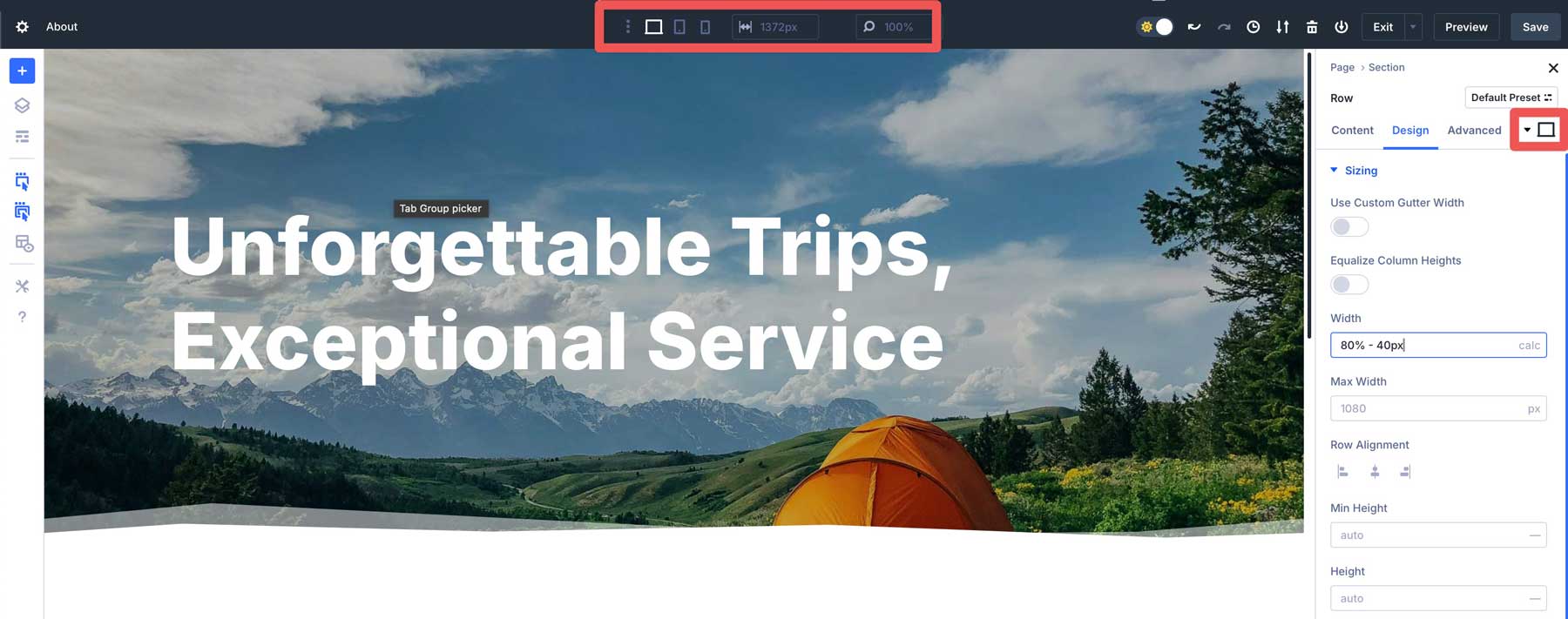
For example, if you want a row to cover 80% of the section container but leave a 20px gap on each side, you can use calc(80% – 40px) and ensure the row’s alignment is set to center. This approach allows the row to adapt to screen size while maintaining consistent spacing on both sides. The 80% width keeps things fluid, while the pixels ensure precise control throughout different breakpoints.

But calc() in Divi 5 can do more than that. Let’s take a look at a few examples of how you can use calc() in Divi 5 for dynamic spacing.
Dynamic Padding Based On Viewport
You can add padding to a row using calc() in Divi 5. For example, let’s say you need padding that scales with the screen. Instead of a static 20px padding, head to the design tab of a row, find the padding settings and enter calc(20px + 2vw). This starts with 20px and adds 2% of the viewport width. It’s fluid, proportional spacing without extra breakpoints, all set directly in the Visual Builder.
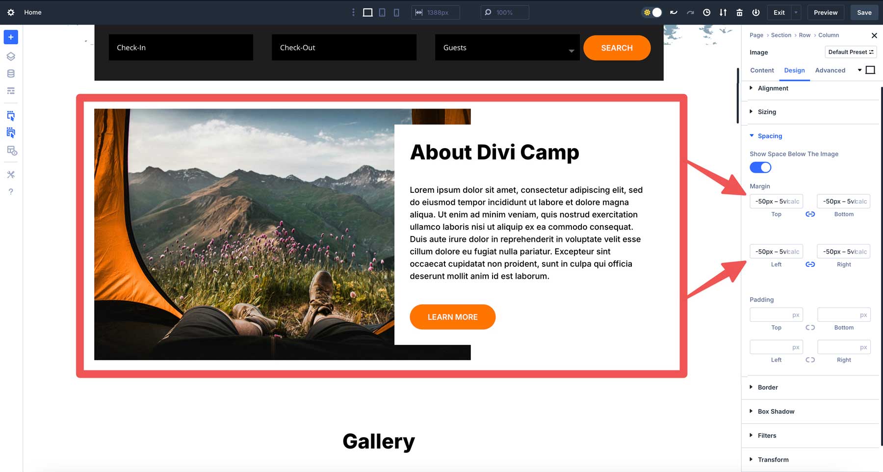
Overlapping Elements With Negative Margins and calc()
Overlapping designs are eye-catching, and calc() makes them responsive in Divi 5. Let’s say you want a two-column row with an image overlapping a text module. In the image’s margin settings, enter calc(-50px – 5vh). The -50px sets a base overlay, while -5vh scales it with the viewport height.
Adaptive Padding With Content Alignment
Suppose you’re designing a three-column layout in Divi 5, with a sidebar and main content area. You want the third sidebar’s padding to adapt to the column’s width while maintaining a fixed minimum. In the column’s padding settings, enter calc(10px + 3%). This sets a 10px base padding plus 3% of the column’s width, ensuring proportional spacing. The sidebar’s content stays well-spaced, aligning visually throughout breakpoints.
Adjusting Section Heights
Another example where calc() comes in handy is adjusting a section’s height. Let’s say you have a hero section you’d like to make span with the viewport’s height. Rather than trying to determine the best size for all screens, you can use a simple calc() expression to define it. In Divi 5, you can simply select calc from the dropdown menu and enter (100vh – 60px) into the height field of a section. This will set the section’s height to 100vh (viewport height) and subtract 60px.
Setting Font Sizes
Calc() can also define text sizes that adjust perfectly on every device. For example, you can use calc() within Divi 5’s Heading module. In the design tab, locate the Heading Text Size field and add calc(5em + 1vw). This sets the font size to a base size of 5em plus 1 viewport width, scaling the text slightly with screen size.
Best Practices For Using calc() In Divi 5
Calc() is a great tool, but like any other, it needs to be used with wisdom. Here are some practical tips for making the most of Calc in Divi 5.
1. Get To Know The Basics
It’s tempting to go wild with nested formulas when just starting, but simple expressions are easier to tweak and troubleshoot. Master the basics, then level up to more complex calculations like calc(50% + 2 vw – 10px). 50% sets the width or height of the parent section. It’s a relative unit, so it scales based on the size of the container. For example, if the parent element is 1000px wide, 50% equals 500px. If the parent shrinks to 500px, 50% becomes 250px.
The + 2vw part of the calculation stands for viewport width, where 1vw is 1% of the browser window’s width. So, 2vw is 2% of the vw. This part of the calculation adjusts based on the screen size, not the parent element. If your viewport is 1200px wide, 2vw is 24px. On a 600px mobile screen, it’s 12px. It’s a way to tie the value to the user’s screen size.
Finally, the -10px part of the equation subtracts a fixed 10 pixels from the total. Unlike % or vw, px is a static unit, always 10px, regardless of screen or container size. It gives you precise control over the final result.
2. Test Responsiveness For Consistency
Calc() is all about adaptability, but you still need to double-check its performance. Use Divi’s responsive preview system to switch between desktop, tablet, and mobile views.
A formula like calc(100vw – 80px) might look perfect on your widescreen monitor but could squeeze too tight on a phone. Previewing ensures your spacing stays perfect and consistent everywhere.
3. Combine calc() With Variables
Divi 5 also supports CSS variables, and they pair beautifully with calc(). Define a variable like –spacing:20px; in the page’s CSS settings.

You can then use it in a calc() expression like calc(var(–spacing) * 2). If you need to adjust site-wide spacing later, you can update the variable once, and every calc() using it follows suit.
4. Avoid Being Too Complicated
Once comfortable using the calc() function, turning it into a math puzzle could become easy. Sure, calc() is powerful, but nesting multiple functions, like calc(calc(50% – 10px) + calc(2vw + 5px)), might work, but it’s in most cases redundant. Keep it lean and legible, and your future self (or anyone who has to work behind you) will thank you.
Follow these pointers, and calc() will be a trusty sidekick, not a runaway experiment. It’s all about striking a balance between creativity and control – and Divi 5 makes it easy to get there.
Unleash Dynamic Layouts With calc() In Divi 5
Divi 5’s integration of calc() into the Visual Builder is a big step forward, turning spacing into a seamless, real-time experience. It’s not just about saving time but unlocking a new level of creativity. You can mix units, adapt to any viewport, and watch it all come together live — all while keeping your workflow smooth.
So, if you haven’t downloaded the latest Divi 5 Alpha, now’s the time. Dive in, experiment with a few formulas, and see how it transforms how you build websites with Divi. It’s a small feature with a big impact, proving that Divi 5 is here to make your design life easier and more efficient.


Leave A Reply