
 In Divi 5 To Create Fluid Responsive Typography")
Divi 5 now supports Fluid Typography using CSS Clamp(). This is a huge step forward in responsive design and will dramatically improve the speed and quality of website building. Here, I wanted to show you how to get started using clamp() in Divi 5, even if you knew nothing about it before reading this.
Read along to understand the theory and how to apply it. I also link to a helpful tool that can make creating your clamp() calculation much easier.
Clamp() vs Media Queries for Responsive Typography
Media Queries can change the size of your typography based on breakpoint sizes. When a page scales up or down and hits the next defined breakpoints, Media Queries will automatically apply the styles associated with them. So, if you have three breakpoints (mobile, tablet, desktop), your text can change at each of those breakpoints.
This works really well and is what many web designers got used to using. However, it’s not fluid, meaning that your Heading 1 Font size at 767px viewport width could be 100px big but at 776px could immediately drop to 56px (if that were your breakpoints and the H1 values assigned at both).
Clamp(), on the other hand, allows you to have smaller typography on smaller screens and scale it up as screen viewports scale up. This video compares setting three breakpoints with three font-sizes for an H1 and a similar sizing convention but done in Clamp() instead.
In this example, clamp() smoothly transitions from 30px to 100px without abrupt jumps, whereas simple pixel declarations at various breakpoints cause big changes over the course of a single pixel width. The result is that I have the min/max font sizes of my choosing either way, but with clamp(), my font is a lot more responsive and looks better based on the screen size. I’d have to use all of Divi’s seven breakpoints to get hardcoded font sizes to look good on most screen sizes.
Divi 5 Typography Elements that Support clamp()
In Divi 5, you will likely use clamp() the most with typography settings. Specifically, you can use clamp() to set:
- Font Size (most common use)
- Line Height
- Letter Spacing
This gives you readable, responsive typography without setting up any breakpoint declarations for your typography setting. So, not only does this make for a more fluid design, but you are also speeding up your build time.
Font size, letter spacing, and line height are available for both headings and body typography.
How Clamp() Works
The clamp() function uses three values:
clamp(min-value, preferred-value, max-value)
Each value is separated by commas, and each serves a specific role:
Min Value: This is the smallest allowed size. No matter how small the screen, your font will not shrink below this.
Preferred Value: This is your ideal or “target” size. It usually employs dynamic units or math functions (like calc()) to scale fluidly between your min and max.
Max Value: This sets the largest possible size. Even on huge screens, the element won’t exceed this value.
Understanding CSS Units in Clamp()
Units greatly affect how clamp() scales:
- px (Pixels): Absolute units; fixed, stable sizes. Useful for min/max values to establish clear boundaries.
- rem: Relative units based on root font size. If the user’s browser font changes, rem scales accordingly. Great for accessibility.
- vw (Viewport Width): Dynamic units that scale based on the screen width. Ideal for the preferred value to create fluid scaling.
- vh (Viewport Height): Similar to vw, but for height. Less useful unless working with a language that prints top to bottom instead of right to left (or vice versa).
- em: Relative to the parent element’s font size, ideal for more controlled responsive scaling.
- And any unit that you are comfortable using.
Typically, min and max use absolute or stable units like px/rem, while the preferred value uses dynamic units like vw/% or a math function for responsive scaling.
How Preferred Value Affects Clamp()
The preferred value is where clamp() truly shines. It defines how your text scales.
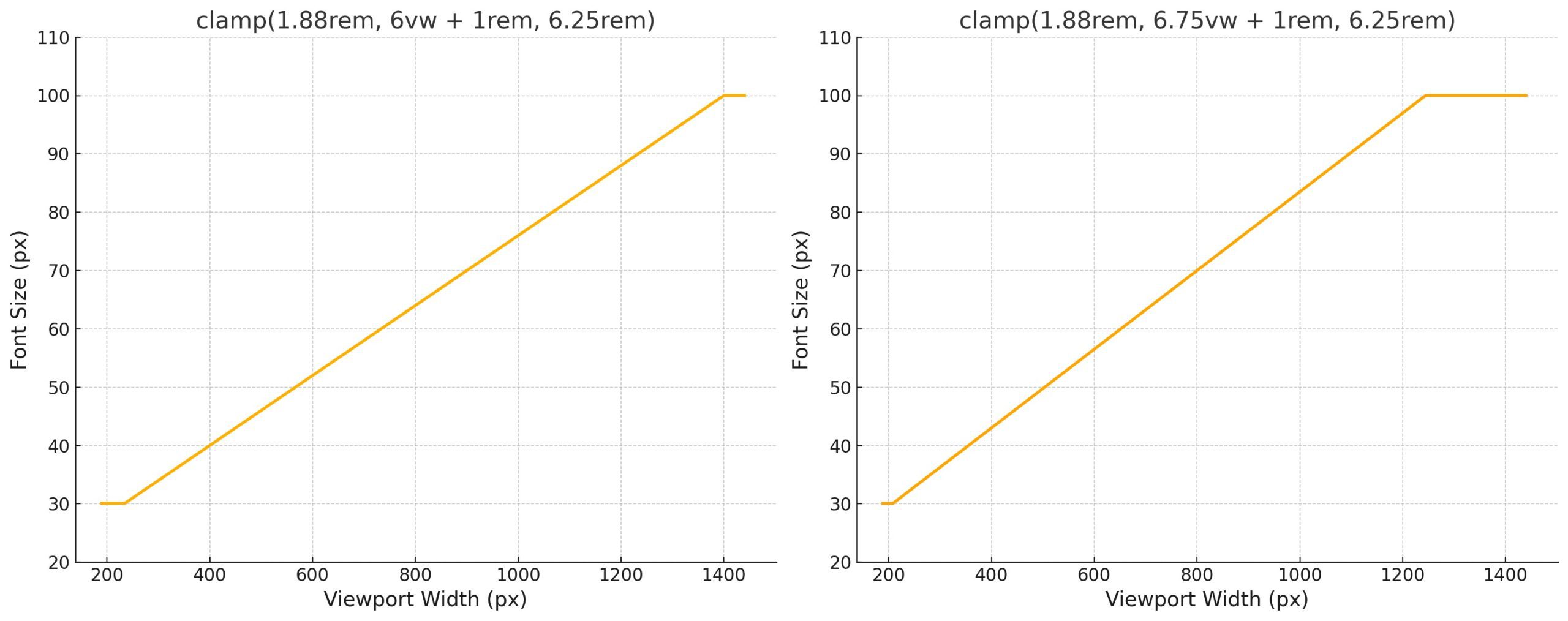
A higher preferred value means the element will reach its max clamp limit sooner. This gets confusing fast (because things like vw and rem are relative units), but I wanted to show you two similar clamp() functions that use a slightly different vw multiplier in the preferred value. The heading on top has a smaller value—note the actual size of the heading as the viewport scales (highlighted in yellow).
The lower preferred value scales down to the minimum value at a marginally wider viewport sooner than the higher preferred value (sooner when scaling down). The inverse is true for the higher value, which reaches the max value at a smaller screen width sooner than the lower preferred value (sooner when scaling up).
Here’s a graph view of what’s happening in this instance:
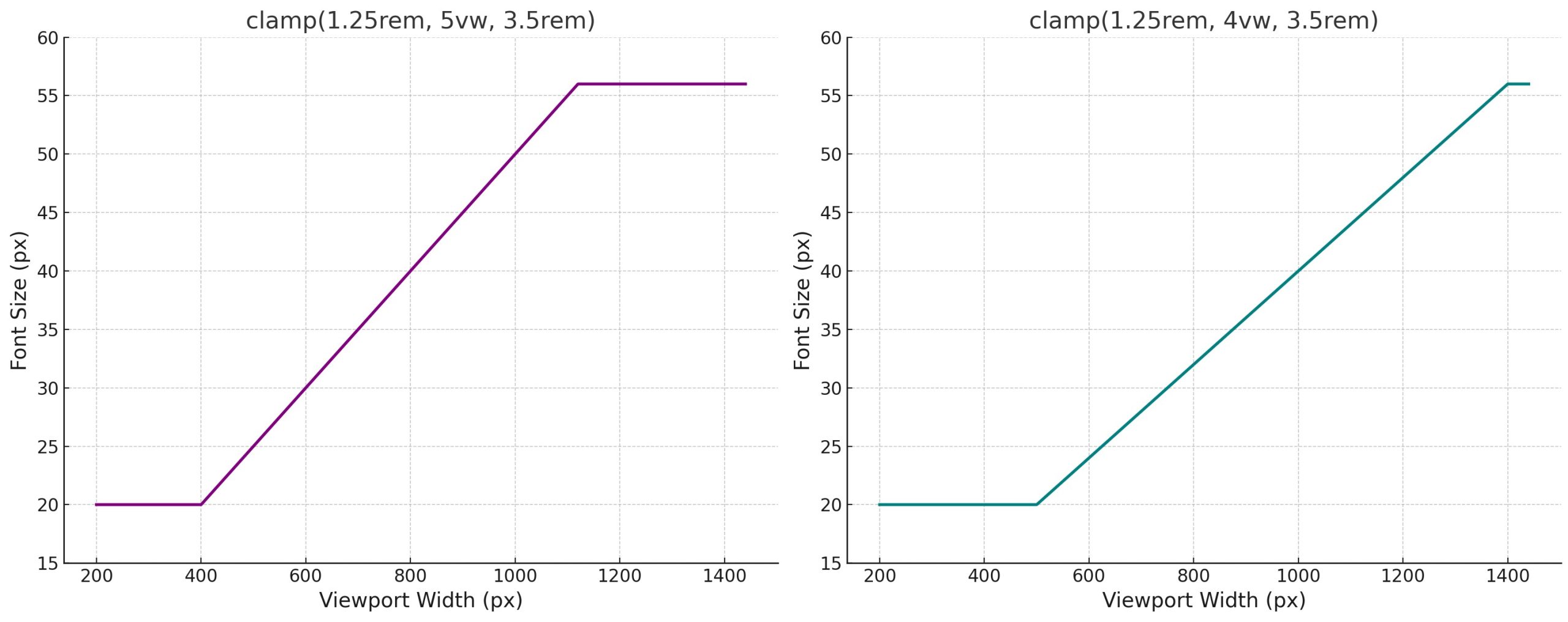
For the sake of demonstration, here’s another graph comparing two slightly simpler Clamp() functions that differ only slightly.
Again, this feels complicated, but in practice, it is a lot less so. I highly recommend you use a typography size generator that supports CSS Clamp. One of my favorites is Fluid Type Scale Calculator. You provide the values you want to try out, and it’ll automatically generate CSS variables with your clamp functions. Super snazzy!
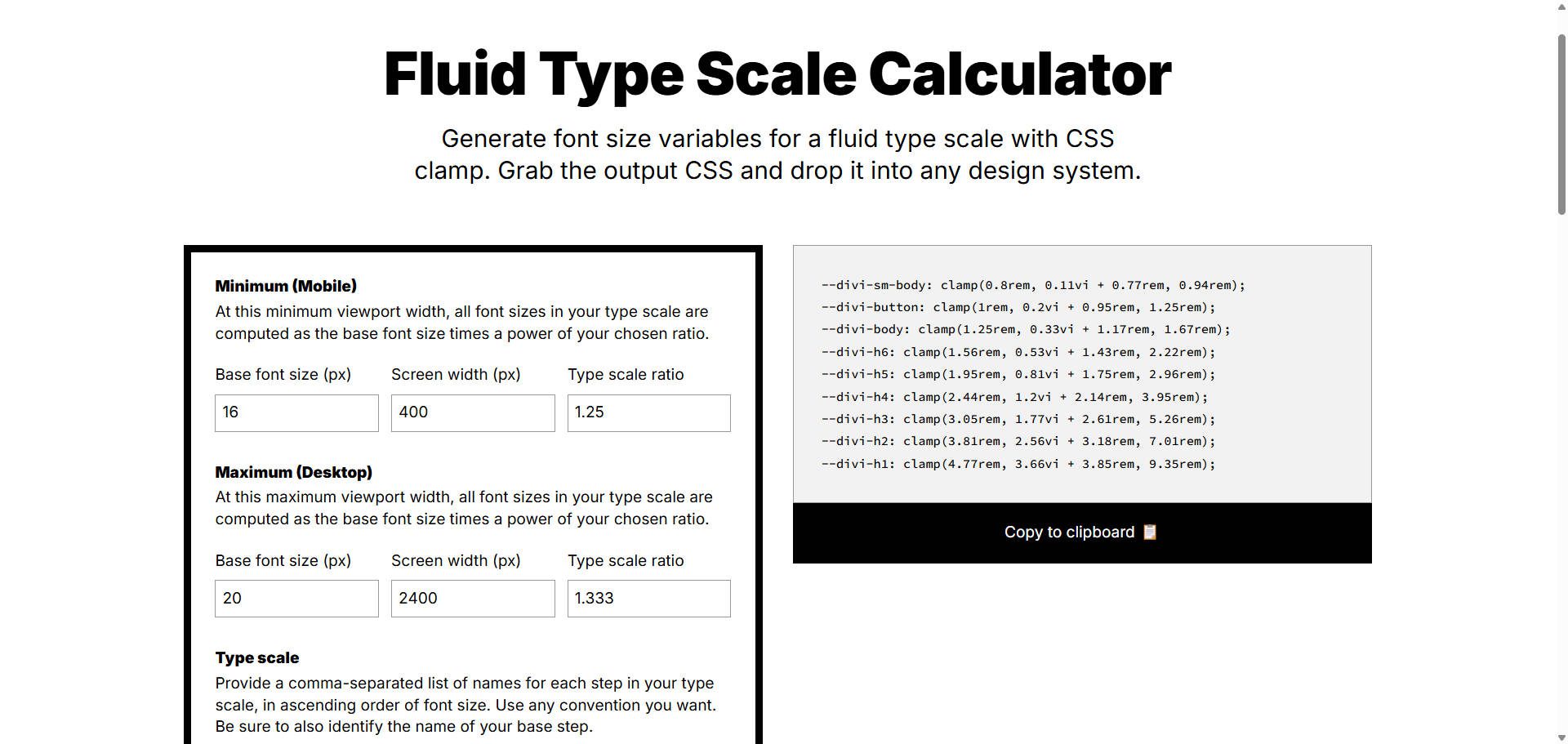
You can scroll down and see how your typography will scale based on screen width.
And soon you will be able to save those CSS Variables in Divi 5’s Design Variables and easily call them in your presets without relying on a separate CSS Stylesheet.
I find it best to open the generator in two browser tabs. In the first one, use the generator to create only your headings sizes. In the second tab, use it to make your body text typography sizes. This way, you aren’t trying to create both sets in the same thing (it doesn’t work particularly well that way). If you need to create a smaller version of your headings and text, use separate instances of the generator to create those. Lastly, make sure the naming conventions make sense to you and that you don’t use the same Var name twice.
Using clamp() for Typography with Divi
Let’s see clamp() in action. Here’s one way to set up Typography for your whole website using Divi.
Applying clamp() to Headings and Titles
I will be using the Fluid Type Scale Generator featured above for ease. This is one of the sets of fluid typography using clamp() that I created with it. You can use the vars like this, but I will use the values directly in Default Option Group Presets to show you how to use Divi to its fullest extent.
:root {
--divi-sm-body: clamp(0.8rem, 0.11vi + 0.77rem, 0.94rem);
--divi-button: clamp(1rem, 0.2vi + 0.95rem, 1.25rem);
--divi-body: clamp(1.25rem, 0.33vi + 1.17rem, 1.67rem);
--divi-h6: clamp(1.56rem, 0.53vi + 1.43rem, 2.22rem);
--divi-h5: clamp(1.95rem, 0.81vi + 1.75rem, 2.96rem);
--divi-h4: clamp(2.44rem, 1.2vi + 2.14rem, 3.95rem);
--divi-h3: clamp(3.05rem, 1.77vi + 2.61rem, 5.26rem);
--divi-h2: clamp(3.81rem, 2.56vi + 3.18rem, 7.01rem);
--divi-h1: clamp(4.77rem, 3.66vi + 3.85rem, 9.35rem);
}
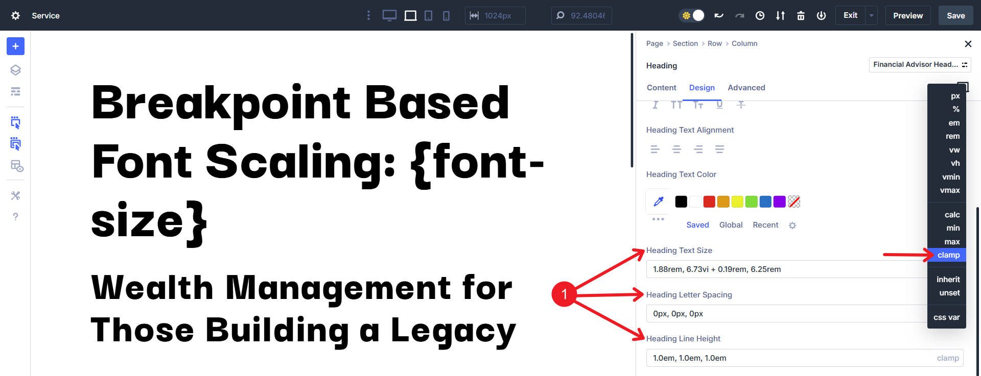
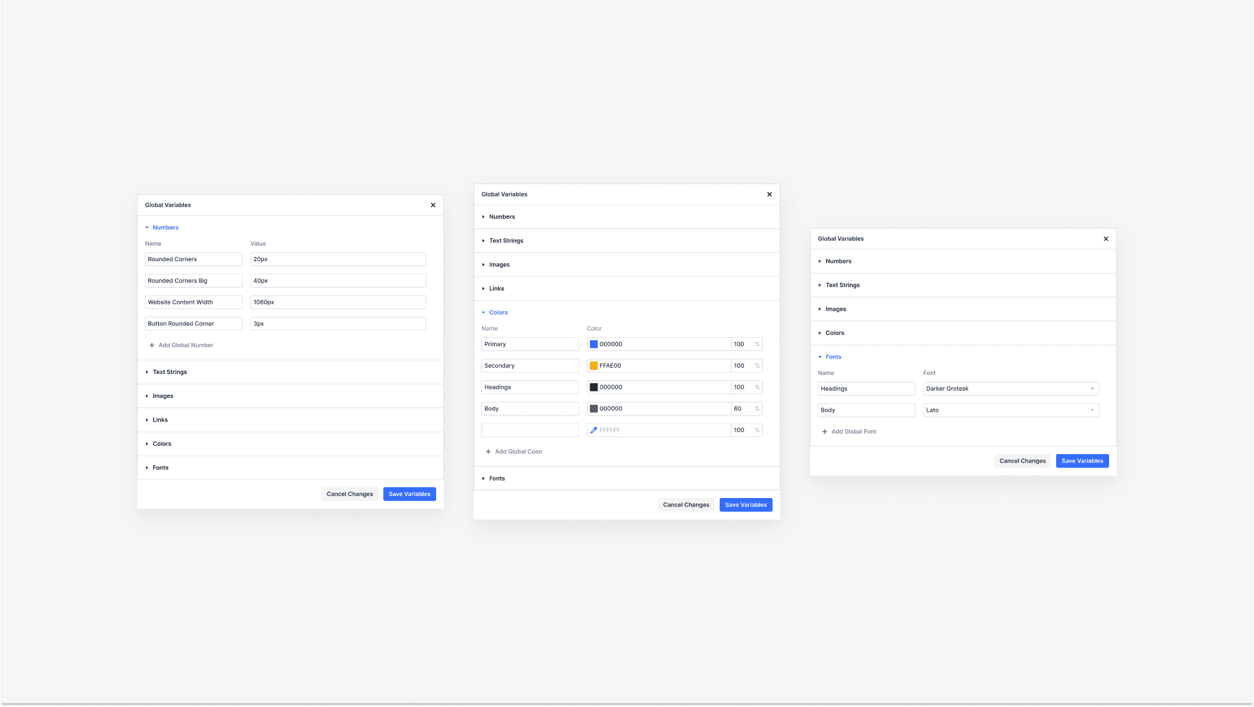
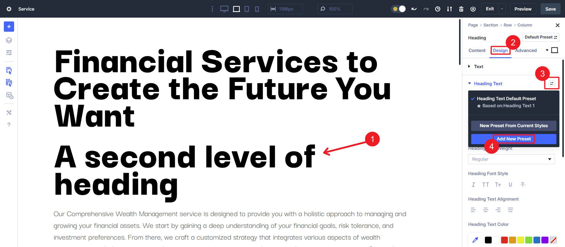
First, create Default Option Group Presets for each Heading/Title level. To do so, click on a Module with a Heading or Title (they share an Option Group, though they have slightly different names across modules). In the Design tab, find Heading Text or Title Text. Click the Option Group Preset Icon.
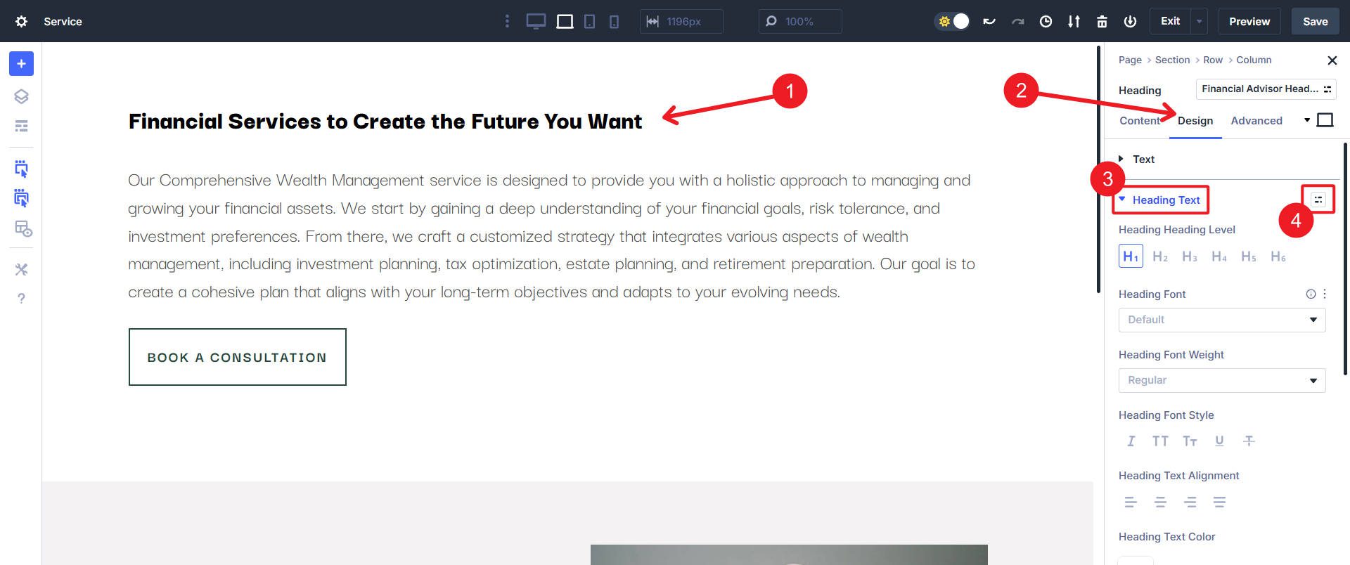
This will show a menu of at least the Default Option Group Preset. We will go ahead and use the Default OG Preset here for our H1. Click the “Gear” icon to open the OG Preset Design Settings. In later steps, we will create more OG Presets for each heading level (H1-H6).
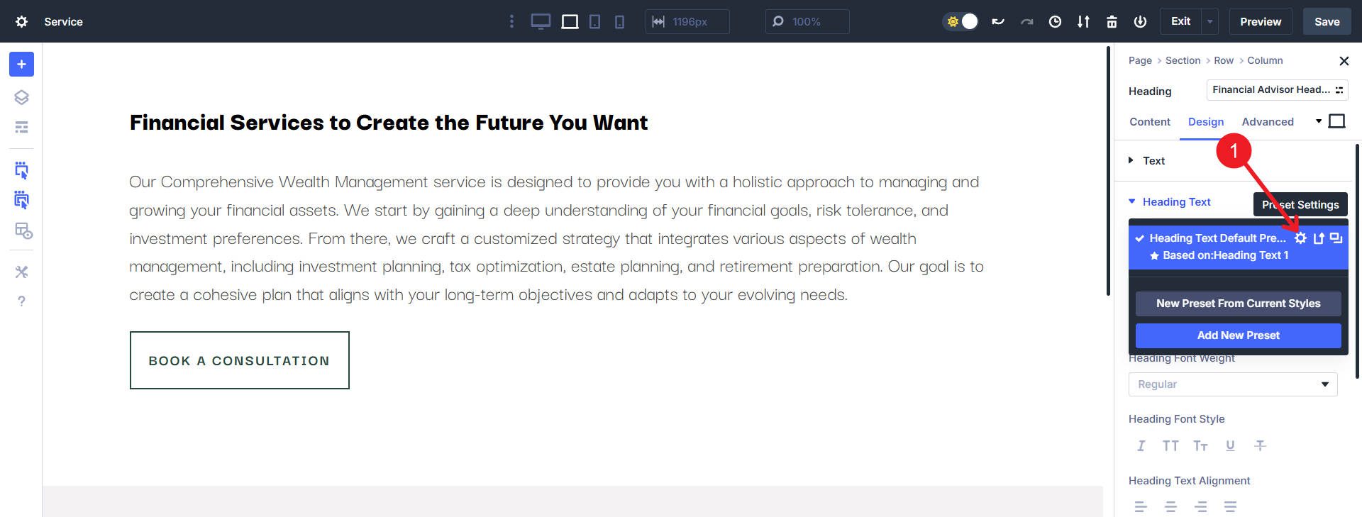
You will notice the Option Group that we are working in inverts from light mode to dark mode (or vice versa if you started out in dark mode), which is a helpful way to know which design context you are in. Scroll down to Heading Text Size and paste the clamp() value of your preference. In our case, we are using this for the H1:
clamp(4.77rem, 3.66vi + 3.85rem, 9.35rem)
Make sure to scroll down and click Save, or you will not successfully apply your OG Preset.
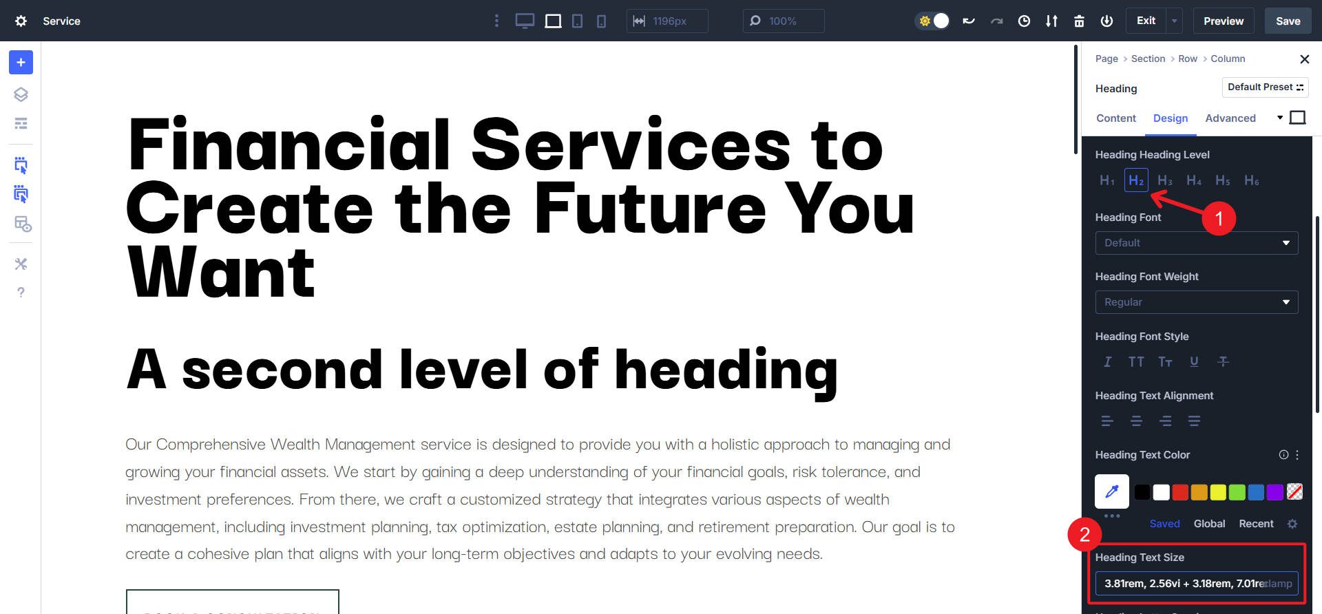
Now, we will continue through all our heading levels. I will just show you the next heading level (H2). Via the same method as before, get to the OG Preset area, only click Add New Preset this time.
For our OG Preset to be used on H2s, we will use this clamp() function from the generator:
clamp(3.81rem, 2.56vi + 3.18rem, 7.01rem);
Select the H2 option from the Heading Level selection area. Then paste the clamp() value into Heading Text Size, which will set the size of the H2 headings using that OG Preset.
From there, you will continue through your heading levels. We can also set up the size of our body text and things like button text. Many modules have special types of text that might be able to use these clamp() values, but for some, you might want to create some more (like Form Module labels or Blog Post meta text).
If you wanted to use CSS Variables, you would follow the same exact steps (assuming you’ve loaded the font sizing variables in Theme Options > CSS), but instead of pasting the clamp() value, you would paste the Var (something like “–divi-h1” or whatever naming convention you choose to use).
Jump into the Divi 5 Experience Today
Divi 5 is adding features at a breakneck pace. Responsive breakpoints, all advanced CSS units, and Option Group Presets are just some of the first fruits of our newly developed infrastructure.
Building professional websites with Divi is getting even easier and more powerful. I couldn’t be more excited for you to try out the new experience. CSS Clamp is just one of the many features that Divi users have asked for and now have. So, if you haven’t downloaded the latest Divi 5 Alpha, now’s the time.
Try out different CSS functions across your whole build to see how they open new design possibilities. This small feature has a mighty impact, and proves that Divi 5 is designed to make your design process better than ever.


How did you create the real-time dynamic font size display in the yellow highlight in your demo card video (Comparing-Two-Clamp-Functions-With-Different-Preferred-Values-1.mp4) That is pretty slick and would be a great help for me during development. Is that a JQuery snippet?
Thanks for noticing and glad that it was a helpful visualization.
CSS class on the element and then used JavaScript to observe font sizes on that element (and observe changes to the DOM). Then, JavaScript to dynamically display the font size on a tag in the content. I created two bookmarklets to get this effect and also track other metrics like width, height, and border width of classed elements.
Outstanding!