Divi’s new Fashion Layout Pack has a great setup for any online store. The integration of the shop module and the organization of the page layouts give you a significant headstart. But in order to get this layout up and running as a functional online store, we need the WooCommerce plugin. And, you may be surprised at just how well Divi and WooCommerce work together.
In this tutorial, I’m going to show you how to create an online store using Divi’s Fashion layout pack using Woocommerce. I’ll walk you through how to properly setup your layouts to be customized, how to bring the shop page to life with Woocommerce integration, and some tips on how to use elements of your layout and the theme customizer to style Woocommerce pages.
- 1 The Setup
- 2 The Sneak Peek
- 3 Using Divi’s Fashion Layout Pack to Create an Online Store with WooCommerce
- 4 Change your Global Accent Color
- 5 Update Typography Settings in the Theme Customizer
- 6 Set WooCommerce Shop Page
- 7 Add Products to your Store
- 8 Update Shop Modules on the Shop Page
- 9 Add a Shop Module to Display “On Sale” Items on the Shop Page
- 10 Style Your WooCommerce Pages with the Fashion Layout
- 11 Using Custom CSS to Style WooCommerce Archive pages?
- 12 Final Thoughts
The Setup
For the sake of time, I’m going to start this tutorial with certain steps already completed.
1. Install and activate the Divi Theme
2. Install and activate WooCommerce
3. Download the Fashion Layout Pack and Import the Fashion_All.json file to your Divi Theme Library.
4. Create new pages for each layout.
5. Create your primary menu.
If you are confused by the setup listed above, you can find more detailed instructions on how to setup your layout properly by checking out these 10 steps for using a layout pack for your new project.
Once you have completed the 5 steps above, you are ready to start.
The Sneak Peek
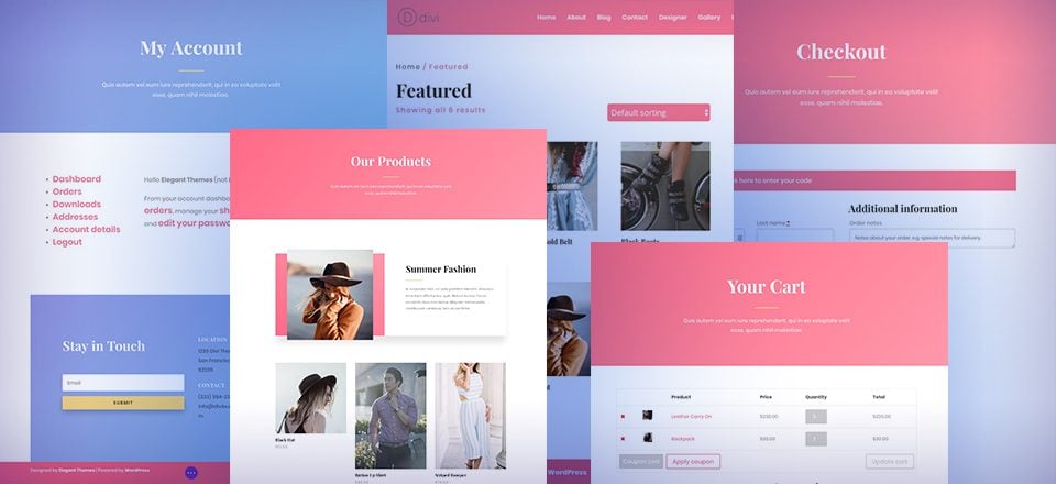
Here is a peek at some of the WooCommerce pages you will be creating.
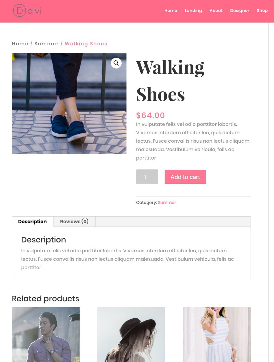
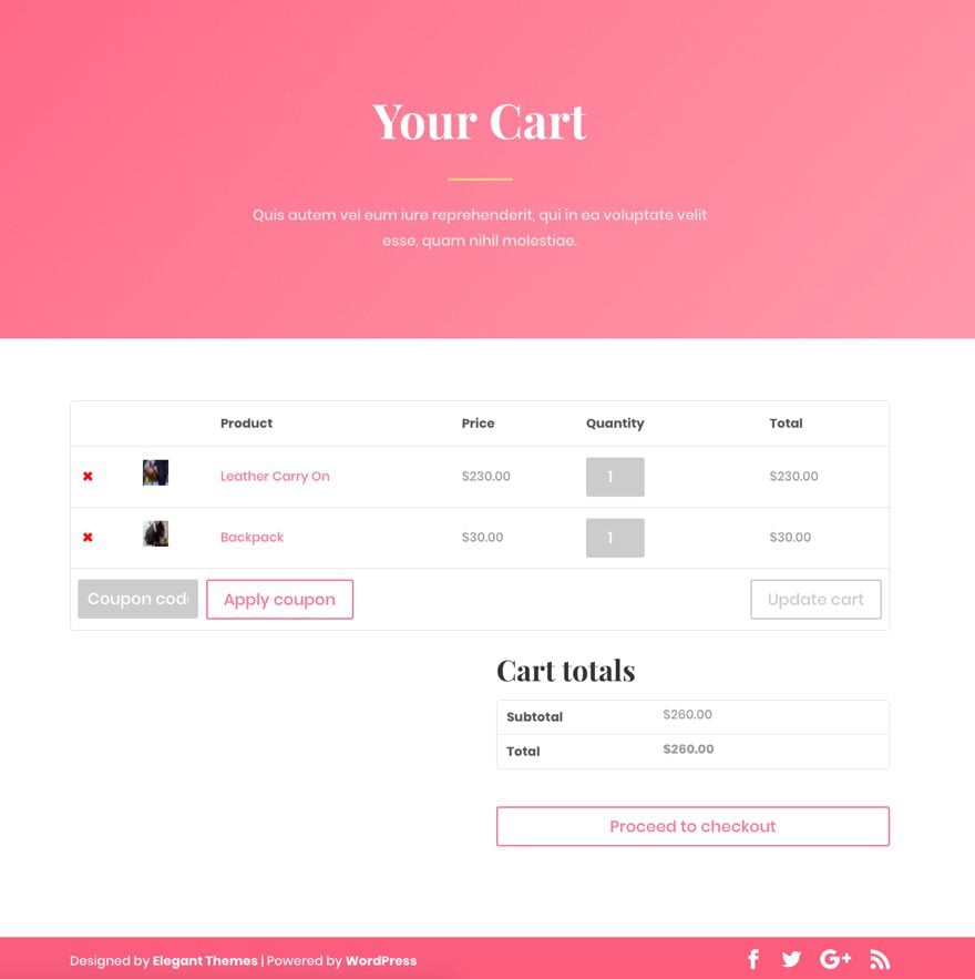
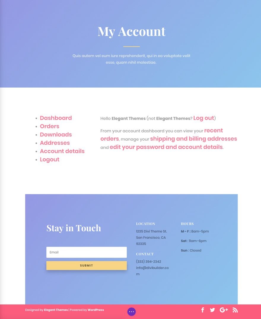
Using Divi’s Fashion Layout Pack to Create an Online Store with WooCommerce
Subscribe To Our Youtube Channel
Change your Global Accent Color
To start things off, we are going to change the global accent color for the Divi Theme. Changing the global accent color to match your layout is always a good idea, but it is also the easiest way to match your WooCommerce pages with your color scheme without having to use custom CSS. You will notice this accent color being used to style elements on every one of your WooCommerce pages like the single product page, cart page, etc…
To change the Global Accent Color, go to the Theme Customizer and navigate to General Settings > Layout Settings and find the Theme Accent Color option at the bottom.
I’m using this pink color from the layout: #fc7086
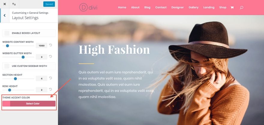
Then, once you change it, save & publish your settings and refresh your page to allow the accent color to update other settings within the customizer.
Update Typography Settings in the Theme Customizer
Since WooCommerce uses your default theme customizer settings to style the text for each of its pages, you will want to make sure you match the typography used on your layouts with the typography settings in the theme customizer.
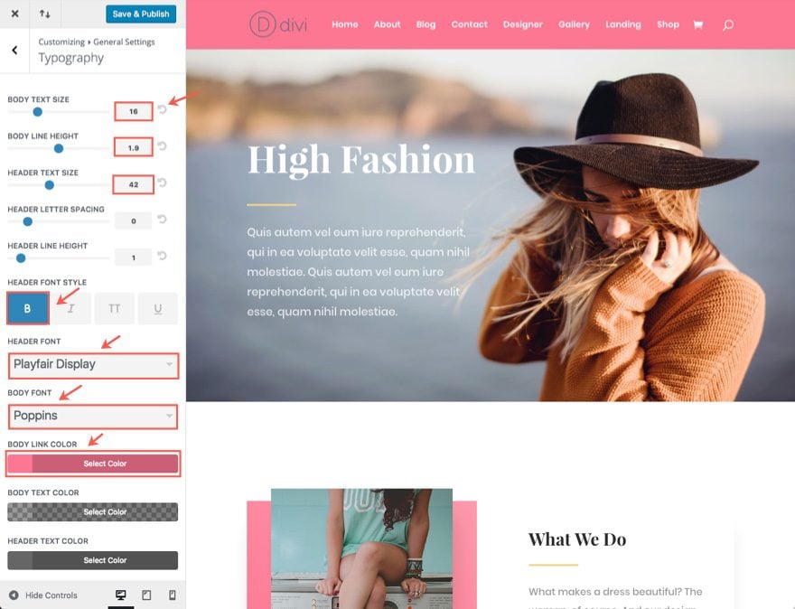
To update your typography, go to Divi > Theme Customizer > General Settings > Typography and update the following:
Body Text Size: 16px
Body Line Height: 1.9
Header Text Size: 42
Header Font Style: B
Header Font: Playfair Display
Body Font: Poppins
Body Link Color: [if you updated your global accent color, this color should show up here]
Set WooCommerce Shop Page
WooCommerce allows you to set which page you want to be your base shop page. This page should include all product categories so that users will know everything your shop has to offer. Since our layout has a shop page, let’s go ahead and make this our base shop page.
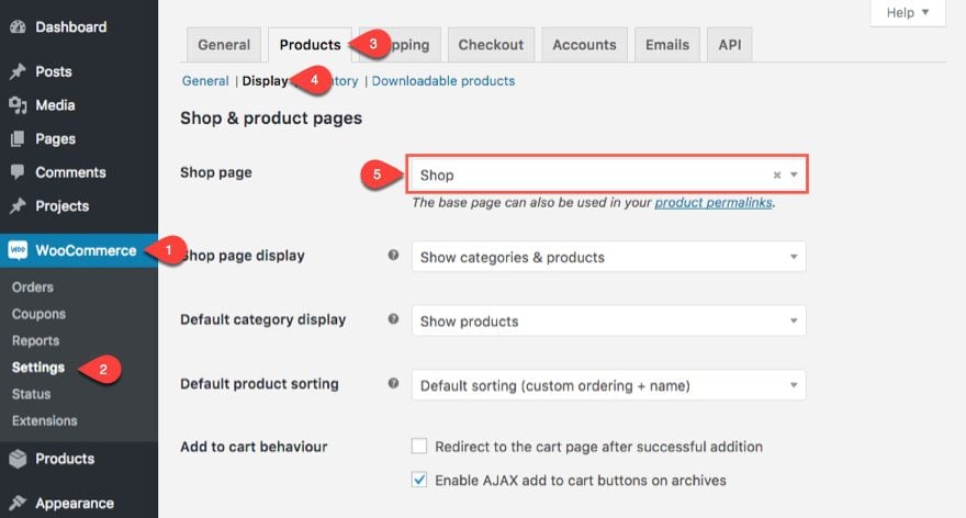
From your WordPress Dashboard, go to WooCommerce > Settings and click the Products tab at the top of the page. In the menu directly below the tab, select Display. Then select the Shop Page to the “Shop” page you created with the new shop page layout from the fashion layout pack.
Then save changes.
Add Products to your Store
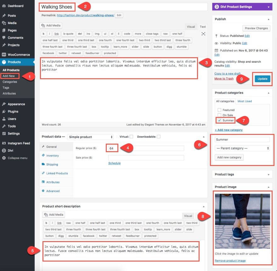
You may have noticed that your Shop Page, despite having two shop modules, doesn’t show any products. Well obviously you need to add products first. To add a new product to your store, go to your WordPress dashboard and follow these steps:
1. Navigate to Products > Add New
2. Enter Product Name
3. Enter Description for Product
4. Enter Price of Product
5. Enter Short Description for Product
6. Add Three New Categories (Summer, Featured, and On Sale)
7. Select the category for your Product (in this case it would be Summer)
8. Add Product Image
9. Publish/Update Product
Assign Categories to your Products
As you repeate the steps above to create more new products, make sure to assign a category to each one (#7 in the steps listed above). For this tutorial, I’ve added 6 products under the category “Summer”, 6 products under the category “Featured”, and 1 product under the category “On Sale”.
Update Shop Modules on the Shop Page
Now that you have your products created, you can add these products to your shop page. As I mentioned before, the shop page layout already has shop modules built in to the layout. There is one under the Summer section and one under the Featured section.
Go to the shop page and deploy the visual builder. Then hover over the shop module (currently not showing any products) under the row containing the Summer Fashion headline and click on module settings.
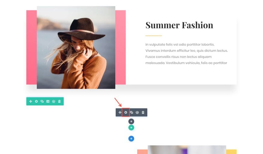
Update the settings to include only the category “Summer”.
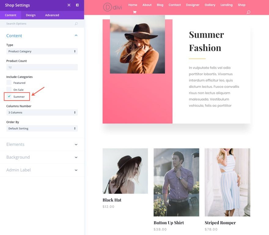
Now you should see all the products added with the category summer.
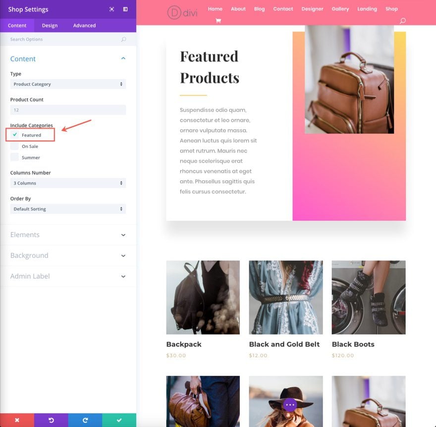
Next, find the shop module under the featured Products Headline and update the settings to include only the Featured category.
Add a Shop Module to Display “On Sale” Items on the Shop Page
Since we have two categories (Featured Products and Summer Fashion) on the shop page, it would be easy to create addition categories and products using the modules already provided in the layout.
Let’s create another section to display our “On Sale” products.
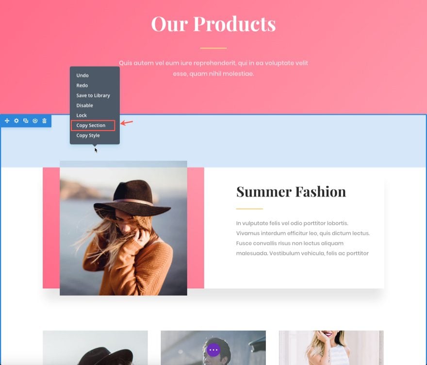
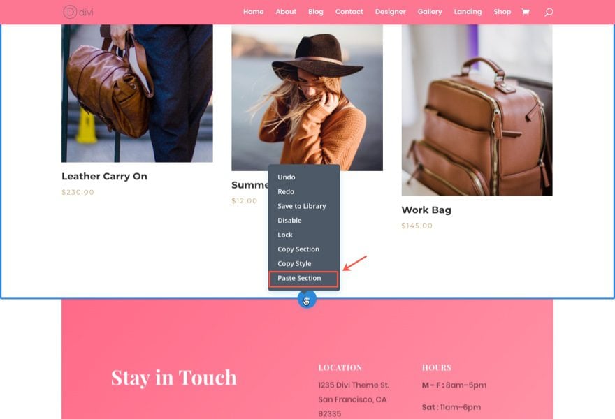
To do this, deploy the visual builder and use the right click options to copy the entire section displaying the summer fashion products and paste it directly below the Featured Products section.
Now all you have to do is make a few updates.
In the row displaying the Headline, go ahead a click on the text in the text module and change the headline to say “On Sale” instead of “Summer Fashion”.
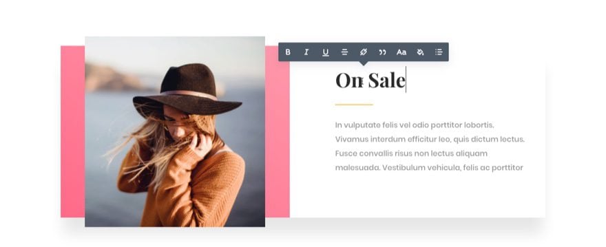
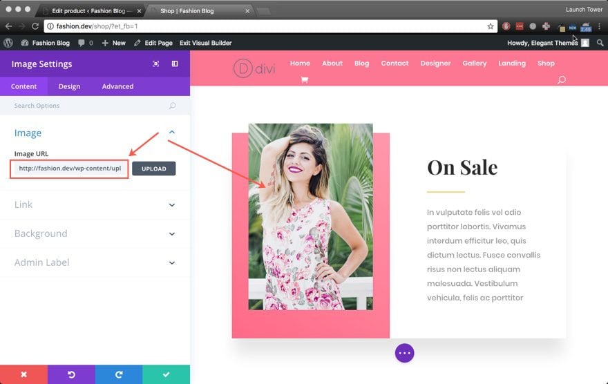
Then change the image in the left column to something more consistent with your sale products.
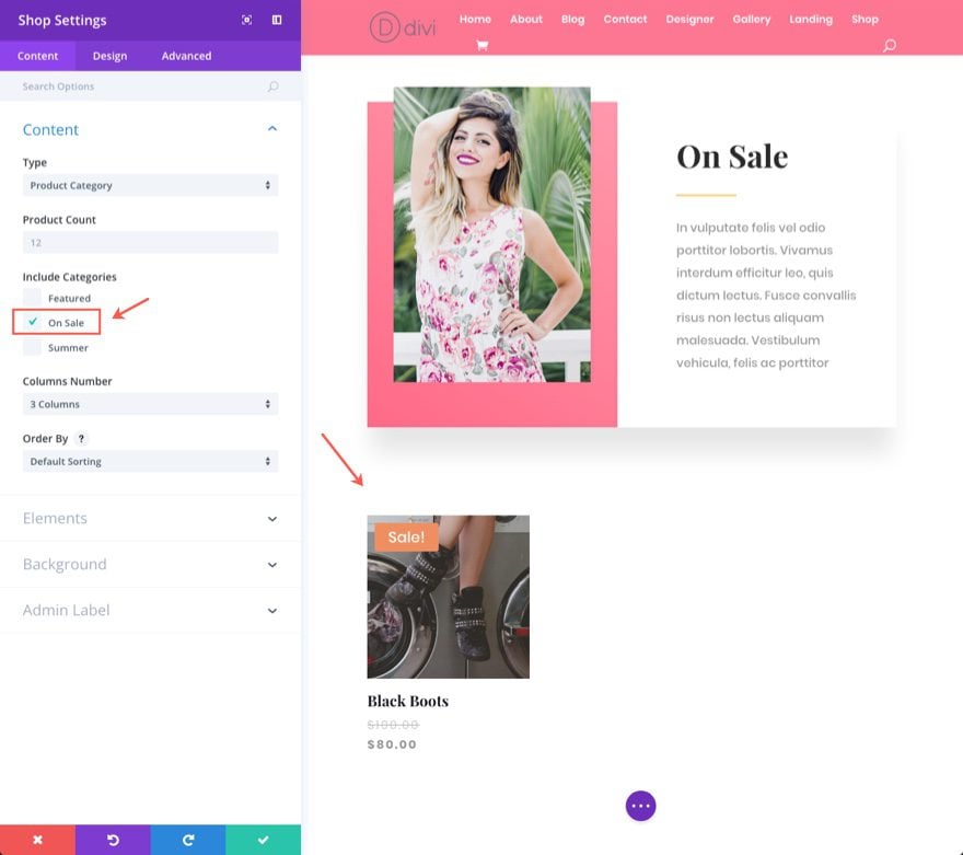
Finally, update the shop module to include only the category “On Sale”.
Style Your WooCommerce Pages with the Fashion Layout
WooCommerce generates its own set of WooCommerce pages automatically when you install the plugin. These include the following:
Shop – which is a placeholder for a post type archive for your products.
Cart – which uses the shortcode [woocommerce_cart] to generate the cart contents
Checkout – which uses the shortcode [woocommerce_checkout] to show the information.
My Account – which uses the shortcode [woocommerce_my_account] to show specific customer information related to their account.
Since we have already selected our Shop page, there is no further design needed. But for the other 3 WooCommerce pages, we need to style them to fit the design of our other page layouts.
Adding a Section Header to the Cart and Checkout Pages
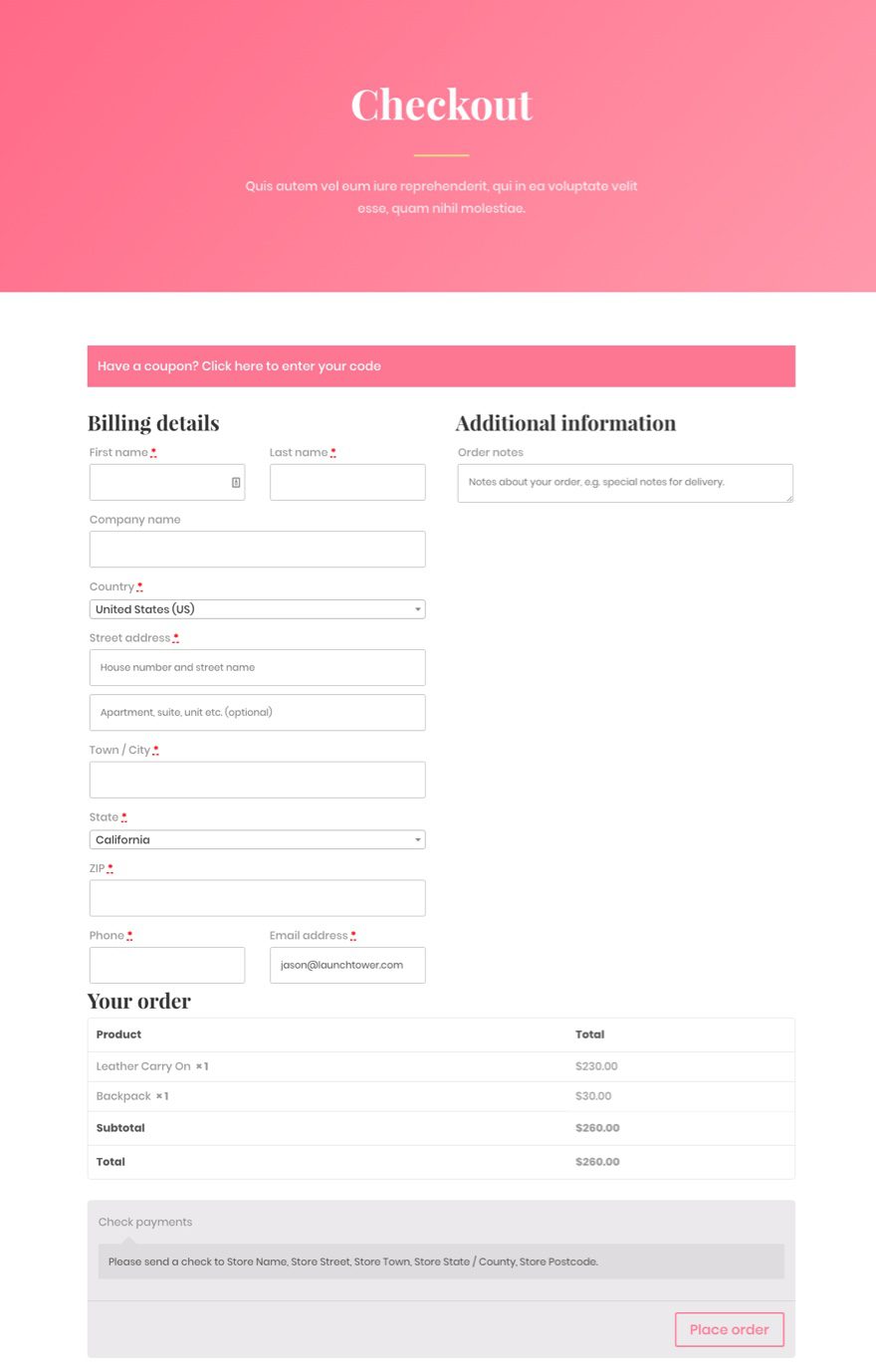
Let’s take a look at the Cart page first. Here is what it looks like before we do anything to it.
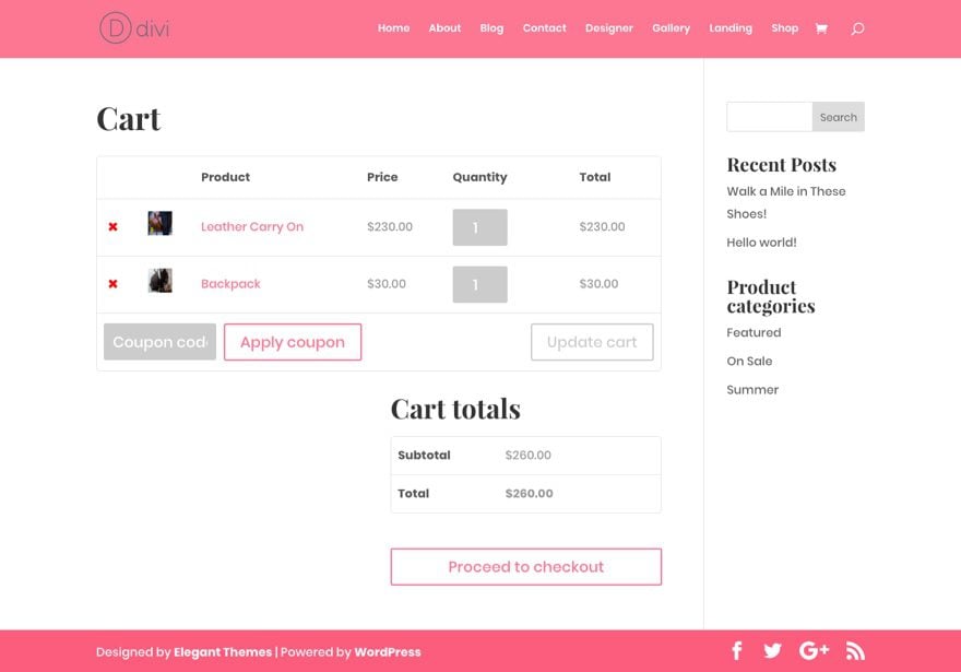
Notice that because we updated our global accent color, our links and buttons match the color scheme already. And, since we updated our typography settings in the Theme Customizer, the headers and body text also match our theme.
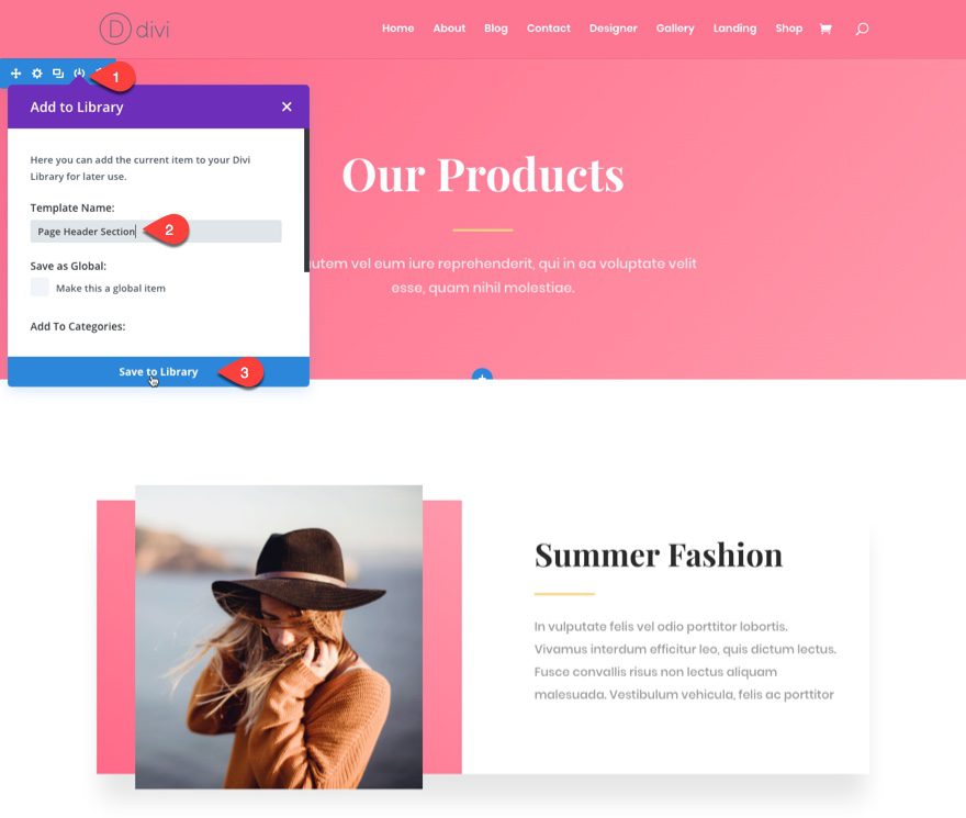
But we can do a little better than this with just a few clicks. First go to the shop page, deploy the visual builder, and save the top section containing the page header to the library. You can give the name “page header section”.
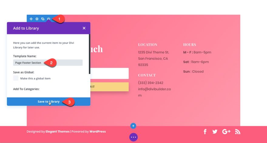
Then scroll down to the bottom of the page and find the last section containing the email optin and contact details and save it to your library with the name “page footer section”.
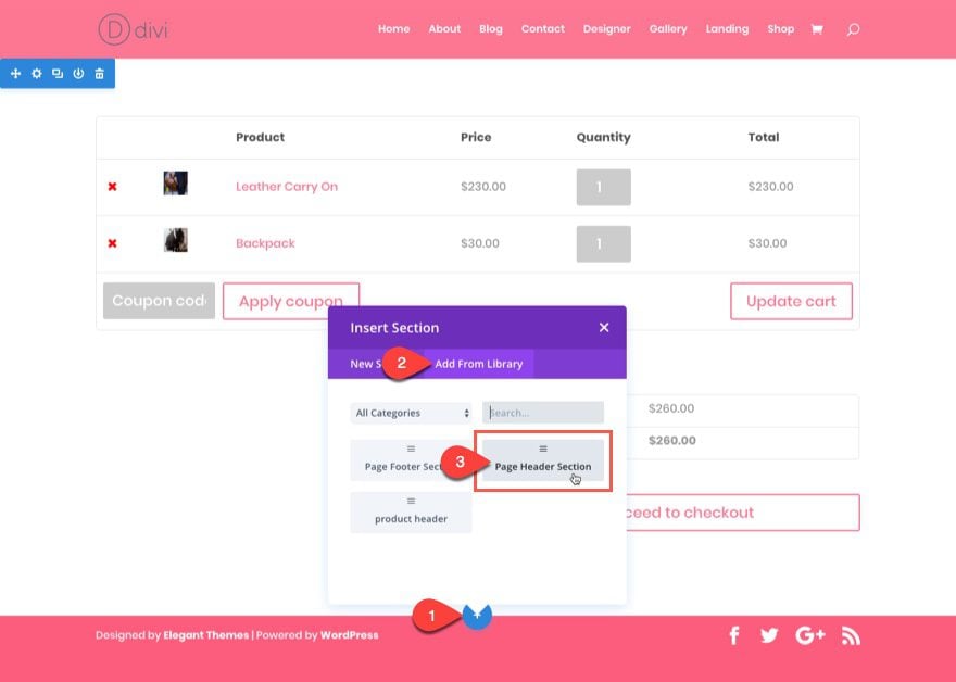
Now go edit your cart page. From the default page editor, select to use the Divi Builder, then “Use Visual Builder”. The builder should have automatically put the shortcode [woocommerce_cart] in a text module within a one column row of a regular section. If not, you will need to create this yourself. Next, click the blue plus icon to add a new section under the current one, select the “Add from Library” tab. Then select the new section you just created called “Page Header Section”.
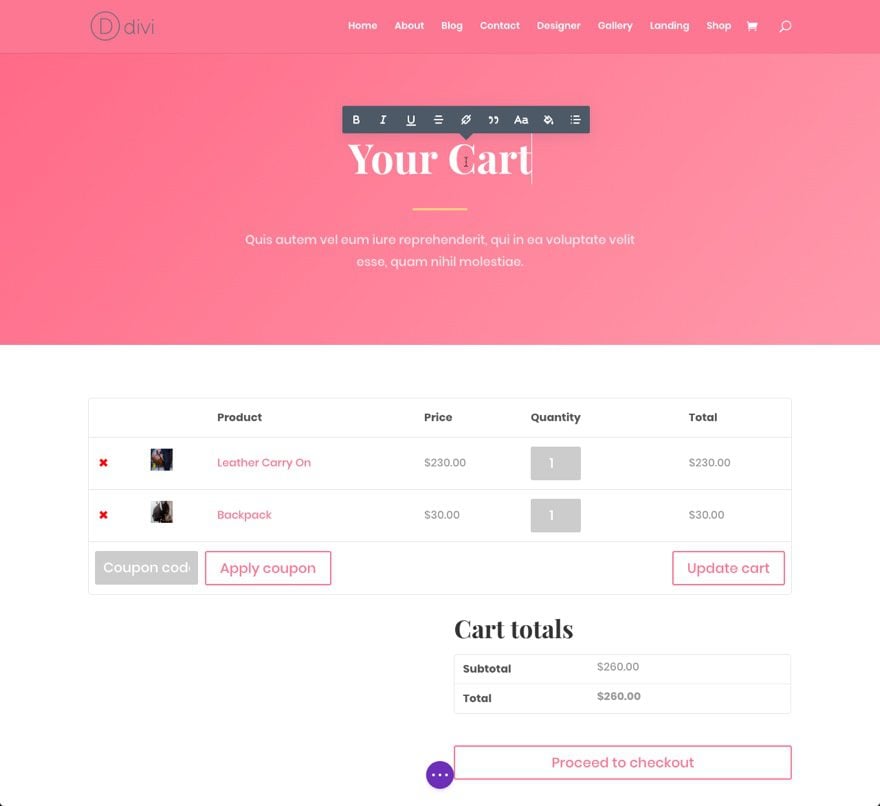
Then drag that section to the top of your page and change the title text to “Your Cart”. That’s it!
You can repeate this process for the Checkout Page as well.
Designing the My Account Page using the Divi Builder
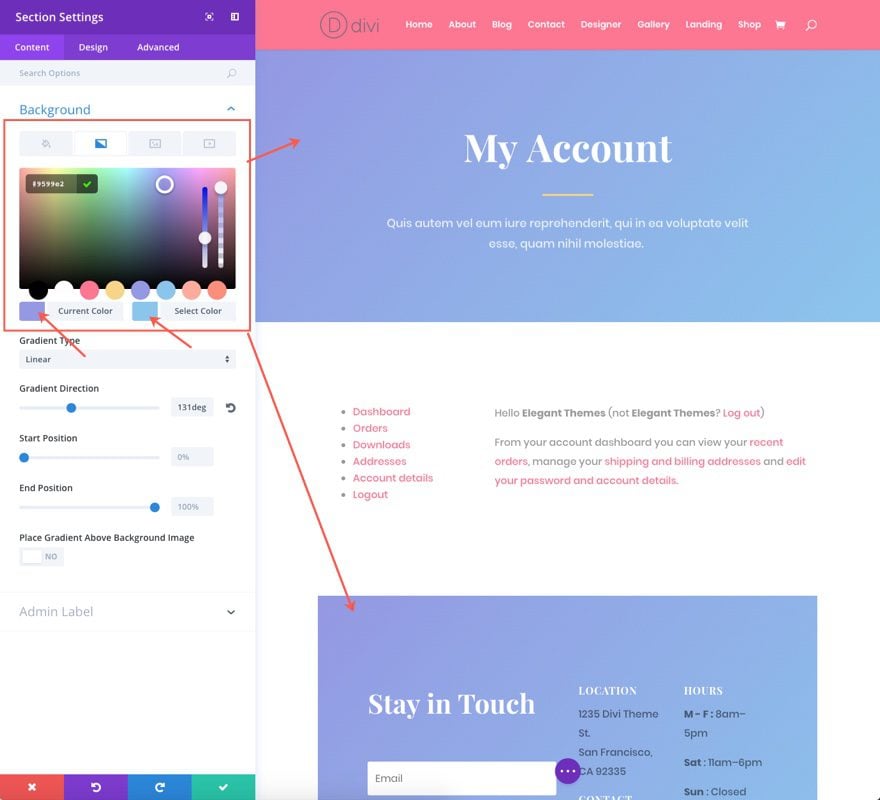
Now that you know how to add a header to these WooCommerce pages, go ahead and do the same for the My Account page. This time you can add the footer section you saved to the library to the bottom of this page.
You may want to give this page a distinct design to make it more obvious this is a page that manages your account. So instead of the pink gradient background for the header and footer sections, go to the section settings for each and change the background gradient colors to #9599e2 and #8bc6ec.
Use the Text Module Settings to Style WooCommerce Shortcode Content
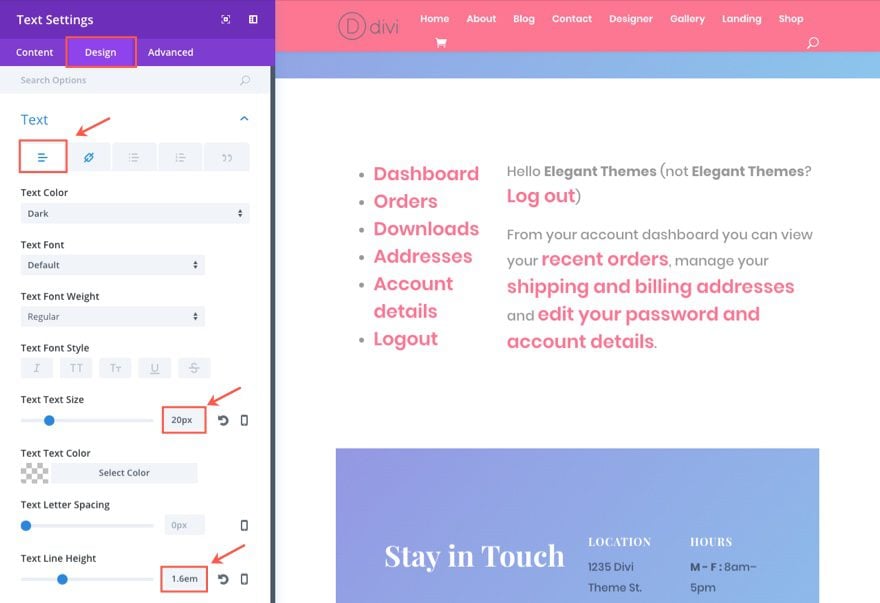
Because the WooCommerce shortcode now resides inside a text module, you can use this to your advantage to style some of those elements within the module settings.
Let’s do this for our My Account page. From the visual builder, update the settings of the text module that holds the shortcode content as follows:
Under the design tab…
Text Text Size: 20px
Text Line Height: 1.6em
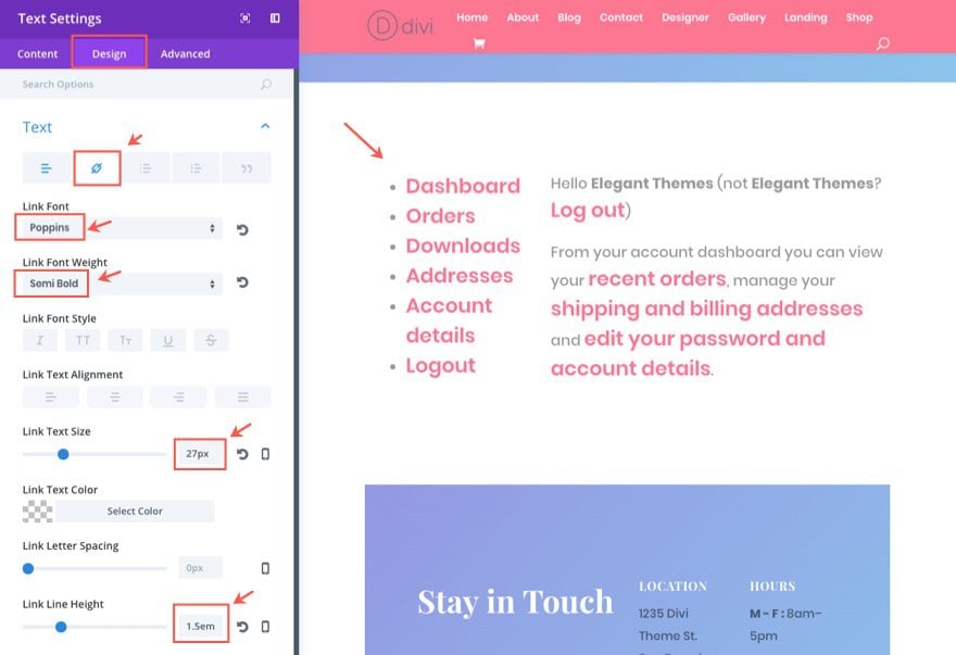
Now click on the link tab under the Text section to style the links as follows:
Link Font: Poppins
Link Font Weight: Semi Bold
Link Text Size: 27px
Link line Height: 1.5em
Save Settings
Now check out your My Account Page.

Using Custom CSS to Style WooCommerce Archive pages?
Some of the archive pages used by WooCommerce are not generated with a shortcode like the other pages, therefore they cannot be tweaked using the Divi Builder. So for these pages, you would need to break out some custom CSS.
Let’s look at the Featured Category page as an example.
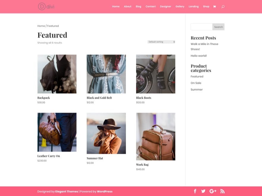
Now let’s open the Theme Customizer and click on Additional CSS and add the following:
.orderby {
background: #fd7792;
color: #fff!important;
font-size: 18px;
height: 40px;
font-size: 18px !important;

}

.woocommerce-Price-amount, .woocommerce .woocommerce-breadcrumb, p.woocommerce-result-count {
 font-size: 16px !important;
 color: #fd7792 !important;
 letter-spacing: 2px;
}
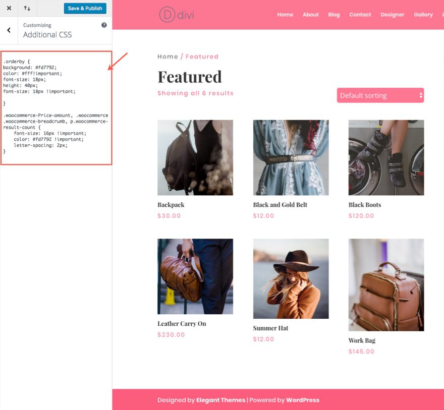
This will style the sorting dropdown box, the breadcrumbs, and the price font. The rest of the text can be changed using the Typography settings from the theme customizer.
Final Thoughts
Building an online store for your website is made a lot easier with the help of this amazing layout pack, WooCommerce, and the Divi Builder. Obviously, there are some necessities that still need to be done that are beyond the scope of this article. For instance, you will still need to decide what payment gateway to use, how you want to handle shipping, and other more company specific action items. But WooCommerce should be able to handle most of what you need.
If anything, I hope this post inspired you to create something amazing on your own.
I look forward to hearing from you in the comments.
Cheers!




Hi Jason Champagne,
I downloaded this Fashion theme and got on with it.
I followed every step of this post.
It was very easy to follow the steps.
But I got one question.
The shop icon in the header start in grey.
If you scroll down the icon change to wiht.
I tried everything, but I can’t get it with from the beginning.
This is my test location.
http://test.vd-solutions.be
Thanks upfront.
Keep this great work going.
Grts
Hi, I downloaded this layout. Thanks. But, when I went to extract it, it’s only giving me the images and no JSON files. Any ideas?
Sorry Korrie. Is this still the case? Have to tried to download it again?
Got it now, bad day for downloads, no electricity, internet out, hosting you know
Is this the best option to use if I am selling services, not products, and want to create an online store with Woo Commerce? I am using Divi.
Thank you.
Thanks for the question Terri. You can definitely use WooCommerce to sell services (not physical products). Just use a simple product and select “virtual” to disable the shipping elements.
Hope that helps.
Best WordPress Theme
Great indepth tutorial with images to guide along……
Woocommerce is the most popular shopping cart on the market. If you combine the elegance of Divi theme and the power of Woocommerce, you can create perfect e-commerce websites.
Hi Jason,
Thanks for a great tutorial. I’ve got three questions…
1. In a world of “Mobile First” the cart layout on mobiles is not great and the Divi builder mobile view differs noticeably from the same thing in Chrome. Do you have any guides for improving the mobile version of the cart in this layout?
2. When the WooCommerce shop page layout is customized, will WooCommerce add-ons such as “WooCommerce Product Filter” and “WooCommerce Product Search” still work?
3. When the Shop page has been customized to show some products from 2 or 3 categories, how can this layout work to display all products or categories if the store has 10-15 categories and +100 products (which isn’t that much in a fashion store)?
Thanks Again,
Donal
I would Really like to see the answers to these questions.
Great article. I’m working on an e-commerce website for a client which has many products. Which product filter plugins would you recommend? I have tried a couple, but they do not work with divi.
Hi Julio,
I’ve used Woof Product Filter and I find it really good.
Where you might hit a problem with Divi is if you’re trying to filter the Divi Shop Module, which doesn’t seem to allow external filtering.
Woof will work with the default WooCommerce shop pages only, including categories and tags.
Hope this helps,
Donal
Don’t know if you could touch on this, but in your article demo, the listing of products show a mismatch of heights of the thumbnails…possible ideas on how to make all the thumb nail images the same height without having the crop the original image and then regenerate the thumbnails?
Personally, I think it’s better for the designer to produce images that are of a consistent size rather than to attempt programmatic fixes ad hoc. Do the work where it is best suited, ie., proficient designers should be set up to bulk process images in their image editor of choice. Additionally, you should be specifying the sizes of images you need ahead of time to the designer to eliminate Page Speed issues that arise from using CSS or JS to change the size of images instead of using the correct size. You will get dinged for forcing the user to download more image than they need.
Have you tried to enable the”Hard Crop” setting in…
WooCommerce ->
Settings ->
Catalog
This will do exactly as it says; It’ll crop your images to the size that you set.
Hope this helps,
Donal
This has been the Number 1 problem with Divi for me since buying it. My clients often ask me “can you make this the same height?”
What do I say to them? Yeah I can try but it’s going to cut off words or look weird, this theme I sold you on isn’t so good with making blog posts line up… Really shocking that they are spending so much time adding box shadows and not allowing you to have equal size boxes and images uniformly on the blog layout. Would make a HUGE difference to my work.
Hi Charlie,
Is this strictly a Divi thing, or a WordPress thing?
I know that I have struggles with images when they are supplied in different sizes and the ways that I usually (not always) deal with it are…
1. Send them back and get equal sized images.
2. Run them through Photoshop or Lightroom to resize.
3. Use a hard crop in WooCommerce.
4. Use “Equalize Row Heights” in Divi.
5. Use Jason’s suggestion of setting height and overflow in css.
Just my thoughts…
Donal
Unfortunately no solid ideas come to mind. You could try going to the shop module settings > advanced tab and enter the following custom css in the image input box:
That would take care of some minor overlap but may cut off too much for some images.
Sorry I couldn’t be more helpful.