Welcome to part 3 of this 6 part series that will teach you how use Divi and its new Animation options to design awesome page sections. I’m going to be walking you through how to build the different sections of our live demo page in order to show you techniques for adding animations to your website. The Animation features truly are fun and easy to use. And with the Visual Builder, you can see your creation come to life every stage of the way. Come and join me as we explore the power of Divi animations.
In our last post, I showed you a few creative ways to design and animate sections of your website for displaying products and services as we built section 3 and 4 of our animation demo page.
Today, we are going to be tackling Section 5 which uses great animation to display four stunning Blurb Modules. The step by step timing of the blurb animations really compliment the step by step process in which the blurbs are being used.
Let’s dive in!
Here is a Sneak Peek of What We Will Be Building in Today’s Post

Preparing the Design Elements
The only thing you really need for this tutorial are the 4 207×188 image icons used for the Blurb Modules. Here are the images I will be using.



Using Divi’s Slide Animation to Show the Progression of a Process
Subscribe To Our Youtube Channel
Building Section 5
Using the Visual Builder, add a regular section (under section 4 if you are following the series). Before you do anything else, add the background color #f5f9fc to your section and save your settings.
Add Your Section Headline Using Two Text Modules
Then add a one-column row. In the row, add a Text Module and update the settings as follows.
Under the Content tab…
Content: “Setup”
Under the Design tab…
Text Font: Bold (B), Uppercase (TT)
Text Font Size: 15px
Text Text Color: #6a8091
Text Letter Spacing: 5px
Text Line Height: 1.9em
Text Orientation: Center
Spacing: 20px Bottom
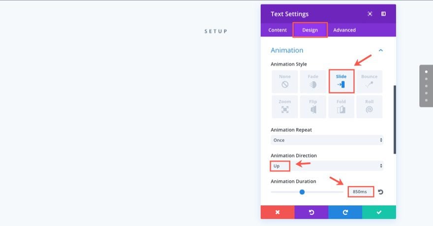
Animation Style: Slide
Animation Direction: Up
Animation Duration: 850ms
Save Settings
Now let’s add the section headline by adding another Text Module under the one you just created. Update the Text Settings as follows:
Under the Content tab…
Add the following html in the text tab of the content box:
<h1>Say Hello to DIVI</h1>
Under the Design tab…
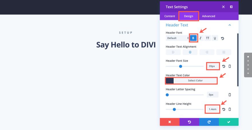
Header Font: Bold (B)
Header Text Alignment: Center
Header Font Size: 39px
Header Text Color: #2f3a54
Note: Since this is an h1 header, we need to edit the Header Text settings.
Width: 600px (type in this value)
Module Alignment: center
Custom Margin: 20px Bottom
Animation Style: Slide
Animation Direction: Up
Animation Duration: 850ms
Animation Intensity: 12%
Animation Speed Curve: Ease-Out
Save Settings
Design The Four Blurbs
Now we are ready to add our Blurb Modules. First, create a row with a four-column (1/4 1/4 1/4 1/4) structure.

Add a Blurb Module to the first (far left) column.
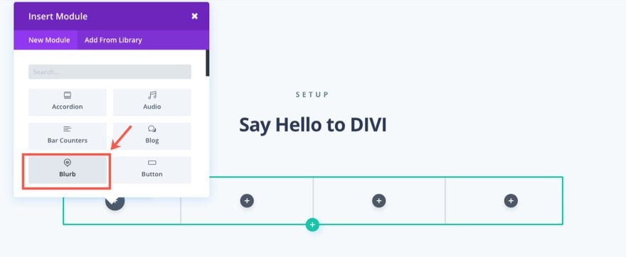
Then update the Blurb Settings.
Under the Content tab…
Add the following html in the text tab of the Content Box:
<p>Lorem ipsum dolor sit amet, consectetur adipiscing elit. Phasellus bibendum est vitae felis rhoncus gravida sed nec purus.</p>
<p><a href="#" style="font-size: 12px;letter-spacing: 1px; color: #6a8091;"><strong>READ MORE ➔</strong></a></p>
Note: I added in a link manually to give the user another option to click. Make sure the url for the manual link matches the link you add to the blurb module url.
Url: [enter url]
Image: [enter your 207×188 image]
Background Color: #ffffff
Under the Design tab…
Text Orientation: Center
Header Font: Default, Bold (B), Uppercase (TT)
Header Text Color: #7969f4
Header Letter Spacing: 3px
Header Line Height: 3em
Body Text Color: #6a8091
Body Line Height: 1.9em
Custom Padding: 40px Top, 40px Right, 40px Bottom, 40px Left
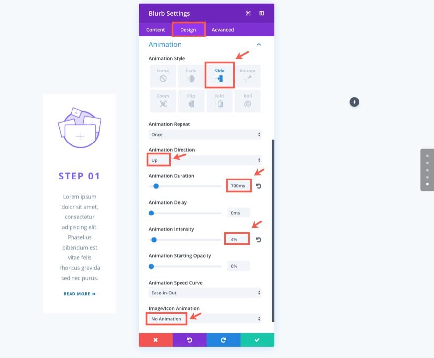
Animation Style: Slide
Animation Direction: Up
Animation Duration: 700ms
Animation Intensity: 4%
Image/Icon Animation: No Animation
Under the Advanced tab…
Add the following Custom CSS in the Main Element box:
border-radius: 6px;
box-shadow: 0 15px 35px rgba(50,50,93,.1), 0 5px 15px rgba(0,0,0,.07);
Save Settings
Now that you have completed one Blurb, we can use it as a template for the next three blurbs.
Go ahead and right click on the module and select copy module. Then paste (ctrl + v) the module into each of the three remaining columns.
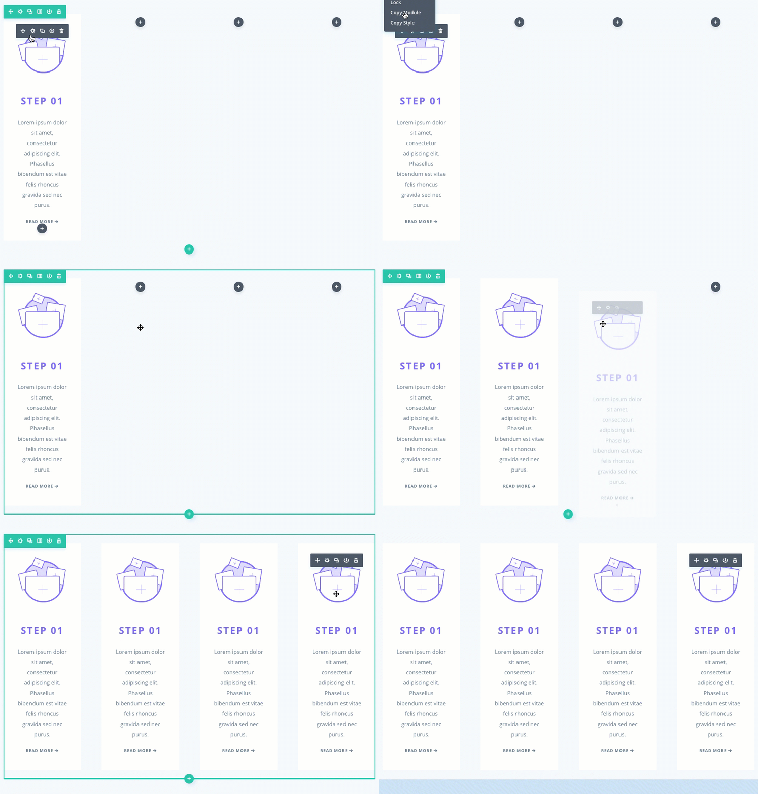
Now all we have to do is add a few updates to each of the three duplicated modules.
For the Blurb Module in the second column, update the following:
Under the Content tab…
Title: Step 2
Content: [update text and manual link url]
Url: [update blurb url]
Image: [add new 207×188 image]
Under the Design tab…
Header Text Color: #e944ff
Animation Delay: 50ms
Animation Intensity: 12%
For the Blurb Module in the third column, update the following:
Under the Content tab…
Title: Step 3
Content: [update text and manual link url]
Url: [update blurb url]
Image: [add new 207×188 image]
Under the Design tab…
Header Text Color: #3ebaef
Animation Delay: 100ms
Animation Intensity: 20%
For the Blurb Module in the fourth column, update the following:
Under the Content tab…
Title: Step 4
Content: [update text and manual link url]
Url: [update blurb url]
Image: [add new 207×188 image]
Under the Design tab…
Header Text Color: #95d624
Animation Delay: 150ms
Animation Intensity: 30%
Once you have updated all of your Blurbs, let’s update the Row settings as follows:
Under the Design tab…
Use Custom Width: YES
Custom Width: 1366px
Use Custom Gutter Width: YES
Gutter Width: 2
Animation Style: Zoom
Animation Duration: 700ms
Animation Starting Opacity: 100%
Save Settings
Now you are all done with this section. The demo page has another image below the blurbs but I didn’t think it necessary to include it here.

Bonus: Download These Sections for Easy Import
As a bonus perk we’ve packaged the sections built in today’s tutorial into a free download that you can get using the email opt-in form below. Simply enter your email and the download button will appear. Don’t worry about “re-subscribing” if you’re already part of our Divi Newsletter. Re-enter your email will not result in more emails or duplicates. It will simply reveal the download.
Enjoy!
To use these downloads, start by locating the zipped file called Animation_Effects_Part_3.zip in our downloads folder. Unzip it to reveal the following imports.
Animation Effects Part 3 (section 1).json
Animation Effects Part 3 (section 2).json
Navigate in your WordPress Admin to Divi > Divi Library > Import & Export. When the portability modal pops up, click the import tab and the button labeled choose file.
Select the json file you prefer and click “Import Divi Builder Layouts”. Once the import is complete navigate to the post or page you would like to add one of the above sections to.
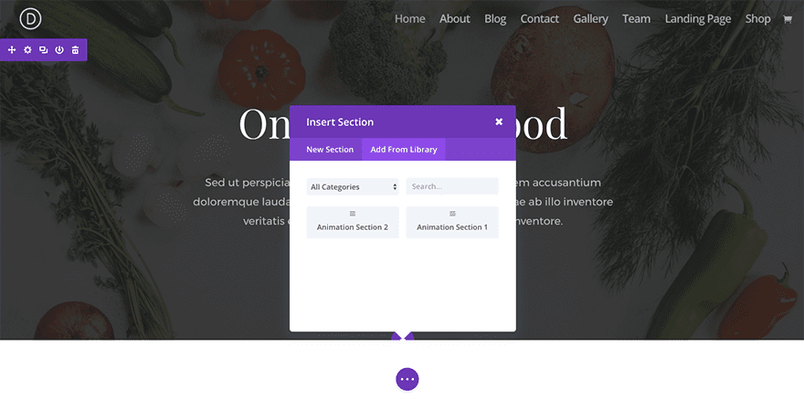
Activate the visual builder. Navigate to the part of the page you would like to add one of the above sections to. When you click the add new section icon, you will be presented with the option to “Add From Library”. Choose this option and select the layout you want.
Wrapping Up
The design and animation of section 5 really does show the power that just a few animation settings can make on the delivery of content. Not only does it look cool to have each of the blurbs show in progression, but it also makes sense considering you are showing steps to a process anyway.
Coming Up

In part 4 of our series, I will be showing you a gorgeous layout for displaying products or downloads. And, of course, I will highlight the smart use of animation throughout.
Until next time!
I look forward to hearing from you in the comments below.



Great video. Love the animations. I have just changed a section on my site to use this layout! Really looking forward to part 4!
hello there i loved watching your video all that i want to say now is that it was really worth it and we hope to see more in the coming time 🙂