This post is part 2 of 5 in our mini series titled 5 Impressive Divi Gallery Layouts and How to Create Them. Stay tuned for all five unique examples of the gallery module and tutorials on how to achieve them!
In this second example, we’re going to create a tight-tiled gallery look with custom padding to add a clean and uniform white space between each image. Several of my clients spanning across multiple industries seem to LOVE this layout so I’m excited to share it with you!
The majority of the settings we’ll change are in the standard module options, then we’ll just add a little CSS for the custom padding.
- 1 Today’s Before & After: The Divi Gallery Module
- 2 How to Create a Tiled Gallery with Custom Padding with the Divi Gallery Module
- 3 Concept & Inspiration for the Tiled Look with Custom Padding Gallery Module
- 4 Preparing Your Design Elements
- 5 Implementing the Tiled Gallery with Custom Padding Module Design in Divi
- 6 In the Row Module Settings
- 7 Gallery Module Settings
- 8 Tomorrow: Creating a Unique Border for your Divi Gallery Module Images
Today’s Before & After: The Divi Gallery Module
Before we begin, let’s take a look at the default Divi and its Gallery Module. When you add images to the Divi Gallery Module and do nothing else, the image below is basically what you get.
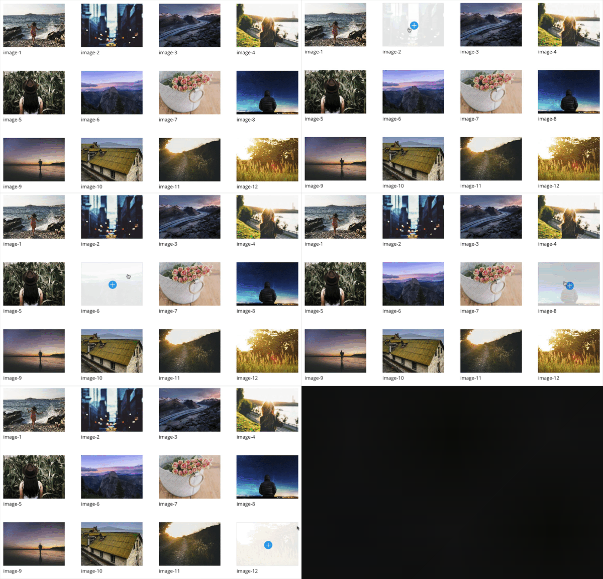
Default Gallery Module Hover Over
By the end of our tutorial today we’re going to achieve a tiled gallery with custom padding like the one you see below.

Tiled Gallery Hover Over
How to Create a Tiled Gallery with Custom Padding with the Divi Gallery Module
Subscribe To Our Youtube Channel
Concept & Inspiration for the Tiled Look with Custom Padding Gallery Module
The first time I used this effect was when I was asked by a client to put “just a little bit of space” between each image. It occurred to me that with the Divi gutter options, the images were often lined up together or spaced far apart. I realized that just with a little addition of CSS padding, I could achieve the look my client wanted. I now use this look for the majority of my sites and it’s really helped set my galleries apart from other Divi sites. My hope is that you can use this idea, adjust the settings to your liking and create some unique looking galleries of your own!
Preparing Your Design Elements
Today’s tutorial, like yesterday’s, will require twelve images. I used unsplash.com to get my own completely free images to use. If you’re creating demo content or simply following along with this tutorial for fun then I would recommend you do the same. On the other hand, if you have your own original images then by all means use those.
The size I found that worked best for me for these images is 1200px wide by 1000px height. You’ll also want to save these as compressed jpegs to save space. If you are unsure how to do that, you can view this tutorial for step by step instructions.
As with yesterday’s post I would also recommend that you label your files in a readable way (instead of the default jumble of letters and numbers cameras produce). This is helpful with SEO and your own personal organization/file hunting.
Implementing the Tiled Gallery with Custom Padding Module Design in Divi
For this example, we’ll use the Divi Gallery Module and make adjustments in these 3 areas:
– General Settings
– Advanced Design Settings
– Custom CSS Settings
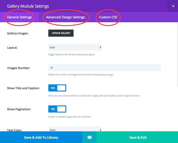
Setting’s we’ll change.
To begin, create a single section with a single row and single gallery module.
In the Row Module Settings
The first thing we need to do is adjust the gutters so that the images line up tight next to each other.
General Settings:
Use Custom Gutter Width: YES
Gutter Width: 0
Keep Custom Padding on Mobile: YES
Save & Exit
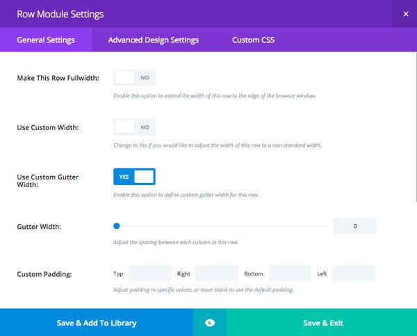
Example 2 – Row Settings
Gallery Module Settings
General Settings:
Gallery Images: Added the images to the gallery
Layout: Grid
Images Number: 12
Show Title and Caption: NO
Show Pagination: NO
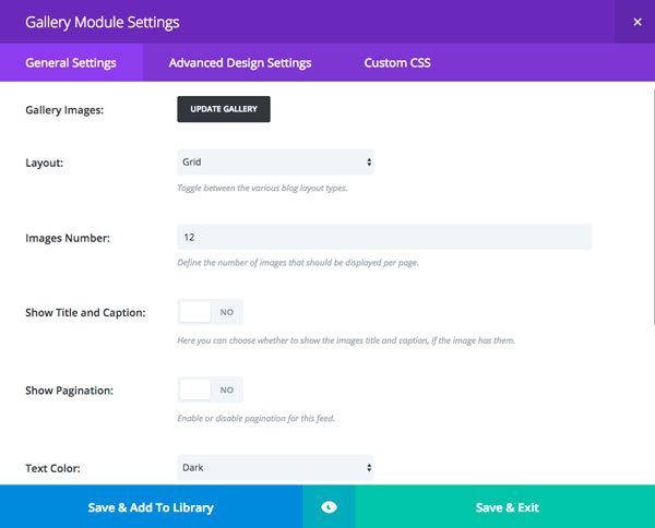
Example 2 General Settings
Advanced General Settings:
Zoom Icon Color: #606060
Hover Overlay Color: rgba(255,255,255,0.75)
Hover Icon Picker: Magnifying glass icon
This is what the user will see when they scroll over the image. I’m using the magnifying glass in this example but you can try any icon you’d like on your design.
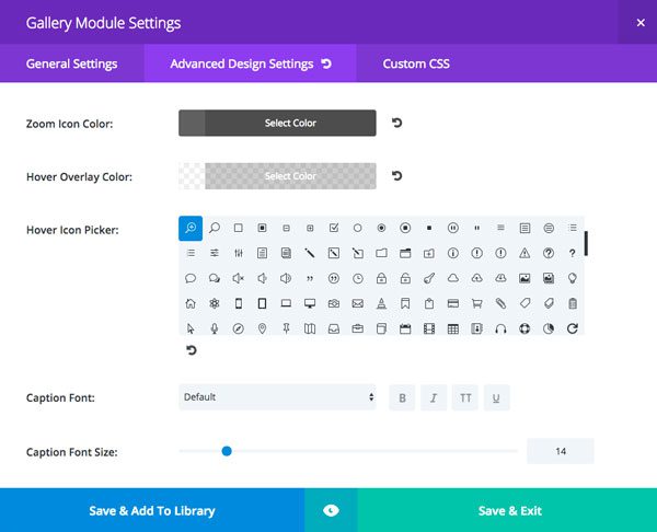
Example 2 Advanced Design Settings
Custom CSS:
Gallery Item:
padding: 3px;
The gallery item section here singles out each image in the galler so whatever adjustments you make here will effect every image.
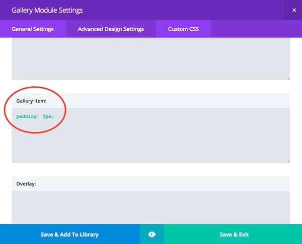
Example 2 – Custom CSS Settings
Save & Exit

Your final design, the Tiled Look with Custom Padding w/ the Divi Gallery Module!
And there you have it! With some adjustments to the module options that Divi gives us and just one line of custom CSS, we have a slick tiled gallery that’ll really give our galleries a nice look. You can play around with the padding number to create more or less space between your images.
Tomorrow: Creating a Unique Border for your Divi Gallery Module Images
Check back tomorrow for example 3 – where we’ll use a clipping mask to create unique borders on our Divi Gallery Module images!
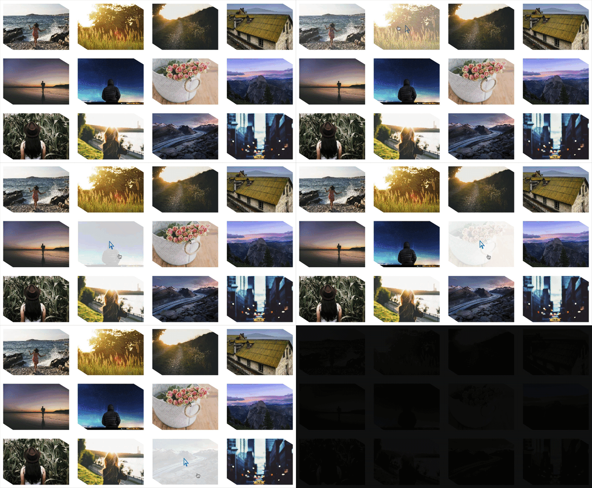
Example 3 – Unique Image Border
Be sure to subscribe to our email newsletter and YouTube channel so that you never miss a big announcement, useful tip, or Divi freebie!





Hey Ho 😉
How can I make the thumbnails all the same even if the images are of a different size (portrait and landscape)?
Karsten asked that too.
Could you explain that please?
Being a retailer of bridal dresses, most of our images are portrait – please advise how to display in Divi gallery
Hi,
Thank for the awesome post!
I would like to know if there is a way to remove the links from the images?
I would like to use the gallery with the hover effect, but make the images non-clickable.
Could you show me how this is done?
Thx
Love the tutorial, thank you!
But I am wondering if it is possible to create a tiled gallery with portrait AND landscape oriented images?
Thanks!
Love this tutorial, thank you! However, I wonder if it is possible to use a tiled gallery for landscape AND portrait oriented images in the same gallery?
Thank you! Just used it an it looks very nice.
Great to hear, Sueli! Nothing better than knowing a tutorial was put to good use right away!
Amazing! Great tutorial! Thank you!
Thanks Jordan!
hank you for this information, I will use these tips when I’ll be creating my next Divi gallery.
Another great article!
In these articles what do you use to show the live animated examples?
Thank you again,
Thanks Larry – I use ScreenFlow for Mac to record the examples then save them as animated GIF’s.
Cheers!
Thank you for the great tutorials! Divi is great!
Thanks, Stig!
I task it back. with a bit of fiddling I have got there. Please do not release my previous comment
I am currently putting a gallery into a new site. The customers want to keep the titles. I would like to implement one of the approaches seen here but with the titles showing. Presumably there will be other customers who could also want this in future.
I would like an increase in the width and a commensurate increase in the height height of the gallery “thumbnails”
How can you do this?
Thank you for these tutorials. I will use these tips when I’ll be creating my next Divi gallery. 🙂
Great to hear, Andrej!
And how can I make the thumbnails all the same even if the images are of a different size (portrait and landscape)?
Hi, good Tips & Tricks, but I need to create a gallery module with carousel style same as Portfolio module. What should I do to have the same carousel style?