Divi’s email optin module has several text and content areas that can show additional content. These areas can be styled within the email optin module. Along with the module’s layout options, this provides a solid design for a simple email form. However, this does limit the design possibilities. Fortunately, we can use the email optin module with text modules to create even more design and styling options. In this post, we’ll compare using the text fields inside email optin module itself with using separate modules for your copy.
Let’s get started!
Inline Email Optin Module Content Elements
Aside from the form itself, Divi’s email optin module has three areas with content. They include the title, body content, and footer content. The Title is a single text field with no adjustments in the Content tab. The Body and Footer content have complete content editors that accept text, media, HTML, CSS, etc. You can also use dynamic content, customize them for individual device sizes, and adjust their hover state.
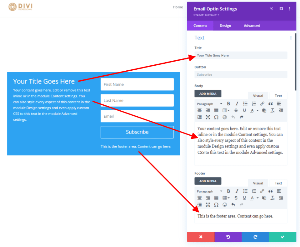
Inline Email Optin Module Design Tab
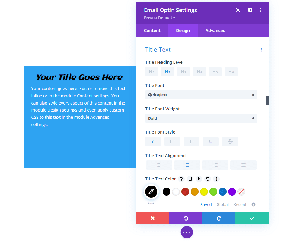
The Design tab has the basic styling settings for the title and content areas. Options include the Heading Level, Font, Font Weight (regular or bold), Style, Alignment, Color, Size, Spacing, Line Height, and Shadow. Let’s look at each one.
Email Optin Module Title Options
Here are the design settings for the Title. I’ve adjusted Heading Level through Text Color in this image.
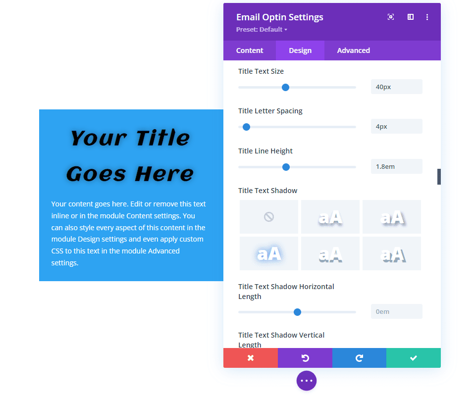
I’ve adjusted Text Size through Text Shadow in this image.
Email Optin Module Body and Footer Text Options
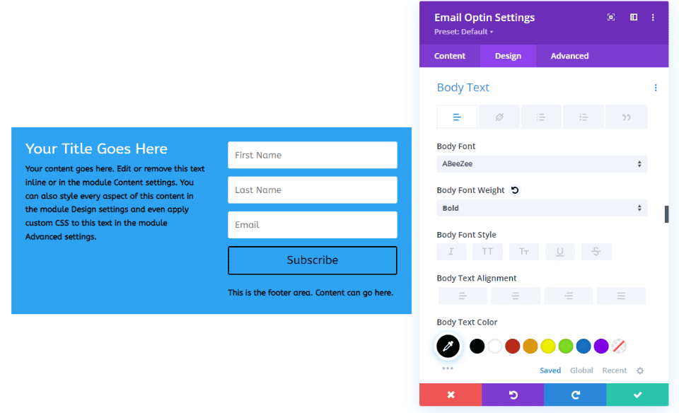
The Body and Footer text is controlled by the same Design settings. The image below includes the Font through Font color options. This section also adds the standard text features such as bullets, a link, a quote, etc. The Title text follows the styling of the Body text unless it has its own styling. The button will use some of the text options unless it’s styled separately.
The image below adds the Text Size through Text Shadow options.
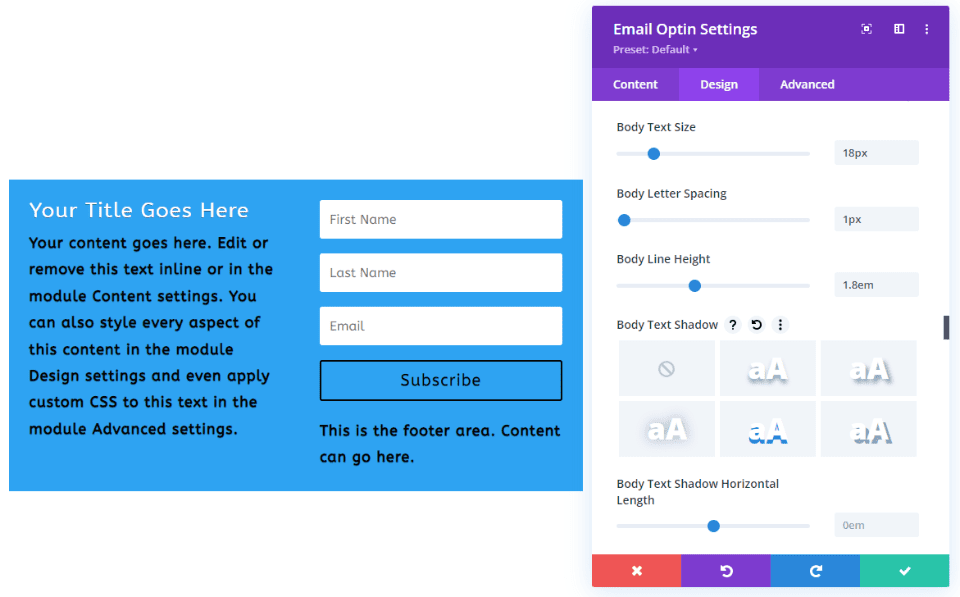
You can use inline CSS in the content editor, but anything that isn’t styled will follow the styling in the Design tab.
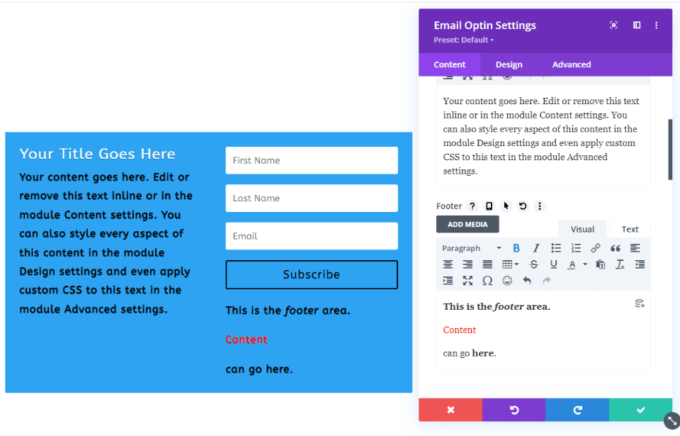
Inline Email Optin Module Content Layouts
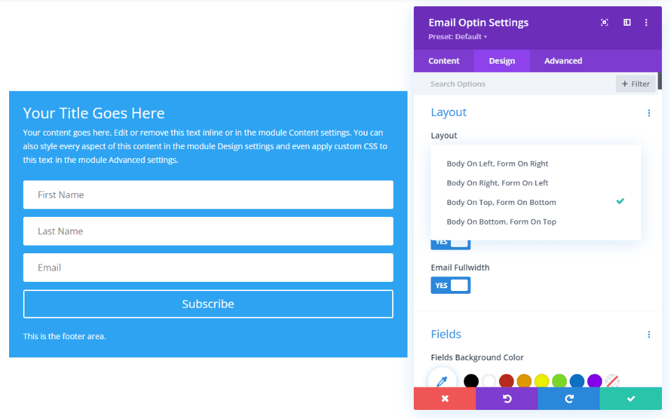
Layout options allow us to place the title and body content above, below, to the right, or the left of the form. The example below places the body on top and the form on the bottom.
Pros and Cons with the Email Optin Content
Pros
- Everything is contained in one module. This simplifies the creation and styling of the email form.
- It’s easy to use and it’s efficient. If you want to copy or move the email form, you only need to handle one module.
- The email optin module provides three areas of text that we can use. The text looks great and works well for basic email forms.
- To make adjustments, you only need to open one module.
Cons
- The Title text has a simple field to enter the title, and it has the basic styling options in the Design tab.
- The body and footer text have individual content editors in the Content tab, but they use the same settings in the Design tab.
- The module has four layout options that determine the placement of the body and form. You can place the body above, below, to the right, or the left of the form, but you can’t separate them.
- The form’s fields have separate styling options, but the other styling elements apply to the entire module. For example, the background, sizing, spacing, border, box shadow, filters, transform, and animation applies to every element of the module. This means you can’t adjust the background of the title separately from the body, footer, or form.
- The title is always above the body text. The footer content is always below the button.
- Any adjustments to the placement or styling that are not available in the Design tab have to be added to the CSS fields in the Advanced tab.
Combining the Text with Modules
The alternative is to create the same text elements with individual text modules along with the email optin module. This option requires you to style multiple elements and you might need to use rows with multiple column options. However, it also provides you with the most features and options.
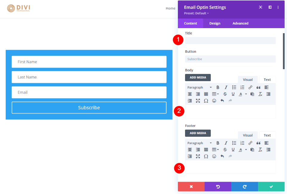
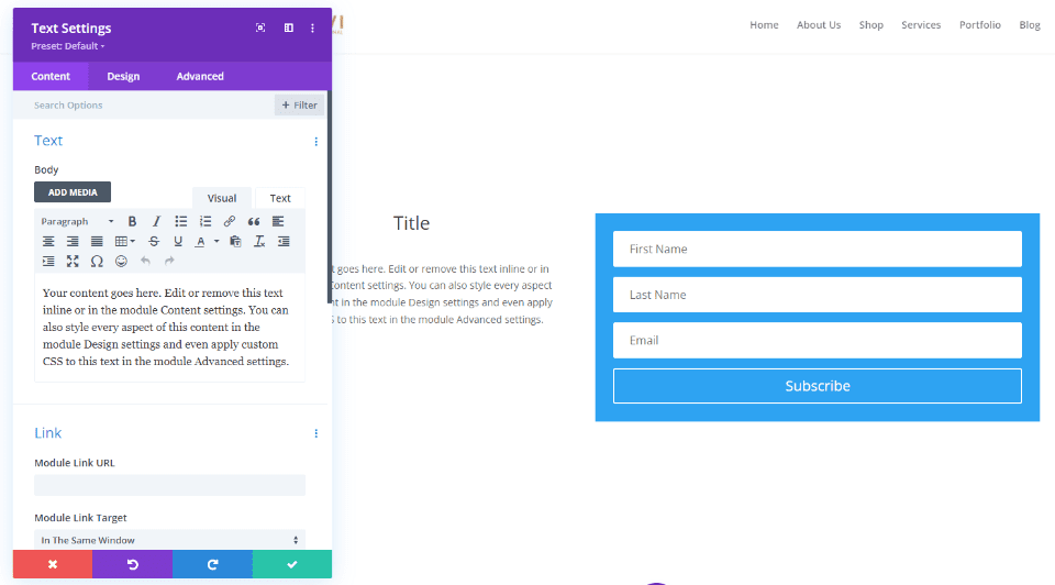
To use this method, simply leave the email optin module’s Title, Body, and Footer fields empty, as I’ve done in the example below. This gives you the form with no other text elements.
Then, use text modules to create the elements you want. I’ve added two text modules next to the form in the example below. As this example shows, the content editor is the same as the one in the email optin module.
Text Module Content Design Options
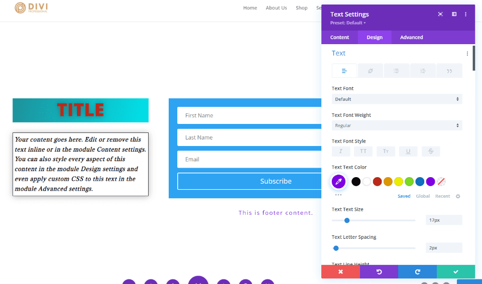
The text module has the same design settings for body text and heading text as the email optin module but adds a few more options. The heading text includes five font weights. Since you can use a different module for each set of text, you can have a different background, border, box shadow, etc., for each one.
The example below uses the email optin module for the form and adds three different text modules to create the title, body, and footer text. I’ve styled each module separately. This shows the settings for the Font, Weight, Style, Color, Size, Spacing, Line Height, and Text Shadow. I’ve also adjusted the Backgrounds, Spacing, and Borders.
Pros and Cons with Using Text Modules for the Email Optin Content
Pros
- The text modules give you a lot more styling features for each of the elements. Since each module is styled individually, you can have different styling for each element. This includes different backgrounds, spacing, sizing, borders, etc.
- You’re not limited with layout options.
- You’re not limited to one set of content. You can surround the form with as many modules as you want, to create any design you want.
- You’re not limited to text modules. You can use anything you want, such as images, video, sliders, CTAs, and lots more.
- You can still use them in combination with the content in the email optin module.
Cons
- For placing the content next to the form, you’ll have to use rows with more columns.
- It’s more difficult to copy or move individual modules.
- There are more modules to open if you want to make changes.
- It can take some extra styling effort to make them look like a single form. Borders and backgrounds for the email optin must be done in the row settings if you want to change them and make it look like a single module.
Email and Text Module Combination Examples
Next, let’s look at a few examples with combinations of email optin modules and text modules. For most of these examples, I’ll use the email optin form from the free NGO Layout Pack that’s available within Divi. I’ll show the desktop and wireframe views.
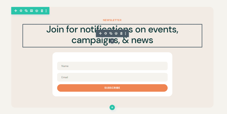
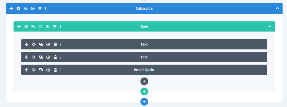
Firstly, here’s the email optin as it appears in the layout. It uses two text modules and the email optin module. The background styling is done in the row. It places a small title at the top, a large description under that, and then the form.
Here’s the wireframe view.
Email and Text Module Combination Example One
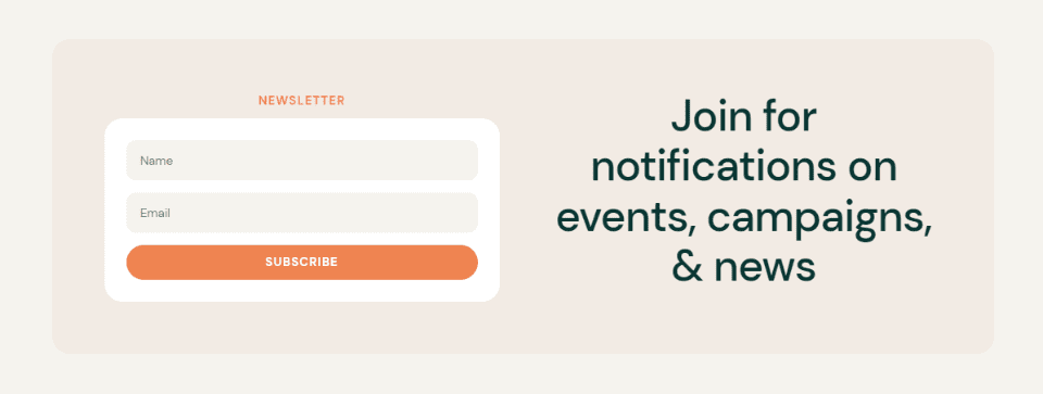
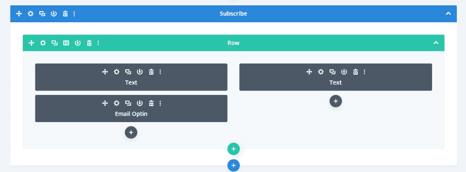
Our first example moves the description to the right of the form but keeps the title above the form. This layout is simple, but it’s not possible without using a text module above the form. I’ve changed the row to 2 columns.
Here’s the wireframe view.
Email and Text Module Combination Example Two
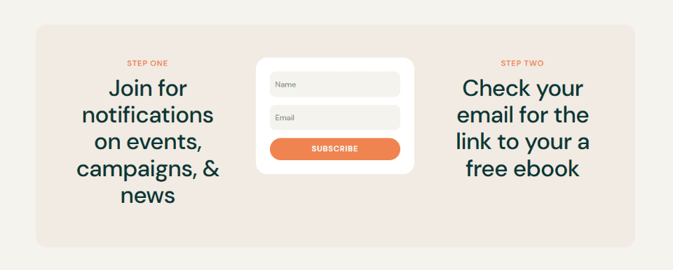
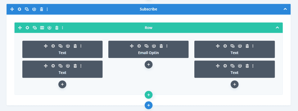
Our second example, I’ve changed the row to 3 columns and placed text modules in the outer columns. Each of the rows with text includes a title and description that provides numbered steps. The email optin module could display one step, but not both.
Here’s the wireframe view.
Email and Text Module Combination Example Three
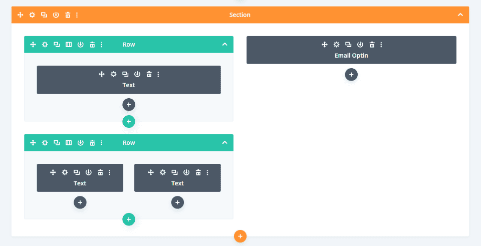
Our third exanple uses a specialty section with multiple rows and column widths. It displays a title and two modules for descriptions on the left and the email form on the right.

Here’s the wireframe view.
Email and Text Module Combination Example Four
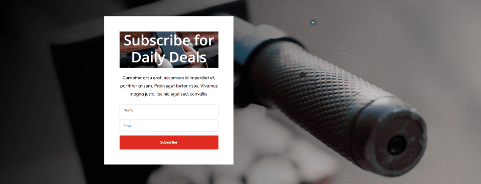
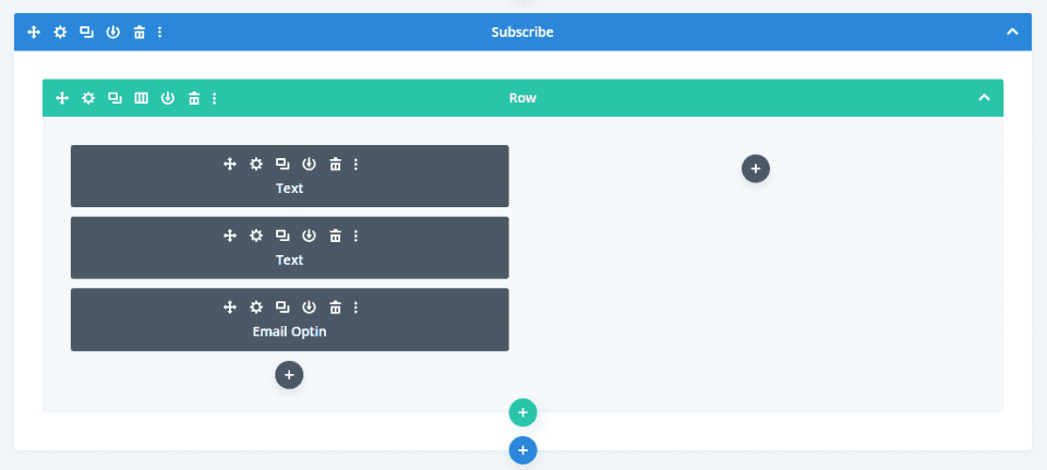
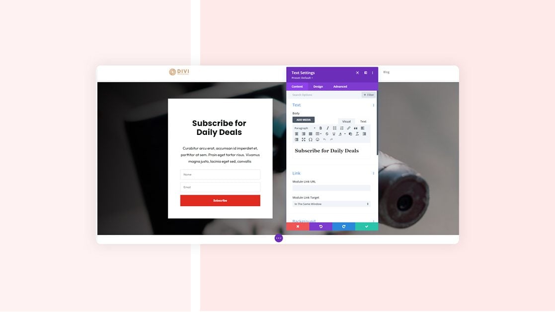
Here’s our fourth example. It uses the email optin form from the free Scooter Rental Layout Pack. I’ve added an image to the background of the title and changed the title’s font color to white. Everything else is the same as the original. The white background of the column makes it look like a single module.
Here’s the wireframe view.
Ending Thoughts
That’s our look at using the inline email optin module vs. combining it with text modules. The email optin module works well and provides a simple email form, but it is limited. Using text modules for the title and description gives you lots more design options. With a little bit of styling, multiple modules can look like a single module. Using multiple modules, you can create unique email optin forms with lots more layout and design options.
We want to hear from you. Do you use the content features in the Divi email optin module, or do you prefer to use text modules for that content? Let us know in the comments.



AAARGH! I NEED THE 1 ROW EMAIL OPTIN U_U