Thumbnail Track vs Dot Navigation is one of those things we have to consider when adding a Video Slider module to our Divi layouts. Both are good choices, but each one is better suited for certain situations. In this article, we’ll look at using Thumbnail Track vs Dot Navigation in Divi’s Video Slider module to help you decide which to use in your situation.
The Thumbnail Track and Dot Navigation make it easy to navigate through the video slides within the Divi Video Slider module. Both display the current video within the video player, but their navigation is very different.
Both types of navigation work well, but there are times when one is a better choice than the other. We’ll explore this idea as we go. The example below shows both types of navigation.

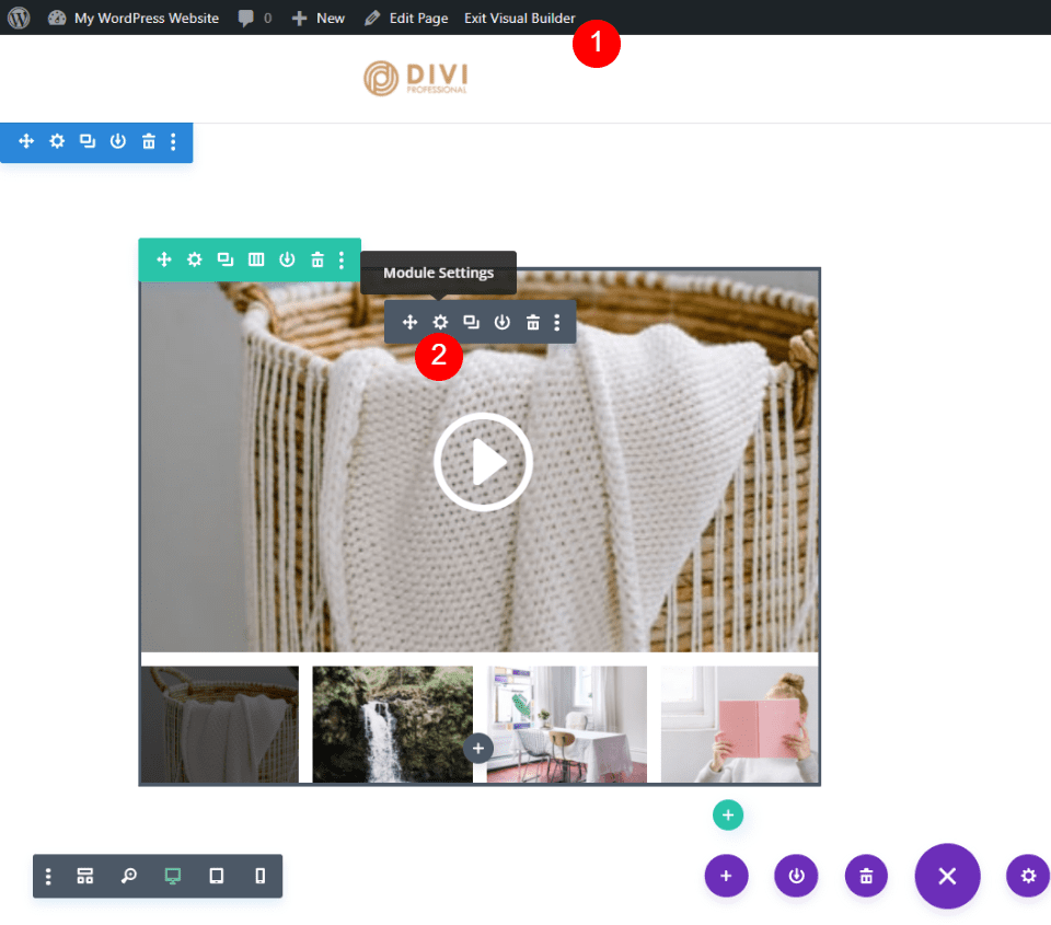
It’s easy to change between Thumbnail Track and Dot Navigation. Enable the Visual Builder at the top of the screen. Hover over the Video Slider module and click the gray gear icon.
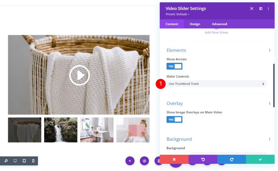
Scroll down to Elements. You’ll see a setting called Slider Controls that includes a dropdown box. This dropdown contains both navigation options. Simply click on the option you want. Use Thumbnail Track is the default setting. That’s the navigation seen in the image below.
Slider Controls:
- Use Thumbnail Track
- Use Dot Navigation
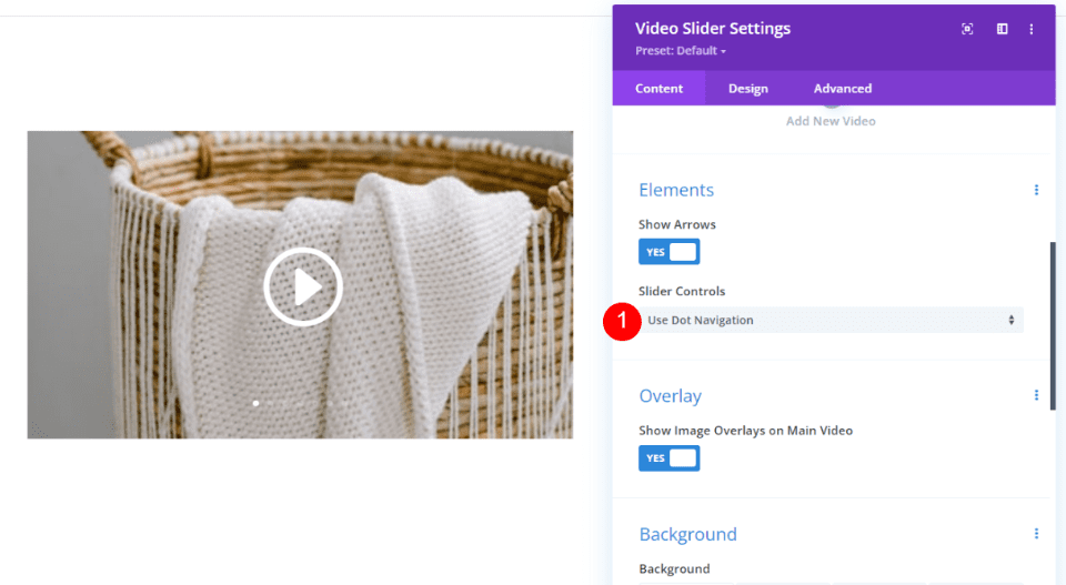
I’ve now selected Use Dot Navigation. The thumbnails have been removed and dots now appear on the video’s image.
A Look at Thumbnail Track
Thumbnail Track displays a thumbnail image of the slides under the video player. Hovering on a thumbnail shows the play icon and reveals left and right arrows. I’m hovering over the second thumbnail from the left in this example.

Clicking on a thumbnail shows that video in the video player. The thumbnail for the current video shows an overlay.

Clicking on an arrow in the Thumbnail Track scrolls the thumbnails to the previous or next set of thumbnails. This allows users to easily see the thumbnails and choose their video in the Video Slider.

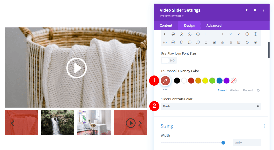
You have control over the Thumbnail Track’s overlay and control color. Choose any color for the Thumbnail Overlay Color. Select between Light and Dark options for the Slider Controls Color.
- Thumbnail Overlay Color: choose custom color
- Slider Controls Color: choose Light or Dark
When to Use Thumbnail Track
Since Thumbnail Track displays images, it’s best to use it on a page, or within a location on a page, that doesn’t have a lot of images. Use it with white space. It’s ideal when you want to draw attention to the slides.
Where Thumbnail Track is Ideal
Here are a couple of examples. It works well in the examples below because there aren’t a lot of images in the area around it and it has enough white space to separate it from the other elements.
In this example, I’m using the Room page in the free Bed and Breakfast Layout Pack. I’ve replaced the Video Module and Image modules with a single Video Slider module. This is the perfect use of the Video Slider module with Thumbnail Track. The thumbnails show what the slides are, so the visitor can easily see the room they’re interested in.

Dot Navigation isn’t ideal for this layout. It doesn’t draw attention to the rooms, which is the goal of this page.

In the example below, I’ve placed the Video Slider module with the Thumbnail Track within the Home page of the free Consultant Layout Pack that’s available within Divi. There is white space between the Video Slider and the modules above and below it. The module has the full width of the layout, so there’s plenty of screen width for the navigation thumbnails.

The Dot Navigation also works well here, but it doesn’t draw attention to the video slides. It needs more information, such as a title to describe it.

Where Thumbnail Track is Not Ideal
Thumbnail Track is not ideal when there isn’t a lot of space for the thumbnails and there is a lot of images around it.
In this example, I’ve moved the Video Slider module to a small column next to an image with graphics. The video slider does look good here, but the thumbnails are difficult to see. The video slider becomes lost in the visuals, so this isn’t a location you’d want to place it if you wanted to draw attention to the videos.
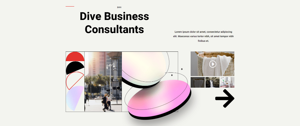
Dot Navigation fits well here. It has a minimal design that doesn’t take away from the elements around it. This is a good choice if you want to use the videos as smaller, supporting elements.
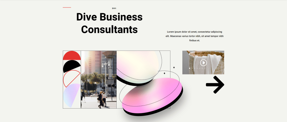
Dot navigation adds a dot to the featured image for each slide. The dot for the current slide is brighter than the others.

Clicking on a dot selects that dot’s video. In the example below, I’ve selected the last dot. The video player now shows the image of that video slide. I’m hovering over the video image, which shows an overlay and makes the dots easier to see with my color scheme.

You can choose between light and dark colors for the dots. This lets you make the dots more visible based on the colors or overlays of your video’s featured images. I’ve selected the dark option for the example below.
- Slider Controls Color: choose Light or Dark
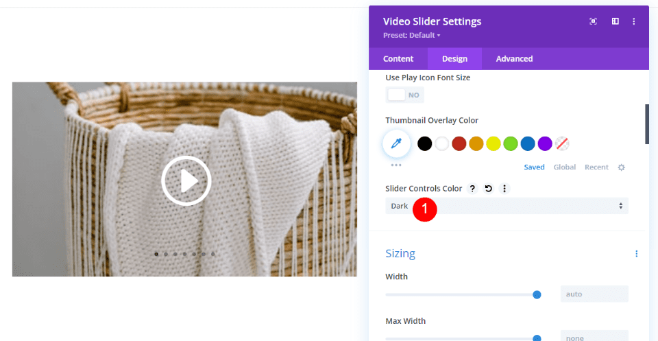
Dot Navigation is ideal the slides in the video slider are not the main focus, or when you want to keep the page clear of visual clutter. It keeps the page simple, but it’s still easy to navigate between the slides.
Where Dot Navigation is Ideal
Here are a few examples of Dot Navigation. It works well where there isn’t a lot of space, you want to keep the page clean, or the goal isn’t to draw attention to every video in the Video Slider.
For this example, I’ve added a Video Slider module to the Testimonials section. This section includes several written testimonials along with the Video Slider. The goal of this page is to promote the services. The videos are just one type of testimonial to help support the sale. There’s no need to draw attention to every slide. The user can view as many as they want. I’m using the Home page for the free Flooring Layout Pack.

Thumbnail Track does look nice, but it could be distracting in this layout, and it isn’t needed based on the purpose of the page. We don’t want our testimonials distracting from our call to action.

Here’s another example. This one uses the Blog page from the free Blogger Layout Pack. I’ve replaced the Blog Post module with a Video Slider module. This example includes a lot of video slides and images around the slider. The layout looks clean and easy to navigate. The goal isn’t to focus on every post, but to give the user a way to see them if they want to.

Thumbnail Track still looks good here, but the page becomes too cluttered with a lot of slides.

Where Dot Navigation is Not Ideal
Dot Navigation is not ideal when we want to draw attention to the video slides. For this example, I’m using the Landing page for the free Clothing Store Layout Pack. I’ve replaced the WooCommerce product images in the New Arrivals section with a Video Slider. In this case, we want to see the new products. The area around the slider is empty. This page design isn’t ideal for conversions.

The Thumbnail Track works better here. The focus is on the products, which is where we want it.

That’s our look at Thumbnail Track vs Dot Navigation in Divi’s Video Slider module. Both types of navigation work well, but it’s best to use them in their ideal situations. There are times when one works best for our designs. In general, you can think of Thumbnail Track vs Dot Navigation with these basic ideas:
- Use Thumbnail Track for larger areas or to draw attention to the video slides.
- Use Dot Navigation for smaller areas or when you want to keep the layout clean.
We want to hear from you. Do you prefer Thumbnail Track or Dot Navigation? Let us know in the comments.




Leave A Reply