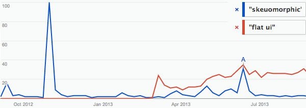
Over recent years, graphic design has seen quite a rapid change in popular trends.For the most part, current debates are focused on two styles and buzz words: ‘Skeuomorphic‘ and ‘Flat.’
Skeuomorphic describes design details that reference real life objects.
Flat describes that which is stripped of all gradients, textures, dimension, and realism.
Skeuomorphic Beginnings
Skeuomorphic design began trending with the introduction of mobile apps on a level of interaction that had never been seen before—Using the iOS calculator felt like you were holding an actual calculator in your hand, and the experience was one of tapping physical buttons. There were no mass complaints about this trend at the time, in fact, a lot of people fell in love with it. Many designers strived to achieve hyperrealistic elements and icons, while users enjoyed interacting with touch screens that could transform into a game controller, the page of a book, or even a malty beverage.
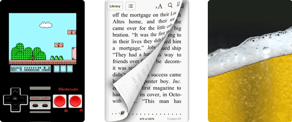
With this came an exponential rise in mobile and desktop apps, leading to advances in phone, tablet, laptop and desktop devices being used by people of all demographics. Furthermore, skeuomorphic design cues became less vital as people became more familiar with the medium. A long story short: arguments against over-the-top realism arose, and heavy skeuomorphism quickly became a thing of the recent past.
That being said, many designers are still creating beautiful skeuomorphic designs very well, just not as much for UI elements such as buttons and navigation bars. Skeuomorphs are best being used in accent illustrations, app icons, and product presentations. Now, many designers are taking advantage of a digitally educated generation of users, and using much less texture, shadow, and dimension in their designs. This makes for interfaces with less content-clouding details, more focused on color, typography, and subtle animation to enrich the user experience—all things that essentially led to this ever so popular ‘flat’ movement.
For now, flat design is the talk of the town and is a great solution for a simple user interface. It is also almost entirely capable of being made up of CSS, which translates to faster load times, responsive designs that don’t rely on hundreds of images, and is resolution independent by nature. For example the button on the left (flat) is made up of CSS and looks amazing across all layouts and resolutions, whereas the button to the right (skeuomorphic) is an image that gets blurry across multiple sizes.

17% of Web Traffic from Mobile
Many people would argue that making design desicions based on mobile limitiations is an unworthy compromise, but as we move forward, users are becoming more and more comfortable with accessing websites on-the-go. As devices become faster, screen resolutions get higher, and multi-touch technology advances, it will be pertinent to have your content just as comprehensible on a mobile device.
According to a survey by Mashable.com “People around the globe are accessing the web via their smartphones more often than ever. So far in 2013, 17.4% of web traffic has come through mobile, representing more than a 6% increase since 2012 when 11.1% of traffic came from mobile.”
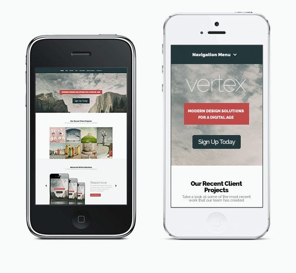
Not so long ago, using the web on a phone was nearly impossible if not at least frustrating. Now, with responsive layouts, the expectation is to not have to zoom and pan, but to embrace the action of scrolling. According to our recent WordPress survey, 62% of people will only buy a responsive theme. As people have gotten more comfortable with scrolling on mobile devices, they have also become more ok with scrolling through longer desktop web pages. Here is an example of what our theme, Vertex, may have looked like on a mobile device in past years (left) and what it looks like now (right). There is very little information above the fold, but it is designed in a way that encourages scrolling rather than presenting you with a scaled down webpage.
Above and Beyond the Fold
This long-page design approach has led to debate about how much information should live above the fold, leaving designers with the challenge of deciding what and how much content should be visible prior to scrolling.
-
The Pros
- The user gets everything they need to know or do upon first glance
-
The Cons
- Having an overwhelming amount of unorganized content above the fold
- Requiring users to click through many pages with too little content
- Lowers the chance of scrolling through the entirety of your page
Overall, layouts are becoming less about the fold, and more about how the content hooks a viewer into the rewards of the page wherever they may be. Ultimately, you want to tell a story that people are interested in. A few current design trends that are used to do this are:
- Large, bold, engaging imagery.
- Subtle on-load animations.
- Lots of white space that allows primary content to stand out.
- Fixed headers for instant navigation no matter where you are on the page.
- Infinite scrolling of images and posts.
- Placing content surprises and Calls to Action throughout the page.
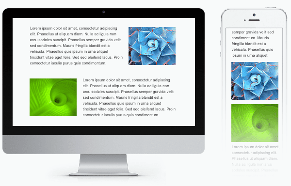
An advantage of a long, vertical layout is a smoother transition between mobile and desktop layouts, however, you can easily lose the attention of a reader with too much scrolling. As we continue to move forward, we will see mobile designs as less of an after thought and having more influence on desktop layouts. Due to constraints in current HTML and CSS standards, the reorganization of content from desktop to mobile layouts is not always perfect, so finding a nice balance between the two is important when planning out your site. Here is an example of a desktop layout that does’t quite respond to a mobile device as clearly as one may think at first glance—the images become more paired with each other, instead of with their corresponding paragraphs.
Responsive design may not be a perfected practice yet, but the industry is making steps in the right direction. Considering that desktop devices are still the primary way of accessing the internet, compromising too much for the sake of a mobile layout is probably not worth it, but back and forth refining will always lead to a better solution.
Moving Forward
As the design industry moves forward and people become more familiar with how to interact with the web, trends will continue to evolve. For now, take the opportunity to innovate through such an exciting and fast-paced industry. Next time, maybe try designing your mobile layouts before your desktop layouts, or asking for design critique from a non-designer. Trends are swaying by the day so it’s vital to keep up with the momentum. If anything is certain, people learn quickly when it comes to new design and technology. Sooner than later, hand gestures and voice commands will erase the need for many UI elements and design will continue to become more about the experience.
The next time you find yourself struggling with a design challenge, which theme to use, or design trend to go with, start by thinking of how your user is going to interact with your content across multiple devices. Organize your content so that it tells a story—let it influence how a viewer experiences the content rather than making them figure it out. A ‘clean design’ cannot always clarify your content, but an organized story can foster beautiful design and create a memorable experience.





Great information. I wonder where we’re heading next…
Thanks Kenny, Thanks Nick, for the advice and tips that help us understand the trend, this really inspire me
Personally I can’t stand this new “Flat” trend. Don’t get me wrong I think all your themes coming out with it are still great, I just don’t like the overall direction of the style, I feel like it’s going backwards.
I think there should be a middle ground, not completely flat, but also stay away from sharp gradients and overuse of drop shadows etc.
Nice article, good read.
Thanks,
~Kraymer
I think there are a lot of good things happening, but I totally agree with you in that there should be a nice balance.
I had never heard the word Skeuomorphic, but everything about design and how things have evolved makes so much more sense now!
I read only short time ago that ET decided to add a new designer to its fold. I can see he has already made great impact on ET. These blogs that have been coming recently are just great! Nick really picked a winner by his side. Congratulation to them, to ET and to all of us customers who already are and will benefit from it! >>> THANKS!
Thanks for the kind words, Sigurfreyr! Stay tuned for many more 🙂
Thanks for the article guys. I love the way we have been abler to progress through to CSS3 since I first got involved in web design way back in the late 90’s
George
Kenny, you continue to amaze me with your talent and knowledge. Your willing to learn and to stretch your horizons and design capabilities are mind boggling. To think you are changing hundreds of thousands of peoples ideas on design and the future…….WOW! Love MOM
Kenny, now these are some awesome tips!!!! I am for below the fold. Period!!!
An excellent post…
Thanks for it…
Thanks for update on latest trends in design
Very informative. Thanks for posting, looking forward to all the changes.
Do you have recent data from Nielsen about the amount of people who scroll down on a page? Because a few years ago the data was that only 1/3 of people scroll, and that is the whole reason for the “above the fold” discussion.
I imagine that it’s more than that, considering the rise in mobile traffic.
Very True… now most of the users are viewing website on Mobile so we have to provide more flexibility and usability for mobile website
Such an valuable information and tips for any developers and designers. You guys rock the designs. Keep it up go on. Thanks for sharing ET Team !!!
Thanks, Dipak! 😀
Thanks for the information. As a designer, this was useful. We’ve been pushing the flat look for years, even though skeuomorphs were popular (and visually seductive). I always inferred from the “page turning” look of some multipage interfaces that the designer assumes that I’m uncomfortable with a digital interface and I need to be coaxed along. It looked old the first time I saw one.
Kenny, you sound so smart. :*
It would be great if you could do a blog post on speeding up your themes through image size reduction and coding techniques for more advanced users.
Thanks for the suggestion Mark. I can say that the easiest thing you can do to speed up your site is install W3 Total Cache. Definitely try that out if you haven’t already 🙂
One issue I have with the article is that I cannot replicate the demos it talks about. When I download themes and import the sample data, I never end up with a site like the demo. The images are not even the same. I would like the thesample data to replicate the demo site when imported.
I’m afraid we cannot provide the images in our demos. They are copyrighted and purchased from Shutterstock.com. The purpose of the sample data is to fill out the theme, but all images and text must be replaced as it is technically gibberish to fill an empty shell.
Excellent post! Very informative. It is nice to see someone break down why things are being used the way they are. yes it comes back to the user, and how a user sees things.. but for you all to go the extra mile ofrom rseach, not just heeresay.. is why ET again strands out in the crowd. In a way, I would call ET responsive to the themes being responsive 😉
please keep up the excellent work. i love the article s on how and why;;;;;;
Thanks, Erica!
We will continue to strive for excellence 😉
Thanks kenny for awesome tips. Love the way you have presented with examples.
Cheers! 😀
Yes, ET, the layout of the Vertex demo on a phone is too wide. Have to scroll left and right. I checked on both a iPhone 4 and 5. Let us know what’s up w this — thanks.
BTW — recent posts you’ve been adding on general topics like this are good. Keep it up.
That’s strange Chris, the point of the mobile layout is that you don’t have to scroll horizontally. I would be interested to figure out why the theme is not rendering properly in your case – maybe it has to do with the theme demo iframe? Try loading the page directly via this url: http://www.elegantthemes.com/preview/Vertex
Hi Nick, OK — I viewed the URL you suggested and that works fine, thanks. I guess your demo link needs attention.
Thank you!
Maybe ET must build demo iframe like this : codecanyon. net/item/fbar-responsive-php-theme-switcher-demo-bar/5045579
Users can easily see responsive design work in a variety of display, just my idea 🙂
Thanks.
Thanks for the article Kenny. But your side-by-side comparison of the mobile Vertex theme really baffles me. I still believe a non-responsive theme looks much better on today’s big-screened mobile devices than these simplified responsive sites.
I tried everything with the ET Support staff to make Vertex non-responsive but it gets too buggy. I’d personally rather see a beautiful and fully-functional desktop site on my phone than a minimalist approach, but it seems I’m in the minority here.
I have to keep up with the times but hopefully future responsive themes will resemble their desktop counterparts a little more.
Thanks for the response, Daniel
I think there is something to be said for seeing the entirety of a site on first load, but I personally end up zooming in for legibility. You are probably right in that things will start heading a bit in the opposite direction with the introduction of bigger and higher resolution screens. Opinions like these are what push us to find a better balance in the way we design 🙂
I suppose it is case of differing personal opinions. I find the experience to be much more intuitive on a phone when there is no horizontal scroll. This is the paradigm in mobile UI – all apps are built around the idea of a long vertical-scrolling experience, and it’s smart to replicate this on your website as well to provide the most fluid experience for your users.
For me I think having the best of both worlds would be a great design. responsive and none responsive all in one.
What I mean is this.. you arrive on your mobile to a full desktop site and enjoy the fact that you have full bird-eye view of the whole page.
This is where it would get responsive. Instead of having to zoom in on the text you just have to tap on the particular section on that page that you want to view and it presents that section to you in the responsive format – up close and personal and the with another tap your back to the full screen layout ready to tap on another section.
Its all tap and view.
Hey Kenny, awesome post my man! I’m an elegant themes member, and actually just posted something similar to this… if you want to check it out on our blog 😉
Thanks Brian! Just read your post 🙂 It’s easy to believe, but still amazing that 70+% of social media is accessed on mobile devices. Social media has played a huge roll in how much people browse the web, in general, on their phones. Can’t wait to see what 2014 has in store!
Excellent post, Kenny! Very informational. It’s great to know that the ET design theme is not only creating themes that are modern now, but also looking forward to what’s ahead for the industry. Regarding the last image with the mobile version not scaling down in the best way, is there ways of fixing this? I have a few sites that have this issue on a couple of pages.
ET design team**
Right, it’s not really something that can be fixed until CSS/HTML allow for source-order-independence in design. But I am sure it’s something that will be tackled in the near future 🙂
Thanks, Tim!
As far as I can predict, CSS will move in a direction that is more versatile in terms of responsive layouts. At WordCamp SF 2013, we saw demos of upcoming CSS features that allowed you to control pieces of a layout with numbers, and you could specify the order of those numbers in different layouts.
(i.e. [1][2][3][4] on tablet and [1][3][2][4] on phone)
Advances like this will hopefully lead to much more control over how we design responsive websites.
Currently, this is a perfect example of how much room there is to grow. To answer your question, I’ve seen this specific instance solved with things like line rules, div tiles, and CSS Floats. 🙂