Last week we announced the 2014 Customer Showcase Contest, and since then we have received over 1,000 wonderful submissions. It was an incredibly difficult task, but we have whittled down the finalists to 30 amazing websites, and now it’s time for you to vote on your favorite from the bunch to decide which lucky 3 will win a slew of amazing prizes!
There were so many great websites submitted, and so many more entries that we wanted to include, but we did our best to pick a manageable amount of unique and beautiful websites for you to explore. Browse the list of websites below, and then use the voting form at the bottom of the page to cast your vote. I know it’s tough to pick only one favorite, so we are allowing everyone to select up to 3 websites!
- 1 My Muze
- 2 Impulse Eve
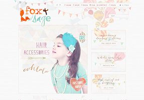
- 3 Fox & Sage
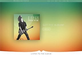
- 4 Pierce Bivens
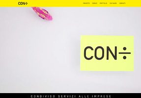
- 5 Condiviso
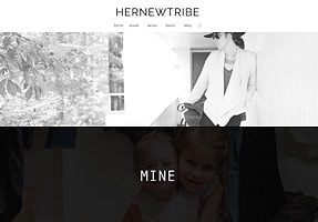
- 6 HERNEWTRIBE
- 7 Brewlife
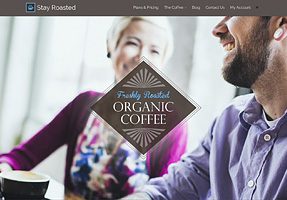
- 8 Stay Roasted
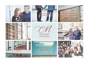
- 9 Cameneti
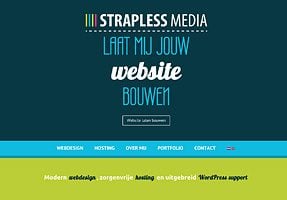
- 10 Strapless Media
- 11 ConversionLab
- 12 Titot
- 13 Real True Foods
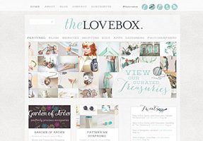
- 14 The Love Box
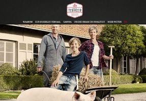
- 15 Huyze Terroir
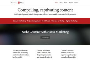
- 16 Michael P. Hill
- 17 Atipso
- 18 Oakerparker
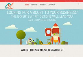
- 19 PIT Designs
- 20 Y Camp
- 21 Kayla Rose Design
- 22 Donal Doherty
- 23 Thinkmojo
- 24 Digital Strategy School
- 25 Carolina Pooper Scoopers
- 26 Nisha Moodley
- 27 Sketch Fury
- 28 My Little Muppet
- 29 My Gentle Born
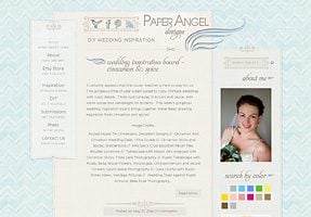
- 30 Paper Angel Designs
- 31 Vote For Your Favorite Websites!
My Muze
Impulse Eve
Fox & Sage
Pierce Bivens
Condiviso
HERNEWTRIBE
Brewlife
Stay Roasted
Cameneti
Strapless Media
ConversionLab
Titot
Real True Foods
The Love Box
Huyze Terroir
Michael P. Hill
Atipso
Oakerparker
PIT Designs
Y Camp
Kayla Rose Design
Donal Doherty
Thinkmojo
Digital Strategy School
Carolina Pooper Scoopers
Nisha Moodley
Sketch Fury
My Little Muppet
My Gentle Born
Paper Angel Designs
Vote For Your Favorite Websites!
This contest is all about celebrating the amazing talent that the Elegant Themes community has to offer. It’s impressive to see how many great websites have been created in the past year, so help us give your fellow members a hand and vote for your favorite entires below.

















Missed the part but I am sure that was a great contest.Anyway some fabolous site present here.
Nick, the link to the strapless media does not show the beautiful side behind 😉
http://straplessmedia.com/_cms/
Sincerely
Peter
This is gorgeous idea! I would love to learn from every websites.
Thanks.
Hi Nick,
is there a deadline defined for the vote?
We are impatient to know the results.
Thanks for the chance to enter our website and get all this visibility!
There’s some beautiful sites here, but there are some that have absolutely no content and some really don’t look particularly unique – I wonder how many were done in a hurry in order to enter?! I know everyone loves a beautiful design, but a website is good because of the content, how you engage your visitors, and of course a whole heap of other things too. So, unfortunately, the ones that have no content didn’t get my vote. Would love to know what the judging criteria was 🙂
Congrats to everyone featured here. Looking forward to seeing the winners. Cheers, Ellen.
These are all amazing work!
Never though how amazing one can create such marvelous designs. https://pitdesigns.com surly grabbed my attention being a person that works in a business field with many Logo designs needed. Such great themes to all and such a great website idea.
Keep up the great work everyone!!! 🙂
I spend one hour to visit all websites and I vote for one of them… good luck to all!
The site cameneti.net is being blocked by Norton, you might want to review this, here are the details.
Norton Safe Web has analyzed cameneti.net for safety and security problems. Below is a sample of the threats that were found.
Summary
Computer Threats: 1
Identity Threats: 1
Annoyance factors: 0
Total threats on this site: 2
would be better if you also mention which theme they are paying with, would be easy to judge what level of customization have been done.
The point also should be taken not all of users are pro with coding, a good coder can easy make any theme upside down but What should be considered that how easily the designer make theme different without massive modifications.
just my two cents
Great entries and inspirations. I submitted a few as well, but I have to admit that the majority of the selected ones rock! I have one suggestion – maybe you could show us within your blog how to make cool menu designs with Divi, like on https://pitdesigns.com/ website?
Hi Anna,
I’ve designed PIT Designs using Divi.. The main menu is actually a trick, of using a custom-made background image and patterns.
The main menu background image that looks like this http://alturl.com/v4b67
And I’ve used two backgrounds for the first section, what you see on the homepage is this http://alturl.com/5b6u2
So that it also works with the subtle parallax effect.
the second background is used for all the other pages’ first section, which is this http://alturl.com/n2ycq
Put together with proper margining, gives the seamless overlap >> that effect you see..
And i’ve changed font to Oswald 500/size 24px, line height 23px (this is important to keep a relatively large font size in line)
Along with some margines/padding changes..
And of course same is customized for smaller screen view as well..
It’s those little things, that change the look, I find interesting in crafting & customizing themes..;)
Cheers
Noz
Wow, that’s really smart! Thanks for sharing!
you’re welcome 🙂
Thanks for the opportunity to showcase one of our sites.
As many others have said, this is a great way to see some of the potential of different Elegant Themes and draw inspiration for future projects.
Hey Nick – did you announce the showcase competition, did I miss it?
I’d appreciate the chance to submit stuff next time too.
Elijah,,
Hi Elijah,
It was announced as a blog post last Wednesday here: http://www.elegantthemes.com/blog/general-news/2014-customer-showcase-contest
Best,
Timur
I see. I’ll go and punish my brains.
Just noticed that Fox and Sage doesn’t have any content. Sorry, not gonna vote for the site that doesn’t have a content. Love the design, but it still should be a real site imho. I was assuming that all of the sites here are real ones – are they not?
Hi Elijah,
Fox & Sage was recently rebranded, reimagined and moved back to WordPress from BigCommerce just this week so unfortunately, no, it doesn’t have content up as yet. As Nick mentioned last year re: empty sites, this is a showcase for creative interpretations of the themes themselves and that the content was not itself being judged. This is why I thought to enter despite the placeholder text.
It was really not my intention to create such a fuss amongst voters. I was just looking for feedback on my designwork 🙁
Sure, I didn’t say it to diminish the amount of work you invested and I really love what you did with the site. I think it is rather simple – if ET want us to provide feedback, they should make the criteria known.
Please accept my apologies if you feel it was directed at your design work. Was not my intention at all 🙂
There are some amazing sites on that list I am stoked and inspired by them all in one way or another. Great job folks! And thank you Nick and the rest of the folks at Elegant Themes for making web design accessible to the masses 😀
Sniff….next time….:)
Some really nice sites, I particularly like http://brewlife.com/
Nice to see one our sites in there! http://www.huzeterroir.be
Just saw this and I regret not having submitted my website, http://www.mrtechnique.com 🙁
With that being said, I saw some great looking websites that I could draw inspiration from.
I really enjoy the idea of having best work showcased here. Some works are really stuff you can learn and grow from.
Grrrrr why don’t y’all make the links open in a new taaaaaaabbb ???!!! Drives me bonkers!!! Lol
Ctrl-Click in Windows
Somebody has to be punished for making us do heavy clicking! 🙂
Leslie, I am asking myself the same question! 🙂
Hmmm…. I don’t see a Submit button … is this an IQ test?
Some truly incredible sites are on the list. Most of them deserve a spot in a top 3. One great contest it is. Best of luck to all finalists!
Glad my client’s site made it in the top 30! So many great designs, lots of inspiration for me since I use Divi more as a framework than as a theme. It’s powering a lot of my client sites. Hernewtribe.com was a fun project, super minimalist but with loads of images. What’s great is that she’s able to manage all her content now and do so very easily because of the modules put in place.
Good luck to everyone!
Yep, the site looks really amazing.
When have you announce this contest? I never received the notification… 🙁
Are you gonna have abother contest? I’ll like to participate with our company website http://www.realgraphics.us
Please let me know!
Does anyone know, which Elegant theme the Fox & Sage is built with? I love that one!
Hi Sam!
It looks like Fox & Sage’s site layout has been designed as a PSD file first and than converted into a website. And the theme is Divi.
Divi
How do you know??
How did they change the width?
It’s pretty easy, go to http://whatwpthemeisthat.com/ then provide the address of the website, it’ll tell the theme and the plugins used.
Yeah, Divi screenshot but no other indication it is Divi?
I’d love to know how they changed the width of a Divi site??
If you don’t want to use full width layouts, Divi comes with boxed layouts too:
http://elegantthemes.com/preview/Divi/boxed-layout/
Yeah, but…How do you change the width?
According to Divi support it is VERY hard.
Ninos was correct in that I used the boxed layout for Divi, not the full width layout. I didn’t need to change the width for any of the content, just shifted the module margins around a bit!
Thanks Emily, I see now that the footer is indeed 1200 Divi pixels wide! 🙂
I can see I’ll have to experiment a bit more with it, you’ve been very creative!
What theme are each of these using?
PIT Designs ; Divi
Y Cam is using Fusion
My Little Muppet , I think did a nice job with StyleShop !
And all the others i reviewed were built with Divi, I think.. We love that theme!
RealTrueFoods gets all screwed up when you size it down.
Great work everyone! It’s impressive how far some of these sites were able to push beyond the bounds of the underlying themes, we’re constantly using the Elegant Themes blog and documentation as a reference and source of inspiration. Thanks for build such great tools for us to work with.
Really nice job on Pierce Bivens!
Thanks Alex!
Congrats to the finalists! Good luck to whomever wins! Thanks for putting on this contest Nick!
hey I’m curious what plugin you are using for the list of checkboxes!
Thanks!
Steve
Holy #POW!NESS these are Amazing, Kudos to all of those behind (and of course including Elegant Theme$ and Team #Divi!!)
There were so many to pick from – finally came down to readability of font/text to help me choose. Wow, amazing sites! Great job to all entries!
Fantastic websites! It’s very hard to choose a favourite!!!
Wow, these are stunning. It would be amazing if you could get these designers to do some posts about their work. Like some how-to’s regarding the tricks they use on these sites.
This is a great idea! I would love to learn from everyone involved.
http://foxandsage.com/ i love it!!!!!!!
I’ll reserve my judgement til it has some content.
I wonder what theme they used??
divi 🙂
I’m not sure how I feel about this but I visited 2 websites and they had no content on them. One of them had the standard blog post that’s created when you install wordpress. The other one has products that lead to a different website.
They are shell websites. Is that allowed?
Jim:
That kind of threw me, too! I pulled up one site with a link for a store, but there’s nothing in there and the blog page contains ‘hello world’ and even the Home page is 50% blank. Weird.
It makes a mockery of the whole “…It was an incredibly difficult task, but we have whittled down the finalists to 30 amazing websites…”
If anyone had a site that they think could compete with those chosen then I would suggest they don’t take it to heart the fact that they missed out.
Good luck to whomever does win it. Don’t forget Friday’s lottery.
As far as I am aware, the content is not what is being judged here – it’s the putting together of the website using Elegant Themes.
I don’t think that the designers should be punished for what the clients do and do not do with the sites after hand off. Not every entry is maintained by those who put it together! And at the end of the day, I’m still going to put them in my portfolio.
Best of luck to all the finalists 🙂
90% of Divi sites look like Divi sites, they just have different content, and the creative use of content is what makes some sites stand out – Condivisio e.g.
There are a couple of exceptions here from Et Alia Creations – Fox and Sage, and The Love Box, which look nothing like Divi.
I’d love to see a tutorial about how they did those sites, and why they chose Divi.
I second that request on walkthroughs on setting their Divis to do what they did! Awesome stuff! It was hard to choose!
Actually, in my opinoin, all the elements involved in making a website up to today’s standards should be taken into consideration,
from design, ease of use, UX, Content, how well written and polished the content is, SEO factors, PageSpeed, and so on..Rather than spamming the webpage with images only.
It took me more time & effort to finalize those than putting the layout together with pretty graphics on pitdesigns.com
cheers
I noticed the same thing and was wondering about it.
Are you kidding? some of these are works of art.
I’m particularly drawn to the Steve Jobs quote about about “Muse Company/App” (with the lifted copyright photo…) The fact that the site is split across two domains with unedited boilerplate text in some shouldn’t influence any judging in my opinion.
Too much irony for our cousins across the pond? Okay, I’ll tone it down.
You are forgetting that if everyone on here was either a designer and/or a developer they wouldn’t be using Elegant Themes (although some of us are and do).
Ignore the efforts that don’t meet your expectations and take solace in knowing your bank account balance is the best litmus test for your skills. 😉
Good luck to whoever wins.
They’re all fabulous! Turn the winners into PRE-DEFINED DIVI LOAD LAYOUT TEMPLATES!!!
Although layouts can’t be copyrighted, turning someone’s creation into a pre-defined layout makes me ill. At least ASK the person and compensate them. Someone spent a HUGE amount of time and skills creating a layout unique to them. People get PAID for layout designs.
Don’t assume it’s ok to take those layouts and replicate 100%. Many web designers will not ever duplicate 100% of someone’s layout.
As a widely published photographer, I know too well what it’s like to see MY creations used without permission, credit and/or compensation. This is how people make their living. Or their identity.
ASK before replicating or using someone’s work. Otherwise people simply are not able to continue creating. We need compensation and recognition.
THAT is in fact is why copyright laws were written. Not to protect the big companies like Disney. To protect and encourage the creativity of the average person (and often their families), who make HUGE sacrifices to create art. Simple as that.
Jen, of course I meant with their permission (I got a little carried away with all the Divi design possibilities featured here.) It would be nice to incorporate some of the cool functionality and page structures into the pre-defined layouts (like the Case Study page, et al.) I should have been more clear.
So excited Nisha’s site made it!!
However, the name is spelled wrong above. How can we get that fixed?
Thanks again 🙂 🙂
All these sites are so fantastic I am so happy to have been included in the list you have no idea! This totally made my day 🙂 🙂
You did a great job Linda it made my top 3! Good luck!
Thank you!! I am so thrilled to be a part of this. The sites are soooo good. Just being up there has made my whole month I think 🙂
Whoops, my mistake. I fixed the spelling error.
You’re awesome! Thank you so much 🙂
What Brad C said.
Wow they are very nice. Makes mine feel inadequate now!
Hello,
First of all, Congrats to all the finalists. great websites..
I’m happy to see my own, PIT Designs among them..
But I noticed a mistake in the URL.
while View The Site link is correct pitdesigns.com , the link in the list is not.
it’s showing pitdesigns.Net ! should be .com
hope this won’t affect anything !?
Sorry about that, I fixed it.
Nick,
You’ve actually turned the other URL into .net as well
pls, the correct one is pitdesigns.COM
Got it now, sorry. Good news is you are doing really well in the poll so far! 🙂
Thanks.. good to know 🙂
Wow, great looking sites, don’t know which one to pick. 🙂
A mine of insights and ideas!
Yes, the codivision loop video is great, is in my top three.
Brad C I could not agree more…I was memorized. I really need to stop being glued to Condivisio and give the others a hard look before I vote!
The video work on Condiviso is absolutely mind blowing. I watched it loop 2 or 3 times. I just couldn’t turn away. Well done. All of them are great.
absolutely crazy. I would be interested how long they have worked on it. but it is certain that they have fun in their work.
I agree with you. It is simply AMAZING!!!!
Great concept. The staff look like the cast of a French movie!!
Wow, these are all so incredible. I always love to see what people do with this theme.
where is the Submit button for the voting??
Some fabulous looking sites – the hard part is choosing a favourite!