This is a guest post by Morten Rand-Hendriksen from Lynda.com. Swing by their WordPress Tutorials section for more great resources.
Exploring The New Theme Interface
One of the key features of WordPress–and a likely catalyst for its popularity and success–is the ability for a user to easily change the appearance and functionality of his/her site without writing a single line of code. In many ways, the theme functionality in WordPress is like a wardrobe: You pick the outfit you want (your theme), and then you accessorize to finish your look (your menus, widgets, featured content displays, and so on). And like any wardrobe, there is always room for improvement both in what clothes are available and also how they are organized, displayed, and made accessible.
Alongside the rest of the WordPress admin UI, the theme experience – or wardrobe if you like – has undergone a complete overhaul in the 3.8 release of WordPress, and the new design and functionality makes theme management and customization easier than ever before.
Let’s take a look at some of the key improvements:
The Themes Page
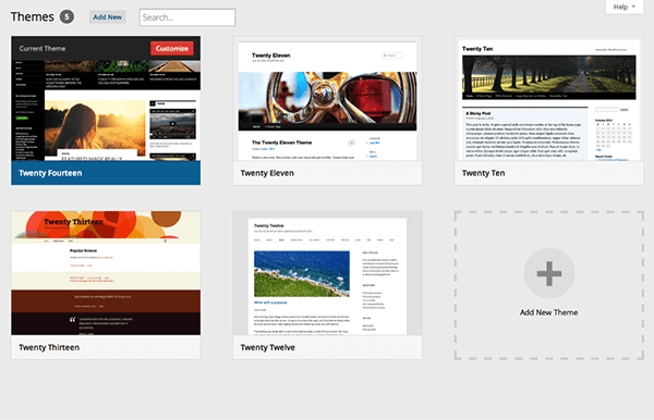
Your first encounter with theme management is usually the Themes page, and significant focus has been placed on simplifying and de-cluttering it’s look and feel. The vertical split between your current, active theme and other available themes is gone–replaced with a simple, responsive, tiled display of all available themes. The top-left theme is highlighted and labeled “Current Theme”, complete with a button directing the user to the Customizer (more on that in a bit).
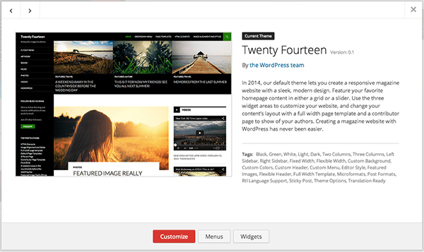
Hovering over and clicking on a theme thumbnail opens a window with a larger thumbnail display, and detailed information about the theme in question. This window now also allows you to navigate between your available themes using arrow buttons. For the current theme, you’re provided with links to the Customizer, as well as menu and widget management. For other installed themes you now have buttons for activating the theme, opening a live preview, or deleting the theme entirely.
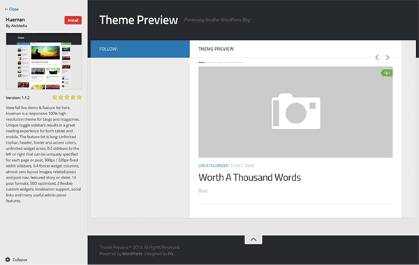
The new Themes page features two interactive ways to add new themes to your WordPress site- a button at the top left, and an Add New Theme area at the bottom of the Themes list. Both will take you to the Install Themes view, from which you can search, upload, and browse available themes. The new theme preview option in the installer gives you a full-screen display of the theme in question, with the same clean design and layout as the preview for your installed themes.
The Customizer
The Theme Customizer was introduced a few releases back to make overall theme customization easier, and with 3.8 it’s truly coming into its own. The Customizer allows you to change certain attributes of your current theme – from your Site Title and Tagline to colors, header and background images, to navigation elements and custom theme-specific functions like featured content displays – all in a live test environment where you can preview changes before making them public to the world. This can be done either using your currently active theme, or with a new theme before you activate it. These custom settings are stored in the database alongside the theme itself, so if you customize a theme and then activate a different one, your original customizations will be brought back should you choose to reactivate the original theme at some point in the future.
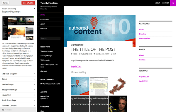
While there are no large new developments on the surface of the Theme Customizer in 3.8, its functionality has been improved and the design has been overhauled. The real change here is less about the Customizer itself and more about how theme developers are using it: the powers that be in the WordPress development community are making an aggressive push to have theme developers to move their functions from the custom theme options pages to the Customizer. This ultimately makes it easier for end users to customize their themes and creates a more consistent customization experience across different themes. Whether this will become the norm is yet to be seen, but with the 3.8 update the process of building content into the Customizer is easier than ever–so if this is the direction WordPress continues to move towards you’ll be spending more time in the Customizer, and less time trying to figure out where various theme customization options are in future releases.
The Widgets Page
As WordPress has evolved, so has the plugin landscape, and more and more plugins (and themes, for that matter) now provide custom widgets to be added to sidebars, footers, and other areas on your site. With this in mind, the Widgets manager has been long overdue for an overhaul. Anyone who has attempted to drag a widget from the bottom of a 50+ long list of available widgets to the Primary Sidebar area at the top of the page will immediately know what I’m talking about.
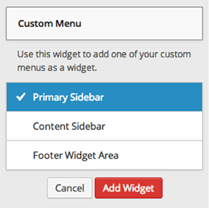
The new Widgets manager solves this issue in a such a clean and obvious way we should all scratch our heads and ask why it wasn’t thought of sooner: simply click on the widget you’d like to add, and a list of available “widgetized” areas is displayed. All you have to do is select the appropriate area (for example, “Sidebar”) and the widget is added to the appropriate area of your theme. Now all that’s left is to place it in the appropriate order using drag-and-drop, and customizing the widget the same way as in previous releases of WordPress. This is truly a simple addition that makes a huge difference.
The Way Forward
The new designs and updates in version 3.8 are forging a new way forward for WordPress that harken back to its roots of clean design and simple, intuitive user interfaces. The specific updates that I’ve outlined in this article is only the tip of the iceberg of new experiences and features in this release, so I strongly urge you to take the time to explore WordPress 3.8 and all it has to offer.




I am in the dashboard of the new wordpress, and I can’t figure out how to access the new themes page – any hints?
Happy to hear about this! Love the new UI.
fantastic- concise and informative! Thank you!
Installed it and wordking good together with the great theme DIVI!!!
divi rocks!!
Are Elegant Themes 3.8 Compatible or not?
Yes, they are. If you experience any problems, please let us know in the forums. We have not encountered any bugs.
Thank you for the write up. Nice overview. WordPress just keeps improving…!
Hi Nick, It is great to see WordPress leading the way in UI interface design. Hope to read more helpful information from you. Have a nice day
The future is here…WordPress keeps blowing our minds and thanks to the ingenious community of developers all around the world.
Good to be in the trend, Thanks for the post!
Excellent!
We seems to be getting spoiled with so many regular updates and new features.
Thanks
Morgan
Whats about ET Themes compatibility?
I like the change and thank you Morten Rand-Hendriksen for this great article. I learnt a lot from Morten Rand-Hendriksen tutorial at lynda.com
Thanks Paul! I much appreciate the compliment. I’m working on new courses as we speak so stay tuned for more!
yeah, I have tried, great new dashboard.
It’s a big change for WP Customizer. Live test will help this feature more helpful.
There is a very strong push to move theme features into the Customizer. From a user perspective this is a great idea because of the live preview. I hope to see it implemented throughout most themes soon.
The new theme interface is awesome! Good write up too 😉
Great stuff – thanks! I was excited to see these changes too.
The team is definitely moving in the right direction here. It is great to see WordPress leading the way in UI interface design.
Thanks for the update 🙂