The second major release of WordPress is due within the next few weeks. Two beta releases have been released thus far, which have allowed me to get a preview of what we can expect when the stable version of released.
If you are expecting ground breaking new features in WordPress 4.0, you are going to be disappointed. While WordPress 3.0 was a revolutionary step for WordPress as a platform, 4.0 is more of an evolutionary move forward that improves existing features.
Let us take a closer look at what you can expect to see next month when you upgrade to WordPress 4.0.
Language Select During the Installation
WordPress has always offered non-English versions through WP Central. International users have to download WordPress in their own language through their regional WordPress website.
In WordPress 4.0, you will be able to select your language on the first page of the installation process. This seems like a more practical solution to offering different versions of WordPress and I am sure non-English users will welcome it.
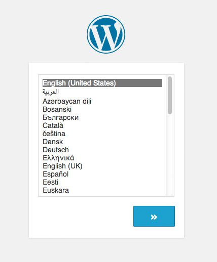
The first page during the WordPress installation process is the language select screen.
Sticky Post Editor Toolbar
For many years, the post editor has used a scroll bar at the right hand side of the editor. This allows you to move up and view the beginning or end of your article easily. This has been removed in 4.0. You can still scroll up and down the page, but the scrollbar has been removed and the post editor toolbar is now sticky. Therefore, the toolbar will be visible at all times.
This may seem like a trivial modification, however it makes writing long articles much easier. Previously, if you had a long article and scrolled to the bottom, the toolbar would no longer be visible. You then had to scroll back up in order to insert formatting or add a link. This will not be a problem anymore as the toolbar is visible at all times.
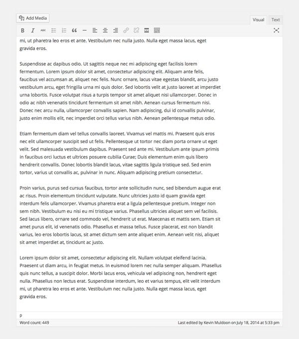
The new sticky toolbar means you no longer have to scroll up the page to find formatting buttons.
Video Previews
WordPress has supported video embedding since version 2.9. In the past, the visual editor would just show a block where the video would be placed and you would have to preview the article in order to view the video. From 4.0, a preview will now be shown of any video you embed if you are using the visual editor.
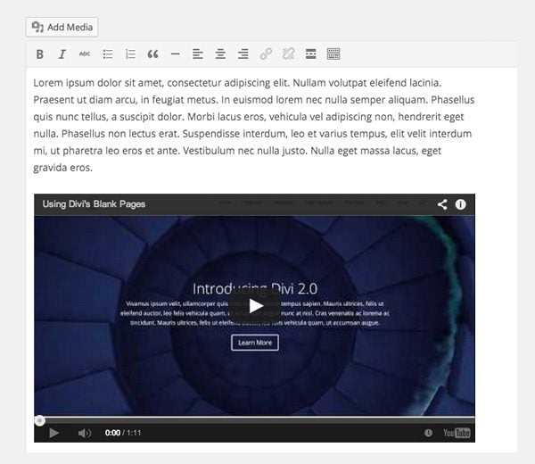
A preview of your video can now be seen if you are using the visual editor. You can even play the video in the visual editor if you wish.
Better Widget Integration in the Theme Customizer
The theme customizer was first introduced in WordPress 3.4. Over the last two years, theme developers have slowly adopted the feature and added support for it to their WordPress designs.
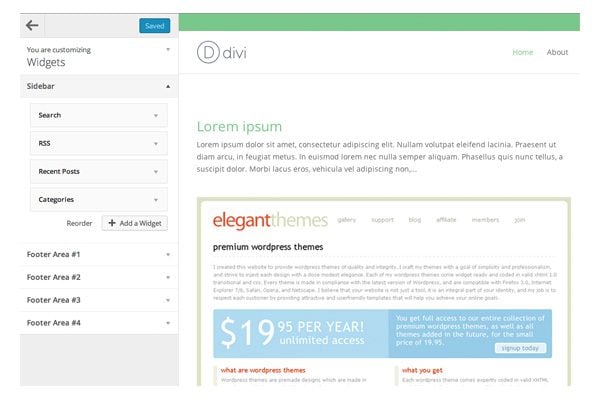
The last version of WordPress added widget support. Widgets were loaded into the main customizer with all other elements. This was not ideal as it forced elements such as header, footer, and navigation, down the page.
They have addressed this issue in WordPress 4.0. Widgets are now all grouped together under a widgets area. When you select widgets, the theme customizer panel will slide to the right hand side and reveal all widget areas. It is a small modification but it does make customizing your widgets through the theme customizer better.
Media Library “Grid View”
In addition to the existing list view, WordPress 4.0 will introduce a new grid view option for viewing your uploaded media items. The grid view option uses infinite scroll rather than pagination. Therefore, you can view more images by simply scrolling down the page.
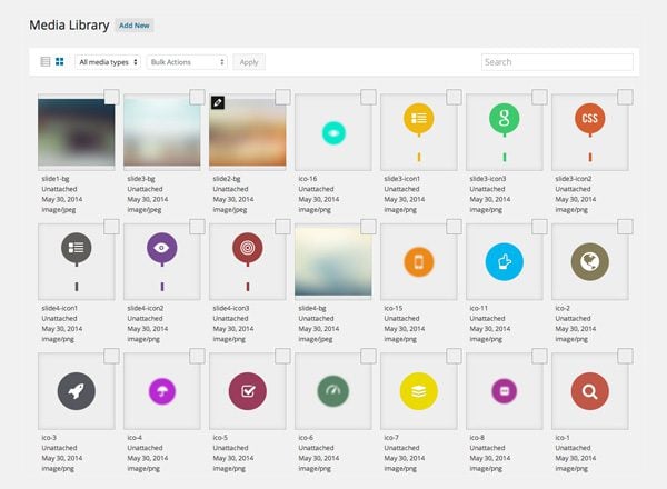
Browsing images in media grid view is a nice alternative to the traditional list view.
Editing multiple images is easier under the new grid view option due to the ability to move to the next image using the arrows at the top right hand area of the image edit screen.
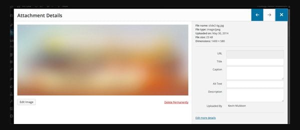
The image edit page in grid view is different too. This layout makes it simple to add and change multiple image titles, descriptions, alt tags, and captions.
Improved Plugin Installation Experience
The plugin installation area has had a cosmetic overhaul too. When you install a plugin through the admin area from WordPress 4.0, plugins will be listed in a grid view. This presents plugins in a more professional manner than previously.
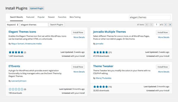
The new WordPress plugin installation area looks great.
Final Thoughts on WordPress 4.0
Two beta versions of WordPress 4.0 have been released so far. Over the next few weeks, WordPress will be addressing bugs so that the stable release functions correctly.
4.0 does not introduce any new major changes, however there is no doubt that they have taken WordPress forward with these changes. In addition to the changes noted above, WordPress 4.0 has also made changes to some formatting functions and to the visual editor. More features may be added in the final stable release of 4.0.
What feature of WordPress 4.0 are you looking forward to the most? Please let us know in the comment area below.




Until a client asked about the “missing scroll-bar”, I had no idea it disappeared!
We have a problem after updating WordPress to version 4.0.
We are using the Divi template and Elegant Page Builder. After the update we cannot edit the pages anymore.
What can be the problem?
Be sure you are using the latest version of Divi. If you still need help, please open a ticket in our support forums.
It looks promising. I’m looking forward to seeing the new stable WP 4.0 version in action.
I hope you can deploy a framework soon, as an Elegant Themes suscriptor it is quite annoying and sometimes difficult to update each theme separately,
I’m managing more than 40 different sites at the moment and it’s becoming harder and harder to update all of them manually
the sticky toolbar is a good idea, but the enlargement of the text input area and the removal of its scrollbar is a step backwards, or sideways at best. it should be possible to select the size of this area and there should be a scrollbar if the post content is larger than the selected size. in addition, many of the other features on the ‘post creation’ page should be moved into the scrollbar or made sticky: saving and previewing drafts. selecting tags. any other frequently-used commands on the page.
Hi,
I’m running into a wall everytime I’m trying to embed a video in the Divi Theme, using Blog Post Format.
Tell me where I’m wrong:
1. I use a Child Theme, just updated to the new version BTW (I mean the main theme, the child one remains unchanged)
2. To write a blog post, in the WP editor, I choose “Video” in the Format menu on the right side.
3. I paste the video url in the Text editor.
3. The Post does contain the video but the Blog page (where all blog post are being displayed as thumbnail with their featured image) does not feature the video in the area where a standard “thumbnail”/”featured image” would appear.
I have tested Blog Post Format with Sound, the featured sound displays properly, same for quote and link.
Si there must be something wrong with what I do, although I’m doing excatly the same thing as what is described on the “How To Use Blog Post Format”,
Where’s the catch what toggle (or else in the Divi Option Menu) did I miss ?
I’m stuck,
Cheers,
Alexis
User Name Here : ALPA
Ok,
Here’s yet again the same old WP devil rubbing my nose on the ground:
Deactivate all the pugins, then re-activate them and now it works.
Grrrr I just freaking hate that ! anyways, solved …
Don’t you get tired of reading “comments” from people who don’t say anything other than to moan and groan about whether this qualifies to be a full-number or a fractional-number upgrade? I do. What’s the point? Why waste the effort?
Really nice features specially language selector and sticky post editor.Thanks for sharing this info.
I love the present traction WP is gearing…supporting backward compatibility as well as creating room for advancement. And I’m happy that language translation has been included into the core a cum the sticky post editor. Since WP doesn’t hype .0 versioning, I’m expecting great semantic features to be added in the subsequent. Thanks Kevin, you scarce! 🙂
Thanks for all this information. I too look forward to your blog posts and have found them very helpful. Keep up the great posts!
I just hope WordPress can run faster…
There are many good new features are coming in WordPress. Excited to use new themes to test them.
Thanks for keeping us informed. I always look forward to any improvements to the visual editor since I don’t know how to use CSS and can only fiddle with code a little bit – love short codes.
My favorite is the video preview since I do add some videos to blog posts and at times a page on a website.
I’m agree with Toby on the stick toolbar being a time saver!
Hm, I wonder why the version jump, these features are all neat, but they seem to be rather minor?
Well, these days even Firefox jumps a version number when they fix a bunch of bugs, so who am I to complain…
It’s just the way they do things. 0.1 increment releases have new features (3.7, 3.8, 3.9 etc), 0.01 releases are security updates (3.91, 3.92 etc).
Features seem like a good move in the right direction. I am just surprised that they have named it 4.0 as it seems more like a 3.5 update.
Very Good post Kevin, Waiting for WordPress 4.0 and new updates. Thanks for share preview and information.
All really good updates it sounds like. Very USEFUL tools coming. Its funny how you see these and think OH YEAH! That would be much easier. lol!
Your right Kevin, this update isn’t anything crazy, but 4.1 will be with the JSON REST API.
Improvements are always great. One thing I’d like to see is better, integrated filing for the media library. The ability to create folders/directories is desperately needed.
The sticky toolbar sounds great & the scrolling media….time saver!
Thanks guys!
Halllujah for the sticky toolbar! That is a MAJOR improvement!
You’re right, it’s a bit disappointing. IMO they just made WP much easier to use for non tech-savvy people and that’s pretty much it.
Oops, seems like I clicked the wrong reply button for some reason.. lol. This was supposed to be a reply to the main post, not your comment. Sorry!
I think I agree with Adam in that this sounds more like a dot release and new version. I do like the idea of the Sticky Toolbar like everyone else though.
Looking forward to the sticky post editor toolbar, video previews, and the media grid. Thanks so much for keeping us updated on what’s going on at WordPress!
Video previews! Yes!
I was expecting some bigger and more exciting updates in the 4.0 update… :/
Yes this release is more of a refinement of the existing product. There are very little new features.
This just made my monday! Small changes that are a BIG deal and makes our job much easier and more attractive #winWIN with WP always forward and Great Article Kevin and EG!
BEST
#TheWebStylist
Thanks for the preview! Looking forward to the picture library and widget support.
WYSIWYG text editing window!
Sticky Toolbar and grid view media are great! Would LOVE to have a native media organizer though.
The sticky toolbar will be great! Scrolling back to the top to insert a hyperlink has always been annoying. I usually get annoyed and forget what I’m scrolling up to do ha.
How about the new collapsible panels on the Customizer? Will they finally be included in WordPress 4.0?
I think they are a great idea because the real state on the left side of the Customizer can get quite overcrowded when many customizing options are included for a theme.
Thanks for the handy round up. I’m sure we’ve got nothing to worry about with ET theme compatibility.
Psss… does anyone know how can I fix a language typo on the previous comment? 😛
I’m pretty excited for this. I always love new updates. Thanks for the post!
What impact do you guys think this will cause over the current WP installations that uses Elegant Themes?
I mean, Normally is not recomendable to anyone to upgrade on production without a prior test on dev enviroments. But if you guys are testing this on the beta versions probably by now you have a better conception than us (the humild mortals) about this matter.
Do you think there migth be any issue on the front end with an early upgrade?
We always make sure our themes are compatible with the latest version of WordPress. We test on the beta releases and update all themes as necessary. If we miss any bugs, they will be fixed as soon as they are reported (usually the next day).
Just curious as to how much stuff this will break haha!
Really looking forward to the widget support!
Hey Kevin,
I must admit nothing here has me very excited. The sticky post editor toolbar sounds like it will be convenient though. This almost seems like it should be a point release rather than a new version, but I suppose small advancements are better than no advancements 🙂 Thanks for the update.
Adam
I’m actually not sure of the sticky post editor now. At first I loved it, but I’ve found that you need to scroll back up to the top of the page in order to save draft. That’s arguably more annoying that the scrollbar ever was!
Agree 100% XD
It would really be helpful if the bugs in Divi 2 could be fixed before WP4! Perhaps more time could be spent on fixing Divi than writing blogs.
I, almost in every available opportunity, come here to read what’s new? Kevin writes these posts as a resident tutorial master and thanks for keeping us up-to-date. Surely, any and all bug fixes are important but I also need my daily dose of blog. 🙂
None of our developers write these blog post, so closing down the blog would not speed up our theme development. You can simply unsubscribe if the blog post frequency is bothersome.
As always, we are working hard on our themes (Divi included).
This made my day Nick. Keep up the hard work!
Continuez les Blogs, ce travail m’a permis de découvrir tellement de choses et d’étendre la réflexion de ce que l’on fait au quotidien et parfois de dire : oui , les autres font mieux et il faut s’en inspirer !
Le blog me sert pour mes clients, que j’envoie pour qu’ils lisent et comprennent mieux les attentes de celui qui va leur créer un site !
good job, no stop blog 😉
Nick the idea behind the Divi Theme is awesome and i think most clients (like me) understand some bugs to come out at the begining.
However we expect in any case some quick updates from Divi 2.0 for the fixes that they are already in the support forums (like the bug with the 2 columns table, or the one with the parallax effect that didn’t work), to address those bugs so we wouldn’t need to do those hacks in the theme with css or coding.
There haven’t been any update for 2.0 to address those errors and that could lead to more post reporting them from the new costumers (thus more time wasted from the support team) and for the old costumers give us a feeling of desertion from the development team. I think is important to care for the new as much as for the old. Don’t you think Nick?
I was addressing Joh’s complaint, that we spend too much time on blog posts and not enough time on themes. Writing less blog posts will not improve development time, as our dev team does not work on the blog.
We are working just as hard as we ever have – on Divi and our new products, and we will be fixing bugs as quickly as we can. In fact, Divi 2.1 is very close to being finished.
These comment columns really get skinny.
Hi Nick, can we have a area t0 send some suggestions for next divi update?
I really want a a feature that we can hide a section and un-hide when needed again so rather then deleting a section with all modules we can just trun it off or hide and turn it ON again when needed..
some more suggestions like this… I am sure some guys can share great ideas.
Hey Hammad, if I am not wrong there is an specific space to do so on the support area. I guess is what you are looking for.
There exist two topics about it.
1. Theme Suggestions (Under general support)
2. Customization Help (Under Themes customization) 😉
Just want to say that I really enjoy the blog posts and love that there is always so much good information being shared here on a daily basis.
If there was one little thing which would make it better would be to have a few more css tips. Apart from that, keep up the great work Nick & team.
Doesn’t sound much like enough for a Major 4.xxx update. More like 3.95??
When you look at v 3.0 and v4.0 the difference is actually remarkable in a hundred and one ways.
The fact that they have steadily increased version numbers over the past 2 years means that you dont really see much of a difference when you hit v4 however if you look at it in the sense of what have they achieved in v3 compared to v4 the picture is much clearer.
If Automattic never released all the incremental updates during v3.x and released v4 you would probably think differently.
Its also why chrome and firefox are at v39, v40 because they fastrack releases and i guess they no longer worry about major updates anymore they are all incremental updates to bring new features to the public in a quicker way.
I’m really looking forward to the new media library. I like that you don’t have to bounce around as in the past.
I want to be able to place media in folders or organize it somehow, rather than having a huge list/gallery of images. It is ridiculous that you have to try to find an image from 3 years ago that you don’t know the name of by actually clicking through pages of images.
These are some welcome upgrades to the WordPress system, making it even more easier for newbies to learn. We have many clients that have us design websites but the sight of the WordPress backend always makes them cringe.
I think this will just improve WordPress all round, and become an even more important part of a web designers life.
Thanks for the write up Kevin – always good to know what’s just around the corner.
“Sticky Post Editor Toolbar” sounds good.
Soon be update time.
If this language selection can be around after the installation it will be wonderful.
I prefer to work in English (easier to get documentation and search for terms) but most of my clients are Greeks, it will be easier for them if I could change the language after I’m done with the site and they want to add stuff themselves.
Don’t get me wrong, but…. Honestly, I hope it can’t. 😛 I can’t believe it will be so difficult to them to learn that ‘Pages’ equals to ‘Selides’ (* my apologies to the non-greek audience). And frankly, I can’t imagine myself having to deal with “I’m clicking on ‘epexergasia yparxousas dimosieysis’ and it doesn’t work”… LOL
Anyway, that’s another story for another day. 😉 Happy to see a fellow Greek here. Wish you all the best! 🙂
Will all current ET themes be updated to work flawlessly with WordPress 4.0? The main one I am questioning is obviously Divi 2.0 as 100% of my sites run on this!
We will be making sure that all of or themes are compatible before the release. If we happen to miss any compatibility issues, they will certainly be fixed as soon as they are reported.
Divi theme’s modules not working in WP 4…help….
I cannot edit my pages….still running Divi 1.7, but upgraded Wp to 4.0
Afraid to update Divi because I fear losing all my changes.
HELLLLLLLLLLLLLLLLLLP!
You always do 🙂
+1! I can remember the jump from WP2 to WP3 brought a lot of stress to keep the frontend of my sites intact. I can only hope this is going more smoothly with this major release.
Excited though, seems like some great improvements!
I don’t know, but you need to try Microweber v. 1 http://goo.gl/vNt7T9