Even if you’re a content creator, you aren’t necessarily a graphic designer. You probably have enough skills to get by, but you may not be the Photoshop and InDesign whiz that other folks on your team are. But with Canva magazine layouts, that doesn’t matter. Canva is a drag-and-drop, for-the-masses graphics editor that actually has more power in it than you may realize. In fact, it’s powerful enough that you can create a full, digital magazine that your blog readers can download — and they will never know you didn’t make the whole thing by hand in a much more expensive and complicated program.
Why Create a Digital Canva Magazine in the First Place?
There are two main reasons for you to create a digital magazine in Canva:
- It’s a way to get a shareable piece of content that has a different look and feel than your standard content
- People love free stuff
In much the same way people like to hand their friends books they love, spreading around PDFs is a way that techy folks share information. While ebooks have not fully overtaken print as doomsayers predicted years ago, PDF copies of books and magazines are often distributed freely among different communities. Because they’re more tangible. And in many cases, carry more weight in terms of credibility and veracity (regardless of whether that’s true or not) because of that tangibility.
Well, more tangible, at least, than a link that was copied and pasted. A shared file is still a something. Plus, if you upload it to your own servers, it can get indexed by Google. (Yep, Google indexes PDF files.)
Ideas for How to Use Digital Magazines as Promotional Materials
I have personally used these Canva magazine templates for a few different promotions since I discovered them.
- Email Sign-up Incentives – People love exclusive stuff potentially more than they do free stuff. You may get some unsubscribes, but giving away exclusive content is a great way to get new names on your list.
- Special Edition Content – I’ve formatted some of my short stories into small, printable editions using the Canva magazine layouts for a different reading experience than simply posting them as a blog or traditional ebook.
- End-of-Year/Quarter Reports – My wife put me onto this one. She has used the Canva magazines to write end-of-year reports for her library’s board of trustees. Telling the story of your business in a premium way is much better than bulleted lists in manilla folders (or worse, Excel spreadsheets).
- Event Schedules – Using Canva to make a downloadable schedule for your event is a great idea to keep your branding consistent, as well as make it so that your attendees have a single document with all of the information they need in one doc. When they get to the end, they keep scrolling and there’s a link to your donation page! How about that?
I’m sure that you can think of a lot more, too, but these have been incredibly successful in my experience. I hope you find they are for you, too.
Step 1: Canva Magazine Templates
You will obviously need a Canva account to create your downloadable, digital magazine. So head over and sign up.
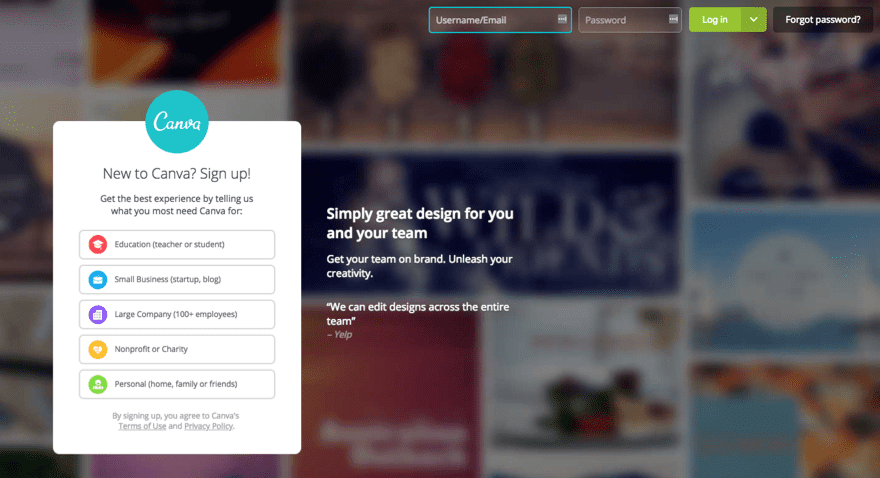
When you log in, you’ll get a choice: Canva 1.0 or Canva 2.0. Normally, I am all about the newest version of things. But for downloadable PDF magazines, you can’t actually find all the templates in 2.0. So we are going to change back to Canva 1.0 for the time being.
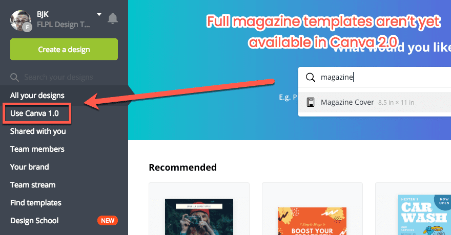
Once in version 1.0, you will need to start a design. You can either press the green Create a Design button to the left or the white + More… button to the right.

Simply scroll down until you find Magazine Cover under Documents. For some reason, full magazine templates and interior pages are categorized as covers. It’s just one of those things, so we just have to deal with it.

Now you’re in the Layouts tab, where you can scroll through the myriad of different types of magazines. There are covers and interior pages abound, so let’s get to Frankensteining something together.
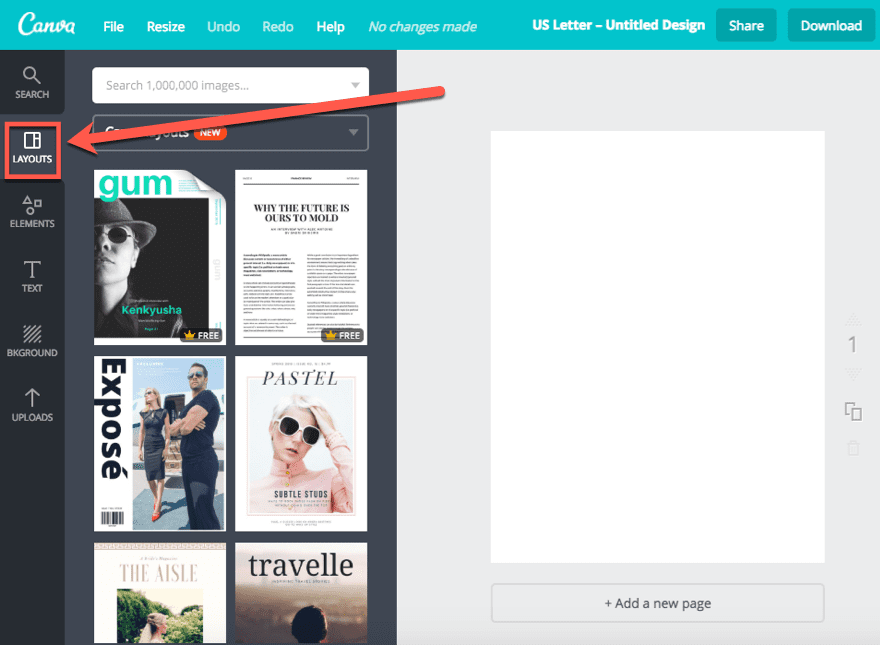
Step 2: Choosing a Magazine Layout
I am going to assume that you’ve already outlined and come up with the content for the magazine. If not, you should probably work on that. Once you know what all needs to fit inside, you can grab the appropriate layout and start to work.
The first thing you should know when choosing your digital magazine’s layout is that Canva offers two types of content in their layout sections. Whole magazines with page and covers, and covers only. You can tell the difference by the icon to the left.
If the corner of the page is turned down, it is a full magazine with templates for matching pages. If the corner is not turned down, that particular layout is a cover alone.
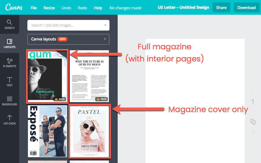
When expanded, you will be able to select any or all of the elements you want to add to your magazine. Simply click on the thumbnail to add a page or cover to your document.
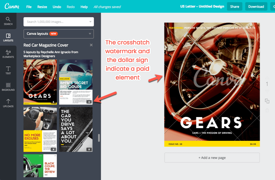
Keep in mind that some layouts contain paid elements. Some are totally free. And some contain a mix of both. Additionally, you must press the Add a New Page button to add a new page. If you don’t, the thumbnail you click will replace the existing page.
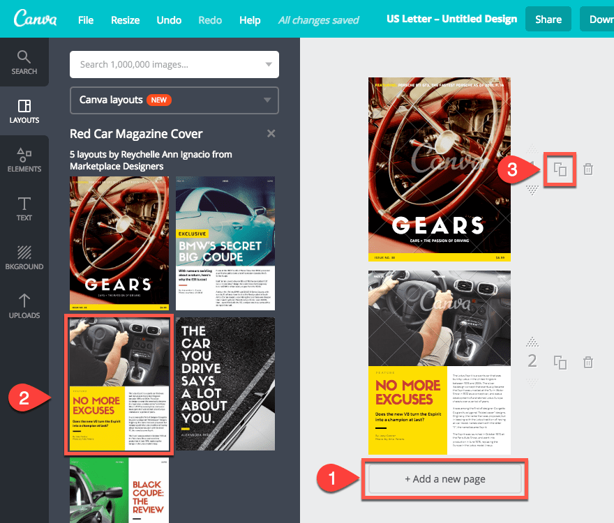
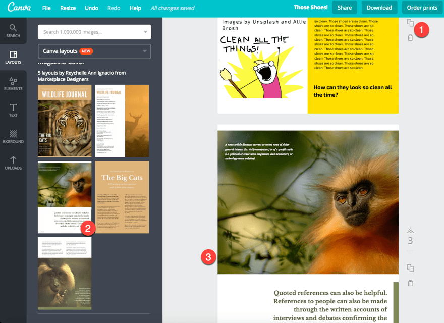
You can also press the duplicate button to use the same page over again and adjust any elements you want.
Step 3: Customizing the Canva Magazine Layout Template
Regardless of your topic or chosen template, the real work comes in customizing it. Canva allows you to customize every single piece of their design with a fair amount of options. Of course, you don’t have the tools you have in Photoshop or InDesign, but they’re perfectly adequate for creating a professional-looking piece of downloadable content.
Every single element in the magazine layout can be edited. All you have to do is click on an element to get the toolbar for it. You can adjust any colors in it, layering, and more. Additionally, you can click on Uploads or Elements in the left sidebar to add your own images or content in its place.
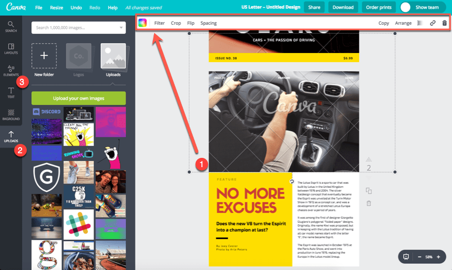
Since this is a paid image, let’s say we want to change it to one we own the rights to. All we have to do is click into the image box and then click on our replacement. Note: Admittedly Canva can be finicky. If the image does not insert itself into the photo element box, simply drag the new image into it when it appears on the page. That’ll fix it.
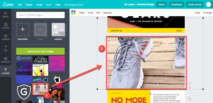
The same can be done for each and every piece on the page. From the price and page number in the corner to the separator dash, all the individual paragraphs of text or headings, all of it. You can even resize any of it if you want. And don’t feel like you are stuck with this exact design — you can move stuff around as you want. Nothing is locked. You’re just using this as a base.
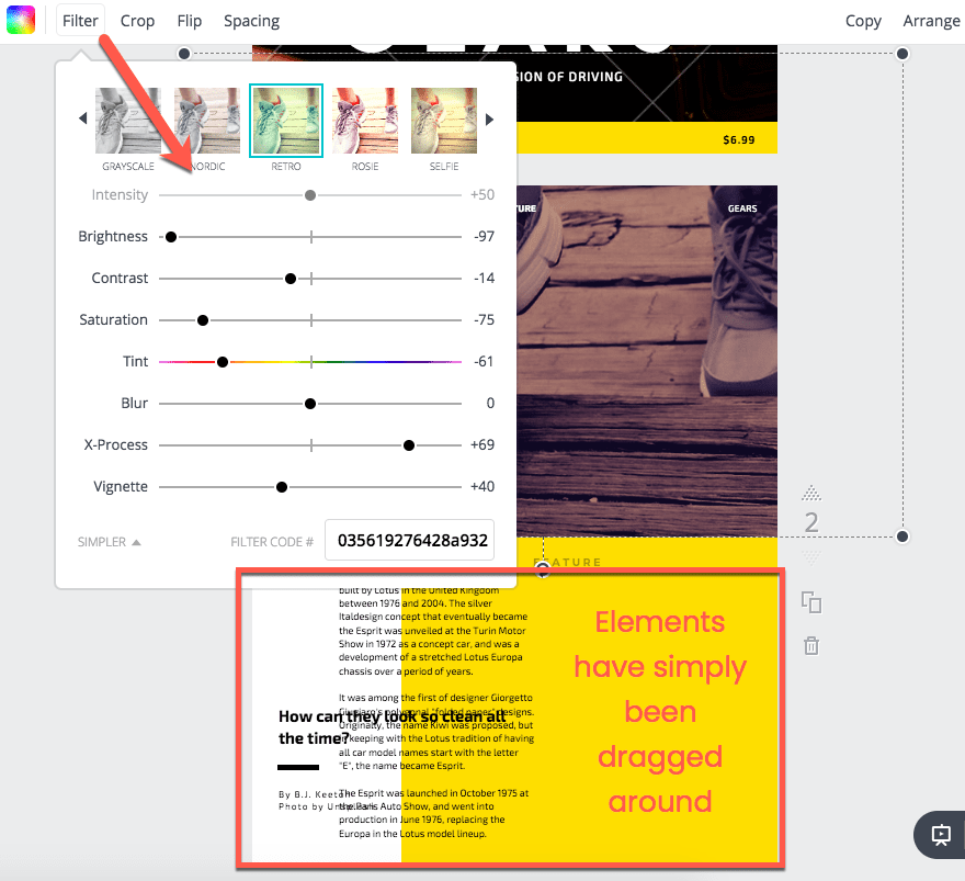
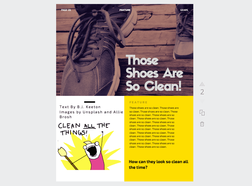
In the end, you can just play with whatever you want and make it look like you want.
Another point to remember is that you aren’t limited to a single layout’s pages. You can pull in covers and pages from anything Canva magazine offerings. So if you like a page out of a food magazine here and a travel magazine there, Frankenstein them together into something amazing.
Step 4: Creating Pages from Scratch
You may not like a single Canva magazine. You want your digital magazine to be yours and yours alone. Perfect. You can do that, too. Just add a new page or start a new document with the dimensions you want. I suggest A4 or 8.5 x 11 inches.
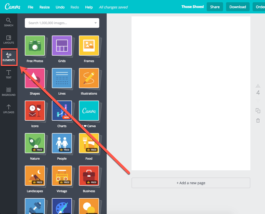
This time, instead of going into the layouts or uploads, click on the Elements tab. You have access to as many different design assets as you could need, each categorized in different ways. You can use these to piece together your own magazine layouts. Specifically, the Free Photos, Frames, Icons, Lines, and Shapes will be the most useful to you, I think.
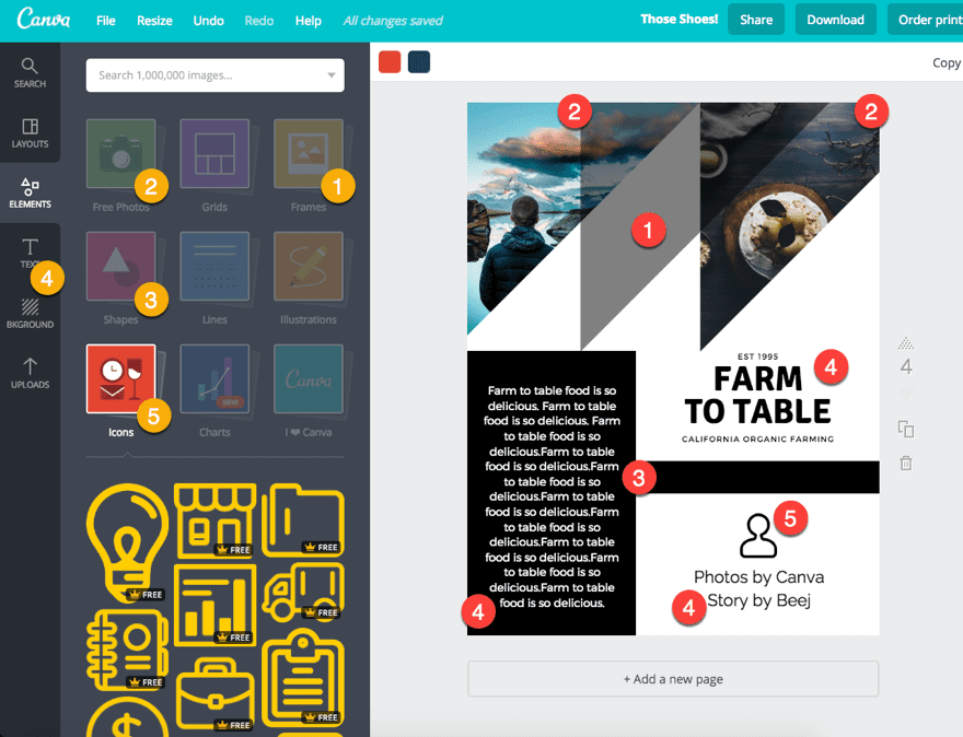
In this example, I used 5 different design elements to make this page.
- A triangle design under Frames for a header.
- Two of the Free Photos to finish out the frame.
- The black is simply two black rectangles from Shapes overlapping.
- Text has text boxes, headings (for the bylines), and even pre-made logotypes you can tweak to create headlines and asides.
- The generic human being is from the Icons tab.
All of the pre-made templates and downloadable magazine layouts are made out of these same elements, too. You can add them to or subtract them from whatever you’re using to make that perfect boost to your website.
Final Thoughts
If you have never tried a long-form publication for your website before, I highly suggest it. Like I said above, it can make a big difference in the feel of events and even being an email subscriber to see that someone put in the effort to make a premium document for them. And when you’re using a digital Canva magazine layout, you don’t actually have to put much more work in than you would just formatting a blog post or standard document.
If you’re an InDesign wizard, you probably already have a workflow and a library of templates to pull from. But for the rest of us, being able to make our own magazines that stack up to yours sure does make our lives a little better.
What kind of promotions would you use a downloadable digital magazine for?
Article featured image by Keep Calm and Vector / shutterstock.com



Great tip! I am into Xmas catalogue for my shop, this tool will be brilliant. Txs so much!
I don’t seem to have the option to use Canva 1.0
Could not find Canva 1.0 on my Canva Dashboard
Ótima dica! Farei isso com as minhas postagens. Que coisa incrível!
This is such a cool idea and really has my wheels turning on ways to use it! I had no clue you could do this in Canva and I’m in there all the time. Thanks for letting us know about it!
LucidPress is much more professional than Canva.
Take a look!
I will! I haven’t heard of that one, but I am always on the lookout. Thanks for the advice!
Wow! I’ve used Canva for years and didn’t know about this feature. Thank you!
Apologies if I missed the links but it would be great to see some examples of how you’ve used the magazines you mentioned creating & using on your sites. Thanks for this great post!
I went looking for them, and the only one I can find is this one I made years ago. Forgive the design I’ve since learned to do better, haha. 😉
http://bit.ly/2QqPwZu