You’re standing in front of a room of people, ready to knock their socks off with your expertise, witty comments, and terrible puns. You’ve prepped your info, made sure that you can answer every question your audience might ask. Then you open up your presentation…and it’s hideous. Or worse…it’s generic.
Turns out, three people have used the same Keynote templates that day, and you’re one of them! Ruh-roh, Raggy.
Luckily, the interweb is full of people who can stand lackluster Keynote themes even less than I can, and I’ve picked out some really awesome ones that will definitely make you stand out at your next gathering.
Free Keynote Templates
Everyone loves free stuff. Just start your presentation out by saying “who loves free stuff?” and when everyone responds “Yay! Me!” tell them you don’t have anything. It’s hilarious.
Well, that’s a lie, technically. You will have an awesome free Keynote template, but you don’t have to tell them that.
Tree Diagram
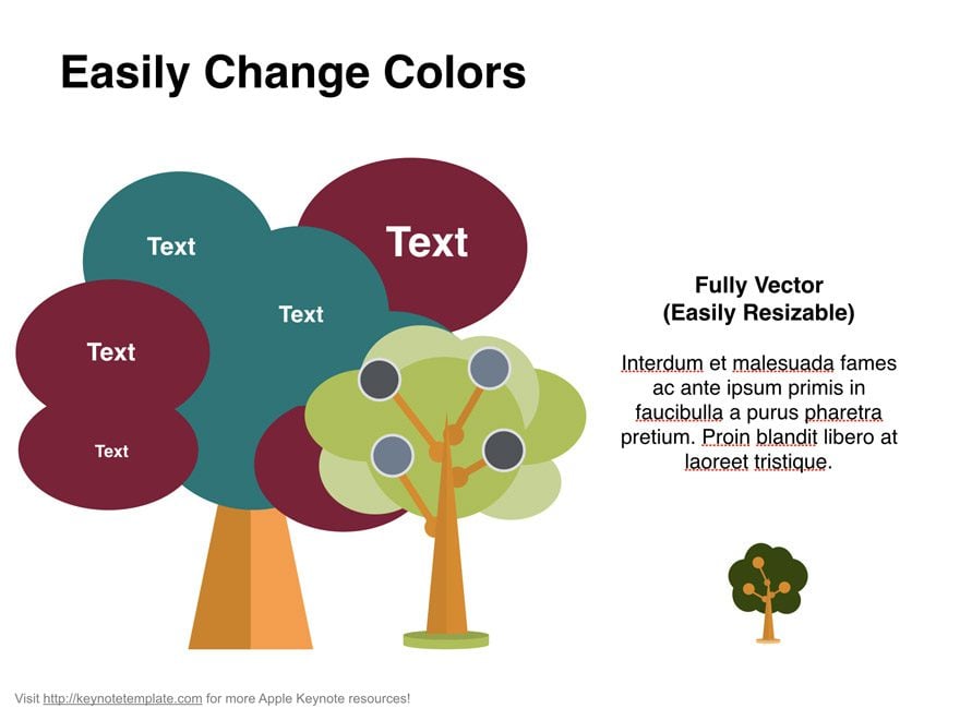
To start off with, this template is not only free, but it also has a really unique layout. Instead of being stuck with blocks of text and images, you’re able to break down your project and presentation into easy-to-follow chunks. Plus, the git-style branching is ideal for software devs.
Technology

Sometimes, you will want to keep your presentation as simple as possible. Minimal templates like this one are perfect for that. Made up of editable vector graphics, this tech template is designed to emphasize your content, while still maintaining professionalism and web-standard design practices.
Let’s be honest: you can’t go to a WordCamp, tech conference, or Meetup without there being either a slew of social media presentations or a dedicated social track. So why not lean in and use this on-the-nose template? Colorful–I originally typo’d that as colorfun, which also works in this case!–and simple, you can also make use the included vector graphics to make some neato infographics that your listeners will be able to share. See? Social is everywhere.
Merry Christmas

Don’t laugh! I’m serious! This template has some beautiful art in it, and if you’ve ever given an end-of-the-year presentation, you know how hard it is to keep people’s attention. With five different colors you can use, it’ll kind of be like you’re unwrapping a present with each slide transition. Okay, so maybe it’s not that great, but you’ll still get a lot more of a reaction out of this than a standard theme if you use it at the right time of year. And hey, if you really want to make an impression, use it in June or July!
Material
I am a sucker for Material design. I see it, and I feel right at home (which makes you wonder why I have an iPhone, huh? #shrug). This one is a simple theme using bold colors and loots of whitespace to mimic the fundamental ease that comes from material design. Your audience will be able to follow along easily because you will be able to put your information in a format they’re used to seeing pretty much every day.
While those free templates are pretty awesome, we do want to make sure that designers and artists get paid for their hard work. If you’re looking to invest and make your WordCamp presentation truly memorable, you should totally look into one of these premium Keynote themes.
Retro Slides
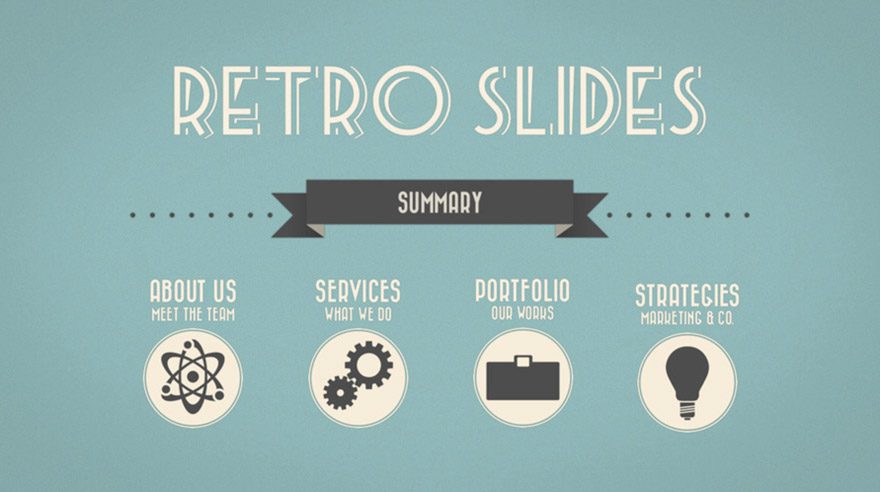
You know what’s super hot right now? Retro and vintage themes. If you want to give your next tech talk a bit of an old-school, pen-and-paper feel, this theme will suit you just fine. Muted, earthy colors and some delightful animations are sure to please your inner hipster.
MNML
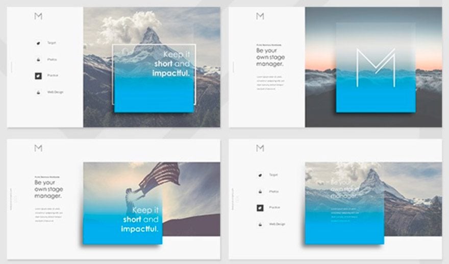
Nothing says minimal like removing all the vowels. If you didn’t guess, this minimalist theme is head-and-shoulders above its competitors. It’s sleek and uses whitespace well, while also including striking spots for imagery and pops of color. You don’t have to minimize your content just because you’re using a minimal theme. Who needs vowels, anyway? Not you. Not anymore.
Five

I wanted to make this template the fifth item on our list, but there were just too many cool free ones to talk about. Oh well. What makes this template stand out is the use of shapes for making its images stand out. Just drag-and-drop your photos or pictures of your project, and you’re on the way to being the stand-out presentation at your Meetup.
Flat Pitch
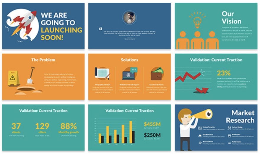
Color, color, everywhere. And it is glorious. This theme is made up of colors and flat illustrations that show you’re not just a black-and-white slides kind of person. No, you’re vibrant and your ideas sparkle, and so should your presentation. Even if the lights are bright in your presentation, this theme will keep your audience engaged.
Doodle
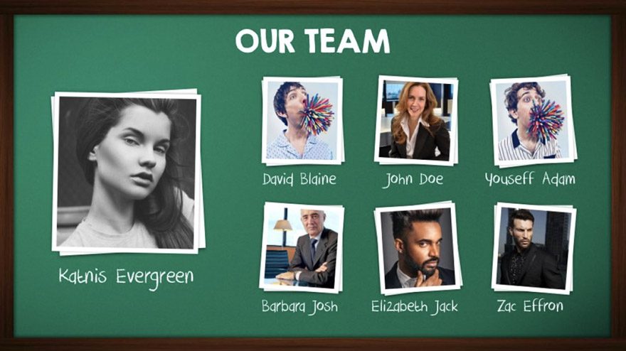
Doodle is just a fun word to say. And it’s just as fun to use for your next presentation. Though it comes in 4 background colors, the green caught my attention because it looks really similar to a school chalkboard that I grew up with. This template seems just perfect for any kind of tutorial talk because it will hit on your audience’s nostalgia and make them pay extra attention and take notes (or they’ll be dusting erasers after you’re done!).
Rework
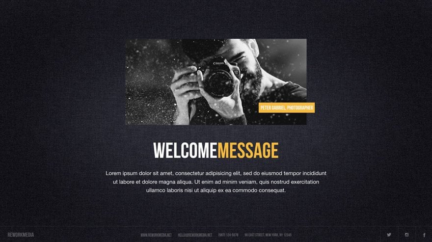
Do you know what’s better than one Keynote template? Two keynote templates. This one comes in a light and dark version, which very much look like two separate templates. Rework stands out because it looks like you’re scrolling a super-high-end magazine across the screen. A couple hundred icons, nearly fifty slide templates, and a sleek design will surely get some oohs and ahhs from the people listening to you.
Falls
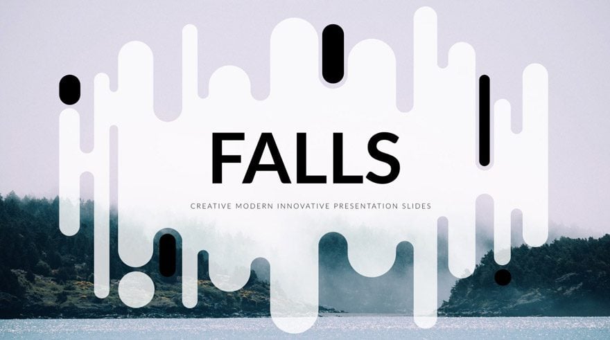
Every once in a while, you run across a theme that just looks different enough that you have to use it. This one is that way for me. With the inclusion of world maps and vector icons, you’re getting over 70 slides for your money. Using a modern and minimal design, the template is seamlessly pieced together so that no matter what your presentation is about, the people listening know you’ve got style. Cut-out areas for photos as well as built-in timeline graphics make this one to look at when seeking Keynote templates for your next tech conference.
60-in-1 Bundle
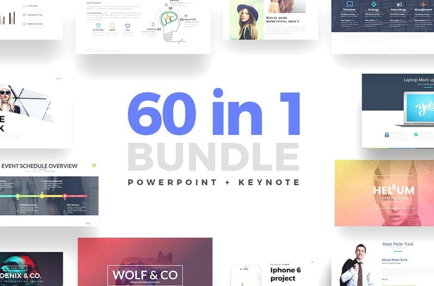
I gotta say, when I find a 60+ bundle of templates, I gotta take a look. Usually, they’re not too impressive for the money I’d spend. But, like most things, there are exceptions. I am a big fan of Helium, Startup, Impresario, Phoenix, and Martik. Those alone tend to make me think this bundle is worth taking a look at. And hey, you get thousands of icons and vectors with it, which go a long way, ya know?
Some Good Keynote Templates, Huh?
Hopefully, when we see you at the WordCamp, WooConf, or LoopConf, your laptop will be sporting one of these handy-dandy Keynote themes. And if not, that’s okay, too. We all make bad decisions sometimes. (I kid, I kid.)
Article thumbnail image by Kittichai / shutterstock.com



Thanks for your great article, actually I didn’t know about these templates before reading this.
however I see that it requires keynote program of Apple. Even to convert them to powerpoint I might need an apple account first.
Do you have any other suggestion to use these in windows as keynote software doesn’t have a windows version I think?
Since Keynote is a first-party Apple product, there isn’t a Windows version, but a lot of these themes that I listed have PowerPoint versions as well and most of them are linked somewhere on the site (at least for the premium ones, I recall.)