Web design trends change rapidly. They come and go. Websites today follow very different trends than they did just a year ago. As web designers, it’s helpful to know what the current and upcoming trends are. It can help you stay ahead of the competition and it can help you meet your client’s needs. Keep in mind that “trend” doesn’t necessarily mean “new.”
Many new design trends come from the tastes and preferences of designers and users in design and usability. What makes those changes possible is improvements in technology (such as our very own Divi theme for WordPress). Technology is a major driving force and is always helping design move forward.
To help understand where we’re going, let’s take a look at where we’re been.
- 1 Where Web Design Trends Have Been
- 2 Where Web Design Trends Are Heading
- 3 Material Design
- 4 Typography
- 5 Mobile UX
- 6 Mobile Layouts
- 7 More Imagery, Less Text
- 8 Tiles Replaced with Cards
- 9 Dynamic Storytelling
- 10 Greater Focus on Social Comments
- 11 Greater Focus on Content, Less Focus on Ads
- 12 Greater Focus on Article Layouts
- 13 Designer Tools
- 14 Final Thoughts
Where Web Design Trends Have Been
Web design for 2015 saw a lot of refinements of trends from 2014.
Recent years saw trends such as:
- Minimal
- Flat
- Video sliders
- Background video
- CSS animation
- Long scroll
- Hero images
- Hamburger menus
- Responsive
- Mobile first
- Newsletter popups
- Frontend frameworks
Many of these trends will continue to be refined. Some will be replaced with better alternatives. Others, such as background video, will be used with moderation.
Where Web Design Trends Are Heading
2016 web design trends could probably be summed up in two letters: U and X. Okay, and maybe one more word, too: mobile. Trends will follow best practices for both UX and mobile platforms. UX and mobile have been in view over the past few years, but now they’re front and center and the main driving focus of website design with an uncluttered UI.
This year will see even more refinement and standardization of current trends. We’ll see concepts go from just an ideal to the standard. From new to the norm.
Material Design
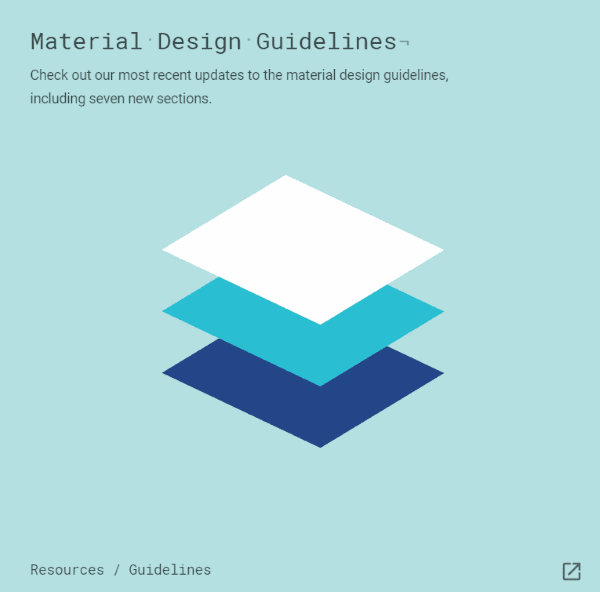
Material Design is an alternative to flat design that brings back some nice graphical elements. It’s a set of Google design standards that separates elements using the layers concept found in image editing software. It can stack and remove elements as needed. It even has built-in animations that would normally need to be created manually.
It’s a design language with a specific set of guidelines which takes out the guesswork. The results look the same from one platform to another. Since these standards are established by Google they’re sure to have widespread support.
It is possible, however, that adhering to strict guidelines will hamper creativity. I see this as a challenge to improve creativity within the guidelines.
Compared to Flat Design
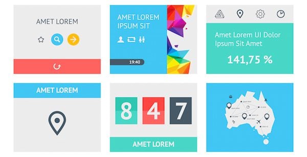
Image by fet / shutterstock.com
Material design is different from flat design. Flat design a design basis for presenting UI and graphical elements. It simply strips the visuals down to the basics and does away with visuals that try to mimic the real world with designs such as rounded corners, textures, shadows, etc. It minimizes all of the showy stuff that distracts from the story and reduces the amount of information that readers have to deal with. It has solid colors, sharp edges, and thin lines.
Flat design scales well and is easy to read on mobile devices. It’s practical and works well. It loads fast. The problem is appearance is secondary. It limits the amount of colors you can use and can sometimes look generic.
Flat design won’t be going away. It’s actually compatible with Material Design as well as being responsive and minimal. There will be a focus on turning off what’s not needed so they can focus on what is. The trend will be finding that perfect balance between the two. Flat doesn’t have to mean boring.
Material design is based in 3D. It’s a better choice for those who do want some stylish visual design. Material design gives you some of the design elements back. You’re not stuck with only having solid colors or not having animation.
Material design focuses on mobile devices first as more consumers are using smartphones and tablets as their primary devices, too. It streamlines the website and speeds it up. Expect material design to become the standard in web design.
Typography
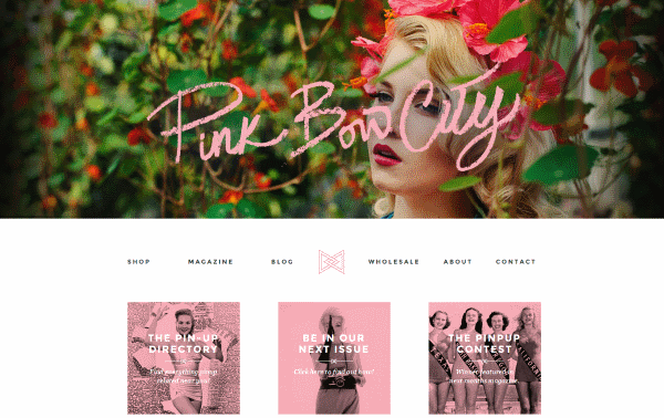
Image by http://www.pinkbowcity.com/
Increased resolutions and responsive designs make it possible to improve typography, which is why that is one of the web design trends we simply must include here. Typography can be more colorful and stand out. It can make a statement. Two trends that I’ve seen with typography are the use of serifs and hand-writing. Each have specific uses.
- Serifs help improve legibility. They were removed previously due to lower resolution screens and screen size. Screen resolutions and sizes are getting larger. Also, layout designs are cleaner and leave room for more elegant fonts. Expect to see serifs more often within the content itself.
- Handwriting is more personal. If it’s done correctly, it’s pretty and adds a special touch to a website. Just like serifs, the challenge is to keep the style legible and readable on small screens. Hand-writing will mostly be used in logos, headers, post titles, menus, business cards, and so forth.
One thing to consider is more users are consuming content on mobile devices. Unfortunately lower end devices, such as the Fire HD 10, display lower resolutions. This is more noticeable on larger screens because they have a lower pixel density due to having the same resolution as their smaller counterparts. One solution is to display typography based on the screen resolution. This means serifs and handwriting would display on mobile devices for high-res screens while screens with lower resolutions could receive a font that’s more suitable to its resolution. Of course server speeds and load time have to be taken into consideration.
Mobile UX
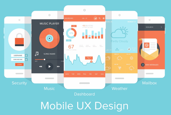
Image by vasabii / shutterstock.com
Not only will typography become more suitable to mobile screens and resolutions, but navigation, forms, images, and mobile-specific features (such as GPS) will have the focus of design. The use of images will change somewhat. Where images have been used for effects and text, CSS and fancy fonts will be used for effects and text will be used for text. This reduces page-loading times and server load.
Touch events are becoming more prominent. More sites are using plugins to handle events such as tap and swipe. This takes websites beyond just being responsive to the screen size, but also to the screen type, finger size, amount of pressure used, etc. Buttons and fields have to be large enough and have enough distance between them so they’re not hit accidently. Which brings us to mobile layouts.
Mobile Layouts
Minimalism rules for mobile devices. Some desktop elements can be hidden when the site is viewed on a mobile device. Other elements will be adjusted or modified depending on the screen size and type. This allows the message to fit the screen. Strip out the elements that are less important and fit it to the screen without losing the message.
Slideshows, images, buttons, elements, menus, and so forth should be developed with mobile in mind. Fortunately, Material Design brings back visual elements so sites don’t have to look plain on mobile. Also, you can render an image at a different size or resolution depending on the size of the screen. This will speed up the page-loading and the images will still look great on mobile devices.
More Imagery, Less Text
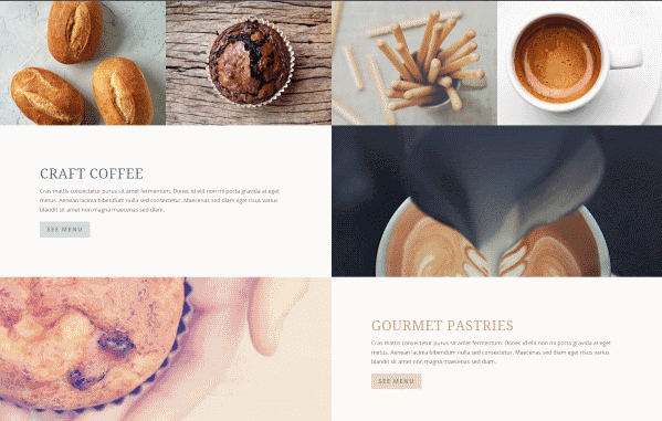
Divi Café Live Demo
Consumers tend to look more at pictures and video and less at the text. This creates a balancing act between SEO and UX. Search engines prefer text they can index. This will move text-rich content to sub-pages and the image-rich content to the homepage. If text is required for the homepage, try to place it under the imagery. Target the users first and the search engines second.
Browsers are becoming faster at rendering images. This means images can be larger with higher resolutions than before. Expect a greater emphasis on higher quality images and artwork.
Tiles Replaced with Cards
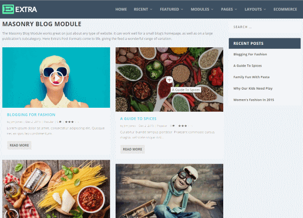
Extra theme masonry blog module
We saw lots of tile-based designs in 2015. Pinterest made (or helped make) the design popular. Cards take the design to a deeper level by adding functionality and interactivity. They can provide more information using hover effects, by flipping the cards over, expanding them, and more. They are a great design element that places the focus on imagery and offer a usable way and help make the content easy to see at a glance. They essentially create grid layouts while minimizing content.
Dynamic Storytelling
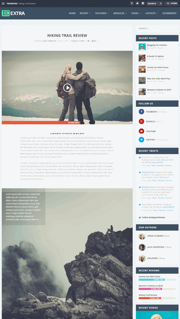
Dynamic storytelling works by telling a story through graphics with textual support. This is one of the web design trends that has held popularity for a few years now. It guides the visitors through a thought process or a timeline. It can show benefits of a product or service, history of an organization, or anything you want your visitors to know about you or your company. This can be a video or presentation that’s automated or one they can step through themselves by clicking or scrolling.
This requires a high level of graphic skill and has to be done carefully and skillfully in order to look right. It requires storyboarding, knowing your website’s message, and how to convey that message. It should highlight benefits and features in the most succinct way possible with the right balance between graphics and text. Too much of either can result in a UX that’s unfocused, overwhelming, or both.
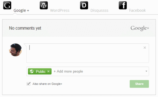
Image by Social Comments / https://wordpress.org/plugins/social-comments/screenshots/
WordPress has a great commenting system, but more readers tend to leave comments within social networks than on websites themselves. To capture social comments, the trend continues to move toward more websites using social commenting systems rather than the built-in WordPress commenting system. This ensures visitors can comment using their social accounts and/or any social media mentions are picked up and displayed right on your site.
Greater Focus on Content, Less Focus on Ads
Over the past few years, readers have become blind to ads within sidebars. Homepages have moved from being a banner for the content and ads, to being an eye-catching landing page with great visuals. They contain more visuals than text and the ads have moved to the content itself. This requires a great layout to make room for them, which leads us to…
Greater Focus on Article Layouts
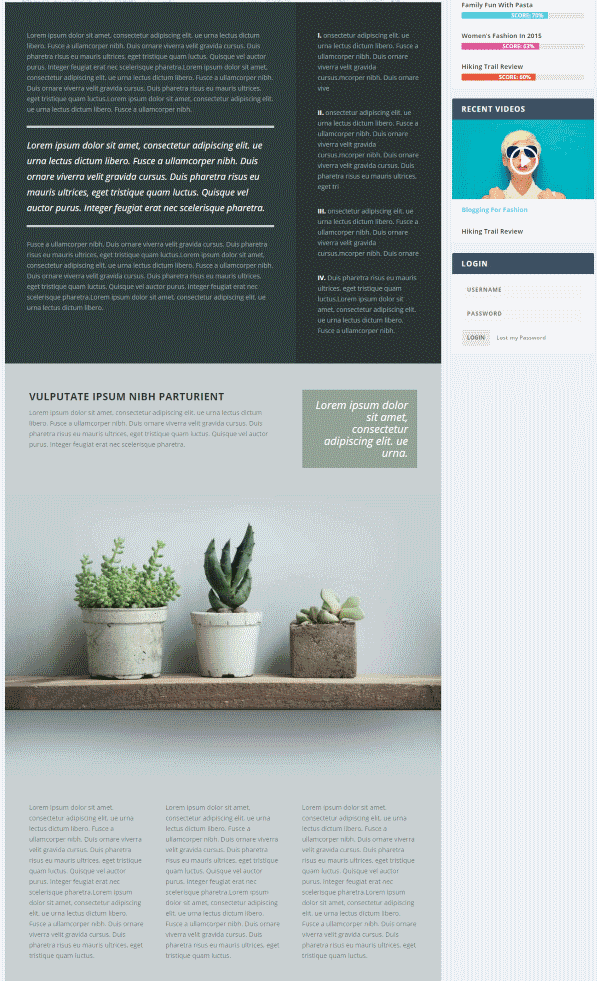
Divi Café Life Demo
We’ve seen drag and drop builder plugins that let us create homepages, but there is also a need for layout design within the posts themselves. Systems that allow for post layout design will be popular as users can create layouts with widget areas and place modules, giving their sites a much more elegant look and feel.
Designer Tools
There are some interesting tools to help designers to prototype websites and design layouts that have landed on the scene recent or are projected to be released this year. Here are a few that I expect to be popular in 2016.
Adobe Project Comet
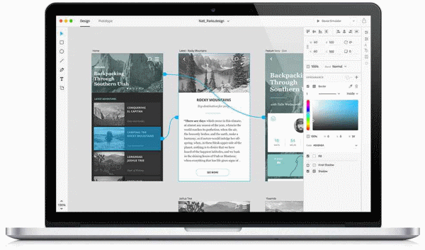
Adobe Project Comet arrives this year. It’s a cross-platform app for designing the UX from start to finish. It has tools for wireframing, visual design, interaction design, prototyping, and more. You can preview it on any device. It works with Photoshop and Illustrator, and can be expanded through community-built plugins. This will be the developer tool to watch.
Sketch
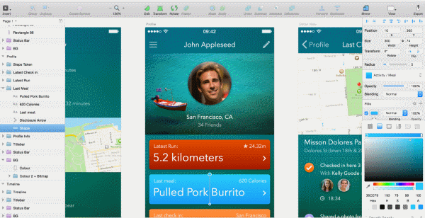
Sketch is an app for Mac that many are using in place of Photoshop. It has a nice work environment and was designed specifically for web and mobile designers. It has features such as layer styles, text effects, tools to create vector elements, and more.
Final Thoughts
These are just a few of the web design trends that will become more prominent throughout 2016. Of course the popular trend is not always the best choice, but they are good tools to have waiting in the wings should you need them. Plus, this process of finding ways to stand out from the crowd can help push a trend forward.
Your turn. Do you agree with these trends? What web design trends have you noticed that I left out? Do you have anything to add? Let us know in the comments below.
Article thumbnail image by Graphicworld / shutterstock.com



Super stuff. A true inspiration. Excellent writing.
Great article Randy, I’m really liking the direction of website design trends at the moment! I particularly like how web designers are focusing on fulfilling the user experience first and worrying about SEO second. It creates a better looking website while still fulfilling the SEO needs.
Nice Blog..Thanks for Sharing.
Very interesting! Thanks for helping me keep on top of trends and point me in the direction of additional topics I can research.
Where do I go to post to have an e-commerce website and apps developed where it is highly likely that the developers are knowledgeable about the 2016 website development tools you have mentioned? I’d like to hire a website development team that is looking forward and not stuck in 2015.
Thanks,
Sun
I’m not aware of any place that guarantees dev teams by these standards per se. However, you can simply write up a couple questions for when you’re interviewing potential freelancers or agencies.
Agreed…. Nice article
I hope that websites will move more towards text-heavy layouts. If there’s one thing I can’t stand in a design, it’s enormous, high-resolution, minimalist pictures with two lines of infantesably small print. (Sorry, Divi Café Live Demo)
The “flat design” trend had in reality nice feel to it on responsive websites. These are very good themes and I really delightful the grouping of sites. I would be keen on to see additional categories of ‘flat design’ such as medical and restaurant websites, etc. Thanks.
Agree with all that this article is great. I, too, am new to the web but not to design. My first talent, however, is writing. And I’m disappointed to see that, once again, content is being subordinated to visuals.
People don’t go to websites because they want to look at pretty or glitzy visuals. They go to learn more on a subject, business, or product. They want information. I’m well aware that audiences have to be engaged immediately and quickly, and a great design does make that happen. And so do words. Maybe people won’t read lots of text. But if they’re really interested in the subject, they will. And it will be the information, not the visuals, that drives them to act.
I’m always stunned by other designers’ websites. They tout their design, their SEO, their pricing, their customer focus, and such. But rare is the designer’s website that promotes or even mentions content and its importance. Such designers forget that content is what shapes audience trust.
My own website is more words than visuals. I’m not satisfied with that, but if a potential client wants to know my company’s distinction and value, they can learn it all from my website. Meanwhile, my design can evolve.
Lastly, I’m not talking about just any writing. I’m talking about expert writing—writing that’s logical, friendly, accurate, and concise. Time and time again, I’ve left a website just because its writing was so unclear, unfocused, and grammatically wrong. Good copy creates trust, conveys a company’s integrity and mastery, and perhaps most important, is friendly. The smallest typo, misspelling, or such can instantly destroy all of that.
Just saying …
SO much agree with you lady!
I am new to the web. But NOT to design. I’m gratified and astounded to see the focus returning to high quality, standard print layout techniques. Look at the examples and see how much like high-end magazines they are. Even saying “Put the picture first, and the text underneath.” Classic Headline over photo over caption. And THEN the body copy, complete with call outs, and bolded subheads. I feel right at home. And vindicated. What the old-guard web builders called my anachronistic style is now avant garde. HooRah!
Randy, as an old print guy myself, I couldn’t agree more.
ernie.
Love the new ideas such as a focus on article layouts – that’s something I’ve definitely seen people testing and have seen a lot of focus on that rather than just the standard layouts given by WordPress. And BTW – Divi has some awesome ways to help lay this out.
I saw a lot of these on this infographic that breaks them down and gives examples – http://www.coastalcreative.com/design-trends-2016-infographic/ – such as the storytelling, material design, and mobile UX. A lot of the ideas are continuations of the past few years, but a few are new as well!
Great post! First blog/article I have ever left scomment on in 10 years as a web designer!!!
Everything is changing.we should cope up with this change.But sometimes its defficult to adjust.But you guys always by our side.This article is really a guide line for us.Thanks a lot.Really this is what i wanted to read.
A few things to think about. Many thanks!
Hi,
First, I want you to know that my first language is French so sorry for my spelling mistakes …
I’m with Elegants Themes for some years now but I board not benefited enough. We could almost say that I am just beginning. I love reading articles. There is always something new and interesting. I read the comments too. This allows me to find out more. And with the new arrival Divi 2.6, I have a lot of fun to learn …
I know we’re not on a forum but if any of you could tell me what I would need to build the most wonderful web sites.
As an example, where to find beautiful images, beautiful icons, what are the best plugins for better working etc … Because I confess, were the icons that complicates my work more loll. I would like to eventually find everything I need.
This year I intend to renew my subscription but this time, to a Lifetime Membership. I like that better.
Well
Thank you to Mr. Brouwn for this article and have a nice day you all.
Mr Brown,
I have some little messed up your name in my first review. I am really sorry… 🙁
Thank you for this. It definitely gave me some ideas in how to improve my website. 🙂
Another great article, thank you. Is Elegant Themes planning to incorporate Material Design into the next update of Divi?
Thanks for this.
Insightful and as always, well written.
Dynamic storytelling and material design FTW!
An exciting time to be in this industry. 🙂
Indeed i like every product of elegant themes. Your UI, and designing style always impresses me! i more like to use and follow products and updates of elegantthemes.
thanks a lot describing the future trends of blogs
Indeed i like every product of elegant themes. Your UI, and designing style always impresses me! i more like to use and follow products and updates of elegantthemes.
thanks a lot describing the future trends of blogs
Great article! Exactly what I needed to know. Thanks a gaZiLLion
Awesome article, the best I read on Elegantthemes in 2016.
May even feature it in an upcoming post. Great work!
I had a lot of client projects past month and just went over my blog today. Up to now I always included my opt-ins in-content instead of sidebars. I just thought (again) about adding a sidebar but then I read your statement:
“Over the past few years, readers have become blind to ads within sidebars. Homepages have moved from being a banner for the content and ads, to being an eye-catching landing page with great visuals. They contain more visuals than text and the ads have moved to the content itself. This requires a great layout to make room for them, which leads us to…”
And honestly my opt-ins converted very well. If users are blind to sidebars nowadays I can continue to leave them out of my site. Seems like I did it right from the start. Therefore thanks for easing the sidebar decision for me 🙂
Cheers,
Arian
And what do we have from Elegant Themes for these new trends?
Nothing, just simple theme bullshit
That’s not fair! The E.T. TeAM does a great job!
I would like more design options within a post. For example in divi I use toggle modules a lot because they are clean and I can hide a lot of info. How the ability to organise that info in the open toggle in a creative and interesting way is limited and time consuming
excellent article. Thanks! I’ll definitely be applying these trends in my future Divi and Extra designs.
Randy,
Thank you for this thoughtful and well laid out article. I have often wished that more emphasis was placed on UX and UI than we have now. Often my clients tend to sacrifice UX and UI for fancy schmancy animations (despite my passionate entreaties of why it is necessary). I am also gratified to hear that Material Design is making a comeback. In my opinion as a web designer, you can only do flat for so long before it becomes overused. I also appreciated your inclusion of the links to the Google material design page and to Adobe Project Comet. You made me squee!
Excellent article! Forwarding it to my web designer
If you have hired a web designer who doesn’t read ET Blog posts then OMG!
Web designers don’t read blogs with content such as lists of 10 things with this and that…. That’s Kelly Kapoor’s 10 secrets of business! OMG!
lol.. nice
Great article. Interesting to see a glimpse of the future in webdesign.
Thanks for this!