WordPress is the world’s largest self-hosted website creation tool, with millions of sites relying on it to deliver their content.
It is also an entirely open source project that supports a wide array of incredible themes and plugins, giving users the ultimate freedom to build and customize their sites however they want.
Today, users are finding all sorts of new ways to take their WordPress sites way beyond standard design and functionality, with some of the results proving to be nothing short of astonishing. Here are just 25 perfect examples of how they’re doing it.
- 1 1. Gisi Design
- 2 2. Who Is Leon?
- 3 3. Mercedes-Benz
- 4 4. Katy Perry
- 5 5. Fair Ivy
- 6 6. Outward Bound Croatia
- 7 7. Happy in My Skin
- 8 8. Neopolitan Clothing
- 9 9. Flow Festival
- 10 10. Brandice Daniel
- 11 11. Fineshmaker
- 12 12. James Brandon Photography
- 13 13. Facebook Newsroom
- 14 14. Blue Cadet
- 15 15. Wanda Print
- 16 16. Essen International
- 17 17. The Next Web
- 18 18. July July
- 19 19. Bloomberg
- 20 20. Team Les Chameaux
- 21 21. Rincon Del Socorro
- 22 22. Trefecta Mobility
- 23 23. NASA
- 24 24. Flickr Blog
- 25 25. Statek Psychologia
- 26 Conclusion
1. Gisi Design
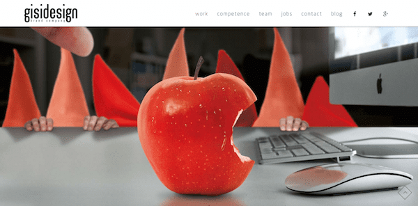
Gisi Design is a German brand company website that runs on the X Theme – ThemeForest’s most popular WordPress theme.
The site has clearly been built to put visuals front and center while keeping text minimal and elegant. Browsing through each page will take you through some very beautiful transitions and animations that look incredible, whether you’re browsing from a desktop or mobile device.
2. Who Is Leon?
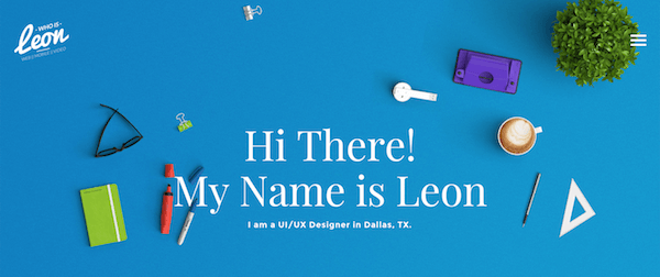
Who is Leon? As his websites proclaims front and center, he is a UI/UX developer in Dallas, TX, and as all good designer/developers, he utilizes his own website as a showcase of his abilities.
Critical types might consider it over-the-top, but one thing you can’t fault is Leon’s ambition in the execution of his design. Some rather innovative transition effects are coupled with an elegant flat design to create a cutting edge effect. The old phrase “I can’t believe it’s WordPress” has now worn so thin as to be antiquated, and this website rams that point home with gusto.
3. Mercedes-Benz
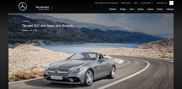
Mercedes-Benz is just one of the world’s largest brands that has its international site running on WordPress.
With a slick and high-end looking custom theme to match its brand, the site clearly serves to highlight the images and videos of its cars. Many of its pages feature full screen sliders to show those images off to visitors.
4. Katy Perry

Huge celebrities use WordPress for their websites too, and singer Katy Perry just happens to be one of them.
Her site is all about parallax scrolling visuals, with large background images that change as you make your way down the page. Social media has a big focus here too and is emphasized around her site in some effective ways.
5. Fair Ivy
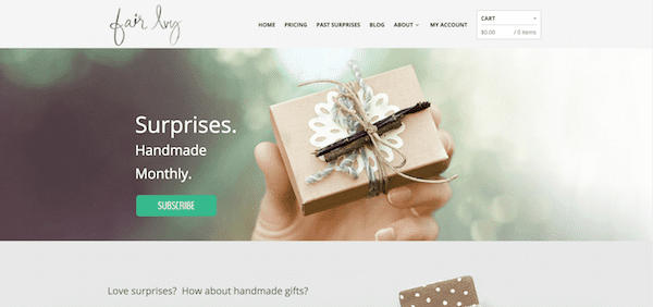
Fair Ivy is a gift subscription service with a website that runs on another one of ThemeForest’s most popular themes, The Retailer.
The site maintains a clean and elegant look that’s easy to navigate for users who are thinking about signing up. Those who do sign up for a subscription can easily access their account and see their cart items without being overwhelmed with too many visuals or effects.
6. Outward Bound Croatia
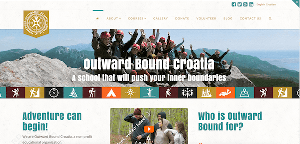
Outward Bound Croatia is an outdoor adventure organization that has a website running on the Integrity theme.
Scrolling through the site and all its gorgeous imagery will make you want to get outside and do something fun. The number counters on this one are also great for really making those stats and figures stand out.
7. Happy in My Skin
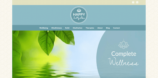
Happy in My Skin is a wellness therapy website that uses the Renew theme.
Right off the bat, the site offers visitors a look that’s calm, serene and spa-like while highlighting just the essentials as you scroll down. Overall, it’s a stunning example of a simple site that makes a big impact.
8. Neopolitan Clothing

Neopolitan Clothing is an apparel company that uses a WooCommerce website and a custom-designed WordPress theme.
This one is all about black and white color schemes combined with large, striking headline text. It works extremely well to emphasize the images and details while still maintaining a clean and pleasant browsing experience.
9. Flow Festival

Flow Festival is a very cool looking website that uses parallax scrolling to highlight illustrated patterns.
The creative and colorful patterns used on Flow Festival help highlight the large images for each section, including the ones from social updates and recent blog posts. This is one website that’s a lot of fun to scroll through just to see what’s going to catch your eye next.
10. Brandice Daniel
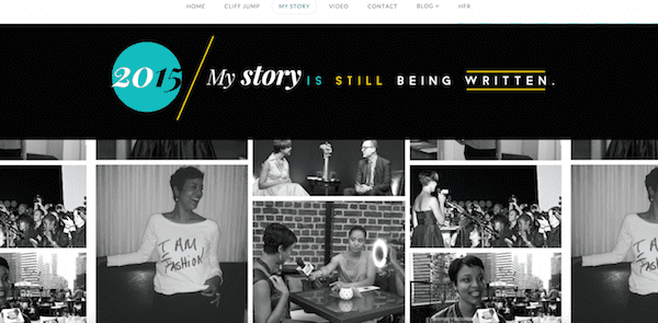
Brandice Daniel has a business coaching website that runs on the Icon theme.
The layout is minimal, yet it features impressive storytelling as you scroll down through all the sections. It’s just one example site that may serve as a great inspiration for anyone looking to give their own personal WordPress site a makeover.
11. Fineshmaker
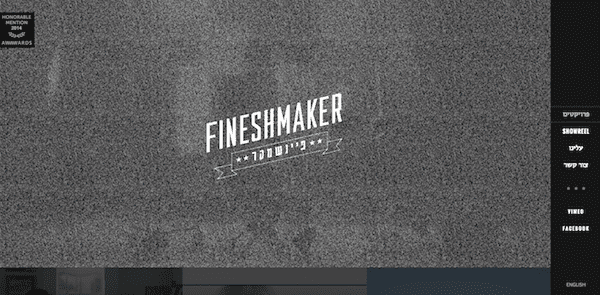
Fineshmaker is a boutique production company website that takes a unique approach to showing off their videos.
Videos are displayed in a grid and appear over the page when clicked. A simple and responsible sidebar can be accessed any time from the right, and there’s a TV static animation effect that goes great with the overall theme of the site.
12. James Brandon Photography
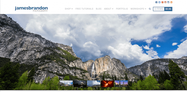
James Brandon’s photography website uses the Ethos theme.
While the theme itself is ideal for sites with a news magazine style, this site is a good example of how a photography site can still look amazing without having to be all about huge images and practically nothing else. There seems to be a very nice balance here between photos, additional information and resources.
13. Facebook Newsroom
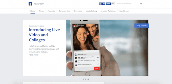
The world’s largest social network uses WordPress to power its news blog.
Looking like an extension of Facebook itself, the blog has a very clean and minimal look that makes it easy to read and navigate. You probably couldn’t mistake it for anything else but Facebook with that blue and white color scheme.
14. Blue Cadet
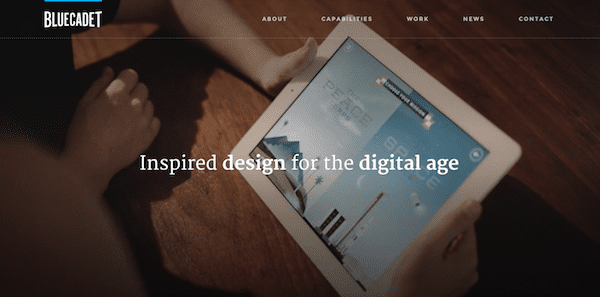
Blue Cadet is a digital agency that designs unique user experiences, and you can bet that they show it off through their own website as well.
Everywhere you look, there are smooth and engaging effects throughout the site that get visitors wanting to click to see more. Just scroll and hover your mouse over any image to get a firsthand look at how exquisite this site really is.
15. Wanda Print
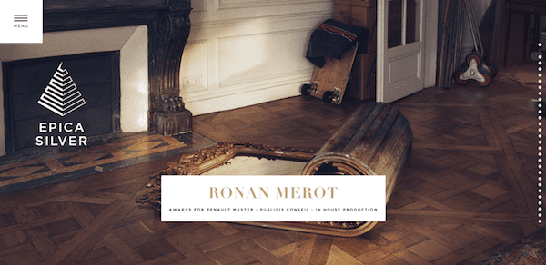
Wanda Print is a productions and creative studio with a site that really is mesmerizing to scroll through.
As you scroll down, full screen images will appear as one half of it slides from the top and the other slides from the bottom to fit together. The menu is always accessible when you need more than just pretty pictures to look at, plus there’s a clickable headline that appears over each image.
16. Essen International

Essen International has a clearly common theme on its website: size!
Everything from the images to the text have been made to look larger than what you’d typically see on most other sites. Click the menu to see it drop down and take up as much as half of your desktop screen. For a site that keeps much of its content to a minimum, the oversized look works.
17. The Next Web
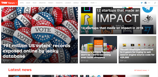
The Next Web is a popular tech news website that relies on WordPress to deliver its content.
The site puts its feature stories right at the top and then breaks its main categories up into sections with card-like article summaries. With a layout like this, you can get your news fix without being overwhelmed by too much clutter.
18. July July
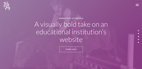
July July is a digital agency that may just be one of the most fun websites to browse through.
The site uses a lot of large images, videos and text combined with animation effects to make a big impression on visitors. Click on any case on the front page to see a superb presentation of its contents.
19. Bloomberg
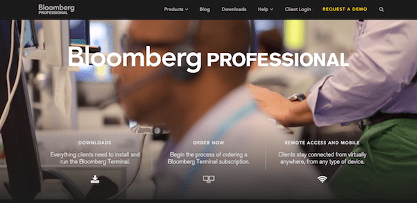
Bloomberg is another huge brand that uses WordPress to showcase and sell its products to customers.
The site features a large-scale video background with overlapping calls to action followed by featured blog posts that use full screen images and enormous headlines. This is one more example that displays the most essential information in an enticing way without overwhelming users with too much to look at.
20. Team Les Chameaux
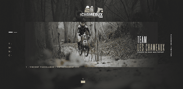
Team Les Chameaux is a French outdoor adventure team with a WordPress website that really captures what it means to be adventurous.
Watch as the images and text move in subtle ways around your screen as you scroll down or enlarge as you roll your mouse over them. The small menu on the left of the screen also has some really great mouse rollover effects.
21. Rincon Del Socorro

Rincon Del Socorro is a tourist destination website that wows its visitors with beautiful imagery from its natural ecosystems.
The site features parallax scrolling with videos and image galleries that visitors can view for even more great visual content. The text is beautifully formatted and there’s just enough of it to accompany the imagery in a way that supports the overall storytelling.
22. Trefecta Mobility
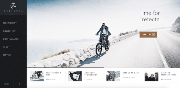
Trefecta Mobility is an e-bike company that uses WordPress to show off its innovative products.
Imagery and video are the big focus here, and clicking on Technology in the menu options on the left will trigger interactive animation of the bike that you can scroll through at your own pace. A quick browse through this site might be enough to make you want to pre-order one of these things.
23. NASA
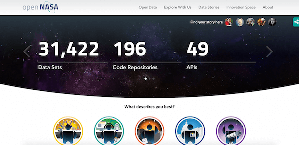
Everyone knows that NASA is the United States government space agency, and believe it or not, they’re actually a huge fan of WordPress.
According to a WordPress.com VIP case study, the NASA Open Government Initiative team picked WordPress as its open source CMS of choice to host some of its websites that aim to help federal agencies generate more transparency, participation and collaboration. These include sites like open.nasa.gov, data.nasa.gov and code.nasa.gov.
Although not every NASA site is powered by WordPress (like the main NASA.gov site), you can check out NASA’s Glenn Research Center WordPress page to see a small sampling of additional sites that use WordPress.
24. Flickr Blog
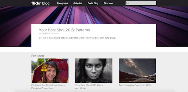
Yahoo’s big photo-sharing platform, Flickr, uses WordPress for its blog section.
Since photos are what Flickr is all about, it only makes sense that they’re the main focus of its blog. A full screen feature image and corresponding post appears at the top, followed by the most recent posts.
25. Statek Psychologia
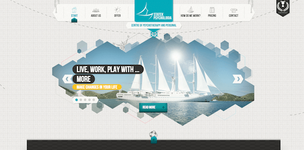
Statek Psychologia is a Polish psychotherapy website that’s eye-catching in all the right ways.
At first glance it looks quite simple, but this WordPress site has some clever components you’ll see as you browse through it. The geometric design features in the background and in the unique slider are pretty hard to miss, and as you scroll down, the menu that looks like it hangs from two ropes remains fixed while the footer can be expanded and accessed any time no matter where you are on the page.
Conclusion
If you’ve taken the opportunity to dive deeper into any of the websites featured above, you should have a good idea of just how versatile WordPress truly is. The possibilities really are endless, and it will be exciting to see what kinds of new and amazing things developers and designers might able to do with WordPress in the near future.
Do you know of any other cool WordPress-powered websites that are worth showing off? If you have one that comes to mind, feel free to mention it in the comments.
Editor’s Note: This post has been updated as of 1-13-16 to ensure that all featured websites are running on WordPress.
Article thumbnail image by vasabii / shutterstock.com




Thanks so much for including me in this list, what an honor! Would love to have a link to my site up there too in case people want to check it out. Thanks again!
Thanks for including my website (July, July)!
Hi Anders – Your website is looking good and well done to that but just a piece of feedback; I have a super fast mac book pro and have never had issues viewing sites with heavy videos, graphics or animated content. The minute I got onto your site everything just slowed down! I tested this 3 times and same deal. Maybe a bit of performance and load testing will help go a long way 🙂
Hello there! Thank you so much for featuring the website I designed for Brandice Daniel in your post! I’m honored to have my work featured among these AH-mazing sites. 🙂
You’re welcome Dana!
These themes are really good. I have made my site with wordpress. It is really easy to manage all things. Sometimes I think WordPress is my family member.
I would venture to say that most of these websites are running highly customized child themes if not custom themes altogether.
Nice post, site Nasa used Drupal.
We’ve updated the post to clarify which NASA sites do and don’t use WordPress 🙂
I find it odd that the so-called “professional writer” hasn’t even bothered to explain how he screwed this up (or even own up to it)?
We know at least 2 of the 25 aren’t even running on WordPress.
Perhaps he should slow down and fact check before he posts garbage like this.
I expect much better standards from ET.
Hey Ron, we took note of this and had it corrected. Thanks for the heads up.
Whoops….looks like 3 of the 25 aren’t on WP.
Just another pump and dump blogger that hasn’t even bothered to check back in.
Hi Ron,
What you refer to as ‘fact checking’ is definitely something I should have done better on with this piece, I’ll admit that. Not looking to duck anything; we live and learn. The piece has been updated accordingly.
Cheers,
Tom
Make that 3 of the 25 aren’t on WP.
They may be good designs and visually appealing but not many designers are good marketers. Pretty websites do not equal an attractive ROI and rarely accomplish the reason we have websites in the first place.
WTF????
Alway great to see stylish WordPress websites, it a tough old world to be unique.
I checked out the Wanda Print site, and I’ve got to say that I hated the user-experience on the home page.
Your review says “As you scroll down, full screen images will appear…” But there’s no way to scroll down (at least not on my chrome browser), you have to click on the tiny dots on the right hand side (which means you have to move the mouse each time).
If they had a “down” arrow on the bottom so I could just click,click,click quickly through the screens, I’d be happy. As it is, WAY too much effort to look at them all. The images may well be great, but because of the way the site has been designed I didn’t bother looking at most of them.
The scroll works for me (you need to have a scroll wheel on your mouse – great design – NOT) but I have to say the site is HIDEOUS! Takes forever to load and the UI/UX is a joke.
Just wow…..
Scroll works for me too, using my touchpad. I understand where you guys are coming from, but personally, I feel it offers an alternative example of what is possible with WordPress. Let’s not forget that a few short years ago no one thought it was anything more than a blogging platform. Whether you hate Wanda Print’s design, I’d like to think you’d agree that it is a powerful showcase of WordPress’ potential.
Well, I am pretty proud of [my website] especially since I can’t figure out how to use Divi.
It is using Interactive by MyThemeShop. Eric’s themes are fast, fully responsive and really easy to set up.
Looked randomly at #15. If the font were any fainter, it wouldn’t be there. Pages take forever to load. What the hell makes this “cool” – a ludicrous term for a business site other than music or comic books.
Each to their own Michael 🙂
Many are “cool” aesthetically but not very user friendly functionally wise. We seem to think something is “cool” based on looks instead of practicality. That’s to bad, it makes everyone more on edge just to accomplish simple things.
Hi Brad,
The purpose of this article was more to look to aesthetic than usability I’d admit. Not to say usability isn’t important (it is – vitally), but we took a different approach in evaluating sites for this piece 🙂
Cheers,
Tom
The page speed on some of these sites is excruciatingly slow .. bells and whistles, videos, animations and slideshows are great … if your visitors can wait that long. WordPress has many great features, but speed is generally not one of them.
I disagree. WordPress is a tool. You can do the best with it or not. I don’t like the loading screens on some of the examples but it doesn’t mean that it is WordPress’ fault.
WordPress is a very quick with optimised images, not a bloated content and a good cache plugin. There is plenty of very fast websites made with WordPress.
I agree with basiten. Lots of times a WordPress site gets handed over to a client who would like to do their own updates, but don’t know anything (and don’t care much) about things like SEO or image optimization. It is all the little things that add up to a well-run website.
Yep – agreed with Bastien. WordPress can be lightning fast. As for the sites about, “cool” does not always align with “lightning fast load times” 😉
Interesting that none of the Top Designs you identified use the Divi theme…
Also, Dagobert is NOT WordPress, according to Builtwith.com
Well spotted Bill; we’ve replaced it. Thanks for the heads-up!
I have a question : are all these designs possible with Divi ?
A lot of the styling you see above is possible with Divi right out of the box. I didn’t see anything that couldn’t be done with Divi given a custom child theme and/or custom coding.
I think you can. Divi is really flexible if there is something not in the package, you still can add some codes to make it.
Great question, or are any “more” possible than others?
Thanks for the list. Could you do a feature on sites that use navigation creatively? So many of the sites we see are just a list. I’d love to examples of people breaking the mould.
Nice collection, All of them are contain Images and Complex animations.
Among all my top 4 selection based on colors and look will be http://www.primeit.pt/en/ , http://www.happyinmyskin.co.uk/ , http://newsroom.fb.com/ , http://www.brandicedaniel.com/ .
I would love to see less agency- and PR-websites in such a compilation.
There is more to see outside than PR
To show mostly PR – and Tech-Websites is like sitting in a pond promoting frogs ;=)
What kind of websites would you like to see?
I think New York Times blogs also use WordPress CMS. Almost all top tech blogs are also using WordPress.
Yeah I think you’re correct. TechCrunch too I believe.
I’m very grateful to WordPress. Without it I certainly would not have a website.
I’m not a developer by any stretch of the imagination but I managed to build my own site and although it doesn’t have those fancy-dancy features in your examples I think it works pretty well, in other words, IT DOES THE JOB I INTENDED IT TO DO.
And as a bonus it’s earned me a couple of jobs building sites for others.
By the way, I’ve learned a great deal from Elegant themes and I’m grateful for that too.
We’re glad to help in any way possible Hazel 🙂
Great sites! but one thing i would like to clarify, ethos, renew, integrity and icon are all from the same theme: X theme, hehe a looooot of “themes” from this list are actually one (the best one, if you ask me. and yes, i’m a X theme user/ web developer hehe ) i like its flexibility so much that i have almost made it exclusive on my web design business :p
X Theme is a very popular theme, no doubt 🙂
Would love to see you run a few blog articles on not-for-profit sites and maybe links or templates available to them (us).
Thanks in advance.
Sounds like a good idea.
I hate #1,#2, And #15….
Loading screens BLOW!!!
I agree. For simple website with a few pages displaying the services and realizations, I don’t like to have a loading screens. I can understand them for a web app where there is a real service behind, but not for just a simple html page with some text and images.
You know what – as an end user, I agree. However, from a design perspective, I really liked what the ‘loading screen’ sites were doing, and felt they warranted inclusion on that basis. Perhaps ‘cool’ doesn’t always align with ‘wonderful user experience’, eh? 😉
When you consider WordPress powers over 22% of ALL WEBSITES online today, it’s no wonder larger brands are taking advantage of it’s extendibility and easy to maintain CMS. Nice list, thank you for sharing. > v <
Great collection, but Dagobert does not seem to be a WP site… ?
It’s been replaced. Thanks for the heads up!
WordPress is from far a great development platform, but at a simple check, nasa website runs on drupal…
That entry has been updated to reflect Nasa’s use of WordPress on many sites.
The main website definitely runs on Drupal. And the other sites don’t seem to be WordPress either.
It appears Nasa is on Drupal?
The Nasa entry has been updated to reflect their actual use of WordPress.
Yep – just to clarify, it wasn’t originally ideal wording on my part, but NASA *does* use WordPress for certain websites 🙂
You are correct. Yet another “expert” that doesn’t bother to double check.
A couple of comments.
I never miss a chance to look at any list that includes the words “Best of WordPress Sites” I always learn a lot when I visit the sites. It’s a great way to see how the pros are doing it.
My first second comment is that I’ve installed a program from McAfee called Site Advisor which helps me to avoid websites that may contain viruses or malicious content. Having said that, I clicked on the site http://www.neopolitanclothing.com and McAfee went crazy with all kinds of warnings about malicious content on most of its pages. Is the correct link being used in the article?
My other comment is I’m always looking for WordPress examples that are eCommerce related and actually sell product using WP and a site anchored shopping cart. The Katy Perry site is a neat site but when you go to shop, it takes you to another website altogether. Do you have a link to a “Best Of WorddPress” list that shows sites that sell product through the WP site.
Thanks,
Mark
Hey Mark,
I didn’t receive any warnings from Chrome concerning that link. I doubt there is anything to worry about there.
As for your other comment, I think a “Best of WordPress eCommerce” sounds like it would be a great post. I’ll see if we can put that on the editorial calendar!
Best,
Nathan
Thank you to Elegant Themes for standing out from the crowd with an elegant presentation of websites powered by WordPress.
Great examples! They definitely all have one thing in common– powerful images and good design! This would be handy to share with someone who is skeptical about WordPress…
Yeah I think something a lot of people overlook is how necessary good design is–no matter what platform you’re using. Just because you have amazing tools doesn’t mean you’re good with them!
Oh, I would love to get some companies to use these as templates. Bad web design is alive and well.
That’s for sure! Do you think our community would like it if we re-created some of the cooler website we’ve come across with Divi and gave away the design elements we used?
That would be cool!