The world isn’t black and white, so why does your website need to be black and white? Ok – there aren’t many entirely black and white websites. But that doesn’t mean we still can’t make the web more colorful. And to give you the inspiration to do just that, we’ve collected some gorgeous examples of colorful websites to get your creative juices flowing.
While it would be easy to fill this list with websites from design and branding agencies, we tried to find websites that span all niches and design styles. That means you’ll find agencies, eCommerce stores, SaaS products, F&B companies, and more. The only unifying factor is that they’re all colorful!
Jump in and get inspired…
-
1
1. Odd Pears Socks
- 1.1 2. Bonnaroo
- 1.2 3. Aida
- 1.3 4. Mambo Mambo
- 1.4 5. Milkable
- 1.5 6. Baianat
- 1.6 7. Avocado
- 1.7 8. Perfect Day
- 1.8 9. Litmus
- 1.9 10. Wistia
- 1.10 11. 3 Sided Cube
- 1.11 12. PepsiCo Beverage Facts
- 1.12 13. Chipotle Savor Wavs
- 1.13 14. Essentially Geared Wine
- 1.14 15. Packwire
- 1.15 16. Anywhere
- 1.16 17. 7UP Lemon Lemon
- 1.17 18. Havaianas
- 1.18 19. Deskpass
- 1.19 20. Sweet Leaf Tea
- 1.20 21. Austin Beer Works
- 1.21 22. Word Counter
- 1.22 23. Huxtaburger
- 1.23 24. Fotonaut
- 1.24 25. Survival Russian
- 1.25 Wrapping Things Up
1. Odd Pears Socks
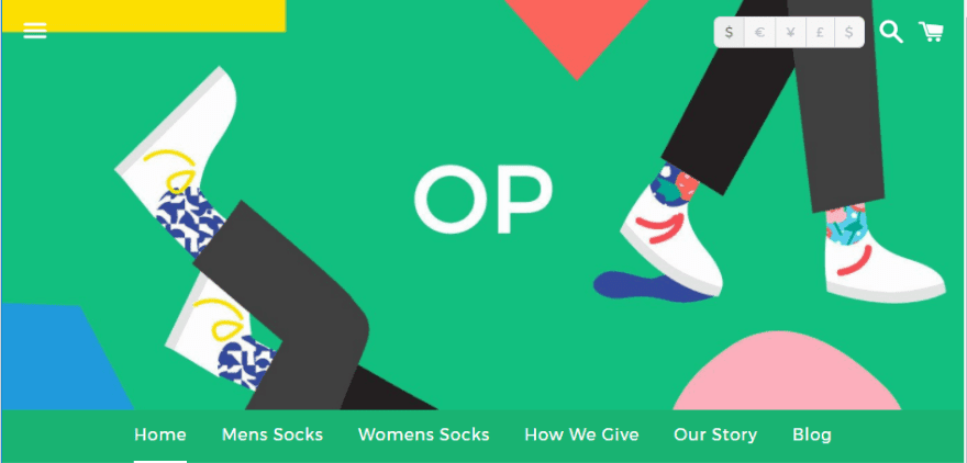
Odd Pears goes with a bold colorful look that matches the quirky socks that they sell. So not only is their website design eye-catching, but it also fits their brand and aesthetic.
While the actual product pages aren’t quite as colorful, the socks themselves still add a dose of color to the entire site. Definitely a cool eCommerce store (even if it is built on Shopify instead of WooCommerce!)
2. Bonnaroo
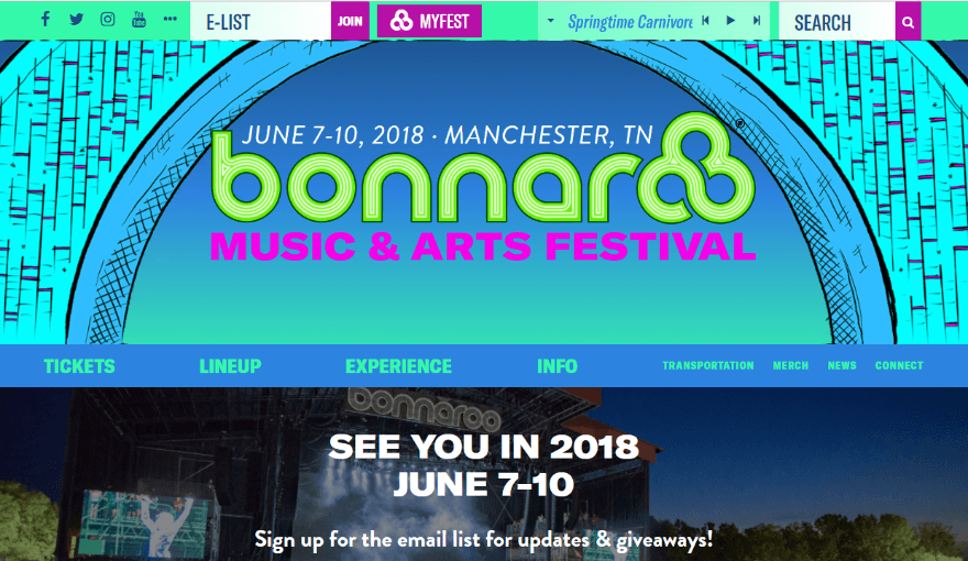
Bonnaroo, the massive music and arts festival in Manchester, TN, goes with a colorful psychedelic look that meshes well with the spirit of the festival.
The bold header is site-wide, so visitors to every page are going to get a serious dose of color.
3. Aida
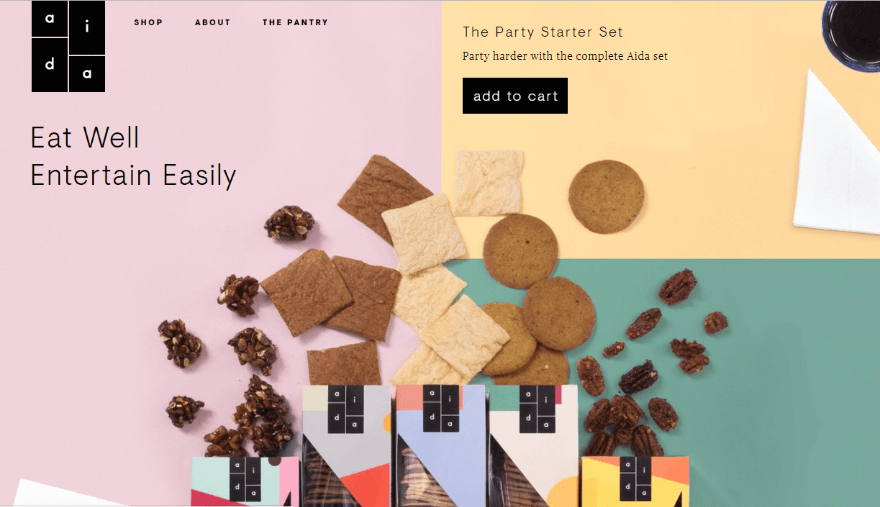
Aida is a New York City-based line of “eating and entertaining essentials. “ They have whimsical branding that’s reflected in their site’s colorful design.
While Aida’s website does incorporate tons of colors, it still manages to put product imagery front and center.
4. Mambo Mambo
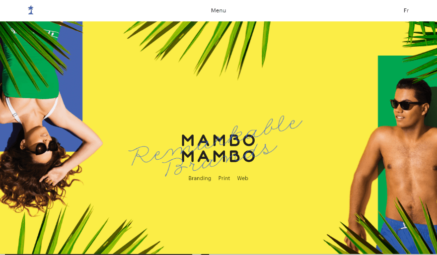
Mambo Mambo is a branding agency with about as bold and colorful a homepage as you’ll find. Beyond the eye-catching colors, Mambo Mambo’s site also features a neat scroll effect as you move down the rest of the colorful page.
5. Milkable
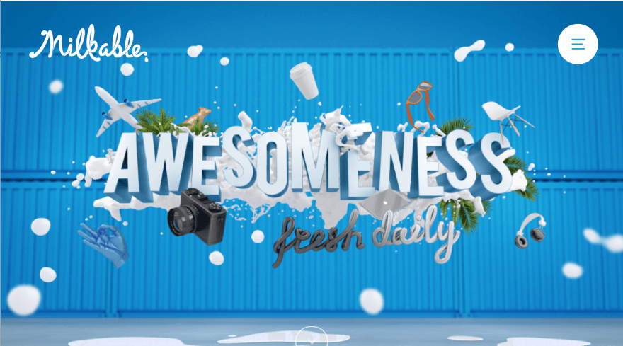
Milkable is a creative agency with an attention-grabbing and colorful homepage. Despite the bevy of milk branding, Milkable is, as far as I can tell, not funded by the dairy industry.
6. Baianat
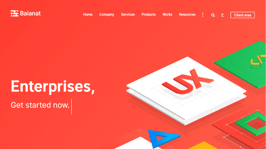
Baianat is a web and graphic design studio with a bold red homepage. Beyond their own site, you can also find plenty more colorful websites in Baianat’s client list. It appears Baianat is an overall fan of color!
7. Avocado
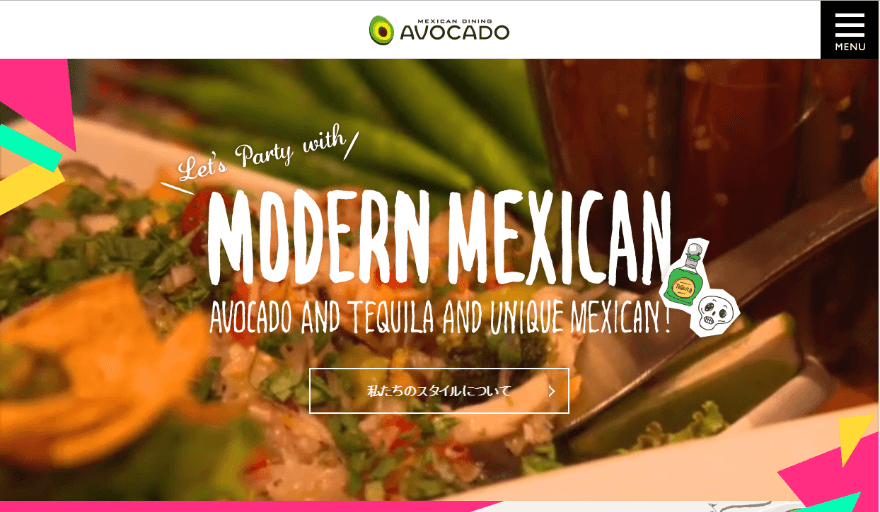
Colorful websites aren’t limited to design agencies! At least that’s what this Japanese restaurant (that serves Mexican food) proves. The full-width hero video is framed by colorful graphics.
Avocado maintains the same colorful style as you scroll through the menu and contact information.
8. Perfect Day
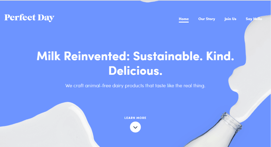
While Milkable wasn’t about milk, Perfect Day keeps a similar aesthetic to…actually talk about milk. Well, not dairy milk – but “animal-free dairy products that taste like the real thing.”
9. Litmus
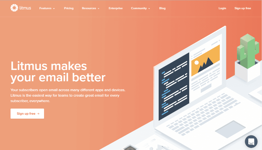
Litmus is a good example of how SaaS products can still have colorful websites. This is a tool to help improve email deliverability. And while that’s a fairly dry subject, this company keeps things exciting with its colorful website design.
10. Wistia
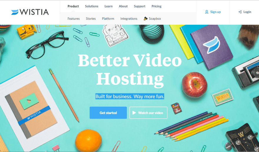
Wistia is another SaaS company that doesn’t shy away from color. Beyond the teal background, they bring in dashes of other colors with the pencils, oranges, and other desk items.
In addition to looking great, the colorful design helps reinforce their branding of “Built for business. Way more fun.”
11. 3 Sided Cube
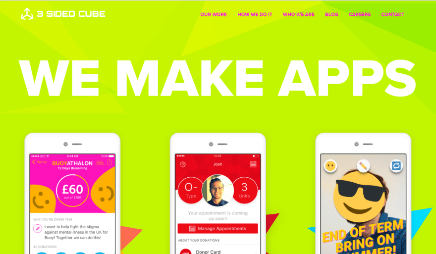
3 Sided Cube is an app development shop with a bold neon homepage. They also don’t beat around the bush with that they do! The iPhone mockup screens help to make the neon green background less overwhelming and add some additional color.
12. PepsiCo Beverage Facts
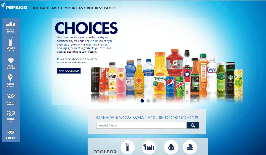
Let’s mix things up by getting a major corporation into the list! PepsiCo Beverage Facts is PepsiCo’s website where consumers can learn more about what goes into PepsiCo’s beverages.
It features a colorful blue design that fits PepsiCo’s branding.
13. Chipotle Savor Wavs
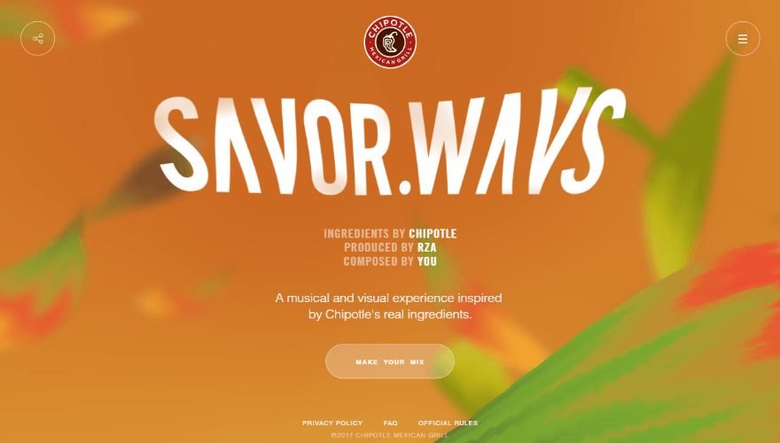
Chipotle Savor Wavs is a “musical and visual experience” based on Chipotle’s ingredients. Yeah, that’s fairly odd. But it’s also a great example of a colorful website.
14. Essentially Geared Wine
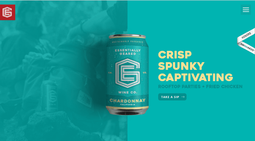
Wine in a can? Yes, that is part of what Essentially Geared Wine is advertising on its website. As you scroll down the website, the colors on both the can and the background change. Like Aida, it manages to both be colorful and incorporate plenty of product visuals.
15. Packwire
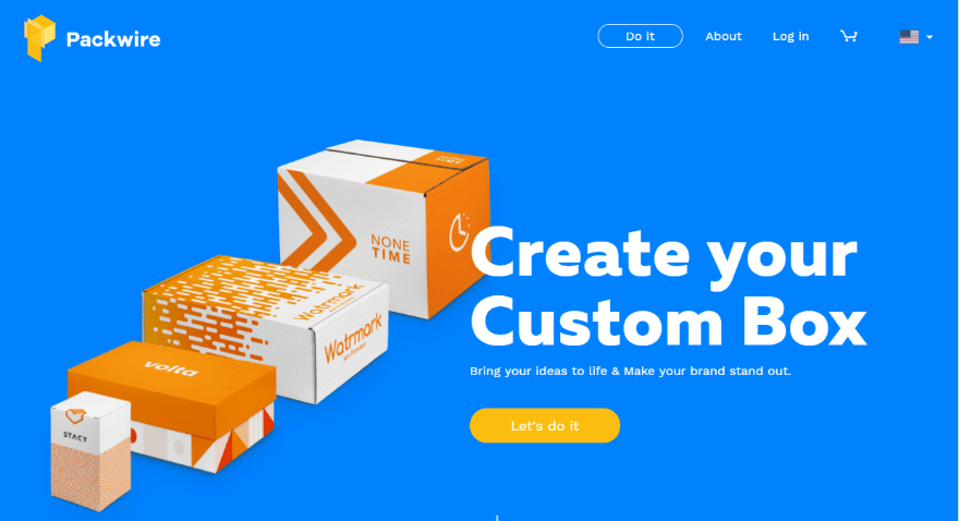
Packwire is a service that helps people create custom boxes. For example, an eCommerce store could use Packwire to create branded boxes to ship their products in.
Because cardboard boxes aren’t the most exciting industry, Packwire is another good example of how you can use color to make a dull industry a little less boring.
16. Anywhere
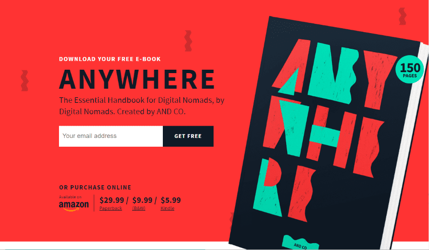
Anywhere is a “handbook for digital nomads” from AND CO. While the product imagery itself is already colorful, the bright red background only takes things up a notch.
This one is both a good example of a colorful website as well as a handy resource if you’re a location-independent developer.
17. 7UP Lemon Lemon
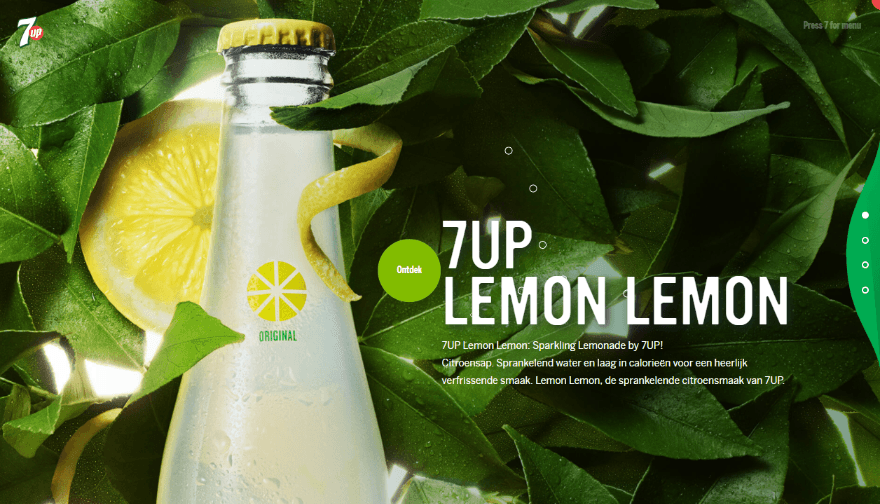
Autoplaying music aside, 7UP Lemon Lemon Netherlands is another nice example of how FMCG companies can create a colorful website.
18. Havaianas
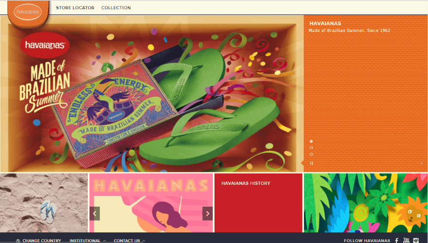
Known best for their flip-flops, Havaianas sells sandals and accessories via their colorful store. Havaianas has always had a fairly beachy/tropical brand, so the bright colors fit well with their overall aesthetic.
19. Deskpass
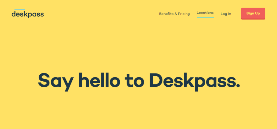
Deskpass is a coworking pass that gives subscribers access to 135+ coworking spaces for one monthly rate.
Their bold yellow look keeps things light and casual, which fits the branding that most coworking enthusiasts enjoy.
20. Sweet Leaf Tea
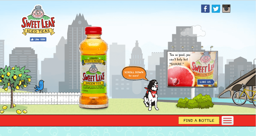
Sweet Leaf Tea is a popular brand of flavored iced tea. Their product packaging has always been colorful, so it’s fitting that their website is equally as colorful.
21. Austin Beer Works
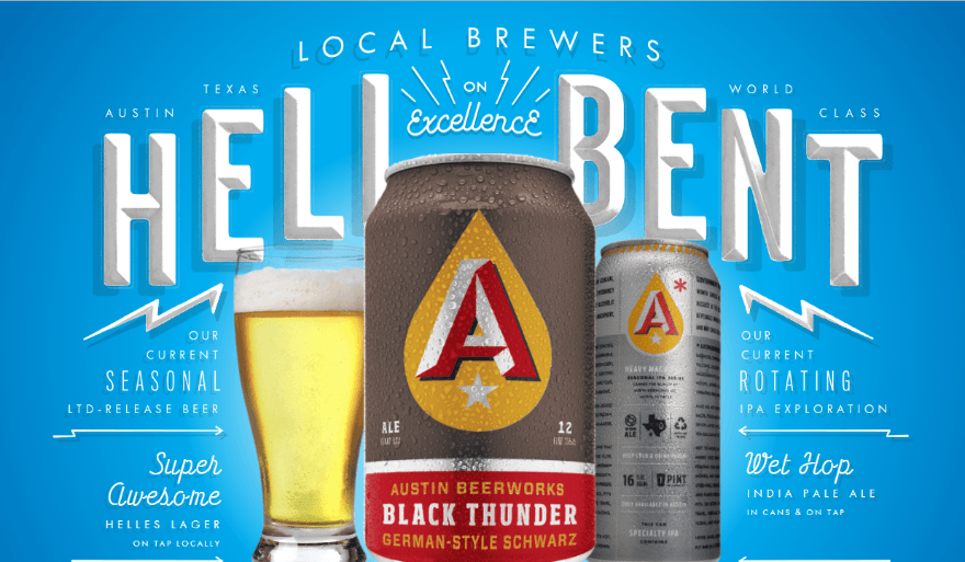
Austin Beer Works is another beverage company that relies on bold colors to showcase their beers. And like Essentially Geared Wine, Austin Beer Works incorporates actual product imagery into its colorful design.
22. Word Counter
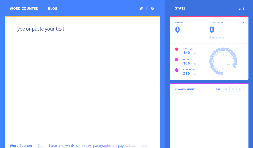
Word Counter is a nice example of a simple web app that uses color well in its design. The entire tool is one page, but it manages to differentiate itself from many of the similar tools by incorporating colorful blue tones.
23. Huxtaburger
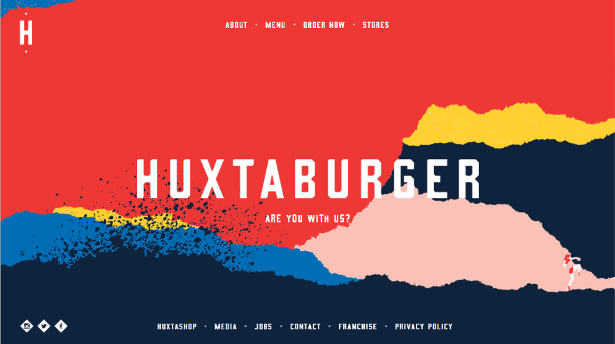
Huxtaburger is another restaurant that’s not afraid to incorporate colors into its website design. The homepage sets a colorful tone that extends throughout the rest of the website.
24. Fotonaut
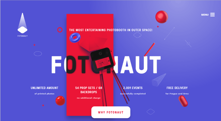
Fotonaut is a Czech service that rents out photo booths for parties and events. They heavily market how entertaining their photo booths are, so it’s only fitting that Fotonaut has its own colorful, entertaining design.
25. Survival Russian

Survival Russian is a “machine-learning app” to help users improve their Russian skills. While learning a language is a bit of a dry topic, the colorful design certainly keeps things from being boring.
Wrapping Things Up
I hope you enjoyed these 25 examples of colorful websites! Used right (that part is important), color can enhance your website designs and make for a more enjoyable experience.
Additionally, color can also enhance branding, which is especially notable with many of the whimsical products or design studios featured. Or, it can make a boring topic like cardboard boxes a little more exciting.
Now over to you – do you know any great colorful websites that are worth sharing?
Article thumbnail image by By Veleri / shutterstock.com




Some of the examples are really stunning. I like minimalistic layouts with a big strong picture and a bold catchy headline!
I am doing a pretty colorful Divi website for a printer and I thought I was using too many colours. Thanks for the inspiration
Most of the website samples here are pretty spectacular. Even though it’s very minimal, I’m really digging the Deskpass site. I’m at the early design phase for a new client and was looking for some inspiration. These examples helped a lot.
Nice collection of website designs. Some designs are really eye catching which use some good bright colors to make them stand out from each other…
There are many other colourful websites also available and some of them are very popular like Twitter and others.
“Ok – there aren’t many entirely black and white websites.”
Yah, but there still are way too many. This collection is a welcome change from the dreary, depressing sites with photos of sulking people that we see everywhere. The Russian Survival App was amazing. The animations were so intriguing I read everything on the page just watching things change as I scrolled. Besides being attractive it was fun. That’s the way to catch people’s attention.
Some have an impressive design. Excellent collection of colorful websites.
Some great and colorful examples. Rather than publishing everything in black and white I think that a lot of people have got too obsessed with the psychology of color and have built sites that they believe will convert because of the colors that they have used. What they should have done is focus on making a real impact with their colors (as with many of the sites that you have shown) and the customers will convert anyway.
WOW!
I have no words … Fantasia is boiling!
I’m designing a my project now. Got a place to take. ))
Fresh air in web design. Thank you!
You must have been very thirsty to add so many drinks to this compilation!
Gorgeous inspiration. Thank you!
hi, great collection for new outlooks, what I miss are personal websites for freelancers, designers or workers like therapists, i mean “service provider”, companies with one or two professionals – but I can wait 😉 thank you for the new design suggestions, best regards, agnes
The Milkable site must be built using Bootcamp because it has that rollover effect that changes the colour of the linked image when you press on it. Divi can’t do that according to the Divi support guys 🙁
You can’t do it with Divi out of the box, but it can be done. I think it’s either Divi Space or Divi Life that has an add-on that does this specifically, but it can also be done very easily with a small bit of custom CSS.